
Wikipedia:Graphics Lab/Map workshop: Difference between revisions
→Benghazi Map: new section |
→Benghazi Map: oops forgot to sign |
||
| Line 498: | Line 498: | ||
</gallery></center> |
</gallery></center> |
||
'''[[Benghazi]] |
'''Article(s):''' [[Benghazi]] |
||
'''Please vectorise the map and make it look nice. |
'''Request:''' Please vectorise the map and make it look nice. |
||
'''Graphist opinion(s):''' |
'''Graphist opinion(s):''' |
||
| Line 506: | Line 506: | ||
{{I take|name}}: when you accept the request ; |
{{I take|name}}: when you accept the request ; |
||
{{Done}}: when the request is done. --> |
{{Done}}: when the request is done. --> |
||
[[Special:Contributions/161.74.11.25|161.74.11.25]] ([[User talk:161.74.11.25|talk]]) 19:49, 20 January 2011 (UTC) |
|||
Revision as of 19:49, 20 January 2011
The Graphics Lab is a project to improve the graphical content of the Wikimedia projects. Requests for image improvements can be added to the workshop pages: Illustrations, Photographs and Maps. For questions or suggestions one can use the talk pages: Talk:Graphics Lab, Talk:Illustrations, Talk:Photographs and Talk:Maps.
This specific page is the requests page for the Map workshop. Anyone can make a request for a map to be created or improved for a Wikipedia article. The standard format for making a request is shown below, along with general advice, and should be followed.
You are encouraged to share information and request advice from others. Also see possible conventions toolbox, map tutorials and topographic map tutorials.
| Advice to requesters |
|---|
|
What do we do?
|


| If you have completed work and not received a reply you may use the {{GL Map reply}} template to inform the requester. |
| Map makers and other visitors to the Graphics Lab may be interested in the RSS feed of changes to this page. You may find it here. |
| See also our sister Map workshop at Commons and the WikiProject Maps |
| Result | Code | Usage |
|---|---|---|
{{resolved|~~~~}}
|
Mark a thread as resolved and request archiving | |
{{subst:bump}}
|
Delay automatic archiving of a section for 30 days | |
{{I take|~~~~}}
|
When you'll be working on the request | |
{{Done}} ~~~~
|
When the request is done |
This page is automatically archived by ClueBot III. | |
| This page has a backlog that requires the attention of willing editors. Please remove this notice when the backlog is cleared. |
Axial Seamount
-
 Position of Axial Seamount on the Juan de Fuca ridge.

Article(s): Axial Seamount
Request: Cleanup, wikify, vectorize, crop the title at the top. Prospective GA. Thanks, ResMar 02:55, 11 October 2010 (UTC)
Graphist opinion(s): ![]() Done Jon Chui (talk) 02:55, 28 December 2010 (UTC)
Done Jon Chui (talk) 02:55, 28 December 2010 (UTC)
- Thanks: now I just need to find my source usb... :) ResMar 23:38, 28 December 2010 (UTC)

Bihar legislative assembly election, 2010
Article(s): Bihar legislative assembly election, 2010
-
 Attempt (please update/modify)

Request: Could someone please a make a map like this [1] from the one currently on the page? It seems the external one would be copyvio.
- Also, after the polls are announced on November 24 then wed need something like this. Thanks. Lihaas (talk) 13:37, 25 October 2010 (UTC)
Graphist opinion(s):
- Using the SVG that map file was derived from would be better. I find it a little odd that it's not just a clipped region from the SVG file. gringer (talk) 21:39, 25 October 2010 (UTC)
- Actually, on further observation, that map won't do. The administrative boundaries aren't detailed enough for the election boundaries. gringer (talk) 12:44, 26 October 2010 (UTC)
- To demonstrate that, I've extracted out the relevant portion of the locator map and coloured regions as close as possible to the boundaries in the external image (using 4-colour colours plus two more taken from the locator conventions). gringer (talk) 13:12, 26 October 2010 (UTC)
Iran–Bolivia relations

Article(s): Iran–Bolivia relations
Request: Need an introductory map akin to Iran - Ecuador relations. Thanks again for all your hard work.Lihaas (talk) 07:54, 28 October 2010 (UTC)
Graphist opinion(s):
![]() Done Wereldburger758 (talk) 06:29, 31 October 2010 (UTC)
Done Wereldburger758 (talk) 06:29, 31 October 2010 (UTC)
- Thanks.(Lihaas (talk) 10:38, 1 November 2010 (UTC));
Pilbara iron ore mining map request
-
 Iron ore mining in the Pilbara map

Article(s): Hammersley & Robe River railway, Goldsworthy railway, Mount Newman railway and Fortescue railway Request: We are after a map of the privatly owned iron ore railways in the Pilbara region of Western Australia. As sources, the following are available:
- Hammersley & Robe River railway (Rio Tinto - official)
- Hammersley & Robe River railway (Rio Tinto - secondary source)
- Mt Newman & Goldsworthy (BHP)
- Fortescue (showing all systems)
- Department of state development map
Calistemon (talk) 14:48, 5 November 2010 (UTC)
- I've created a rather basic and primitive map myself, if somebody can be found that is interessted in the project, maybe they can use it as an example of would I'm trying to have on the map. Calistemon (talk) 14:56, 4 December 2010 (UTC)
Graphist opinion(s):
Spain Demographic Map
-
.PNG file, color intensity map of the world (similar to the one currently in the article). I would break it into four intensity levels: 0-24,999, 25,000-49,999, 50,000-74,999, 75,000+, though you could do it how you please.
Article(s): Demographics of Spain
Request: From this website (Ministry of Employment and Immigration, Spain): http://www.mtin.es/es/estadisticas/Inmigracion_emigracion/index.htm you can download the data file 'Inmigración y Emigración (Observatorio Permanente de la Inmigración)' which has Visa and work allowances for immigrants until 2009. The first section gives the total population in 2009 per each listed country. The current article has a map most recently updated in 2002, and lacks to account for the recent EU enlargements (in 2004 and 2007). Please let me know if you have any questions.
The data can be accessed at this link (the first table, you can open with excel). http://extranjeros.mtin.es/es/InformacionEstadistica/Anuarios/ Mdestito (talk) 21:54, 22 November 2010 (UTC)
Graphist opinion(s): Can you provide a more specific link to the data? That would help those of us whose Spanish is a bit rusty... Classical geographer (talk) 15:21, 23 November 2010 (UTC)
The data is here. http://extranjeros.mtin.es/es/InformacionEstadistica/Anuarios/ —Preceding unsigned comment added by Mdestito (talk • contribs) 15:44, 23 November 2010 (UTC)
.svg map combining


Article(s): To be inserted into National Weather Service Chicago, Illinois and National Weather Service Paducah, Kentucky
Request: Please create county locator maps for Indiana and Illinois combined and Missouri, Illinois, Indiana, and Kentucky combined (leave the highlighting in the resulting maps, if possible). I need them to display the locations of the county warning areas for the Paducah, Kentucky and Chicago, Illinois National Weather Service offices. Also, in the process, could the state borders in the counties highlighted be fixed in a manner similar to that which Kmusser did with this image? Thanks in advance, Ks0stm (T•C•G) 04:34, 23 November 2010 (UTC)
Graphist opinion(s):
requesting world map
Sorry, I have no idea how to parse my data into wiki's format, but what I'm asking for is this:
A blank world political map in equirectangular projection, showing current widely recognized sovereign nations. It should also show the whole world, including antarctica. I'd like PNG format, so that the map only has 2 or 3 colors in it, making it easy to use color fill. And I'd like it to be big, at least 2400 x 1200.
The closest I've seen to this is Roke's Pacific Centered map, but the projection has errors, as I explain on his talk page here: http://commons.wikimedia.org/wiki/User_talk:Roke#map_error_in_your_pacific-centered_map
Alternatively, if anyone knows how I can do this myself, please advise. I have little experience with raw map making, but can use a computer well.
DrZygote214 (talk) 19:21, 24 November 2010 (UTC)
- Nothing for you in commons:Category:Blank SVG maps of the world? Or commons:Category:Blank maps of the world? Uwe Dedering (talk) 18:48, 25 November 2010 (UTC)
- Nope. I browsed through all that for a long time. There are many maps there that are close, but not what I need. Can't use SVG (nor the PNG derivatives) because the borders aren't clean---they use many shades of white and gray. Most of those are Robinson and not Equirectangular to begin with. DrZygote214 (talk) 07:27, 26 November 2010 (UTC)
- Why Equirectangular? A world map with that projection looks really bad... I also don't understand the border thing. Not clean? You will have to tell us more about your plans... Uwe Dedering (talk) 16:00, 26 November 2010 (UTC)
- Dude, there are many map projections. Which one "looks good" is all opinion and we shouldn't argue about it. As for the clean borders, here is an explanatory screen shot http://img253.imageshack.us/img253/6127/mapss.png On the left is a svg, zoomed in. As you can see, the borders are all smudgy, but the png is clean. The png uses only 2 colors. So I want PNG for a clean map, and I want equirectangular because that's just the one I like most. DrZygote214 (talk) 18:05, 26 November 2010 (UTC)
- You realize that the point of .svg is you can zoom in infinitely and the borders stay clean? See http://en.wikipedia.org/wiki/File:Bitmap_VS_SVG.svg for an example of what I mean. Ks0stm (T•C•G) 05:10, 27 November 2010 (UTC)
- The only map with equirectangular projection i find is [2], center such map on pacific is not a great problem because it's a SVG, (trust the opinion of graphics!), nore eliminating the orange indicatrix; editing all the countryies boundaries will take a lot of time, so it's better if you explain what is your goal. Alternatively, try to make your request to the cartographer who made this map (using cartographical programs like GRASS i.e.) at french graphic lab: they are really kind and probably would help you.Ciaurlec (talk) 15:05, 27 November 2010 (UTC)
- This map seems to be an equirectangular projection, based on the description ("all lines of latitude and longitude are all evenly spaced and parallel"). Would it meet your needs? It's svg (not png), but as described above, svg is better for scaling, clean borders, and editing the colors of different countries. Calliopejen1 (talk) 16:31, 30 November 2010 (UTC)
- Dude, there are many map projections. Which one "looks good" is all opinion and we shouldn't argue about it. As for the clean borders, here is an explanatory screen shot http://img253.imageshack.us/img253/6127/mapss.png On the left is a svg, zoomed in. As you can see, the borders are all smudgy, but the png is clean. The png uses only 2 colors. So I want PNG for a clean map, and I want equirectangular because that's just the one I like most. DrZygote214 (talk) 18:05, 26 November 2010 (UTC)
- If you want clean borders, a PNG file isn't appropriate, because every decent map uses antialiasing to make the lines look better. Please consider using SVG (Inkscape is a very capable SVG image editor). The SVG format also has the benefit that country boundaries can be grouped (and styled per-group), so it's much easier to alter colours of particular countries that are composed of multiple islands. This is a low-resolution (i.e. small file size) SVG map of the world, with political boundaries for countries as their own group (inside a sovereign group, if it is separate). If you really want no antialiasing, save as a fairly large PNG image, load up in GIMP, and use a posterize tool to flatten the colours. gringer (talk) 00:36, 6 December 2010 (UTC)
- FWIW, I just did that using the SVG image I linked to here (took me about 2 minutes), so I guess this is a link to the type of map you wanted. A bit smaller than requested, though (I just used the 2000px image link on the wikipedia page). gringer (talk) 00:46, 6 December 2010 (UTC)
Valenzuela Map
Article(s): Valenzuela City
Request: Can somebody do this map for Valenzuela City, Philippines? Source image I have a hard time doing it, especially I can only manipulate pictures using MS Paint (and it's difficult to build a map there :) ) Anyway, don't bother with the name, if possible, it should be a blank map in PNG format. The colors in the source image indicates the local government division, please include such borders in the map. Thanks.— JL 09 talk (site)contribs 07:59, 1 December 2010 (UTC)
- this map might help as a starting point. P. S. Burton (talk) 20:03, 1 December 2010 (UTC)
Graphist opinion(s):
EuropeArticleLanguages map
I would like to request an edit to the map found under Article (grammar), originally submitted by Nikolik. http://en.wikipedia.org/wiki/Article_(grammar) It has been fixed a few times already. I wish I knew how to edit it myself, but I don't. Basically the Arabic speaking world is currently the lighter shade of blue in the legend, which indicates definite articles only. A new category in the legend needs to be named "definite and diacritically marked indefinite articles." This information is already present in the Wikipedia article that the map is being used for.
Please contact me if there is any issue. Thanks. Rsg70007 (talk) 06:01, 5 December 2010 (UTC)
graphist opinion: This should be a simple photoshop job if all you need is a PNG. The thing is... I got confused reading the article (ahh! Grammar!) Can you just tell me/us which countries need to be changed to what shade of color? Jon C (talk) 23:46, 2 January 2011 (UTC)
2 requests regarding the Kingdom of the Netherlands in the caribbean
-
 Netherlands Antilles map; basis for both requests
 -
 information to see which islands are actually Bonaire, Sint Eustatius and Saba
 -
 map for the orientation of the islands (west to east): Aruba, Curacao, Bonaire


Article(s):
request 1: Caribbean Netherlands (and several others, like Netherlands)
request 2: diocese of Willemstad, Netherlands Antilles and several others)
Request 1: Caribbean Netherlands: After the dissolution of the Netherlands Antilles, three islands Bonaire, Sint Eustatius and Saba are now collectively called the Caribbean Netherlands, yet there is no map clustering them together. Could the Netherlands Antilles map be changed to include only those islands in the green area? Better even, could the image be cropped to have as little ocean as possible to the east? Then the "worldmap+focusarea" can be placed in the upper-left corner. Maybe (who knows) the islands become a bit more visible; I am afraid for this action a better resolution image is required however...
Request 2: Netherlands Antilles 1954-1986:Quite some things are arranged within the full territory of the Kingdom of the Netherlands in the Caribbean. That would be Aruba + the former Netherlands Antilles. Could the green area in the (original) map from above be changed to also include Aruba?
For the location of the islands, see the map to the right , Aruba is the island to the west of Curacao (see also ABC islands). L.tak (talk) 19:42, 6 December 2010 (UTC)
Graphist opinion(s):
Painted turtle distribution


Article(s): Painted turtle
Request: I would like to see the image on the left cleaned up in a few ways. Could it be converted to the standard wikimap layout, something like the bog turtle distribution to the right? Also, can it show slight overlap between the subspecies (just the different colors)? NYMFan69-86 (talk) 20:20, 8 December 2010 (UTC)
The yellow south border needs to be further south as well (into Alabama) to match our text. ;) TCO (talk) 20:43, 8 December 2010 (UTC)
- I took care of this bit, still needs other changes though.--NYMFan69-86 (talk) 04:05, 12 December 2010 (UTC)
This site offers a good range as well: http://people.wcsu.edu/pinout/herpetology/cpicta/speciesidentification.html However, I would like to keep the range subspecies-specific. Thank you!--NYMFan69-86 (talk) 23:23, 11 December 2010 (UTC)
Graphist opinion:
Scottish placenames
-
Origin of Scottish placenames
Articles: Scottish Gaelic, Early Scots
Request: This should be in SVG format. 155.33.172.164 (talk) 20:03, 9 December 2010 (UTC)
Graphist opinion(s):
USA map with lat/long
-
 This could serve as base map
 -
 Or maybe this


Article(s): Wikipedia:Geonotice
Request: Please create a map of the US with clearly labeled latitude/longitude lines, that can be used for easily figuring out the coordinate rectangles for geonotice areas (strangely, there are no maps of this kind yet available on Commons). See here and here for model examples. Analogous maps of other Anglophone countries and also countries like India would be useful as well.--Pharos (talk) 19:00, 10 December 2010 (UTC)
Graphist opinion:
Eyak native tribe
-
 Map showing Ahtna language. Eyak is #15
 -


Article(s): Eyak language, Eyak
Request: Looking for a location map for the Eyak language. Vedrfolnir (talk) 22:38, 10 December 2010 (UTC)
Graphist opinion(s):
Puerto Rico Map Topographic
-
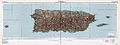 1952 Topographic map of the archipelago of Puerto Rico
Request: Needs center line removed. QuAzGaA 02:05, 11 December 2010 (UTC)
Graphist opinion(s): Try the photography workshop -- there are better experts in blending out raster images than here. Jon C (talk) 07:28, 3 January 2011 (UTC)
elk and moose maps
-
 map of elk range currently in use on numerous projects
 -
 map of moose range


Request: I don't really know anything about the processes used to create such a map, but I do know that I have seen elk as far north as Whitehorse, Yukon, which does not appear to be included on this map. So I guess I am asking for some clarification on what data was used to create this map and suggesting that it may need to be updated. I will do some digging of my own to see if I can find some verification. Beeblebrox (talk) 02:28, 14 December 2010 (UTC)
- Well, the Yukon government is issuing hunting permits as far north as Carmacks, [3] so either I am misreading the map or it is inaccurate, I doubt they are issuing permits to hunt elk that don't exist. Beeblebrox (talk) 02:39, 14 December 2010 (UTC)
- Oh dear, I'm afraid the map of the range of the moose has the opposite problem, moose do not live in the rugged coastal areas of Southeast Alaska, here is the Alaska Department of Fish and Game map of the moose range in Alaska [4] (scroll down). It even shows them living on islands that are well offshore. Moose are ok swimmers, but not so good that they could swim all the way out the Aleutian Islands. Beeblebrox (talk) 03:32, 14 December 2010 (UTC)
Graphist opinion(s):
- I agree these maps are not very good. Neither provides sources. It's not uncommon for Wikipedia/Commons maps to get away with not providing sources, but they should, same as text on Wikipedia. There are many many obviously inaccurate maps on Wikipedia/Commons, and this seems to be another example. I wouldn't trust it. Some kind of reliable source needs to be found for making a good map. The moose map stands out as clearly wrong to me. It seems to claim there are moose in the Oregon High Desert, Vancouver Island, the Olympic Peninsula, etc etc, but not in Yellowstone and the Tetons. I almost walked into a moose in the Tetons! And there definitely aren't any on the Olympic Peninsula. It also shows moose distribution in the Buffalo and Niagara Falls area, which I can assure you is plain wrong. You could bring up these problems on the talk pages of each map, although I've had little luck in getting results that way. You could bring it up on talk pages for articles that use the maps. The best thing would be to find a reliable source with maps showing the proper distribution. (Okay, I just added comments to the talk page on the moose map at The Commons, http://commons.wikimedia.org/wiki/File:Moose_distribution.png -- and a "disputed accuracy" template. Don't hold your breath though--the file has not been edited in a long time. It's possible the author is long gone) Pfly (talk) 12:19, 15 December 2010 (UTC)
Islam and secularism
-
 Map showing the constitutional status of Islam in Muslim-majority countries.

Article(s): Islam and secularism
Request: Hello, I would like to request that Bangladesh be coloured blue on the map. The High Court of Bangladesh has ruled that the country is a secular state, in line with the original constitution of 1972 (see here). Thanks, The Celestial City (talk) 19:17, 1 January 2011 (UTC)
Graphist opinion(s): ![]() Done The change is made (overwritten). There is, however, a corresponding vector file, and not having looked closely to see if they remain identical, I did not change that. Jon C (talk) 08:22, 4 January 2011 (UTC)
Done The change is made (overwritten). There is, however, a corresponding vector file, and not having looked closely to see if they remain identical, I did not change that. Jon C (talk) 08:22, 4 January 2011 (UTC)
Bhutan and World Wars
-
 Participants of WWI
 -
 Participants of WWII


Article(s): World war
Request: Change Bhutan to the color grey beacuse it was nuetral during the Wars Spongie555 (talk) 06:35, 2 January 2011 (UTC)
Graphist opinion(s):
UK postcode map
Request: Can someone create an svg map out of this [5]. It's a postcode map of the UK in about 2008. I'm not sure if it's up-to-date. I think it may not be, since it is 120 codes [6], and our article states there are 124 (although the ref appears to be a deadlink). If someone could make an svg from the map I linked to, then we could use it as a template for the surname distribution maps that this website shows [7]. Just do a search for a surname on that site, and see how they show the distribution of names. I'd like to be able to do that in some of our articles. Could someone bang up a map we could use as a template?--Brianann MacAmhlaidh (talk) 11:07, 3 January 2011 (UTC)
Graphist opinion:
Clean up on external map
Article(s): Zhao Rugua
Request: I have two halves of a map that need to be cleaned up. Unfortunately, they are each too big to be uploaded to a hosting site, so I can't provide a link for other editors to look at. I plan on adding a smaller version of the complete map to the linked article, but I need the larger version cleaned up first. If anyone is interested in looking at the map, you can contact me via my email, which is accessible through Wikipedia. Just go to my talk page and click the button that looks like a mail box. If the interested editor has email set up, I will email you both halves. Basically, a gray haze needs to be removed from the background and the letters and outlines on the countries need to be darkened. Thank you. Ghostexorcist (talk) 13:47, 4 January 2011 (UTC)
Graphist opinion(s):
Navi Mumbai Map
Article(s): Navi Mumbai, various others
Request: Please create a map of Navi Mumbai (http://www.navimumbaiindia.com/images/navi_mumbai.jpg, http://www.maharashtratourism.gov.in/mtdc/HTML/MaharashtraTourism/images/MapsofMaharashtra/Mumbai/greater-mumbai.jpg) in SVG. I have tried using OpenStreetmap, but since I am not good with vector graphics, I have not been able to produce a good map for this city which requires one.) --92.3.157.210 (talk) 15:31, 4 January 2011 (UTC)
Flag-map of the world
-
 Flag-map of the world
.svg)
Article(s): Quite a few
Request: In the small previews, only Southeast Asia and Australia are visible. I used the same method to make each country so I don't know the cause.
If it helps you to determine the cause, the versions of this file prior to October 2010 only have the US missing (they're outdated though). Transparent 6lue (talk) 22:50, 12 January 2011 (UTC)
Graphist opinion(s):
Europe Map
-
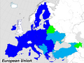 Map of EU and deals with neighbors
 -
 Map showing EU and ENP policies

Article(s): Future enlargement of the European Union Request: Please convert these images to svg format. Rctycoplay (talk) 21:05, 13 January 2011 (UTC)
Graphist opinion:
File:Mangalorean catholic migration.JPG
-
 The path of migration of Goan Catholics towards South Canara.

Article(s): Mangalorean Catholics, Captivity of Mangalorean Catholics at Seringapatam
Request: The image is of poor quality. Would someone please convert it into SVG format? Both the articles in which it appears have GA status. Such a low quality image does not belong there. Joyson Noel Holla at me! 14:16, 15 January 2011 (UTC)
- Please hurry up! One of the articles in which it appears has been nominated for FA status. Joyson Noel Holla at me! 09:18, 17 January 2011 (UTC)
Graphist opinion(s):
Veracruz, Mexican State
-
 Image A
 -
 Image B
 -
 Image C
 -
 Image D
 -
 Image E
 -
 Image F


Article(s): Veracruz and Municipalities of Veracruz and derivated articles for each city/municipality
Request: Hi I would like to have an image like Image D but for the State of Veracruz (ignoring the infobox in Image D). Actually my main concerns are:
- The size of Image A (2.05MB) when i see images like E (432KB) or F (123KB). If you could give me reduced version of this image I can do all the rest.
- Missing municipality on Image A and B: in Image B, the Municipality in darker blue is Playa Vicente (number 21 of Image C) which wrongly includes Santiago Sochiapan (number 22 Image C) within its borders, if it could be added to a reduced version of Image A, there is no need to create an image similar to Image D, i could take care of it.
Thank you very much. (Sorry to be repetitive, but just a reduced file size would make my day and I could start creating derivative maps after having it) EOZyo (мѕğ) 07:28, 16 January 2011 (UTC)
Graphist opinion(s):
- The size is in the details - image A contains polygons for all municipalities, which takes up much more data than just drawing all states of Mexico. Technically, a less precise version of A (i.e. one with less nooks and corners of all municipalities displayed) would suffice, but that's a lot of work. With a regular image, you could use graphical software to smooth the lines, but since every line is actually two edges of neighbouring municipalities, automatic smoothing gives unsatisfactory results... Sorry. Is the big file size a problem, though? Classical geographer (talk) 10:53, 20 January 2011 (UTC)
wine

Article(s): wine
Request: English version, please... Kintetsubuffalo (talk) 14:49, 16 January 2011 (UTC)
Graphist opinion(s):
Rally Dakar
Article(s): 1979 Paris–Dakar Rally and others from Template:Dakar_Rally
Request:Hello, please create maps of all years Dakar Rally in same style like 2010 and 2011 (easy-translate SVG with all route). Sources are here [8] and here [9]. Thanks. Slfi (talk) 16:59, 17 January 2011 (UTC)
Graphist opinion(s): That's a lot of work, Slfi. Makes it worth your while to have a go yourself with Inkscape, maybe, if someone here provides you with a map showing France, Spain and NW-Africa? Classical geographer (talk) 10:49, 20 January 2011 (UTC)
Transilien P
Article(s): Transilien Paris – Est, Ligne P du transilien on the french wikipedia and the future article Transilien lijn P on the dutch wikipedia
Request: Could you make a map of line P of the transilien-network? Resources can be found here and here. Aliesperet (talk) 17:25, 19 January 2011 (UTC)
Graphist opinion:
- There is no map at all of any Transilien service. I think that would be a first priority; either a schematic map (as on the official Transilien website here) or one overlaid over a map of Paris - which would have the advantage of showing more clearly that Transilien services reach somewhat further out than the RER network. Aliesperet, what do you say? Classical geographer (talk) 10:45, 20 January 2011 (UTC)
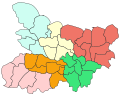
Benghazi Map
-
 Map of the Mutamarat Shabiya (local divisions) within the Benghazi shabiya (top level national division).

![[2]](https://en.wikipedia.org/wiki/File:Tissot_indicatrix_world_map_equirectangular_proj.svg)
![[5]](http://gbnames.publicprofiler.org/help/..%5Cimages%5CUKpostarea.png)
Article(s): Benghazi
Request: Please vectorise the map and make it look nice.
Graphist opinion(s):