Georgia (typeface)
 | |
| Category | Serif |
|---|---|
| Classification | Transitional PANOSE: 2263545234 |
| Designer(s) | Matthew Carter |
| Foundry | Microsoft Corporation |
| Date created | 1993 |
| Date released | 1996 |

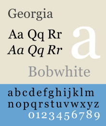
Georgia is a transitional serif typeface designed in 1993 by Matthew Carter and hinted by Tom Rickner for the Microsoft Corporation, as the serif companion to the first Microsoft sans serif screen font, Verdana. Microsoft released the initial version of the font on November 1, 1996 as part of the core fonts for the Web collection. Later, it was bundled with Internet Explorer 4.0 supplemental font pack.
Georgia is designed for clarity on a computer monitor even at small sizes, partially effective due to a large x-height.[1][2] The typeface is named after a tabloid headline titled "Alien heads found in Georgia."[3]
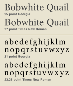
The Georgia typeface is similar to Times New Roman, but with many subtle differences: Georgia is larger than Times at the same point size, and has a greater x-height at the same actual size; Times New Roman is slightly narrower, with a more vertical axis; and Georgia's serifs are slightly wider and have blunter, flatter ends. Georgia incorporates influences from Clarendon-style typefaces, especially in b, r, j, and c (uppercase and lowercase).[citation needed] Figures (numerals) are an exception: Georgia uses text (old-style) figures whereas Times New Roman has lining figures.
Variants
New versions of Georgia, along with its sister font Verdana, were released in 2011.[4][5] The extension of the original font, named Georgia Pro, features a set of additional typefaces and designs, including:
- Additional weights, including condensed versions
- Specialised small caps designs
- Extensions to the character sets
- Extensions to the kerning
- OpenType typographic features for enhanced typography
The expanded font was designed for organisations which had made extensive use of Georgia and Verdana due to its availability but desired additional versions for specific uses.
Microsoft has commissioned a number of variants. Georgia Ref, a variant of Georgia consisting of a single weight, but with extra characters, was bundled with Microsoft Bookshelf 2000, Encarta Encyclopedia Deluxe 99, Encarta Virtual Globe 99. MS Reference Serif, a derivative of Georgia Ref with a bold weight and italic, was also included in Microsoft Encarta.
In 2007, Carter completed a new variant of Georgia for the graphical user interface of the Bloomberg Terminal.
Awards
The Cyrillic font won an award at Kyrillitsa in 1999.[6]
May 26, 2011 Matthew Carter received a Lifetime Achievement Award from the Smithsonian's Cooper-Hewitt National Design Museum in part for design of Georgia font.
See also
References
- ^ "Georgia & Verdana: Typefaces designed for the screen (finally)", by Daniel Will-Harris, accessed 24 November 2005
- ^ Friedl, Friedrich, Nicolaus Ott and Bernard Stein. Typography: An Encyclopedic Survey of Type Design and Techniques Throughout History. Black Dog & Leventhal: 1998. ISBN 1-57912-023-7.
- ^ Typeface Descriptions & Histories
- ^ Georgia and Verdana Pro. Monotype http://georgiaverdana.com/. Retrieved 4 October 2013.
{{cite web}}: Missing or empty|title=(help) - ^ Enhancements to Georgia & Verdana Typeface Families Announced
- ^ U&lc Online Issue: 25.4.1: The Winners
External links
- Georgia font information (Microsoft typography)
- Georgia Ref font information (Microsoft typography)
- Article by Daniel Will-Harris
