
Wikipedia:Graphics Lab/Illustration workshop
This page is deprecated and will not be monitored. Please use one of the three workshop pages. This specific page is {{{1}}}
See also
- Category:Images for cleanup
- Category:Images for redraw
- meta:Philip Greenspun illustration project/Requests
More Zimbabwean Coats of Arms
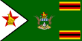
-
 Bulawayo COA
 -
 + 7 days}}.
 -
 Mutare flag
 -
Gweru flag
-
Easy?
-
![help with a redraw. foud the image here: http://users.picknowl.com.au/~hanuman/mwenezi/organisations.htm]](//upload.wikimedia.org/wikipedia/commons/e/ed/Pix.gif) help with a redraw. foud the image here: http://users.picknowl.com.au/~hanuman/mwenezi/organisations.htm]
help with a redraw. foud the image here: http://users.picknowl.com.au/~hanuman/mwenezi/organisations.htm]


![help with a redraw. foud the image here: http://users.picknowl.com.au/~hanuman/mwenezi/organisations.htm]](/wiki/File:Pix.gif)
Article(s): Bulawayo, Chitungwiza, Mutare, Gweru, Marondera, Zimbabwe, MDC
Request: To make SVG versions of the above images. Its a lot to ask and if it can't be done, it can't be done. The flags can be made using the coats of arms once an SVG has been made for them so no need to make the COAs twice. The writing on the Chitungwiza Banner should read Pamberi Nekushandria Pamwe. The Bulawayo flag is the Bulwayo COA on a blue bkgd. It looks different in the image above but use the image as in the COA as this is the proper version. SVG Zimbabwe COA and enlarge for clarity if possible. Many thanks Mangwanani (talk) 17:16, 19 January 2008 (UTC)
Graphist opinion:
- OK, the MDC flag was easy. Some of these coats of arms, however, are at a low resolution—I'm concerned about losing detail if we try to vectorize them. That may just be me, though :) Why is the Chitungwiza COA tagged as a logo? Fvasconcellos (t·c) 13:35, 23 January 2008 (UTC)
- Most of them are tagged as logos probably because when I uploaded them I couldn't find the right tag. To be fair they are logos in a sense... I thought the low resolution may be a problem but if it can't be done, it can't be done. The Bulawayo one is of a high resolution and the flag for it can be made by sticking the logo onto a blue background. The flag that is shown above for the Blwo flag I don't think is right as I never remember seeing the flag with a logo like that so I would stick to the logo shown as I got that off official documentation. Thanks Mangwanani (talk) 16:59, 23 January 2008 (UTC)
- Sorry I keep adding to it but it would be great if they could all be done. Mangwanani (talk) 19:46, 23 January 2008 (UTC)
- Don't apologize :) I'll list those already done below. Fvasconcellos (t·c) 10:58, 24 January 2008 (UTC)
-
 Yes :)
 -
 Air Force done
 -
 Southern Rhodesian Air Force until 1953
 -
 1964-1968

.svg)
.svg)
.svg)
- Could the colours for the Air Force flag be a bit darker? More of a teal and a navy? Mangwanani (talk) 17:01, 24 January 2008 (UTC)
- I used the color approximations listed at the Commons' Pantone approximation chart for British flag colours, they would look a bit different than those used in the GIF. They'll look closer to what you expect depending on monitor settings—for instance, if I set the color temperature of my LCD display to 6500K, the Air Force ensign looks teal, and if I set it to 9300K, the flag looks sort of a sky blue. The colors I chose are used by most SVGs of British-style ensigns, which makes for more consistency across articles; I can change them if you'd like, though. Fvasconcellos (t·c) 17:25, 24 January 2008 (UTC)
- No its fine if theres a standard way of doing it. I'm still new to all this but you have a way of working which works so I shall try not to interefere! I still don't know about the Rhodesian flag and COA which was done some time back. I still think the COA looks too green... Mangwanani (talk) 20:24, 24 January 2008 (UTC)
- I used the color approximations listed at the Commons' Pantone approximation chart for British flag colours, they would look a bit different than those used in the GIF. They'll look closer to what you expect depending on monitor settings—for instance, if I set the color temperature of my LCD display to 6500K, the Air Force ensign looks teal, and if I set it to 9300K, the flag looks sort of a sky blue. The colors I chose are used by most SVGs of British-style ensigns, which makes for more consistency across articles; I can change them if you'd like, though. Fvasconcellos (t·c) 17:25, 24 January 2008 (UTC)
- Ok, so the flags were deleted before you could make SVG versions of them. However, all the flags/COAs I listed can be found here [1]. Thanks. Mangwanani (talk) 17:27, 28 January 2008 (UTC)
- Argh—I should have downloaded them first, I only got the Marondera COA and flag. Oh well, FOTW it is. Fvasconcellos (t·c) 18:26, 28 January 2008 (UTC)
You'll have to get them from FotW now, Commons dropped the bomb on us! 68.39.174.238 (talk) 19:02, 28 January 2008 (UTC)
- Someone should go there and administer a good Whacking with a Wet Trout. Sagredo⊙☿♀♁♂♃♄ 04:34, 29 January 2008 (UTC)
- I added an older insignia to the airforce collection. It seems most of the examples I saw had a ratio of 1:2. Is this generally correct for this type of flag? aliasd·U·T 04:13, 29 January 2008 (UTC)
- FOUL, TIME OUT, WHOA!!! jackaranga, why are you not tagging these with the proper {{Non-free symbol}} tag? That's what it's there for, and it's a lot less deletionist and confrontational than tagging them for deletion. Chris (クリス • フィッチ) (talk) 23:24, 5 February 2008 (UTC)
- Has any more progress been made with these images before Commons remove them all? Mangwanani (talk) 17:31, 19 February 2008 (UTC)
- Sorry, but not really. I've been out of commission lately—rather, my computer has. Again, I apologize. Fvasconcellos (t·c) 10:16, 20 February 2008 (UTC)
- Added one of my own SVGs. The spear probably needs tyding up a tad... Mangwanani (talk) 16:21, 2 March 2008 (UTC)
- Sorry, but not really. I've been out of commission lately—rather, my computer has. Again, I apologize. Fvasconcellos (t·c) 10:16, 20 February 2008 (UTC)
- Has any more progress been made with these images before Commons remove them all? Mangwanani (talk) 17:31, 19 February 2008 (UTC)
-
 Zimbabwe Presidential Flag
 -
 Bulawayo COA by Mariana
 -
 Flag
Flag


This is my version, however, I think I corrupted the file by inserting a bitmap image... Mangwanani (talk) 17:45, 8 March 2008 (UTC)
- I'll have a look. Fvasconcellos (t·c) 03:00, 16 March 2008 (UTC)
- Indeed you did :D Fvasconcellos (t·c) 13:44, 16 March 2008 (UTC)
- I'm trying to make the Zim COA (see below) and once that's made it can be used for a whole host of other images but I'm struggling as my knowledge of Vector graphics is so limited...Mangwanani (talk) 19:54, 16 March 2008 (UTC)
- I have added the COA as it has been done so far. It will need correcting when the COA is finished. Mangwanani (talk) 11:22, 2 April 2008 (UTC)
- I'm trying to make the Zim COA (see below) and once that's made it can be used for a whole host of other images but I'm struggling as my knowledge of Vector graphics is so limited...Mangwanani (talk) 19:54, 16 March 2008 (UTC)
- Indeed you did :D Fvasconcellos (t·c) 13:44, 16 March 2008 (UTC)
- I'll have a look. Fvasconcellos (t·c) 03:00, 16 March 2008 (UTC)
I have made the coat, could someone please use it to ake the flag? -LadyofHats (talk) 02:27, 16 March 2008 (UTC)
- Flag done. As for the COA, let me just say—wow. Fvasconcellos (t·c) 03:00, 16 March 2008 (UTC)
- That's exactly what I said... Mangwanani (talk) 12:28, 16 March 2008 (UTC)
- Flag done. As for the COA, let me just say—wow. Fvasconcellos (t·c) 03:00, 16 March 2008 (UTC)
Burning ship map
-
 Position map
 -
 larger map
 -
 Possibly from here?


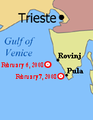
Article(s): M/S UND Adriyatik
Request: SVG-ification for legibility, if possible show a larger chunk of the Adriatic and country names so position is clearer? This is currently hardly legible, but the article is linked from ITN on the main page. -- Circeus (talk) 18:57, 9 February 2008 (UTC)
Graphist opinion: I'll do it. -- I. Pankonin (t·c) 02:47, 16 February 2008 (UTC) Nevermind I thought the map of the Adriatic was SVG. I don't have the tools for this. -- I. Pankonin (t·c) 02:49, 16 February 2008 (UTC)
- Could you open the png in Inkscape, draw on it, and then export the drawing as a png. —Preceding unsigned comment added by 67.42.172.193 (talk) 06:54, 20 February 2008 (UTC)
- Can get an SVG from above but I don't know how to crop in Inkscape! :S Mangwanani (talk) 21:55, 15 March 2008 (UTC)
- I don't think there's a simple way of cropping to a selection like in PS. Simplest way I think is to create a rectangle, move it to the top layer, select all of your objects and rectangle and then go to Object > Clip > Set. The shapes are still outside of the rectangle, they just aren't shown. — ₪₪ ch1902 ₪₪ 12:42, 16 March 2008 (UTC)
- One way to do this is easily is to make the entire drawing, then set the page size to cover the area you want. When the drawing is uploaded to wikipedia or viewed in a browser window, it will only show what is inside the page area. Jeff Dahl (Talk • contribs) 03:36, 25 March 2008 (UTC)
- Can get an SVG from above but I don't know how to crop in Inkscape! :S Mangwanani (talk) 21:55, 15 March 2008 (UTC)
Cheatsheet to Vectorized


Article(s): For Wikipedia use, especially the {{welcome}}
Request: -- 210.203.61.15 (talk) 14:26, 11 February 2008 (UTC) Can someone convert these pdf into SVG, or redo it in SVG. Since SVG is understood by MediaWiki (display an image) and SVG is easier to translate, that should be really helpful to have them in SVG format. The wikipedia-Logo is not available in SVG, and will need to be deleted.
Graphist opinion: All done... Some fonts were messed up, but all in all, i think it looks good. Any problems? Let me know... Please fix the licenses on both vector images. I hate doing that bit, also can you add descriptions? Thanks XcepticZP (talk) 12:33, 13 February 2008 (UTC)
- Muahahah !!! Many Thanks !! I will tell the French about this news, to get more translations. You can also encourage your wikipedia to use the english SVG within the {welcome} template. ;) Yug (talk) 16:34, 13 February 2008 (UTC)
- ...:)Glad you like... PDF --> SVG conversions are incredibly easy for me, so feel free to send those my way any time. If you feel the request has been fulfilled, please change the request to done. Thanks XcepticZP (talk) 17:04, 13 February 2008 (UTC)
- O.O !!! I just noticed that you upload your files on wikipedia english !! => big mistake O.o. That's fine, you just need to know that for all free images you have to upload them on wikimedia commons (see http://commons.wikimedia.org , you need to log in). Also, from now, you will have to upload all your free images on commons to allow ALL wikipedians (like Frenchs like me) to see your images. ;)
- English wikipedia should just host your Fair use images, which can be use only on the englsih Wikipedia. Yug (talk) 15:42, 15 February 2008 (UTC)
- ^,..,^y really.... ! muahaha ! So I'm sorry to announce that your work is not finish, their are a dozen of such pdf on commons:Category:Wikimedia promotion... (soory... that make lot of work to convert them into pdf.) Please, remember you to categorize them as {{Wiki Cheatsheet}} (add this when you upload your fille on commons this will add the licence template and the category ^__^y) if you continue to convert somes . Don't rush : the French and english ones were the more need, so no worry you stop here. Yug (talk) 15:18, 15 February 2008 (UTC)
- ...:)Glad you like... PDF --> SVG conversions are incredibly easy for me, so feel free to send those my way any time. If you feel the request has been fulfilled, please change the request to done. Thanks XcepticZP (talk) 17:04, 13 February 2008 (UTC)
The vector versions are showing major kerning problems on my system (XP, firefox). I normally don't see many problems with SVGs, so this there any way to fix? Could also convert text to paths, but would have a much larger file size. Jeff Dahl (Talk • contribs) 02:14, 17 February 2008 (UTC) Also opening them in inkscape shows the problem is more than just a browser rendering problem. Why not just stick with the raster version--the need for fast page loads for a welcome message/cheat sheet might outweigh the limitations of not having the vector version. Jeff Dahl (Talk • contribs) 02:17, 17 February 2008 (UTC)
- I do see the problem. It says "Simply dick on the link", among many other problems.
 . I never quite understood why wikipedia doesn't have solid support for this. And frankly, svg text never comes out right if not converted to path. At least for me, anyways. I think it is readable, though. And I don't see any rendering problem in Illustrator. XcepticZP (talk) 18:11, 17 February 2008 (UTC)
 - I have problems loading the fonts as well -- how large are these with text converted to paths? That would be a useful comparison for laoding. I'm using FF2.0.0.7 on Mac OSX. +sj + 03:37, 11 March 2008 (UTC)
- Converting to paths with this much text would make the file enormous--too large to serve its intended purpose. These cheatsheets are intended for brand new users, so whatever they're presented with ought to render reliably. Can we close out this request? Jeff Dahl (Talk • contribs) 03:48, 26 March 2008 (UTC)
Several African COA
-
Botswana COA
-
 My bad attempt
 -
COA of Namibia
-
My attempt
-
 Swaziland COA
 -
 Shield already(?) SVG'd.
 -
Lesotho COA
-
Vectorised
-
Malawi COA
-
Seychelles COA
-
 Vectorised
 -
 Correct bird
 -
Does this help?
-
 Outline


Article(s): Botswana, Namibia, Swaziland, Lesotho, Malawi, Seychelles and respective sub-articles.
Request: SVG image. Thanks Mangwanani (talk) 19:24, 20 February 2008 (UTC)
Graphist opinion:
- Bostwana
After playing with Inkscape for the first time, here is my attempt at it... (Botswana) Mangwanani (talk) 15:46, 2 March 2008 (UTC)
- A part is black and should be red, can you fix it. (at the right of the blason, and in the hands of the right antilope ) 220.135.4.212 (talk) 12:06, 17 March 2008 (UTC)
- Partly fixed. I'm not doing too good on this one... Mangwanani (talk) 19:24, 26 March 2008 (UTC)
- Namibia
I'm having a go at Namibia — ₪₪ ch1902 ₪₪ 16:04, 16 March 2008 (UTC)
- OK, Namibia done. I matched the colours to the svg flag rather than the raster COA. — ₪₪ ch1902 ₪₪ 20:53, 16 March 2008 (UTC)
- Namibia looks great. Can we make the Welwitschia look more plant like rather than stringy? Mangwanani (talk) 21:13, 16 March 2008 (UTC)
- Ack sorry I didn't realise they were so stringy! Added the plant from the original COA. — ₪₪ ch1902 ₪₪ 23:30, 16 March 2008 (UTC)
- Yup, like it. Namibia done. Mangwanani (talk) 16:28, 18 March 2008 (UTC)
- Ack sorry I didn't realise they were so stringy! Added the plant from the original COA. — ₪₪ ch1902 ₪₪ 23:30, 16 March 2008 (UTC)
- Namibia looks great. Can we make the Welwitschia look more plant like rather than stringy? Mangwanani (talk) 21:13, 16 March 2008 (UTC)
- Zimbabwe
I dug out one of my old school books and found I had the Zimbabwe Coat of Arms there. Its a bad drawing done when I was small. Does this help for the SVG? Mangwanani (talk) 17:31, 16 March 2008 (UTC)
- Here's an SVG outline which can be worked on... Mangwanani (talk) 18:12, 16 March 2008 (UTC)
- I'd give it a try but I can't even tell what is on the floor in front of the shield :( — ₪₪ ch1902 ₪₪ 20:53, 16 March 2008 (UTC)
- From left to right - Wheat, cotton, corn. Mangwanani (talk) 21:11, 16 March 2008 (UTC)
- Well someone has vectorised the image. It is, however, not finished. The colours of the kudus aren't quite right, the words need a bullet between them, the wavy lines need to be blue and white, Great Zimbabwe needs more brick work, the gun isnt quite (see the bitmap and the pic from my school book) and the wreath should be green and gold. Additionally, the Zimbabwe bird is wrong. See Image:Zimbabwe Bird.svg for correct version. Mangwanani (talk) 18:32, 26 March 2008 (UTC)
- I have fixed the bird, waves and wreath. Does the shield look wonky to anyone else? Mangwanani (talk) 18:49, 26 March 2008 (UTC)
- If we can get more bricks onto Great Zimbabwe and make the mielie (corn, maize or other intl variations) to look more grainy then this image is done and dusted. Mangwanani (talk) 18:10, 29 March 2008 (UTC)
- I have fixed the bird, waves and wreath. Does the shield look wonky to anyone else? Mangwanani (talk) 18:49, 26 March 2008 (UTC)
- Well someone has vectorised the image. It is, however, not finished. The colours of the kudus aren't quite right, the words need a bullet between them, the wavy lines need to be blue and white, Great Zimbabwe needs more brick work, the gun isnt quite (see the bitmap and the pic from my school book) and the wreath should be green and gold. Additionally, the Zimbabwe bird is wrong. See Image:Zimbabwe Bird.svg for correct version. Mangwanani (talk) 18:32, 26 March 2008 (UTC)
- From left to right - Wheat, cotton, corn. Mangwanani (talk) 21:11, 16 March 2008 (UTC)
- I'd give it a try but I can't even tell what is on the floor in front of the shield :( — ₪₪ ch1902 ₪₪ 20:53, 16 March 2008 (UTC)
- Lesotho
I've done Lesotho. It seems there was a typo on the scroll on the raster version, according to all other sources I could find the motto is "Khotso, Pula, Nala" not "Khoto, Pula, Nala". It's corrected on the vector version.
- Could you make the crocodile slightly more scaly as in the raster? Mangwanani (talk) 12:04, 27 March 2008 (UTC)
BSAC
-
 Southern Rhodesia BSAC flag
 -
 Mangwanani version
 -
 Fvasconcellos version, accepted by Mangwanani
 -
 BSAC COA
 -
 My attempt
 -
 To be fixed
 -
 Fixed?
 -
 Two for the price of one


.svg)
.svg)
Article(s): Several
Request: Vectorise flag and logo. Thanks Mangwanani (talk) 18:47, 22 February 2008 (UTC)
- What's the need of the full BSAC coat? Looking @ the flags shows only the lion-crest and "B. S. A. C.". 68.39.174.238 (talk) 04:15, 23 February 2008 (UTC)
- Eh? :S Mangwanani (talk) 17:15, 23 February 2008 (UTC)
- The defacement of the BSAC flag is clearly not the entire coat, but just the crest of it and some text. 68.39.174.238 (talk) 17:50, 23 February 2008 (UTC)
- Yeah, but my request was to vectorise the COA as well as the flag. Mangwanani (talk) 18:04, 23 February 2008 (UTC)
- The defacement of the BSAC flag is clearly not the entire coat, but just the crest of it and some text. 68.39.174.238 (talk) 17:50, 23 February 2008 (UTC)
- Eh? :S Mangwanani (talk) 17:15, 23 February 2008 (UTC)
Graphist opinion: Have attempted a trace of the crest... Mangwanani (talk) 15:23, 2 March 2008 (UTC)
- ...and now the flag. Mangwanani (talk) 19:16, 2 March 2008 (UTC)
- I think the thing under the lion is supposed to be more like a twisted, multicolored towel. 68.39.174.238 (talk) 20:17, 2 March 2008 (UTC)
- It is but I don't know how to do it...Mangwanani (talk) 16:26, 3 March 2008 (UTC)
- I've tweaked the flag a little. How's that? The lion looks amazing, by the way. Fvasconcellos (t·c) 21:03, 5 March 2008 (UTC)
- Thanks. I was quite impressed with the lion myself, even with my lack of experience. Your version of the flag is, not surprisingly, better than mine. Think we'll go for your version. Mangwanani (talk) 21:22, 5 March 2008 (UTC)
- I've tweaked the flag a little. How's that? The lion looks amazing, by the way. Fvasconcellos (t·c) 21:03, 5 March 2008 (UTC)
- It is but I don't know how to do it...Mangwanani (talk) 16:26, 3 March 2008 (UTC)
- I think the thing under the lion is supposed to be more like a twisted, multicolored towel. 68.39.174.238 (talk) 20:17, 2 March 2008 (UTC)
- Could you fix the above flag in the manner of the flag you made for the BSAC? ThanksMangwanani (talk) 17:19, 7 March 2008 (UTC)
- Sure. Aren't Governors' flags supposed to look like this? Fvasconcellos (t·c) 21:42, 7 March 2008 (UTC)
- Never mind. Flags of the World suggests this is the correct design. Fvasconcellos (t·c) 21:49, 7 March 2008 (UTC)
- And done. Managed to knock down the file size too. Fvasconcellos (t·c) 22:12, 7 March 2008 (UTC)
- I also threw in the 1951–1965 flag of the Governor, as described in FOTW. Fvasconcellos (t·c) 22:59, 7 March 2008 (UTC)
- As you say, thats what Flags of the World suggests. Have no idea whether the wreath should be added or not... They look great though. Thanks a million. What do you think about the BSAC crest? Mangwanani (talk) 17:32, 8 March 2008 (UTC)
- Never mind. Flags of the World suggests this is the correct design. Fvasconcellos (t·c) 21:49, 7 March 2008 (UTC)
- Sure. Aren't Governors' flags supposed to look like this? Fvasconcellos (t·c) 21:42, 7 March 2008 (UTC)
- There's some strange stuff on the left... and the background didn't show up correctly (Too light). Also, was it supposed to be in black and white? I thought most coats would have colors. 68.39.174.238 (talk) 18:39, 20 March 2008 (UTC)
- If you can find a BSAC COA in colour I would love to see it... Mangwanani (talk) 13:28, 25 March 2008 (UTC)
- http://www.fotw.us/Flags/zw-bsac.html#CoA 68.39.174.238 (talk) 19:36, 25 March 2008 (UTC)
- I can't do it. The version present at the moment is good enough. Marked as done for the flags. Mangwanani (talk) 15:10, 14 April 2008 (UTC)
- http://www.fotw.us/Flags/zw-bsac.html#CoA 68.39.174.238 (talk) 19:36, 25 March 2008 (UTC)
- If you can find a BSAC COA in colour I would love to see it... Mangwanani (talk) 13:28, 25 March 2008 (UTC)
- There's some strange stuff on the left... and the background didn't show up correctly (Too light). Also, was it supposed to be in black and white? I thought most coats would have colors. 68.39.174.238 (talk) 18:39, 20 March 2008 (UTC)
List of Quebec Provincial Highways
-
An example image
-
Another example.
Article(s): List_of_Quebec_provincial_highways
Request: -- There are hundreds of these to be converted to svg. Perhaps there is an easy way to do this? Any help appreciated, thanks :) 137.215.6.50 (talk) 17:19, 3 March 2008 (UTC)
Graphist opinion: Are all these really necessary? It seems to me that just having one or two as examples would be enough. Apart from that though, having a base SVG without a number and then using a template something like Template:GBthumb to overlay a number would be better both in terms of number of images and ease of use on pages. Time3000 (talk) 17:32, 3 March 2008 (UTC)
- Hopefully, the wiki software supports the font which is used, we can then create a script to make all the files, but we will need a bot flag to upload them all or it will take forever, and may cause problems for a user if he were to upload them without a flag. Jackaranga (talk) 01:50, 4 March 2008 (UTC)
- I will outline my plan hopefully it will work:
- 1.Create the first SVG (download the correct font) (leave the numbers as text)
- 2.Write a script to create all the files (incrementing the number in each one)
- 3.Convert the number in each file to a path using the Inkscape command line (because Mediawiki doesn't have the correct font installed for the SVG rendering)
- 4. Use an upload bot to upload them all to the commons. Jackaranga (talk) 20:33, 6 March 2008 (UTC)
- Any chance of that script being able to center the text object on the shield as well? :D Incrementing the numbers will invariably make the text asymmetrical from one file to another if it's not centered. Fvasconcellos (t·c) 20:42, 6 March 2008 (UTC)
- In Inkscape when you choose "centre lines" in the "text and font" properties window, the text stays centred, like in Word when you use the centre tool. Jackaranga (talk) 20:50, 6 March 2008 (UTC)
- Yes, I know; it's just that I've gotten some sketchy results in the past from using text properties. Oh well, maybe it was just me. Fvasconcellos (t·c) 14:23, 7 March 2008 (UTC)
- Ok, I've started the svg. After it is done, we'll continue as you suggested. XcepticZP (talk) 13:44, 7 March 2008 (UTC)
- Here are a couple of prototypes:
-
png
-
png
-
 Hand made (uploaded by a bot)
 -
 made using a process a bot can reproduce ((uploaded by a bot))


- Finished ! Still need to replace the pngs in the articles though. The full list is at commons:User:File Upload Bot (Jackaranga)/Quebec Highway
- That's remarkable. Nice work :) Fvasconcellos (t·c) 00:32, 12 March 2008 (UTC)
Is this really stale, or have they all been done, or what? It looks done-ish, but nothing's happened here so it's going "stale"... 68.39.174.238 (talk) 13:31, 28 March 2008 (UTC)
- Well I'm not planing on doing anymore work on them for the moment unless something more is needed ? Jackaranga (talk) 17:10, 2 April 2008 (UTC)
- If you can make your bott tag all the pngs as VVA, I think we could mark this done. 68.39.174.238 (talk) 02:29, 3 April 2008 (UTC)
Australia Day Fireworks

Article(s): Wikipedia:WikiProject Holidays
Request: sharpen and Wikify if can -- Chris (クリス • フィッチ) (talk) 00:07, 8 March 2008 (UTC)
Graphist opinion: Cropped everything except the main firework explosion. Fixed color and brightness. Reduced blur slightly. Reduced jpg file size with no loss in quality. I think it looks much better now. But if someone is willing, a SVG firework explosion could be designed as a replacement for this image. XcepticZP (talk) 18:35, 8 March 2008 (UTC)
- I'm intrigued, explain? :) Chris (クリス • フィッチ) (talk) 19:26, 8 March 2008 (UTC)
- Just make an svg that looks like an explosion of fireworks. It could work. XcepticZP (talk) 19:01, 10 March 2008 (UTC)
- I really like the ethereal quality of this image now that you've modified it. But since its status on Commons is up for grabs, that may not be a bad idea. Please proceed. Chris (クリス • フィッチ) (talk) 01:41, 11 March 2008 (UTC)
- It would be wrong to convert it to svg, because this is a photograph, and not a diagram or some kind of emblem (flags, medals, etc.). It would say it would be wrong to make it a svg-image.
- But on the other hand, it's fairly small and is kinda of blurred; Should we consider to just take a new image. --Henrikb4 (talk) 18:19, 4 April 2008 (UTC)
- OK Doctor Who. You take an image of an event that has already past... Mangwanani (talk) 20:24, 6 April 2008 (UTC)
- But on the other hand, it's fairly small and is kinda of blurred; Should we consider to just take a new image. --Henrikb4 (talk) 18:19, 4 April 2008 (UTC)
- Just make an svg that looks like an explosion of fireworks. It could work. XcepticZP (talk) 19:01, 10 March 2008 (UTC)
- I don't think it has to be of this specific event, just of a firework exploding. Also, the comment about SVGifying this is a suggestion to create a SVG image of a fireburst based on this, not to actually SVG this... 68.39.174.238 (talk) 02:38, 7 April 2008 (UTC)
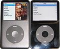
iPod 5G vs. 6G image
-
5G and 6G iPod Classics side-by-side
-
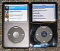 First image, perspective corrected + crop
 -
different version of the pic, equally as bad as the first.
-
 Removed background, and other minor changes.


Article(s):IPod classic
Request: Please remove the background from the image and rotate the iPods so that they are vertically aligned. It Is Me Here (talk) 07:42, 14 March 2008 (UTC)
Graphist opinion: When you say rotate so that they are vertically aligned do you want them straigtened up or put one on top of the other? I'm a little confused here. Mangwanani (talk) 17:13, 15 March 2008 (UTC)
- Just funny sounding language. As far as I understand his words, I think he wants you to just rotate the individual ipods so that the edges of the ipods are at right angles to the edges of the image. XcepticZP (talk) 20:38, 15 March 2008 (UTC)
- Thats what I wondered but wasnt sure... Mangwanani (talk) 20:41, 15 March 2008 (UTC)
- That's what I meant, yeah - it would just look neater if the iPods were vertical (i.e. at 90 degrees to the bottom edge of the picture). It Is Me Here (talk) 22:20, 20 March 2008 (UTC)
- This could also use some perspective correction. It's certainly doable, but removing the background will make the picture look wonky. Friendly note to photographer—if you had something white lying around to cover the carpet with, that would have made things a whole lot easier :) Fvasconcellos (t·c) 21:11, 25 March 2008 (UTC)
- OK, here's an attempt, with the original background (but cropped closer to the iPods). Fvasconcellos* (t·c) 23:13, 25 March 2008 (UTC)
- This could also use some perspective correction. It's certainly doable, but removing the background will make the picture look wonky. Friendly note to photographer—if you had something white lying around to cover the carpet with, that would have made things a whole lot easier :) Fvasconcellos (t·c) 21:11, 25 March 2008 (UTC)
- That's what I meant, yeah - it would just look neater if the iPods were vertical (i.e. at 90 degrees to the bottom edge of the picture). It Is Me Here (talk) 22:20, 20 March 2008 (UTC)
- Thats what I wondered but wasnt sure... Mangwanani (talk) 20:41, 15 March 2008 (UTC)
Here it's: Removed background, Set the battery indicator to 100% on both, removed now playing on 6G, removed now pause indicator, removed some "stuff" from select button, tried to remove fingerprints, rotated them so the align, and some minor color correction. If someone could just remove the fingerprints, we had one less task. --Henrikb4 (talk) 19:17, 4 April 2008 (UTC)
Pioneer Column
-
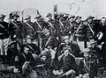 Pioneer Column

Article(s): Pioneer Column
Request: Get rid of splodgy bits and possibly lighten for deail. Thanks-- Mangwanani (talk) 19:35, 16 March 2008 (UTC)
Graphist opinion: (neat image, I wonder why the rugby shirts?) Chris (クリス • フィッチ) (talk) 19:43, 16 March 2008 (UTC)
- If you look closely, it's actually the decoration on their uniform, á là the typical uniform of Hussars.
- Thats not the splodgy bits i meant. Its the bit around their heads. Mangwanani (talk) 17:15, 28 March 2008 (UTC)
M*A*S*H sign
-
 lightened and cropped by Stepshep

Article(s): Wikipedia:WikiProject M*A*S*H
Request: free-use graphic version of this for the new Wikipedia:WikiProject M*A*S*H -- Chris (クリス • フィッチ) (talk) 04:44, 18 March 2008 (UTC)
- I don't get the request: According to the image page, it is tagged PD. Is this incorrect? 68.39.174.238 (talk) 18:03, 21 March 2008 (UTC)
- The photo itself may be public domain, but because the subject is someone else's creative work, I do not know if the Wikipedia:WikiProject M*A*S*H will get in trouble for using it on templates. My request is for a graphic representation of the sign to be made. If I had any skills like you guys (I don't), it would strike me as kind of fun.
- Meanwhile, can the photo itself also be brightened for detail? Chris (クリス • フィッチ) (talk) 00:18, 22 March 2008 (UTC)
Graphist opinion: So if something is stale can we still touch it? I can't make a graphic of it, too out of my league with all the dimensions, but I could lighten and crop the pic. §hep • ¡Talk to me! 00:47, 10 April 2008 (UTC)
- If something is stale you are welcome to touch it. Just remove the stale template and proceed as normal; if anything the stale template should be an encouragement to work on it as it means the requester has been waiting a while.--Dycedarg ж 20:23, 12 April 2008 (UTC)
- Yes please, if you would lighten and crop that would be wonderful! Chris (クリス • フィッチ) (talk) 20:30, 12 April 2008 (UTC)
- Lightened and cropped. Hope that's better. §hep • ¡Talk to me! 02:14, 13 April 2008 (UTC)
- Yes please, if you would lighten and crop that would be wonderful! Chris (クリス • フィッチ) (talk) 20:30, 12 April 2008 (UTC)
- That's great, thank you! Is anyone up for a graphic version? Chris (クリス • フィッチ) (talk) 02:21, 13 April 2008 (UTC)
Urania riphaeus engraving
-

-
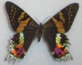 topside to give an idea of the real colors
 -
 underside to give an idea of the real colors


Article(s): Chrysiridia rhipheus
Request: The one there now is from [4], I modified it myself. But [5] is a source that could be used to replace the image. Or better yet (this is why I'm asking here) take the image from here [6] (First result with google search "Uranie riphée" for me), arrange the colors, remove the "new" writing, and upload the result. Pro bug catcher (talk • contribs). 15:53, 18 March 2008 (UTC) See also In Google Books. Pro bug catcher (talk • contribs). 21:30, 22 March 2008 (UTC)
Does anyone know who handles this kind of requests usually? Pro bug catcher (talk • contribs). 16:52, 1 April 2008 (UTC)
Pinkerton
-

-
 Went back to LoC, found higher-resolution copy, worked from that.
 -
 Update, started to remove string, but have flu and wasn't able to finish yet.


Article(s): Pinkerton National Detective Agency
Request: rotate to straight, trim, lighten for detail -- Chris (クリス • フィッチ) (talk) 06:29, 19 March 2008 (UTC)
Graphist opinion: I've had a go. There's some oddites - like that string - that made this image a bit awkward. I had to selectively remove some highlights, and don't think this end result is perfect. I found the levels adjustment a little awkward because the sky kept blowing out whenever I tried to fix the shadowed lower part of the picture. Eh, well. This'll do for tonight. It's actually slightly trapezoidal [or wedge-shaped], so it cannot be made perfectly straight - this isn't uncommon for Victorian engravings - but I tried to compromise. Shoemaker's Holiday (talk) 22:37, 21 March 2008 (UTC)
- That is great and I really appreciate it! Can anyone help with those adjustment levels? Thanks! Chris (クリス • フィッチ) (talk) 00:20, 22 March 2008 (UTC)
- Just a warning: The photograph is very very slightly blurred. Not enough to matter in normal use, but enough that fine details are just a little lighter and more "spread out" than they should be, meaning they could easily be lost or damaged unless any levels adjustment from this point on is extremely careful, and at the least, makes use of masking to protect the more delicate areas. I saved a unadjusted copy, by the way, so if you think this version is too dark, it's not too hard to go back and tweak some more. Shoemaker's Holiday (talk) 00:47, 22 March 2008 (UTC)
- Saw it on a better monitor, the clarity is good, so you just want to go after that string? Chris (クリス • フィッチ) (talk) 04:31, 25 March 2008 (UTC)
- Pretty much. =) Shoemaker's Holiday (talk) 10:25, 25 March 2008 (UTC)
Pennſylvanian state logo
-
 Central shield and eagle crest from here.
 -
 Traced SVG
 -
Updated. Redraw a lot of it, it's much sharper now. (Text and the bottom thing.)


Articels: Many, including Seal of Pennsylvania
Request: SVGify the seal 68.39.174.238 (talk) 00:14, 20 March 2008 (UTC)
Oppinion: How does that work? I wasn't sure how to incorporate the flag part (specific part wanted?), if there is I'll fix it. §tepshep • ¡Talk to me! 02:03, 20 March 2008 (UTC)
No, I use VectorMagic to edit the bitmap, then make it SVG, I pop it into InkScape and make it transparent. It takes all of 15 minutes to get right if anything gets truly messed up. §tepshep • ¡Talk to me! 17:45, 20 March 2008 (UTC)
- It seems to break down the detail though: For one, the ships rigging becomes sortof a blurred blob. 68.39.174.238 (talk) 03:08, 21 March 2008 (UTC)
- And what I meant with the flag was that the ship, plow and grain were already vectorized on the flag, just in a different shaped shield. Same with the eagle. 68.39.174.238 (talk) 03:09, 21 March 2008 (UTC)
Never said you had to use it, just thought I'd offer some help. No harm done? §tepshep • ¡Talk to me! 04:06, 21 March 2008 (UTC)
- Nono, it's fine. If the flag can't be used or noone else does, then your version is still good enough to be used in place of the raster'd seal. 68.39.174.238 (talk) 18:01, 21 March 2008 (UTC)
I've just updated it so the text and the bottom thing is much sharper. --Henrikb4 (talk) 14:46, 12 April 2008 (UTC)
- Nice; is there any way to get the elements off of the flag? They appear much sharper there... 68.39.174.238 (talk) 16:58, 12 April 2008 (UTC)
Range map
-
 Range of Song Thrush.

Article(s): Song_Thrush
Request: I don't know if a GIF is appropriate. → Pepper / ?
Graphist opinion: I'll take this one. That's one loooow resolution map you got there.— ʞɔıu 09:09, 23 March 2008 (UTC)
- Man, the lack of resolution in this map is really frustrating, and it's not sourced. Also, I have found information online that says that the Song Thrush is quite well-established in Australia and New Zealand. I'm wondering if we shouldn't just ditch this map altogether and wait for someone to come up with something more accurate.— ʞɔıu 07:22, 27 March 2008 (UTC)
- Does that make this "resolved" ? 68.39.174.238 (talk) 12:20, 2 April 2008 (UTC)
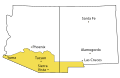
Arizona Territory map
-

-
 might be useful --~~~~
 -
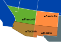 What do you think, 68?


Article(s):Arizona Territory (CSA)
Request: Wow, this map really needs some help. Someone should really SVGify it.— ʞɔıu 08:41, 21 March 2008 (UTC)
- I request that if you do, you use better colors. 68.39.174.238 (talk) 18:00, 21 March 2008 (UTC)
- Aye Aye.— ʞɔıu 02:23, 22 March 2008 (UTC)
Graphist opinion: Don't mind if I do. :-) — ʞɔıu 08:41, 21 March 2008 (UTC)
- OK, I've got something put together. What do you guys think? Are these colors OK? I wish I knew how to crop in Inkscape…— ʞɔıu 08:53, 23 March 2008 (UTC)
- Basically two ways—you can use a clipping path (create a crop-sized rectangle, place above the paths you'd like to crop, select all, do
Object > Clip > Set) or Boolean intersection (create a crop-sized rectangle, place above the paths you'd like to crop, select all, doPath > Intersection, repeat until all paths are cropped). The latter method is far more complicated, but can produce smaller file sizes in some cases. Fvasconcellos (t·c) 14:19, 23 March 2008 (UTC)- Aaah, Intersection! Of course! Thanks for the pointer, Fvasconsellos.— ʞɔıu 20:12, 23 March 2008 (UTC)
- Basically two ways—you can use a clipping path (create a crop-sized rectangle, place above the paths you'd like to crop, select all, do
The borders seem jagged for some reason (May just be me). 68.39.174.238 (talk) 21:35, 4 April 2008 (UTC)
Cypric Coats
-
Note the date in this on is erroneous, it should be 1983
-


Articels: The respective coat-pages
Request: SVGify and correct the 2nd one in the SVG. 68.39.174.238 (talk) 23:24, 21 March 2008 (UTC)
Opinion: I would just like to mention how ironic it is to have an olive branch-wielding dove be on the CoA for half of Cyprus. When it comes to their symbolism, the Cypriots don't fuck around! :-)— ʞɔıu 07:08, 22 March 2008 (UTC)
- It's on both halves. 68.39.174.238 (talk) 13:07, 22 March 2008 (UTC)
- I made a start to vectorising this but it just needs more detail added now and I don't really know how to do it since the image is so low resolution. It doesn't look like this was originally a vector image, looks more like a painting. Hopefully this can be useful to somebody who wants to continue working on it but I can't get any further: Image:Cyprus Coat of Arms.svg I left the raster image embedded so you can continue working with the raster at the size I had it at. -- Borb (talk) 15:18, 3 April 2008 (UTC)
Maps of Arizona
-
 Raster version
 -
 SVG version
 -
 Raster version
 -
 SVG version
 -
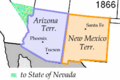 Raster version
 -
 SVG version


Article(s): Gadsden Purchase, Arizona in the American Civil War, several others.
Request: SVGification. I don't feel like doing these right now, so I'm not claiming them. It would be good if we could maintain a common color scheme for the three "Wpdms" maps (these two and the third in the other Arizona Map request above). — ʞɔıu 09:04, 23 March 2008 (UTC)
Graphist opinion:I'll do these. I'm not sure how the colors relate to each other between the pictures, so I'll just copy the colors from the source images. If anyone wants to, they can change the the color afterwards :) XcepticZP (talk) 21:20, 23 March 2008 (UTC)
- For the last one, I strongly request you use a better color than "spraypaint from Windows Paintbrush". 68.39.174.238 (talk) 03:00, 24 March 2008 (UTC)
- Does it have to be striped? Just the light-green color alone would work fine. 68.39.174.238 (talk) 00:23, 28 March 2008 (UTC)
I popped off the blue stripes. §hep • ¡Talk to me! 21:02, 13 April 2008 (UTC)
- That looks fine to me, so if the requester says it's OK... 68.39.174.238 (talk) 22:16, 13 April 2008 (UTC)
- Yeah, all right. I'll switch my other map to continue using the old colors.— ʞɔıu 23:51, 13 April 2008 (UTC)
Fédération Indochinoise des Associations du Scoutisme
Article(s): Fédération Indochinoise des Associations du Scoutisme
Request: rotate to straight and trim a little -- Chris (クリス • フィッチ) (talk) 00:38, 24 March 2008 (UTC)
Graphist opinion:
- Anyone? Anyone? Please? Chris (クリス • フィッチ) (talk) 01:04, 15 April 2008 (UTC)
- I believe that would constitute a derivative work :( Fvasconcellos (t·c) 01:08, 15 April 2008 (UTC)
- By rotating maybe two degrees clockwise and cropping? How is that derivative? You guys straighten images all the time! Chris (クリス • フィッチ) (talk) 02:52, 15 April 2008 (UTC)
TB in 2005
-
 Tuberculosis in 2005
 -
 PNG by Sbw01f


Article(s): Tuberculosis
Request: A better one maybe. → Pepper / ? 20:34, 24 March 2008 (UTC)
- Question: What do the colors mean (IE. Where is the legend)? Also, to whoever takes this: Be very careful, this map is very defective in its borders... 68.39.174.238 (talk) 22:40, 24 March 2008 (UTC)
- The legend is in the image page, Anyway it's this: Cases per 100,000; Red = >300, orange = 200-300; yellow = 100-200; green 50-100 and grey <50. Data from WHO, 2006. [7]
- Yeah, I was filling in Image:BlankMap-World6.svg to export as a PNG and noticed some inconsistencies. For example the area between Pakistan and China, Yemen and above Bangladesh. If they are just meant to be different areas of the same country that's OK but I take the black lines to be borders, which makes no sense in those areas. — ₪₪ ch1902 ₪₪ 23:14, 24 March 2008 (UTC)
- I'd just go with the data and apply it to a blank map. That's what I did with Image:Polio worldwide 2005.png and its companion SVG; the original JPG had several inaccuracies, so I just used the WHO data. Fvasconcellos* (t·c) 02:14, 25 March 2008 (UTC)
- I thought of that too, but upon opening the spreadsheet there are a dozen sheets with different data and I have nooooo idea which sheet or which data it is. Nothing seems to stand out as "cases per 100,000" :-/ — ₪₪ ch1902 ₪₪ 13:40, 25 March 2008 (UTC)
- I see. Maybe 2006 data from the 27th page of this report (http://www.who.int/tb/publications/global_report/2008/pdf/report_without_annexes.pdf) is more useful. → Pepper / ? 15:09, 25 March 2008 (UTC)
- I thought of that too, but upon opening the spreadsheet there are a dozen sheets with different data and I have nooooo idea which sheet or which data it is. Nothing seems to stand out as "cases per 100,000" :-/ — ₪₪ ch1902 ₪₪ 13:40, 25 March 2008 (UTC)
- I'd just go with the data and apply it to a blank map. That's what I did with Image:Polio worldwide 2005.png and its companion SVG; the original JPG had several inaccuracies, so I just used the WHO data. Fvasconcellos* (t·c) 02:14, 25 March 2008 (UTC)
- Yeah, I was filling in Image:BlankMap-World6.svg to export as a PNG and noticed some inconsistencies. For example the area between Pakistan and China, Yemen and above Bangladesh. If they are just meant to be different areas of the same country that's OK but I take the black lines to be borders, which makes no sense in those areas. — ₪₪ ch1902 ₪₪ 23:14, 24 March 2008 (UTC)
Graphist opinion: It appears Sbw01f has produced a PNG from the WHO data—see above. Is this what you had in mind? Fvasconcellos (t·c) 01:12, 15 April 2008 (UTC)
- If the PNG is what was wanted I'll do the SVG for it. Mangwanani (talk) 15:35, 15 April 2008 (UTC)
Anjouan flag
-
our own Jeff Dahl is a genius at doing hands in Islamic symbolism
Article(s): 2008 invasion of Anjouan, others
Request: as this is being used in a current event, please make fingers better proportioned, more human. Unless the island is populated by hobbitses, in which case my apologies. -- Chris (クリス • フィッチ) (talk) 20:58, 25 March 2008 (UTC)
Graphist opinion: Apparently, the fingers are indeed a bit stumpy :) Fvasconcellos (t·c) 21:09, 25 March 2008 (UTC)
- It says there that there is not a lot of documentation, save for the white hand and crescent on a red field. "According to Article 2 of the Loi fondamentale de L’île autonome de Ndzuani, «L’île Autonome d’Anjouan dispose de ses propres symboles qui cohabitent avec les symboles de l’Union des Comores. L’emblème de l’île Autonome d’Anjouan est le drapeau rouge frappé au centre d’une main droite ouverte au dessus d’un croissant de couleur blanche.» " Can we find a better source? It looks weird. Chris (クリス • フィッチ) (talk) 00:32, 26 March 2008 (UTC)
- A cursory Image Google suggests that alot of people (organizations), aren't even sure which way the thumb points. 68.39.174.238 (talk) 00:40, 26 March 2008 (UTC)
- Yes, I noticed. Drapeau rouge frappé au centre d’une main droite ouverte au dessus d’un croissant de couleur blanche—red field charged with an open right hand above a crescent, all white. Wouldn't "open right hand" suggest thumb pointing right? I'm glad there's no specified finger length :) Fvasconcellos* (t·c) 00:47, 26 March 2008 (UTC)
- A cursory Image Google suggests that alot of people (organizations), aren't even sure which way the thumb points. 68.39.174.238 (talk) 00:40, 26 March 2008 (UTC)
SVG these flags please
-
Flag of Seborga
-
Flag of the Hutt River Province
-
 Flag of Purmerend
 -
 Flag of Purmerend, SVG
 -
 Flag of Hilversum


-
 COA of Hilversum
 -
 Vector version


Article(s):many
Request: I was working on some of these articles and though that someone with some free time could help me and make these flags and that one coa into nice svg files. Cheers. --SelfQ (talk) 22:09, 25 March 2008 (UTC)
Graphist opinion: One down, four to go :) Fvasconcellos* (t·c) 23:48, 25 March 2008 (UTC)
- Thanks man. The COA look like this in real life by the way: clicky I hope you will agree with me that the current one is completely inacurate. also the yellow dropletts on the hilversum flag follow the same design. again thanks and good luck with the rest of them! --SelfQ (talk) 20:03, 26 March 2008 (UTC)
SVG Mexican Coat of arms
-

-

-
 Already SVG'd current coat, to work from?


Article(s):Coat of arms of Mexico
Request:I want to improve the article but I don't like how this images look like. Bewareofdog 02:50, 26 March 2008 (UTC)
Graphist opinion:
Coat of Arms of Sweden
-
 Coat of Arms of Sweden
 -
 SVG missing some stuff at the bottom.
 -
Lesser Coat of Arms
-
Example
-
Another example.


Article(s): Several
Request: SVG images. Thanks-- Mangwanani (talk) 19:14, 26 March 2008 (UTC)
Graphist opinion: There are a couple of SVG versions of these on Commons (see Category:Coats of arms of Sweden), although they don't exactly match either of the above; as I've mentioned before, that's the "problem" with coats of arms :) Fvasconcellos (t·c) 01:55, 27 March 2008 (UTC)
- The lesser coats are all the same (SVG and raster), but could you add the various dangling orders to the SVG of the greater coat and upload it as a new file? 68.39.174.238 (talk) 02:35, 7 April 2008 (UTC)
Qajar Dynasty

Article(s): Qajar dynasty
Request: SVGify and make it so the legend template can be used to make a template in the picture caption, standardize colors for losses and gains -- Chris (クリス • フィッチ) (talk) 01:36, 28 March 2008 (UTC)
Graphist opinion:
Aztec glyphs
-
 16th century version
 -
Modern version (for comparison)
-
SVG version

Article(s): Azcapotzalco (altepetl) and possibly others
Request: Similar to my last request, an SVG glyph to represent the pre-Columbian polity of Azcapotzalco. The dots don't have to be reproduced perfectly. There are a few different ways of drawing this (see e.g. the right-hand side of Image:Tezozomoc.jpg), but this version (from the Codex Mendoza) is the most famous, and is the one the modern Mexico City borough named after Azcapotzalco based their logo on. (An SVG version of the borough's glyph might be wanted too, although I don't know if copyright allows that.) --Ptcamn (talk) 23:02, 29 March 2008 (UTC)
- And another one, for Huitzilopochco. See [8] for a clearer but slightly different version. --Ptcamn (talk) 14:53, 6 April 2008 (UTC)
Graphist opinion:
Side note-this is actually fascinating if you are going to clean up each altepetl thus. Those we have are in mixed condition. Chris (クリス • フィッチ) (talk) 19:30, 30 March 2008 (UTC)
- I converted it to an svg. I don't think it looks too shabby! What do you all think? XcepticZP (talk) 07:52, 12 April 2008 (UTC)
- I think it is snazzy, the requester likes it, can we mark it done? :) Chris (クリス • フィッチ) (talk) 20:45, 16 April 2008 (UTC)
My SVG won't display properly
-
 Original PNG version
 -
 My SVG version


I have recently uploaded Image:Carbon monoxide 2D.svg to the Commons, an SVG that I made in Inkscape in order to replace Image:Carbon-monoxide-2D-dimensions.png. However, Image:Carbon monoxide 2D.svg does not display correctly on its image page, although it does look fine when you click on it.
Articles: Carbon monoxide
Request: Can anyone help me fix the image? It Is Me Here (talk) 10:47, 30 March 2008 (UTC)
- The problem was the flowed text. You need to use simple unflowed text (default in Inkscape 0.45.1, I can't get 0.46 yet so don't know whether it is there also). To turn flowed text to unflowed text, use the command on the Text menu. You should also save as a Plain SVG rather than an Inkscape SVG if you are not already doing so. The image doesn't appear fixed yet, as Wikipedia seems to be having trouble with thumbnailing (despite purging the cache, the thumbnail still won't correct itself), but this rendering:
- shows that it does now work properly. Stannered (talk) 11:21, 30 March 2008 (UTC)
- When you have a simple drawing like this, it's often useful to convert the text to paths, because this will prevent a number of other rendering errors. For example, if the user changes the default text size, the drawing's text will change unless you convert to paths. The disadvantage would be that the file size is bigger, but in this case this is a trivial concern; only when you have lots of text would it matter. Jeff Dahl (Talk • contribs) 19:16, 30 March 2008 (UTC)
- You also lose the ability to edit the text easily. I can't say I've noticed the issue you described - does this only occur when the SVG is actually embedded in the page, rather than rendered to PNG on the server? Stannered (talk) 20:50, 30 March 2008 (UTC)
- Well, with only a few letters, the ability to edit is not too much of a loss. The general solution to the problem of lost editability is to embed the text version in a hidden layer, though I have never had to resort to this strategy. The errors I usually see with text occur when you view in full size (for me, ffox and XP); the wikimedia thumbnail renderer usually does a good job (though not perfectly). Another problem with not converting text to paths is that the user has to have the right font installed on their machine; the inkscape default font is, I think, bitstream vera sans which is not a standard font for everyone. Jeff Dahl (Talk • contribs) 02:27, 31 March 2008 (UTC)
- You also lose the ability to edit the text easily. I can't say I've noticed the issue you described - does this only occur when the SVG is actually embedded in the page, rather than rendered to PNG on the server? Stannered (talk) 20:50, 30 March 2008 (UTC)
- True enough... I use Opera and find the SVG rendering satisfactory when viewed at full size - when using Opera's zoom feature it resizes the entire image rather than just the text (the S in SVG is for scalable, after all), but it's not perfect (doesn't seem to antialias at all). Neither is the Wikimedia renderer - see issues described at commons:Commons talk:Transition to SVG. Stannered (talk) 12:31, 31 March 2008 (UTC)
Is this really satle or is it actually done? 68.39.174.238 (talk) 21:33, 15 April 2008 (UTC)
Palisades Interstate Parkway welcome sign
-
 Welcome sign on the Palisades Interstate Parkway

Article(s):
Request: -- Need a quick removal of the glare from it.Mitch32contribs 20:41, 30 March 2008 (UTC)
Graphist opinion:Done. It's not perfect, but I had to rebuild that right pillar using bits from all over. Let me know what you think, I can do more if need be. Sorry about the delay, but I've been busy. I just assumed someone else here would do it. Please don't hesitate to post more requests. XcepticZP (talk) 18:33, 3 April 2008 (UTC)
Philippines Commonwealth

Article(s): Commonwealth of the Philippines
Request: the actual arms is closer to the brown/red first variant, seal shaped in keeping with US territories of the time. Can the two ideas be combined to create the proper version? -- Chris (クリス • フィッチ) (talk) 08:35, 31 March 2008 (UTC)
Graphist opinion:
- I think we'd need a better reference... Shoemaker's Holiday (talk) 01:52, 2 April 2008 (UTC)
Coat of Arms of Unseen University
-
Badly drawn SVG
-
Original PNG
Article(s):Unseen University, Portal:Discworld, many userboxes
Request: The image was poorly converted to SVG from original - reconversion/redrawing needed please. The tracing has mucked up bits like the point at the bottom, and the shadows. The worst part is that the lines are extremely rough (traced over aliasing) - they need to be completely smooth if possible. Even if that means redrawing. The SVG also has loads of extraneous lines and shapes that aren't needed, and thumbnails very badly (as seen above) - the gradients should be duplicated from the PNG. Thanks, SVG graphists.—Vanderdecken∴ ∫ξφ 13:43, 2 April 2008 (UTC)
Graphist opinion: I have redrawn the whole thing except for the text. I started to redraw the text but I decided it was too much work since I'm sure that font exists somewhere but I don't have it. So if somebody could add the text to this it would be complete: Image:Discworld-unseen-university-amoswolfe-2.svg Note that I have left the raster embedded which you should removed after it is finished. Also I used the blur effect for the shadows but I'm not sure if Mediawiki will render this properly (Firefox doesn't), so that might need to be removed. -- Borb (talk) 18:07, 3 April 2008 (UTC)


.svg)
.svg)
.svg)
.svg)
New names
Article(s):Coat_of_arms_of_Montreal
Request: Really easy work : found or make four SVG to display the elements of the flag (the flag is already in SVG).
Graphist opinion: There you go. :) -- Borb (talk) 18:18, 3 April 2008 (UTC)
- Can you reupload them as "Coat_of_arms_rose.svg", Coat_of_arms_lys.svg, etc. , using the name used on Coat_of_arms_of_Montreal, that would be more convenient for further use. 218.170.137.112 (talk) 06:44, 4 April 2008 (UTC)
Demographic history of the United States
-

-
Better style (according to Mangwanani)
-
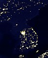 Korean Peninsula at night (A more analogous image, in the author's opinion)


Article(s): Demographic history of the United States
Request: much as I like Twinkle Twinkle Little States... um, yeah. Slow it down and put it on a normal Wiki map background so it doesn't look like the whole thing is a surprise-- Chris (クリス • フィッチ) (talk) 08:48, 3 April 2008 (UTC)
Graphist opinion:
- I'm not a graphist, but a solution to the speed issue would be to include 1x, 2x, 4x, 8x buttons in the description portion of the thumb, each of which leads to a different image that changes at a different speed. This can be done by creating Image:PercentOfUSPopInEachState1x.gif, Image:PercentOfUSPopInEachState2x.gif, Image:PercentOfUSPopInEachState4x.gif, and Image:PercentOfUSPopInEachState8x.gif. The black color is off putting. JohnABerring27A (talk) 15:02, 6 April 2008 (UTC)
Author's opinion:
- こんにちは, I'm the author. Thanks for your interest in this image! Just wanted to let you know that back when I created this image, I tried various speeds, state colors, and background colors. I found that a fast speed was necessary in order to make the movement over the decades most visible... when you slow it down you just can't see the patterns of movement, which is really the whole point of the image. I also found that white --> black was the most intuitive color scheme for the states (brighter = larger share of the population) and easiest for the eye to recognize the subtle shades of difference. And I found that black was the background color that worked best with that. Still, if anyone thinks they can improve, good luck and have fun playing with it! Szu (talk) 05:15, 7 April 2008 (UTC)
- I would change the background color to something else. The northwestern states barely show up on my monitor. 68.39.174.238 (talk) 22:33, 7 April 2008 (UTC)
- They will barely show up on any monitor, and that's on purpose. States with hardly any population are hardly visible; as they get more people they stand out more. That's exactly why I chose black for the background. When I tried other background colors, the black states would become just as visible the brighter ones, drawing attention away from the important action going on in those brighter states. If you do choose another background color I'd hope it would be very dark. Szu (talk) 14:34, 8 April 2008 (UTC)
- I'm sorry but that doesn't make sense. The whole point of the image is to inform people not keep them guessing and thus they need to be able to see the image to be able to use it. If they wanted to guess the information, as will be done on some monitors, they are wasting their time looking at the image as it is as far as I can say. Mangwanani (talk) 19:50, 8 April 2008 (UTC)
- So people who don't know when Idaho, Utah, Montana and Wyoming gained statehood just have to guess at when it's "There's not state here" and when it's "There's a state with no population here"? 68.39.174.238 (talk) 20:17, 8 April 2008 (UTC)
- This image doesn't distinguish between "there's no state here" and "there's a state with no population" because that's not the point of the image. This image is not trying to show when states were admitted to the union; the point of the image is just to show the general movement of population over the decades, which I think it does well and without requiring any guesswork. Still, like I said, if you guys can do better, go ahead and have fun with it! ;-) Szu (talk) 20:51, 8 April 2008 (UTC)
- I'm just going to be blunt about this. I don't think it works. I have added an image of the growth of WWII just as it was the first map I came across that I think works very well in showing its point and timeline. If we could make a new version styled on this I think would be much clearer and less, as Chris called it, Twinkle Twinkle. Mangwanani (talk) 15:46, 9 April 2008 (UTC)
- Thanks for your bluntness. Bear in mind there are other people who do think it works. Also I should say that the fact that you propose a map of WWII conquests as a model suggests that you don't understand the point of the image. This image is not meant to provide detail of a historical event like a military battle or territorial acquisition. It's meant to show a broad social/geographic pattern, just like "Korean Peninsula at night" which I think is much more similar in purpose. But rather than complaining about this image, please go ahead and make your own version. I'll be looking forward to see what you come up with! :-) Szu (talk) 19:12, 9 April 2008 (UTC)
- As I have said before and many times on this page, my graphic skills are limited. I am simply stating that in my opinion the image doesn't work. I also don't see how the Korean Peninsular can be compared to this image. It isn't twinkle twinkle and shows something completely different. Mangwanani (talk) 19:27, 9 April 2008 (UTC)
- I'm sorry, I haven't seen your comments on other images, only this one. On the surface, the WWII map may seem to be more similar: it moves, it's historical, it's a map. But in terms of purpose, "Korean Peninsula at night" is much more similar: it illustrates a broad pattern of human population in a very simple manner; it's not trying to be a precise, detailed record like the WWII map. Szu (talk) 20:00, 9 April 2008 (UTC)
Portuguese Forest
I'm sorry, my english is fairly poor, I prefer to write my demand also in French
-
 1
1 -
 2
2


Article(s):
Request: Hello, I would like to know if it were possible to make three charts, one with the rate arborisation by city and other, the various types species (trees) in the areas (in Portugal) and the last with all the zones left in fume (fire).
The charts will be in French, Portuguese and English, thank you, Cancelos (talk) 19:01, 4 April 2008 (UTC)
Bonjour, je voudrais savoir si il était possible de faire trois cartes, une avec le taux d'arborisation par commune et l'autre, les différents types d'espèces (d'arbres) dans les régions (au Portugal) et la dernière avec toutes les zones partit en fumées (feu).
Les cartes seront en français, Portugais et Anglais, merci, Cancelos (talk) 19:01, 4 April 2008 (UTC)
Graphist opinion:
Niihau Incident
Article(s): Niihau Incident
Request: Is there any way to make this a little more uniform an image? -- Chris (クリス • フィッチ) (talk) 00:40, 6 April 2008 (UTC)
Graphist opinion:
- I uploaded a bigger version of the same image, but I don't understand what you mean by more uniform. If you are referring to the colour of the sea, it has been deliberately left that way, you can read the explanation at http://visibleearth.nasa.gov/view_rec.php?id=16470 Jackaranga (talk) 15:04, 7 April 2008 (UTC)
- Ah. Yes, that's what I meant. Can a second version be made with the sea uniform, with the islands darker for contrast? Chris (クリス • フィッチ) (talk) 15:27, 7 April 2008 (UTC)
2008 HOA Zimbabwe election, constituency winners map
-
 started version
 -
 The map I started from (wrong)
 -
 PNG municipalities
 -
 Provinces here too
 -
-
 An example of how this kind of maps look when finished
 -
 An already vectorialized map we can start from
 -
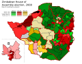 My Started version ~~~
.svg)


Article: Zimbabwean parliamentary election, 2008
Request: Someone at Talk:Zimbabwean parliamentary election, 2008 requested that a map of the House of Assembly constituency winners be made, and I started work on the project. However, I based my map on a vectorialization of Image:Zim-provinces blank.jpg, which has proven to contain some gross errors forcing me to constantly reshape provinces and constituencies. I'm in exams now and can't afford to put more time on this, so I'm here to ask for help: is someone willing to finish the job?. The current status can be seen on the left. Thanks in advance. Habbit (talk) 10:06, 6 April 2008 (UTC)
Graphist opinion:There are better maps of Zimbabwe on which this can be based. There is also this link here which has all the results and some maps also. Mangwanani (talk) 11:18, 6 April 2008 (UTC)
- Yup, that was the website I was checking to get the results and paint the constituencies as required. The second map you posted (PNG municipalities) looks better, but some municipalities are split in several constituencies, partially due to population sizes, and also some gerrymandering. Habbit (talk) 13:43, 6 April 2008 (UTC)
- Yup. It may well be out of date but that's the way things go sometimes. Does the final image have to be vector? Can I also ask why half of Mashonaland East is missing in your map? Mangwanani (talk) 14:03, 6 April 2008 (UTC)
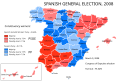
- I would prefer the final image to be vector, as it could be scaled as needed (say, for printing or outside Wikipedia). The final result I was trying for is something like Image:Spanish general election, 2008 - constituency winners.svg. It appears that I chose the wrong map to start with, and I might have overdid the post-vectorization "simplifying" step, so I seemingly cut off part of a province. Thus, it would be better to just start again with another map as the base (Image:Zimbabwe Locator.png looks good), but I won't be able to start in this week, or even month, since I'm in exams right now, that's why I asked for help here. Habbit (talk) 14:20, 6 April 2008 (UTC)
- That's fine. I'm sure we can come up with something. Not sure how good my skills at vector are for this... Mangwanani (talk) 15:03, 6 April 2008 (UTC)
- I have tried but I can't do it. :( My action plan (which I was attempting) was to vectorise the maps from Sokwanele (just the outlines not the colours or the writing) and then once they were all vectorised to slot them neatly into a map of Zimbabwe and then change the colours accordingly to reflect the election results. Mangwanani (talk) 19:39, 6 April 2008 (UTC)
- Well, that's just what I was doing before. I ran into the problem of the bad map I started from (with wrong-shaped provinces), but I believe that doing so with a correct base provincial map should be relatively easy. If no-one else stands up for finishing the map in a week or so (i.e. after I finish my exams), I will restart work with a new base map. Thanks for trying, though! Habbit (talk) 20:17, 6 April 2008 (UTC)
- I have tried but I can't do it. :( My action plan (which I was attempting) was to vectorise the maps from Sokwanele (just the outlines not the colours or the writing) and then once they were all vectorised to slot them neatly into a map of Zimbabwe and then change the colours accordingly to reflect the election results. Mangwanani (talk) 19:39, 6 April 2008 (UTC)
- That's fine. I'm sure we can come up with something. Not sure how good my skills at vector are for this... Mangwanani (talk) 15:03, 6 April 2008 (UTC)
- I would prefer the final image to be vector, as it could be scaled as needed (say, for printing or outside Wikipedia). The final result I was trying for is something like Image:Spanish general election, 2008 - constituency winners.svg. It appears that I chose the wrong map to start with, and I might have overdid the post-vectorization "simplifying" step, so I seemingly cut off part of a province. Thus, it would be better to just start again with another map as the base (Image:Zimbabwe Locator.png looks good), but I won't be able to start in this week, or even month, since I'm in exams right now, that's why I asked for help here. Habbit (talk) 14:20, 6 April 2008 (UTC)
- Yup. It may well be out of date but that's the way things go sometimes. Does the final image have to be vector? Can I also ask why half of Mashonaland East is missing in your map? Mangwanani (talk) 14:03, 6 April 2008 (UTC)
- I made Image:Zimbabwe admin.svg it might be useful. Jackaranga (talk) 20:53, 6 April 2008 (UTC)
- Indeed. It will be extremely useful, since we won't need to create/vectorialize another map of Zimbabwe: just split/join the boundaries for constituencies, and then paint them. Thank you very much!! The only thing we're missing now is a map of the constituencies inside Harare and, iIrc, another province not available in the above website. Habbit (talk) 22:03, 6 April 2008 (UTC)
- Ok, here's my started version. I have vectorised the constituency maps from Sokwanele and inserted them into Jackaranga's map. Mangwanani (talk) 19:32, 9 April 2008 (UTC)
- Is this going how you intended? Before I go any further... Mangwanani (talk) 19:20, 11 April 2008 (UTC)
- Indeed. You're doing a quite wonderful job. My congratulations. Habbit (talk) 13:04, 12 April 2008 (UTC)
- OK, its as done as I can do - can't find a map for the Midlands. It may, nay does, need tyding up a lot around the edges. Additionally, Lake Kariba (partly in black) needs something doing but I'm not sure what. Mangwanani (talk) 17:04, 12 April 2008 (UTC)
- I found constituency maps for the remaining provinces here, which should be easy to correlate with election results sites, thus filling the last voids. Harare will need to be shown enlarged just like Bulawayo (that's why I reserved the 'H' space in my first map and put the color code in another place). About the lake, I'd just forget about it, i.e. show it as part of the constituency next to it. Besides the need for some reconciling of the constituency borders with the provinces, this is a great job. Once again, my compliments. Habbit (talk) 13:31, 13 April 2008 (UTC)
- Sorry, but I really don't have the patience to work with those maps. Sorry. Mangwanani (talk) 14:23, 13 April 2008 (UTC)
- Well, I won't say I'm particularly happy with the coitus interruptus, but still you have gone a long way with this job and I thank you for it. A great map with vectorisations of more than 150 constituencies. My exam streak ends this Wednesday, so I'll take over that night - however, if anyone else in the Graphic Lab wishes to complete this map before, I'll be even happier ^.^ Habbit (talk) 20:29, 13 April 2008 (UTC)
- Just an after-thought and getting ahead of myself, once this is done, can we make a copy that has all the constituencies in grey like the other blank Wikipedia maps for future use... Mangwanani (talk) 15:30, 15 April 2008 (UTC)
- Well, I won't say I'm particularly happy with the coitus interruptus, but still you have gone a long way with this job and I thank you for it. A great map with vectorisations of more than 150 constituencies. My exam streak ends this Wednesday, so I'll take over that night - however, if anyone else in the Graphic Lab wishes to complete this map before, I'll be even happier ^.^ Habbit (talk) 20:29, 13 April 2008 (UTC)
- Sorry, but I really don't have the patience to work with those maps. Sorry. Mangwanani (talk) 14:23, 13 April 2008 (UTC)
- I found constituency maps for the remaining provinces here, which should be easy to correlate with election results sites, thus filling the last voids. Harare will need to be shown enlarged just like Bulawayo (that's why I reserved the 'H' space in my first map and put the color code in another place). About the lake, I'd just forget about it, i.e. show it as part of the constituency next to it. Besides the need for some reconciling of the constituency borders with the provinces, this is a great job. Once again, my compliments. Habbit (talk) 13:31, 13 April 2008 (UTC)
- OK, its as done as I can do - can't find a map for the Midlands. It may, nay does, need tyding up a lot around the edges. Additionally, Lake Kariba (partly in black) needs something doing but I'm not sure what. Mangwanani (talk) 17:04, 12 April 2008 (UTC)
- Indeed. You're doing a quite wonderful job. My congratulations. Habbit (talk) 13:04, 12 April 2008 (UTC)
- Is this going how you intended? Before I go any further... Mangwanani (talk) 19:20, 11 April 2008 (UTC)
- Ok, here's my started version. I have vectorised the constituency maps from Sokwanele and inserted them into Jackaranga's map. Mangwanani (talk) 19:32, 9 April 2008 (UTC)
- Indeed. It will be extremely useful, since we won't need to create/vectorialize another map of Zimbabwe: just split/join the boundaries for constituencies, and then paint them. Thank you very much!! The only thing we're missing now is a map of the constituencies inside Harare and, iIrc, another province not available in the above website. Habbit (talk) 22:03, 6 April 2008 (UTC)
JohnABerring27A images
Article(s): as listed on the image page.
Request: These photos were taken on the same day and all have similar problems. Image:Michelle house American Pie northwest view.JPG was fixed, but the rest have not been fixed. Please add sky and fix 'em up as you see fit. -- JohnABerring27A (talk) 14:56, 6 April 2008 (UTC)
Graphist opinion:
Seven hills of Rome
-
 Seven hills of Rome: 19th century map scan
 -
 German wiki map
 -
 Very old version from this revision
 -
![This plan of Rome may help]](//upload.wikimedia.org/wikipedia/commons/thumb/6/64/Plan_Rome-_Servische_Muur.png/120px-Plan_Rome-_Servische_Muur.png) This plan of Rome may help]
This plan of Rome may help]


![This plan of Rome may help]](/wiki/File:Plan_Rome-_Servische_Muur.png)
Article(s): Aventine Hill, Seven hills of Rome, plus usable on other 7 hills articles. Another German wiki map is here.
Request: Make a proper schematic or contour shaded map, showing hills, river, Servian Wall. Use Latin and English names together, possibly also modern Italian names. Potential use in a number of articles. --mervyn (talk) 19:35, 8 April 2008 (UTC)
Graphist opinion:
Douglas Bay Panorama
-
 A panorama of the Douglas bay in Isle of Man
 -
Edit 1
Article(s): Douglas, Isle of Man
Request:This panorama is stitched from a number of high resolution (5MP) photographs. I am very satisfied with this image though I think the colours could be slightly brighter. I am also wondering whether a different crop would balance the photograph better. I've tried various versions myself but haven't managed to come up with anything remarkably better. -- Ganeshrg (talk) 14:51, 9 April 2008 (UTC)
Graphist opinion: Lightened it. Still looking for an interesting crop. What do you think? §hep • ¡Talk to me! 23:00, 9 April 2008 (UTC)
Comment: It looks slightly better. Do you think cropping out the wall at the left will improve the picture? I tried that but realised that the little piece of wall gives the photo a better perspective. Would anyone think this is a Feature Picture Candidate? If yes, could somebody please help me put it up there? Thanks.
- It has some visible stitching errors, maybe you could upload the individual images used to make this panorama, and let someone else try stitching for you Thisglad (talk) 15:13, 10 April 2008 (UTC)
- Thanks for the update. Could you please inform me how/where I can upload the source images?--Ganeshrg (talk) 16:27, 10 April 2008 (UTC)
--Ganeshrg (talk) 16:27, 10 April 2008 (UTC)
- You can upload them at commons like you uploaded before Thisglad (talk) 16:49, 10 April 2008 (UTC)
- In the edit 1, i cropped out the parking lot on the right. I think It gives it a more uniform look. But ya, if you have all the full res images I would be easy to adjust each image by itself so they all had the same color to them and hand stitch them if there's less than 10 or so. §hep • ¡Talk to me! 19:51, 10 April 2008 (UTC)
- I have put up the originals now. You can find them on this image's description page under "source". They are all 1280x960 resolution so should be small enough to download while being large enough to preserve detail. I would be grateful with anything that you can come up with. I used a Panasonic Lumix FZ20 and the EXIF info on the source photos has been retained so you can see the settings that I have used for each photo on the image description page under the "Metadata" section. The day was quite cloudy yet bright. I hope this helps. If you need any more info, feel free to ask away. Thanks.--Ganeshrg (talk) 11:33, 11 April 2008 (UTC)
Lordy, lordy. This will take a bit. :) Always fun to have a new project. §hep • ¡Talk to me! 21:48, 11 April 2008 (UTC)
- Sorry, I have to drop out of the race. The camera literally tilts angles of the houses from picture to picture. I ran it though an auto one to make sure I wasn't going crazy and it made a circle. Never seen that before. I guess I don't have the skill for this one. Sorry, and good luck! §hep • ¡Talk to me! 22:20, 11 April 2008 (UTC)
- Thanks for trying, Shep. @XcepticZP, is there a way I can EMAIL the large sized originals to you or upload them somewhere else instead of on wikimedia commons? Wikimedia commons is just too tedious coz you have to upload each picture one by one. —Preceding unsigned comment added by Ganeshrg (talk • contribs) 18:34, 12 April 2008 (UTC)
- Yes there is a way. Take them all, compress them to something reasonable like 1mb each. Zip them all together with winrar or winzip. Upload them to rapidshare.com. Then send me the url that they give you. Send me the url by sending me a msg, that way it'll get emailed to me automatically. If you don't mind other people downloading the file, then just post it on my userpage. XcepticZP (talk) 19:54, 12 April 2008 (UTC)
US Route 5 sign
-
 Signage at the southern split between U.S. Route 5 and Connecticut Route 15

Article(s): U.S. Route 5 in Connecticut
Request: Photo was taken from inside a car. Would it be possible to remove the effect of the windshield and also to enhance the contrast and sharpness? --Polaron | Talk 18:55, 9 April 2008 (UTC)
Graphist opinion:
Oh, and you could crop off the lower part of the picture to remove the "windshield effect"... —Preceding unsigned comment added by 68.101.123.219 (talk) 03:51, 10 April 2008 (UTC)
I did a quick contrast increase but there's still the irregularity in the bottom-right corner. Time3000 (talk) 15:59, 10 April 2008 (UTC)
- Request done... Hope you like!! XcepticZP (talk) 18:13, 11 April 2008 (UTC)
- Is this now markable as complete? Chris (クリス • フィッチ) (talk) 20:46, 16 April 2008 (UTC)
London Midland Rail Network Map
-
 Map of the London Midland railway network.

Article(s): Go-Ahead Group, Keolis, Govia, London Midland.
Request: -- Could some of the errors in this map be corrected please? I've only taken a brief look, but there are several spelling mistakes in the station names, e.g. Blakedown, not Blakedowh; Canley, not Oanley; Barnt Green not Banrt Green; some stations are incorrectly named e.g. Five Ways not "Five Flags"; just "Olton" not "Olton Green"; and some stations are missing altogether, e.g. Sutton Coldfield which should be located between Wylde Green and Four Oaks. Also the railway junction between Dorridge and Lapworth is drawn wrongly. Thanks DWaterson (talk) 00:57, 11 April 2008 (UTC)
Graphist opinion: I have fixed the spellings and names mentioned. Havn't fixed anything else though. Mangwanani (talk) 18:11, 11 April 2008 (UTC)
- I've put in Sutton Coldfield, but I couldn't find Dorridge or Lapworth (!). Time3000 (talk) 10:57, 15 April 2008 (UTC)
Coat of arms of Yemen
Article(s): Coat of arms of Yemen
Request: SVGify -- Chris (クリス • フィッチ) (talk) 03:58, 11 April 2008 (UTC)
Graphist opinion: Looking over google I've found three distinct variants. One with a golden eagle, the one here, and one with the scroll bent out a bit Like here. Should I follow the one on Wikipedia, or is another version the correct one? §hep • ¡Talk to me! 00:32, 12 April 2008 (UTC)
- I believe it should be a golden eagle. The official website of the Yemeni government has the golden eagle. Fvasconcellos (t·c) 15:10, 12 April 2008 (UTC)
Improve contrast and centre image on the parrot
-
 Parakeet clinging to cage bars.
 -
 First edit


Article(s): It might be possible to use an improved imaged on the species page of several language wikis.
Request: Please improve contrast and center the picture on the parrot. There is a different species of parrot in the background on the right side of the picture; this may be distracting and would be better edited out of the photo. This is the only image that the wiki has at the present time showing the white tip of the birds tail feathers. Snowman (talk) 17:06, 12 April 2008 (UTC)
Graphist opinion: I gave my hand at it. I cropped it and sharpened it a bit as there was some motion blur. §hep • ¡Talk to me! 18:21, 12 April 2008 (UTC)
- A bit more space above and below the parrot please. Snowman (talk) 18:46, 12 April 2008 (UTC)
- Fixed it up a bit more. Anything else I missed? §hep • ¡Talk to me! 19:29, 12 April 2008 (UTC)
- A bit more space above and below the parrot please. It is still a bit long and narrow. Can you make it a perfect rectangle shape please? Snowman (talk) 19:40, 12 April 2008 (UTC)
- That's the best I can do to get it a perfect square. §hep • ¡Talk to me! 22:43, 12 April 2008 (UTC)
- A bit more space above and below the parrot please. It is still a bit long and narrow. Can you make it a perfect rectangle shape please? Snowman (talk) 19:40, 12 April 2008 (UTC)
- Fixed it up a bit more. Anything else I missed? §hep • ¡Talk to me! 19:29, 12 April 2008 (UTC)
First World
-
 Raster
 -
 Vector
 -
 is there a way to use a map like this? no need for Antarctica, as it is not a country and has no demographics
 -
 Stepshep tried it


Article(s): First World
Request: svgify -- Chris (クリス • フィッチ) (talk) 17:20, 12 April 2008 (UTC)
Graphist opinion: I'm on it! Mangwanani (talk) 18:55, 12 April 2008 (UTC)
- How's that? Mangwanani (talk) 19:09, 12 April 2008 (UTC)
- Better? Mangwanani (talk) 20:51, 12 April 2008 (UTC)
- You're looking for this projection. Fvasconcellos (t·c) 20:57, 12 April 2008 (UTC)
- There isn't a huge amount of difference between the two... Mangwanani (talk) 21:10, 12 April 2008 (UTC)
- I meant it's the vector version of Image:BlankMap-World.png as Chris requested above. Fvasconcellos (t·c) 21:13, 12 April 2008 (UTC)
- I won't fix it today coz the fidly small places in Oceania are starting to annoy me. I'll have another look at it tomorrow. Mangwanani (talk) 21:17, 12 April 2008 (UTC)
- It can be quite easier to color the countries in a text editor if you like—instructions are here :) Fvasconcellos (t·c) 21:56, 12 April 2008 (UTC)
- I won't fix it today coz the fidly small places in Oceania are starting to annoy me. I'll have another look at it tomorrow. Mangwanani (talk) 21:17, 12 April 2008 (UTC)
- I meant it's the vector version of Image:BlankMap-World.png as Chris requested above. Fvasconcellos (t·c) 21:13, 12 April 2008 (UTC)
- There isn't a huge amount of difference between the two... Mangwanani (talk) 21:10, 12 April 2008 (UTC)
- You're looking for this projection. Fvasconcellos (t·c) 20:57, 12 April 2008 (UTC)
- Better? Mangwanani (talk) 20:51, 12 April 2008 (UTC)
- You can leave Oceania grey, as there are no First World countries outside of Australia and New Zealand. Also could you use the brighter royal blue so it stands out better? Thank you! Chris (クリス • フィッチ) (talk) 21:23, 12 April 2008 (UTC)
- If this goes against some rule please let me know. I saw this sitting and gave it a shot. Mangwanani you could use this for a start if you want. I believe all the countries are marked. If it's taboo to step in just hit me with a trout. §hep • ¡Talk to me! 23:17, 12 April 2008 (UTC)
- It is not at all taboo for multiple editors to work on one graphic, but thanks for your politeness. Often one editor may have a strength and be able to add the missing touch, we've done that many times here.
- The only thing needed now are the border separations between the blue countries. Thanks! Chris (クリス • フィッチ) (talk) 23:53, 12 April 2008 (UTC)
- I thickened the borders and now they're 0.473 pixels. If you want them thicker just say. §hep • ¡Talk to me! 00:56, 13 April 2008 (UTC)
- Checked it on a better monitor, they look great, thanks! Chris (クリス • フィッチ) (talk) 20:57, 15 April 2008 (UTC)
Coat of arms of the Federation of the West Indies
-
best one I could find, can anyone find better?
-
 flag should be orange in the middle
 -
Colors from website
-
 the source site says "Blue", unless qualified, usually means the same blue as in a Blue Ensign.
 -
found the image, though I suspect it is really done in the orange and dark blue of the flag and the smaller image
.svg)

Article(s): West Indies Federation
Request: create large usable coat of arms. Also please correct the flag, based on this link here http://www.crwflags.com/FOTW/FLAGS/gb-carib.html -- Chris (クリス • フィッチ) (talk) 00:28, 13 April 2008 (UTC)
Graphist opinion: Comment: The current flag matches the description "in the West Indies Gazette" (mentioned in the FOTW link you provided). Fvasconcellos (t·c) 01:34, 13 April 2008 (UTC)
- Actually, that link says "The official description given in the West Indies Gazette is "Flag approved has blue ground with four white horizontal wavy bars (the top pair of bars being parallel and the lower pair also parallel) and an orange sun in the centre." Not the most enlightening description. "Blue", unless qualified, usually means the same blue as in a Blue Ensign." (orange, not red) Chris (クリス • フィッチ) (talk) 01:45, 13 April 2008 (UTC)
- Wow—that looks distinctly orange to me (more precisely, tangerine). Do you know of a more official source for the image? I couldn't find any... Fvasconcellos (t·c) 14:49, 13 April 2008 (UTC)
- I've checked two monitors at different locations, it's coming through as red as that Guernsey shield below. If it is orange on yours, it needs to be lightened several shades at any rate. Chris (クリス • フィッチ) (talk) 15:54, 13 April 2008 (UTC)
- It's definitely orange, InkScape ran a color check and it's orange (RGBA:ff6600ff). Should it match the flag at the other link exactly, or just change the circle? I added a verson with the web colors. §hep • ¡Talk to me! 19:28, 13 April 2008 (UTC)
- Thank you so much, I appreciate your time! Could you make it the darker blue of the ensign above? Chris (クリス • フィッチ) (talk) 20:16, 13 April 2008 (UTC)
- Switched over the color. §hep • ¡Talk to me! 20:44, 13 April 2008 (UTC)
- Thank you so much for your hard work! Now to the coat of arms... Chris (クリス • フィッチ) (talk) 21:04, 13 April 2008 (UTC)
- Anything bigger to work off of? §hep • ¡Talk to me! 21:07, 13 April 2008 (UTC)
- When I google, I find Communication and Information Sector's Photobank - Watermark of ...Watermark of the Coat of Arms of the West Indies Federation ... Place: Federal Archives Centre, University of West Indies (UWI). Country: Barbados ...
portal.unesco.org/ci/photos/showphoto.php?photo=4626 - 21k and Communication and Information Sector's Photobank - Watermark of ...Watermark of the Coat of Arms of the West Indies Federation. View Smaller Image ... Place: Federal Archives Centre, University of West Indies (UWI) ... portal.unesco.org/ci/photos/showphoto.php/photo/4626/size/big - 21k but I can't get into either of them. Chris (クリス • フィッチ) (talk) 22:06, 13 April 2008 (UTC)
Coat of arms of Palau
-
color to match Image:Execseal.gif
Article(s): Palau
Request: color to match Image:Execseal.gif -- Chris (クリス • フィッチ) (talk) 00:28, 13 April 2008 (UTC)
Graphist opinion:
Guernsey coat
-
To be SVGified
-
 Get the lions off of here?
 -
by Stepshep
-
 by Fvasconcellos


Articels: Anything (maybe) on Guernsey
Request: SVGify. 68.39.174.238 (talk) 02:04, 13 April 2008 (UTC)
Oppinion: Gave it my best shot, still working on the leaf if someone would like to jump in. §hep • ¡Talk to me! 03:18, 13 April 2008 (UTC)
- Found out I'm not good at leaves. If someone could fix my try it'd be appreciated. §hep • ¡Talk to me! 04:18, 13 April 2008 (UTC)
- I'll have a go. Doesn't mean it will look much better than yours ;) Fvasconcellos (t·c) 14:54, 13 April 2008 (UTC)
- OK, how's this? Fvasconcellos (t·c) 15:29, 13 April 2008 (UTC)
- That's definitely better than mine. §hep • ¡Talk to me! 15:51, 13 April 2008 (UTC)
- OK, how's this? Fvasconcellos (t·c) 15:29, 13 April 2008 (UTC)
- I'll have a go. Doesn't mean it will look much better than yours ;) Fvasconcellos (t·c) 14:54, 13 April 2008 (UTC)
I went with the second one. The 1st one can be deleted or something(?). Thanx. 68.39.174.238 (talk) 22:10, 13 April 2008 (UTC)
Eintracht Frankfurt jersey
Article(s):Eintracht Frankfurt
Request: -- Could someone please create the away and the third jersey, respectively. Maybe this template helps you. Template:Football_kit. If you have further questions, don't hesitate to contact me. Help is much appreciated! -Lemmy- (talk) 10:38, 13 April 2008 (UTC)
Graphist opinion:
Nasser al-Din Shah Qajar

Article(s): Nasser al-Din Shah Qajar
Request: straighten and remove artifacts -- Chris (クリス • フィッチ) (talk) 17:42, 13 April 2008 (UTC)
Graphist opinion:
general-use non-ovoid Pacific-centered SVG world map
-
horribly skewed attempt from Commons
-
 colorful one from Commons
 -
this type of map is needed
-
 Start SVG
 -
 180E
180E -
 162E
162E -
 Square map centered at 162E


Article(s):
Request: This one struck me while we were doing the map above. There's not really a good general-use Pacific-centered SVG world map on the 'pedia. A good one can be found at http://www.eduplace.com/ss/maps/pdf/world_pacific.pdf, but it has the grids and the colors are reversed. Anyone up to the challenge? -- Chris (クリス • フィッチ) (talk) 18:51, 13 April 2008 (UTC)
- The use of which would be...? :S Mangwanani (talk) 19:25, 13 April 2008 (UTC)
- Organizations and weather-chart maps and World War II battles and... not that much of a stretch to think out oneself. Chris (クリス • フィッチ) (talk) 20:42, 13 April 2008 (UTC)
Graphist opinion: I have a start. I converted the PDF to an SVG and am going to start to switch the color over. Above is what I've got so far. I have to invert the continents and oceans so far. §hep • ¡Talk to me! 20:13, 13 April 2008 (UTC)
- That's as far as I can take it. §hep • ¡Talk to me! 20:39, 13 April 2008 (UTC)
- You've done a fantastic job, thank you so much! Chris (クリス • フィッチ) (talk) 20:46, 13 April 2008 (UTC)
- Anyone else up to making Africa all one piece, as the Atlantic-centered one is not split thus? Chris (クリス • フィッチ) (talk) 20:46, 13 April 2008 (UTC)
- Missed the cross-posting with Wikipedia talk:WikiProject Maps anyhow here are two maps. They still contain all of the ISO code tagging for easy use. /Lokal_Profil 22:30, 13 April 2008 (UTC)
- Any way to make this a rectangle projection, and leave a whole Iceland on the side with Europe? Thanks! Chris (クリス • フィッチ) (talk) 07:42, 14 April 2008 (UTC)
From what I've been trying, if you want a flat map without any breaks you're going to get something like what you called "horribly skewed". With the other maps it was an easy break because the whole PAcific ocean was pretty much dropped off. With this you're messign with land that can't just go away. §hep • ¡Talk to me! 19:41, 14 April 2008 (UTC)
- What I meant by horribly skewed is that in Image:Pacific centric no colonies blank world.png, Alaska and Siberia are nowhere close to each other, and in reality they are but a few miles. Chris (クリス • フィッチ) (talk) 20:58, 14 April 2008 (UTC)
- I can generate a flat map from the 162E map above but it will still cut island (and part of greenland) into two. I can put the whole of greenland on the Africa side but that would result in cutting Greenland in two big chunks. Also it would obviously move the centre of the image further (towards Asia) from the date line. /Lokal_Profil 20:51, 14 April 2008 (UTC)
- I want to thank you both for your contributions. What is needed is not a wrap-around map, what is needed is just a map of the world's political units for general use, centered on the Pacific. It should not cut anything in two, not Africa, not Greenland, not Iceland. In Image:BlankMap-World6, compact.svg, no country is cut or broken, even though in reality there is overlap. If Greenland or Iceland has to be mended to put it on one side, rather than the other, please do so. Thank you so much! Chris (クリス • フィッチ) (talk) 20:58, 14 April 2008 (UTC)
- If there is an overlap in Image:BlankMap-World6.svg (which is the source for Image:BlankMap-World6, compact.svg) then it's a very small one making it barely visible. After having tried around with preserving Iceland intact I came to the conclusion that a split Greenland looks worse so for optimised aestethics and accuracy Iceland will simply have to be split. Keeping greenland and Iceland intact would require a "fake" map which is something I'm not really comfortable with. My preferred map remains Image:BlankMap-World-162E.svg and after all if the map is centered on the Pacific then Iceland will rarely be needed. /Lokal_Profil 21:36, 14 April 2008 (UTC)
- I want to thank you both for your contributions. What is needed is not a wrap-around map, what is needed is just a map of the world's political units for general use, centered on the Pacific. It should not cut anything in two, not Africa, not Greenland, not Iceland. In Image:BlankMap-World6, compact.svg, no country is cut or broken, even though in reality there is overlap. If Greenland or Iceland has to be mended to put it on one side, rather than the other, please do so. Thank you so much! Chris (クリス • フィッチ) (talk) 20:58, 14 April 2008 (UTC)
- Thank you again for your contributions, we'll keep going. The question is not about having a "fake" or a geographically precise map, it's about having a non-ovoid Wiki-useful map for situations when a Pacific-centric map is called for. I am sorry if you are uncomfortable with that, but Image:BlankMap-World6, compact.svg is done in the exact fashion I am calling for, that map is Wikipedia-accepted, and it is what is needed in this situation, not geographic precision according to some different standard. But I do appreciate what you have done. Chris (クリス • フィッチ) (talk) 00:38, 15 April 2008 (UTC)
- addendum-let me give you an example. Image:Blank US Electoral Map.svg is not a geographically accurate map. Alaska is wildly off-scale, and Hawaii is not really in Mexico. Yet the map is functional and perfectly suited for use. That is what is needed. (likely either a Behrmann projection, Equirectangular projection, or Van der Grinten projection) Chris (クリス • フィッチ) (talk) 01:02, 15 April 2008 (UTC)
- Very good! Thank you all for your hard work on this weird one! Chris (クリス • フィッチ) (talk) 20:51, 16 April 2008 (UTC)
- Perfect! Thank you so much for your last push! This is it! Chris (クリス • フィッチ) (talk) 00:19, 17 April 2008 (UTC)
Maynard James Keenan
-
 MJK at Roskilde festival 2006.

Article(s): Maynard James Keenan, Scientology in popular culture
Request: -- east718 says that this image has given him PTSD and that he now suffers chronic headaches just from thoughts of the image. Therefore, with his health as the specific concern, the background is in need of muting a bit, if possible. Lara❤Love 13:56, 14 April 2008 (UTC)
Graphist opinion:
My eyes! My eyes!!!!!!!!!!11!!! (Sorry—actually improving this is out of my league, but I just had to do that.) Fvasconcellos (t·c) 14:27, 14 April 2008 (UTC)
- Not sure it's worth it. Image:Maynard James Keenan Roskilde 1.jpg is better. These photos all turned out a lot better then those I took at the same concert. /Lokal_Profil 21:24, 14 April 2008 (UTC)
Iran-United Kingdom relations

Article(s): Iran-United Kingdom relations
Request: even out coloration -- Chris (クリス • フィッチ) (talk) 03:43, 15 April 2008 (UTC)
Graphist opinion: I just converted it to b&w, since there's no real need to keep the slight sepia toning. Time3000 (talk) 10:35, 15 April 2008 (UTC)
- That'll do, then. Chris (クリス • フィッチ) (talk) 14:17, 15 April 2008 (UTC)
Amanullah Jahanbani

Article(s): Amanullah Jahanbani
Request: lighten for detail -- Chris (クリス • フィッチ) (talk) 03:43, 15 April 2008 (UTC)
Graphist opinion:I lightened it up a little bit. How's this? --ANONYMOUSPUSSY 15:50, 15 April 2008 (UTC)
- I've reduced the noise a bit with a DFT and lightened it up again (similar to the other version for lightness). Time3000 (talk) 19:17, 15 April 2008 (UTC)
- These are too close for me to tell the difference between the two. Would you gentlemen decide? They both look good, and thank you! Chris (クリス • フィッチ) (talk) 20:52, 15 April 2008 (UTC)
- IMO depends on what you're looking for, the first looks more like it was taken straight off of, maybe an old newspaper and cleaned. The other one is softer and looks more like a portrait, but doesn't exactly portray the canvas texture. I like the NR better. §hep • ¡Talk to me! 22:46, 15 April 2008 (UTC)
DPRK's coat of arms
Article(s): Lots of articles
Request: SVG the coa of North Korea please. Thanks --SelfQ (talk) 13:25, 15 April 2008 (UTC)
Graphist opinion:
decent SVG of the western hemisphere
-
 svg cropped from a projection of a world map (really skewed)
 -
 satellite image with a head-on view (much better)
 -
 Less skewed?


Article(s): many many articles could use a decent SVG of the western hemisphere. one example is Paraguay-United States relations
Request: :Another related request (not urgently needed but this reminded me of something I wanted earlier) - it would be fabulous to have an SVG of the Americas that wasn't super warped. Currently all the base maps of the Americas have this weird skew to them because they're cropped versions of world projections. It would be great if we could have a less distorted map of the Americas. Mangostar (talk) 00:56, 16 April 2008 (UTC) Surprisingly, all the maps of the western hemisphere are horribly skewed. I'm not even really sure where to look to find a decent projection to base a better SVG on (commons doesn't seem to have much). It would be wonderful if we could have a generic western hemisphere SVG for country labeling where it's unnecessary to have the rest of the world, marking the ranges of new world animals, etc. -- Mangostar (talk) 01:07, 16 April 2008 (UTC)
Graphist opinion:
- Rotated the "main" worldmap. This should give a less skewed basis for an Americas only map. I can clean out the other countries later on but exam revision will have to take priority. BTW why cant a "normal" map (such as Image:France Canada Locator.svg) be used for Paraguay-United States relations? /Lokal_Profil 02:39, 16 April 2008 (UTC)
- For that one it's fine because the countries are both very big, but for highlighting very small countries (say Central America or Caribbean) in other articles, when you include the entire world it's very hard to see where the relevant countries even are. Similarly, there are plenty of animals that are just in the western hemisphere, and again including the whole world makes it harder to see what's happening in the relevant part. Mangostar (talk) 15:02, 16 April 2008 (UTC)
- Just tell me the projection you would like and I can make one in about 2 minutes. By the way when you say skewed it is in fact a deliberate choice to try and preserve area rather than angles. You can see different map projections at Map projection Jackaranga (talk) 12:18, 16 April 2008 (UTC)
- That new map made by Lokal is actually really great. (I guess s/he understood from my garbled request that the projection as such wasn't wrong, just where the projection was centered.) A couple little things: Is it possible to make it have the rounded edges-type projection similar to that at Image:BlankMap-World6.svg so that polar stuff isn't so huge? And could someone crop it so you can only see western hemisphere countries? (Sadly/embarrassingly, I have never figured out what I need to do to crop things in Inkscape....) Mangostar (talk) 15:02, 16 April 2008 (UTC)
- It's not possible to have it with the round edges since that "skews" the continents similar to the first image. I can remove the antarctic and "hide" the non-Americas countries but I don't have time to properly remove them (whilst preserving the ISO tag structure) until after exams. /Lokal_Profil 19:44, 16 April 2008 (UTC)
- There, done (once the uploading stops complaining). The only difference between hiding and removing the other countries is the filesize (currently a whopping 3,5MB). I take it it's ok if Iceland is part of the map. /Lokal_Profil 19:56, 16 April 2008 (UTC)
- Thanks for all your help. Maybe later you could consider the rounder projection? I don't think the "skew" would be very bad, because the problem with the original map is that the Americas are all on one side. I guess what I mean is the on the original world map the longitude lines are like <<||>> and when you chop of the non-America part you're left with <<, so it is curved in a strange crescent way. If the Americas were centered, you would get the straighter || part (or really like <> but less severe). Do you understand what I'm getting at?
- There, done (once the uploading stops complaining). The only difference between hiding and removing the other countries is the filesize (currently a whopping 3,5MB). I take it it's ok if Iceland is part of the map. /Lokal_Profil 19:56, 16 April 2008 (UTC)
- It's not possible to have it with the round edges since that "skews" the continents similar to the first image. I can remove the antarctic and "hide" the non-Americas countries but I don't have time to properly remove them (whilst preserving the ISO tag structure) until after exams. /Lokal_Profil 19:44, 16 April 2008 (UTC)
- That new map made by Lokal is actually really great. (I guess s/he understood from my garbled request that the projection as such wasn't wrong, just where the projection was centered.) A couple little things: Is it possible to make it have the rounded edges-type projection similar to that at Image:BlankMap-World6.svg so that polar stuff isn't so huge? And could someone crop it so you can only see western hemisphere countries? (Sadly/embarrassingly, I have never figured out what I need to do to crop things in Inkscape....) Mangostar (talk) 15:02, 16 April 2008 (UTC)
Hassan Pakravan

Article(s): Hassan Pakravan
Request: remove newsprint bleed from face -- Chris (クリス • フィッチ) (talk) 03:40, 16 April 2008 (UTC)
Graphist opinion:
Hossein Fatemi

![[2]](https://commons.wikimedia.org/wiki/Image:Cheatsheet-fr.svg)
![[3]](https://commons.wikimedia.org/wiki/Image:Cheatsheet-en.svg)
.svg)
Article(s): Hossein Fatemi
Request: cleanup halftoning -- Chris (クリス • フィッチ) (talk) 03:40, 16 April 2008 (UTC)
Graphist opinion:
I'll get this one with a Fourier transform when I'm on the right PC : ) . Time3000 (talk) 09:44, 16 April 2008 (UTC)