
Talk:Climate change
Template:Community article probation
| This is the talk page for discussing improvements to the Climate change article. This is not a forum for general discussion of the article's subject. |
Article policies
|
| Find sources: Google (books · news · scholar · free images · WP refs) · FENS · JSTOR · TWL |
| Archives: Index, 1, 2, 3, 4, 5, 6, 7, 8, 9, 10, 11, 12, 13, 14, 15, 16, 17, 18, 19, 20, 21, 22, 23, 24, 25, 26, 27, 28, 29, 30, 31, 32, 33, 34, 35, 36, 37, 38, 39, 40, 41, 42, 43, 44, 45, 46, 47, 48, 49, 50, 51, 52, 53, 54, 55, 56, 57, 58, 59, 60, 61, 62, 63, 64, 65, 66, 67, 68, 69, 70, 71, 72, 73, 74, 75, 76, 77, 78, 79, 80, 81, 82, 83, 84, 85, 86, 87, 88, 89, 90, 91, 92, 93, 94, 95Auto-archiving period: 5 days |
Frequently asked questions
Q1: Is there really a scientific consensus on climate change?
A1: Yes. The IPCC findings of recent warming as a result of human influence are explicitly recognized as the "consensus" scientific view by the science academies of all the major industrialized countries. No scientific body of national or international standing presently rejects the basic findings of human influence on recent climate. This scientific consensus is supported by over 99% of publishing climate scientists.[1]
Q2: How can we say climate change is real when it's been so cold in such-and-such a place?
A2: This is why it is termed "global warming", not "(such-and-such a place) warming". Even then, what rises is the average temperature over time – that is, the temperature will fluctuate up and down within the overall rising trend. To give an idea of the relevant time scales, the standard averaging period specified by the World Meteorological Organisation (WMO) is 30 years. Accordingly, the WMO defines climate change as "a statistically significant variation in either the mean state of the climate or in its variability, persisting for an extended period (typically decades or longer)."[2] Q3: Can't the increase of CO2 be from natural sources, like volcanoes or the oceans?
A3: While these claims are popular among global warming skeptics,[3][4] including academically trained ones,[5][6] they are incorrect. This is known from any of several perspectives:
Q4: I think the article is missing some things, or has some things wrong. Can I change it?
A4: Yes. Keep in mind that your points need to be based on documented evidence from the peer-reviewed literature, or other information that meets standards of verifiability, reliability, and no original research. If you do not have such evidence, more experienced editors may be able to help you find it (or confirm that such evidence does not exist). You are welcome to make such queries on the article's talk page but please keep in mind that the talk page is for discussing improvements to the article, not discussing the topic. There are many forums that welcome general discussions of global warming, but the article talk page is not such a forum. Q5: Why haven't the graphs been updated?
A5: Two reasons:
Q6: Isn't climate change "just a theory"?
A6: People who say this are abusing the word "theory" by conflating its common meaning with its scientific meaning.
In common usage, "theory" can mean a hunch or guess, but a scientific theory, roughly speaking, means a coherent set of explanations that is compatible with observations and that allows predictions to be made. That the temperature is rising is an observation. An explanation for this (also known as a hypothesis) is that the warming is primarily driven by greenhouse gases (such as CO2 and methane) released into the atmosphere by human activity. Scientific models have been built that predict the rise in temperature and these predictions have matched observations. When scientists gain confidence in a hypothesis because it matches observation and has survived intense scrutiny, the hypothesis may be called a "theory". Strictly speaking, scientific theories are never proven, but the degree of confidence in a theory can be discussed. The scientific models now suggest that it is "extremely likely" (>95%) to "virtually certain" (>99%) that the increases in temperature have been caused by human activity as discussed in the IPCC Fifth Assessment Report. Global warming via greenhouse gases by human activity is a theory (in the scientific sense), but it is most definitely not just a hunch or guess. Q7: Does methane cause more warming than CO2?
A7: It's true that methane is more potent molecule for molecule. But there's far less of it in the atmosphere, so the total effect is smaller. The atmospheric lifetime of methane (about 10 years) is a lot shorter than that of CO2 (hundreds to thousands of years), so when methane emissions are reduced the concentration in the atmosphere soon falls, whereas CO2 accumulates in the atmosphere over long periods. For details see the greenhouse gas and global warming potential articles.
Q8: How can you say there's a consensus when lists of "skeptical scientists" have been compiled?
A8: Consensus is not the same as unanimity, the latter of which is impractical for large groups. Over 99% of publishing climate scientists agree on anthropogenic climate change.[1] This is an extremely high percentage well past any reasonable threshold for consensus. Any list of "skeptical scientists" would be dwarfed by a comparably compiled list of scientists accepting anthropogenic climate change. Q9: Did climate change end in 1998?
A9: One of the strongest El Niño events in the instrumental record occurred during late 1997 through 1998, causing a spike in global temperature for 1998. Through the mid-late 2000s this abnormally warm year could be chosen as the starting point for comparisons with later years in order to produce a cooling trend; choosing any other year in the 20th century produced a warming trend. This no longer holds since the mean global temperatures in 2005, 2010, 2014, 2015 and 2016 have all been warmer than 1998.[12]
More importantly, scientists do not define a "trend" by looking at the difference between two given years. Instead they use methods such as linear regression that take into account all the values in a series of data. The World Meteorological Organisation specifies 30 years as the standard averaging period for climate statistics so that year-to-year fluctuations are averaged out;[2] thus, 10 years isn't long enough to detect a climate trend. Q10: Wasn't Greenland much warmer during the period of Norse settlement?
A10: Some people assume this because of the island's name. In fact the Saga of Erik the Red tells us Erik named the new colony Greenland because "men will desire much the more to go there if the land has a good name."[13] Advertising hype was alive and well in 985 AD.
While much of Greenland was and remains under a large ice sheet, the areas of Greenland that were settled by the Norse were coastal areas with fjords that, to this day, remain quite green. You can see the following images for reference:
Q11: Are the IPCC reports prepared by biased UN scientists?
A11: The IPCC reports are not produced by "UN scientists". The IPCC does not employ the scientists who generate the reports, and it has no control over them. The scientists are internationally recognized experts, most with a long history of successful research in the field. They are employed by various organizations including scientific research institutes, agencies like NASA and NOAA, and universities. They receive no extra pay for their participation in the IPCC process, which is considered a normal part of their academic duties. Q12: Hasn't global sea ice increased over the last 30 years?
A12: Measurements show that it has not.[14] Claims that global sea ice amounts have stayed the same or increased are a result of cherry picking two data points to compare, while ignoring the real (strongly statistically significant) downward trend in measurements of global sea ice amounts.
Arctic sea ice cover is declining strongly; Antarctic sea ice cover has had some much smaller increases, though it may or may not be thinning, and the Southern Ocean is warming. The net global ice-cover trend is clearly downwards. Q13: Weren't scientists telling us in the 1970s that the Earth was cooling instead of warming?
A13: They weren't – see the article on global cooling. An article in the Bulletin of the American Meteorological Society has reviewed the scientific literature at that time and found that even during the 1970s the prevailing scientific concern was over warming.[15] The common misperception that cooling was the main concern during the 1970s arose from a few studies that were sensationalized in the popular press, such as a short nine-paragraph article that appeared in Newsweek in 1975.[16] (Newsweek eventually apologized for having misrepresented the state of the science in the 1970s.)[17] The author of that article has repudiated the idea that it should be used to deny global warming.[18] Q14: Doesn't water vapour cause 98% of the greenhouse effect?
A14: Water vapour is indeed a major greenhouse gas, contributing about 36% to 70% (not 98%) of the total greenhouse effect. But water vapour has a very short atmospheric lifetime (about 10 days), compared with decades to centuries for greenhouse gases like CO2 or nitrous oxide. As a result it is very nearly in a dynamic equilibrium in the atmosphere, which globally maintains a nearly constant relative humidity. In simpler terms, any excess water vapour is removed by rainfall, and any deficit of water vapour is replenished by evaporation from the Earth's surface, which literally has oceans of water. Thus water vapour cannot act as a driver of climate change.
Rising temperatures caused by the long-lived greenhouse gases will however allow the atmosphere to hold more vapour. This will lead to an increase in the absolute amount of water vapour in the atmosphere. Since water vapour is itself a greenhouse gas, this is an example of a positive feedback. Thus, whereas water vapour is not a driver of climate change, it amplifies existing trends. Q15: Is the fact that other solar system bodies are warming evidence for a common cause (i.e. the sun)?
A15: While some solar system bodies show evidence of local or global climate change, there is no evidence for a common cause of warming.
Q16: Do scientists support climate change just to get more money?
A16: No,
Q17: Doesn't the climate vary even without human activity?
A17: It does, but the fact that natural variation occurs does not mean that human-induced change cannot also occur. Climate scientists have extensively studied natural causes of climate change (such as orbital changes, volcanism, and solar variation) and have ruled them out as an explanation for the current temperature increase. Human activity is the cause at the 95 to 99 percent confidence level (see the IPCC Fifth Assessment Report for details). The high level of certainty in this is important to keep in mind to spot mention of natural variation functioning as a distraction. Q18: Should we include the view that climate change will lead to planetary doom or catastrophe?
A18: This page is about the science of climate change. It doesn't talk about planetary doom or catastrophe. For a technical explanation, see catastrophic climate change, and for paleoclimatic examples see PETM and great dying. Q19: Is an increase in global temperature of, say, 3 degrees Celsius (5.4 degrees Fahrenheit) important?
A19: Though it may not sound like much, a global temperature rise of 3 degrees Celsius (5.4 degrees Fahrenheit) is huge in climate terms. For example, the sea level rise it would produce would flood coastal cities around the world, which include most large cities.
Q20: Why are certain proposals to change the article discarded, deleted, or ignored? Who is/was Scibaby?
A20: Scibaby is/was a long term abusive sock-master (or coordinated group of sock masters) who has created 1,027 confirmed sock puppets, another 167 suspected socks, and probably many untagged or unrecognized ones. This page lists some recent creations. His modus operandi has changed over time, but includes proposing reasonably worded additions on the talk page that only on close examination turn out to be irrelevant, misinterpreted, or give undue weight to certain aspects. Scibaby is banned, and Scibaby socks are blocked as soon as they are identified. Some editors silently revert his additions, per WP:DENY, while others still assume good faith even for likely socks and engage them. Q21: What about this really interesting recent peer-reviewed paper I read or read about, that says...?
A21: There are hundreds of peer-reviewed papers published every month in respected scientific journals such as Geophysical Research Letters, the Journal of Climate, and others. We can't include all of them, but the article does include references to individual papers where there is consensus that they best represent the state of the relevant science. This is in accordance with the "due weight" principle (WP:WEIGHT) of the Neutral point of view policy and the "Wikipedia is not an indiscriminate collection of information" principle (WP:IINFO) of the What Wikipedia is not policy. Q22: Why does the article define "climate change" as a recent phenomenon? Hasn't the planet warmed and cooled before?
A22: Yes, the planet has warmed and cooled before. However, the term "climate change" without further qualification is widely understood to refer to the recent episode and often explicitly connected with the greenhouse effect. Per WP:COMMONNAME, we use the term in this most common meaning. The article Climate variability and change deals with the more general concept. Q23: Did the CERN CLOUD experiment prove that climate change is caused not by human activity but by cosmic rays?
A23: No. For cosmic rays to be causing global warming, all of the following would have to be true, whereas only the italicized one was tested in the 2011 experiment:[28]
Q24: I read that something can't fix climate change. Is this true?
A24: Yes, this is true for all plausible single things including: "electric cars", "planting trees", "low-carbon technology", "renewable energy", "Australia", "capitalism", "the doom & gloom approach", "a Ph.D. in thermodynamics". Note that it is problematic to use the word "fix" regarding climate change, as returning the climate to its pre-industrial state currently appears to be feasible only over a timeframe of thousands of years. Current efforts are instead aimed at mitigating (meaning limiting) climate change. Mitigation is strived for through the combination of many different things. See Climate change mitigation for details. References
|
| This article is of interest to the following WikiProjects: | |||||||||||||||||||||||||||||||||||||||||||||||||||||||||||||||||||||
| |||||||||||||||||||||||||||||||||||||||||||||||||||||||||||||||||||||


This article has been mentioned by multiple media organizations:
|
 | Climate change is a featured article; it (or a previous version of it) has been identified as one of the best articles produced by the Wikipedia community. Even so, if you can update or improve it, please do so. | |||||||||||||||
| This article appeared on Wikipedia's Main Page as Today's featured article on June 21, 2006. | ||||||||||||||||
| ||||||||||||||||
| Current status: Featured article | ||||||||||||||||
There is a request, submitted by AaThinker, for an audio version of this article to be created. For further information, see WikiProject Spoken Wikipedia. The rationale behind the request is: "This is a long-time featured article about a vital topic covering several prominent Wikipedia projects.". |
| Please stay calm and civil while commenting or presenting evidence, and do not make personal attacks. Be patient when approaching solutions to any issues. If consensus is not reached, other solutions exist to draw attention and ensure that more editors mediate or comment on the dispute. |
| This is the talk page for discussing improvements to the Climate change article. This is not a forum for general discussion of the article's subject. |
Article policies
|
| Find sources: Google (books · news · scholar · free images · WP refs) · FENS · JSTOR · TWL |
| Archives: Index, 1, 2, 3, 4, 5, 6, 7, 8, 9, 10, 11, 12, 13, 14, 15, 16, 17, 18, 19, 20, 21, 22, 23, 24, 25, 26, 27, 28, 29, 30, 31, 32, 33, 34, 35, 36, 37, 38, 39, 40, 41, 42, 43, 44, 45, 46, 47, 48, 49, 50, 51, 52, 53, 54, 55, 56, 57, 58, 59, 60, 61, 62, 63, 64, 65, 66, 67, 68, 69, 70, 71, 72, 73, 74, 75, 76, 77, 78, 79, 80, 81, 82, 83, 84, 85, 86, 87, 88, 89, 90, 91, 92, 93, 94, 95Auto-archiving period: 5 days |
Propose Change: Global Warming theory
"Global warming is the theory about increase in the average temperature of Earth's near-surface air and oceans since the mid-20th century and its projected continuation."
Rationale for this change: for someone uneducated on Global Warming, this article is misleading. It is disingenuous not to disclose the unsettled nature of the Global Warming debate earlier in the article.
Specifically, this article is framed such that Global Warming appears to be founded in conclusive scientific research. There is now a large enough body of data as well as scientific opinion that challenges the scientific foundation of the Global Warming theory. The Collapsing Scientific Cornerstones of Global Warming TheoryProfessor denies global warming theory
There is also evidence that collusion Editorial: Time to investigate global warming collusion claims and coercion among politicians and scientists played a role. This collusion is also evident in the Climategate event.
There is no proof that Peer Review proves any scientific concept beyond a reasonable doubt. Peer review is the basic concept cited as to why the Global Warming data is of high integrity. Since the peer review process is susceptible to human failure in rationale, behavior, judgment, and prejudice, any scientific studies citing peer review as the fundamental rationale must still be considered theory.
As this debate is ongoing Scientists meet to dispute global warming theory it would be prudent to disclose early and often to the reader so that they are aware that there is a debate. As it stands the acknowledgment of the debate as well as questionable scientific conclusions are buried at the bottom of the article. The acknowledgment of the debate is also framed such that people who disagree with the science behind Global Warming are 'deniers' or 'skeptics' implying opposing viewpoints should not be tolerated. BizWebCoach (talk) 15:12, 12 February 2010 (UTC)
- This has been discussed ad nauseum, but to give the general response:
(1)The vast majority of climate scientists consider global warming settled science, and per WP:FRINGE we shouldn't give equal weight to minority viewpoints. Vocal skeptics and newspapers do not change this fact. (2)To call rising temperatures a "theory" would be an incorrect usage of the word. — DroEsperanto (talk) 15:40, 12 February 2010 (UTC)
- Which rising temperatures would these be? Martin Hogbin (talk) 23:18, 12 February 2010 (UTC)
- Suggest BizWebCoach consults a dictionary for the meaning of the word theory.Simonm223 (talk) 15:42, 12 February 2010 (UTC)
- I think the first paragraph really ought to be beefed up to state more forcefully, the factual nature of manmade global warming please put in the known effects of the horrendous warming up there in the first sentence because people need to know about it.89.168.160.215 (talk) 16:08, 12 February 2010 (UTC)
That article 'The Collapsing Scientific Cornerstones of Global Warming Theory' is a great example of spin and twisting the truth, but unfortunately lacks scientific credential. Hitthat (talk) 20:14, 12 February 2010 (UTC)
- Been discussed befor. Please don't take it offensively, but repeating proposals is not looked highly upon. FAQ 8 explains it fairly well. Ludwigs2 made a proposal earlier this month.[1][2] I'd appreciate if you'd read it, and reply with something substantially new that hasn't been discussed before. ChyranandChloe (talk) 22:51, 12 February 2010 (UTC)
- The status of the theory of AGW is continually changing and thus it should be regularly discussed here. Martin Hogbin (talk) 23:17, 12 February 2010 (UTC)
- Interesting. Can you mention the latest thing that has changed in the theory? Has our view on radiative forcing changed for instance? --Kim D. Petersen (talk) 00:20, 13 February 2010 (UTC)
- The status of the theory of AGW is continually changing and thus it should be regularly discussed here. Martin Hogbin (talk) 23:17, 12 February 2010 (UTC)
- GCR and solar variations are increasingly implicated. Sjoone (talk) 01:06, 13 February 2010 (UTC)
- Where? In the professional literature and at major conferences they're increasingly shown to be of little or no importance to recent temperature trends. Se e.g., the recent article by Lockwood in Phil. Trans. Short Brigade Harvester Boris (talk) 02:49, 13 February 2010 (UTC)
- Not sure what "professional" literature is, but in the peer reviewed scientific literature it is just the opposite. Sjoone (talk) 03:30, 13 February 2010 (UTC)
- Not in the journals that I subscribe to (all of the AMS journals, JGR-D, and GRL) or regularly browse. There's Scafetta's stuff, but it's so riddled with basic methodological flaws that it's hard to read it without cringing with embarrassment for the guy. The GCR work used to be considered an interesting speculation. Short Brigade Harvester Boris (talk) 03:49, 13 February 2010 (UTC)
- Are you saying that his work has been published in peer-reviewed journals but you just do not like it? Martin Hogbin (talk) 15:35, 13 February 2010 (UTC)
- No. Short Brigade Harvester Boris (talk) 16:02, 13 February 2010 (UTC)
- Since "most scientists" are relying on the very data that we now know cannot be corroborated or duplicated, it is reasonable to question whether the conclusions they draw from those data might be incorrect. To act as though these revelations are not "new" information is to deny reality. It is time to allow this information onto Wikipedia. Mcoers (talk) 05:32, 16 February 2010 (UTC)mcoers
- No. Short Brigade Harvester Boris (talk) 16:02, 13 February 2010 (UTC)
- Are you saying that his work has been published in peer-reviewed journals but you just do not like it? Martin Hogbin (talk) 15:35, 13 February 2010 (UTC)
- Not in the journals that I subscribe to (all of the AMS journals, JGR-D, and GRL) or regularly browse. There's Scafetta's stuff, but it's so riddled with basic methodological flaws that it's hard to read it without cringing with embarrassment for the guy. The GCR work used to be considered an interesting speculation. Short Brigade Harvester Boris (talk) 03:49, 13 February 2010 (UTC)
- Not sure what "professional" literature is, but in the peer reviewed scientific literature it is just the opposite. Sjoone (talk) 03:30, 13 February 2010 (UTC)
- Where? In the professional literature and at major conferences they're increasingly shown to be of little or no importance to recent temperature trends. Se e.g., the recent article by Lockwood in Phil. Trans. Short Brigade Harvester Boris (talk) 02:49, 13 February 2010 (UTC)
- GCR and solar variations are increasingly implicated. Sjoone (talk) 01:06, 13 February 2010 (UTC)
Could you explain what you mean when you say that "most scientists" are relying on the very data that we now know cannot be corroborated or duplicated? --TS 00:08, 20 February 2010 (UTC)
Phil Jones: No Global Warming For The Last 15 Years
See FAQ Q3
|
|---|
|
Specifically, the Q-and-As confirm what many skeptics have long suspected: Neither the rate nor magnitude of recent warming is exceptional. There was no significant warming from 1998-2009. According to the IPCC we should have seen a global temperature increase of at least 0.2°C per decade. The IPCC models may have overestimated the climate sensitivity for greenhouse gases, underestimated natural variability, or both. This also suggests that there is a systematic upward bias in the impacts estimates based on these models just from this factor alone. The logic behind attribution of current warming to well-mixed man-made greenhouse gases is faulty. The science is not settled, however unsettling that might be. There is a tendency in the IPCC reports to leave out inconvenient findings, especially in the part(s) most likely to be read by policy makers. Worth incorporating I think... Mk 71.228.77.211 (talk) 07:15, 15 February 2010 (UTC)
Jones concedes global warming may not be a man-made phenomenon
Climategate U-turn as scientist at centre of row admits: There has been no global warming since 1995. Gwen Gale (talk) 00:04, 17 February 2010 (UTC)
I have changed the first sentence to reflect the admission by Jones seen in many papers that there has been no significant warming in the last 15 years.Isonomia (talk) 10:18, 19 February 2010 (UTC)
|
Graph and trend
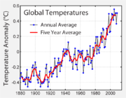
Hi, I've substituted the temperature graph because the nasa/giss one (http://en.wikipedia.org/wiki/File:NASA_global_temperature_data_1880-2009.gif) was a low quality gif, this one is based on NOAA data, change it back to nasa reconstruction if you want when the Dragons flight graph will be updated.
I've also updated lower troposphere trend and added that also NOAA reconstruction show 2005 as the warmest year on record.--Giorgiogp2 (talk) 19:30, 15 February 2010 (UTC)
- I'm the one who added the NASA/GISS graph, after it seemed that no one was going to update the Dragon's flight graph. The graph that I added is consistent with past graphs, as it's from NASA/GISS and shows the five year average. Your new graph shows it a different way and from a different source. We should be consistent about how this is done. The GIF that I added was high enough quality, although if anyone has a higher quality one with the same data, they could change it to that. Grundle2600 (talk) 19:37, 15 February 2010 (UTC)
Hi Grundle2600, i understand that you upload that file because the old one was outdated but gif file use is deprecated and preview looks bad, anyway it doesn't matter to me if you want to change it again with the nasa/giss file. —Preceding unsigned comment added by Giorgiogp2 (talk • contribs) 21:23, 15 February 2010 (UTC)
- OK. But I don't know how to change the kind of file. Maybe somoene else here can do that. I'll put the image back, and then see if someone else wants to make it better. Grundle2600 (talk) 21:35, 15 February 2010 (UTC)
- I'd suggest turning the higher quality image found here into a gif file: http://data.giss.nasa.gov/gistemp/graphs/Fig.A2.pdf Zeke Hausfather (talk) 01:15, 16 February 2010 (UTC)
11-year smoothing? You cannot be serious.
The chart has always had a 5 year trend line. Now that the five year trend would show a drop, it has been replaced with an 11 year year trend. "Hide the decline" is alive and well! 76.19.65.163 (talk) 21:03, 15 February 2010 (UTC)
76.19.65.163, the previous graph was not mine...the use of a 11-year filter is appropriate because it removes both short term enso variation and solar cycle effect. Actually CRU uses 21-years binomial filter and NOAA 30-years gaussian filter, furthermore NOAA reconstruction shows less warming then nasa/giss in recent years and the nasa/giss 5 year average is going a little bit up with 2009 data included. —Preceding unsigned comment added by Giorgiogp2 (talk • contribs) 21:29, 15 February 2010 (UTC)
- I predicted this POV change last year, and it is so good to find that at least I (unlike climate "scientists") are able to make predictions that are correct! Having said that, I have always used a decadel smoothing on my own analysis because, for technical reason's its a good timeperiod. That doesn't make me happy with not supporting 5years, but give it a few more years and even a longer period won't be able to hide the decline! 88.110.2.122 (talk) 22:32, 23 February 2010 (UTC)
The long term consensus has been for a five year average, so the article should maintain that method. Grundle2600 (talk) 21:40, 15 February 2010 (UTC)
- The 11-year smoothing will not be a problem for long; next year it will be 12-year smoothing. Martin Hogbin (talk) 22:48, 15 February 2010 (UTC)
I'm planning to update my graphs this week. Dragons flight (talk) 02:16, 16 February 2010 (UTC)
Let's keep the rhetorical excesses to a minimum here folks. Keep focused on how to improve the article, rather than the motivations of contributors. --TeaDrinker (talk) 02:28, 16 February 2010 (UTC)
- I think that rhetorical excess is in order at this point. It is time to open this Wikipedia article up to allow skeptics to contribute. Instead, all that happens is that comments (like mine) get deleted because I call people out on their dishonest approach here. Manipulating the timelines of the graphs is always an *option*, and sure you can come up with an *excuse* to do it. But that doesn't make it right. It is one thing to assume we're all here to make the article better. But for me I can see very obviously (as can others who have expressed similar outrage), that this page is controlled by advocates of the global warming alarmist crowd. It is TIME to open your process up! Mcoers (talk) 05:19, 16 February 2010 (UTC)mcoers
So, this is my last comment here because since i have done that edit i got only aggressive response and not a single scientific suggestion (this page is controlled by advocates of the global warming alarmist crowd?) despite:
1-I've changed the graph only because the existing one is of a deprecated format and poor quality in preview and i am not really interested if it goes down or not in the end nor in general article like this one.
2-I've motivated the use of an 11-year filter; the main reason we use filters is to remove short term variability and an 11-year filter is effective to remove enso effect/volcanic cooling/solar cycle effects while a five year filter shows a lot of ups and down.
3-I've used NOAA data; if i wanted to cancel global warming slowdown i would have used the existing NASA/GISS data since in recent years this reconstruction is considerably warmer and indeed 2009 according to nasa/giss is the second warmest year on record[5] the fifth according to NOAA[6]--Giorgiogp2 (talk) 07:00, 16 February 2010 (UTC)
- Why are there only 3 error bars? 71.80.162.157 (talk) 07:22, 16 February 2010 (UTC)
- The source doesn't explicitly state this, but I assume that the error bars given are intended to give a measure of the uncertainty for different ages of data - less uncertainty for newer data seems to make sense. Mikenorton (talk) 08:19, 16 February 2010 (UTC)
- Lies, damned lies and wikipedia global warming articles! Of course it should remain the same - but somehow that doesn't hid the decline, so now the POV pushers have decided to "redefine what average means". This is utterly rediculous. 88.109.44.132 (talk) 08:53, 16 February 2010 (UTC)
- The logic for three sets of error bars does not make any sense. The errors around a value are a function of the information going into that point. As such the error bars around and two points will be unlikely to ever be the same. In other words, if the errors bars are being used as implied (ie to give a 90% or 95% bound for the average of 5 or 10 years) then larger error bars represent a much greater variation within that time period. If these error bars are being used to represent something else then that needs to be explained or the error bars need to be removed. Arzel (talk) 01:18, 17 February 2010 (UTC)
- Lies, damned lies and wikipedia global warming articles! Of course it should remain the same - but somehow that doesn't hid the decline, so now the POV pushers have decided to "redefine what average means". This is utterly rediculous. 88.109.44.132 (talk) 08:53, 16 February 2010 (UTC)
- The source doesn't explicitly state this, but I assume that the error bars given are intended to give a measure of the uncertainty for different ages of data - less uncertainty for newer data seems to make sense. Mikenorton (talk) 08:19, 16 February 2010 (UTC)
- As a statistical matter, does anybody think that 11 year smoothing is not better than 5-year smoothing? I understand why various IP editors are kicking up a fuss, but I don't think political considerations, such as attempting to appease the politically compromised, should rule our decisions here. A good reason has been given for using 11 years. Are there any statistically literate objections? --Tasty monster 09:04, 16 February 2010 (UTC)
- As I've learned a while back, the filters used are usually polynomial or Gaussian, i.e. they give more weight to closer points. Even an 11-year filter is not a simple moving average of 11 years. So wether we use a 5 or an 11 year filter, its unlikely to completely remove the 11 year solar cycle. So I'd prefer to stick with the current version, if only for consistency. --Stephan Schulz (talk) 09:27, 16 February 2010 (UTC)
- To answer TastyMonster's question, there has to be some kind of balance between smoothing out short term fluctuations and getting an answer in a reasonable time. The optimum smoothing period to achieve that was originally considered to be 5 years. There needs to be an exceptionally good rationale to change that now. When using or evaluation a mathematical model, the use of statistical techniques that assume components of that model in presenting the data must be considered bad practice as must changing of the statistical display techniques mid-experiment. I appreciate that the solar cycle is a well-established phenomenon but, as Stephan Schulz has pointed out, it would take a much longer smoothing period to remove this effect. Far better to present the less smoothed (5-year smoothing) data and note the 11-year solar cycle than use suspect and ineffective statistical techniques to attempt to remove it. Martin Hogbin (talk) 10:29, 16 February 2010 (UTC)
- As I've learned a while back, the filters used are usually polynomial or Gaussian, i.e. they give more weight to closer points. Even an 11-year filter is not a simple moving average of 11 years. So wether we use a 5 or an 11 year filter, its unlikely to completely remove the 11 year solar cycle. So I'd prefer to stick with the current version, if only for consistency. --Stephan Schulz (talk) 09:27, 16 February 2010 (UTC)
- As a statistical matter, does anybody think that 11 year smoothing is not better than 5-year smoothing? I understand why various IP editors are kicking up a fuss, but I don't think political considerations, such as attempting to appease the politically compromised, should rule our decisions here. A good reason has been given for using 11 years. Are there any statistically literate objections? --Tasty monster 09:04, 16 February 2010 (UTC)
I've used a Welch smooth, anyway it doesn't matter since most user wants a 5 year average i've uploaded a good quality png so the question is over. Thanks to Zeke Hausfather for the link to PDF nasa/giss image.--Giorgiogp2 (talk) 12:05, 16 February 2010 (UTC)
I don't greatly care if we use 5 or 11 years. Arguments such as 'The optimum smoothing period to achieve that was originally considered to be 5 years. There needs to be an exceptionally good rationale to change that now. are completely invalid - there was no extensive discussion; I think it was just DF's choice. Either is fine. Having a slightly longer term smoothing that 5 to help smooth out solar / enso is quite plausible William M. Connolley (talk) 12:09, 16 February 2010 (UTC)
The reason I asked is that I don't see any good reason to use a five-year filter. 11 years, or more, makes more sense statistically. I fear we've collectively permitted ourselves to be brow-beaten so often by people who obviously have no understanding of statistics and continually expose us to their quite toxic and baseless assumptions.
It's a good idea to stop, sometimes, and ask whether we're being panicked into a poor decision by poor arguments instead of going where the science leads us. I think we should seriously consider a much longer smoothing period. --Tasty monster 12:22, 16 February 2010 (UTC)
- (By the way, the Tasty monster account is me, operating a cellphone web browser on a bumpy bus). --TS 12:51, 16 February 2010 (UTC)
- Are you saying that a filter is being applied by editors on WP? If so this is completely wrong. We should show data, as published by reliable sources. Martin Hogbin (talk) 15:16, 16 February 2010 (UTC)
Usually the original data source do not provide smoothed data and i don't see the problem if the wikipedia author smooth the data(if properly done), most of the temperature graphs currently in use are actually smoothed see for example[7], even the instrumental temperature graph looks different from nasa-giss(less noisy); i don't know if it is only a graphical artifact because it is not specified the smooth method used but seems that data are 5-year gaussian smoothed or something like that and not the original nasa/giss 5 year running mean.[8][9]--Giorgiogp2 (talk) 15:42, 16 February 2010 (UTC)
- See also previous discussion from a couple of years ago about what kind of smoothing was used Talk:Global_warming/Archive_37#Svg first image. Mikenorton (talk) 17:05, 16 February 2010 (UTC)
- Any form of data processing by editors here is, in my opinion, unacceptable. Why are we processing the data? To make something clearer? This is OR. We must only show what reliable sources show. Martin Hogbin (talk) 17:28, 16 February 2010 (UTC)
- I suppose we could always use the GISTEMP graphs, if they are compatible with our licence. The two line charts under "Global Annual Mean Surface Air Temperature Change" each plot an annual mean and a five-year mean. --TS 18:10, 16 February 2010 (UTC)
"Having a slightly longer term smoothing that 5 to help smooth out solar / enso is quite plausible"...that's original research. You are deciding how to average the data. We need to just present the data points as is, and provide no manipulation. BC Builder (talk) 03:20, 17 February 2010 (UTC)[confirmed scibaby sock --Kim D. Petersen (talk) 11:44, 22 February 2010 (UTC)]
Since there doesn't seem to be any consensus to switch to NOAA temp data, and we have a good-quality chart from our prior reliable source (NASA GISS) that includes 2009, shall we consider this issue closed for now? Zeke Hausfather (talk) 06:31, 17 February 2010 (UTC)
No. I would like to see all smoothing removed, and error bars to 3 standard deviations for each year's data points. This is the correct way to represent the data. BC Builder (talk) 06:40, 17 February 2010 (UTC)[confirmed scibaby sock --Kim D. Petersen (talk) 11:44, 22 February 2010 (UTC)]
The current graph in use is the original gistemp not a wikipedia user own work, giss as far as i know do not provide error bars for each data points (which would make the graph rather confusing). Anyway wikipedia rules encourage users to prepare graphs and images and allow routine calculations as long as data sources are provided and calculations are verifiable, adding a smooth line is not advanced math for sure... Thus i suggest to restore Dragons Flight graph when it will be updated because user graphs and images are an added value for wikipedia that should not be lost, no matter if we use a 5 year smoothing or not.--Giorgiogp2 (talk) 07:05, 17 February 2010 (UTC)
This is fine if you are plotting the flucuations in peach tree bat populations or the yearly salarly of Nebraska math teachers--but it does not work with politically charged data such as that represented by the plot. Does it not seem odd that just as one of the key keepers of climate data says there has been no warming for the last 15 years, all of a sudden there is a proposal to switch from 5 year smoothing to 11 year smoothing? Could there be a greater appearance of trying to manipulate data unduly? The process of choosing the time window is clearly subject to POV influences that must be resisted. BC Builder (talk) 07:12, 17 February 2010 (UTC)[confirmed scibaby sock --Kim D. Petersen (talk) 11:44, 22 February 2010 (UTC)]
- Even for peach tree bats, manipulation of data by editors here is of dubious legitimacy. For climate data it is completely unacceptable. The only reason that there has been any consensus for the current graph is that most editors, like myself, were not aware that the data hand been processed here. The graph must be replaced with an unprocessed one from a reliable source. Martin Hogbin (talk) 09:14, 17 February 2010 (UTC)
- Have a little patience, Dragons flight has already promised to update the figure that has been used in the article for the last few years. The addition of a smoothed trend line (however constructed) is not there to hide anything. The datasets (from whatever source) use such a smoothed trend and our figure reflects that - the data available do not, as far as I know, include the smoothed trend so we have to do that ourselves. I really don't think that this should be regarded as either original research, 'data manipulation' or 'data processing'. Mikenorton (talk) 09:35, 17 February 2010 (UTC)
- If the data has not been smoothed by a reliable source, we should not be doing it here, whether to hide something or otherwise. Martin Hogbin (talk) 12:17, 17 February 2010 (UTC)
- The current graph with a 5-year average was copied verbatim from NASA, and is the exact same graph that has been used in this article for the past year but updated to include the 2009 datapoint. Changing this graph to something else would require a consensus from editors of the article. Zeke Hausfather (talk) 17:06, 17 February 2010 (UTC)
- I am not quite sure what you are saying. Something published by a reliable source is fine, something produced by editors here is not. Martin Hogbin (talk) 01:04, 18 February 2010 (UTC)
If this is from NASA, why does Dragons flight need to "update" the figure? Let's just pull that from NASA and put it in there directly. If there is need, it is simple to get a release from NASA to put the direct image into Wikipedia. If this is true, there should be no need to have a user manipulate the data into a graph.BC Builder (talk) 04:49, 18 February 2010 (UTC)[confirmed scibaby sock --Kim D. Petersen (talk) 11:44, 22 February 2010 (UTC)]- DF takes the raw data and produces the useful and beautiful graphs that we have used for years. His work is straightforward - e.g. choosing the average according to the IPCC standard and running a plotting program. The result is aesthetically much better than what NASA does. This is completely in line with WP:OR. Moreover, DF has a PhD in a related field and has published peer-reviewed articles. He would easily qualify under WP:SPS anyways. --Stephan Schulz (talk) 16:42, 18 February 2010 (UTC)
I checked the NASA site, and it seems this would be a much better plot to include: http://data.giss.nasa.gov/gistemp/graphs/Fig.C.lrg.gifBC Builder (talk) 04:56, 18 February 2010 (UTC)[confirmed scibaby sock --Kim D. Petersen (talk) 11:44, 22 February 2010 (UTC)]- Why would you want to take a graph of 15 years of monthly temperatures to illustrate changes in climate - an effect that is typically defined over 30 year averages? --Stephan Schulz (talk) 16:42, 18 February 2010 (UTC)
- Because it looks like this the best available that has been published in a reliable source, unless you know of a better one. Martin Hogbin (talk) 16:57, 18 February 2010 (UTC)
- No, it does not look like that. We've had much better NASA orginals - in fact, the one that currently is in the article is a much better NASA original than the one suggested by BC. Can you explain why you would think otherwise? --Stephan Schulz (talk) 17:05, 18 February 2010 (UTC)
We need BOTH plots in there, which are both reliable NASA plots. The 15 year data is more clearly observed, and provides data for recent years. This provides an excellent comparison, alongside the plot with the longer time scale. The lack of consistent error bars in both cases is troubling, however, for anyone who values good data. The NASA plots are actually more aesthetically pleasing. BC Builder (talk) 19:21, 18 February 2010 (UTC)[confirmed scibaby sock --Kim D. Petersen (talk) 11:45, 22 February 2010 (UTC)]
- No, it does not look like that. We've had much better NASA orginals - in fact, the one that currently is in the article is a much better NASA original than the one suggested by BC. Can you explain why you would think otherwise? --Stephan Schulz (talk) 17:05, 18 February 2010 (UTC)
- Because it looks like this the best available that has been published in a reliable source, unless you know of a better one. Martin Hogbin (talk) 16:57, 18 February 2010 (UTC)
- Why would you want to take a graph of 15 years of monthly temperatures to illustrate changes in climate - an effect that is typically defined over 30 year averages? --Stephan Schulz (talk) 16:42, 18 February 2010 (UTC)
- I am not quite sure what you are saying. Something published by a reliable source is fine, something produced by editors here is not. Martin Hogbin (talk) 01:04, 18 February 2010 (UTC)
- The current graph with a 5-year average was copied verbatim from NASA, and is the exact same graph that has been used in this article for the past year but updated to include the 2009 datapoint. Changing this graph to something else would require a consensus from editors of the article. Zeke Hausfather (talk) 17:06, 17 February 2010 (UTC)
- If the data has not been smoothed by a reliable source, we should not be doing it here, whether to hide something or otherwise. Martin Hogbin (talk) 12:17, 17 February 2010 (UTC)
- Have a little patience, Dragons flight has already promised to update the figure that has been used in the article for the last few years. The addition of a smoothed trend line (however constructed) is not there to hide anything. The datasets (from whatever source) use such a smoothed trend and our figure reflects that - the data available do not, as far as I know, include the smoothed trend so we have to do that ourselves. I really don't think that this should be regarded as either original research, 'data manipulation' or 'data processing'. Mikenorton (talk) 09:35, 17 February 2010 (UTC)
FYI, I've update my instrumental temperature plot to include 2009. For what it is worth, I am grateful to the people here who support my work, but I don't personally think it matters very much whether you use my version or someone else's. I will be posting updates for several other figures over the next week or two. Dragons flight (talk) 01:03, 20 February 2010 (UTC)
new chart lacks identification of components
the new 'Global mean surface temperature difference relative to the 1961–1990 average' has no legend for the three green "I" bands that are present in the graph. are we expected to guess what these bands represent? i'd recommend reverting to the old chart until a properly labeled chart can be generated. Anastrophe (talk) 05:14, 18 February 2010 (UTC)
- I agree, and I would also ask that Atmoz not make comments like this associated with his edits. Not only is it a violation of the sancations against the GW articles, but it is not clear what they are saying. I have 15 years of statistical experience, and it is not clear why there are three bars or why they are located where they are located. Obviously they should be error bars of some sort, but what is obvious to me or Atmoz is not going to be obvious to all readers of this page. What is not obvious is the limits on the error bars or for what purpose they mark those specific three points in time. The only thing worse then a bad graph is a bad graph that doesn't explain what it is trying to tell you. Arzel (talk) 15:56, 20 February 2010 (UTC)
- It's Atmoz, I wouldn't take it personally. He got me POed before. You have statistical experience, they're error bounds at 95% confidence. The reason why there are they're spaced out is because thirty years (although this one seems increase it to sixty) is the standard for averaging in climate statistics since it'll even out most natural cycles. In short, they're the error bounds for the average of sixty years of data. Here's the link to the WMO's FAQ, they simplify climate statistics a little, and if you want, I can help you look for a better source. I think you might like this graph better, the methology is older/less major, but it spaces error bounds every thirty years instead of sixty. Dragons flight's graph and NASA's graph use the same data; didn't even need to do the regression either, five year running mean is provided as data points. You can read about the methodology here, the graphs were originally published by Hansen et al. I hope this clears things up for you. ChyranandChloe (talk) 22:21, 20 February 2010 (UTC)
- C&C, [10] seems to be a broken link. If, instead of "they're the error bounds for the average of sixty years of data" you had said, "they're the average error bounds for sixty years of data", I'd be clearer. Do you take 60 years of data, 60 data points, each with a 95% error band, and display the average error band somewhere in the display of the 60 points? That I would understand. If you average the 60 data points into one average temperature figure, then it's error bar will be very small compared to the individual error bars for each of the 60 separate points. If you know, can you say which it is? I mention this because I took a guess (with no prior reading) as to the meaning of those green bars below under #Please don't start to edit war over the lede image. If my guess was right, then I would say that the green bars are self explanatory. If they mean anything else, then I would advocate not showing them. --Nigelj (talk) 00:23, 21 February 2010 (UTC)
- Yeah, broken link fixed, missed the "l" in ".html". I think I need to retract my comment. Finally got a chance to fully read Hansen et al. I kind of wish they were simple sixty year aggregate error bounds. But no, they're much more complex. The three error bounds represent, to my understanding, the error resulting from incomplete spatial coverage resulting from the three methods of measuring global temperatures. They compare modeled measurements at the instrument's location to the variability of instrumental measurements. This is why they call them "uncertainty estimates" rather than "confidence intervals". The farthest right represents the error from satellite measurements of sea surface temperature since 1982. The middle, from documented procedures for data over land. The farthest left, ship-based analysis. This is my deduction. You should ask Boris, he might know. ChyranandChloe (talk) 02:38, 21 February 2010 (UTC)
- C&C, [10] seems to be a broken link. If, instead of "they're the error bounds for the average of sixty years of data" you had said, "they're the average error bounds for sixty years of data", I'd be clearer. Do you take 60 years of data, 60 data points, each with a 95% error band, and display the average error band somewhere in the display of the 60 points? That I would understand. If you average the 60 data points into one average temperature figure, then it's error bar will be very small compared to the individual error bars for each of the 60 separate points. If you know, can you say which it is? I mention this because I took a guess (with no prior reading) as to the meaning of those green bars below under #Please don't start to edit war over the lede image. If my guess was right, then I would say that the green bars are self explanatory. If they mean anything else, then I would advocate not showing them. --Nigelj (talk) 00:23, 21 February 2010 (UTC)
- It's Atmoz, I wouldn't take it personally. He got me POed before. You have statistical experience, they're error bounds at 95% confidence. The reason why there are they're spaced out is because thirty years (although this one seems increase it to sixty) is the standard for averaging in climate statistics since it'll even out most natural cycles. In short, they're the error bounds for the average of sixty years of data. Here's the link to the WMO's FAQ, they simplify climate statistics a little, and if you want, I can help you look for a better source. I think you might like this graph better, the methology is older/less major, but it spaces error bounds every thirty years instead of sixty. Dragons flight's graph and NASA's graph use the same data; didn't even need to do the regression either, five year running mean is provided as data points. You can read about the methodology here, the graphs were originally published by Hansen et al. I hope this clears things up for you. ChyranandChloe (talk) 22:21, 20 February 2010 (UTC)
Mention of future / present effects caused by the Sun?
Sorry if I missed a topic of this listed elsewhere within the talk page. Would it be feasible to mention that the Sun is growing in luminosity and therefore radiant heat output (as it has over the last millions of years)? It IS a fact that our Sun will render this planet inhabitable someday, so I would reckon that it must have something to do with increased global temperatures... User:Rayne 02-19-10
- This article is about climate change on the order of hundreds of years. The undeniable increase in solar influence on the inner planets on the order of millions of years is not relevant in this short term. See the section in the article, which is called Solar variation. There is a related article with the same name that gives more detail on that subject. An article such as stellar evolution gives a general picture of how stars evolve, and if there are no articles spelling out what science tells us about the likely future of our system. they can be created. --TS 22:51, 19 February 2010 (UTC)
Explanation of a revert of an edit referring to 20th century warming
See FAQ Q3
|
|---|
|
I've reverted the following edit: Dikstr edited the opening sentence from:
to:
On a purely historical matter, obviously the temperature doesn't know or care about the decimal system that leads us to draw a distinction between one century and another. On a statistical matter, all calculations by reputable scientific sources tell us that global warming is continuing. In effect, the edit falsely implies that global warming is a thing of the past. --TS 00:37, 20 February 2010 (UTC)
I checked my facts. See this announcement by the World Meteorological Organization: Tasty monster (TS on one of those new fangled telephone thingies) 13:11, 20 February 2010 (UTC)
If Plain jack and BC Builder are going to continue along this line, perhaps we should consider a new FAQ question. --TS 23:17, 21 February 2010 (UTC) |
Please don't start to edit war over the lead image
Look at these edits: [11], [12], [13], [14], [15], [16], [17]. There is some discussion about it above, but there's more edits than talk at the moment, I think. We seem to have the following images:
-
 Instrumental Temperature Record.png
 -
NASA global temperature data 1880-2009.gif
-
NASA global temperature data 1880-2009.gif
-
 NOAA Land Ocean temperature anomaly.png
 -
Nasa-giss 1880-2009 global temperature.png
-
 Nasa-giss 1880-2009 global temperature.png


![[9]](https://en.wikipedia.org/wiki/File:Nasa-giss_1880-2009_global_temperature.png)
Which is the best and why? We can't show them all first; don't edit war over them; pick one and give reasons why it's the best for the first image in this article. --Nigelj (talk) 19:43, 20 February 2010 (UTC)
- I vote for the NOAA Land Ocean temperature anomaly. The 11 yr running mean is a good filter for the solar magnetic activity cycle. The 5 year means of other charts has no logical justification for a climate time scale.Dikstr (talk) 20:06, 20 February 2010 (UTC)
- Of course we don't vote ;-). I support the leftmost image by DF. We have used it for years, and I find it the best looking one. It's also based on one of the two more prominent temperature records. It also has the advantage of showing the anomaly relative to the base used in most published works and by the IPCC, while NASA uses a different baseline. --Stephan Schulz (talk) 20:11, 20 February 2010 (UTC)
- The green error bars for the NASA images are not clear in their purpose. Why those three points in time? What are they trying to say? Is the average reader going to understand what they are trying say without any explanation? If we are to use either of those two graphs the reasoning behind those three error bars needs to be expanded. Per that I would suggest a NOAA graph of 11 years to account for solar variation. Arzel (talk) 20:14, 20 February 2010 (UTC)
- I'm pretty sure I understand what the green error bars are supposed to represent, but I agree that's not the same as knowing what they represent. For the sake of consistency I think we should stick with the image that's been in the article for a while now - that said I'm not particularly against the NOAA graph with the 11-year mean. Mikenorton (talk) 20:37, 20 February 2010 (UTC)
- Can't say I care a lot. As it happened, I reverted back to the dreaded "green bars" in the course of removing this [18] - we don't need climategate in a science article William M. Connolley (talk) 21:21, 20 February 2010 (UTC)
- We should stay with the one on the left, which has been used for several years. Changing the way the average is computed would allow editors to either exaggerate or hide the decline, based on political beliefs. 76.19.65.163 (talk) 22:20, 20 February 2010 (UTC)
- As to the green bars, let me take a guess: "The likely errors in these unsmoothed data points are larger way back, slightly smaller in the middle and noticeably smaller in recent data. In all cases except the oldest data, the errors are likely to be smaller than the visible 'noise', so that is probably real". Am I right? If someone knows what they really mean, and that is close, then I would say that they mean what they say and no further explanation is needed for their use in three cases, but without the clutter of showing them throughout. That really leaves the question of 5-year versus 11-year smoothing. If William doesn't care about this, should anyone? The noise is real; the smoothing is never perfect; the trend is clear. I hope no one's getting out their magnifying glass and studying the 'hook' at the very end of some smoothed lines: with a trend like that, it clearly means nothing, whether visible or not. This isn't a stock-price chart, but a highly complex physical process following lots of basic laws superimposed. The trend is clear and its causes well known and on-going. --Nigelj (talk) 22:34, 20 February 2010 (UTC)
- Look back up to the section 'Graph and trend' where ChyranandChloe seems to have answered queries regarding the dreaded green bars. Mikenorton (talk) 22:43, 20 February 2010 (UTC)
- Can somebody please say which of these graphs are exactly as published in a reliable source. Martin Hogbin (talk) 00:31, 21 February 2010 (UTC)
- Click on each graph to find information on its source. Short Brigade Harvester Boris (talk) 01:34, 21 February 2010 (UTC)
- You have not answered my question. It is not easy to determine whether there has been any data processing by individuals or organisations other than the cited source. Martin Hogbin (talk) 10:34, 21 February 2010 (UTC)
- I'm unclear what you mean by 'data processing', the graphs created by Dragons flight and Giorgiogp2 plot published values (both graphs give their sources), they also include 5 year and 11 year means respectively of the data, chosen to match those used in published graphs. I wouldn't call any of that data processing or manipulation. The other two graphs are taken directly from the Nasa website (just two versions of the same graph with different resolutions), but they contain the green bars that we seem to be finding difficult to get precise explanations for. Mikenorton (talk) 11:37, 21 February 2010 (UTC)
- Graphs created by WP editors have no place at all in this article, this is OR. We should only show graphs exactly as shown in reliable sources. Martin Hogbin (talk) 12:42, 21 February 2010 (UTC)
- That's not what WP:OR says, "Original images created by a Wikipedian are not considered original research, so long as they do not illustrate or introduce unpublished ideas or arguments, the core reason behind the NOR policy". Mikenorton (talk) 13:15, 21 February 2010 (UTC)
- Graphs created by WP editors have no place at all in this article, this is OR. We should only show graphs exactly as shown in reliable sources. Martin Hogbin (talk) 12:42, 21 February 2010 (UTC)
- I'm unclear what you mean by 'data processing', the graphs created by Dragons flight and Giorgiogp2 plot published values (both graphs give their sources), they also include 5 year and 11 year means respectively of the data, chosen to match those used in published graphs. I wouldn't call any of that data processing or manipulation. The other two graphs are taken directly from the Nasa website (just two versions of the same graph with different resolutions), but they contain the green bars that we seem to be finding difficult to get precise explanations for. Mikenorton (talk) 11:37, 21 February 2010 (UTC)
- You have not answered my question. It is not easy to determine whether there has been any data processing by individuals or organisations other than the cited source. Martin Hogbin (talk) 10:34, 21 February 2010 (UTC)
- Click on each graph to find information on its source. Short Brigade Harvester Boris (talk) 01:34, 21 February 2010 (UTC)
- Can somebody please say which of these graphs are exactly as published in a reliable source. Martin Hogbin (talk) 00:31, 21 February 2010 (UTC)
- Look back up to the section 'Graph and trend' where ChyranandChloe seems to have answered queries regarding the dreaded green bars. Mikenorton (talk) 22:43, 20 February 2010 (UTC)
- I also prefer the leftmost graph, it's what we have shown for quite some time and unless it has a gross mistake I think it should stay. --Seba5618 (talk) 03:51, 23 February 2010 (UTC)
- I prefer the leftmost graph as well. It should be our default option in the absence of clear consensus anyhow, since its the image that has been on the page for the past few years updated with the 2009 datapoint. Zeke Hausfather (talk) 16:13, 23 February 2010 (UTC)
Editor generated images are OR
Presenting numerical data in order to illustrate a point is not the same as, for example, producing a diagram. As any marketing or advertising person knows, the same data can be presented in a variety of different ways in order to make very different points.
In deciding how to show data graphically the following points (at least) need to be considered.
Data set and title
What is the appropriate data set to include. Starting when? Ending when? What should the graph be called?
Presentation
What is the most appropriate form of graph, line, bar etc? What captions should be present? What colours and line types should be used? Should expected or predicted trends be shown?
Axes
How are the axes to be labeled, brief descriptions or full details of the exact nature of the measurements? How should the axes be scaled? What should be the zero point for each axis? Should room be left for envisaged continuation of one or more of the axes?
What lines should be added
What lines should be added, if any, to connect the data points? Should any forms of smoothing or moving average be used? Should error bars be shown, if so for what confidence limits? Martin Hogbin (talk) 15:31, 21 February 2010 (UTC)
- Please read WP:OI. Generating simple plots is no OR. And, as I've already pointed out above, in this case the editor in question is qualified as an expert under WP:SPS anyways. --Stephan Schulz (talk) 18:43, 21 February 2010 (UTC)
- I have read it and it is quite obvious, as shown above, that many decisions made in the presentation of data in graphical form constitute OR. We should only show graphs as published in reliable sources. The same data can be presented in many different ways to suggest many different things. Martin Hogbin (talk) 16:44, 22 February 2010 (UTC)
- You keep repeating this like a broken record. That does not make it relevant. Yes, user-generated images can be misused. But that generic statement is useless - so can any edit. This particular image has been carefully created by a competent expert who also happens to be a Wikipedia editor, and who, in all relevant aspects, closely follows other images released e.g. by NASA and other reliable sources. --Stephan Schulz (talk) 09:07, 23 February 2010 (UTC)
- If the images that have been produced by the expert have been published in a reliable source that is fine. Otherwise, why do we not show a published image? Martin Hogbin (talk) 16:52, 23 February 2010 (UTC)
- I would assume that it's because either they're unusable because they're not freely licensed, or they're just less attractive. May I ask what original ideas you think this graph is presenting? — DroEsperanto (talk) 16:59, 23 February 2010 (UTC)
- If the images that have been produced by the expert have been published in a reliable source that is fine. Otherwise, why do we not show a published image? Martin Hogbin (talk) 16:52, 23 February 2010 (UTC)
- You keep repeating this like a broken record. That does not make it relevant. Yes, user-generated images can be misused. But that generic statement is useless - so can any edit. This particular image has been carefully created by a competent expert who also happens to be a Wikipedia editor, and who, in all relevant aspects, closely follows other images released e.g. by NASA and other reliable sources. --Stephan Schulz (talk) 09:07, 23 February 2010 (UTC)
- I have read it and it is quite obvious, as shown above, that many decisions made in the presentation of data in graphical form constitute OR. We should only show graphs as published in reliable sources. The same data can be presented in many different ways to suggest many different things. Martin Hogbin (talk) 16:44, 22 February 2010 (UTC)
Objection to mention of "Climategate"
See global warming controversy. This article is about the science
|
|---|
|
William M Connelley objected to this:
Comments? Put in article? Re-write it? Suomi Finland 2009 (talk) 22:58, 20 February 2010 (UTC)
You're wrong. Have you been reading the Daily Mangle? . . dave souza, talk 16:57, 21 February 2010 (UTC)
http://cruelmistress.wordpress.com/2010/02/15/yes-our-press-corps-is-that-bad/ William M. Connolley (talk) 21:40, 21 February 2010 (UTC) No. Blog. Irrelevant.130.232.214.10 (talk) 22:11, 21 February 2010 (UTC)
If there are Reliable Sources that question the validity of the science, then the questions should go into the science article.--Jojhutton (talk) 22:04, 21 February 2010 (UTC)
We've been through this at least twice before. I definitely need to get started on that "Did Phil Jones say global warming stopped 15 years ago?" FAQ. Meanwhile, do you have a proposal for improving the article? Apart from placing highly creative interpretations of the Phil Jones interview into the article, that is. --TS 05:51, 22 February 2010 (UTC)
This was all obvious nonsense, but there is now an Economist article saying so [24] and calling the Daily Mail article "a lie" directly William M. Connolley (talk) 13:29, 23 February 2010 (UTC) |
Climate scientists withdraw journal claims of rising sea levels
This has been discussed at talk:current sea level rise and Talk:Criticism of the IPCC AR4
|
|---|
|
guardian.co.uk: Climate scientists withdraw journal claims of rising sea levels. Gwen Gale (talk) 01:51, 22 February 2010 (UTC)
Ah, so your position is that we should just randomly select from whatever the latest published papers in peer reviewed journals say, without waiting for the bugs to shake out? And then we should write about any that do, unfortunately, turn out to be incorrect? Well no. That is what newspapers do. Wikipedia is an encyclopedia. Take a look at the answer to FAQ Q22. --TS 05:53, 22 February 2010 (UTC)
Just imagine writing an entire encyclopedia article about a major scientific subject in which every single article on the subject ever published must be discussed, irrespective of its prominence in the field, including those withdrawn due to flaws. Yikes, evolution would be a real mess. --TS 14:52, 22 February 2010 (UTC)
|
- I would disagree. The fact there is a retraction on such an incredible claim really speaks to the debate on global warming and is therefore germane. I would include it.Winsomet (talk) 20:57, 23 February 2010 (UTC)
- Yes, retractions of incredible claims really do speak to the debate. However, this article is about the science, not news items about papers that the article didn't cite. . . dave souza, talk 21:38, 23 February 2010 (UTC)
- I would disagree. The fact there is a retraction on such an incredible claim really speaks to the debate on global warming and is therefore germane. I would include it.Winsomet (talk) 20:57, 23 February 2010 (UTC)
How well does theoretical predictions match real data?
I have read several comments here, saying: "this article is about the science", those are absurd comments because if those making the comments had any scientific training and thought for even a few seconds they would quickly realise that the heart of science is the validation of hypothesis by testing whether they predict real data. So obviously one of the key questions that needs to be answered in a scientific article is how well the theory of manmade warming predicts actual data. As far as I am aware there have been very few actual predictions so it should be very easy to list these and give some indication of whether the real data tends to validate or invalidate those predictions. In particular, the 2001 report suggested warming of between 1.4-5.8C in the next century. How well does that fit actual temperatures? Don't the Met Office produce yearly global temperature predictions based on the theory of global warming? How well do these theory based predictions predict actual climatic change? Or to put that in reverse, how valid is the theory based on actual data and not the votes of researchers?
Come on this is supposed to be a science article, so please can we see a bit of real science! Is the theory supported by the data or is it not? 88.110.2.122 (talk) 22:51, 23 February 2010 (UTC)
- You hit on one of the topics of interest to me. I agree that you've identified a critical issue - what did the climate models predict, not just means but 95% confidence intervals, and how did actual results turn out? Of course, even if actual results over the last 20 years, for example, are outside the confidence band of a model prediction from 20 years ago, it would call into question the models of 20 years ago, not the current models. I think many climate scientists would happily tell you that the climate models have improved materially over the last 20 years.
- Still, while I've seen some evidence along these lines, I haven't seen as formal or complete a study as I would like. If someone is aware of such studies, I'd love to see them.
- I trust you are aware our task is to find the studies, not create them.--SPhilbrickT 02:13, 24 February 2010 (UTC)
- Right now I'm reading Hansen et al. Presented predictions in 1988, three scenarios, and published findings in 2006. The second scenario, and regarded as the most plausible, predicted a .19°C per decade increase, which fits the observed 0.19–0.21°C. I'm not sure if this answers your question though. Have you read the FAQ? I think parts of your question can be answered by Q3 and Q8. You seem to be more interested in statistics though, not climate models, and I think I might have some studies there. What do you think? ChyranandChloe (talk) 06:16, 24 February 2010 (UTC)
- FA-Class Weather articles
- Top-importance Weather articles
- Unsorted weather articles
- WikiProject Weather articles
- Unassessed Environment articles
- Unknown-importance Environment articles
- WikiProject Climate change articles
- FA-Class Environment articles
- FA-Class Geology articles
- High-importance Geology articles
- High-importance FA-Class Geology articles
- WikiProject Geology articles
- FA-Class Arctic articles
- High-importance Arctic articles
- WikiProject Arctic articles
- Pages using WikiProject banner shell with duplicate banner templates
- Wikipedia pages referenced by the press
- Wikipedia featured articles
- Featured articles that have appeared on the main page
- Featured articles that have appeared on the main page once
- Old requests for peer review
- Spoken Wikipedia requests