
Wikipedia:Graphics Lab/Map workshop: Difference between revisions
Sumone10154 (talk | contribs) |
|||
| Line 815: | Line 815: | ||
'''Request:''' |
'''Request:''' |
||
:Please change the label "Missionary Hills" to the correct name: "[[Mission Hill, Boston|Mission Hill]]" <font color="#339989">–[[User:Sumone10154|'''<font color="#339989">sumone10154</font>''']]<sup>([[User talk:Sumone10154|<font color="#339989">talk</font>]])</sup></font> 01:04, 30 April 2014 (UTC) |
:Please change the label "Missionary Hills" to the correct name: "[[Mission Hill, Boston|Mission Hill]]" <font color="#339989">–[[User:Sumone10154|'''<font color="#339989">sumone10154</font>''']]<sup>([[User talk:Sumone10154|<font color="#339989">talk</font>]])</sup></font> 01:04, 30 April 2014 (UTC) |
||
{{resolved|1=Done by [[User:Ypsilon]]. <font color="#339989">–[[User:Sumone10154|'''<font color="#339989">sumone10154</font>''']]<sup>([[User talk:Sumone10154|<font color="#339989">talk</font>]])</sup></font> 00:35, 2 May 2014 (UTC)}} |
|||
'''Graphist opinion(s):''' |
'''Graphist opinion(s):''' |
||
: |
: |
||
Revision as of 00:35, 2 May 2014
The Graphics Lab is a project to improve the graphical content of the Wikimedia projects. Requests for image improvements can be added to the workshop pages: Illustrations, Photographs and Maps. For questions or suggestions one can use the talk pages: Talk:Graphics Lab, Talk:Illustrations, Talk:Photographs and Talk:Maps.
This specific page is the requests page for the Map workshop. Anyone can make a request for a map to be created or improved for a Wikipedia article. The standard format for making a request is shown below, along with general advice, and should be followed.
You are encouraged to share information and request advice from others. Also see possible conventions toolbox, map tutorials and topographic map tutorials.
| Advice to requesters |
|---|
|
What do we do?
|


| If you have completed work and not received a reply you may use the {{GL Map reply}} template to inform the requester. |
| Map makers and other visitors to the Graphics Lab may be interested in the RSS feed of changes to this page. You may find it here. |
| See also our sister Map workshop at Commons and the WikiProject Maps |
| Result | Code | Usage |
|---|---|---|
{{resolved|~~~~}}
|
Mark a thread as resolved and request archiving | |
{{subst:bump}}
|
Delay automatic archiving of a section for 30 days | |
{{I take|~~~~}}
|
When you'll be working on the request | |
{{Done}} ~~~~
|
When the request is done |
This page is automatically archived by ClueBot III. | |
| This page has a backlog that requires the attention of willing editors. Please remove this notice when the backlog is cleared. |
Red Fort

Article(s): Red Fort
Request:
- Please convert this map into svg. The colours of the lawns, water, the buildings, etc. can be found here on the second page [1]. The legend should not be included, I will add that to the description page. The missing Salimgarh Fort at the top should be added however, based on the pdf document. There are also some features on the pdf which are more correct than this current map. -- Gryffindor (talk) 22:35, 21 December 2013 (UTC)
Graphist opinion(s):
:![]() Request taken by Cloudlet (talk) 23:24, 21 December 2013 (UTC).
Request taken by Cloudlet (talk) 23:24, 21 December 2013 (UTC).
Sorry, but I think I'll have to withdraw from this request. Good luck with the map, though! Cloudlet (talk) 03:43, 26 December 2013 (UTC)
![]() Request taken by Goran tek-en (talk) 17:37, 26 December 2013 (UTC).
Request taken by Goran tek-en (talk) 17:37, 26 December 2013 (UTC).
![]() Question: How do you want it to look;
Question: How do you want it to look;
- Like a line drawing similar to File:Handbooktravelle00john 0356.jpg
- Or like a colored kind of painting similar to page 2 in the pdf
--Goran tek-en (talk) 19:09, 26 December 2013 (UTC)
- The second option please. Gryffindor (talk) 12:40, 2 January 2014 (UTC)
- Thanks for that. I have now done all the "lines" and you can have a look at draft here.
- You wrote something about some features which is more accurate in the pdf.
- You have to tell me exactly what, because I have zero knowledge of this?
- Do you want some of the surrounding added also?
- I want you to really to check the draft now so that I will get it right before I start to add color. --Goran tek-en (talk) 13:27, 2 January 2014 (UTC)
- Some of the lines are not quite correct, such as in the Methab Bagh. I have found on page four a higher resolution [2]. For the buildings, please put them alphabetically like A or B and for the courtyards starting from the outside (left to right), numbers like 1 and 2. The surroundings should be added. Thank you. Gryffindor (talk) 18:57, 3 January 2014 (UTC)
- Now you can have a look here and then give me feedback.
- As for the numbering and buildnings you have to give me much more detailed instructions. I know nothing of this and I can't read on the image. --Goran tek-en (talk) 15:59, 8 January 2014 (UTC)
- Now you can have a look here and then give me feedback.
- Thanks for that. I have now done all the "lines" and you can have a look at draft here.
@Gryffindor: I need your feedback as above if you want me to be able to complete your request, thanks. --Goran tek-en (talk) 17:04, 17 January 2014 (UTC)
- hi Goran tek-en, sorry I just saw your message now. There is something odd with the map that I gave you here [3] on page four, it looks like the gate structures were included with a side view, to make it apparent they are gates. Also the courtyard with the arches can be seen from the sides in the main courtyard. Could you replace the side-view gates with grey blocks instead and remove any side-views? It should look similary to the old map. The scale of feet and the north direction should also be included.
- The canal in the upper right hand part should be a straight line. You can see it here on Google Maps [4].
- For the names and numbers of the places, please orientate yourself on the old map. I will send you an email with the detaied changes. Gryffindor (talk) 00:14, 21 January 2014 (UTC)
- @Gryffindor: I think I understood most of it and you can look at the draft here, maybe you need to reload the page to get the new image.
- You had two 11 in your list;
- 12 should be 11
- 10 should be 11
- Give me feedback on this, thanks. --Goran tek-en (talk) 14:28, 23 January 2014 (UTC)
- @Gryffindor: I think I understood most of it and you can look at the draft here, maybe you need to reload the page to get the new image.
- For the names and numbers of the places, please orientate yourself on the old map. I will send you an email with the detaied changes. Gryffindor (talk) 00:14, 21 January 2014 (UTC)
- Hi, I have made the changes necessary in a png file, since I am not familiar with svg. I hope you can read it. I have uploaded it here File:Plan of the Red Fort.png. This is a local file, after we are done here I will delete it. Thank you. Gryffindor (talk) 15:29, 10 February 2014 (UTC)
Now there is a new version up for you to check, new version, maybe you need to reload the page to get the new image, get back to me with feedback.
Eventually I will need the following;
- Name of the file
- Description
- Category/ies
to be able to upload it as a new file or if you want me to upload it as a version of the existing you have to tell me. --Goran tek-en (talk) 19:31, 10 February 2014 (UTC)
- Hi. A couple of things: the courtyard/square between 2 and 3 is still showing these funny arches or holes on the upper part, it should just be a solid wall/line. The same applies to lines between 3 leading to Z and and running underneath 11. The blue water canal/line between 10 and 12 should be a straight line, not intersected by rectangles. The words "Zer Jharokha" should be right next to number 8, basically in-between 9 and 7. The orange structure between 4 and R needs to be removed. The only bridge leading to S needs to be the same width from each side, not the trapezoid shape it currently has. S is not an island but the tip of a peninsula, so the backland in white should show. The line running all the way between 4 and 12 should be red, in the png it's maybe not that easy to see. The name of the river Yamuna should be more spread out. Please check my png file carefully for comparison, the svg should look exactly like the png. Thank you. Gryffindor (talk) 21:24, 11 February 2014 (UTC)
- @Gryffindor: New version, maybe you need to reload the page to get the new image. It's very hard for me to check every little detail and compare to your png, I do my best but you have to tell me what to change at this stage. Hope that's OK with you. Before you told me the canal should be a straight line but on the png it's not so I'm not sure of which is the right, I kept it straight so you have to tell me if I should change again. Get back to me, thanks. --Goran tek-en (talk) 20:00, 13 February 2014 (UTC)
- I haven't got the feedback I needed so I have now uploaded the current version Red Fort drawing. If you want me to do any changes further on just contact me, thank. --Goran tek-en (talk) 14:24, 21 February 2014 (UTC)
- Hi there, sorry but I have been busy. I made some changes on the png file and wrote the notes on it. Thank you. Gryffindor (talk) 16:37, 21 February 2014 (UTC)
- Great, thank you very much. Gryffindor (talk) 21:32, 7 March 2014 (UTC)
- Hi there, sorry but I have been busy. I made some changes on the png file and wrote the notes on it. Thank you. Gryffindor (talk) 16:37, 21 February 2014 (UTC)
- I haven't got the feedback I needed so I have now uploaded the current version Red Fort drawing. If you want me to do any changes further on just contact me, thank. --Goran tek-en (talk) 14:24, 21 February 2014 (UTC)
- @Gryffindor: New version, maybe you need to reload the page to get the new image. It's very hard for me to check every little detail and compare to your png, I do my best but you have to tell me what to change at this stage. Hope that's OK with you. Before you told me the canal should be a straight line but on the png it's not so I'm not sure of which is the right, I kept it straight so you have to tell me if I should change again. Get back to me, thanks. --Goran tek-en (talk) 20:00, 13 February 2014 (UTC)
A request from the talk page to add maps indicating the locations of the spring training sites for Major League Baseball teams that train in Florida (nicknamed the Grapefruit League) and Arizona (nicknamed the Cactus League) respectively. Previous maps of these were deleted, and the page is poorer for it. The Arizona one should probably be zoomed in on Phoenix, as all the teams are within the metro area, but the Florida one would need more area covered. Thanks. oknazevad (talk) 16:32, 25 February 2014 (UTC)
- I reply to this in order to not mark it as stale. I can imagine doing this at some later point in time. But as it is a lot of work, i am asking: Is this really needed? Does this really make the article much better? I am not a football fan, so i am asking naively.--DLommes (talk) 16:12, 30 March 2014 (UTC)
States with limited recognition
![]() Not done
Not done

Article(s): Various
Request:
- Please add in the Republic of Crimea in orange. This state has declared independence on 17 March 2014 and has been recognized only by Russia. 109.77.97.217 (talk) 13:59, 12 March 2014 (UTC)
- I'd wait on this one until after the referendum on the 16th, from that article sources disagree on whether the declaration was immediate or pending on the referendum, and there's no reliable source that Russia has recognized it yet (though I imagine that won't be long in coming). Kmusser (talk) 14:42, 12 March 2014 (UTC)
- No sources say it is recognised by Russia. Most sources say independence is dependent on the referendum rather than being declared already. Either way, such maps are already in the history for this file, so this can by closed as resolved as no attention is needed map-wise. CMD (talk) 15:04, 12 March 2014 (UTC)
- I'd wait on this one until after the referendum on the 16th, from that article sources disagree on whether the declaration was immediate or pending on the referendum, and there's no reliable source that Russia has recognized it yet (though I imagine that won't be long in coming). Kmusser (talk) 14:42, 12 March 2014 (UTC)
Graphist opinion(s):
 Not done - The self-proclaimed state has ceased existence. It is now a (disputed) federal republic of Russia.DLommes (talk) 14:30, 4 April 2014 (UTC)
Map of Grankullaviken requested
Article(s): See below
Request:
Hi map makers--first of all, thanks for the valuable work you do for your beautiful project. I have a request, maybe two. I'd like a (regular, geographical) map of Grankullaviken, one that I might could use on Trollskogen and Långe Erik. There is an example here, but the big purple line is a bit distracting. Now, it would be nice to have another map, maybe of Trollskogen and the surrounding area, with the cute Rs indicating archeological finds--I could use that in Böda socken also. If any one of you reads Swedish you might find this database helpful, or this map. (I'll be honest, I cannot easily navigate those maps or figure out what's what--my Swedish is very limited, and so is my archeologish.) Thanks in advance! Drmies (talk) 14:22, 16 March 2014 (UTC)
Graphist opinion(s):
- Drmies First, It would be great if you used the "New Section" link above because then all the necessary code would be added automatically, I have added it manually now.
- As I'm from Sweden I can't resist this and I'm pretty sure I will have some questions later on.
 Request taken by Goran tek-en (talk) 15:48, 16 March 2014 (UTC).
- Thanks, and sorry. Drmies (talk) 21:05, 16 March 2014 (UTC)
- Comment: I was about to take this when I remembered we have a resident Swedish map maestro :). The job is in good hands. ► Philg88 ◄
 talk 04:57, 17 March 2014 (UTC)
- Philg88 Thanks for that trust.
- Drmies I would like you to tell me how much details you want in the map. You had this example here so tell me what you want or not want from that map. --Goran tek-en (talk) 18:54, 18 March 2014 (UTC)
- Tough call, Goran tek-en. Not individual settlements or the little islands in the bay. Names of villages, yes; little roads, no. I'd like more of those lovely Rs that can come from that database: ideally, I'd want a clickable map where a click leads to a description, and if you could write all those articles that would be great. :) If the nature reserve Trollskogen could be green that would be nice, with the wall marked, but that map doesn't really give that much detail. And I don't see Lange Erik on the map, but that's at Olands norra udre; nor do I see Swiks marked there: the article has the coordinates, but I don't know how correct those are, and whether you can easily incorporate that. I'm afraid of asking too much, so you decide how much time you want to put into it: I'm grateful for anything, really. Tack sa mycket, Drmies (talk) 20:01, 18 March 2014 (UTC)
- Drmies So you know some swedish, great. Now you can look at this draft and give me feedback.
- Tell me what you think and we will take it from there.
- This with a clickable map is possible but not right now and as you guess I'm not a person that write articles, I do graphic work. What one could do is to make a map in google maps and link the Rs and other things as you wish. Then you can link that map into an article. I don't know if this is OK with google or wikimedia but it can be done. --Goran tek-en (talk) 19:39, 19 March 2014 (UTC)
- Wow! That is really something. You got the wall and the wreck and the lighthouse...great. Can you add the names for those three little islands, Stora grundet, Borren, and Lilla grundet? (Borren is the little one in the middle, but I'm sure you know that.) Besides that, I think this will suffice for the present purposes. If I think of anything else we can always add, right?
As a side note, I am learning how to navigate this site and it's a gold mine; I suppose that's where you pulled some info from. Also, I'm going to have my GIS colleague take a look at your work; he'll be impressed. Thank you so much for your hard work! I'm really very impressed. Drmies (talk) 19:55, 19 March 2014 (UTC)
- I'm happy you like it. Even though I'm from Sweden I don't know much of this area or subject, so I learn a lot all the time working with maps and illustrations, it's great. Yes we can add stuff at any time, just contact me.
- I will need the following;
- Name of the file
- Description
- Category/ies
- to be able to upload it as a new file.
- I agree with you that Riksantikvarieämbetet is a fantastic place for info like this. I would like to learn more about how to produce maps with GIS so I would be interested in getting in contact with your colleague. I have a GIS program but haven't got that deep into it yet and I'm also interested in Googles new map engine which is a GISsystem. --Goran tek-en (talk) 15:02, 20 March 2014 (UTC)
- Wow! That is really something. You got the wall and the wreck and the lighthouse...great. Can you add the names for those three little islands, Stora grundet, Borren, and Lilla grundet? (Borren is the little one in the middle, but I'm sure you know that.) Besides that, I think this will suffice for the present purposes. If I think of anything else we can always add, right?
- Drmies So you know some swedish, great. Now you can look at this draft and give me feedback.
- Tough call, Goran tek-en. Not individual settlements or the little islands in the bay. Names of villages, yes; little roads, no. I'd like more of those lovely Rs that can come from that database: ideally, I'd want a clickable map where a click leads to a description, and if you could write all those articles that would be great. :) If the nature reserve Trollskogen could be green that would be nice, with the wall marked, but that map doesn't really give that much detail. And I don't see Lange Erik on the map, but that's at Olands norra udre; nor do I see Swiks marked there: the article has the coordinates, but I don't know how correct those are, and whether you can easily incorporate that. I'm afraid of asking too much, so you decide how much time you want to put into it: I'm grateful for anything, really. Tack sa mycket, Drmies (talk) 20:01, 18 March 2014 (UTC)
- Philg88 Thanks for that trust.
Now it's uploaded Map of Grankullaviken, Öland.
- Did you want that other map also? --Goran tek-en (talk) 18:35, 20 March 2014 (UTC)
- Thanks! Other map--a clickable one? Well, sure--but that's a hell of a lot of work and I wouldn't be able to do much with it immediately (would have to write all those articles...), so I think I should really say no, thanks, because your labor would not be quickly displayed for all the world to see. Goran, you've done great--thanks. Drmies (talk) 18:44, 20 March 2014 (UTC)
- Drmies You misunderstood me. This is what you wrote also "Now, it would be nice to have another map, maybe of Trollskogen and the surrounding area, with the cute Rs indicating archeological finds--I could use that in Böda socken also." and that was the second map I was thinking of. --Goran tek-en (talk) 18:55, 20 March 2014 (UTC)
- Sorry, you're right. I kind of skipped over that because the map you made has so much already. It would be great to have a map for Böda socken, but I can't really find a good example. In addition, I'm thinking now that a map of the northern part (basically from Byrum Sandvik up) would be great, but one of the features that map ought to have is a clear demarcation of Böda kronopark and the park's own map isn't always clear (to me). The kronopark's map is here and that can serve as a model; if you think you can turn that into a less touristy map, with clear boundaries and the main settlements (Böda, Bödabukten, Byrum (and Sandvik, and a little mark for the Byrum's raukar), Kyrketorp, Böda hamn, Mellböda, Byrum, Byxelkrok, Skaftekarr, Grankulla) and roads (esp. 136, of course), that would be great, yes. Drmies (talk) 01:25, 21 March 2014 (UTC)
- Drmies Now there is a draft for you to check out and give me feedback on. The Kronopark is really hard to get a clear view on it's boundaries. I'm not sure if I got it right, but I tried.
- How come that you, on the other side of the world knows anything, and has interest in a small island in Sweden?
- Get back to me, thanks. --Goran tek-en (talk) 19:02, 26 March 2014 (UTC)
- Goran, another great job. But let me call on the other expert, Bishonen--Bish, the left top of the island is not part of the park, right? Goran, I vacationed there a few times and I am quite fond of that island, that's why, I suppose. Plus, I was on a bicycle, and that's a great way to learn an area. Thanks again, and let's wait and see what Bishonen says.
Wait--now I see it: the blue line is Boda socken, not the Kronopark; green is the park, not simply trees. Is that correct? Then maybe a small legend indicating that the boundary is for the socken is helpful, since the name is placed in the bay, as if it were the bay. And can you stick Trollskogen in, with a little line for the boundary? Drmies (talk) 22:10, 26 March 2014 (UTC)
- I'm the farthest thing from an expert on Öland you're likely to find in Sweden, Drmies. I do think the sandy beaches in the extreme northwest aren't part of the park, but I'm merely drawing conclusions from Sveaskog's map, i e the park owner's map. As you know, that map is infuriatingly ambiguous, but the northwest beaches seem to be out of it, and indeed what would Sveaskog want with sand? With the exception apparently of a tiny dinghy-shaped bit of sand... see it? Bishonen | talk 22:51, 26 March 2014 (UTC).
- Goran, another great job. But let me call on the other expert, Bishonen--Bish, the left top of the island is not part of the park, right? Goran, I vacationed there a few times and I am quite fond of that island, that's why, I suppose. Plus, I was on a bicycle, and that's a great way to learn an area. Thanks again, and let's wait and see what Bishonen says.
- Drmies Now there is a draft for you to check out and give me feedback on. The Kronopark is really hard to get a clear view on it's boundaries. I'm not sure if I got it right, but I tried.
Drmies New version, update the page and give me feedback.
I agree on the map, it's really bad. Anyway what I did was to remove all that WAS NOT the Kronopark and this is what I ended up with. And as Bishonen writes, Sveaskog is a forest company so I guess it's all forest more or less. Get back to me if you want any more changes and give me;
- Name of the file
- Description
- Category/ies
so I can upload it when it's done, thanks.
You did ask for two maps but to me they are almost the same or did I misunderstand you? --Goran tek-en (talk) 16:34, 27 March 2014 (UTC)
- Goran, it looks great. Yes, they do look at bit similar, but this one is much bigger and more topical for Böda socken, which is maybe what we should call it. (And I should write up Road 136.) Category:Maps of Öland should suffice for now. Thanks! Drmies (talk) 21:51, 27 March 2014 (UTC)
- https://en.wikipedia.org/wiki/Wikipedia:Graphics_Lab/Map_workshop#Map_of_Grankullaviken_requested What do you mean by "And I should write up Road 136", Is there anything I should change? --Goran tek-en (talk) 19:40, 28 March 2014 (UTC)
- No, I just mean that I should write that article... Thanks, Drmies (talk) 16:47, 30 March 2014 (UTC)
- https://en.wikipedia.org/wiki/Wikipedia:Graphics_Lab/Map_workshop#Map_of_Grankullaviken_requested What do you mean by "And I should write up Road 136", Is there anything I should change? --Goran tek-en (talk) 19:40, 28 March 2014 (UTC)
Now it's uploaded here Böda socken.
- For the other map you talked about, is this what you meant. Give me feedback on it, thanks. --Goran tek-en (talk) 18:18, 30 March 2014 (UTC)
Drmies I haven't got any feedback on the draft above, please get back to me, thanks. --Goran tek-en (talk) 15:50, 5 April 2014 (UTC)
- Looks great, Goran tek-en, both of them, but...Byrum's raukar do not seem to be in the right place: they are above Boda in both maps. Are the coordinates in the article incorrect? That's my only comment, really. Thanks, Drmies (talk) 16:23, 5 April 2014 (UTC)
- You know, that Boda socken map really looks wonderful. I like the compass rose, haha. And I see you got the top part of Hornsjön in there. When I get some time, and I get my thoughts together, I'll file a request for a map of that area, but I'll do that separately from this one. Thanks again, Drmies (talk) 16:26, 5 April 2014 (UTC)
- Drmies Sorry for that. Now you can look at the new ones and you probably have to update the page to get the new ones.
- northern
- Böda
- Let me know if they are ready now? --Goran tek-en (talk) 17:56, 5 April 2014 (UTC)
- I looked at a whole bunch of maps. I think it's best to remove the "locality" color from Byrum Sandvik--if it's a locality at all, it's not much. In addition, the names now kind of run together: let's scrap "Byrum Sandvik" altogether. Thanks Goran, Drmies (talk) 20:19, 5 April 2014 (UTC)
- Drmies New versions, and you probably have to update the page to get the new ones.
- northern
- Böda. Give me feedback, thanks. --Goran tek-en (talk) 16:52, 6 April 2014 (UTC)
- Goran, they look great--thank you so much. I appreciate all your help and your being open to suggestions. Drmies (talk) 18:43, 6 April 2014 (UTC)
- Drmies New versions, and you probably have to update the page to get the new ones.
Böda socken has it's new version and the other you can find here Northern Öland. --Goran tek-en (talk) 19:15, 6 April 2014 (UTC)
![]() Done
Done
Map of wolf evolution

Article(s): Gray wolf/Eastern wolf/Red wolf
Request:
- A map with text included, based on the map present on page 117 of this google book here -- Mariomassone (talk) 19:33, 16 March 2014 (UTC)
Graphist opinion(s):
- Comment The reference states that the map is copyright (based on the underlying data) and that is impossible to circumvent as there is no other way to show the evolutionary tree. Sorry, but it looks like your request is unworkable as it stands. ► Philg88 ◄ talk 21:05, 19 March 2014 (UTC)
- I don't quite see why the version i made below should infringe on their copyright. The actual data can not be copyrighted, the shape of a tree diagram neither. The only thing that can be copyrighted is the presentation, and I'd argue my version differs quite a bit. What are your opinions?DLommes (talk) 17:27, 30 March 2014 (UTC)
- Hi DLommes. As far as I can see, the only difference in your version is that you moved "Eurasia" and "North America" from the top of the diagram to the bottom. If I put a world map behind that, then the labels will appear in the Antarctic Ocean, which doesn't make sense. Let me see if I can come up with an alternative interpretation then I'll get back to you. Best, ► Philg88 ◄ ♦talk 06:56, 31 March 2014 (UTC)
 Done ► Philg88 ◄ ♦talk 09:51, 31 March 2014 (UTC)
- If you look at Gray_wolf, then the image in the book we were working from is misleading. The Gray wolf exists in North-America AS WELL AS in Eurasia. The image in the book and both our derivatives suggest otherwise. I propose we just scrap the whole Map thing then and just use my diagram without the gray bars. I will change it accordingly. But if you have another idea, I am open. Cheers.DLommes (talk) 21:07, 2 April 2014 (UTC
- Hi DLommes. As far as I can see, the only difference in your version is that you moved "Eurasia" and "North America" from the top of the diagram to the bottom. If I put a world map behind that, then the labels will appear in the Antarctic Ocean, which doesn't make sense. Let me see if I can come up with an alternative interpretation then I'll get back to you. Best, ► Philg88 ◄ ♦talk 06:56, 31 March 2014 (UTC)
- I don't quite see why the version i made below should infringe on their copyright. The actual data can not be copyrighted, the shape of a tree diagram neither. The only thing that can be copyrighted is the presentation, and I'd argue my version differs quite a bit. What are your opinions?DLommes (talk) 17:27, 30 March 2014 (UTC)
@DLommes I've modified the map to take that into account. Please let me know whether you want to use it or not. Cheers, ► Philg88 ◄ ♦talk 04:56, 3 April 2014 (UTC)
- @Philg88 Yours is definetly much nicer than mine. But there are a few small problems:
- The big one: Your map suggests geographical distribution. If you look at File:Present_distribution_of_wolf_subspecies.gif the different subspecies are spread all over nothern america.
- The dates refer not to the specific branches, but to the point in time when they split. So the big split happened 1-2mn years ago, the Coyote / Eastern wolf split then ~200k years. Please move the labels accordingly.
- "Eastern wolf", not "Eastern Canadian Wolf" is the name Wikipedia uses.
- Eastern wolf and Red wolf should have separate branches, as these are different species, or so I believe. Inversely, the subspecies of Grey wolf should not be more prominently branched than the Eastern wolf / Red wolf split. But that is just something i believe, i do not really know. I will invite some people from the wolf pages over to take a look.
- I would crop your map on the left side.
- Thus I feel that my diagram might just be a better fit. It does only one thing (evolutionary descent), but it does not suggest anything else. Having said all of that, your map is, once again, MUCH NICER than mine, and if we (perhaps with the help of the wolf people) can adapt your map then I'd be more than happy to lobby for your map. I have no emotional investment in my diagram, i just think that (at the moment) it is potentially less confusing. Thanks for your work. I will go find wolf people now.DLommes (talk) 12:26, 3 April 2014 (UTC)
- Let's see what the wolf people say :) ► Philg88 ◄ ♦talk 13:15, 3 April 2014 (UTC)

- I personally prefer the full map on purely aesthetic grounds, though I'd suggest replacing the English names with the binomial latin ones, that way it can be used on foreign language wikis. As for the graph, I don't think the grey backgrounds were misleading, as they were meant to illustrate the geographical origin of these species, not their current distribution.Mariomassone (talk) 18:26, 3 April 2014 (UTC)
- @Mario, what about using a map of the coastline at, say, 21 Cal Years BP:
- I personally prefer the full map on purely aesthetic grounds, though I'd suggest replacing the English names with the binomial latin ones, that way it can be used on foreign language wikis. As for the graph, I don't think the grey backgrounds were misleading, as they were meant to illustrate the geographical origin of these species, not their current distribution.Mariomassone (talk) 18:26, 3 April 2014 (UTC)

War in Somalia (update)
-
 Map of zones of control in the War in Somalia

Article(s): War in Somalia (2009–)
Request:
- The map is quite good in principle, but was last updated in March 2013 – since then, the zones of control have shifted a bit again, as can be read in 2013_timeline_of_the_War_in_Somalia and 2014_timeline_of_the_War_in_Somalia. It'd be great if someone could take half an hour of their time, go through the timeline since the last update and update the zones of control as described therein. —Nightstallion 11:56, 17 March 2014 (UTC)
Graphist opinion(s):
- If you would list the changes to be made, this would make it much easier.--DLommes (talk) 18:34, 28 March 2014 (UTC)
Philippine map in the Tagalog Language topic/subject
Hi!
I would like to request that the Philippine in the Tagalog Language topic/subject be edited, to also highlight the Palawan islands. Palawan is part of MIMAROPA which are Tagalog speakers. In fact in another link which redirects to MIMAROPA, Palawan is shaded/highlighted on map shown there. It was not highlighted in the map under this subject matter, to supposedly show the places/provinces where Tagalog speakers are located. I have placed links below of the maps (1st link Tagalog Language and 2nd link MIMAROPA map), for your reference.<rhttp://en.wikipedia.org/wiki/File:Katagalugan.pngef><http://en.wikipedia.org/wiki/File:Ph_locator_region_4b.png/ref>
Hoping for your kind assistance. Thank you in advance!
Chiqui Mariano
-
 Caption1
 -
Caption2

-
Description of first image
-
Description of second image (if needed)
-
Description of third image (if needed; don't request too many at once, though)
Article(s): [[]]
Request:
- Details of your request go here... -- 2601:1:2B80:17A:8558:C79:CDE6:3F1F (talk) 19:52, 29 March 2014 (UTC)
Graphist opinion(s):
- You say "I have placed links below of the maps". But you have not provided links to the maps, instead you have provided invalid URLs. I believe that what you want could easily be done, but I do not know what map you want changed, nor what change you want made to it. Maproom (talk) 10:24, 31 March 2014 (UTC)
- @Maproom: I think he intended to link to File:Katagalugan.png and File:Ph locator region 4b.png. Jackmcbarn (talk) 19:37, 16 April 2014 (UTC)
- Ok. So should I treat this as a request to edit File:Katagalugan.png, making Palawan and the islands between Palawan and Mindoro the same colour as Mindoro? Maproom (talk) 20:07, 16 April 2014 (UTC)
- @Maproom: I think he intended to link to File:Katagalugan.png and File:Ph locator region 4b.png. Jackmcbarn (talk) 19:37, 16 April 2014 (UTC)
World Rail Gauge Map
-
 Existing rail gauge map
 -
 Possible base map to be used.


Article(s): List of track gauges, Track gauge in Europe, etc.
Request:
- It would be great if this map could be made into an SVG using the world base map I suggest or some other base map. It would make it easier to zoom in on smaller countries. -- gren グレン 15:05, 1 April 2014 (UTC)
Graphist opinion(s):
- There already is File:Rail gauge world.svg, which is an SVG Map, it is just outdated. If I find the time tomorrow, I will update it. If someone else is fast, be my guest... --DLommes (talk) 21:03, 2 April 2014 (UTC)
- I will most likely not do this in the next few days.--DLommes (talk) 14:28, 4 April 2014 (UTC)
Distribution of North American Canis

Article(s): Gray wolf, Eastern wolf, Red wolf.
Request:
- A map based on the second map on page 8 of this pdf document, illustrating the modern distribution of wolves, coyotes and their hybrids, with the addition of the range of the red wolf (shown here [5]), which is oddly ommitted in the pdf file. The names should be written in their Latin, rather than English forms, as this will allow it to be used on foreign language wikis. Mariomassone (talk) 18:40, 3 April 2014 (UTC)
Graphist opinion(s):
- Done, or so i think. Have a look Mariomassone, if everything is alright. The legend is in the description, and can be copied to articles from there. Cheers.--DLommes (talk) 13:51, 4 April 2014 (UTC)

- Excellent work! Now all it needs is the binomial names of each species superimposed on each range (the true binomial name of Eastern wolf/coyote hybrids, pictured in orange, is "Canis latrans var."Mariomassone (talk) 19:05, 4 April 2014 (UTC)
- Just use the legend in the description. It can be added in the caption of any use of the image. This assures easy translatability even for those who do not know how to deal with svg images.DLommes (talk) 21:42, 4 April 2014 (UTC)
- Excellent work! Now all it needs is the binomial names of each species superimposed on each range (the true binomial name of Eastern wolf/coyote hybrids, pictured in orange, is "Canis latrans var."Mariomassone (talk) 19:05, 4 April 2014 (UTC)
- Is there a way to place the legends side by side, rather than on top of each other? They are taking a lot of space here [6]. Mariomassone (talk) 10:56, 5 April 2014 (UTC)
- @Mariomassone: You mean like that? --DLommes (talk) 12:32, 5 April 2014 (UTC)
C. lycaon
| |
C. lupus/C. latrans
|
- Doesn't seem to work, as placing it in the infobox cancels it out. Mariomassone (talk) 08:51, 6 April 2014 (UTC)
If straightforward wikitable does not work, try the following, which is wikitable via template. Lommes (talk) 14:24, 6 April 2014 (UTC) class="wikitable "
- Perfect, thanks. Mariomassone (talk) 17:53, 6 April 2014 (UTC)
Iowa senate districts
Article(s): Iowa Senate and Iowa House of Representatives
Request:
- Make a free map of Senate districts and House districts -- CTF83! 01:11, 4 April 2014 (UTC)
- Anyone??? CTF83! 21:10, 11 April 2014 (UTC)
Graphist opinion(s):
Need help for editing a svg map
-
 Dioceses of Hong Kong Sheng Kung Hui

Article(s): Hong Kong Sheng Kung Hui
Request:
- Please erase the white lines within each colour, so that each of the green, red and blue areas will be continuous. The white lines are boundaries of political districts of Hong Kong but not of ecclesiastical dioceses of Hong Kong. -- Hailpeace (talk) 14:11, 4 April 2014 (UTC)
Graphist opinion(s):
- It is my opinion that these lines should stay in the image. Users are most likely familiar with the districts, so they can then use the district boundaries as clues as to the size and extent of the dioceses. We do the same regularly with maps of ancient states (where the current boundaries are shown) and with species distribution maps.--DLommes (talk) 14:25, 4 April 2014 (UTC)
- When the territories of the dioceses were drawn, the political district (designated by the government) was used a reference. Although each diocese was formed by grouping several neighbouring political districts, the political districts themselves are not sub-divisions of the dioceses (parishes are). If the white lines are kept, the readers may be misled into thinking that the church divides the dioceses into political districts. --Hailpeace (talk) 14:49, 4 April 2014 (UTC)
- Similarly for File:Dioceses of Church of England.svg, only the boundaries of the dioceses are shown, but the county boundaries are not. So I think it would be sensible if the white lines of the HKSKH map are removed. --Hailpeace (talk) 14:54, 4 April 2014 (UTC)
- THen I would advise you to create a caption like the following: Map of the ecclesiastical dioceses of Hong Kong, xyz in green, xyz in blue, ... Political districts of Hongkong are displayed for reference.
- And i also think the english one should be changed as well.
- Perhaps you can convince someone else, but according to my understanding this is common practice and should not be changed. DLommes (talk) 14:57, 4 April 2014 (UTC)
- Not done DLommes is quite right. The boundary markers should not be removed per established map conventions, I suggest you follow the advice above. Good luck, ► Philg88 ◄ ♦talk 15:15, 4 April 2014 (UTC)
- I understand it is entirely up to graphists' discretion whether to accept a request or not. However, I believe the "map convention" for dioceses maps is: the map shows boundaries of the dioceses, and does not show other subvisions not used by the church. Examples include: File:EpiscopalChurch-Diocesesmap.png, File:Map of Church in Wales.svg, File:Dioceses of the Scottish Episcopal Church.png and File:Dioceses of the Church of Ireland.png. The Irish one does not even show the national border between the United Kingdom and the Republic of Ireland. --Hailpeace (talk) 15:56, 4 April 2014 (UTC)
- Maybe they don't show these things – but they would be better maps if they did. Maproom (talk) 19:14, 4 April 2014 (UTC)
- Hailpeace removed the lines him/herself. I don't want to make a big fuss about it, i don't really care neither about the lines, nor about the anglican church in HK, but removing them after three other editors said they should stay seems wrong.DLommes (talk) 22:42, 5 April 2014 (UTC)
- As DLommes says, a consensus (albeit a small one) indicates that the lines should stay. Any editor is of course free to revert to the previous version of the map and if it becomes a dispute to follow the appropriate process. ► Philg88 ◄ ♦talk 05:46, 6 April 2014 (UTC)
- Hailpeace removed the lines him/herself. I don't want to make a big fuss about it, i don't really care neither about the lines, nor about the anglican church in HK, but removing them after three other editors said they should stay seems wrong.DLommes (talk) 22:42, 5 April 2014 (UTC)
- Maybe they don't show these things – but they would be better maps if they did. Maproom (talk) 19:14, 4 April 2014 (UTC)
- I understand it is entirely up to graphists' discretion whether to accept a request or not. However, I believe the "map convention" for dioceses maps is: the map shows boundaries of the dioceses, and does not show other subvisions not used by the church. Examples include: File:EpiscopalChurch-Diocesesmap.png, File:Map of Church in Wales.svg, File:Dioceses of the Scottish Episcopal Church.png and File:Dioceses of the Church of Ireland.png. The Irish one does not even show the national border between the United Kingdom and the Republic of Ireland. --Hailpeace (talk) 15:56, 4 April 2014 (UTC)
Vancouver Island Ranges
-
 Mountain ranges on Vancouver Island lacking geographic coordinates

Article(s): Vancouver Island Ranges & dozens of individual mountain pages like Golden Hinde (mountain) Mount Prevost, Mount Tzouhalem
Request:
- 1. Require geographic coordinates for the boundaries of the existing map in order to accurately locate mountains on Vancouver Island on their individual articles. The typical map used is for the entire province of British Columbia which is too large an area. -- Canuckle (talk) 21:48, 6 April 2014 (UTC)
- 2. Permit users to click on the 16 subranges listed on the map and open the article specific to the subrange. -- Canuckle (talk) 21:48, 6 April 2014 (UTC)
Graphist opinion(s):
Amphisbaenia range map
Article(s): Amphisbaenia
Request:
- The current map (File:World.distribution.amphisbaenia.1.png) is inaccurate, showing, among other things that amphisbaenas occur in Madagascar, in a different area of the Arabian Peninsula from their actual range, and missing their range in Asia Minor. The second page of this article contains an accurate map of Amphisbaenia distribution and I'd like to request that a new map be made for this article based on it. Note that the article has different colors for each Family within the group, and that the range of Amphisbaenia is the aggregate of those ranges. It might also be worthwhile to make a distribution map for each family to be included in the respective articles on those taxa. Cheers! Peter G Werner (talk) 03:01, 7 April 2014 (UTC)
Graphist opinion(s):
- The external link given above gives me a "File not found" message. But this link works. Maproom (talk) 06:42, 7 April 2014 (UTC)
Russo-Georgian war
-
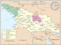 This image serves as the base for a new map.
 -
 Knowledge of German is required. The areas in Abkhazia and adjacent Georgian territory.
 -
Spanish map. Areas controlled in South Ossetia by Georgia are shown in two different shades of green.
-
 Polish map. The borders are the most accurate here, but the quality is low. It can be combined with Spanish map.
 -
 International Crisis Group (ICC) map.


Article(s): Russo-Georgian War, Background of the Russo-Georgian war
Request:
- The map is needed for the article to show the areas controlled by Georgia before 2008. First image is to be edited and the areas of the separatist enclaves controlled by Georgia shown in different colors. The symbol of Globe and the frame around the map must be removed. I don't have the knowledge of either German or Spanish but I guessed some things.
- The areas in Abkhazia (Abchasien on the map) controlled by Georgia and UN is shown on German map. UN controlled area must be shaded in the same style on the new map as it is on the German one and show the exact borders. Another map for verification is here in this source: ABKHAZIA TODAY, Europe Report N°176 – 15 September 2006, p. 27
- Spanish map depicts the situation in South Ossetia more accurately than German map. There are two shades of Green on the map of South Ossetia and both supposedly show the Georgian-governed territories, so therefore both should be combined into single colour area. But Polish map seems to have more accurate boundaries. There is a slight difference in the areas between the two maps. There are some light green areas shown on Spanish the map, that aren't shown on the Polish and ICC maps. These areas are not to be taken into consideration. --UA Victory (talk) 17:51, 11 April 2014 (UTC)
Graphist opinion(s):
- It would be great if you signed your request, I don't think many will work on it without knowing who requested it, anyway that goes for me, thanks. --Goran tek-en (talk) 17:28, 11 April 2014 (UTC)
- Sorry, I have now signed my request. This is the first time I requested a Graphics work done and the blank where I had to fill in all the details, I forgot it.--UA Victory (talk) 18:55, 11 April 2014 (UTC)
- Request taken by Goran tek-en (talk) 18:24, 25 April 2014 (UTC).
- UA Victory I have taken this request and I will gladly do it. It will take a week or maybe two before I can start to work on it. If that doesn't work for you just tell me and then maybe someone else can do it faster than that, it's all up to you, thanks. --Goran tek-en (talk) 18:24, 25 April 2014 (UTC)
- Actually, I will gladly wait until the map is made. --UA Victory (talk) 18:36, 25 April 2014 (UTC)
- Sorry, I have now signed my request. This is the first time I requested a Graphics work done and the blank where I had to fill in all the details, I forgot it.--UA Victory (talk) 18:55, 11 April 2014 (UTC)
Map of ongoing armed conflicts
-
 Map of ongoing armed conflicts. Change is requested for Egypt, China, N. Korea, S. Korea and Paraguay.

Article(s): List of ongoing armed conflicts
Request:
- Shading Egypt in red while adding China, the Koreas and Paraguay in orange. Consensus can be found on Rybec's and Greyshark's talk page. The graphists can check the article's discussion as well for more information. -- Fitzcarmalan (talk) 21:07, 11 April 2014 (UTC)
Graphist opinion(s):
Request help for someone else
-
 Need a plain, black & white PNG version of this map
 -


Article(s): Various
Request: User Soman asked in the Illustration workshop for help on an Indian election map. Because I run my os on a 486, my computer cannot handle images of that size. Can someone give him a hand? Preferably by making a SVG-map of the data provided by him. Or if he doesn't want that, a png-file (emptied of the results of 2009) of the SVG-file already posted here. Wereldburger758 (talk) 07:46, 15 April 2014 (UTC)
Graphist opinion(s):
LTE (telecommunication)
-
 World Map of country activity

Article(s): LTE (telecommunication)
Request:
- Please change the colour of India to match that f South Africa in accordance with this -- Lihaas (talk) 16:02, 15 April 2014 (UTC)
Graphist opinion(s):
- THat was easy. DoneLommes (talk) 16:35, 15 April 2014 (UTC)
LTE (telecommunication)
-
World Map of country activity
Article(s): LTE (telecommunication)
Request:
- Please change the colour of Colombia to red as it now offers commercial LTE in most of its departments.[7][8][9] or just update the whole map to match the following [10] -- pipeafcr (talk) 22:31, 15 April 2014 (EST)
Minor changes on the map at "Second Optional Protocol to the International Covenant on Civil and Political Rights"
On the map at the article Second Optional Protocol to the International Covenant on Civil and Political Rights - this map: [11] - El Salvador, Gabon and Macedonia (The former Yugoslav Republic of Macedonia) must be dark green, to update the map (these countries have become parties to the Convention).
- Source:[12]
Thanks. 2A02:2F0A:506F:FFFF:0:0:BC19:A0C0 (talk) 13:31, 16 April 2014 (UTC)
- And Poland must be added too, it has now ratified - on 25 Apr 2014. It must be dark green on the map.[13] 2A02:2F0A:506F:FFFF:0:0:BC1B:44A0 (talk) 12:50, 27 April 2014 (UTC)
Blank very-large World map request
Article(s): [[]] Request: Hi, It is possible for the world location map to be in a bigger resolution than posted as 2000px... can you try something around 20,000px. I need a map this large to zoom in to certain locations without being pixelated. The map is just perfect for what I need. Thanks — Preceding unsigned comment added by 67.86.15.72 (talk) 03:57, 17 April 2014 (UTC)
Graphist opinion(s):
- First, it would have been great if you used the --New request-- link above as it provides all the code that is needed. Also it would be appreciated if you had signed your request here.
![]() Request taken by Goran tek-en (talk) 17:41, 17 April 2014 (UTC).
Request taken by Goran tek-en (talk) 17:41, 17 April 2014 (UTC).
- You can find the big png here Worldmap location NED 50m 20000-10027. --Goran tek-en (talk) 17:41, 17 April 2014 (UTC)
![]() Done
Done
Cambridge electoral wards

Article(s): en:Cambridge
Request:
- Can someone please vectorise en:File:CambridgeWards.png (and not use Comic Sans)? By the way, where can one check if the boundaries are still valid? cmɢʟee⎆τaʟκ 22:02, 17 April 2014 (UTC)
Graphist opinion(s):
- @cmglee please check if the boundaries are valid BEFORE you request a map. this way we don't need to do the work twice (once now, and once when you find out that there are new boundaries. thanks.--Lommes (talk) 18:58, 18 April 2014 (UTC)
- The Cambridge City Council site does have a fairly basic map showing the current 14 wards.[14] -- [[ axg // ✉ ]] 19:48, 18 April 2014 (UTC)
- Edit: The user has already filed a request at the Commons Graphic Lab, which has been answered. -- [[ axg // ✉ ]] 19:52, 18 April 2014 (UTC)
- Done – combined Cambridge_UK_ward_map_2010_coloured.svg on Cambridge-Openstreetmap-08-06-13.svg as on right. cmɢʟee⎆τaʟκ 16:17, 21 April 2014 (UTC)
World locator map
Thanks for the large locator world map you uploaded!. [[15]] Is it possible adding the US states as well as the Great Lakes in it as well?
Greatly appreciated! 67.86.15.72 (talk) 12:54, 18 April 2014 (UTC)
Stanley in Africa
Article(s): Henry Morton Stanley's first trans-Africa exploration
Request:
- Details of your request go here... -- DePiep (talk) 22:30, 18 April 2014 (UTC)
Hi. Henry Morton Stanley's first trans-Africa exploration could use a nice graph. -DePiep (talk) 22:30, 18 April 2014 (UTC) Graphist opinion(s):
Location map for Telangana, India
Article(s): Telangana, Hyderabad, several others
Request:
- Please create a location map image of Telangana, similar to Andhra Pradesh's File:Location map India Andhra Pradesh.png (though it should be an SVG, not a PNG). -- Jackmcbarn (talk) 18:35, 21 April 2014 (UTC)
Graphist opinion(s):
LTE (telecommunication)
-
World Map of country activity
Article(s): LTE (telecommunication)
Request:
- Please change the colour of Greece to red as more than half of the population is covered with LTE by two carriers. link 1
link 2 -- Sergiogr Sergiogr (talk) 11:20, 22 April 2014 (UTC)
Graphist opinion(s):
- Not easy. 99% of the work will be identifying which of the hundreds of "path"s in the file correspond to Greece. It would have been so much easier if the SVG contained comments to identify the countries. Maproom (talk) 20:35, 22 April 2014 (UTC)
- Done. By the way, you can right-click somewhere on an SVG and hit Inspect element (at least in Firefox) to see which path it is. Jackmcbarn (talk) 01:26, 25 April 2014 (UTC)
- Thank you, Jackmcbarn, for the tip! I'll be using that. Maproom (talk) 07:09, 25 April 2014 (UTC)
Mashonaland East districts - map error

Article(s): Districts of Zimbabwe and Mashonaland East Province
Request:
- Please, could the districts be correctly labeled. The current map has an obvious labeling error. It lists two districts as "Murehwa". The probable cause is that the two districts used to be a single district named "Murehwa". About 1978 Murehwa District was split into a reduced Murehwa District to the south and the new Uzumba-Maramba-Pfungwe or UMP District to the northwest. This can be seen on the larger map: Davies, D. Hywel and Wheeler, R. G. "Zimbabwe Administrative Areas (as used for the basis of the Enumeration Areas for the Population Census of 1982)". Central Statistical Office, the Department of the Surveyor-General, Zimbabwe.
{{cite web}}: CS1 maint: multiple names: authors list (link). This can also be seen (using some interpretation) on the constituency map at File:Mashonaland East-constituency2008.gif and on the UN-OCHA map of Uzumba-Maramba-Pfungwe, but it is most clearly seen on the maps at http://www.mapmakerdata.co.uk.s3-website-eu-west-1.amazonaws.com/library/stacks/Africa/Zimbabwe/Mashonaland%20East/index.htm. --Bejnar (talk) 19:24, 22 April 2014 (UTC)
Graphist opinion(s):
- Done. The anti-aliasing is not as good as I would like, but that's what happens when I use PaintShop Pro, slanted text, and a bitmap. Maproom (talk) 20:20, 22 April 2014 (UTC)
LTE (telecommunication)
-
World Map of country activity
Article(s): LTE (telecommunication)
Request:
- Please change the colour of Pakistan to match that of India in accordance with this -- - sms- talk 09:20, 23 April 2014 (UTC)
Graphist opinion(s):
- Done. Maproom (talk) 09:44, 25 April 2014 (UTC)
Ward map for King, Ontario

Article(s): Municipal government in King, Ontario; King, Ontario; King City, Ontario; Nobleton, Ontario; Schomberg, Ontario; and others
Request:
- An electoral ward map for the township of King, Ontario, which is in the Regional Municipality of York. The township has a ward map on its website (see this). I'd prefer something with simpler or more muted colours (ie - not as saturated). Mindmatrix 00:50, 25 April 2014 (UTC)
Graphist opinion(s):
- Done See image above. @Mindmatrix: please comment. Philg88 ♦talk 10:06, 1 May 2014 (UTC)
- Thank you so much for doing this. I've already added it to a few articles. Would it be possible to have a version without the legend, and possibly a blank version with only the municipal boundary indicated? Mindmatrix 14:38, 1 May 2014 (UTC)
- I just noticed a small issue. The label for Richmond Hill is almost entirely in the area representing Vaughan (the area south of King, with eastern and western boundaries a southward extension of those for King). Richmond Hill is the area east of Bathurst Street, with northern boundary at Bloomington Road (just north of King's southern boundary). I'm not sure where you could squeeze in the label, though, so the way you did it may be the only option. Could you also make the text for the municipal labels horizontal for consistency with others, or does that look awkward in the final map? Mindmatrix 14:57, 1 May 2014 (UTC)
 Working Philg88 ♦talk 15:46, 1 May 2014 (UTC)
Cross-sections, Antarctic and Tibet/Himalaya
-
Cross-section/transect comparison of Tibetan Plateau and Antarctica
Article(s): Antarctica
Request:

- It would be great to have a map comparing the heights of the Tibetan Plateau and the Antarctic, to scale (obviously the vertical scale will have to be much larger than the horizontal scale, but the same scales for both locations). The height of Antarctica is really important to the regional circulation and other features, and it would be great to have a vivid visualization of how tall it is. A N-S transect for Himalaya/Tibetan Plateau, and a 90W-90E one for Antarctica, would work well.
The individual cross-sections, seperately, would make useful and informative images in their own rights, and encourage people to modify them to present geological and biozone information.
Showing the under-ice ground surface is nice, but not essential. See the metadata of the image on the right for a data source.
Antarctica example: http://lima.nasa.gov/antarctica/ Himalayan example: http://sciencythoughts.blogspot.co.uk/2012/11/how-bar-headed-geese-cross-himalayas.html
-- HLHJ (talk) 11:49, 28 April 2014 (UTC)
Graphist opinion(s):
South West England

Article(s): South West England and many others
Request:
- Only nine years late... I've noticed that this map does not show the Isle of Wight (for comparison see File:EnglandSouthEast.png). It needs to be added - it's specifically mentioned at, for instance, West Country dialects. -- Ghmyrtle (talk) 18:43, 29 April 2014 (UTC)
Graphist opinion(s):
Small edit to error on a map of Boston
-
 SVG version
 -
 PNG version


Article(s): voy:Boston
Request:
- Please change the label "Missionary Hills" to the correct name: "Mission Hill" –sumone10154(talk) 01:04, 30 April 2014 (UTC)
Graphist opinion(s):
On the UN Ukraine vote map for Europe, Greenland should appear green (like Denmark) not grey
-
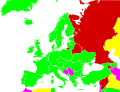 United Nations General Assembly resolution 68-262 vote in Europe

Article(s): United Nations General Assembly Resolution 68/262
Request:
- Summary: On the above map, please change the colour of Greenland from grey to green (the same colour as Denmark and the rest of Western Europe).
- Details: I've already posted a detailed justification for this request on the article's Talk Page, in this section. To avoid duplication, I haven't copied it to here, but please feel free to do so if you think that would help. Tlhslobus (talk) 03:19, 30 April 2014 (UTC)
Graphist opinion(s):
Languages of Indonesia
-
 Indonesia Ethnic Groups Map English
 -
 Indonesian Province

![[11]](https://en.wikipedia.org/wiki/File:ICCPR-OP2-map.PNG)
![[15]](https://en.wikipedia.org/wiki/File:Worldmap_location_NED_50m_20000-10027.png)
Article(s): Languages of Indonesia
Request:
- Please add province boundary in Indonesia Ethnic Groups Map. -- Kaiyr (talk) 16:41, 1 May 2014 (UTC)
Graphist opinion(s):