
Talk:COVID-19 pandemic in South Africa: Difference between revisions
→Needs updating: Reply Tags: Mobile edit Mobile web edit Advanced mobile edit |
→National infection rate: new section |
||
| Line 216: | Line 216: | ||
::The template... not sure. Perhaps if you have a source you may update its data, however i do not object in having it removed completely. [[User:Leaderofthewave.|Leaderofthewave.]] ([[User talk:Leaderofthewave.|talk]]) 11:57, 5 July 2020 (UTC) |
::The template... not sure. Perhaps if you have a source you may update its data, however i do not object in having it removed completely. [[User:Leaderofthewave.|Leaderofthewave.]] ([[User talk:Leaderofthewave.|talk]]) 11:57, 5 July 2020 (UTC) |
||
== National infection rate == |
|||
The infection rate appears to have peaked around 20 July when the confirmed weekly infections reached 89,529 and have been dropping daily since then. This can be seen from <ref>https://www.worldometers.info/coronavirus/country/south-africa/</ref> and <ref>https://aatishb.com/covidtrends/</ref> which I monitor daily. |
|||
Revision as of 05:46, 10 August 2020
| This is the talk page for discussing improvements to the COVID-19 pandemic in South Africa article. This is not a forum for general discussion of the article's subject. |
Article policies
|
| Find medical sources: Source guidelines · PubMed · Cochrane · DOAJ · Gale · OpenMD · ScienceDirect · Springer · Trip · Wiley · TWL |
| Archives: 1 |
| This article is of interest to the following WikiProjects: | |||||||||||||||||||||||||||||||||||||||||||||||||||||||||||||||||||||
| |||||||||||||||||||||||||||||||||||||||||||||||||||||||||||||||||||||
.svg)


| This article is written in South African English, which has its own spelling conventions (colour, realise, analyse) and some terms that are used in it may be different or absent from other varieties of English. According to the relevant style guide, this should not be changed without broad consensus. |
Gauteng map?

Hi, all. The Gauteng Health Department has now introduced a map depicting the amount of COVID-19 cases in the respective metros and districts of the province. Can somebody maybe create a freely-licensed map that can be included in the article? See here and here. Kind regards. LefcentrerightTalk (plz ping) 16:55, 23 April 2020 (UTC)
- Is there a .gov.za site that regularly gives updates on these numbers? Twitter.com keeps giving me errors, and the EWN site doesn't seem to have a category for this to check. The WC and NW premiers are regularly giving updates at https://www.gov.za/media-statements and there are also maps at https://www.westerncape.gov.za/department-of-health/news -- Jeandré, 2020-04-24t10:49z
Deaths more than the weekly average?
[Can] we include the related deaths not from covid the same [...] timeframe -- 197.95.177.213, 2020-04-23T18:19:22 [1]
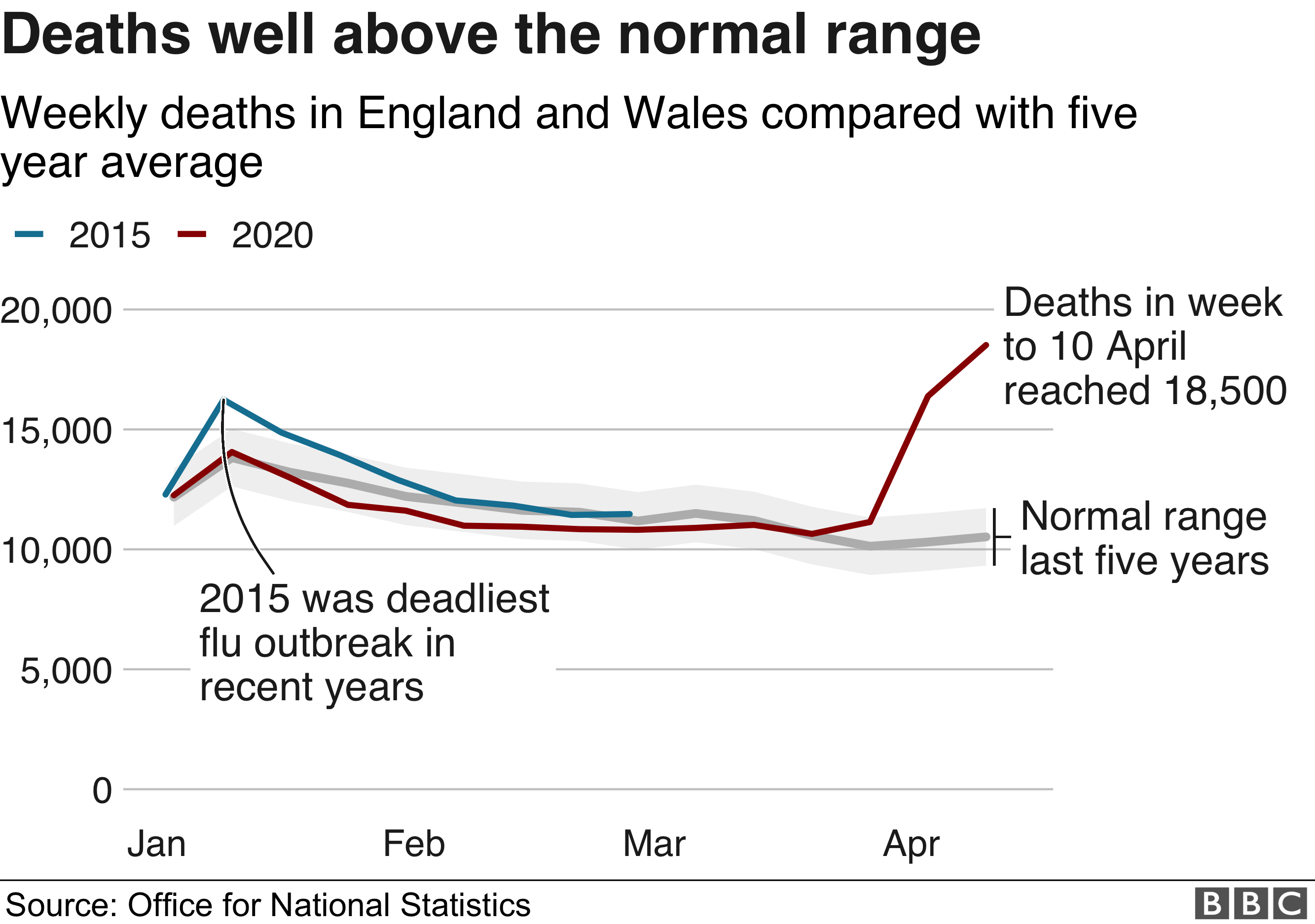
- I think this is related to 2020 coronavirus pandemic in South Africa#Reduced deaths from non-COVID-19 causes, and asking for average deaths over the same time in previous years. Anyone know if StatsSA does this, the way ONS in the UK does: https://ichef.bbci.co.uk/news/624/cpsprodpb/16645/production/_111871719_mortality_01-nc.png -- Jeandré, 2020-04-23t18:47z
- The South African Medical Research Council does this. Please help keep an eye on their news page for reports like https://www.samrc.ac.za/news/report-weekly-deaths-south-africa https://www.samrc.ac.za/sites/default/files/files/2020-04-29/WeeklyDeaths21April2020.pdf -- Jeandré, 2020-05-04t09:50z
Color scheme C?
I'm uploading the maps using color scheme C. Shall we use it also for the charts?
Confirmed cases:
Active cases (eventually only stay in charts and historical or timelapse maps):
Recoveries (vaccinated?):
Deaths:
Totals not adding up.
I am having a problem with the statistics provided on website https://en.wikipedia.org/wiki/COVID-19_pandemic_in_South_Africa#Provinces_and_municipalities on the subject, "COVID-19 confirmed cases in South Africa by province", in that the total cases and new cases per day, doesn't add up. — Preceding unsigned comment added by 160.119.224.156 (talk) 21:09, 15 May 2020 (UTC)
- Sometimes daily changes in numbers are not reported - we're using the official sources, but there's usually very poor reporting on data cleaning (when it turns out someone didn't actually test postitive, or subsequent tests showed the initial test was wrong), so we can't just subtract figures to add missing numbers. If there's a zero, then that's what the source reported - if the cell is empty then the data wasn't reported.
- If not missing, but incorrect: which dates?
- The NICD images, and gov.za/speeches HTML seem to be good about not changing pages without indicating that they've made changed, because they have version numbers in file names and instead point to newer versions of files, but some other sites are a mess. -- Jeandré, 2020-05-16t09:17z
[South Africa daily CoViD-19 medical] cases chart not matching the total number in header.
Hi, Header today is: Total new cases 15,515. that DOES match the Latest tweet, but the daily case graph is missing the latest count form May 17 of 1,160 cases. it stops at yesterdays 831 new cases. as does the total over time chart.
Latest count: https://twitter.com/DrZweliMkhize/status/1262106273128087552?s=20
the SA department of health does terrible maths themselves, so that might cause hassles in your data feed. Thanks! Goldfinger100
Goldfinger100 (talk) 04:58, 18 May 2020 (UTC)
- Template:COVID-19 pandemic data/South Africa medical cases chart updated manually for 05-17 and 05-18. Anyone know how to do it automatically from verifiable sources? I can't verify anything from Twitter because the domain doesn't load for me. -- Jeandré, 2020-05-19t07:34z
- Template:COVID-19 pandemic data's ref fixed, someone else updated the data for 05-1
78. -- Jeandré, 2020-05-19t07:38z
- Template:COVID-19 pandemic data's ref fixed, someone else updated the data for 05-1
Diagram of recoveries by age?
Is it possible to include a CoViD-19 recoveries by age in South Africa diagram similar to the CoViD-19 deaths by age in South Africa diagram? I don't know if recoveries-by-age data exists. Thanks. —Bruce1eetalk 09:58, 20 May 2020 (UTC)
- I don't know of recoveries- or cases-by-age stats. Recent Mkhize releases like https://www.gov.za/speeches/minister-zweli-mkhize-confirms-total-17-200-cases-coronavirus-covid-19-20-may-2020-0000 only split deaths by age. -- Jeandré, 2020-05-20t10:33z
- Pity, I think that would be a very useful statistic. Anyway thanks, and for all your hard work on this page. —Bruce1eetalk 11:35, 20 May 2020 (UTC)
Graph comparing deaths in other countries.

Re [2]. Which countries should be in this graph? I initially chose
- the USA as the country with the highest number of cases, a good percentage of testing, and a terrible "lockdown".
- Italy for being the 1st country to pass China, and a similar semi stay-at-home situation to SA.
- China for being an example of an actual lockdown, and for a country without any warning.
- South Korea and Taiwan as examples of no lockdown, but excellent testing, tracing, and isolation. Also because SK's initial arc was so similar to SA's.
- Iceland and New Zealand because of their proactive nature and actually stopping their outbreaks, instead of choosing short term financial gain by sacrificing some of their older citizens.
Should the chosen countries instead be the top few, and/or other African countries similar to SA?
I'd really like SK, NZ, Iceland, and/or Taiwan in there to show what a good approach can do tho. -- Jeandré, 2020-05-21t09:57z
- Such a graph isn't actually necessary within the scope of this article. No other country's articles have one to my knowledge. However, that isn't a strong enough reason for this article to not have such a graph. An important thing in statistical standards is to plot elements with an objective, clear and strong relationship between them or ones with a clear base. For such a graph, the most objective elements (countries) directly in relationship with South Africa are other African countries (as they are in the same continent = good base level). The countries you have listed above with your reasoning for choosing them are very subjective and hence not according to statistical standards. In a nutshell, we cannot choose elements which we think are good, they must be ones which establish a coherent relationship with the main element. I have thought of other base levels but none of them are as strong as other African countries. •Shawnqual• 📚 • 💭 02:22, 22 May 2020 (UTC)
South Africa is very different from other African countries historically, economically, and in terms of medical capacity.
By this logic, all the countries chosen above (Iceland, Taiwan, China etc....) are just as different if not more or less from South Africa as well.Brazil is probably closer
Again, very, very subjective! I repeat, there needs to be an objective relationship to the elements chosen. African countries are all in the same continent, does not matter how different their situations are, they are in the same continent, which can be used as an objective base level. Using countries with extremes makes little sense, it is bound to make the main element (South Africa in the graph) look minuscule in comparison! That is not how graphs are made. •Shawnqual• 📚 • 💭 19:50, 22 May 2020 (UTC)
Lead: include estimates?
Hello. @Jeandré:
Thank you for including the projections:
"Scientific experts and the the Department of Health presented data on 19 May 2020 estimating 475 confirmed COVID-19 deaths by the end of May, and more than 40000 deaths by November.[1][2] There could also be insufficient ICU beds by June or July.[1]"
The projection time horizon of 6 months, until November 2020, is relatively far. Estimates that far into the future are very likely to be inaccurate/wrong. The lead/introduction is not for speculative information which could engender unwarranted panic. I am going to revert your projection introduction section. Ear-phone (talk) 21:11, 21 May 2020 (UTC)
@Bobbyshabangu: @Netha Hussain: @5 albert square: @Shawnqual: @Discott:
References
- ^ a b Hunter, Qaanitah (2020-05-19). "Grim Covid-19 projections for SA: 40 000 deaths, 1 million infections and a dire shortage of ICU beds". 24.com. Retrieved 2020-05-20.
- ^ "New coronavirus projections from Mkhize and top scientists". BusinessTech. 2020-05-20. Retrieved 2020-05-21.
- I didn't see this section when I reinstated some of the estimates. The information has been released by the DoH tho, and I think it's probably one of the most important things in the article. Wikipedia:Manual of Style/Lead section#Comparison to the news-style lead has an example with an estimate: "Others estimate 8,000 died within two weeks and another 8,000 or more have since died from gas-related diseases." -- Jeandré, 2020-05-22t17:21z
- Yes, but note how the example is based in the past (died, not will die) and (have since died, not would have died). An estimate like the one you are putting forth would make sense if it were to be added somewhere in September or October, not this early in May, and especially not in the lead.•Shawnqual• 📚 • 💭 19:54, 22 May 2020 (UTC)
- I didn't see this section when I reinstated some of the estimates. The information has been released by the DoH tho, and I think it's probably one of the most important things in the article. Wikipedia:Manual of Style/Lead section#Comparison to the news-style lead has an example with an estimate: "Others estimate 8,000 died within two weeks and another 8,000 or more have since died from gas-related diseases." -- Jeandré, 2020-05-22t17:21z
- The scientitis who developed the model state, "“There are, however, many factors that could cause deviations from these projections, including individual behavior change and tighter (or looser) restrictions than we currently assume.” “The projections we have made are based on a simplified, and fairly pessimistic, set of assumptions about people's behaviour.”".
- For a neutral point of view, these caveats would need to be added in the interests of fair and proportionate representation of information. I am going to revert your edit and leave the info. in the body of the article.Ear-phone (talk) 23:27, 22 May 2020 (UTC)
- @Bobbyshabangu: @Netha Hussain: @5 albert square: @Shawnqual: @Discott:
- I am really not too sure how to proceed on this so I checked for precidence on other similar pages for guidance. The article on the UK has its own "modeling" section on estimates and puts all that content there from what I can currently see. The USA article lead seems to focus more on the Trump administrations eccentricities during the crisis with general warnings about "accelerated transmissions" and also puts the predictions in its own section. The closest the Indian article lead comes to predictions is a mention on grow rates. Judging from this small sample of the better developed COVID 19 country articles I would say the current precedence is to not include predictions but rather put that in its own dedicated section focusing on "modeling" the pandemic's growth.--Discott (talk) 14:40, 26 May 2020 (UTC)
Map, recoveries, colour mistake.
Eastern Cape has over 1000 recoveries SouthAfricanCitizen (talk) 18:58, 23 May 2020 (UTC)
- I'll fix it with the 05-23 update which I'm doing now. Feel free to try out free SVG editors like InkScape to edit images like these (use the objects view to select parts in the provincial maps which you can't just click). -- Jeandré, 2020-05-23t19:43z
SA maps without numbers.
I'll have limited internet access from now on, so may not be able to update the maps. I've uploaded versions of the current maps without numbers or dates. Feel free to update just the colors, or also inlcude the numbers and date again (by downloading and editing a previous version at commons), using an SVG editor like InkScape. -- Jeandré, 2020-05-26t12:41z
Lockdown section
I think that given the length and detail of the "Preparations and response" section, in addition to the high level of public interest in the lockdown, that the section should be broken up a bit. Most specifically that the National lockdown should now have its own dedicated section.--Discott (talk) 14:54, 26 May 2020 (UTC)
Maps : No numbers?
Is my wiki somehow acting up or are there no numbers of confirmed cases on provinces? SouthAfricanCitizen (talk) 11:16, 28 May 2020 (UTC)
- Hello @SouthAfricanCitizen:. @Jeandré:, the creator of the daily numbered maps is away. Ear-phone (talk) 12:02, 30 May 2020 (UTC)
👊🏿 SouthAfricanCitizen (talk) 14:07, 30 May 2020 (UTC)
Data table deaths split by Province
I see there is a data table in the section on Statistics which splits the cases by Province but there is just a total deaths listed as one number. Is it possible to get the daily deaths data split by Province as well? Anyone know where I can find that? Thanks 163.202.51.15 (talk) 15:27, 4 June 2020 (UTC)
That would be quite redundant as we already have a map, on the infobox showing the provincial data of cases, deaths, and recoveries. Leaderofthewave. (talk) 10:42, 5 June 2020 (UTC)
- Well, the table will also contain data of how the deaths distribution progressed over time whereas your infobox solution only shows the breakdown for the latest numbers. 163.202.51.19 (talk) 16:04, 17 June 2020 (UTC)
- @163.202.51.19 You could go to the source, https://sacoronavirus.co.za/, where you'll find every day represented by a picture of a map with a date and the essential national figures. When clicking on any of those maps, it'll give you the provincial breakdown of cases, deaths and recoveries for each day; but you'll not find the table that you're looking for. The solution would be to copy and paste those numbers into a spreadsheet until you've created the table yourself - as I have done. With the greater number of Wikipedia editors, arguing about stuff such as tables and graphs and whatnot, will not bring you anywhere. Having futilely spent a lot of time of arguing about a particular thing which I know a lot about, with them clearly being 99% ignorant about it, taught me a simple lesson: on Wikipedia, we unequivocally have, right under our noses, far more genuises happily tapping away on computer keyboards than we've ever expected. Timflamink (talk) 23:02, 18 June 2020 (UTC)
Patients
Hello @Leaderofthewave.: A patient may be defined as, "a person receiving or registered to receive medical treatment.". Not all those who died from COVID-19 were receiving or registered to receive medical care e.g. some in nursing homes. I will change from patients to people for deaths, in the introduction. Ear-phone (talk) 13:54, 11 June 2020 (UTC)
Number of deaths on 4 June
The total number of deaths on 4 June 2020 was actually 848. But the page has this number at 858. This is an actual error in Wikipedia and it should be corrected. 163.202.51.19 (talk) 16:05, 17 June 2020 (UTC)
Numeric style
Leaderofthewave. why did you restore the numeric style with gaps? This is not standard style for numbers. Wikipedia:DIGITS Greenman (talk) 20:10, 25 June 2020 (UTC)
@Greenman: For consistency. As throughout the whole article they are formatted as such. Leaderofthewave. (talk) 23:57, 25 June 2020 (UTC)
- Leaderofthewave. Any objections to using the standard style? The space is used in numbers in Afrikaans, which is where I think the confusion came from, but it shouldn't be used in English. Greenman (talk) 17:33, 26 June 2020 (UTC)
@Greenman: Which "standard style" are you referring to? From my understanding of MOS:NUMBERS gaps, and commas can be used interchangeably to format strings of digits. Leaderofthewave. (talk) 17:40, 26 June 2020 (UTC)
- Leaderofthewave., thanks for changing! Gaps are also acceptable, but all the COVID-19 articles I've come across use commas, so this seems preferable. Greenman (talk) 23:52, 27 June 2020 (UTC)
Numbers on infobox maps
Is it necessary to continue our '"practice" of numbering the maps? As most articles on this subject only make use of colours and a corresponding legend. Furthermore, the provincial breakdown can be found in a template under the Statistics subsection. Leaderofthewave. (talk) 22:09, 28 June 2020 (UTC)
Needs updating
Hello, all. Thanks for all the work being done! Some parts of this article are in need of an update, especially these images:
- File:CoViD-19 pandemic cases in South Africa, Western Cape municipalities.svg
- File:CoViD-19 pandemic recoveries in South Africa, Western Cape municipalities.svg
- File:CoViD-19 pandemic map, cases in South Africa, North West municipalities.svg
- File:CoViD-19 pandemic cases in South Africa, Gauteng districts.svg.
All of them were last updated in May. I would love to do it, but I don't know how. Maybe @Leaderofthewave.: can help?
Lastly, this template Template:COVID-19 pandemic data/South Africa, Western Cape medical cases was updated a month ago. Is it still necessary to be included in the article or should it be dropped?
Have a nice Sunday. Best, LefcentrerightDiscuss 21:47, 4 July 2020 (UTC)
- @Lefcentreright: you could try downloading the images in question as SVGs from commons, then make use of an SVG editor, there's plenty but personally I use Inkscape (about 80 MB in size).
- The template... not sure. Perhaps if you have a source you may update its data, however i do not object in having it removed completely. Leaderofthewave. (talk) 11:57, 5 July 2020 (UTC)
National infection rate
The infection rate appears to have peaked around 20 July when the confirmed weekly infections reached 89,529 and have been dropping daily since then. This can be seen from [1] and [2] which I monitor daily.
- C-Class COVID-19 articles
- Low-importance COVID-19 articles
- WikiProject COVID-19 articles
- C-Class Disaster management articles
- Low-importance Disaster management articles
- C-Class medicine articles
- Low-importance medicine articles
- C-Class pulmonology articles
- Low-importance pulmonology articles
- Pulmonology task force articles
- All WikiProject Medicine pages
- C-Class South Africa articles
- Mid-importance South Africa articles
- WikiProject South Africa articles
- C-Class virus articles
- Low-importance virus articles
- WikiProject Viruses articles
- Wikipedia articles that use South African English