
Wikipedia:Picture peer review: Difference between revisions
No edit summary |
→Suggestions for FPC and VPC: moved to FPC |
||
| Line 13: | Line 13: | ||
{{Wikipedia:Picture peer review/Sunflower disk florets}} |
{{Wikipedia:Picture peer review/Sunflower disk florets}} |
||
{{Wikipedia:Picture peer review/Architecture in Amsterdam}} |
{{Wikipedia:Picture peer review/Architecture in Amsterdam}} |
||
{{Wikipedia:Picture peer review/Royal Caribbean Cruise Ship}} |
|||
{{Wikipedia:Picture peer review/Western Sushi}} |
{{Wikipedia:Picture peer review/Western Sushi}} |
||
{{Wikipedia:Picture peer review/Disembarking Shermans}} |
{{Wikipedia:Picture peer review/Disembarking Shermans}} |
||
Revision as of 16:46, 11 February 2009
|
Picture peer review was a staging area for potential Featured Picture Candidates (FPCs). This review was a useful "spot check" before making a formal FPC nomination – a working area where you can get some creative feedback, request help with useful pictures that might need minor editing, or advice with finding the best article that they illustrate – giving that nomination its best possible chance of promotion. Note: "peer review" usually implies a group of authoritative reviewers who are equally familiar with and expert in the subject. The process represented by this page is not a formal academic peer review in that sense. Images that undergo this process cannot be assumed to have greater authority than any other. For general advice on editing pictures prior to uploading, see Wikipedia:How to improve image quality. For the specific criteria against which FPCs are judged, see Wikipedia:What is a featured picture?
|
Featured picture tools: |
Sizes of the planets and stars


It's a mind-blowing sequence. The viewer is invited to reflect on stars so large their size strains the limits of comprehension.
- Creator
- Dave Jarvis
- Nominated by
- StevenJohnston (talk) 21:12, 10 February 2009 (UTC)
- Comments
- In general, it really is a nice, easy to understand comparison, but I have three concerns. There's quite a lot of leniency with images citing sources, but something like this, relying heavily on statistical information, really needs a link or some sort of citation on the description page. The credit at the bottom of the image also belongs on the description page, not as part of the image itself. Finally, I'd check the projection type for the map used on Earth; it looks stretched. For something like this, you need to use an orthographic projection. If those three things are fixed, I'd definitely consider an FP nomination. Thegreenj 23:01, 10 February 2009 (UTC)
- I agree that the Earth image is a bit squashed. I think it was done that way to avoid preferentially showing one hemisphere rather than another. I've had a little attempt at replacing the earth disc by a satellite image of the earth (see, for example, the images on blue marble article) but it doesn't look quite right because the lighting in the real-world image is from the side (if you have the north pole at the top) but in the image here it'd need to be lit from above to fit in with the other planets on the row. One alternative would be to put a real-world image with the north-south axis skewed to one side but I think that people wouldn't like that just as much as the squashed image. My image manipulation expertise don't extend to wrapping a map (from here for example) onto a sphere and then lighting it from above to get the shadow to look right. It should be simple enough to do using some 3D image software but I'm unable to do it myself. Anyone else? StevenJohnston (talk) 12:42, 11 February 2009 (UTC)
- It looks to me like most (if not all) planets have errors in the texture mapping causing distortion of the surface features. Mars' polar surface features are too large, Venus, Earth and Uranus have an incorrect planar texture mapping and Jupiter's texture is distorting all features to half their width horizontally. These problems would all be easy to fix with the original 3D file... - Zephyris Talk 21:34, 11 February 2009 (UTC)
- I've linked to an updated and improved version that coincidentally addresses almost all of the issues that have been raised. Opinions please. StevenJohnston (talk) 17:57, 12 February 2009 (UTC)
- Seconder
Wikipedia:Picture peer review/STS-123 launch new
Hong Kong Night Skyline (Realistic Exposure)


This is a restitch and a newer version of the current File:Hong Kong Night Skyline.jpg. I wish to delist and replace it. I believe this version has a more realistic exposure, given that the time of shooting is around 8:00 PM, completely after Civil Twilight. This version shows less mountains on the bottom left, but every notable architectual building is still preserved. I also adjusted the colour balance to match what I have observed every day ... Slight warm. I would like to collect more opinion, please inspect both images at full screen or full size, thank you. I edited this photo under a 400 cd/m^2 monitor, and I think this brightness is enough to see the detail and feel the atmosphere of "Night".
- Creator
- Base64
- Comments
- I mean, yea sure, go ahead and offer a new nom if you'd like. Personally I prefer the "less realistic" one just because it's cooler and shows more. Just my opinion though. ~ ωαdεstεr16«talkstalk» 03:22, 18 February 2009 (UTC)
- Seconder
Sarah Palin
-
 Alaska Governor Sarah Palin at Dover, New Hampshire.
 -
 Alaska Governor Sarah Palin in O'Fallon, Missouri.
 -
 Alaska Governor Sarah Palin prepares for a public service commercial to be aired during the Super Bowl, Jan. 25, 2009.
 -
 Camp Buehring, Kuwait - Alaska Governor Sarah Palin talks to Nome, Alaska, native 1st Sgt. Dewey Green. Palin visited the Soldiers of 3rd Battalion, 297th Infantry Regiment, Alaska National Guard to learn about their mission in Kuwait.


I'm hoping to eventually bring the article Sarah Palin to featured status (I know this will be difficult with such a controversial subject). But I'd like to have a featured photo to place in the article. We have plenty of photos of Governor Palin, but many are of low quality. The highest-resolution pics are military photos, such as the lead photo, and this one and we also have some fairly dynamic photos from the 2008 presidential campaign, but unfortunately they are of kinda low resolution (see gallery above).
I'm hoping on some feedback on these photos, and what I should look for in determining a possible featured photo. In making these selections, I looked at other featured photos of politicians, especially this one.
Any constructive feedback welcome, thanks! Also any help fixing the format of this nomination page, which I seem to have screwed up but can't figure out how to fix. :) Kelly hi! 00:20, 5 February 2009 (UTC)
- Creator
- Airman 1st Class Kristin High
- Comments
- Maybe use File:Sarah Palin Kuwait 13a.jpg for featured?--King Bedford I Seek his grace 05:14, 17 February 2009 (UTC)
- Not sure if FPC will accept the lighting or the guy's face in the background. ~ ωαdεstεr16«talkstalk» 03:28, 18 February 2009 (UTC)
- IMO the best among these is the one from Missouri --Muhammad(talk) 16:56, 19 February 2009 (UTC)
- Seconder
MetLife Building

Striking features of this photo include the sky color, complimentary cloud patterns, excellent composition and color balance, and long depth of field. The composition is such that the unusual shape of the building and its proximity to Grand Central Terminal are clearly portrayed. The long depth of field shows details from the very top of the building (including the logo) and details from the Grand Central Terminal facade are in excellent focus and especially sharp. Furthermore, this photo is included in the MetLife Building article and helps the reader visualize the proximity of the building with Grand Central Terminal, as discussed in the article.
- Creator
- Jnn13
- Comments
- Great photo (and a surprisingly old one, given its high quality). I'm concerned it may work better artistically than encyclopedically however. The Met Life building is cut off on the side and bottom, and little of Grand Central is visible. I note the skyscraper has two levels -- I don't know what to call them -- where the facade is indented and large supporting columns are visible. This is an important architectural element but only one of them is visible in this picture. Yes, I realize it's New York City and a challenging place to photograph, but we do have other pictures in the article that give nearly a top to bottom look of the Met Life Building. It is a compelling picture, I grant you that, but given that it's such a prominent, commonly photographed location, I would expect folks on FPC to be very demanding. I wouldn't rule out a nomination though, if you are confident about it. Fletcher (talk) 03:28, 5 February 2009 (UTC)
- Thanks for the fair feedback. My initial reaction was that this photo would pique a viewer's curiosity and compel the viewer to read the article ("...being eye-catching to the point where users will want to read its accompanying article." - as per Wikipedia:Featured picture candidates. I don't know enough about the architectural significance of elements in the photo to argue either way. Thanks for the great review! Jnn13 (talk) 04:58, 5 February 2009 (UTC)
- I agree with Fletcher. It is an artistic and visually appealing photo; kudos on your work. But I don't really see it passing FPC because of its artistic nature (the angle it's taken at, for one). I'm unsure if you live in NYC or will be visiting again in the future, but the article lacks a full shot of the building from Park Ave. A shot that includes Grand Central and the full building (best done if you stitch a couple zoomed shots together rather than taken one shot zoomed out) would easily become the main image of the page and would be something to put up at FPC. I'd even be willing to stitch the images if you don't have any software to do that. Also, I'm not a Commons FPC regular, but they do judge images on artistic merit. Maybe a trip over there is in order? ~ ωαdεstεr16«talkstalk» 16:54, 11 February 2009 (UTC)
- Thanks - already in the Commons. A shot of the whole building is especially tough, since the bottom portion (which is actually rectangular, not octagonal like the upper tower) is surrounded by tall buildings on all sides. I had not thought of stitching together a couple of shots - I will try that out next time the clouds remotely mirror the photo! Saw your photos, BTW - nice. —Preceding unsigned comment added by Jnn13 (talk • contribs) 03:03, 13 February 2009 (UTC)
- I'm not an artist, I don't take the best pictures (I submitted one captured by a cell phone above this), but I do know this. That image is very well taken, the angle is impeccable, and like any good image, you want to take a good look before scrolling onward. I especially like that fancy building (Grand Central Station) in the foreground, with its detailed little statues... it adds fantastic contrast to the sleek, modern MetLife building in the background. In fact, the Grand Central Station almost throws in an old-world charm. These are within miles from each other, old meets new, ect. It is a very appealing photograph, and is quite enjoyable to look at. In short, it's one heck of an imag! Great job! I commend whoever took it --TurtleShroom! :) †Jesus Loves You and Died for you!† 18:28, 11 February 2009 (UTC)
- Seconder
Craig Brackens layup

It is a wonderful image of a basketball layup.
- Creator
- SD Dirk
- Nominated by
- Showtime2009 (talk) 09:57, 31 January 2009 (UTC)
- Comments
- This picture is not likely to succeed at FPC because of some uniform and very prominent weirdness and CCD blooming. That said it has high EV for the players and would make a great valued picture candidate. MER-C 11:07, 1 February 2009 (UTC)
- Seconder
Mount McLoughlin, Oregon

I thought that this was a pretty good picture and was just wondering if possibly it was suitable to be a featured picture.
- Comments
- Comment. Pretty, but the mountain is out of focus and the image has purple fringing (which, I've learned, is what you get when you use a point-and-shoot digital camera). Spikebrennan (talk) 20:58, 27 January 2009 (UTC)
- Seconder
Highland Park Dentzel Carousel

I took the picture and thought it was good; it has a nice perspective, and I'd like some comments. Thanks!
- Creator
- Dudemanfellabra
- Nominated by
- Dudemanfellabra (talk) 23:24, 24 January 2009 (UTC)
- Comments
- Comment. I assume that the picture is being offered as being an encyclopedic depiction of the carousel shelter house. A problem is that the composition focuses on the fountain rather than the building, and not all of the building is in the shot. Spikebrennan (talk) 21:00, 27 January 2009 (UTC)
- Seconder
Sunflower disk florets


- Reason
- Good quality and EV. No other images in the articles display the details that this image displays.
- Articles this image appears in
- Sunflower, Asteraceae
- Creator
- Muhammad
- Support as nominator --Muhammad(talk) 19:10, 23 January 2009 (UTC)
- Comment Few problems to fix first. There are "reflections" on all four sides that need to be cropped out (typical artefact of the focus stack). The shadows and highlights are both clipped, assuming you are using CombineZM it seems to inadvertently increase the contrast during the stack process. If you are shooting from raw reduce the contrast, stack, then fine tune it afterwards. Noodle snacks (talk) 07:54, 24 January 2009 (UTC)
- Unfortunately, I didn't shoot raw. Would just cropping the reflections be fine? I can't believe I didn't see those. --Muhammad(talk) 10:47, 24 January 2009 (UTC)
- Can you reduce the contrast in the jpgs before doing a restitch? The blown highlights and clipped shadows are pretty substantial at the moment. I'd recommend shooting RAW just for the extra dynamic range you get. Noodle snacks (talk) 11:05, 24 January 2009 (UTC)
- Unfortunately, I didn't shoot raw. Would just cropping the reflections be fine? I can't believe I didn't see those. --Muhammad(talk) 10:47, 24 January 2009 (UTC)
- I reduced the contrast by 35 on each of the pictures, stacked and downsampled. Is it better? I have uploaded a slightly smaller temp version without any other adjustments made. --Muhammad(talk) 07:20, 27 January 2009 (UTC)
- Highlights are still quite blown, but not much chance of recovery without raw by the look of it. The blown highlights aren't immediately obvious just looking at the image though, so as long as no one notices then you should have a decent chance at success if you pick your article(s) and caption correctly (to avoid the inevitable "cut-off" complaints)
- Seconder
Architecture in Amsterdam

Highly-detailed and has EV
- Creator
- Massimo Catarinella
- Nominated by
- Massimo Catarinella (talk) 12:58, 24 January 2009 (UTC)
- Comments
- I currently haven't uploaded the full resolution of this picture (14 mpx or so). Though I'm confident the technicalities are good enough to become a FP, I'm not so sure about the EV. We already have two FP's of Amsterdam's canals, but none of them shows such a diversity in architecture (Different types of merchant houses and the bow bridge.) Also, both of them aren't this detailed and in both of them most of the merchant houses are obscure. --Massimo Catarinella (talk) 13:05, 24 January 2009 (UTC)
- Especially with two FPs on the subject, I don't know about this one. It doesn't quite have Diliff's excellent composition or your other FP's night mood. It just seems, well, redundant, especially against your FP, which does a good job at showing the diversity in building styles. Thegreenj 02:49, 25 January 2009 (UTC)
- Thank you for your comment. --Massimo Catarinella (talk) 12:21, 25 January 2009 (UTC)
- Especially with two FPs on the subject, I don't know about this one. It doesn't quite have Diliff's excellent composition or your other FP's night mood. It just seems, well, redundant, especially against your FP, which does a good job at showing the diversity in building styles. Thegreenj 02:49, 25 January 2009 (UTC)


- Seconder
Western Sushi

I'd like to get it nominated as a featured picture. It's asthetically pleasing, colorful and technically correct. I get hungry just looking at it!
- Creator
- Mrmcdonnell
- Nominated by
- Mrmcdonnell (talk) 17:19, 21 January 2009 (UTC)
- Comments
- Comment Very narrow depth of field-- most of the image is out of focus. Spikebrennan (talk) 20:06, 21 January 2009 (UTC)
- Comment I agree with the above comment. The fact that more than 50% of the image is out of focus is highly distracting. ~ ωαdεstεr16«talkstalk» 07:53, 24 January 2009 (UTC)
- I really like it, personally. It's very three-dimensional, brightly colored, nice contrast. I think you did a good job! However, at the very back of the picture, it kinds a bit blurry. It's not a problem at all for a photograph-Noob as myself, but it may annoy experts. Personally, I love it. --TurtleShroom! :) †Jesus Loves You and Died for you!† 18:32, 11 February 2009 (UTC)
- Seconder
Sherman tank disembarking at Anzio

I have been looking for images of tanks to be featured on Portal:Tank, and honestly it's difficult to find a good picture. I found this one by "accident"; it was suggested through a conversation going on on Talk:Tank, and I thought it had excellent EV and was large enough to be worked on. Learning my lesson with two failed FPs, I decided to take this to peer review first, to get what people thought. This is an image of a M4 Sherman disembarking from a Landing Ship, Tank; it has EV value for the landings at Anzio, the M4 Sherman tank and the LST. JonCatalán(Talk) 22:35, 20 January 2009 (UTC)
- Creator
- WWII Signal Corps Photograph Collection
- Nominated by
- JonCatalán(Talk) 22:35, 20 January 2009 (UTC)
- Comments
- It does have brilliant EV, but it needs some restoration work before FP nomination; I'm thinking mainly of the dust (e.g. near the top of the door out of the ship). It would also need to be in some articles! The composition isn't quite perfect - to me it feels cut off on the left - but I think it could succeed at FP with the dust removal and certainly at VP even without the dust removal once it's been in a few articles for a month. Time3000 (talk) 17:04, 9 February 2009 (UTC)
- Seconder
Snow Arowana

It clearly displays the overall body shape and appearance of this fish, it is of a suitable size, and the contrast between the subject and background is quite striking.
- Creator
- Lerdsuwa
- Nominated by
- Mister Morris (talk) 23:39, 19 January 2009 (UTC)
- Comments
- It's well composed, but there was funny lighting happening that I wasn't sure about - when looked at bigger I could see that it's clearly been taken in some sort of aquarium and the dark parts are full of reflections on the glass of the other patrons and the windows behind them. It appears overly soft to me as well; it has been taken at ISO800 on a 400D, and I find that almost inevitably photos taken at that setting come out quite soft. It could handle some sharpening, but that will also exacerbate the problems, and there appears to be only limited detail anyway. I honestly don't think it would fare that well at FPC. It may be a suitable candidate at VPC however, although I'm not sure that the article really describes this pigmentation, so EV may be in question. --jjron (talk) 11:55, 20 January 2009 (UTC)
- Seconder
Interior of the Tokyo International Forum

The article about the Tokyo International Forum needs a photo of the interior; this one is the best we have and seems to nicely capture the elongated shape and structures.
- Creator
- 663highland
- Comments
- Quality does not seem that great and it looks a bit underexposed near the bottom. Interesting building though. Fletcher (talk) 04:51, 20 January 2009 (UTC)
- Seconder
NASA IBM System/360 Model 91 from the 60's

A great picture illustrating the engineering advances made in the computing industry.
- Creator
- Toresbe
- Comments
- Interesting enough photo, but quality is quite frankly pretty terrible. It's clearly been overly and quite badly downsampled as it's full of heavy jpeg artifacting. If you're not sure what I mean, look particularly at shadow and dark areas such as the men's suits and the bottom and sides of the computer and you'll see blocks and grids of pixels rather than smooth gradients. The original would have been nothing like this condition. To be honest I probably wouldn't be that sold on the detail of the machine that the image holds regardless, at least not at this size. (BTW the creator was NASA, Toresbe was simply the uploader.) Thanks for putting it up here, --jjron (talk) 11:44, 20 January 2009 (UTC)
- Seconder
Pirin mountains panorama

Pretty high quality picture, has a pastoral feel to it. Good encyclopedic value too.
- Creator
- Dido3
- Comments
Great Picture! --Peizo (talk) 02:24, 19 January 2009 (UTC)
- INCREDIBLE! That could appear in a magazine! This should definately recieve a Featured Status! FANTASTIC! Beautiful! Job well done! --TurtleShroom! :) †Jesus Loves You and Died for you!† 18:36, 11 February 2009 (UTC)
- Seconder
SLAC Large Detector


Obviously the workings of a particle collision detector cannot be worked out just by looking at it. However, this photo effectively captures its insanely evil nature. At least it made me want to read the article. I'm putting it up for peer review because I am concerned about the noise I see in the shadows and would appreciate tips for reducing it.
- Creator
- Justin Lebar
- Comments
- I went ahead and created an edit with NR. Mfield (talk) 06:23, 15 January 2009 (UTC)
- Looks good, thanks! How did you do it? Wronkiew (talk) 06:43, 15 January 2009 (UTC)
- No problem, in this case using Nik Dfine. Mfield (talk) 06:48, 15 January 2009 (UTC)
- The NR makes it look somewhat soft though, not sure if it would make it through FPC. Would a downsample help? Fletcher (talk) 04:55, 20 January 2009 (UTC)
- No, there is detail that would be lost by any degree of downsampling enough to correct any softness. Downsampling is never the answer for improving apparent sharpness, if the image is felt to be too soft then the way to fix it is with selective sharpening. (Sorry if that sounds a bit harsh, but its a bugbear that downsampling is too often incorrectly suggested as a fix for softness). What I do note is that the original is kind of artifacty from the camera NR/JPEG engine and sharpening will probably only make those artifacts worse. Mfield (talk) 05:19, 20 January 2009 (UTC)
- The NR makes it look somewhat soft though, not sure if it would make it through FPC. Would a downsample help? Fletcher (talk) 04:55, 20 January 2009 (UTC)
- No problem, in this case using Nik Dfine. Mfield (talk) 06:48, 15 January 2009 (UTC)
- Looks good, thanks! How did you do it? Wronkiew (talk) 06:43, 15 January 2009 (UTC)
- Seconder
Fomes fomentarius

I have 100's of mushroom photos I'd like to upload, and think some of them might be good enough quality for FP. But I'm just an amateur photographer, and am looking to get some feedback about whether they're as decent as I think.
- Creator
- sasata
- Comments
- This is very soft at full size - as much an artifact of your camera as anything else. Focus is a bit uncertain, and depth of field appears a bit shallow. You could play with camera settings to help out a bit, but I'm not sure how much manual control you can take on your camera, though I believe it's not that much. I personally would suggest a downsize by as much as 50% - there's basically no loss in detail in doing so, and the picture looks a lot crisper as a result (it would still meet FPC size requirements). Re its chances on FPC I feel it's technical qualities may not be quite there, even with the downsize. It's a good and interesting photo, and well identified (often voters like a species to have its own article, but given that the Fomes article itself has just been created and is short on detail containing only this image, that may not be a problem). Sometimes photos that are down a bit on technical aspects get through with what's termed a 'WOW' factor - I personally don't feel many people will find a wow in this; composition is serviceable but not stunning, and I suspect most voters will feel 'it's just a fungus' so not that hard to photograph (regardless of the reality). It could be a potential candidate at VPC once the image/article has been around a while (that has a one month minimum on images being in articles). Would be interested in seeing some of your other best shots. I think we could do with some fungus FPs. Regardless of its chances at FPC, I think it's still a good contribution to Wikipedia, and would encourage you to keep uploading other good images you have. --jjron (talk) 17:15, 14 January 2009 (UTC)
- Thank-you kindly for your insightful comments, they are appreciated. I was thinking the same thing about fungus FPs. I'll put some more of my best shots for review here later. Sasata (talk) 17:43, 14 January 2009 (UTC)
- Seconder
White Lion

good quality, clear. shows whole animal.
- Creator
- Benjamint 10:12, 13 January 2009 (UTC)
- Nominated by
- Benjamint 10:12, 13 January 2009 (UTC)
- Comments
- Seems sharp and well exposed. The grass looks like zoo grass, not its natural habitat, but that's not much of a criticism given that the animal is mostly found in zoos these days. Can't say if it would pass but I think it's worth nominating. And cool view of the fang! Fletcher (talk) 05:09, 20 January 2009 (UTC)
- Seconder
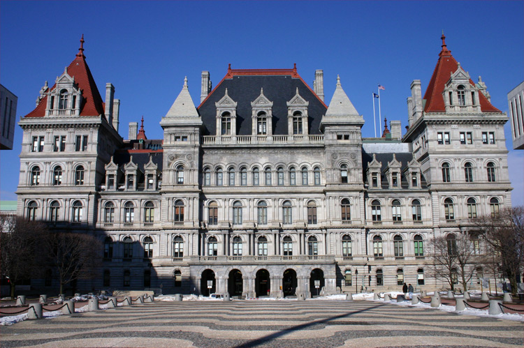
New York State Capitol

So I got a new camera (Nikon D60) and I'm working to get myself an FP. This image is stitched from six originals and is a high resolution view of the southwest face of the New York State Capitol, taken from the northeastern edge of the Empire State Plaza. I'd like to get some critiques to hear what I should/shouldn't be doing. I'm using PTGui for panorama stitching.
- Creator
- wadester16
- Nominated by
- ωαdεstεr16«talkstalk» 02:32, 12 January 2009 (UTC)
- Comments


- I'm not sure if the aperture was constant throughout the frame here, the sharpness varies wildly across the frame, set the camera to manual for panoramas and use a similar aperture to the beach image (around f8-10). I also think that this was taken at the wrong time of day, the lighting is only really nice on one side of the building. I don't know what else surrounds this which might hinder better lighting though. It might pay to pick a day which isn't so overcast as well. Again I think there is some geometric distortion which the use of control points might help. Noodle snacks (talk) 03:35, 12 January 2009 (UTC)
- It has the appearance of being tilted (particularly at the bottom), but looking at it closer it seems that perhaps the building is perhaps built on a hill? Perhaps a bit more foreground would help to balance this out and lessen the apparent tilt. --jjron (talk) 13:59, 12 January 2009 (UTC)
- Yes, it is built on a hill, which you can see from the main entrance (the archway on the left is shorter than its counterpart on the right). You can't back up any further because two buildings get in the way, the Legislative Office Building and the Justice Building, shown at right.
- Fair enough. With your six originals, are you taking six horizontally or 3 x 2? Just thinking if you were doing the 3 x 2 you may be able to go a little lower at the bottom and therefore get more ground? If the metadata is right and you've gone 14.5mm on the D60 you probably don't have much opportunity to go much wider angle and get more ground that way. --jjron (talk) 08:28, 14 January 2009 (UTC)
- Three wide by two high and yes, that was as wide as I could go. If you look at this, you can see that there's not really much to see on the ground. I guess if it's more photogenic to include the ground, it could be included in my next version (which I'll take during summer on a sunny day). ~ ωαdεstεr16«talkstalk» 17:36, 16 January 2009 (UTC)
- Actually that image confirms my thoughts that including more ground takes away the badly tilted feeling. It's not that there's that much to see as you say, though I find that patterned courtyard kind of interesting, but for mine it balances the photo better and helps with the apparent tilt, so I'd personally say definitely go for the extra foreground if you can. Oh, but I do like how yours removes those two side buildings intruding into the other shot. --jjron (talk) 12:01, 20 January 2009 (UTC)
- Three wide by two high and yes, that was as wide as I could go. If you look at this, you can see that there's not really much to see on the ground. I guess if it's more photogenic to include the ground, it could be included in my next version (which I'll take during summer on a sunny day). ~ ωαdεstεr16«talkstalk» 17:36, 16 January 2009 (UTC)
- Fair enough. With your six originals, are you taking six horizontally or 3 x 2? Just thinking if you were doing the 3 x 2 you may be able to go a little lower at the bottom and therefore get more ground? If the metadata is right and you've gone 14.5mm on the D60 you probably don't have much opportunity to go much wider angle and get more ground that way. --jjron (talk) 08:28, 14 January 2009 (UTC)
- Yes, it is built on a hill, which you can see from the main entrance (the archway on the left is shorter than its counterpart on the right). You can't back up any further because two buildings get in the way, the Legislative Office Building and the Justice Building, shown at right.
- Seconder
Idaho map counties

Accurate SVG
- Creator
- ZooFari
- Comments
- Not really featured material. It's merely a county map of Idaho. No colors, no nothing. Sure, it's accurate, but it doesn't catch a reader's attention, and I hate to put it this way, but it is rather boring. No really stunning appeal. To quote Racheal Ray, "there's no WOW factor". --TurtleShroom! :) †Jesus Loves You and Died for you!† 18:39, 11 February 2009 (UTC)
- Seconder
Nominated at both FPC and VPC by ZooFari. --jjron (talk) 14:00, 12 January 2009 (UTC)
Human Eye

It is a nice diagram showing the parts of an eye.
- Creator
- Rhcastilhos
- Comments
- Seconder
Physiphora alceae

-
 Alternative 1
 -
 Alternative 2


Good EV. The picture quality is also good considering how small the fly was (~5mm).
- Articles appears in
- Picture-winged fly, Tephritoidea
- Creator
- Muhammad
- Comments
- Seconder
Moringa oleifera flower


Good quality, Ev and has been in the article as the lead image for quite some time, replacing my previous picture.
- Creator
- Muhammad
- Comments
- The sharpness is fine, but it is in dire need of a levels adjustment imo. Noodle snacks (talk) 04:28, 12 January 2009 (UTC)
- Would an auto-levels suffice? Muhammad(talk) 09:35, 12 January 2009 (UTC)
- It'd be a reasonable first step, except it might clip the highlights slightly. You need to get the white balance right, then I'd use curves to adjust the contrast without blowing highlights. Noodle snacks (talk) 09:58, 12 January 2009 (UTC)
- I would require the raw file to get the white balance right, wouldn't I? Muhammad(talk)
12:53, 12 January 2009 (UTC)
- It is the easiest way, but its not strictly needed, assuming that the petal is meant to be white just use the grey eyedropper in photoshop curves to get it right. Noodle snacks (talk) 10:34, 13 January 2009 (UTC)
- Done. Is it ok? Muhammad(talk) 19:07, 13 January 2009 (UTC)
- I can't be sure of the original colours, but the edit looks greyed out and lifeless to me. --jjron (talk) 10:31, 14 January 2009 (UTC)
- I am not well versed with photoshop adjustments. IMO the original was probably closest to reality. Could either you or NS do the adjustments? Muhammad(talk) 09:53, 15 January 2009 (UTC)
- Perhaps I will leave it to NS since he knows what he's looking for. I'm not so sure what he's thinking, I guess it comes up a little dull and perhaps a bit over green, but I don't mind the colouring. I had a little play and got some more pop out of it, but didn't really end up with anything I thought was that much of an improvement. --jjron (talk) 16:21, 15 January 2009 (UTC)
- Added an edit, might be slightly too much, i'll let you decide. The white balance also seems to vary across the flower. Noodle snacks (talk) 00:48, 16 January 2009 (UTC)
- IMO the edit is quite an improvement. If you guys think it has a decent chance at FPC, I am willing to go with the edit. Did you sharpen the image as well? --Muhammad(talk) 06:43, 16 January 2009 (UTC)
- I'd see how you go, and I think I did, but I can't remember as it was last week. Noodle snacks (talk) 12:20, 21 January 2009 (UTC)
- IMO the edit is quite an improvement. If you guys think it has a decent chance at FPC, I am willing to go with the edit. Did you sharpen the image as well? --Muhammad(talk) 06:43, 16 January 2009 (UTC)
- Added an edit, might be slightly too much, i'll let you decide. The white balance also seems to vary across the flower. Noodle snacks (talk) 00:48, 16 January 2009 (UTC)
- Perhaps I will leave it to NS since he knows what he's looking for. I'm not so sure what he's thinking, I guess it comes up a little dull and perhaps a bit over green, but I don't mind the colouring. I had a little play and got some more pop out of it, but didn't really end up with anything I thought was that much of an improvement. --jjron (talk) 16:21, 15 January 2009 (UTC)
- I am not well versed with photoshop adjustments. IMO the original was probably closest to reality. Could either you or NS do the adjustments? Muhammad(talk) 09:53, 15 January 2009 (UTC)
- Aye, in need of a contrast adjustment with curves. Noodle snacks (talk) 11:06, 14 January 2009 (UTC)
- I can't be sure of the original colours, but the edit looks greyed out and lifeless to me. --jjron (talk) 10:31, 14 January 2009 (UTC)
- Done. Is it ok? Muhammad(talk) 19:07, 13 January 2009 (UTC)
- It is the easiest way, but its not strictly needed, assuming that the petal is meant to be white just use the grey eyedropper in photoshop curves to get it right. Noodle snacks (talk) 10:34, 13 January 2009 (UTC)
- I would require the raw file to get the white balance right, wouldn't I? Muhammad(talk)
12:53, 12 January 2009 (UTC)
- It'd be a reasonable first step, except it might clip the highlights slightly. You need to get the white balance right, then I'd use curves to adjust the contrast without blowing highlights. Noodle snacks (talk) 09:58, 12 January 2009 (UTC)
- Would an auto-levels suffice? Muhammad(talk) 09:35, 12 January 2009 (UTC)
- Seconder
Spoked wheel of chariot, Airavateswarar temple, Darasuram

One of the perfect examples of Chola art and architecture. The Airavateswarar temple is known for its rich sculptues and accurately carved figurines. I also feel that we need more pictures of Indian temple art making it to the main page.
- Creator
- User:Ravichandar84
- Nominated by
- RavichandarMy coffee shop 12:26, 6 January 2009 (UTC)
- Comments
- Comment. Cropped too tightly. What articles would this image illustrate? Spikebrennan (talk) 14:44, 6 January 2009 (UTC)
- It's fairly accurate in its depiction of a 12-century chariot wheel. Also note the decorations along the circumference-RavichandarMy coffee shop 02:39, 8 January 2009 (UTC)
- Yeah, the composition isn't really on - cropped very tight top and bottom, actually clipping off parts of the wheel, but with extraneous (and distracting) elements at the sides. You could perhaps try cropping 'square', i.e., just to the wheel, but only really worth it if you've got a version that's not clipped top and bottom. FWIW, I think a 'real' chariot wheel from the 12th century would have higher EV for a proposed article, and I'm guessing there's probably still some around, and if not there' be some pretty spot-on reproductions. I think it would really need to be able to represent the art or temple you mention. --jjron (talk) 13:49, 9 January 2009 (UTC)
- Yeah, there was the wall to the right; to the left are the hind legs of the horse to which the chariot is yoked. It would have been difficult, too, if I had positioned my camera vertically instead of horizontally. Then, the sides of the wheel would not have appeared. Yeah, I'll upload a cropped image of the wheel.-RavichandarMy coffee shop 15:02, 18 January 2009 (UTC)
- By the way, if I had taken a vertical shot, would it still satisfy the size requirements for an FP-RavichandarMy coffee shop 15:04, 18 January 2009 (UTC)
- I don't see why not. The size requirements are simply at least 1000px on at least one side, though you tend to go a bit bigger, especially on shots like this. It sounds a bit of a difficult shooting situation, though I wonder why not just include more, such as the horse. The other thing to bear in mind, and as has been stated before at FPC, with some things it probably just isn't possible to take an FP quality image of the subject. --jjron (talk) 12:09, 20 January 2009 (UTC)
- Seconder
Rise and Fall of the Ottoman Empire

Very well documented, high quality animation
- Creator
- Esemono
- Nominated by
- -- þħɥʂıɕıʄʈʝɘɖı 00:40, 6 January 2009 (UTC)
- Comments
- This is one of those really cool images we need an FP on. I'd wait for a seconder before nominating, though. ₪Ceran →(cheer→chime →carol) 02:10, 6 January 2009 (UTC)
- Is it possible to speed it up? (50-100%'d be ideal for me) Noodle snacks (talk) 11:10, 6 January 2009 (UTC)
- Great in concept, execution needs a little work. The border with Persia is thicker than necessary in some frames. In some frames, there's a border shown through Ottoman territory between contemporary Egypt and Israel. Why include the borders of contemporary (2009) countries at all? Ten years from now, that may render this image obsolete. In some of the later frames, there is no explanation of the internal borders that distinguish some of the associated Balkan states from the Ottoman Empire proper-- if there's a distinction between them and the empire proper, then maybe there should be a color difference and a legend that explains it. Spikebrennan (talk) 15:31, 8 January 2009 (UTC)
- I agree about the Persia border - definitely too thick. It could use a minor speed up, but not too much. I feel the present borders should remain so it gives users a better understanding of relative size of the empire at given times. But I think the present-day borders should be lighter and not so distinct. Def could be FP if some of these obstacles are tackled. ~ ωαdεstεr16«talkstalk» 06:05, 12 January 2009 (UTC)
- I think this image is fantastic. It really shows the growth of the Empire in a way that a static image could not do so alone. It's very slow, but worth the wait! I'd second the motion, but I don't think I have such authority. However, it's got my vote! Great job! Highly educational! --TurtleShroom! :) †Jesus Loves You and Died for you!† 18:42, 11 February 2009 (UTC)
- Seconder
Gittings Kameny Fryer
I asked for commentary on a similar image a couple years ago. Lahusen took thousands of images during the 1960s and 1970s during the infancy of the gay rights movement. The New York Public Library currently has her images in a Digital Collection. They allowed me to have two for Barbara Gittings' article, and I chose this one for its striking subject. As a gay psychiatrist, Dr. Fryer felt compelled to wear a grotesque mask and appear in costume. Homosexuality was still considered a mental disorder at the time, and Fryer felt he would be professionally ostracized for appearing without a disguise. I realize the pixel size is below 1,000, but this is the best size available from NYPL. I am asking for historical image exception for this one.
- Creator
- Moni3, uploader; Kay Lahusen, photographer
- Comments
- I would ask on of the experienced FP people who do edits (I could always do it, if need be) if they could resize this one, and possibly sharpen it if possible. However, I think reality is that this pic is too un-sharp to be an FP. ₪Ceran →(cheer→chime →carol) 02:12, 6 January 2009 (UTC)
- Tricky one. It's not a great picture, but makes a point very effectively. I wonder if people would object to the encyclopedic value it has with respect to any one of these individuals. It has some to be sure, but it is really most informative as a reflection of the social and scientific view of homosexuality rather than as an individual portrait; I wonder if there is a good place for it in some article detailing the history of homosexuality or psychiatry. Fletcher (talk) 03:01, 6 January 2009 (UTC)
- The image is already in Barbara Gittings and John E. Fryer. I'd like to reiterate per sharp, size, and composition that this could be judged on its historical value. Before knowing what the image was when I first saw it, I gasped. The mask Fryer is wearing to my younger eyes looks like Michael Myers from the Halloween franchise. I see it as very creepy. Learning then what the context of the image is seems even creepier. --Moni3 (talk) 03:38, 6 January 2009 (UTC)
- Interesting subject. Unfortunately too weak on the technicals for consideration. Well below minimum size requirements and only 48K. DurovaCharge! 16:54, 10 January 2009 (UTC)
- Seconder
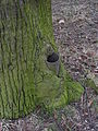
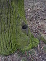
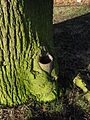
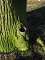
Secondary growth


Hi guys, hope I filled this out ok. This "process" we see here is apparently called secondary growth. It is a tree growing over a sawn-off lamppost, I can only presume that it will continue to "swallow" the post until fully consumed. I believe this is a unique image on Wikipedia (having done a bit of searching) and just wondered if it had what it takes to be featured? Cheers.
- Creator
- Ryan4314
- Comments
- This is one of those bizarre pictures I like to see nominated, a reminder we are an encyclopedia not a photo contest. However the overall sharpness of the picture does not seem very good and I bet it would generate complaints on FPC. Fletcher (talk) 00:38, 6 January 2009 (UTC)
- I wouldn't personally support it at FPC due to the sharpness issues and I suspect some blown highlights, but it is an interesting picture, and the green works well to give some contrast to the trunk from the background. I'd suggest nominating at WP:VPC instead. Noodle snacks (talk) 00:56, 6 January 2009 (UTC)
- Sorry, I know nothing about editing photos etc. Is "sharpness" something that can't be fixed/improved with editing then? Ryan4314 (talk) 01:23, 6 January 2009 (UTC)
- Noodle Snacks could give you a better answer, but in a nutshell sharpening can help, within limits. The computer can't add detail that wasn't there. And too much sharpening looks harsh and unnatural (see Unsharp masking). I dropped the picture into the GIMP and sharpened at the default settings, and still found it too blurry. Sharpened and scaled down to 25% size I think it looks pretty good, but then it's below the image size requirements for FPs. Fletcher (talk) 03:55, 6 January 2009 (UTC)
- Sharpening generally increases the acutance of an image, which can help the sharpness subjectively to a certain degree but it won't increase the amount of information in an image and it wouldn't do much for a fairly blurry case like this. The image does scrub up alright with a fairly heavy downsample but as suspected the highlights are still blown (and can't be recovered unless you have a RAW available). You could try submission with the downsampled version and hope no one is too muffed about the highlights, but then someone might still complain about the small size for a static subject.
- If this is an image that you could go and easily reshoot then set your camera in aperture priority mode and to about F5-5.6 or so, the above shot was made wide open at f3.5, where most lenses are at their weakest. The trouble with setting such an aperture is that I don't think the image stabilisation would be able to successfully counter the camera shake at such low shutter speeds. You could bump the ISO to 200 or so (not likely to be pretty on a point and shoot) or borrow/buy a (cheap) tripod, turn off image stabilisation and use the timer so the camera is perfectly still for the shot. Noodle snacks (talk) 10:25, 6 January 2009 (UTC)
- I can easily go and reshoot the tree, and I understood everything you said EXCEPT, what's the ISO? Also do you think I should replace the image with Fletcher's in the meanwhile? Ryan4314 (talk) 16:18, 6 January 2009 (UTC)
- There is a relatively in depth explanation of what the ISO setting does at Film_speed#Digital_camera_ISO_speed_and_exposure_index. There would be a setting somewhere in the camera. The best results will be achieved leaving it set at 75 and using the tripod/timer method though. Higher ISO settings (200, 400 etc) give you a faster shutter speed at the expense of more noise basically. Also, when you shoot it, set your exposure compensation down a bit to avoid the blown section on the tree. Noodle snacks (talk) 03:41, 7 January 2009 (UTC)
- I should probably note that edited version was Noodle Snacks' as I was too lazy to upload mine, though I am more than happy to take the credit. =P Fletcher (talk) 04:55, 7 January 2009 (UTC)
- Aye, I forgot to mention it, either way a reshoot is the best way forward here. Noodle snacks (talk) 05:03, 7 January 2009 (UTC)
- I can easily go and reshoot the tree, and I understood everything you said EXCEPT, what's the ISO? Also do you think I should replace the image with Fletcher's in the meanwhile? Ryan4314 (talk) 16:18, 6 January 2009 (UTC)
- Noodle Snacks could give you a better answer, but in a nutshell sharpening can help, within limits. The computer can't add detail that wasn't there. And too much sharpening looks harsh and unnatural (see Unsharp masking). I dropped the picture into the GIMP and sharpened at the default settings, and still found it too blurry. Sharpened and scaled down to 25% size I think it looks pretty good, but then it's below the image size requirements for FPs. Fletcher (talk) 03:55, 6 January 2009 (UTC)
Re-shoot: Right, I took 12 photos on a tripod, all at various settings. I couldn't find the option to change my camera's "aperture priority mode". I noticed it says F3.5 on the actual camera, so do all cameras have the ability to change this? I was able adjust the exposure and ISO though. I didn't want to upload loads of photos, so I've upped what I thought looked best. If these are no good, I have photos that are more "exposed" or less "exposed", both with differing ISOs.
-
 "ISO: 50, Exposure -1" #1
 -
 "ISO: 50, Exposure -1" #2
 -
 "ISO: 100, Exposure -1" #1
 -
 "ISO: 100, Exposure -1" #2


Also I should explain, I took 2 photos for every setting I tried, so it's your preference really. Ryan4314 (talk) 16:41, 10 January 2009 (UTC)
- I just did a little googling, unfortunately your camera is missing the aperture priority mode altogether, which is unfortunate (as it allows setting the camera for optimum sharpness). As you can probably see for yourself the tripod has still improved the sharpness a great deal. ISO50 number 2 has the best combination of sharpness and noise in my book. I have adjusted the levels (so they are similar to the original), but with the highlights now preserved and sharpened/sized it a bit. The original does have better lighting (has a bit of sun shining on the stump) and framing however. So I'd nominate the edit of the original and the edit of this new version and people can fight it out for themselves. Noodle snacks (talk) 00:48, 12 January 2009 (UTC)
- Nice work it does look better. I would heed Noodle snacks' advice above. I just did a google image search for this and there are a lot of diagrams and cross-sections that come up - it's possible people on FPC will want something more scientific that explains the parts of the tree in detail. However if it doesn't pass FPC, it's a good candidate for the Valued Pictures project, as it does seem a good illustration of the concept and there are no other pictures in the article. Fletcher (talk) 02:42, 12 January 2009 (UTC)
- LOL I told my father it needed to be "zoomed in more!"
- I have another camera though, with the above mentioned changeable settings. I never considered it before as I assumed it was a run-of-the-mill one that holiday makers use. I messed around with the settings tonight and took this pic
 , can you tell from the data whether this camera would be up to the job? Organizing another re-shoot is no big deal, we go to Oxleas Wood all the time.
 - LOL I actually know nothing about "Secondary Growth", when I uploaded this I basically went to the tree page and said "What's this?". Thanks again for being patient guys, I appreciate it. Ryan4314 (talk) 04:08, 12 January 2009 (UTC)
- The other camera should work better. Set it to F4.5 to F5.0 in aperture priority, zoomed most of the way out (move the camera closer) and the lowest ISO possible and use the tripod again. Try for the same time of day as the original to get similar lighting too. Don't forget the exposure compensation. Noodle snacks (talk) 04:17, 12 January 2009 (UTC)
Re-shoot #2: Uh-oh looks likes the sun's buggered these ones up, well I'll list em anyway. All are at ISO-80 (lowest setting) and as before I took versions that are more/less "exposed".
-
 "F4.5, Exposure -1" #1
 -
 "F4.5, Exposure -1" #2
 -
 "F5.0, Exposure -1" #1
 -
 "F5.0, Exposure -1" #2
 -
 "F5.6, Exposure -1" #1
 -
 "F5.6, Exposure -1" #2


Also I've just realised these new one's are just as "zoomed-out" as the last re-shoot, I really have wasted my time here ay? Well aside from the framing, and the shadows, were the pictures at least taken with the right settings? ;) Ryan4314 (talk) 15:25, 17 January 2009 (UTC)
- Yep, apart from the new problems its pretty right, I'd go with -1 and F5.0 when the conditions are right. These are quite a lot sharper than the originals. Sorry for the delay in response, I was away. Noodle snacks (talk) 01:33, 21 January 2009 (UTC)
- No problem, I appreciate you taking the time to stick with this. Ryan4314 (talk) 03:00, 21 January 2009 (UTC)
- It seems late in the day and you can even see the shadows changing position between the different sets. The light changes very fast then making it hard to tell which exposure is the "right" one, but Noodle snacks' choice seems like a good one. Fletcher (talk) 23:26, 21 January 2009 (UTC)
- No problem, I appreciate you taking the time to stick with this. Ryan4314 (talk) 03:00, 21 January 2009 (UTC)
Please don't archive this review, a third re-shoot is planned.
Update: Sorry, I am still planning another re-shoot, possibly next weekend. Ryan4314 (talk) 11:16, 1 February 2009 (UTC)
- Seconder
Ferry Loading

I had nominated this at FPC last month but there were a few distortion problems, so I withdrew. I would like feedback on its quality now. IMO it has EV but that too was questioned at FPC. Individual images 1, 2 and 3
- Creator
- Muhammad
- Comments
- If you look amidships near the waterline, there is a light brown stripe that is jagged - a stitch error? And to me it seems to bend inward at the center as with pincushion distortion. Fletcher (talk) 04:06, 6 January 2009 (UTC)
- Seconder
2009 Anti-Israel Protest in Tanzania
- Caption
- Tanzanians protesting the 2008-2009 Gaza bombardment by Israel


Good quality, tons of EV. I am not sure which one to nominate and would appreciate help in choosing the best.
- Creator
- Muhammad
- Articles appears in
- 2008–2009 Israel–Gaza conflict, International reaction to the 2008-2009 Israel-Gaza conflict
- Comments
- First of all the caption, I think it should mention the exact location (presumably Dar es Salaam) and perhaps that the protestors are mostly Muslims (I'd assume this is the case). As far as to which images to pick. You could try for a {{FeaturedPictureSet}} I think that 1 and 4 are probably the best individual images as far as conveying some sense of scale goes. I think 10 is a great image, but not really FPC material since one can't see anything but a sign. Hope that narrows it down a bit. Noodle snacks (talk) 12:32, 4 January 2009 (UTC)
- Thanks for taking time to review these images, I know it must have taken a long time. I had to choose from over 150 :) I am not familiar with the featured set nomination. How exactly are the images nominated? --Muhammad(talk) 21:00, 4 January 2009 (UTC)
- Have a look at File:Mandel zoom 00 mandelbrot set.jpg and Wikipedia:Featured picture candidates/Mandelbrot set 2, I'm unsure has to how succesfull such a nomination will be with photographs Noodle snacks (talk) 23:00, 4 January 2009 (UTC)
- Thanks for taking time to review these images, I know it must have taken a long time. I had to choose from over 150 :) I am not familiar with the featured set nomination. How exactly are the images nominated? --Muhammad(talk) 21:00, 4 January 2009 (UTC)
- Seconder
Sideway in LongChang Temple

Please give some advise
- Creator
- sh1019
- Comments
- I think it is an interesting angle artistically, but I doubt it is informative enough about the temple to be a featured picture. Fletcher (talk) 00:33, 6 January 2009 (UTC)
- Seconder
Picture Peer Review Archives
Picture Peer Review Archives Mainpage
|
Please cut and paste nominations to be archived from the Picture peer review mainpage to the top of the appropriate archive page, creating a new archive (by nomination date) when necessary.
|
Pictures that need placing on an appropriate article
If you have an excellent picture, but can't think where to put it, add it to the section below. Similarly if you need help in writing a new article on the subject of a photo, request it below. If you are unsure of what plant or animal is in a picture please ask at Wikipedia:Reference desk/Science.
Pictures that need moving from other Wikipedias
If you have found a good picture on another language Wikipedia that would benefit the English Wikipedia, suggest it below. The image may need confirmation on its identification and assistance with translating the caption and moving to Commons before placing on the equivalent English language article.