
Wikipedia:Graphics Lab/Illustration workshop
This page is deprecated and will not be monitored. Please use one of the three workshop pages. This specific page is {{{1}}}
A simple equation

Articels: Equals sign
Request: SVGify this equation, so that it can be displayed as part of a {{double image stack}} alongside the original (hard to read by modern eyes) equation. 68.39.174.238 (talk) 22:30, 1 September 2008 (UTC)
Oppinion: How's this? Debate 木 09:31, 2 September 2008 (UTC)
- The second looks a little internally strange. EG. Is the "x" in a different fontface? 68.39.174.238 (talk) 00:27, 3 September 2008 (UTC)
- I freely admit that I'm no expert in mathematical symbology, but that's the way the x is displayed when written as an equation in Word, as well as how it's displayed in the mathematical mark-up you used above (ie : <math>14\sqrt{x}+|15|=|71|\,\!</math>), so I presume that the typeface of the x is mathematically significant. Nonetheless, the type-face can be easily changed if required. Debate 木 02:59, 3 September 2008 (UTC)

- For this it doesn't have to be perfect. I strongly suspect that a featured image could be found of some part of this, but will let others decide... 68.39.174.238 (talk) 23:41, 3 September 2008 (UTC)
- Variable names such as x are typically rendered in an italic font in order to distinguish them from constants--so the font change is correct. However, the equation still looks strange. To make it more legible, the operators, + and =, should be surrounded with spaces. Rangergordon (talk) 10:33, 18 October 2008 (UTC)
Map of SkyTrain (section 2)

Article(s): SkyTrain (Vancouver)
Request: There is something wrong with the image. The Millennium Line stations, Sapperton and Braid, are switched, so I need it to be switched back to their original positions. Thanks. -- SRE.K.Annoyomous.L.24[c] 20:09, 25 October 2008 (UTC)
Graphist opinion: done. Mfield (talk) 06:04, 27 October 2008 (UTC)
- O ****. It was good. Actually, revert it. I'm so stupid... -- SRE.K.A
nnoyomous.L.24[c] 06:49, 27 October 2008 (UTC)
- You sure? Other people think its the other way round too. Mfield (talk) 06:59, 27 October 2008 (UTC)
- Yeah, revert it. I'm sure. [1] -- SRE.K.A
nnoyomous.L.24[c] 07:19, 27 October 2008 (UTC)
- Yeah, revert it. I'm sure. [1] -- SRE.K.A
- You sure? Other people think its the other way round too. Mfield (talk) 06:59, 27 October 2008 (UTC)
Coat of arms

-
SVG
Article(s): Pi Kappa Phi
Request: Can someone convert this image to SVG. Thanks. — ŁittleÄlien¹8² (talk\contribs) 20:55, 31 October 2008 (UTC)
Graphist opinion: I made one. The original says that it was made in 1909, so I tagged the new one with {{PD-old}} from the commons, making it no longer fair-use. --pbroks13talk? 18:37, 1 November 2008 (UTC)
- Wouldn't that make the original one PD-US too? 68.39.174.238 (talk) 21:05, 1 November 2008 (UTC)
- I've marked the JPG as such. §hep • ¡Talk to me! 23:30, 1 November 2008 (UTC)
- Wow, that looks great! Thank you so much for making this image. — ŁittleÄlien¹8² (talk\contribs) 00:12, 2 November 2008 (UTC)
- The first version of the Coat of Arms was designed in 1909, "The current coat of arms is much different from the original." is what it says on Pi_Kappa_Phi#Coat_of_arms. Thus both the svg and the jpg are fair-use only. /Lokal_Profil 01:46, 2 November 2008 (UTC)
- Wow, that looks great! Thank you so much for making this image. — ŁittleÄlien¹8² (talk\contribs) 00:12, 2 November 2008 (UTC)
- The final version (with all of the current modifications) was completed by 1909. The original version, that the passage is referring to, was created soon after the fraternity was founded in 1904. — ŁittleÄlien¹8² (talk\contribs) 01:55, 2 November 2008 (UTC)
The section in the Pi Kappa Phi article is incorrect. If you look at the cited reference, it indicates that the changes that took place "in the early years," happened before 1909. — ŁittleÄlien¹8² (talk\contribs) 01:58, 2 November 2008 (UTC)
- Ok. Technically it could still be a problem since the way the Coat of Arms was depicted might have changed although it contents have remained the same, ideally a scanned in version from 1909ish should be used to get around this problem. But I won't press on that. /Lokal_Profil 12:47, 2 November 2008 (UTC)
- Hmm. Looking at this image, this coat doesn't seemed to have changed much in the last 90 years... any thoughts? --pbroks13talk? 06:38, 4 November 2008 (UTC)
- Possibly the design of the lamp might be under a new copyright, but then the image doesn't include the book either so if that was added in say 1911 the lamp might have changed to it's current shape at the same time. Wouldn't worry unless someone writes and complains though. /Lokal_Profil 16:47, 4 November 2008 (UTC)
- Hmm. Looking at this image, this coat doesn't seemed to have changed much in the last 90 years... any thoughts? --pbroks13talk? 06:38, 4 November 2008 (UTC)
Generic Scout badge (our own image, please feel free)
-
1
-
 2-SVG but wrong shape

Article(s): Scout request templates
Request: SVGify... Chris (クリス • フィッチ) (talk) 17:58, 10 November 2008 (UTC)
Graphist opinion: Can the previously requested scout logo be used straight off once the colours are changed? /Lokal_Profil 00:41, 11 November 2008 (UTC)
- No, sorry, this one is meant to be grey like the {{reqphoto}} template. Chris (クリス • フィッチ) (talk) 00:46, 11 November 2008 (UTC)
- I think Lokal meant something like the above. Using the SVG that had already been created. §hep • ¡Talk to me! 07:10, 12 November 2008 (UTC)
- Thanks, I understand now. No, this one is meant to have distinctly different dimensions, thank you though! :) Chris (クリス • フィッチ) (talk) 15:27, 12 November 2008 (UTC)
- Just clarifying. §hep • ¡Talk to me! 21:00, 12 November 2008 (UTC)
- Up for a try? Chris (クリス • フィッチ) (talk) 17:53, 19 November 2008 (UTC)
- Anyone? Chris (クリス • フィッチ) (talk) 15:20, 11 December 2008 (UTC)
- Kan give it a try if you describe in which ways you want the svg image (to the right in the gallery) to be changed. Firstly I'm guessing a different shade of grey and changed into a square shape. /Lokal_Profil 14:10, 12 December 2008 (UTC)
- So, what needs to be changed? The gray is the exact same as the JPG, so the bottom section and some more spacing at the top between the fleur-de-lis and the trefoil? Anything else?§hep • ¡Talk to me! 03:40, 13 December 2008 (UTC)
- Kan give it a try if you describe in which ways you want the svg image (to the right in the gallery) to be changed. Firstly I'm guessing a different shade of grey and changed into a square shape. /Lokal_Profil 14:10, 12 December 2008 (UTC)
- Anyone? Chris (クリス • フィッチ) (talk) 15:20, 11 December 2008 (UTC)
- I just need an SVG, clean-line version of graphic 1, with no change in shape like was done in graphic 2. please overwrite graphic 2 with the same shape and dimensions as graphic 1. Chris (クリス • フィッチ) (talk) 16:28, 13 December 2008 (UTC)
- Here's my work-in-progress. Anyone feel free to step in and modify, I doubt I'll have time to finish this over tomorrow. §hep • ¡Talk to me! 03:22, 14 December 2008 (UTC)
- I've had it up to here *holds hand over head* with InkScape. Ever since I saved the file above it won't minimize or save and the brush tool doesn't work either! I've redownloaded InkScape a dozen times atleast and nothing. I'll leave a note if I can get something else that does vector. §hep • ¡Talk to me! 23:04, 18 December 2008 (UTC)
- Here's my work-in-progress. Anyone feel free to step in and modify, I doubt I'll have time to finish this over tomorrow. §hep • ¡Talk to me! 03:22, 14 December 2008 (UTC)
Fiat Palio Multijet Diesel photo
-
 Photo of the Fiat Palio 1.3 Multijet Diesel in India
 -
 Lowered contrast, brightness, lowered some glare.
 -
 Tone down highlights and lift shadows on car, remove pylon reflection on hood, convert image profile from AdobeRGB to sRGB for correct web color display by Mfield


Article(s): Fiat Palio
Request: Can someone please generally improve the image? There is a bit of glare on the hood and the windscreen and the sunshine is a bit too bright. Ganeshrg (talk) 07:10, 11 November 2008 (UTC)
Graphist opinion: Attempted. --Kamangir1214 (talk) 05:18, 16 November 2008 (UTC)
- Please do not resample the image to a lower resolution (in addition with so bad antialiasing - see the "stairs" on the lower edge of the left window). --pabouk (talk) 16:18, 17 November 2008 (UTC)
- Thanks Kamangir1214 for the effort. I am still looking for a more general improvement on the image though. Would anyone like to take this up? Ganeshrg (talk) 18:13, 17 November 2008 (UTC)
Added another edit - Tone down highlights and lift shadows on car, remove pylon reflection on hood, convert image profile from AdobeRGB to sRGB for correct web color display. No resize. Mfield (talk) 18:23, 17 November 2008 (UTC)
- Mfield, the surroundings look a lot better and so does the car hood. I can notice very strong artefacts on the A,B and C pillars and the region just below the windows. —Preceding unsigned comment added by Ganeshrg (talk • contribs) 04:46, 18 November 2008 (UTC)
- I am not sure what zoom level you are seeing these at but this is a pretty small resolution to be working with in jpeg so it will have some compression artifacts that will be compounded by PP. If you are referring to noise then I am afraid that really you need to take a better picture to begin with, noise is a side effect of lifting detail out of such shadow unless you are using an expensive camera body at a low ISO. I can add noise reduction but it will lose you some detail. It should be easy enough to shoot this on an overcast day. There is only so much that can be done do rescue information when the image has been shot in in bright sunlight with the subject effectively backlit. Mfield (talk) 05:04, 18 November 2008 (UTC)
- Mfield, I have to comfirm that there are clearly visible compression artifacts in your edit. They probably appeared after you overboosted the red colour of the car. --pabouk (talk) 11:37, 2 December 2008 (UTC)
- I am afraid you are mistaken. I did not boost the red color of the car at all. I performed a shadow lift, which would have made more visible compression artifacts and lack of information in the shadows that were already present. Hence "it will have some compression artifacts that will be compounded by PP". If the car appears more red in my edit it is because it is was converted to the correct sRGB color profile for the web and now appears correctly in your browser. If the car now appears the wrong color then the color was incorrectly captured by the camera or was shifted by whatever editing originally resulted in the image becoming AdobeRGB. The fact of the matter is that it is impossible to pull enough shadow information out of such a poorly lit, underexposed shot that has been saved with both such high jpeg compression. Mfield (talk) 16:12, 2 December 2008 (UTC)
- Mfield, I have to comfirm that there are clearly visible compression artifacts in your edit. They probably appeared after you overboosted the red colour of the car. --pabouk (talk) 11:37, 2 December 2008 (UTC)
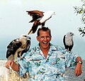
Image:Jeff in thailand.jpg
-
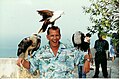 Deceased Wikipedian Jeff Woloson in Thailand
 -
Attempted modification of Image:Jeff in thailand.jpg
-
Second Modification of Jeff in Thailand.jpg
-
 Modification on the removal of the background woman/man


Article(s): Happiness
Request: Jeff Woloson was a Wikipedian who died in August 2008. His family remembers how much Wikipedia meant to him and stated so in the Memoriam dedicated to Jeff. Image:Jeff in thailand is his mother's favorite photo of Jeff. I tried to improve the photo at Image:Jeff in thailand 2 by cropping it and erasing the guy blowing his nose. However, it needs the hands of someone with more skill and better tools. Please improve "Image:Jeff in thailand" and place any improvement at "Image:Jeff in thailand 2.PNG". Perhaps crop better and erase that guy walking in the background. make the colors more vibrant, the image more clear, etc. Coming from Wikipedia, this improvement to his mother's favorite photo would really mean a lot to Jeff's family. Thanks. -- Suntag ☼ 20:29, 13 November 2008 (UTC)
Graphist opinion: I attempted to clean up some jpg artifacts around the woman behind Jeff and raised the quality a moderate amount, along with removing the man you requested. I added my attempt to the gallery. --Kamangir1214 (talk) 04:22, 16 November 2008 (UTC)
- Looking good. Is it possible to remove the man walking and the foot below his right hand in the Image:800px-Jeff in thailand3.jpg image? -- Suntag ☼ 16:00, 20 November 2008 (UTC)
- Oh wow, I actually forgot about this. I think I attempted to do what you asked a while ago, and I was unable to. Sorry about that.--Kamangir1214 (talk) 00:23, 13 December 2008 (UTC)
- I removed the woman behind the eagle. I had to modify some features like the sky and the ground. But overall, it is pretty decent and barley noticeable. ZooFari 00:15, 14 December 2008 (UTC)
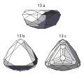
Drawings in Nassak Diamond
-
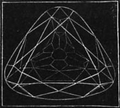 Drawings of the edges of the Nassak Diamond
 -
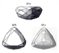 Shaded drawings three views of the Nassak Diamond
 -
 Vectorized
 -
 Vectorized


Article(s): Nassak Diamond
Request: Clean up' perhaps trace the lines, make them straighter where appropriate, etc. -- Suntag ☼ 04:53, 15 November 2008 (UTC)
Graphist opinion: Vectorized 2nd Image, Image:NassakDiamondPlate1904.svg -- GateKeeperX (talk) 07:15, 15 November 2008 (UTC)
- Vectorized 1st Image -- GateKeeperX (talk) 07:44, 15 November 2008 (UTC)
- Thanks. If needed, there is more info at museumdiamonds.com. -- Suntag ☼ 16:19, 15 November 2008 (UTC)
- In the first image (the black and white), are you having any trouble seeing the white lines against the black backdrop? I can increase the line thickness to contrast more sharply if necessary. -- GateKeeperX (talk) 16:48, 15 November 2008 (UTC)
- It looks fine in Nassak Diamond. However, I think the thicker lines in the original drawing represented those lines closer to the viewer and the skinner lines are the ones you would see through the diamond (that appear on the hidden side). In Image:NassakDiamond1876.svg, can you mimic the different line thickness of the original drawing NassakDiamond1876 (make the forward lines thicker). Thanks. -- Suntag ☼ 20:26, 15 November 2008 (UTC)
- I uploaded a new version, with the lines in the back faded, but it appears quite hard to distinguish (at least at this size). I think increasing the thickness of the front lines, might help. -- GateKeeper(X) @ 01:47, 22 November 2008 (UTC)
- Actually, if you look at the image used in the article Nassak Diamond, the new image looks pretty good. Some of the bolded lines in the original image don't seem to have carried through to the latest image. -- Suntag ☼ 04:50, 22 November 2008 (UTC)
- Hi, I've corrrected the one with the black background, how do I upload an SVG? Do I have to register? Thx. december/5/2008 —Preceding unsigned comment added by 189.174.250.132 (talk) 20:54, 5 December 2008 (UTC)
- Hi, I'm the one that made the above comment. I'll upload the SVG as soon as I have 4 days as a member (only then I can upload stuff). Moonsafari (talk) 17:11, 7 December 2008 (UTC)
- Hi, I've corrrected the one with the black background, how do I upload an SVG? Do I have to register? Thx. december/5/2008 —Preceding unsigned comment added by 189.174.250.132 (talk) 20:54, 5 December 2008 (UTC)
- Actually, if you look at the image used in the article Nassak Diamond, the new image looks pretty good. Some of the bolded lines in the original image don't seem to have carried through to the latest image. -- Suntag ☼ 04:50, 22 November 2008 (UTC)
- I uploaded a new version, with the lines in the back faded, but it appears quite hard to distinguish (at least at this size). I think increasing the thickness of the front lines, might help. -- GateKeeper(X) @ 01:47, 22 November 2008 (UTC)
- It looks fine in Nassak Diamond. However, I think the thicker lines in the original drawing represented those lines closer to the viewer and the skinner lines are the ones you would see through the diamond (that appear on the hidden side). In Image:NassakDiamond1876.svg, can you mimic the different line thickness of the original drawing NassakDiamond1876 (make the forward lines thicker). Thanks. -- Suntag ☼ 20:26, 15 November 2008 (UTC)
- In the first image (the black and white), are you having any trouble seeing the white lines against the black backdrop? I can increase the line thickness to contrast more sharply if necessary. -- GateKeeperX (talk) 16:48, 15 November 2008 (UTC)
- Thanks. If needed, there is more info at museumdiamonds.com. -- Suntag ☼ 16:19, 15 November 2008 (UTC)
- Vectorized 1st Image -- GateKeeperX (talk) 07:44, 15 November 2008 (UTC)
Nassak Diamond copy.jpg
-
 Photograph of a copy of the Nassak Diamond from the "Reich der Kristalle" museum in Munich.
 -
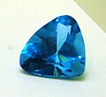 With corrections.
 -
 Darkened, corrections
 -
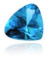
-
 the first vectorization by User:Demoeconomist


Article(s): Nassak Diamond
Request: Make it less grainy, improve, etc. -- Suntag ☼ 16:54, 15 November 2008 (UTC)
Graphist opinion: Am I allowed to reduce the size by 20-25% to improve the quality, because that will help? Anyway, edited.--Kamangir1214 (talk) 04:42, 16 November 2008 (UTC)
- Yes, do what ever you feel will help. -- Suntag ☼ 15:45, 20 November 2008 (UTC)
- Hmm, what about this (copy2; darkened, graininess removed, etc.). Edited of the original. RockManQ (talk) 01:20, 22 November 2008 (UTC)
- Crap, blank spaces got added in, I'll have to edit those out (I'm a little new to this). RockManQ (talk) 01:21, 22 November 2008 (UTC)
- The image is used in the Nassak Diamond article infobox, so feel free to modify the image with that in mind. -- Suntag ☼ 04:48, 22 November 2008 (UTC)
- uploaded a retouched one here: [2] hope it helps (: -- 189.174.250.132 20:07, 5 December 2008 (UTC)
- The image is used in the Nassak Diamond article infobox, so feel free to modify the image with that in mind. -- Suntag ☼ 04:48, 22 November 2008 (UTC)
- I made the first vectorized version(in comparison to the old svg file) as shown above.--Demoeconomist (talk) 04:47, 13 December 2008 (UTC)
- Crap, blank spaces got added in, I'll have to edit those out (I'm a little new to this). RockManQ (talk) 01:21, 22 November 2008 (UTC)
- Hmm, what about this (copy2; darkened, graininess removed, etc.). Edited of the original. RockManQ (talk) 01:20, 22 November 2008 (UTC)
Bacon's Castle
![]() Done as per Much improved. Thanks of Rmhermen
Done as per Much improved. Thanks of Rmhermen
-
 Bacon's Castle

Article(s): Bacon's Castle
Request: Can something be done to correct the apparent lean of the outside walls? And maybe a better crop? Rmhermen (talk) 15:16, 24 November 2008 (UTC)
Graphist opinion: Cropped and adjusted the perspective. If the changes don't look good feel free to revert. Tadpole9(talk • contribs) 18:13, 24 November 2008 (UTC) I did a more complete correction, color balance adjustment and sharpen. I uploaded it over again so check the version history and see which you prefer. Mfield (talk) 04:06, 2 December 2008 (UTC)
Nuclear binding energy
-
 Nuclear binding energy for several isotopes
 -
 Nuclear binding energy for several isotopes with new gridlines


Article(s): Binding energy
Request: It's a nice picture, but it is hard to read. Adding gridlines to the plot would be great too, and it shouldn't be too hard, but I can't do anything in Inkscape to save my butt... Titoxd(?!? - cool stuff) 01:06, 25 November 2008 (UTC)
Graphist opinion: I'm taking a crack at this. My plan is to use a logarithmic scale, as well as adding gridlines. We'll see what I can throw together in gnuplot... — ʞɔıu 04:16, 25 November 2008 (UTC)
- Oops, sorry to jump ahead, but I've extended the gridlines up in a new image, called Image:Binding energy curve - common isotopes with gridlines.svg. Is that useful or not what you want? Mononomic (talk) 04:19, 25 November 2008 (UTC)
- No, it's cool. My logarithmic scale idea didn't pan out. Titoxd can decide if this is sufficient, or if s/he would like something else... — ʞɔıu 18:32, 25 November 2008 (UTC)
- Looks nice, but can we have horizontal gridlines as well? We can change the color of the data points if necessary. Titoxd(?!? - cool stuff) 00:05, 26 November 2008 (UTC)
- No, it's cool. My logarithmic scale idea didn't pan out. Titoxd can decide if this is sufficient, or if s/he would like something else... — ʞɔıu 18:32, 25 November 2008 (UTC)
Quick remark, I find the numbers on the elements pretty hard to read. Any way to make them bigger?Headbomb {ταλκκοντριβς – WP Physics} 08:06, 26 November 2008 (UTC)
- I'd be happy to make them bigger. Is that OK, Titoxd? Mononomic (talk) 00:13, 27 November 2008 (UTC)
- That'd be okay, as would be switching the colors. Titoxd(?!? - cool stuff) 14:26, 28 November 2008 (UTC)
- Any specific color requests or should I just make it look cool? Mononomic (talk) 15:47, 28 November 2008 (UTC)
- Ooh, forgot about this, my bad. Any color would do, as long as it is visible (making the line thicker would help too). Titoxd(?!? - cool stuff) 09:31, 5 December 2008 (UTC)
- Any specific color requests or should I just make it look cool? Mononomic (talk) 15:47, 28 November 2008 (UTC)
- That'd be okay, as would be switching the colors. Titoxd(?!? - cool stuff) 14:26, 28 November 2008 (UTC)
OK, so I've tried to do that but I can only make the gridlines thicker without throwing everything else off. When I try to make the text bigger, the spacing in the graph gets all messed up. Does anybody else want to try or should I just thicken the grid lines and be done with it? Mononomic (talk) 17:29, 6 December 2008 (UTC)
meson nonets
-
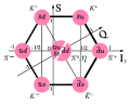 Meson octet spin 0
 -
 Mesons nonet spin 1


Article(s): See images
Request: Alright, this is a bit complicated to explain.
- Image on the left:
- In the middle, there should be a third particle. Currently there is a neutral pion () and an eta meson (), but there should also be an eta prime meson (). If possible, the three particles should be right under the middle circle, rather than next to it.
- should be
- Upload the result as "UDS Meson nonet spin 0"


- Image on the right:
- Should look similar to the image on the left after modifications, but with
- <-->
- <-->
- <-->
- <-->
- <-->
- <-->
- <-->
- <-->
- <-->
- Upload the result as "UDS Meson nonet spin 1".


Headbomb {ταλκκοντριβς – WP Physics} 02:44, 26 November 2008 (UTC)
Graphist opinion: It might be best to contact the original author (Trassiorf). But I can try if need be. Tadpole9(talk • contribs) 06:40, 26 November 2008 (UTC)
- He's registered on the commons, and for some reason (inaptitude probably), my browser refuses to do anything properly on the commons, so I can't.Headbomb {ταλκκοντριβς – WP Physics} 07:50, 26 November 2008 (UTC)
- User:Trassiorf is also registered on several Wikipedias. Maybe you want to contact him there. Or I can contact him on commons. Tadpole9(talk • contribs) 18:47, 26 November 2008 (UTC)
- It's probably simpler if you do it. Sorry for the trouble.Headbomb {ταλκκοντριβς – WP Physics} 23:16, 27 November 2008 (UTC)
- User:Trassiorf is also registered on several Wikipedias. Maybe you want to contact him there. Or I can contact him on commons. Tadpole9(talk • contribs) 18:47, 26 November 2008 (UTC)
- Actually, it looks likes I've contacted him a few months ago. It doesn't look like he's active.Headbomb {ταλκκοντριβς – WP Physics} 23:18, 27 November 2008 (UTC)
- If you're confused by what exactly needs to be don't just ask and I'll answer the best I can.Headbomb {ταλκκοντριβς – WP Physics} 06:26, 7 December 2008 (UTC)
Tom Collins news clipping
-
 1891 news clipping
 -
retouch 1

Article(s): Tom Collins
Request: Clean up and make easier to read. Keep sense of coming from an 1891 newspaper. -- Suntag ☼ 07:41, 26 November 2008 (UTC)
Graphist opinion:
- Lemme see what I can do. L'Aquatique[talk] 08:25, 26 November 2008 (UTC)
- Darkened type, added slight yellowish tint to suggest old newspaper. What else? L'Aquatique[talk] 08:35, 26 November 2008 (UTC)
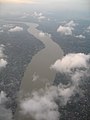
Colour correction on aerial photos
-
 Brisbane River, Brisbane
 -

-
 Edit of #2 by Mfield
 -

-

-
-


Request: Do you have any advice for how to make the colour of photos taken from aircraft windows look a little less "whited-out"? My adjustments using curves are a bit of an improvement on the original, but there must be a better way. I'd like to know exactly what tools you use to get the best results. Cheers Gobeirne (talk) 06:49, 28 November 2008 (UTC)
Graphist opinion: I modified the first one a bit with Google's Picasa 3. I uploaded it over the original to save space, feel free to revert. I'm not sure if I'd call these the best results, considering I only tweaked only one of the defaults, but I think it's an improvement. My only problem was I couldn't tell if the earth was supposed to be that brown or not. If you'd like to see it, I have the image tweaked in the Windows Live software that comes with Vista, too. Although it's a bit dark (again just the defaults). I hope you find Picasa useful. We have a page here that has some other recommended software. §hep • ¡Talk to me! 07:09, 28 November 2008 (UTC)
Graphist opinion: I performed a series of corrections on #2 and uploaded it as #3 in the gallery. Corrected levels, adjusted color balance to remove atmospheric color cast, noise reduction and sharpening. Mfield (talk) 02:52, 2 December 2008 (UTC)
incomplete image chart, help needed
| Back | Sides | |
|---|---|---|
| Strap | Tie | |
| T-back | 
| |
| G-string | 
|
|
| V-string | 
| |
Request: This amazing chart features at the article on Thong (clothing). But, alas, it's incomplete. There are more significant variants remains to be added. I can't darw, and I can't get the original sketchmaster to work on the project. Can the graphic workshop help? Aditya(talk • contribs) 07:23, 28 November 2008 (UTC)
Graphist opinion: I created a C-String illustration, could you be more specific about which additional variants should be created? (Also I would recommend the others be converted from .png to .svg format) -- GateKeeper(X) @ 18:35, 28 November 2008 (UTC)
-

CString

- A cheeky may be very useful. Commons has an image of a regular thong (the commonest type), but it doesn't fit the graphic scheme here. I completely agree to the .svg idea. But, I don't have a software to do that, and already I had to come to this page for the conversion. Thank you very much. And, did I tell you that C-string came just fabulous? Looking forward to seeing the magic of Wikipedia at work. Thanks again. Aditya(talk • contribs) 02:46, 29 November 2008 (UTC)
Shield from the arms of the University of East Anglia

Article(s): University of East Anglia
Request: Could the shield please be either redrawn or touched up to make the quality as good as this image here: ICL-crest.png? However, I cannot stress how important it is to keep the blue of the shield and the motto. The image's quality is extremely poor, and cannot be currently be used. I would be immensely grateful if one of you talented few could help us out! Many thanks. AlpsAlpsAlps (talk) 21:45, 30 November 2008 (UTC)
Graphist opinion:
Image of Salyut 7

Article(s): Salyut 7
Request: If this image could be restored to a decent quality, that would be fantastic - the view is spectacular, and its one of very, very few images of the Soviet Salyut space stations that is in existence. Colds7ream (talk) 22:06, 1 December 2008 (UTC)
Graphist opinion: That looks like a scan from a news paper or magazine. If we can somehow find the original, that would be best. ---J.S (T/C/WRE) 22:12, 1 December 2008 (UTC)
- I did a little cleaning, at least until a new version can be found. --pbroks13talk? 02:22, 2 December 2008 (UTC)
- Yes, it does look that way, but as the original film is probably buried in a filing cabinet somwhere in Russia or Kazakhstan, we can;t get hold of it. On the other hand, even just that cleanup has made the image look a lot better, so maybe there's hope yet. Thanks! Colds7ream (talk) 18:06, 2 December 2008 (UTC)
Wirral council election results 08
-
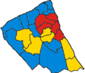 A map of the Wirral showing the council election 2008 results.
 -
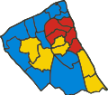 SVG version


Article(s): Wirral Council election, 2008
Request: Could the image be converted to SVG please. It's currently PNG. [User]Jamie JCA[Talk] 22:49, 2 December 2008 (UTC) Graphist opinion:
Lazare Ponticelli
-
 Ponticelli between two soldiers

Article(s): Lazare Ponticelli
Request: Could someone crop Ponticelli from the figure? ~the editorofthewiki (talk/contribs/editor review)~ 00:43, 3 December 2008 (UTC)
Graphist opinion: Hi, retouched the image and removed soldier, hope it helps (: Don't know how to upload pics, so I uploaded it to here: img171.imageshack.us/img171/1987/25tb1.jpg
- Hi, I just registered so I can contribute non anonymously, but I just read that my account has to be at least 4 days old. Just go ahead and upload the image if you can, or wait 'til I can upload it. See you (: —Preceding unsigned comment added by Moonsafari (talk • contribs) 00:01, 7 December 2008 (UTC)
Newton's dynamical equations
-
Newton's dynamical equations
-
 How about his?

Article(s): Physics
Request: Please convert to .svg. When I upload the .svg version it is not right. But png and .jpg seem to work for me. Thank you. Ancheta Wis (talk) 10:07, 3 December 2008 (UTC)
Graphist opinion: I don't see any picture. What's the advantage of using a picture over the wikipedia/TeX markup? bamse (talk) 10:20, 3 December 2008 (UTC)
- Aligning the equations' elements together (aka, p, F, F should be aligned together on the left, the equal signs should be aligned together, and on the right, m, dotted P and F aligned together) would improve the image IMO. Headbomb {ταλκκοντριβς – WP Physics} 08:34, 17 December 2008 (UTC)
- Feel free to realign the elements. I was afraid that there would be too much empty space. The present version is rendered by TeX so I'd consider it standard. bamse (talk) 09:25, 17 December 2008 (UTC)
- TeX isn't made to align things so, I'd just align them manually. However I suck at images, so I won't.Headbomb {ταλκκοντριβς – WP Physics} 09:28, 17 December 2008 (UTC)
- Feel free to realign the elements. I was afraid that there would be too much empty space. The present version is rendered by TeX so I'd consider it standard. bamse (talk) 09:25, 17 December 2008 (UTC)
request for a new image for non articles
-
 Speedy delete symbol
 -
Speedy keep symbol
-
 Speedy keep symbol green


I would like a "speedy keep" icon for voting based on this image but replacing the delete icon with the keep icon--Ipatrol (talk) 20:14, 5 December 2008 (UTC)
- Graphist Opinion: How's the above? I wasn't sure if you wanted to GA symbol or the checkmark, so I went with the keep symbol that's in the same boat as the delete symbol used. §hep • ¡Talk to me! 21:34, 5 December 2008 (UTC)
- Graphist Opinion: We must have been working on that at eactly the same time, and have used exactly the same derivative files. Mine looks a little more zoomy though ;) Mfield (talk) 21:43, 5 December 2008 (UTC)
- That's different. I beat ya by 36 minutes! :P Now watch, I bet Ipatrol wanted the green symbol...(That'd make my day) §hep • ¡Talk to me! 21:52, 5 December 2008 (UTC)
- Tell you what then, I'll change mine to green to keep options open ;) Some renaming of both to include colors would probably be a good plan too, as all that distinguishes them is .SVG instead of .svg Mfield (talk) 22:00, 5 December 2008 (UTC)
- Now that's some interesting color mixing! I was talking about Symbol support vote.svg, which I see used as a keep symbol every now and again. §hep • ¡Talk to me! 22:06, 5 December 2008 (UTC)
Sorry shep, blue for me. you can db the green one as I see no need. snowball on non-deletion discussions can used the "cancelled process" image. The keep is blue because "support" might mean delete.--Ipatrol (talk) 18:48, 14 December 2008 (UTC) P.S. please move the blue one to a lowercase svg for ease of use (very few have an uppercase extension)--Ipatrol (talk) 18:53, 14 December 2008 (UTC)
ZPCAS
-
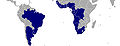 Map of member countries in JPG
 -
 Flag of the ZPCAS
 -
 SVG map


Article(s): en:South Atlantic Peace and Cooperation Zone and iw
Request: Recreate them using vector graphics as an SVG file and highlighting the South Atlantic. As fast as possible! Please. Luan (talk) 01:06, 6 December 2008 (UTC)
Graphist opinion: "As fast as posible" and not saying at least "thanks", is the surest way to make people avoid doing this one as fast as posible.
- Map done. Not going to attempt the flag though. To big a risk of copyright problems. /Lokal_Profil 01:39, 11 December 2008 (UTC)
Dollar and euro
-
 World map with dollar and euro

Article(s): Currencies related to the euro, Currency board, Dollarization, Euro, United States dollar, World currency
Request: I'm partially colourblind, and I can't at all tell the difference between the euro and the CFA franc of sub-Saharan Africa. When I showed this to a non-colourblind friend, he said that it took him a moment to notice the difference. With these things in mind, could we please have the CFA franc and the euro made more different from each other in colour? The image description page includes a guide to the different colours, if you're not certain of which is which. Nyttend (talk) 06:23, 6 December 2008 (UTC)
Graphist opinion:Hi, working on it, what do you think of this scheme, do you see the different colors? check the image --> http://img68.imageshack.us/img68/4800/dollarandeurointheworldbm6.png I'm new so I have to wait 4 days 'til I can upload stuff (: --Moonsafari (talk) 05:02, 7 December 2008 (UTC)
- I think the stripes would be hard to make out the difference at the low resolution the image is presented in. §hep • ¡Talk to me! 05:11, 7 December 2008 (UTC)
- yes, I also think that, maybe just making them a lighter color will be better. Moonsafari (talk) 17:09, 7 December 2008 (UTC)
Coat of arms of Ireland
![]() Done
Done
-
 Coat of arms of Ireland
 -
 Standard coat of arms shape


Article(s): Coat of arms of Ireland
Request: The Coat of arms of Ireland seems to be an odd shape. Could somebody change it to the standard shape (see image 2), and add a black border (which also seems to be standard)? Thank you! Cameron* 21:20, 6 December 2008 (UTC)
Graphist opinion: I don't think there is a "standard" shape for coats of arms. I think, (but I am not sure) that this shape is ment to match the historical shape. It seems to match up with the only other source for it that i could find. -----J.S (T/C/WRE) 21:50, 6 December 2008 (UTC)
- OK, fair enough. Feel free to remove this proposal. I merely mention it because it has been bugging me for a while. Especially when it is listed with other coat of arms. :) Best, --Cameron* 21:56, 6 December 2008 (UTC)
There are various shapes of shield (see Escutcheon (heraldry), but on most it doesn’t matter. The only government link seems to be here (the Irish embassy in Argentina of all places!) and that shows the same shape. Unless it is evidence of a specific shape, then usually the creator of the image has free reign. As for the black line, I really don’t think it matters. Unless it is defined in the blazon (formal description) of the arms, it is the opinion of the once again the graphic's creator as to whether to add a boarder or not. The representation of a coat of arms is really up to interpretation of the blazon, for example all of these show three yellow lions on a red field (the arms of England), but all do it differently.


Therefore it is probably best to stick to the status quo. By the way, apologies for the lesson. You asked for someone with knowledge, but I can get rather longwinded on the subject!-23230 talk 17:56, 10 December 2008 (UTC)
Coat of arms of the Archdiocese of Miami

Article(s): Roman Catholic Archdiocese of Miami
Request: SVG please. Bewareofdog 04:49, 8 December 2008 (UTC)
Graphist opinion:
Ideal layout plan
Hi! I am writing an article about the Jesuit Missions of the Chiquitos and could need an illustration of the ideal layout plan of the mission settlements. The plan should not depict a specific town, so there is some freedom for a creative mind. Ideally it would be 3D, but 2D is also fine.
The following elements should be visible at least:
- (almost) square plaza with a cross in the center and palm trees
- church with two patios, (external) tower, garden and "important" buildings on one side of the plaza
- other houses in rectangular shape and parallel to each other on the three remaining sides of the plaza
For inspiration I can offer the following pictures: ( pic1, pic2 and slideshow, page 4). A description in text form can be found here (English or Spanish)). Would be great if somebody could create such a plan.bamse (talk) 20:07, 8 December 2008 (UTC)
- Some more sources for inspiration: pic3 (search for "Idealplan einer Jesuitenmission") and pdf, page 28 (This layout is a bit unusual as it has extra streets.) bamse (talk) 01:34, 12 December 2008 (UTC)
-
 Unfinished map

[3] - Map of Russia's navigable river system
Article(s): To be created...
Request: Is it possible to create a new (free) map based on that one? And is this the place to ask? Thanks! 189.104.7.8 (talk) 00:24, 10 December 2008 (UTC)
Graphist opinion: Hey there. i am currently working on this one. --pbroks13talk? 06:20, 13 December 2008 (UTC)
- So, do you need everything labeled? Or are there only certain things that need to be labeled? --pbroks13talk? 04:00, 14 December 2008 (UTC)
- I am not the initial requester but would like to give some suggestions. Are those really all of Russia's navigable rivers? If not, the filename is a bit misleading. The map looks good to me. I would at least label the rivers, lakes and major cities. The all-caps labels you used for the seas make it harder to read in my opinion. Also consider adding a minimap to show where this area is located. I know that it is not easy, but country borders would be great. bamse (talk) 12:03, 14 December 2008 (UTC)
- I have a Volga map that covers much of the same territory, feel free to copy from it with labels - without. Kmusser (talk) 20:46, 14 December 2008 (UTC)
Granada(Top)PortOrange(Bottom)Bridges.PNG
-
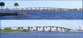 Bridge comparison image
PortOrange(Bottom)Bridges.PNG)
Article(s): Granada Bridge
Request: Please clean up the image perimeters and stretch the smaller image to be the same length as the larger image.-- Suntag ☼ 21:19, 12 December 2008 (UTC)
Graphist opinion:
Second Sino-Japanese war maps
-
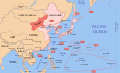 Use this image as a starting point
 -
 EXAMPLE ONE
 -
 EXAMPLE TWO
 -
Taiwan Map 1939
-
 Imperial Japan Map 1939


Article(s): Empire of Japan, Taiwan under Japanese rule, Dadao government.
Request:
Create one where Taiwan is Red and the rest is pink, as seen in EXAMPLE ONE for the Taiwan under Japanese rule article.
Create one where the Empire of Japan, as seen in EXAMPLE TWO, is Red and the rest is pink.
Create a close up of the area around Shanghai, where the Shanghai area is Red, the rest pink, for the Dadao government.
Thanks. --SelfQ (talk) 13:22, 14 December 2008 (UTC)
- BTW, The map its self is already SVG, all that is required is to change the collours.--SelfQ (talk) 15:27, 15 December 2008 (UTC)
Graphist opinion: Just to make sure: by "rest pink" you mean that all the other countries should have the colour of India (not of Manchuko) as in File:Mengjiang map 1939.svg ? The years in the map should be removed? What about the borders in what is nowadays China? If all you want to show in the first two maps is Taiwan and Japan why do you need everything from India to the Pacific Islands? Wouldn't a more zoomed-in map suffice? The third map would require creating a new map if I understand correctly? bamse (talk) 23:37, 15 December 2008 (UTC)
- No, keep the map as it is with the dates, text, the area under the control of Japan and its allies pink (and then the island of taiwan as seen in EXAMPLE ONE/All of the Empire of Japan as seen in EXAMPLE TWO/Shanghai in red) and keep the rest of the countries orange/brown. Taiwans map needs to have the full scale because it was a annexed dependency of the Empire of Japan, so it needs to show the full extent of the empire, from its most eastern pasific island to its most western conquests.
- As for the Shanghai map, I would like something that looks like this: file:China Shanghai.svg, useing the Mengjiang map as a base. Thanks for taking the time to look at my request and feel free to ask if I still arnt clear enough.--SelfQ (talk) 00:31, 16 December 2008 (UTC)
- I made a first attempt for the Taiwan map. Is this how you want it? Please let me know of a suitable file name for this and the other maps. Also the image description needs to be added. bamse (talk) 11:12, 16 December 2008 (UTC)
- This was exactly what I was going for, great stuff. I have taken the liberty of changing the description. As for the file name something along the line of "Dadao map 1939" and "Imperial Japan map 1939" will do fine. Side not though, I could not help but notice the font in your map was abit less readable at thumb size? Anyway thanks again. --SelfQ (talk) 14:36, 16 December 2008 (UTC)
- Thanks, it took 5 seconds in inkscape. I requested the map to be renamed to Dadao map 1939.svg on commons. That should happen automagically over the next days. I uploaded the second map, where I coloured the four main islands of Japan, Korea and Sachalin. How about the Kuril Islands or any other small islands? Do they need to be coloured red as well? Please feel free to add to the description and to add categories to the maps. I am now going to tackle the last map. PS: As for the font, I don't know. All I did was to open the map in inkscape, change the colour and save it. Possibly the original file used an uncommon font which is note available on my computer or the wikipedia renderer does not have this font. bamse (talk) 15:35, 16 December 2008 (UTC)
- (edit conflict)Fonts can be problematic in MediaWiki tried uploading a new version where the two changes were made in a text editor (to avoid Inkscape interference). However it looks as though the fonts still render differently which makes no sense. Tried purging caches but so far no luck. /Lokal_Profil 15:38, 16 December 2008 (UTC)
- I see. I will try saving it as a plain svg (instead of inkscape svg file). Maybe that will help. I also noticed that the original svg-file is not very clean and has some extra stuff which lie outside the visible area. bamse (talk) 15:51, 16 December 2008 (UTC) - No success it seems... bamse (talk) 16:00, 16 December 2008 (UTC)
- (edit conflict)Fonts can be problematic in MediaWiki tried uploading a new version where the two changes were made in a text editor (to avoid Inkscape interference). However it looks as though the fonts still render differently which makes no sense. Tried purging caches but so far no luck. /Lokal_Profil 15:38, 16 December 2008 (UTC)
- Thanks, it took 5 seconds in inkscape. I requested the map to be renamed to Dadao map 1939.svg on commons. That should happen automagically over the next days. I uploaded the second map, where I coloured the four main islands of Japan, Korea and Sachalin. How about the Kuril Islands or any other small islands? Do they need to be coloured red as well? Please feel free to add to the description and to add categories to the maps. I am now going to tackle the last map. PS: As for the font, I don't know. All I did was to open the map in inkscape, change the colour and save it. Possibly the original file used an uncommon font which is note available on my computer or the wikipedia renderer does not have this font. bamse (talk) 15:35, 16 December 2008 (UTC)
- This was exactly what I was going for, great stuff. I have taken the liberty of changing the description. As for the file name something along the line of "Dadao map 1939" and "Imperial Japan map 1939" will do fine. Side not though, I could not help but notice the font in your map was abit less readable at thumb size? Anyway thanks again. --SelfQ (talk) 14:36, 16 December 2008 (UTC)
- I made a first attempt for the Taiwan map. Is this how you want it? Please let me know of a suitable file name for this and the other maps. Also the image description needs to be added. bamse (talk) 11:12, 16 December 2008 (UTC)
- About the Kuril Islands and other small islands, only the following please: Okinawa Prefecture, Kuril Islands, Jeju-do and the smaller islands around Taiwan. So non of the islands from the South Pacific Mandate. Also could you put a red dot on Port Arthur, Japan had a exclave there that was part of the empire prior to the war.--SelfQ (talk) 16:26, 16 December 2008 (UTC)
- It's not about plain svg/inkscape svg, the original file is saved in Inkscape svg anyhow. When inkscape opens the file it sometimes changes the code of objects. E.g. if the original file has "fill:blue" newer versions of incscape will change that to (the equivalent) "fill:#0000FF" when that object is changed in any way. I was thinking that perhaps similar things had happened to the fonts. However in this case it's due to some MediaWiki change since reuploading Image:Mengjiang map 1939.svg as File:Test.svg renders it differently, and they are exactly the same file. /Lokal_Profil 17:14, 16 December 2008 (UTC)
- Thanks for the clarification Lokal Profil. It seems we can only wait for another update to MediaWiki, upload the file as png or convert the text in the svg into paths. bamse (talk) 18:29, 16 December 2008 (UTC)
- I've asked on Wikipedia:SVG_Help#Identical_images_render_differently. Guessing it's the svg renderer which has been updated. Problem with uploading png or converting font to paths is that this would require you to have the font on your computer. Otherwise the result would look the same as now (or worse). Hopefully things will get sorted though. /Lokal_Profil 23:06, 16 December 2008 (UTC)
- Thanks for the clarification Lokal Profil. It seems we can only wait for another update to MediaWiki, upload the file as png or convert the text in the svg into paths. bamse (talk) 18:29, 16 December 2008 (UTC)
- It's not about plain svg/inkscape svg, the original file is saved in Inkscape svg anyhow. When inkscape opens the file it sometimes changes the code of objects. E.g. if the original file has "fill:blue" newer versions of incscape will change that to (the equivalent) "fill:#0000FF" when that object is changed in any way. I was thinking that perhaps similar things had happened to the fonts. However in this case it's due to some MediaWiki change since reuploading Image:Mengjiang map 1939.svg as File:Test.svg renders it differently, and they are exactly the same file. /Lokal_Profil 17:14, 16 December 2008 (UTC)
Coat of arms of Qing Dynasty
-
 flag (use)
.svg)
Article(s): Qing Dynasty, Qing Hanedanı
Request: SVG please and Can you upload Commons, please.--Lord Leatherface (talk) 16:37, 14 December 2008 (UTC)
Graphist opinion:
Upgrade the map - Arctic Council
-

-
 SVG with China and Italy


Article(s): Arctic Council Request: Italy and China are observers. Thanks! Amiens984 (talk) 23:05, 14 December 2008 (UTC)
iPhone map
-
 Example,
but it's outdated -
 To be rotated
 -
 Done
Done


Article(s): iPhone
Request: So I would like a map of iPhone availability that is up-to-date. I like the color scheme of this version, with dark blue being released in 2007, light blue representing 2008, and green "coming soon". Resources:
- List of countries by date
- Apple's list, which does not include dates but does have upcoming releases
- Python script designed to automate this sort of thing.
This seems like a fairly easy sort of thing to do if you can work the Python script. Thanks!--HereToHelp (talk to me) 01:52, 17 December 2008 (UTC)
Graphist opinion:
- Should be fairly easy to update even without the python script. Just wondering though if the flat and compact map wouldn't be better, after all iPhone is never likely to be available in Antarctica. /Lokal_Profil 15:02, 18 December 2008 (UTC)
- Perhaps so. I tried to update it by hand but the countries are listed by two letter codes. Inkscape can't alphabetize them, making it very difficult. As for finding the countries by hand, WYSIWYG, good luck.--HereToHelp (talk to me) 00:41, 19 December 2008 (UTC)
- Also: Can someone rotate the photo viewer app photo so it's square and then upload over the original file? It's completely separate from the map but it should be really easy. Background removal would be nice if it can be done cleanly and easily, but it's not required. Thanks! HereToHelp (talk to me) 01:17, 19 December 2008 (UTC)
- OK, I've fixed the rotation and made the background white. The left side is slightly larger than the right, but it's not very noticeable. CountingPine (talk) 04:43, 19 December 2008 (UTC)
- Perhaps the camera was a little bit closer to the left. Can you crop out some of the whitespace, reducing the horizontal dimension? I tried to do that myself and the resulting file was larger than the original…my program must not have very good compression. Also, still waiting on the map.--HereToHelp (talk to me) 22:42, 19 December 2008 (UTC)
- Perhaps so. I tried to update it by hand but the countries are listed by two letter codes. Inkscape can't alphabetize them, making it very difficult. As for finding the countries by hand, WYSIWYG, good luck.--HereToHelp (talk to me) 00:41, 19 December 2008 (UTC)
- So I've created a new map based on the info on the apple.com page. Not sure I see what additional info there is on the applelot.org page though (apart from saying that the US, Germany, UK and France got it in 2007). Apple.com has info about upcoming releases (such as quatar) which aren't on the applelot.org page. /Lokal_Profil 02:27, 20 December 2008 (UTC)
- Uploaded, please note that dark blue is slightly differently defined from above. /Lokal_Profil 02:44, 20 December 2008 (UTC)
- And updated the original. /Lokal_Profil 02:52, 20 December 2008 (UTC)
- Thank you so much! When you mean "slightly differently defined," I take it as we're ignoring the year and worrying about whether the original iPhone was ever available, correct? Ireland didn't get the original iPhone until '08, but it did have it [4] and is the darker blue on the map. That's probably more useful information anyway, so thanks again.HereToHelp (talk to me) 03:46, 20 December 2008 (UTC)
- And updated the original. /Lokal_Profil 02:52, 20 December 2008 (UTC)
- Uploaded, please note that dark blue is slightly differently defined from above. /Lokal_Profil 02:44, 20 December 2008 (UTC)
Boltzmann's equation

Article(s): See image
Request: Replace that image by this one (right click and save):

Or you could re-make it into something similar to this.
Headbomb {ταλκκοντριβς – WP Physics} 08:27, 17 December 2008 (UTC)
Graphist opinion:
- Done. if you already know how to use LaTeX I recommend. Tex Text which is a good latex plugin for Inkscape. /Lokal_Profil 17:22, 18 December 2008 (UTC)
1965 logo
Article(s): 1965 Records
Request: SVG-ify if possible, remove whitespace. I understand it is a non-free image but i figured removing white space would not come under as a violation of that. Please! SteelersFanUK06 ReplyOnMine! 15:33, 17 December 2008 (UTC)
Graphist opinion:
Please simplify some vector maps
Request: Kmusser (talk · contribs) made vector images out of some shapefiles of Oregon's state legislative districts, which can be found at the bottom of this page. His images are [5] and [6]. The Oregon state government does apparently have the legal right to general copyright authority, and I do not know the extent of this right — however, it is my understanding, per this discussion on WP:MCQ that the government's shapefiles are free, insofar as the data they provide cannot be copyrighted. So any derivative work that does not retain any of the source's copyrightable "expression" of the data is also free. Knusser holds no copyright to his derivative works, since all he did was change their file type, as well as the map projection for one, so I believe they are free.
That said, his files are horrendously huge. It doesn't seem right that they would be about a megabyte. The Oregon county maps, such as this one, are of roughly comparable detail, and are a little over a tenth the size.
Four things appear to be causing this:
- The first thing, which re-saving with Inkscape seems to mostly fix, is all the white space in the source code. Lines of coordinates are double-spaced, for example.
- The next thing, which Inkscape seems to aggravate in my experience, is the way the coordinates are represented. In the Oregon county maps, I see clean-looking coordinate strings like "M 30044,-14006 l 941,-42 30,0 341,-25 315,-14 305,-14 66,-1...". That's seven coordinates. In the legislative district maps, I see "M63.11998,248.46112 L63.11998,248.22106 L63.35998,247.74094 L63.35998,247.02077...". That's only four coordinates. It seems like way too many digits are used for each coordinate. These two formats must be interchangeable, right?
- Almost all of the districts are constructed using more than one object. One, with a fill but no stroke, is used for the body of the district, while one or sometimes two more are used just to make the actual boundary, with a stroke but no fill. The superfluous objects are easily deleted in Inkscape, and they do significantly reduce the file sizes to 500 and 700 kilobytes. But I think this is still way too large.
- Each object has way too many nodes. There are multiple nodes for straight lines. This is very bad. Using Inkscape to automatically simplify the image does reduce the file size drastically, but I do not like the rounding effects on the objects. I've found that manually deleting unneeded nodes gives some results while preserving the visible detail, but it's horribly tedious.
Is there anything the Graphic Lab can do about this? Äþelwulf Talk to me. 22:42, 17 December 2008 (UTC)
Graphist opinion:
Peter Falk
Article(s): Peter Falk
Request: rotate to straight as encyclopedic... Chris (クリス • フィッチ) (talk) 14:04, 18 December 2008 (UTC)
Graphist opinion: Just want to add a warning that this image is probably unfree. /Lokal_Profil 14:56, 18 December 2008 (UTC)
Coat of arms of Sultanate of Egypt
-
 flag (You can use it.)
 -

.svg)

Article(s): Sultanate of Egypt
Request: SVG please and Can you upload Commons, please.--Lord Leatherface (talk) 16:37, 14 December 2008 (UTC)
Graphist opinion:
Map of Chech
-
 Map of the Chech Region

Article(s): Chech, and all (about) 80 settlements associated with the map.
Request: Add topographic data, add all settlements (I can provide all coordinates based on books and databases) and vectorize. Chech Explorer (talk) 00:18, 19 December 2008 (UTC)
Graphist opinion:
Coat of arms of the Satovcha Municipality
-
 Coat of arms of the Satovcha Municipality.
 -
 SVG version


Article(s): Satovcha Municipality, Satovcha, bg:Шаблон:Община Сатовча...
Request: Vectorize please! Chech Explorer (talk) 00:24, 19 December 2008 (UTC)
Graphist opinion: Here you are. I just changed the colours a bit. What do you think? --Ahnode (talk) 14:33, 20 December 2008 (UTC)
- It's great. Thanks! I can change the colors if needed but I don't think it's necessary. --Chech Explorer (talk) 18:01, 20 December 2008 (UTC)
NHL Shield

Article(s): National Hockey League
Request: Needs to be converted to a .SVG. —Preceding unsigned comment added by Connormah (talk • contribs) 20:45, December 18, 2008
Graphist opinion:
Quark decay
-
 Description of image

Article(s): See image link.
Request: Quark is about to be FA'd, but the image should be improved before it is.
- Add two arrows fainter than the rest.
- One pointing from t do d
- One pointing from b to u
- Add "Rarer" to the legend (with the type of arrow used).
- The "minus sign" used right now isn't a minus sign, it's a dash. It should be a real minus sign rather than a dash. Headbomb {ταλκκοντριβς – WP Physics} 08:09, 20 December 2008 (UTC)
Graphist opinion:
Image:Constudevent.gif
-
 Early left anterior negativity

![[2]](http://img261.imageshack.us/img261/9249/50pk2.png%7Cimageshack.us)
.gif)
![[5]](http://www.fantasymaps.com/images/or_house.svg)
![[6]](http://www.fantasymaps.com/images/or_senate.svg)
Article(s): Early left anterior negativity
Request: Make the lines sharper and do whatever you feel will improve the image. The image may be used on the Main Page if cleaned up. See DYK nom. -- Suntag ☼ 18:30, 20 December 2008 (UTC)
Graphist opinion: