
Wikipedia talk:WikiProject Maps
| Geographical coordinates | ||||
| ||||

Wikipedia:Wikipedia Signpost/WikiProject used
| |||||||||||||||

|
This page has archives. Sections older than 90 days may be automatically archived by Lowercase sigmabot III when more than 5 sections are present. |
- Related WikiProjects
The parent of this WikiProject is the Geography WikiProject. WikiProject Maps also is a management type WikiProject for pictorial representations displayed within Wikipedia. The following illustrates the position of WikiProject Maps within the Wikipedia WikiProject lineage:
Extended content
| ||
|---|---|---|
WikiProjects that have made use of geographical maps include:
|
RfC: Guideline on depiction of disputed lands/territories
{{rfc|hist|pol|policy|rfcid=7D16D98}}
Extended content
|
|---|
|
There is no explicit guideline or convention on the depiction of disputed lands/territories. A discussion is going on Talk:China#Chinese map as depicted in the article about the depiction of disputed lands for quite a time. --kondi talk/contribs 14:53, 7 April 2012 (UTC)
|
|
@Dear all : This talk become endless and unproductive. We can't explain to each new user BEFORE why we WILL use grey not red, why we keep neigbourg countries, talk about butterfly, etc: that's time consuming and not productive. Mapmakers' job is to work constantly with borders, borders changes, borders disputes. Edward (cartographer) and myself (cartographer) volunteered to propose a guideline (draft). Edward and myself already gather a long experience, and have the understanding and skills to make a good proposal. Successfull conventions were produce that way, by a single or duo of users, proposing a convention, sharing it, then the proposal was improved with feedbacks. This last way have proven efficient, elegant, and consensual. Accordingly, please simply let us some weeks to propose a guideline draft, then we will have something to comment on. Cheers, Yug (talk) 10:52, 9 April 2012 (UTC) |
- Yug, can you specify how much time it would take for you to come up with a guideline on this? I am in no hurry, but specifying a date would be very helpful. Thank you. — Nearly Headless Nick {c} 13:36, 19 April 2012 (UTC)
- Say 2 months. Maybe more. It needs maturation. I'm currently watching maps with this problematic in mind, thus gathering ideas of current practices and possible conventions. To tell more, the German team actually provided a nice start, light and nice, the bad points are 1. nothing for waterbody, 2. conflicting with the wikipedia (NGO) will to use doted lines (— - — - —) for international border. That's conflicting. My opinion of it will come according to what practices I see within this 2 months, then I will write down a comprehensive proposal within an afternoon. Yug (talk) 15:36, 19 April 2012 (UTC)
- Thank you. I will remind you after 2 months. — Nearly Headless Nick {c} 16:38, 19 April 2012 (UTC)
- Say 2 months. Maybe more. It needs maturation. I'm currently watching maps with this problematic in mind, thus gathering ideas of current practices and possible conventions. To tell more, the German team actually provided a nice start, light and nice, the bad points are 1. nothing for waterbody, 2. conflicting with the wikipedia (NGO) will to use doted lines (— - — - —) for international border. That's conflicting. My opinion of it will come according to what practices I see within this 2 months, then I will write down a comprehensive proposal within an afternoon. Yug (talk) 15:36, 19 April 2012 (UTC)
The two month window has now elapsed, and I hope there will be some resolution to this dispute. — Nearly Headless Nick {c} 19:52, 17 June 2012 (UTC)
Request a map
I wonder if there is a free equivalent of this map. It has to be old (before 18 March 2011), because the structure (Pearl Square) was demolished by authorities. Mohamed CJ (talk) 06:55, 16 July 2012 (UTC)
- The simpliest way is Sharemap.org. I'm creating the Barhain part to show you the way. May you draw the Cairo part and combine the both ? (I'm in exam period). Yug (talk) 14:58, 16 July 2012 (UTC)
- See: http://sharemap.org/public/Bahrain_protest . The Apps is quite simple, easy ti edit, so enjoy yourself ! Yug (talk) 15:01, 16 July 2012 (UTC)
- Wow. It looks nice. Thanks and good luck in exams! Mohamed CJ (talk) 15:45, 16 July 2012 (UTC)
- I was not able to download the map WITH the background. Do a screenshot if need. Cheer. Yug (talk) 16:19, 16 July 2012 (UTC)
- Wow. It looks nice. Thanks and good luck in exams! Mohamed CJ (talk) 15:45, 16 July 2012 (UTC)
Help with an Infobox map
I am having a difficult time with the Infobox map on Blob's Park. I followed the guidelines on Template:Infobox map but that did not seem to work. Any help would be appreciated. LarryGrim (talk) 12:49, 27 August 2012 (UTC)
- I got it for you, switched to a different template and it worked. Kmusser (talk) 14:02, 27 August 2012 (UTC)
- Thanks. That got it. So simple when it is done. So difficult to do alone. LarryGrim (talk) 18:49, 27 August 2012 (UTC)
Seeking critique & advice
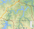
Please let me know if there's a more appropriate venue in which to ask this. I'm looking for constructive critiques of a series of maps I'm creating. These are maps of reservoirs that were never built, which will illustrate an expanded article I plan to write on the defunct Meramec Basin Project.
-
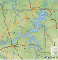 Meramec Park Lake
 -
 Pine Ford Lake
 -
 Union Lake
 -
 Irondale Lake
 -
 Virginia Mines Lake
 -
 Salem Lake


_approximate_extent.svg)


I'm planning on another couple of maps for major reservoirs that were proposed for a second phase of the project, plus one of the full basin showing them all in relation to each other and the basin. --Kbh3rdtalk 17:32, 7 September 2012 (UTC)
- Simply Awesome... the best topographic maps created on the English Graphic lab. Yug (talk) 18:11, 8 September 2012 (UTC)
- That certainly is not true. Overall these aren't bad, IMHO, but I'm looking for real expert guidance on what details need more attention and tweaking in some manner. --Kbh3rdtalk 23:32, 9 September 2012 (UTC)
- Those look great, I think they'd be fine as is. If you have it, it would be cool to show the existing river course going through the reservoirs (but keep it subtle, a light blue dashed line perhaps). I'd probably also use regular case for the water feature labels and reserve the all caps for just the counties, but that's a personal preference. Kmusser (talk) 14:45, 10 September 2012 (UTC)
- For deeper comments...
- 1. You map a small area, so you have neither the misleading north-arrow issue, nor the misleading scale issue. I suspect however that the grey lines indicate the real north (see File:Meramec Park Lake propose v4.svg).
- 2. Background is SVG, which is great (how did you make that ? which soft / script ?)
- 3. Colors are smooth thanks to the conventions.
- 4. I didn't remembered that rivers should have darker borders, but I guess you considered the big zoom justifies to look at rivers are water area rather than water lines.
- Suggestions: I may suggest you to enlarge a bit the frames. More interesting : to create an overall locator map to localize each frame. See File:Metacomet_Ridge_map-fr.svg. Yug (talk) 19:23, 10 September 2012 (UTC)
- Good points. Response per each:
- 1. Most of these were done in UTM 15N, and the area is towards the eastern limit of that zone, which causes north to tilt to the left. The last one (Virginia Mines) was done in the Missouri East state plane which has that problem to a much lesser degree for this area. I may recast all the maps in that projection. The north arrow, particularly the one from the template, doesn't do much good when the deviation from vertical is slight. I included and oriented it in the Meramec Park Lake map, and it's also in the Union Lake map, though I think that was by accident.
- 2. I use Quantum GIS to render the topographic background and export it as a bitmap. I use Inkscape's bitmap tracer to translate that into SVG. That function is available in a standalone utility, too, though I don't remember the name. The lakes, roads, streams, and towns are from shapefile data, after I've derived the lakes' shapefile from the elevation data, and are rendered to SVG with shptosvg, which I wrote. I've gotten my techniques pretty well nailed down while working on this series and have been considering posting a step-by-step tutorial, both to help others learn and to garner suggestions for better methods.
- 3. Using all 19 colors of the convention creates too unwieldy an SVG file, given how they're rendered by the bitmap tracer, and that number isn't necessary for the range of elevations here, so I cut it down to those shown. In most I chose the first n colors, but in the Meramec Park Lake map I used every other color. I think I may adjust that to be the same as the other maps.
- 4. Yes, I realize it goes against the convention, but I believe that the streams as shown look better in these maps. That's how they're shown on USGS topo maps, and the scale here is similar or even smaller.
- I love a map full of details into which I can dive. But topographic details are more easily gleaned from a shaded relief map, I think, than the flat color used here. I don't have a technique for an effective shaded relief map in pure SVG, though. I may make shaded bitmap versions of each of these, as I did for the Pine Ford map. The Metacomet Ridge map you reference is very interesting and well done. I am going to make a map of the whole basin with all these maps shown in context, but I don't think I'll include each of these as insets because it ossifies the presentation -- all these maps as well as the area map can be included and arranged individually in the article I have in mind.
- Thanks for the useful feedback, and more welcomed. --Kbh3rdtalk 20:25, 10 September 2012 (UTC)
- Feedback regarding the descriptions, not the content: It would be useful to have more metadata noted, such as the projection used, co-ordinates displayed, scale and so on. Also the source - the map is your own work, but the data its based on isn't.
- Regarding the content, I'm not sure about the display of the roads. If the dams had been built the roads would have been interrupted. Given that the lakes are shown as if they had been completed, I think it would be better to show it covering those roads. I wish SVG relief shading was viable too...--Nilfanion (talk) 09:13, 12 September 2012 (UTC)
- I added a new map for a reservoir that was proposed for near Salem. Changes in the presentation, based on suggestions here, include: "underwater" roads, added existing lakes and minor streams (presented as simple lines), and projection information and world file on the image description page. Unfortunately, this is near the western edge of the state plane, which causes North to dip to the right; that county line runs east-west. The North arrow is accurate for what it's worth. BTW, Crooked Creek, on the far right, is the namesake of the Crooked Creek crater. --Kbh3rdtalk 23:47, 13 September 2012 (UTC)
File:Urals blank map.png
File:Urals blank map.png has been suggested that it isn't free and should be deleted -- 76.65.131.248 (talk) 20:50, 8 September 2012 (UTC)
Creating a new pushpin map
Are there any instructions on creating a pushpin map?
JASpencer (talk) 23:00, 14 September 2012 (UTC)
- Have you something in mind ? (some radom pushpin maps images). I guess we have nothing, but you can suggest us a convention on the same principle that our other Map Conventions. Yug (talk) 14:56, 15 September 2012 (UTC)


- I found the 3 cases for wikipedia pinpoint maps.
- Case 1: You can draw it completely in SVG, like the Mali map.
- Case 2: ({location maps+}
- Case 3: make an external google maps. Yug (talk) 15:13, 15 September 2012 (UTC)
- Thank you for your answers. JASpencer (talk) 21:39, 21 September 2012 (UTC)
US place location maps
Greetings all,
Some years ago I generated a large number of SVG maps that are used on numerous US place articles (see [2] for an example). They were a step up from the generic pushpin maps that had been used for some years and for the most part people were happy with them, however these maps are deficient in a number of ways - not the least of which being the fact that they are outdated by 12 years now.
![[2]](https://en.wikipedia.org/wiki/File:King_County_Washington_Incorporated_and_Unincorporated_areas_Seattle_Highlighted.svg)
I have been asked from time to time if I planned to do an update on these maps, so I've finally begun looking in to it. I've identified a number of potential upgrades to bring the maps more up to convention as well as adding additional context, based partly on a subset of maps that have been created by User:Ixnayonthetimmay. A test run of the script and some of the potential improvements can be seen at [3], it is obviously lacking the inset window.
![[3]](https://en.wikipedia.org/wiki/File:Shereth_Maricopa_Test_Generated.svg)
Before I move any further with this 'project' I have a few points I'd like to bring up as well as get any potential feedback on how I might be doing thse things better.
- Roads and water features have been added for context. I am slightly concerned that on this scale the size of the roads might in fact be a distraction, so I would love some feedback as to whether or not they should be included. Water features should remain either way, they are particularly useful in coastal regions where the old style map could produce confusing results.
- The maps no longer exist as isolated islands; features that extend out beyond the county lines are displayed.
- I've done my best to conform to convention but there is still some gray area. The previous convention was to show incorporated places as grey and unincorporated places as transparent (no fill). So far I am still going with this old convention but if there is any other suggestions I'm open to hearing them.
- Some derivative versions of these maps show Native American reservation boundaries, but I've left them off. It is my opinion that since the purpose of these maps is to show boundaries for incorporated and unincorporated places (cities and towns, essentially), adding additional jurisdictional boundaries only confuses things. Open to any feedback on these lines.
- Previous discussions regarding minor civil divisions in some states (Michigan, New England Area, etc) indicated that the old maps were deficient for these states. The newer files available from the Census allows the script to treat these as equal to incorporated places so this should not be an issue any longer.
The scripts I have written do most of the hard work but there is still a lot of 'manual labor' involved; inset maps have to be added by hand, for example, as well as some minor fixes to coastal water features. As there are 3000 county and county equivalents in the US, I'd like to get started on the process sooner rather than later if I am to go forward with this, so again, any input or suggestions are quite welcome. Thanks! Shereth 19:02, 18 September 2012 (UTC)
- Glad to see you made a post here, and glad to see you went into more detail with resolving the issues with the old maps than I did.
- Overall, I think it's essential to have all the maps conform to the same standards and a project like this one will address, once and for all, the inconsistent and sometimes obsolete locator maps for the various Wikipedia U.S. city articles. Regarding the specific points you mentioned:
- 1.) Roads should be included for exactly the reasons you mentioned. I am not sure the size would be an issue unless the roads will appear 'thinner' on large county maps and 'thicker' on small county maps. I am wondering if there is some way to compensate for that; bump up the thickness of the road paths for larger maps and vice versa, though this is just an aesthetic point.
- 2.) This will be fine, though I am wondering the effect this will have on cities with significant chunks of incorporated land in adjacent counties. Maybe just take it on a case-by-case basis for the New York Cities out there.
- 3.) This convention regarding unincorporated areas seems to be working. Just a value judgement on my part, but anything we can do to get away from those terrible red dot locator maps will be quite welcome.
- 4.) I must confess this norm for showing rez boundaries shows my Arizona bias, and it seemed to just fit for the Maricopa county maps I made lo these many years ago. I must agree that it doesn't make sense to shoe-horn them into the locator maps anymore.
- 5.) I can't provide any input on the northeastern states issues raised up, but I would like to ask this. Will Midwestern townships and New England "towns" be equivalent to unincorporated places in your map standard?
- If you would like someone to volunteer to help with post-production, I will, though there are some other aesthetic considerations I would like to discuss. But as you mentioned, there are 3000 maps, so it isn't something I could do on my own in any reasonable amount of time. Help would be greatly appreciated!
Pushpin points moved south
I am not sure where to address this, but today I find all the pushpin points placed on File:Uruguay location map.svg moved to the south. I checked with other location maps, like File:Greece location map.svg and I think I see in all of them a deviation of pushpins. Is this visible to all? Was there some change lately that could have this effect? One example as seen at the time I write this is that the coordinates of kilometre 0 of Montevideo Department dispay in the water, though when I placed them 3 days ago, the pushpin was exactly where it should be. Hoverfish Talk 10:52, 19 September 2012 (UTC)
Gradient maps best practices: copy edit need
Dears, I made a push to gather interesting concepts, resources, and tools to generate gradient maps winthin a 'convention page' (best practice is more correct). The page and text is 90% done, but I'am not an English speaker. May some English native speaker come checkspell and copyedit my writing (there:Wikipedia:WikiProject Maps/Conventions/Gradient maps) before its full inclusion / publication within our list of best practices (Wikipedia:WikiProject Maps/Conventions). This copyedit will be appreciate ! Yug (talk) 14:36, 30 September 2012 (UTC)
- Someone to help ? Yug (talk) 20:54, 2 October 2012 (UTC)
Discussion at WT:Titles - All about Maps and Article Names
There is this discussion on-going at If Maps Agree? at WT:AT that would benefit from some input from those editors who understand the role of cartographers in naming places. Thanks --Mike Cline (talk) 12:58, 1 October 2012 (UTC)