
Wikipedia:Graphics Lab/Illustration workshop: Difference between revisions
m Signing comment by 82.120.246.10 - "→SVG please: Original source" |
→SVG please: Half of request completed. |
||
| Line 924: | Line 924: | ||
Image:Jonathan Lambert flag.png|1 |
Image:Jonathan Lambert flag.png|1 |
||
Image:Flag of the Other World Kingdom.jpg|2 |
Image:Flag of the Other World Kingdom.jpg|2 |
||
Image:Jonathan_Lambert_Flag_ZP.svg|SVG of image 1 |
|||
</gallery></center> |
</gallery></center> |
||
| Line 929: | Line 930: | ||
'''Request:''' SVG please |
'''Request:''' SVG please |
||
| ⚫ | * Original source : http://www.owk.cz/symbols/flag-owk-s.jpg <small>—Preceding [[Wikipedia:Signatures|unsigned]] comment added by [[Special:Contributions/82.120.246.10|82.120.246.10]] ([[User talk:82.120.246.10|talk]]) 17:55, 12 June 2008 (UTC)</small><!-- Template:UnsignedIP --> <!--Autosigned by SineBot--> |
||
'''Graphist opinion:''' |
'''Graphist opinion:''' |
||
I did one image. Doing the second one now. [[User:XcepticZP|XcepticZP]] ([[User talk:XcepticZP|talk]]) 19:43, 12 June 2008 (UTC) |
|||
| ⚫ | * Original source : http://www.owk.cz/symbols/flag-owk-s.jpg <small>—Preceding [[Wikipedia:Signatures|unsigned]] comment added by [[Special:Contributions/82.120.246.10|82.120.246.10]] ([[User talk:82.120.246.10|talk]]) 17:55, 12 June 2008 (UTC)</small><!-- Template:UnsignedIP --> <!--Autosigned by SineBot--> |
||
Revision as of 19:43, 12 June 2008
This page is deprecated and will not be monitored. Please use one of the three workshop pages. This specific page is {{{1}}}
See also
- Category:Images for cleanup
- Category:Images for redraw
- meta:Philip Greenspun illustration project/Requests
Waffen-SS unit insignia
-
Collage of SS collar patches
Article(s): SS unit insignia
Request: Could someone make individual SVG patches out of this? also, can someone make out some of the text? Thanks --SelfQ (talk) 23:31, 20 April 2008 (UTC)
Graphist opinion:
- Those words are division numbers. It seems that we have all the insignia for Waffen-SS divisions, but not collar patches. Renata (talk) 17:08, 21 April 2008 (UTC)
- My bad. I was thinking collar patches but didnt type it. fix'ed.--SelfQ (talk) 19:57, 21 April 2008 (UTC)
- Looking at the Waffen-SS pics, could they be SVG or is there a law thingy prohibiting it? Mangwanani (talk) 18:24, 22 April 2008 (UTC)
- Most Waffen-SS images and symbols are public domain, and the legal thingy is only for Germany, and since wikipedia is not hosted in Germany I dont think there is a problem, right?--SelfQ (talk) 19:45, 23 April 2008 (UTC)
- Looking at the Waffen-SS pics, could they be SVG or is there a law thingy prohibiting it? Mangwanani (talk) 18:24, 22 April 2008 (UTC)
- My bad. I was thinking collar patches but didnt type it. fix'ed.--SelfQ (talk) 19:57, 21 April 2008 (UTC)
- I'm pretty sure that law is for noneducational use. 68.39.174.238 (talk) 21:17, 24 April 2008 (UTC)
- So it can be done right?--SelfQ (talk) 16:35, 29 April 2008 (UTC)
- I'm pretty sure that law is for noneducational use. 68.39.174.238 (talk) 21:17, 24 April 2008 (UTC)
- I'm no lawyer, but I don't think German laws apply to us... 68.39.174.238 (talk) 19:14, 7 May 2008 (UTC)
- As long as you add {{Nazi_symbol}} to the image page it's ok to upload them. /Lokal_Profil 19:48, 20 May 2008 (UTC)
- So is anyone willing to make them? --SelfQ (talk) 10:38, 26 May 2008 (UTC)
- As long as you add {{Nazi_symbol}} to the image page it's ok to upload them. /Lokal_Profil 19:48, 20 May 2008 (UTC)
- I'm no lawyer, but I don't think German laws apply to us... 68.39.174.238 (talk) 19:14, 7 May 2008 (UTC)
- Scour the net for a better image and provide the source links of anything you find, then drop me a talk. If you can't see what it's meant to look like then neither can I. Dhatfield (talk) 11:30, 28 May 2008 (UTC)
- Are all of them impossible, or just the more detailed ones? The one at the very end is just off of the coat of Guernsey. 68.39.174.238 (talk) 21:55, 3 June 2008 (UTC)
Northwest Territories License Plate


Article(s): U.S. and Canadian license plates
Request: trim out for clear background, replace bolts with empty boltholes -- Chris (クリス • フィッチ) (talk) 04:18, 22 April 2008 (UTC)
Graphist opinion: Done, but removed bolt-holes completely (irrelevant and distracting). Saved as png to allow transparency. Please mark as resolved if this is OK. --Slashme (talk) 10:40, 9 May 2008 (UTC)
- Sorry for the delay, I'm just getting settled in Japan. Great job, however I did not notice on the original photo that the blue-and-white edge was trimmed off, is there anyway to recreate that? Thanks! Chris (クリス • フィッチ) (talk) 01:04, 19 May 2008 (UTC)
- Sorry, I don't quite understand - what blue and white edge? Good luck on the new life, BTW! --Slashme (talk) 10:24, 23 May 2008 (UTC)
- The border on the bear's back and head should continue to the feet as well. Thanks for the good wishes, it's fun so far! Chris (クリス • フィッチ) (talk) 14:22, 25 May 2008 (UTC)
World 820

Article(s): History of Tibet
Request: put on regular Wiki-style white or clear background -- Chris (クリス • フィッチ) (talk) 05:39, 24 April 2008 (UTC)
- And change Tauregs to Tuaregs. --ANONYMOUSPUSSY 16:55, 3 May 2008 (UTC)
- Shouldn't it be spelled "Caliphate" ? 68.39.174.238 (talk) 23:58, 9 May 2008 (UTC)
- It should indeed be spelled "Caliphate". Chris (クリス • フィッチ) (talk) 01:07, 19 May 2008 (UTC)
Graphist opinion:
Take a look at User:Dhatfield/Historical Map Tutorial -- Dhatfield (talk) 11:55, 28 May 2008 (UTC)
Burmese language requests
-

-
#1 someone please delete this incorrect and unsightly version
-
 #2 From font-closest to needed
 -
 #3 Other Version-also good


Article(s): all sorts of Burmese language requests
Request: SVGify -- Chris (クリス • フィッチ) (talk) 03:59, 25 April 2008 (UTC)
Graphist opinion: There was already an SVG version in use, but it looked traced. Rather than overwrite it, I uploaded a new one converted from a unicode font with burmese characters in it — ₪₪ ch1902 ₪₪ 10:56, 25 April 2008 (UTC)
- I also created one based on the jpg with Inkscape-- Cradel 10:59, 25 April 2008 (UTC)
- I'd go with yours, that font did not scale up at all well! — ₪₪ ch1902 ₪₪ 11:49, 25 April 2008 (UTC)
- Please overwrite what I have labeled #1 with the much better #2, thanks! Chris (クリス • フィッチ) (talk) 13:57, 25 April 2008 (UTC)
- I don't think we can overwrite since the images have different licenses (I don't think you can put a license on letters and geometric shapes...) can't we just use #2 with the existing name? — ₪₪ ch1902 ₪₪ 17:07, 29 April 2008 (UTC)
- The thing is, #1 is absolutely horrible wrong, it needs to be either deleterd or overwritten. If overwritten, the licenses can also be overwritten very easily. It needs to go, it is incorrect and has no place on the 'pedia. Chris (クリス • フィッチ) (talk) 04:53, 30 April 2008 (UTC)
- I've filed for the 1st one (The traced one) to get removed on Commons. 68.39.174.238 (talk) 23:55, 9 May 2008 (UTC)
- Someone want to comment here on #1? 68.39.174.238 (talk) 17:36, 19 May 2008 (UTC)
- I have removed the resolved tag as the horribly incorrect image has not been deleted from Commons. Chris (クリス • フィッチ) (talk) 13:12, 10 June 2008 (UTC)
Why are they taking SO LONG?! 68.39.174.238 (talk)
Suture diagrams
-
 1
1 -
 2
2 -
 Stitches, Fig. 7
 -
 Stitches, Fig. 8
 -
 Stitches, Fig. 9
 -
 Stitches, Fig 10. (full resolution)
 -
 Instruments, Fig. 1
 -
 Instruments, Fig. 2 - Split into 2 parts, see following
 -
 Instruments, Fig. 2 Part 1
 -
 Instruments, Fig. 2 Part 2
 -
 Instruments, Fig. 3
 -
 Instruments, Fig. 4
 -
 Instruments, Fig. 5
 -
 Instruments, Fig. 6
.png)
.png)
,7.png)
,8.png)
,9.png)
,10.png)
,1.png)
,2.png)
,6.png)
The first one is Image:Types of Stitches used in sutures, from Dictionnaire Encyclopédique des Sciences Médicales (1884).png - it's obviously too large, but once it's divided into two, it'll be fine.
Article(s): For use in Suture
Request: Fix perspective distortion from curvature of book, remove shadow. I can do the cleanup of all that ink that bled over from the facing page if you can get me that far, but please do NOT shrink its resolution before I do that cleanup. Shoemaker's Holiday (talk) 00:43, 26 April 2008 (UTC)
Graphist opinion:
- Just an observation: I would suggest splitting the stitch image into four separate images. Renata (talk) 01:03, 27 April 2008 (UTC)
- Er, so, anyone up to doin' it? =)
- I could give the first three a try. There will still be bleedthrough from the text on the other side of the page though. If you still have access to the book I'd recommend scanning it again with a black sheet of paper on the back of the page. /Lokal_Profil 03:33, 19 May 2008 (UTC)
- 3 images extracted. Just noticed that the text on the image page doesn't specify what figure 7 is but does specify what fig 11 is although fig 11 isn't on the image. Just realised that the text isn't bleedthrough but "bleed over" so ignore my comment on rescanning. /Lokal_Profil 03:52, 19 May 2008 (UTC)
- 6 images extracted from teh first image. This leaves only fig. 10 to be extracted. Any cleanup should be easier to do now on a image by image basis. That sort of cleanup is not my forte however. /Lokal_Profil 04:37, 19 May 2008 (UTC)
- 3 images extracted. Just noticed that the text on the image page doesn't specify what figure 7 is but does specify what fig 11 is although fig 11 isn't on the image. Just realised that the text isn't bleedthrough but "bleed over" so ignore my comment on rescanning. /Lokal_Profil 03:52, 19 May 2008 (UTC)
- I could give the first three a try. There will still be bleedthrough from the text on the other side of the page though. If you still have access to the book I'd recommend scanning it again with a black sheet of paper on the back of the page. /Lokal_Profil 03:33, 19 May 2008 (UTC)
- Er, so, anyone up to doin' it? =)
The original image does not appear to be accessible, so I'm unsure of the perspective correction needed, except for images 2 and is it 7? Shoemaker, can you clarify? I'll take them one at a time. Started with an easy one - I'll continue tomorrow. Fantastic quality scan and upload. Dhatfield (talk) 23:03, 29 May 2008 (UTC)
- Sorry about making a hash of the copyright, I can't work the wikimedia interface. They're marked as Public Domain, self work, not a derivative of public domain. Two more down. I'm tackling 2 (3,4,5) now. Time to learn about warping images to paths... wish me luck. 196.2.124.254 (talk) 09:36, 30 May 2008 (UTC)
- Nice work on the cleanups. Feel free to upload the new versions on top of the the old ones though. I did so for Image:Instruments used in sutures, from Dictionnaire Encyclopédique des Sciences Médicales (1884),4.png and changed the info on the page to reflect this. /Lokal_Profil 11:12, 30 May 2008 (UTC)
- Thanks. I'm not confident enough to over-write just yet. I prefer people to judge what they're getting before committing. It looks like 9 has reverted to the unedited version. Dhatfield (talk) 11:32, 30 May 2008 (UTC)
- Did the same thing for the other two images. You can access image 1 by pressing this link. Also I extracted the last image (fig.10) in full resolution. Would it be possible to do the same thng on that one as you did for Image:Types of Stitches used in sutures, from Dictionnaire Encyclopédique des Sciences Médicales (1884),10 v2.png? If image 9 looks unedited it's because there is an old thumbnail stored in your browser. Try refreshing the image by following this link (you may have to reload the page, shift+refresh in firefox). Once again, nice work =) /Lokal_Profil 11:48, 30 May 2008 (UTC)
- Thanks. I'm not confident enough to over-write just yet. I prefer people to judge what they're getting before committing. It looks like 9 has reverted to the unedited version. Dhatfield (talk) 11:32, 30 May 2008 (UTC)
- Nice work on the cleanups. Feel free to upload the new versions on top of the the old ones though. I did so for Image:Instruments used in sutures, from Dictionnaire Encyclopédique des Sciences Médicales (1884),4.png and changed the info on the page to reflect this. /Lokal_Profil 11:12, 30 May 2008 (UTC)
Finished with Fig 2 and 10. Dhatfield (talk) 15:41, 30 May 2008 (UTC)
- Done. Some of the textiles generate visible moire patterns at increased contrast, but that is unavoidable without severly altering the source (or having poor contrast). I'm off to nurse my cramping hand ;) Dhatfield (talk) 16:00, 30 May 2008 (UTC)
- Looks brilliant and Wow. If you are up for similar work, ones your hand has recovered =), there are always the images which were extracted from Image:Oeufs002b.jpg. A warning though, there are 72 of them =)./Lokal_Profil 16:21, 30 May 2008 (UTC)
- That's a lot of oeufs! Where can I find the extracted images? I assume these all have good homes? Anyway, marking this as resolved for now. Dhatfield (talk) 20:09, 9 June 2008 (UTC)
- There all linked to from the bottom of the image page. Also added date tag for the resolved tag. /Lokal_Profil 15:08, 10 June 2008 (UTC)
- That's a lot of oeufs! Where can I find the extracted images? I assume these all have good homes? Anyway, marking this as resolved for now. Dhatfield (talk) 20:09, 9 June 2008 (UTC)
- Looks brilliant and Wow. If you are up for similar work, ones your hand has recovered =), there are always the images which were extracted from Image:Oeufs002b.jpg. A warning though, there are 72 of them =)./Lokal_Profil 16:21, 30 May 2008 (UTC)
Ceylon
-
 The current coat: Get the lion and maybe the inner circle pattern off of here.
 -
 Most of it

.svg)
Article(s): Coat of arms of Sri Lanka
Request: SVGify -- Chris (クリス • フィッチ) (talk) 21:28, 28 April 2008 (UTC)
Graphist opinion: Couldn't elements from Image:Coat_of_arms_of_Sri_Lanka.svg be used instead of tracing this entirely? Or does it need to look older/different from the current CoA...? I'll do a little work; if anyone else decides to work on this, please post. James1293 (talk) 20:00, 29 April 2008 (UTC)
- I can't speak for the original requester, but the lion could probably be taken from the current coat without much trouble. 68.39.174.238 (talk) 14:24, 30 April 2008 (UTC)
- I would be okay with that if someone wants to cannibalize other images. Chris (クリス • フィッチ) (talk) 01:13, 19 May 2008 (UTC)
- The Sri Lankan coat of arms svg is being screwy and I can't open it in Illustrator. If anyone can do it, you can copy the lion from that and stick it in the center. This is mostly done, but I don't speak whatever language is used in the banner so I don't feel confident tracing the letterforms; I can't figure out what a lot of the proper strokes would be and I don't want to accidentally spell something wrong. xD MissMJ (talk) 02:17, 10 June 2008 (UTC)
- I'll try to incorporate the lion. The text is Tamil (left) and Sinhala (center), it's definitely Lanka in Sinhala but I'm not sure about the Tamil part. Fvasconcellos (t·c) 14:37, 10 June 2008 (UTC)
- The Sri Lankan coat of arms svg is being screwy and I can't open it in Illustrator. If anyone can do it, you can copy the lion from that and stick it in the center. This is mostly done, but I don't speak whatever language is used in the banner so I don't feel confident tracing the letterforms; I can't figure out what a lot of the proper strokes would be and I don't want to accidentally spell something wrong. xD MissMJ (talk) 02:17, 10 June 2008 (UTC)
- I would be okay with that if someone wants to cannibalize other images. Chris (クリス • フィッチ) (talk) 01:13, 19 May 2008 (UTC)
- The Tamil is "இலங்கை". 68.39.174.238 (talk) 21:15, 10 June 2008 (UTC)
- You can get the Sinhala from si:ශ්රී_ලංකාව. 68.39.174.238 (talk) 21:21, 10 June 2008 (UTC)
Ares I-X patch
-
 Patch of Ares I-X
 -
 Patch of Ares I-X in vector


Article(s): Ares I-X
Request: Improve this NASA patch by making the colors more solid, remove Collectspace logo and convert to the right image format. Hektor (talk) 23:24, 9 May 2008 (UTC)
Graphist opinion:
- Comment Can't a better version be found at the NASA website? On another note, Mysid (talk · contribs) is our resident mission patch maven—she's done dozens of these in SVG, maybe she can work her magic on this one :) Fvasconcellos (t·c) 13:04, 10 May 2008 (UTC)
- Answer Unfortunately I haven't found it anywhere so far except in two places : hanging on a wall in a Lockheed building I was visiting in Denver last February, and on this Collectspace web site where it was taken from. However, maybe that in a few months, when the actual flight is going to draw closer, NASA is hoing to make this patch broadly available ? Hektor (talk) 13:50, 10 May 2008 (UTC)
- Done. The fonts are not perfect, but as good a match as I could find. Dhatfield (talk) 21:26, 30 May 2008 (UTC)
- I have put the vector image in the article. If someone finds a better fonts he is welcome to give it a shot. Hektor (talk) 21:57, 30 May 2008 (UTC)
- "DEVELOPMENT FLIGHT TEST" is Skia. I don't recognize the other one. Fvasconcellos (t·c) 22:49, 30 May 2008 (UTC)
- Ok, then in this case I remove the "resolved" tag and if someone can put DEVELOPMENT FLIGHT TEST with the Skia font... Hektor (talk) 06:48, 31 May 2008 (UTC)
- Skia is a Mac font that is only available commercially. Sorry, can't help. If someone can recommend a similar free font... Dhatfield (talk) 08:35, 31 May 2008 (UTC)
- As a Mac user, I was able to create a Skia version, which (after converting to a path) I uploaded over the old one.--HereToHelp (talk to me) 13:58, 1 June 2008 (UTC)
- Not to be picky or anything, but it looks like it should be a smaller point size with more letterspacing. The 'T' on the original patch lines up with the rocket thing. MissMJ (talk) 16:06, 1 June 2008 (UTC)
- Sorry; If you care to play with it, go ahead. It's still much better than the old version.--HereToHelp (talk to me) 23:31, 1 June 2008 (UTC)
- Unfortunately, I do not own a license for Skia, so I can't reset it myself, or I would. =( MissMJ (talk) 01:54, 2 June 2008 (UTC)
- Non-graphist stupid question : could it be possible to re-draw the unavailable letters in vector ? Hektor (talk) 15:27, 7 June 2008 (UTC)
- It's possible... Just a pain in the butt? xD Plus it seems silly to bother when it's so much easier to just set the type in that font. Type on a path takes about 5 seconds; provided you have the font. MissMJ (talk) 06:25, 8 June 2008 (UTC)
- Was thinking mostly of the bottom ones ; it seems that everybody agrees that the top ones are commercial Skia font, but I have seen no hypothesis regarding the bottom ones (ARES I-X). Hektor (talk) 21:28, 8 June 2008 (UTC)
- Oh duh, I can read. >_> Here you go. =] MissMJ (talk) 23:59, 8 June 2008 (UTC)
- Thanks a lot, indeed the bottom text is just perfect. Hektor (talk) 21:02, 9 June 2008 (UTC)
- Now let's hope someone who has Skia on her/his computer can adjust the top text so that the 'T' lines up with the rocket... Hektor (talk) 17:33, 10 June 2008 (UTC)
- Thanks a lot, indeed the bottom text is just perfect. Hektor (talk) 21:02, 9 June 2008 (UTC)
- Oh duh, I can read. >_> Here you go. =] MissMJ (talk) 23:59, 8 June 2008 (UTC)
- Was thinking mostly of the bottom ones ; it seems that everybody agrees that the top ones are commercial Skia font, but I have seen no hypothesis regarding the bottom ones (ARES I-X). Hektor (talk) 21:28, 8 June 2008 (UTC)
- It's possible... Just a pain in the butt? xD Plus it seems silly to bother when it's so much easier to just set the type in that font. Type on a path takes about 5 seconds; provided you have the font. MissMJ (talk) 06:25, 8 June 2008 (UTC)
- Non-graphist stupid question : could it be possible to re-draw the unavailable letters in vector ? Hektor (talk) 15:27, 7 June 2008 (UTC)
- Unfortunately, I do not own a license for Skia, so I can't reset it myself, or I would. =( MissMJ (talk) 01:54, 2 June 2008 (UTC)
- Sorry; If you care to play with it, go ahead. It's still much better than the old version.--HereToHelp (talk to me) 23:31, 1 June 2008 (UTC)
- Not to be picky or anything, but it looks like it should be a smaller point size with more letterspacing. The 'T' on the original patch lines up with the rocket thing. MissMJ (talk) 16:06, 1 June 2008 (UTC)
- As a Mac user, I was able to create a Skia version, which (after converting to a path) I uploaded over the old one.--HereToHelp (talk to me) 13:58, 1 June 2008 (UTC)
- Skia is a Mac font that is only available commercially. Sorry, can't help. If someone can recommend a similar free font... Dhatfield (talk) 08:35, 31 May 2008 (UTC)
- Ok, then in this case I remove the "resolved" tag and if someone can put DEVELOPMENT FLIGHT TEST with the Skia font... Hektor (talk) 06:48, 31 May 2008 (UTC)
- "DEVELOPMENT FLIGHT TEST" is Skia. I don't recognize the other one. Fvasconcellos (t·c) 22:49, 30 May 2008 (UTC)
- I have put the vector image in the article. If someone finds a better fonts he is welcome to give it a shot. Hektor (talk) 21:57, 30 May 2008 (UTC)
MAPK pathways
-
 MAPK pathways

Article(s): MAPK
Request: This would be nice in SVG. -- --Seans Potato Business 22:04, 18 May 2008 (UTC)
Graphist opinion: I'll attempt this with a convert-to-svg tool. I'll let you know how it goes. XcepticZP (talk) 14:49, 20 May 2008 (UTC)
- Actually, strike that. I have work to do. XcepticZP (talk) 15:09, 20 May 2008 (UTC)
I've asked the original uploader for comment, maybe he still has a source file that would be easier to work from. --Slashme (talk) 16:09, 24 May 2008 (UTC)
- That would be ideal. Those type membranes are brilliant. Fvasconcellos (t·c) 01:30, 29 May 2008 (UTC)
- Yes, I also saw those! Anyway, no response so far. I will be a bit busy for the next few weeks, but I'll keep an eye out for a chance to get started on this one. --Slashme (talk) 16:35, 4 June 2008 (UTC)
- That would be ideal. Those type membranes are brilliant. Fvasconcellos (t·c) 01:30, 29 May 2008 (UTC)
Gagauzia and Tibet
-

-
 SVG
SVG


Article(s): w:tr:Gagavuzya (exemplary:http://tr.wikipedia.org/wiki/Resim:Gagavuzya_arms%C4%B1.png ), w:tr:Tibet
Request: Hello.I am Turkish Wikipedian.Turkish Wikipedia and other Wikipedias need colored and svg format Image:Coa gagauzie.gif and svg format Image:Tibetarms.jpg.Excuse me.I don't speak Engilish enough.Urgent, please! Signore Faccia di cuoio ileti 19:42, 19 May 2008 (UTC)
- Isn't this the same request as above? Mangwanani (talk) 18:06, 19 May 2008 (UTC)
- Looks like it, except for the Tibet CoA part. /Lokal_Profil 19:02, 20 May 2008 (UTC)
- Isn't this the same request as above? Mangwanani (talk) 18:06, 19 May 2008 (UTC)
- Yes Mangwanani.I have exemple.This [1] is colored Gagauzia arms. Color
 (example:[2])Please.Signore Faccia di cuoio ileti 23:49, 20 May 2008 (UTC)
- Before anyone can work on that svg, they need to know what the text in that COA is. The second word looks like YERS or YERI. It is ambiguous and it would help if the exact word and spelling was known. XcepticZP (talk) 23:55, 20 May 2008 (UTC)
- It's Gagauz Yeri—see the article. I'll gladly take this one now we have a color version to work from. Lord Leatherface, please remove the Turkish arms from your signature—images in signatures are not allowed in the English Wikipedia :) Fvasconcellos (t·c) 00:07, 21 May 2008 (UTC)
- Would someone like me to colour and PNG the raster or is that a waste of resources if we're going straight to vector? Mangwanani (talk) 16:11, 21 May 2008 (UTC)
- It's Gagauz Yeri—see the article. I'll gladly take this one now we have a color version to work from. Lord Leatherface, please remove the Turkish arms from your signature—images in signatures are not allowed in the English Wikipedia :) Fvasconcellos (t·c) 00:07, 21 May 2008 (UTC)
- Before anyone can work on that svg, they need to know what the text in that COA is. The second word looks like YERS or YERI. It is ambiguous and it would help if the exact word and spelling was known. XcepticZP (talk) 23:55, 20 May 2008 (UTC)
- Yes Mangwanani.I have exemple.This [1] is colored Gagauzia arms. Color
I don't speak English.I speak Turkish.Colored Gagauzia arms Please.Signore Faccia di cuoio ileti 19:52, 23 May 2008 (UTC)
I found this image on the commons and it looks a bit different than the link Lord Leatherface gave :

It is also the one used on the gaugazian wikipedia (its a test wiki)-- CD 21:01, 23 May 2008 (UTC)
- Excellent, thank you. The shield is done—now for the rest :) Fvasconcellos (t·c) 22:16, 23 May 2008 (UTC)
- OK, done. How's this? Fvasconcellos (t·c) 14:31, 31 May 2008 (UTC)
I've requested the requester review the image and comment on it (and close it if satisfactory). 68.39.174.238 (talk) 20:56, 6 June 2008 (UTC)
BAG icons
-
 BAG logo
 -
 Vectorized


Article(s):BAG related
Request:Please convert to SVG for better scaling. -- MBisanz talk 20:10, 21 May 2008 (UTC)
Graphist opinion: I'll take a stab at the gears.--HereToHelp (talk to me) 20:50, 21 May 2008 (UTC)
- Here's the gears. I have no idea how to do the leaves, though.--HereToHelp (talk to me) 21:39, 21 May 2008 (UTC)
- Actually, I figured out how to make the SVG work with PNG as Image:BAG_laurier.png. Thanks MBisanz talk 23:49, 21 May 2008 (UTC)
So is this successfully converted? 68.39.174.238 (talk) 21:35, 5 June 2008 (UTC)
Photo of Portugal


.JPG)
-Vilar_Formoso.JPG)
.JPG)

Article(s): Portugal, Cancelos de Baixo, Vilar Formoso, Lourinhã, IP 6 (In Wikipedia Pt and En)
Request: Is it possible to correct its photographs and the chart? (clean, retouched, ...) Because photographs one taken in a car. Thank you
Graphist opinion: I had started doing this a while ago, I'll finish now... L'Aquatique[talk] 23:41, 28 May 2008 (UTC)
- I did the last two pictures. Enjoy. XcepticZP (talk) 17:27, 1 June 2008 (UTC)
Request for a montage
Article(s):
Request: Hi, is this where I come to make a request for a montage? If it is, would someone mind making a montage of these five pics. Ya know so it looks like those cool ones on the WW1 & WW2 pages, cheers, muchly appreciated. Ryan4314 (talk) 16:58, 24 May 2008 (UTC)
Graphist opinion: I got this. I'll be back in a few mins... L'Aquatique[talk] 03:39, 25 May 2008 (UTC)
- How's this?
L'Aquatique[talk] 04:07, 25 May 2008 (UTC)
- Brilliant, thankyou very much. Ryan4314 (talk) 06:20, 25 May 2008 (UTC)
- Good deal. If you're still reading this, for future reference telling us the article that the image[s] will be used in would be very helpful. Thanks! L'Aquatique[talk] 06:46, 25 May 2008 (UTC)
- Looks like its the Falklands War page... Mangwanani (talk) 11:17, 25 May 2008 (UTC)
- Sad to have to anounce that the collage image will have to be deleted. Two of the images are copyrighted and only used under fair use here on en.wiki. Always something to check before starting work on the images. I' we removed those two images from the gallery above and removed the "resolved" tag. I someone can find two new (free) images then a new montage could be made. /Lokal_Profil 15:58, 26 May 2008 (UTC)
- Category:Falklands_War might contain alternatives. /Lokal_Profil 16:11, 26 May 2008 (UTC)
- Sad to have to anounce that the collage image will have to be deleted. Two of the images are copyrighted and only used under fair use here on en.wiki. Always something to check before starting work on the images. I' we removed those two images from the gallery above and removed the "resolved" tag. I someone can find two new (free) images then a new montage could be made. /Lokal_Profil 15:58, 26 May 2008 (UTC)
- Looks like its the Falklands War page... Mangwanani (talk) 11:17, 25 May 2008 (UTC)
(undent) Right, all sorted, please could someone replace the black & white picture of HMS Antelope exploding in the montage with this one File:Sea Harrier during Falklands War.jpg. Also could someone edit this new pic and remove the text off the bottom please. Don't bother replacing the one of the Marines with the flag, that one's ok to use and I'll be updating it's license shortly. Ryan4314 (talk) 19:53, 26 May 2008 (UTC)
- Sorry but IWM images are Crown Copyright [3] so it's copyrighted for 50 years. Don't be fooled by wording such as "usage unrestricted", unless it explicitly states an image is PD it most likely isn't. /Lokal_Profil 20:01, 26 May 2008 (UTC)
Hudson
-
PNG Logo of Hudson
-
 SVG Logo of Hudson
Article(s): Hudson Motor Car Company, Template:Hudson Motors
Request: Continuing with defunct car companies, I'd like a ask for a logo of Hudson. The colors need to be more solid, the logo should be tilted a little counter-clockwise I think. Hudson was famous for the Fabulous Hudson Hornet, featured also in Cars.
Graphist opinion: This is what I was able to create from the original file. The resolution is low, so I may have missed some of the detail in the ships and castles. Gradient_drift 5:28, 11 June 2008 (UTC)
- Seems ok for me. I would consider this one as resolved. Is it allowed to transfer it to Commons ? Hektor (talk) 05:44, 11 June 2008 (UTC)
- Should be ok if the license for the original is ok. However I'm not convinced that the PD-old-50 tag is suitable for the original image. Unless someone can show that the image is pre 1923. /Lokal_Profil 13:12, 11 June 2008 (UTC)
Coat of Arms of Johannesburg
-
 Image:Jhb Arms.jpg
Raster -
 Vector
 -
Vector 2.0
-
Vector 3.0
-
Vector 4.0


Article(s): Johannesburg and possibly others...
Request: I have started to vectorise this image but as you can see its not going too great. Please assist... Thanks-- Mangwanani (talk) 13:14, 25 May 2008 (UTC)
Graphist opinion: I won't be able to finish it, but I'll try to fix some of the easy stuff.--HereToHelp (talk to me) 14:33, 25 May 2008 (UTC)
- I worked mostly on the banner, which looks better, but the rest is a mess and I don't have time to worry about it. (I actually uploaded 3 versions; the first 2 won't display because--doy--I left the raster in them.) Anyway, good luck. Advice: use new geometric shapes to replace the traced approximations wherever possible. I.e., the center of the shield should be easy to recreate as rectangles on a grid.--HereToHelp (talk to me) 15:58, 25 May 2008 (UTC)
- Thanks. Its looking better. Anyone able to take over? Mangwanani (talk) 16:18, 25 May 2008 (UTC)
- I'm in Jozi and I didn't even know the city had a coat of arms :) It's not perfect, but I hope it'll do the job. Dhatfield (talk) 20:07, 28 May 2008 (UTC)
- Wow. Thats pretty impressive. Any chance of dusting up the text a bit more then it can be marked done. Mangwanani (talk) 20:17, 28 May 2008 (UTC)
- Much better scan (or whatever you did). I think it still needs to gone over by hand and remove some of the irregularity. (As in, the yellow thing on the shield should be one color).--HereToHelp (talk to me) 20:23, 28 May 2008 (UTC)
- HeretoHelp, maybe you can give me some advice. I went through the image and selected colours and moved them to different layers (Gimp), used bitmap to path (Inkscape), reduced the number of nodes and hand-tuned out the resulting mess. Is there a better way to do this, or a tutorial somewhere? I'll fix the text up tomorrow morning, Mangwanani. Dhatfield (talk) 21:10, 28 May 2008 (UTC)
- Cleaned up text and shield inlay. Not sure if the text is better or worse, I couldn't find a font with the correct (very tall) aspect ratio, so this was the best I can do. Dhatfield (talk) 07:44, 29 May 2008 (UTC)
- I had a closer look at V2 on Inkscape and it did strike me as having a few untidy edges, such as the splodges on the shield mentioned by HereToHelp. However, looking at the V3 it appears much neater and has better aesthetics. However, there are three points I'd like to raise. First, could we make the text bolder, second rather than black feathers a different shade of grey as in the raster and finally the collars on the lions need a bit of fine tuning, again refer to the raster. However, it is looking much better than my original vector. Thanks for the hard work Dhatfield! Mangwanani (talk) 11:06, 29 May 2008 (UTC)
- Having a closer look, I've noticed that the 8 white stripes on the shield are transparent rather than white and the yellow stripe pointing SE could be a tad longer. Mangwanani (talk) 11:07, 29 May 2008 (UTC)
- Perfection is a worthy goal, but for a 20x20 pixel render on Jhb's site that is very unlikely to ever get looked at? Of course, the beauty of SVG is that you can DIY easily with Inkscape. Dhatfield (talk) 20:13, 29 May 2008 (UTC)
- The fur colors could still use a little work, and the collars on the lions look bad. (Again, make them more regular.) As for the text, why can't you take regular, bolder typeface and increase the height but not width?--HereToHelp (talk to me) 21:06, 29 May 2008 (UTC)
- Just to be clear, I don't plan on doing more work on this - I can't look at a shade of green that ugly any longer. 4 hours was enough, so is anyone willing to do the touch-up? Dhatfield (talk) 08:50, 31 May 2008 (UTC)
- Its almost there... Just a few minor touch up details... Mangwanani (talk) 18:38, 1 June 2008 (UTC)
- Working on it. MissMJ (talk) 23:22, 3 June 2008 (UTC)
- Its almost there... Just a few minor touch up details... Mangwanani (talk) 18:38, 1 June 2008 (UTC)
- Just to be clear, I don't plan on doing more work on this - I can't look at a shade of green that ugly any longer. 4 hours was enough, so is anyone willing to do the touch-up? Dhatfield (talk) 08:50, 31 May 2008 (UTC)
- The fur colors could still use a little work, and the collars on the lions look bad. (Again, make them more regular.) As for the text, why can't you take regular, bolder typeface and increase the height but not width?--HereToHelp (talk to me) 21:06, 29 May 2008 (UTC)
- I had a closer look at V2 on Inkscape and it did strike me as having a few untidy edges, such as the splodges on the shield mentioned by HereToHelp. However, looking at the V3 it appears much neater and has better aesthetics. However, there are three points I'd like to raise. First, could we make the text bolder, second rather than black feathers a different shade of grey as in the raster and finally the collars on the lions need a bit of fine tuning, again refer to the raster. However, it is looking much better than my original vector. Thanks for the hard work Dhatfield! Mangwanani (talk) 11:06, 29 May 2008 (UTC)
- Cleaned up text and shield inlay. Not sure if the text is better or worse, I couldn't find a font with the correct (very tall) aspect ratio, so this was the best I can do. Dhatfield (talk) 07:44, 29 May 2008 (UTC)
- HeretoHelp, maybe you can give me some advice. I went through the image and selected colours and moved them to different layers (Gimp), used bitmap to path (Inkscape), reduced the number of nodes and hand-tuned out the resulting mess. Is there a better way to do this, or a tutorial somewhere? I'll fix the text up tomorrow morning, Mangwanani. Dhatfield (talk) 21:10, 28 May 2008 (UTC)
- Much better scan (or whatever you did). I think it still needs to gone over by hand and remove some of the irregularity. (As in, the yellow thing on the shield should be one color).--HereToHelp (talk to me) 20:23, 28 May 2008 (UTC)
- Wow. Thats pretty impressive. Any chance of dusting up the text a bit more then it can be marked done. Mangwanani (talk) 20:17, 28 May 2008 (UTC)
- I'm in Jozi and I didn't even know the city had a coat of arms :) It's not perfect, but I hope it'll do the job. Dhatfield (talk) 20:07, 28 May 2008 (UTC)
- Thanks. Its looking better. Anyone able to take over? Mangwanani (talk) 16:18, 25 May 2008 (UTC)
- Whoops, almost forgot about this. Just uploaded the 4.0 version. The original svg was kind of messy; I assume it was initially some type of live trace of the raster? Anyway, I kind of... redid a lot of it. >_> Made areas into simple geometric shapes with the pen tool and got rid of a lot of the invisible overlapping colors, etc. Shield, pole + feathers, the "ground" the lions are standing on and the banner (including text) have been redone. I got as far as the claws on the lions before I ran out of willpower to work on this any more, so those haven't really been touched. Overall the file's a lot neater now, visibly and on the back end; I separated and organized the layers, grouped a lot of things, and gave most of them names, so that the next person who works on this won't spend forever trying to figure out where everything is.
- Basically, it's clean now! Mostly. =D MissMJ (talk) 20:05, 8 June 2008 (UTC)
- Its looking sooo much neater. I think once the collars are tidy it can be marked as done. The claws aren't so noticeable unless one looks at it minutely close. I've had a stab at the collars but they look s$#@ so is anyone prepared to clean the collars to finish this off? Thanks a lot MissMJ! Mangwanani (talk) 20:20, 8 June 2008 (UTC)
- MissMJ, you are absolutely right *blush*. This was one of my first attempts at a raster to vector conversion and Inkscape died after my first 2 hours of cleanup - I hadn't saved. Never again, well, not until I've forgotten about this one :) Your efforts are nothing short of heroic, I'll give it another go. Dhatfield (talk) 13:49, 9 June 2008 (UTC)
- Done collars, it's a derivative (overwrite) of v4. Dhatfield (talk) 14:51, 9 June 2008 (UTC)
- Thanks all for all the hard work. Its gone a long way from my original trace. Marked as done. Also, I'll overwrite the current with my original for naming purposes if that's alright. All relevant parties will be credited. Mangwanani (talk) 15:31, 9 June 2008 (UTC)
- Does anyone mind if I clear out the other versions now that the final one has been developed and all contributors credited? /Lokal_Profil 12:32, 11 June 2008 (UTC)
- Nope, go ahead. MissMJ (talk) 19:24, 11 June 2008 (UTC)
- Will do. BTW the latter parts of #Personal_Standard_of_Prince_Albert_II_of_Monaco might be of interest to the contributors of this image. /Lokal_Profil 22:10, 11 June 2008 (UTC)
- Nope, go ahead. MissMJ (talk) 19:24, 11 June 2008 (UTC)
Flight Officer insignia
-
 Flight Officer
 -
 Technical Flight Officer
 -
 Senior Flight Officer
 -
 Cadet Airman Basic/Senior Member


Article(s): Civil Air Patrol
Request: Would it be possible to vectorize these images (the ones on Commons, not the ones saved locally to en.wikipedia)? Also, please remove the funky border effect. — scetoaux (T|C) 19:53, 25 May 2008 (UTC)
- Actually, I hate to do this, but there are 14 other images in the article Cadet grades and insignia of the Civil Air Patrol that also need to be vectorized. Anybody up to the challenge? — scetoaux (T|C) 02:28, 26 May 2008 (UTC)
Graphist opinion: Here's some of them:


MissMJ (talk) 22:23, 28 May 2008 (UTC)
Midnightcomm had already made a vector of the Cadet Major insignia (back in 2007, too), which I used to make the Cadet Lt. Col. and Cadet Col. ones:


MissMJ (talk) 23:08, 28 May 2008 (UTC)
Some more!

The one with the two circles is currently Image:C1Lt_2.svg, but I'm trying to get it moved over to Image:C1Lt.svg since my version is more complete. MissMJ (talk) 01:37, 29 May 2008 (UTC)
Last ones:
That's all I have time for. =) MissMJ (talk) 02:15, 29 May 2008 (UTC)
Thanks but the cadet insignia needs to be cropped so that there are no margins. Right now the way these are, they don't show up too well in image caption boxes. If you could crop them that would be great. I have no idea how to work with Inkscape so I'm afraid I can't do it myself (otherwise I would). — scetoaux (T|C) 00:38, 31 May 2008 (UTC)
- Inkscape?... No idea how to work with that either. =P Cropped them, so they should show up fine now. =) MissMJ (talk) 01:20, 1 June 2008 (UTC)
Request for SVG and modified icon for Flagged Revisions
-
 not sighted
 -
 checked for absence of obvious vandalism
 -
 Proofed version


Article(s):
These images are used with the new FlaggedRevisions (currently beta-tested in German WP). They are available in png and need svg versions — but this would have some time. However, I am bringing this forward here because of my hope that at least one of the icons could be improved to a better metaphor. Everyone responsible at German WP is very busy fixing other bugs, but at the same time a lot of bad blood about "white revolutions" / "admin versus contributors" is going on on German WP. I personally believe that the wording of text messages and the icons contribute to this. Non-reviewer contributors are told that the quality of their contributions is unknown and – even though the first step review only looks for obvious vandalism – the impression is that after review the quality is ok. This is not how Flagged Revisions are intended, just unfortunate wording. The FlaggedRevs-1.png enforces this: I believe it should not be a "minus" or "forbidden" sign! I cannot do nice icons. I got positive feedback from others for my ideas but with the catch: If you can find someone who can create new icons. Can you help here?
Request:
- Instead of the gray minus, please create a gray question mark icon or (perhaps even better) any icon that suggests "draft" version (a pen?).
- Consider whether the yellow eye is OK, or whether a more neutral metaphor can be found. The icon should make clear that the article was checked for obvious vandalism, but not for hidden (values wrongly changed) nor for any quality aspect of the article. It has not been scrutinized, just a plausibility check was made. The wide open eye may suggest more scrutiny than was done; but I cannot think of a better metaphor myself.
- The third icon would probably be ok as it is.
SVG+PNG would be superb, but PNG alone would also be greatly appreciated. Many thanks! --Vigilius (talk) 18:05, 26 May 2008 (UTC)
The yellow eye is ok and the green sign too, but the grey minus could be a grey question mark. Furthermore the current icons have a wrong shadow effect, they should better look like buttons instead of holes. -- Nichtich (talk) 15:56, 27 May 2008 (UTC)
Graphist opinion:
Graphic Lab header
Article(s):Wikipedia_talk:Graphic_Lab/Facelift
Request:I am proposing a new layout for the Graphic Lab to help newcomers and clean up the interface a little bit. As you can see, I've created a Facelift subpage in the talk area where I've done a little work. I think it would be great to have the top banner be some sort of graphic/logo. Perhaps a collage, or maybe just a simple SVG logo. Whatever you guys come up with. I have started a facelift discussion thread here. -- TIM KLOSKE|TALK 21:43, 27 May 2008 (UTC)
Graphist opinion:
Brevard County Seal
-
Image:BrevardCountySeal.gif
Brevard County (Florida) Seal -
I'd like this seal to be used instead (it's higher resolution)
Article(s): Brevard County, Florida
Request: I'm trying to slowly revamp the county article and I'd like to see a better seal on the top of the article. Thanks! -- - Jameson L. Tai talk ♦ contribs 18:37, 1 June 2008 (UTC)
Graphist opinion: I'm confused as to what you want us to do. Make an SVG out of the seal or simply cut out the circular part out of the more high res one (which is not showing up in the gallery, btw)?MissMJ (talk) 20:53, 2 June 2008 (UTC)
- More like make a SVG out of the seal based off of the high res picture. I didn't upload that other picture because I didn't want to replace the picture since the higher res picture has that box that isn't necessary. Thanks! - Jameson L. Tai talk ♦ contribs 04:25, 4 June 2008 (UTC)
- I don't know how well that would go over, the "high res" version is still pretty tiny, especially considering the amount of detail in the center. There's a lot of information I simply can't make out (the details of the man and the flag in the background, the bushes(?) to the side, the statue(?) with the 1854 banner, etc. ...). Unfortunately, I can't invent information that simply isn't there, though someone else is welcome to try? MissMJ (talk) 05:41, 4 June 2008 (UTC)
- The bushes to the side? It's not a statue, just an outline of Brevard County, Florida. I think the top guy's a seminole, but yes I do agree that there are details that are missing. I'll try to hunt down a higher res picture from somewhere. If not I'll try to pull up some legal documents with the county seal and see if I can pull greater detail. - Jameson L. Tai talk ♦ contribs 15:37, 4 June 2008 (UTC)
Extract logo
Article(s): ro:ConQUIZtador
Request: Please try to remove the text from this image (only the "ConQUIZtador" part). -- diego_pmc (talk) 09:21, 3 June 2008 (UTC)
Graphist opinion:
- You need to specify source and copyright information for that image. Whatever the graphists do will be of no use if it's just deleted. gren グレン 12:21, 3 June 2008 (UTC)
- I asked here, because the Romanian Wikipedia doesn't have a Graphic Lab. After/ If the request is completed, I will just upload the logo over at WP:ro, and in case ConQUIZtador will also appear at WP:en, the cleaned-up logo will already exist. 82.76.46.147 (talk) 13:54, 3 June 2008 (UTC)
- Yes, but if it is a copyrighted image, it will just be deleted. MissMJ (talk) 20:02, 3 June 2008 (UTC)
- I asked here, because the Romanian Wikipedia doesn't have a Graphic Lab. After/ If the request is completed, I will just upload the logo over at WP:ro, and in case ConQUIZtador will also appear at WP:en, the cleaned-up logo will already exist. 82.76.46.147 (talk) 13:54, 3 June 2008 (UTC)
Yes it will, from here, but it will exist on ro wp, and if the article is also started on en wp, then the image will only have to be copied, because it will already be fixed. diego_pmc (talk) 21:14, 3 June 2008 (UTC)
- It's a copyrighted image, but the fair use is easy (I just added it): It's an official logo, which is probably one of the safest categories (Impossible to replace with free, doesn't impair saleability, etc.). However I don't know if it will be handled here based on that. If you want to (Since we're cropping it down), you could think of it as reducing the resolution to fit in better with fair use? 68.39.174.238 (talk) 21:23, 3 June 2008 (UTC)
- Resize the image then... diego_pmc (talk) 16:14, 4 June 2008 (UTC)
- As mentioned in the Commons Gaphics lab there is a text only version here which you can upload to ro.wiki. Lokal_Profil 12:14, 7 June 2008 (UTC)
I would still like it if the logo was golden, like to original, and not black. diego_pmc (talk) 19:19, 8 June 2008 (UTC)
- Have constructed a version in gold but still can't upload it to ro.wiki since my account isn't old enough =(. SHould be able to upload it in a few days. /Lokal_Profil 12:36, 10 June 2008 (UTC)
- It can now be found on ro:Imagine:ConQUIZtador logo.svg. /Lokal_Profil 13:15, 11 June 2008 (UTC)
Same-sex marriage in the United States
-
 A color-coded map of the laws in the United States regarding Same-sex marriage (new, as of June 2008)
 -
Current changes

Article(s): Civil union, Same-sex marriage, Same-sex marriage in the United States, Homosexuality laws of the world, Registered partnership, Domestic partnership in the United States, LGBT rights in the United States, Status of same-sex marriage, Same-sex marriage legislation in the United States by state, Same-sex marriage status in the United States by state, LGBT rights in the Americas, Same-sex unions in the United States
Request: California (id "CA") striped #a9218e and #605ca8. New Jersey (id "NJ") striped #00a651 and #605ca8. New York (id "NY") stripes removed; filled completely with #00b7f1. Stripes should be modeled after the existing objects with stripes. MantisEars (talk) 12:19, 3 June 2008 (UTC)
- I recommend forking the changes to a new image and putting as of June 2008 or date it because I think it's useful to have dated backlogs of what the situation was at certain times. gren グレン 12:24, 3 June 2008 (UTC)
- Isn't that what the file history feature is for? The map doesn't serve good historic purpose as-is if that's what you meant. The map was always wrong with New Jersey and New York, no one discussed it until the law was changed in California. MantisEars (talk) 12:38, 3 June 2008 (UTC)
- Also from the image talk page I get the impression that at least the Claifornia change doesn't take place until 17 june, therefore the map shouldn't be updated until then.
- For the other changes please supply sources so that changes can be sourced.
- Whethere to upload above or to a new name always leads to discussions, although older versions are available in the file history they aren't viewable directly. I'd still recommend uploading above the old version with a clear uload comment indicating why. That way the most general name is used for the current map and if someone wants an older version then they can access it from the file history and upload it to a filename which describes when it was accurate. /Lokal_Profil 14:19, 3 June 2008 (UTC)
- In addition, a proposition creating a constitutional amendment banning same-sex marriage will be on the California ballot in November, and I believe there are attempts to get the courts to pause issuing same-sex marriage licenses until then (if that fails, there will be a question of whether the licenses will still be valid if the proposition succeeds in November). Either way, it's very confusing and I don't know if changing the map every 3 months is a good solution while this is being figured out. MissMJ (talk) 19:50, 3 June 2008 (UTC)
- The center gallery now links to a new image, Image:Same-sex marriage in the USA as of June 2008.svg. Re: the constitutional amendment, If it passes, the map should be changed, but we shouldn't hesitate to change the map in the window of time before the ballot procedure because of something that might happen in the future. Citations for NY and NJ: For domestic partnership in New Jersey[4]. I don't have a negative citation for the fact that New York does not have a statute banning same-sex marriage; there is no such statute that's why the stripes need removal. MantisEars (talk) 04:38, 4 June 2008 (UTC)
- The court is not staying its decision.[5] MantisEars (talk) 10:24, 5 June 2008 (UTC)
- No, because you can't use past history in articles. What I'm thinking about is something like Territorial evolution of the United States because someday it will be nice to have an article about all of the changes in gay marriage law across the United States and we will need a separate image for each instance. gren グレン 07:29, 4 June 2008 (UTC)
- I understand that someone has an issue about changing the image and then changing it again. Right now, the thing is inaccurate in three respects:
- (1) California has domestic partnerships, and has for years, and will not really have same-sex marriage until 16 June at 5 p.m. The map shows it as having same-sex marriage only.
- (2) New Jersey has had civil union and domestic partnerships since 2007, but the image only shows civil unions.
- (3) Despite the image, New York does not ban same-sex marriage in the way other states do. New York's statute does not provide for same-sex marriage, but it does not ban it by saying "only marriage between one man and one woman is recognized and valid". See Hernandez v. Robles'. This is an important distinction because it provides the basis for the court decisions that have said out-of-state marriages can be recognized and Governor Patterson's subsequent actions.
- So even before 16 June we have three things to correct. It doesn't seem right to leave up an image that is wrong because it has to change again soon. Moreover, a consensus emerged at the image talk page that California can be said to have provided for same-sex marriage, even if the decision has not taken effect yet. Finally, You could create the stripes for California, but colour them all #605ca8, and I can change half of them to #a9218e after 5 PDT on 16 June. The problem those of us contributing have is a lack of expertise in drawing and removing stripes. Thus, simply adding stripes to CA and NJ, and removing them from NY would suffice.
- It is nearly impossible to source the fact that California will have both same-sex marriage and domestic partnership. The legislature has provided for domestic partnership and has not repealed it despite the marriage ruling. MantisEars provided one source for New Jersey, here is another. New York is also hard to source, but I gave you the court case and the Patterson decision has been widely reported.
- Finally, the fact that California might ban same-sex marriage by amendment in 5 months should not prevent making the image accurate. After all, it might become necessary to show IA or CT as having same-sex marriage at some point in the near future—both have pending cases.
- -Rrius (talk) 05:02, 10 June 2008 (UTC)
- How is the new version? Will add sources to page once I find the time./Lokal_Profil 16:59, 10 June 2008 (UTC)
- California is still not striped. If we want to hold off on the marriage part, it should be blue, not purple. -Rrius (talk) 18:02, 10 June 2008 (UTC)
- California is striped but both stripes are the same colour for now (as you requested above). Should California have the same colour as Hawaii then? Was the original map wrong with this too? /Lokal_Profil 12:36, 11 June 2008 (UTC)
- I'm currently using Inkscape to edit SVGs (because I don't know what else to use) and I don't know how to change the stripes the way they are done now. Can you help me out? -Rrius (talk) 19:51, 11 June 2008 (UTC)
- I've designed the code so that you can open the image in a text editor and only have to change one word in order to update the map on the 16th. However the change (which I'll copy paste in here) will depend on which colour California currently has. So I repeat should California (now) have the same colour as Hawaii? /Lokal_Profil 21:51, 11 June 2008 (UTC)
- Sorry, I was groggy when I read that comment, so I missed the question; yes, it should be the same as Hawaii. Also, thanks for making it that simple—you're awesome! -Rrius (talk) 06:22, 12 June 2008 (UTC)
- No worries, have been planning on making an easy to read (code wise) way of rendering striped areas on maps. Anyhow the colour of California is corrected and when the time comes all you need to do is to save this file to your computer, open it in a text editor and change:
<use xlink:href="#Striped-backdrop" class="partner"/> /*change to marriage*/
to:<use xlink:href="#Striped-backdrop" class="marriage"/>
or drop a line on one of my talk pages. When you upload the new map put something like "Updated for Californian change in legislation 2008-06-16" or something, that way it's easy to track what's going on. /Lokal_Profil 13:58, 12 June 2008 (UTC)
- No worries, have been planning on making an easy to read (code wise) way of rendering striped areas on maps. Anyhow the colour of California is corrected and when the time comes all you need to do is to save this file to your computer, open it in a text editor and change:
- Sorry, I was groggy when I read that comment, so I missed the question; yes, it should be the same as Hawaii. Also, thanks for making it that simple—you're awesome! -Rrius (talk) 06:22, 12 June 2008 (UTC)
- I've designed the code so that you can open the image in a text editor and only have to change one word in order to update the map on the 16th. However the change (which I'll copy paste in here) will depend on which colour California currently has. So I repeat should California (now) have the same colour as Hawaii? /Lokal_Profil 21:51, 11 June 2008 (UTC)
- I'm currently using Inkscape to edit SVGs (because I don't know what else to use) and I don't know how to change the stripes the way they are done now. Can you help me out? -Rrius (talk) 19:51, 11 June 2008 (UTC)
- California is striped but both stripes are the same colour for now (as you requested above). Should California have the same colour as Hawaii then? Was the original map wrong with this too? /Lokal_Profil 12:36, 11 June 2008 (UTC)
- California is still not striped. If we want to hold off on the marriage part, it should be blue, not purple. -Rrius (talk) 18:02, 10 June 2008 (UTC)
- How is the new version? Will add sources to page once I find the time./Lokal_Profil 16:59, 10 June 2008 (UTC)
Graphist opinion:
New Zealand COA
-
 Raster
 -
 Elements possibly from here,
 -
 and definitely here


Article(s): Several
Request: Vectorise please. Thanks -- Mangwanani (talk) 18:36, 3 June 2008 (UTC)
Graphist opinion: There's an outdated template on it as far as determining usage rights? The image seems to be different from what it originally was; vector-images.com has a different version (http://vector-images.com/image.php?epsid=76) and this is obviously not a .png version of that particular file. Where is the current version from?
Even contemplating vectorizing that makes me want to cry. >_< MissMJ (talk) 19:59, 3 June 2008 (UTC)
- The outdated template is the one that used to say "This is a raster from VI, and they allow free use of the rasters", however further enquiries into the situation produced such hopelessly contradictory replies that Commons just gave up and is attempting to get rid of them as fast as they can get new, free replacements for those images, hence the "this tag is obsolete" (Sorry if you already knew this).
- As to vectorization, the shield could possibly be done fairly easily (Easier than the supporters), and @least get the ball rolling? 68.39.174.238 (talk) 21:11, 3 June 2008 (UTC)
- That's fine and all, but the current image is not a raster of the VI version; it looks like it's been replaced last month, without updating the license. So where'd the current one come from? MissMJ (talk) 22:23, 3 June 2008 (UTC)
- Dunno, but if we get the Vector done then it won't matter... Mangwanani (talk) 16:58, 4 June 2008 (UTC)
- Ask user User:Avala on Commons and revert the image before it's deleted (Unsurprizingly, someone marked the new version as NSD!)!. 68.39.174.238 (talk) 21:35, 4 June 2008 (UTC)
- That would be me, the source has been fixed but I'm not convinced the licens is the right one since the latest version was created by the New Zealand government not the UK one. The best way to get around this is to create a free version based on the blasoning only. /Lokal_Profil 22:59, 4 June 2008 (UTC)
- Ask user User:Avala on Commons and revert the image before it's deleted (Unsurprizingly, someone marked the new version as NSD!)!. 68.39.174.238 (talk) 21:35, 4 June 2008 (UTC)
Arms: Quarterly, Azure and Gules on a Pale Argent three Lymphads (sailing vessels) Sable. In the first quarter four Mullets in cross of the last each surmounted by a Mullet of the second (representing the Constellation of the Southern Cross); in the second quarter a Fleece; in the third a Garb (wheat sheaf); and in the fourth two Mining Hammers in Saltire all Or.
Crest: On a Wreath of the Colours a demi-Lion rampant guardant Or supporting a flag-staff erect proper thereon flying to the sinister the Union Flag. Supporters: On the dexter side, a female figure proper vested Argent supporting in the dexter hand a Flag-staff proper, hoisted thereon the Ensign of the Dominion of New Zealand, and on the sinister side a Maori Rangatira vested proper holding in his dexter hand a Taiaha all proper.
Motto: Onward.
The present New Zealand arms are a 1956 revision of the 1911 design. The crest was changed to the Crown of St. Edward, the quarterings were redrawn, and the supporters, instead of facing the front, now faced each other. The motto was changed to “New Zealand”.
- Any takers? Mangwanani (talk) 16:15, 9 June 2008 (UTC)
Fiji COA
-
 Raster
 -
 A start...


Article(s): Many
Request: Vectorise raster. Have made a start on the shield...-- Mangwanani (talk) 16:42, 5 June 2008 (UTC)
Graphist opinion:
JFK motorcade
-
 Only free photo of JFK's motorcade on the day of his assassination

Article(s): John F. Kennedy, Jacqueline Kennedy Onassis, John F. Kennedy assassination, several others
Request: Upon finding this historic gem of a photo I uploaded a crop of the high-rez LoC scan and nominated it for featured picture status. This was premature, as the image could use significant restoration and cleaning up. I've suspended the nomination for now, in the hope that a graphist would take a crack at it. ˉˉanetode╦╩ 08:55, 6 June 2008 (UTC)
Graphist opinion: I'll have a go at it. However, it would seem counter-intuitive to work on the low res crop of the original. Rather I restore the original, then have you crop it how you please. Or you could tell me, I'd crop it for you too. These should be put in jpg format; png is definitely not the right format. XcepticZP (talk) 17:52, 6 June 2008 (UTC)
- I've downloaded the original LoC file and am working on it. Would love it if a collaborator shared the work, because I really hadn't been planning on this job. It's heavily artifacted for an image that's only 45 years old and not in great focus, but considering the underlying importance it's worth a restore. I'm thinking we can each take turns at zapping artifacts until the obvious part is done. The work is simple but tedious, and not a bad way to relax while listening to music. Editors who'd like to help are welcome to contact me by e-mail. DurovaCharge! 19:02, 6 June 2008 (UTC)
- I would prefer to work alone, as I use non-destructive editing methods. And these methods need to stay in .psd files. Those files are too big to email back and forth. But if you want, I'd be glad to collaborate. Post me a message on my talk page when you've uploaded your newest copy and want me to do some work on it. XcepticZP (talk) 15:16, 7 June 2008 (UTC)
- How goes it? You still intend on fixing this image up or what? XcepticZP (talk) 17:53, 9 June 2008 (UTC)
- I would prefer to work alone, as I use non-destructive editing methods. And these methods need to stay in .psd files. Those files are too big to email back and forth. But if you want, I'd be glad to collaborate. Post me a message on my talk page when you've uploaded your newest copy and want me to do some work on it. XcepticZP (talk) 15:16, 7 June 2008 (UTC)
Tank raster to SVG
-
 Source raster
 -
 Vector
 -
 International version


Request: I am working on the raster to vector conversion of this tank to get a 'tank anatomy' image that can be labeled and translated with the relevant parts "hull", "turret", etc as per the tugboat image on Wikipedia:SVG Help. I have made a decent start on the barrel, front of the turret and commanders machine gun, but this is too much work for one person and I'm losing focus - please help.
The svg has a lot of transparency because I had the source image underlaid for reference. The job does not include the detail sub-pics, just the main body. Also please note that I'd like to preserve the hatch intact (underlying the machine gun superstructure). Any help appreciated. Dhatfield (talk) 10:55, 7 June 2008 (UTC)
- I think you are making the svg waay too complicated. Rather have a generic looking tank that can apply to almost all tanks. Like the "lacking picture of famous person" image that is basically just a silhouette of a person. Your example would be the equivalent of putting a picture of a person with hair and pointy nose. Not all people have hair or pointy noses. You see what I'm trying to convey? XcepticZP (talk) 12:55, 7 June 2008 (UTC)
- But on a side note. I'd like to say I really think you did a great job with the svg so far! XcepticZP (talk) 12:55, 7 June 2008 (UTC)
- Good point and thanks, but with the exception of the fancy machine gun mount on the roof this is a 'generic tank' pic. One has to choose a model, a silhouette isn't going to do it here. I realise that the machine gun was over the top (ha ha), but it's done now. Another factor is it's hard to get a clean, good resolution, well posed image of a tank. Most pics are directly from the front or from the rear 3/4 at ground level - not the best angles for an overview, and I'm not good enough to do this freehand. Following through on this one is the best bet and it's pretty easy to clean off unnecessary bits later. I think that the detail makes the image. No point having a blob with a line pointing to it that says "track". It has to look like a track. I'm busy on Tank text - request for assistance stands. Dhatfield (talk) 20:33, 7 June 2008 (UTC)
Graphist opinion:
Pause this request: I'm on it. Dhatfield (talk) 12:51, 8 June 2008 (UTC)
- Withdrawn, but any comments & suggestions appreciated. Dhatfield (talk) 12:33, 9 June 2008 (UTC)
- I have a comment... WOW. The only other thing is that it would be nice with a second version where the labels had been replaced by numbers (like Image:Tugboat diagram-num.svg) for use on Wikipedias in other languages. And did I mention, WOW./Lokal_Profil 16:03, 9 June 2008 (UTC)
- Thanks, good idea, done as Image:M1 Abrams diagram num.svg. Did I mention thanks? Dhatfield (talk) 19:56, 9 June 2008 (UTC)
- Holy mother of Orange! o_O You have too much patience. Please share with the rest of us. =P MissMJ (talk) 20:56, 9 June 2008 (UTC)
- Years and years of boring (to some) computer games, and I quit my job recently =) The FPC application is here - wish me luck. Dhatfield (talk) 11:00, 10 June 2008 (UTC)
- WOW!!! I am speechless!! I just went and supported its featured picture nomination. Λua∫Wise (Operibus anteire) 08:03, 11 June 2008 (UTC)
- Brilliant. Update for those interested, it has 10 support votes - looking positive. Dhatfield (talk) 20:46, 11 June 2008 (UTC)
- WOW!!! I am speechless!! I just went and supported its featured picture nomination. Λua∫Wise (Operibus anteire) 08:03, 11 June 2008 (UTC)
- Years and years of boring (to some) computer games, and I quit my job recently =) The FPC application is here - wish me luck. Dhatfield (talk) 11:00, 10 June 2008 (UTC)
- I have a comment... WOW. The only other thing is that it would be nice with a second version where the labels had been replaced by numbers (like Image:Tugboat diagram-num.svg) for use on Wikipedias in other languages. And did I mention, WOW./Lokal_Profil 16:03, 9 June 2008 (UTC)
Saint martin map
-
French
-
English translation/Color change
Article(s): Saint Martin, Sint Maarten, Saint Martin (France), List of airports in Saint Martin, Philipsburg, Netherlands Antilles
Request: Could someone SVG this map please, and if posible put, on the left hand side in the big body of water a smaller map to point out its location on a continental scale?
--SelfQ (talk) 12:21, 8 June 2008 (UTC)
Graphist opinion:
- Why bother when you already have the very good Image:Saint-Martin map detailed-fr.svg and Image:Saint-Martin map simple-fr.svg ? Jackaranga (talk) 18:50, 8 June 2008 (UTC)
- If the original requester wants to use Image:Saint-Martin map simple-fr.svg instead of the PNG, I can translate the names into English. MissMJ (talk) 20:09, 8 June 2008 (UTC)
- Well I wanted the map to point out the border clearly, the green/orange map does that the best. also its easy to read. This one Image:Saint-Martin map simple-fr.svg also does a resonable job at it, but its in french. So if you find it easier to translate then SVG its fine by me, go ahead. --SelfQ (talk) 20:56, 8 June 2008 (UTC)
- Maybe a reasonable compromise could be to translate the French map but change the color pattern so that the contrast between the French and the Dutch areas is reinforced ? Hektor (talk) 21:24, 8 June 2008 (UTC)
- I've started the translating (translating is always easier than redrawing the whole thing xD). Let me know if y'all want a color change as well. MissMJ (talk) 21:35, 8 June 2008 (UTC)
- Yes, if you could change the colers abit to beter show the difrence. also maybe put france/the netherlands in the same color as there respective island parts in the top left map. a zoom in of europe or something?--SelfQ (talk) 22:04, 8 June 2008 (UTC)
- Alright, here we go (had to do some wrestling with the file to get the fonts to show up right -_-'). I think I translated everything correctly; if anyone sees any errors, go ahead and fix it. I didn't add the zoom of color coded Europe just because the halves are already labeled on the map as being part of France or the Netherlands, and adding another box would have crowded this overcrowded map even more. I think people will understand it without? MissMJ (talk) 23:31, 8 June 2008 (UTC)
- It looks great, but could you change the yellow to a light-orange/orange colour?--SelfQ (talk) 01:53, 9 June 2008 (UTC)
- Here you go. =] MissMJ (talk) 21:11, 9 June 2008 (UTC)
- Awesome, thanks.--SelfQ (talk) 21:21, 9 June 2008 (UTC)
- Here you go. =] MissMJ (talk) 21:11, 9 June 2008 (UTC)
- It looks great, but could you change the yellow to a light-orange/orange colour?--SelfQ (talk) 01:53, 9 June 2008 (UTC)
- Alright, here we go (had to do some wrestling with the file to get the fonts to show up right -_-'). I think I translated everything correctly; if anyone sees any errors, go ahead and fix it. I didn't add the zoom of color coded Europe just because the halves are already labeled on the map as being part of France or the Netherlands, and adding another box would have crowded this overcrowded map even more. I think people will understand it without? MissMJ (talk) 23:31, 8 June 2008 (UTC)
- Yes, if you could change the colers abit to beter show the difrence. also maybe put france/the netherlands in the same color as there respective island parts in the top left map. a zoom in of europe or something?--SelfQ (talk) 22:04, 8 June 2008 (UTC)
- I've started the translating (translating is always easier than redrawing the whole thing xD). Let me know if y'all want a color change as well. MissMJ (talk) 21:35, 8 June 2008 (UTC)
- Maybe a reasonable compromise could be to translate the French map but change the color pattern so that the contrast between the French and the Dutch areas is reinforced ? Hektor (talk) 21:24, 8 June 2008 (UTC)
- Well I wanted the map to point out the border clearly, the green/orange map does that the best. also its easy to read. This one Image:Saint-Martin map simple-fr.svg also does a resonable job at it, but its in french. So if you find it easier to translate then SVG its fine by me, go ahead. --SelfQ (talk) 20:56, 8 June 2008 (UTC)
- If the original requester wants to use Image:Saint-Martin map simple-fr.svg instead of the PNG, I can translate the names into English. MissMJ (talk) 20:09, 8 June 2008 (UTC)
On seconde thought, could you if its not to much trouble also translate this detailed version? it doest need any other ajustments--SelfQ (talk) 21:25, 9 June 2008 (UTC)
- On it. MissMJ (talk) 22:18, 9 June 2008 (UTC)
-
detailed version (French)
-
And in English.
- Ta-da! (This is great practice for my rusting French skills.) MissMJ (talk) 23:42, 9 June 2008 (UTC)
- Again, thanks. Great work.--SelfQ (talk) 12:22, 10 June 2008 (UTC)
- Ta-da! (This is great practice for my rusting French skills.) MissMJ (talk) 23:42, 9 June 2008 (UTC)
Energy Icon
-
 PNG version
 -
 SVG version


Article(s): Hundreds. It is used as the main image for the Energy portal.
Request: Please can this be converted to SVG? Thank you. XcepticZP (talk) 17:51, 9 June 2008 (UTC)
Graphist opinion:
On it. Dhatfield (talk) 20:16, 9 June 2008 (UTC)
- How's this one? There's slight artifacting on the right because my Inkscape renders come out perfectly in Firefox, but it seems that the Wikipedia renderer has a problem with blurring. It also kills the drop shadow on the right prong of the plug (but the Wikimedia renderer does not have the second problem). Inconsistent rendering engines, mutter, mutter. I'll look at the SVG help to see I can fix it. Dhatfield (talk) 10:50, 10 June 2008 (UTC)
- Stroke to path and Object to path as per WP:SVG Help didn't work. I'm at a loss - please help. Dhatfield (talk) 12:10, 10 June 2008 (UTC)
- Um, so I sort of fixed it? I work in Illustrator CS3 and when looking at it, it showed that some paths had some sort of SVG filters on them? So I just thew the filters in the trash. >_> Seems to have fixed it? xD However, Illustrator doesn't support things like blur on vector objects; I can only create blur by making it a raster effect, which defies the purpose, obviously. You'll need to redo those, unfortunately. :( Also, it doesn't support gradient transparency, so I had to implement the white stripe on the orange half of the battery into the main color gradient rather than an overlay. Illustrator did throw some "Transforms are expanded." error when I saved, but it seems to be working? MissMJ (talk) 21:19, 10 June 2008 (UTC)
- Yes, SVG shadow filter is how you get blurry shadows in SVG files. And yes, you can put SVG blur filters on. Illustrator supports these. The problem is WP's SVG support. Really good work so far! XcepticZP (talk) 08:58, 11 June 2008 (UTC)
- This is just weird. When I first put the blurs back in the cell blur rendered correctly. The plug and prongs didn't blur. Then I ungrouped the plug and the plug body blur worked, but the prong blurs didn't. These are all just normal paths, but some take the blur and some don't. I unioned the plug and prongs (to get another plain path) and they went back to them not being blurred, so I reverted. I can't think of anything else to do (apart from hoping that swearing solves the problem). Dhatfield (talk) 17:55, 11 June 2008 (UTC)
- Yes, SVG shadow filter is how you get blurry shadows in SVG files. And yes, you can put SVG blur filters on. Illustrator supports these. The problem is WP's SVG support. Really good work so far! XcepticZP (talk) 08:58, 11 June 2008 (UTC)
- Um, so I sort of fixed it? I work in Illustrator CS3 and when looking at it, it showed that some paths had some sort of SVG filters on them? So I just thew the filters in the trash. >_> Seems to have fixed it? xD However, Illustrator doesn't support things like blur on vector objects; I can only create blur by making it a raster effect, which defies the purpose, obviously. You'll need to redo those, unfortunately. :( Also, it doesn't support gradient transparency, so I had to implement the white stripe on the orange half of the battery into the main color gradient rather than an overlay. Illustrator did throw some "Transforms are expanded." error when I saved, but it seems to be working? MissMJ (talk) 21:19, 10 June 2008 (UTC)
- Stroke to path and Object to path as per WP:SVG Help didn't work. I'm at a loss - please help. Dhatfield (talk) 12:10, 10 June 2008 (UTC)
- On a related point, do you get layers in my SVGs, MissMJ? This SVG one has a couple of layers in Inkscape (the Jhb coat of arms had lots), but I see you re-worked the layers on both. Do we have another compatibility problem? Dhatfield (talk) 17:55, 11 June 2008 (UTC)
- I can't even open the current SVG; it throws a "The operation cannot complete because of an unknown error. [PGFp]" dialog box. o_O The version of the SVG I uploaded earlier had 7 "layers" (Illustrator opens SVG files created with Inkscape [I think] with their layers on one layer called "svg2" and layer1, etc. are groups within that). I think I may have tossed layer2 and 4 from your version, since those seem to be the missing numbers. xD Hm, seems to me I need to download Inkscape to figure out what you guys are looking at and what Illustrator does to an SVG. >_> MissMJ (talk) 19:46, 11 June 2008 (UTC)
- On a related point, do you get layers in my SVGs, MissMJ? This SVG one has a couple of layers in Inkscape (the Jhb coat of arms had lots), but I see you re-worked the layers on both. Do we have another compatibility problem? Dhatfield (talk) 17:55, 11 June 2008 (UTC)
- I'm not too familiar with SVG filters (actually not familiar at all, oops). I'm an artist; I just draw the stuff and select SVG when saving it. >_> I should probably familiarize myself as to what the format actually is/does? xD (Illustrator doesn't appear to render SVG filters when working, every time I would click on a path that had one, it would throw an error.) MissMJ (talk) 19:46, 11 June 2008 (UTC)
- I know nothing about SVG filters. I just drag the little scroll bar that says "Blur" over to the right and watch it cause chaos :) when I opened your Illustrator files I got a top layer, a single sub-layer of that, and then everything was on sub-layers of that. Well, as long as we're aware of it, doesn't sound like too much of an issue. BTW, love o_O. That exactly describes how the WP renderer is making me feel and makes me think of Gerr and The Doom Song. Love it. Dhatfield (talk) 20:13, 11 June 2008 (UTC)
- Yay for user-friendly interface; until something breaks and you find yourself without the know-how of being able to fix it by hand. -_- (SVG#Filter_effects) Hah, it seems that whatever vector editor you use, if the file was made with something else, it just takes everything in it and sticks it on one layer. xD When I did the Johannesburg graphic, I actually made different layers within Illustrator, getting rid of the top layer, but this time around I just left it. Should be able to just ungroup it though. Bit of an annoyance.
- The reference has completely gone over my head, I'm afraid. MissMJ (talk) 20:26, 11 June 2008 (UTC)
Personal Standard of Prince Albert II of Monaco
-
Image:Albertii.gif Original image from Monaco web site
Article(s): Albert II, Prince of Monaco ; Flag of Monaco ; Gallery of flags with headgear
Request: The .png standard is derived from the original image. I think you cannot do anything about the princely crown, too small on the original but both "A"s are connected together in quite a different way. Can something be done about it ? Hektor (talk) 21:15, 9 June 2008 (UTC)
Graphist opinion::
How about an SVG? I can give it a go when I'm on the right computer later... Mangwanani (talk) 12:20, 10 June 2008 (UTC)
- I hate to be the one to bring it up, but the image is fair use so it shouldn't really be here... On the other hand I don't see that SVGifying it would do any harm. Time3000 (talk) 14:29, 10 June 2008 (UTC)
- What is the track record of fair use raster to svgs surviving? I would think it's clearly a violation of the terms of (fair) use, since you can scale it to any resolution you like. We had this discussion about the Interpol logo, and it didn't fly. Dhatfield (talk) 14:52, 10 June 2008 (UTC)
- Question A : The second file is in Commons, so it clearly is not fair use ? Or it should not be in Commons ? Or can we just correct the second file to the right shape, and keep it in .png format (no .svg) so that it remains non scalable... ?
- What is the track record of fair use raster to svgs surviving? I would think it's clearly a violation of the terms of (fair) use, since you can scale it to any resolution you like. We had this discussion about the Interpol logo, and it didn't fly. Dhatfield (talk) 14:52, 10 June 2008 (UTC)
- I hate to be the one to bring it up, but the image is fair use so it shouldn't really be here... On the other hand I don't see that SVGifying it would do any harm. Time3000 (talk) 14:29, 10 June 2008 (UTC)
- Question B : what is the logic behind the following template then:Hektor (talk) 15:19, 10 June 2008 (UTC)
| This fairuse image was uploaded in a raster graphics format such as PNG, GIF, or JPEG. However, it contains information that could be stored more efficiently and/or accurately in the SVG format, as a vector graphic. If possible, please upload an SVG version of this image. After confirming it is of comparable quality, please replace all instances of the previous version throughout Wikipedia (noted under the "File links" header), tag the old version with {{Vector version available|NewImage.svg}}, and remove this tag. For more information, see Wikipedia:Preparing images for upload. For assistance with converting to SVG, please see the Graphics Lab.Do not re-draw or auto-trace non-free images; instead, seek out vector versions from official sources. |  |
- As far as I'm aware you can have SVG free use. Such images do exist on the wiki...Mangwanani (talk) 15:23, 10 June 2008 (UTC)
- I'm guessing the second file should not be on commons. There is no free way (i.e. non derivative) of doing the monogram. /Lokal_Profil 17:54, 10 June 2008 (UTC)
- If you are right, that it is forbidden to do a .SVG from a fair use .gif, the template above {{SVG|fairuse}} should be deleted, since it serves no purpose. Hektor (talk) 18:06, 10 June 2008 (UTC)
- All I'm saying is that an svg (or png) designed from a fair use image remains copyrighted by the copyright holder of the fair use image. Whether the new image qualifies for fair use or not I don't know. /Lokal_Profil 18:25, 10 June 2008 (UTC)
- So it is allowed to do a .png out of it, upload it on English language wikipedia claiming fair use - since it is non scalable contrary to .svg - , not uploading it to Commons ? Can I ask for that here ? and what about a .svg ? Hektor (talk) 18:30, 10 June 2008 (UTC)
- Just had a thought, could this be recreated in SVG freely in the similar style a flag or COA can be? What I'm thinking is of calling this a flag as surely, its used in that style, similar to the Queen's standard Mangwanani (talk) 18:51, 10 June 2008 (UTC)
- The differences between CoAs and this image is that CoAs are defined by a blazon. That means that a free version can be created from the blazon (not from an existing interpretation of it which is why Image:Coat of Arms of Iceland.svg is in trouble). Simply recreating an image in svg does not delink the svg image from the copyright of the original, this is why images such as Coat of Arms of Johannesburg above are in trouble. /Lokal_Profil 12:29, 11 June 2008 (UTC)
- As I understand it the template {{SVG|fairuse}} is indeed a completely pointless contradiction. "...information that could be stored more efficiently and/or accurately in the SVG format". While arguably technically true, functionally nonsense. The fair use rationale stipulates that the image must be low-res. So even if you make a vector version you still have to render it in low res. The "efficiency" difference between a 30kB PNG and a 20kB SVG is negligible, and the rendering resources needed for SVG do away with that benefit. Accuracy is irrelevant, because you still have to deliver it to the viewer at low accuracy (ie. low res). Someone could download it themselves and view it in high res, but then they'd be in violation of fair use. No matter which way you slice or dice it that template is an invitation to waste your time. Dhatfield (talk) 18:17, 11 June 2008 (UTC)
- Now you give me doubts about {{SVG-Trademark}} as well... Hektor (talk) 18:24, 11 June 2008 (UTC)
- As I understand it the template {{SVG|fairuse}} is indeed a completely pointless contradiction. "...information that could be stored more efficiently and/or accurately in the SVG format". While arguably technically true, functionally nonsense. The fair use rationale stipulates that the image must be low-res. So even if you make a vector version you still have to render it in low res. The "efficiency" difference between a 30kB PNG and a 20kB SVG is negligible, and the rendering resources needed for SVG do away with that benefit. Accuracy is irrelevant, because you still have to deliver it to the viewer at low accuracy (ie. low res). Someone could download it themselves and view it in high res, but then they'd be in violation of fair use. No matter which way you slice or dice it that template is an invitation to waste your time. Dhatfield (talk) 18:17, 11 June 2008 (UTC)
- The differences between CoAs and this image is that CoAs are defined by a blazon. That means that a free version can be created from the blazon (not from an existing interpretation of it which is why Image:Coat of Arms of Iceland.svg is in trouble). Simply recreating an image in svg does not delink the svg image from the copyright of the original, this is why images such as Coat of Arms of Johannesburg above are in trouble. /Lokal_Profil 12:29, 11 June 2008 (UTC)
- Just had a thought, could this be recreated in SVG freely in the similar style a flag or COA can be? What I'm thinking is of calling this a flag as surely, its used in that style, similar to the Queen's standard Mangwanani (talk) 18:51, 10 June 2008 (UTC)
- So it is allowed to do a .png out of it, upload it on English language wikipedia claiming fair use - since it is non scalable contrary to .svg - , not uploading it to Commons ? Can I ask for that here ? and what about a .svg ? Hektor (talk) 18:30, 10 June 2008 (UTC)
- All I'm saying is that an svg (or png) designed from a fair use image remains copyrighted by the copyright holder of the fair use image. Whether the new image qualifies for fair use or not I don't know. /Lokal_Profil 18:25, 10 June 2008 (UTC)
- If you are right, that it is forbidden to do a .SVG from a fair use .gif, the template above {{SVG|fairuse}} should be deleted, since it serves no purpose. Hektor (talk) 18:06, 10 June 2008 (UTC)
- I'm guessing the second file should not be on commons. There is no free way (i.e. non derivative) of doing the monogram. /Lokal_Profil 17:54, 10 June 2008 (UTC)
- As far as I'm aware you can have SVG free use. Such images do exist on the wiki...Mangwanani (talk) 15:23, 10 June 2008 (UTC)
 | This is a Scalable Vector Graphics (SVG) image of a registered trademark or copyrighted logo. If non-free content restrictions apply, this image should not be rendered any larger than is required for the purposes of identification and/or critical commentary. See Wikipedia:Logos. |
- That being said, I'd be most thankful if someone cares to produce a nice fair use .PNG of the standard of Prince Albert II. Hektor (talk) 18:27, 11 June 2008 (UTC)
- Find a blazon and create the image springs to mind, bearing in mind the cliché "easier said than done". The Joburg raster was uploaded by Flagmanbruce who says he is the FOTW Southern Africa administrator (for want of a better word). Mangwanani (talk) 19:41, 11 June 2008 (UTC)
- That being said, I'd be most thankful if someone cares to produce a nice fair use .PNG of the standard of Prince Albert II. Hektor (talk) 18:27, 11 June 2008 (UTC)
- But thats just the thing. Coat of arms (and coat of arms like flags) have a blasoning, logos and monograms normaly don't, thus making free versions of the impossible. The Joburg raster is the same as that here and is thus not an "original interpretation of the blason" but rather a copyrighted interpretation from 1997. The fact that Flagmanbruce has scanned it gives him no copyrightrelated rights. Thus since the new vector version are a derivative of these they are also copyrighted by whoever created the raster. In order to create a truly free image the new one would have to based only on heraldic rules and the text:
ARMS: Vert, a fret couped Or, the mascle voided Gules, between in chief and base respectively four shield thongs Argent; behind the shield a spine erect Or, plumed Sable.
SUPPORTERS: Two young lions Or, armed and langued Gules, each gorged of a beaded collar dancetty throughout Gules and Azure, the triangles fimbriated Or. SPECIAL COMPARTMENT: A ground, the flanks Azure and the centre Sable, separated from one another by means of narrow piles inverted, Argent.
MOTTO: UNITY IN DEVELOPMENT.
- The new image would have to be created without any regard to the "official" interreation in Image:Jhb Arms.jpg. As it is now the new vector versions (although nice and impressive) are fair use at best and should probably not be on Commons. /Lokal_Profil 22:07, 11 June 2008 (UTC)
- Shoot, that needs translation into English. I couldn't draw anything from that description, that's for sure. MissMJ (talk) 22:38, 11 June 2008 (UTC)
Back to the Joburg Arms, it isn't entirely based on the raster. My trace obviously was but the rest of the work done by other users was an interpretation of the raster... Mangwanani (talk) 15:51, 12 June 2008 (UTC)
Angels awards
-
 WikiHalo 1
 -
 WikiHalo 2
 -
 WikiHalo 3


Article(s):
Wikipedia:WikiProject Christianity
Request: -- Wikipedia:WikiProject Christianity is looking to develop some "ranked" awards, similar to those of the MILHIST project at Wikipedia:WikiProject Military history/Awards. We were thinking, as about the only comparable image I at least can think of, maybe denoting the ranks by increasing pairs of angels wings. I know legend and various images show some angels and others with varying numbers of wing pairs. Tekle Haymanot is an example. Would anyone be able to create roughly analagous to the Milhist chevrons using angel wings instead? John Carter (talk) 02:14, 10 June 2008 (UTC)
Graphist opinion:
Awards are good. What do you think of these? Pillar of faith & halos. Sorry, no WikiWings although the name is much better :) Dhatfield (talk) 20:05, 11 June 2008 (UTC)
- They look very good to me. Let me run them past the members of the project. John Carter (talk) 17:20, 12 June 2008 (UTC)
Article: My Lai Massacre
Request: I want more images to choose from for placing in the gallery in that article. I also want to upload more images to commons:Category:My Lai massacre for other wikipedias and their articles.
There are more images here:
- "Report of the Department of Army review of the preliminary investigations into the My Lai incident. Volume III, Exhibits, Book 6 - Photographs, 14 March 1970". From the Library of Congress, Military Legal Resources.[6]
These photos have already been extracted from it:
There are more images to extract from it. I still do not know how to extract images from PDF files. See previous jpg extraction discussion here:
- Wikipedia:Graphic Lab/Images to improve/Archive/Jun 2008#9/11 --Timeshifter (talk) 05:25, 10 June 2008 (UTC)
- I may be having better luck with this PDF file. It seems that when I click an image in the PDF file that it is selected, and when I then right-click the image I am given an option to copy it. I can paste it into IrfanView. I don't know what format I am getting though. It does not say in IrfanView. I think it is a bitmap due to the size of the image file. In IrfanView before I save it there is some text under the image that says "Not a file /8.21 MB". I saved the file as a PNG file at the highest compression. It is a 2,446KB PNG file. It doesn't look any different from the image in the PDF file no matter what size I look at. So maybe this PDF file is not protecting the images from extraction. I would still like to know how the PDF file is storing the image though. --Timeshifter (talk) 06:26, 10 June 2008 (UTC)
- As far as I know pdf stores them as jpegs with differing levels of compression. PDF stands for "Portable Document Format". Hence making a PDF file 42MBs in size by using bmp or png photos is just plain stupid and defies the whole point of it being portable, so I doubt that they used those formats. I don't understand why you are trying to make a PNG? Is that the only image format that your program can output? I am downloading the pdf file now, so when that finishes I'll extract them. XcepticZP (talk) 06:53, 10 June 2008 (UTC)
- I am referring to image "P-36" in the PDF file. The table of contents is clickable. I can save the color photo in many formats. I chose PNG since it is a lossless format. It ended up being a 2.38MB PNG image which is not too big for such a large photo. I don't think I am getting the photo in a JPG format to begin though from the PDF file. So I figured there was no reason to convert the photo to JPG since all conversions to JPG are lossy even at the highest quality settings. But I have no idea what format the color images in this particular PDF are stored in within the PDF file. The image I copied and pasted into IrfanView is 1449 x 1981 pixels.
- This section of the wikipedia PDF article may be helpful:
- Portable Document Format#Raster images - All kinds of compression filters used in PDF files for raster images. See also:
- Portable Document Format#Content
- PDF article mentions PostScript graphics:
- PostScript#Graphics manipulations --Timeshifter (talk) 08:39, 10 June 2008 (UTC)
- Jpeg isn't as lossy as people think it is. And in this case, because the image is a photo, it is quite acceptable to use jpeg. Besides, by the looks of the artifacting in the images I extracted, it definitely looks like they used a jpeg format to hold the image. Simply zoom in to around 350% and you'll agree with me. Hence, these should be stored as jpegs. XcepticZP (talk) 10:51, 10 June 2008 (UTC)
- Ok, I've extracted a whole bunch of the images. The page numbers (of the document inside the pdf, not the pdf file) are: 26, 27, 28, 29, 30, 31, 33, 34, 35, 36, 38, 41, 195, 198, 199, 200, 202, 203, 204, 206, 207, 208, 210, 212, 215. If you want the pdf file pages I think just add 10 to the number. Let me know what you want me to do with them. XcepticZP (talk) 11:37, 10 June 2008 (UTC)
- Thanks for extracting the images. Now for the fun part. Please upload the large versions with a U.S. federal government license tag to the commons. I can fill in the descriptions. I will watch the category as it fills up. I can easily see the image problems at 1449 x 1981. But I figure why accept any additional image quality loss. That is why I chose the PNG format. Please see commons:Commons:File types. On the other hand most people are used to jpg. If people want the best photos they can get the large ones from the commons in jpg form, and then convert them to PNG before resizing them to make them smaller for whatever use they want them for. This way almost everybody is happy. Please see: See: commons:Commons:Copyright tags#United States, and the upload form for "from a US federal government source." --Timeshifter (talk) 23:31, 10 June 2008 (UTC)
- I posted the page numbers of the images I extracted. I didn't bother extracting the black and white ones stored in tiny dots. I only extracted 3/4 of the color photographs. That means they stay as jpeg. Photos stay as jpeg, not png. I don't understand why I have to re-iterate that same point for the third time now? XcepticZP (talk) 09:36, 11 June 2008 (UTC)
- You misunderstood what I wrote. I did not say that you had to save and upload the images as PNG images. I suggested that you upload the large JPG versions since that is the format you have used to save the images in. Please don't upload small JPG or PNG versions. --Timeshifter (talk) 10:21, 11 June 2008 (UTC)
- I posted the page numbers of the images I extracted. I didn't bother extracting the black and white ones stored in tiny dots. I only extracted 3/4 of the color photographs. That means they stay as jpeg. Photos stay as jpeg, not png. I don't understand why I have to re-iterate that same point for the third time now? XcepticZP (talk) 09:36, 11 June 2008 (UTC)
- Thanks for extracting the images. Now for the fun part. Please upload the large versions with a U.S. federal government license tag to the commons. I can fill in the descriptions. I will watch the category as it fills up. I can easily see the image problems at 1449 x 1981. But I figure why accept any additional image quality loss. That is why I chose the PNG format. Please see commons:Commons:File types. On the other hand most people are used to jpg. If people want the best photos they can get the large ones from the commons in jpg form, and then convert them to PNG before resizing them to make them smaller for whatever use they want them for. This way almost everybody is happy. Please see: See: commons:Commons:Copyright tags#United States, and the upload form for "from a US federal government source." --Timeshifter (talk) 23:31, 10 June 2008 (UTC)
guardian building
-
 Original image

Article(s): Corrado Parducci ; Guardian Building; Architecture of metropolitan Detroit
Request: Any improvements to the image - maybe better crop, rotate/straighten, maybe something can be done with the sharpness? on right side, etc.
- Please give us a bit more information. Are the doors and plaques at the bottom important or can we take them off? what about the crest at the top? Dhatfield (talk) 21:25, 11 June 2008 (UTC)
Graphist opinion::
Daimler
-
Image:Daimler logo.jpg
jpg Logo of Daimler
Article(s): Daimler Motor Company
Request: Continuing with car companies, I'd like a ask for a .svg logo of Daimler. From the web site, the colour should be inverted I think and it should be black letters against transparent background.
- www.daimlercars.com (Official Web Site)
- Please in the future sign your name when you post requests here, Hektor. Thank you. XcepticZP (talk) 09:19, 11 June 2008 (UTC)
Graphist Opinion
Paranormal Stub
-
Current image.
-
 Found on Commons

Article(s): All paranormal stubs.
Request: Can someone create a simple ghost svg to put here? Thank you. XcepticZP (talk) 09:14, 11 June 2008 (UTC)
Graphist opinion: Simple enough? /Lokal_Profil 12:50, 11 June 2008 (UTC)
- Actually quite good, reminds me of those little pac-man baddies! XcepticZP (talk) 19:37, 11 June 2008 (UTC)
Star Stub
-
 Current Image
 -
 Star icon.svg
 -
 A sample version.
 -
 Perhaps an icon of Ursa Major? (Prettier than this, obviously.)
 -
 Potential icon?


Article(s): All star stubs.
Request: Can someone create a simple star svg to put here? Thank you. XcepticZP (talk) 09:14, 11 June 2008 (UTC)
Graphist opinion: I'll do it.--HereToHelp (talk to me) 13:09, 11 June 2008 (UTC)
- How's this?--HereToHelp (talk to me) 13:29, 11 June 2008 (UTC)
- Sorry but I don't see how a blurry yellow circle looks like a star. Maybe it can be used for a representation of a sun, not a star. Even though they are the same thing. I uploaded a little sample I came up with. I think one of the talented svg people here can make it much better? XcepticZP (talk) 19:35, 11 June 2008 (UTC)
- Well, what do you want done to it? Looks good to me. Unless... Since the current image is of a star constellation, you could use an icon of the Big Dipper or something? I could make that. MissMJ (talk) 19:57, 11 June 2008 (UTC)
- Hmm, the constellation thing is a really good idea. Better than a single star. Let's see how it looks? But I'm definitely leaning towards your constellation idea. XcepticZP (talk) 21:19, 11 June 2008 (UTC)
- There. Though remember, when used as a stub icon it's going to be pretty tiny, so any minor changes made to it are unlikely to be visible. MissMJ (talk) 22:33, 11 June 2008 (UTC)
- It might be better to go for slightly more orange in the yellow to increase visibility at low resolutions. /Lokal_Profil 13:42, 12 June 2008 (UTC)
- There. Though remember, when used as a stub icon it's going to be pretty tiny, so any minor changes made to it are unlikely to be visible. MissMJ (talk) 22:33, 11 June 2008 (UTC)
- Hmm, the constellation thing is a really good idea. Better than a single star. Let's see how it looks? But I'm definitely leaning towards your constellation idea. XcepticZP (talk) 21:19, 11 June 2008 (UTC)
- Well, what do you want done to it? Looks good to me. Unless... Since the current image is of a star constellation, you could use an icon of the Big Dipper or something? I could make that. MissMJ (talk) 19:57, 11 June 2008 (UTC)
- Sorry but I don't see how a blurry yellow circle looks like a star. Maybe it can be used for a representation of a sun, not a star. Even though they are the same thing. I uploaded a little sample I came up with. I think one of the talented svg people here can make it much better? XcepticZP (talk) 19:35, 11 June 2008 (UTC)
Roanoke Star in white
-
 The Mill Mountain Star lit in white following the Virginia Tech massacre.

Article(s): Mill Mountain Star
Request: The Roanoke Star was lit in white following the shootings at Virginia Tech. However, the only free images I know of showing the star in this configuration are the ones I took, and parts of the star were not working correctly, as this was the first night showing the star in this configuration. This was also the regular color configuration prior to 9/11, when the pattern was changed to red-white-blue. Would a graphist be able to "fill in" the remaining parts of the star to complete the image? It would make a great addition to Mill Mountain Star, but I'm loath to add it in its current state. SchuminWeb (Talk) 02:07, 12 June 2008 (UTC)
Graphist opinion: Doesn't look like an easy thing to do. Only because of the awkward perspective you took from the right. I'll try this. But I can't promise anything. XcepticZP (talk) 08:44, 12 June 2008 (UTC)
Carpentry Stub
-
 Smoothing plane drawing.

Article(s): Woodworking stubs template and woodworking templates.
Request: Can this be converted to an svg. Or perhaps a similar woodworking-type svg found to replace it? Thank you. XcepticZP (talk) 08:48, 12 June 2008 (UTC)
Graphist opinion:
- Although not svg I think there might be better images in commons:Category:Planers. /Lokal_Profil 13:45, 12 June 2008 (UTC)
SVG please
-
 1
1 -
2
-
SVG of image 1

,4.png)
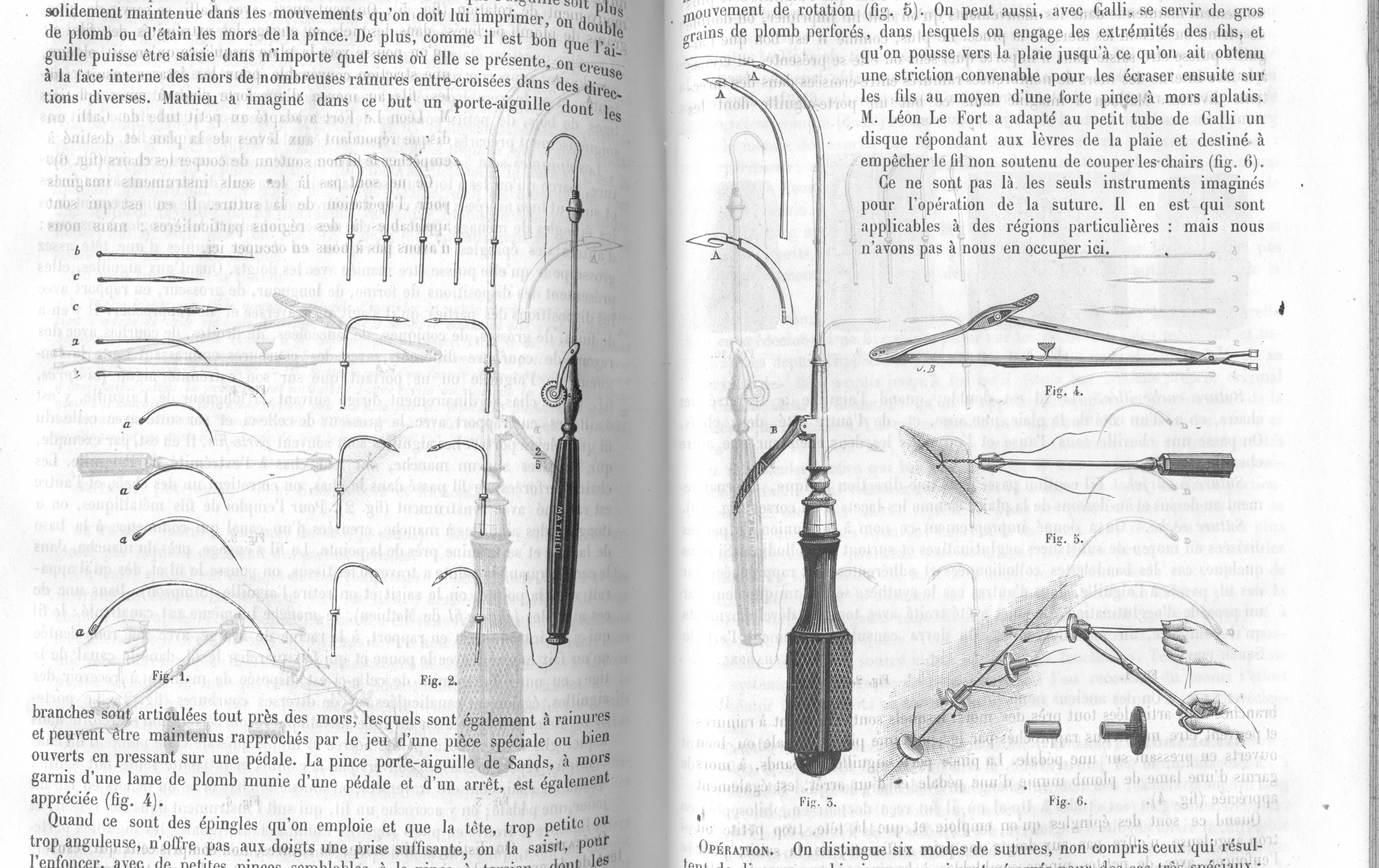
,10_v2.png)
Article(s):Multiple micronation related articles.
Request: SVG please
- Original source : http://www.owk.cz/symbols/flag-owk-s.jpg —Preceding unsigned comment added by 82.120.246.10 (talk) 17:55, 12 June 2008 (UTC)
Graphist opinion: I did one image. Doing the second one now. XcepticZP (talk) 19:43, 12 June 2008 (UTC)