
Wikipedia:Graphics Lab/Map workshop
The Graphics Lab is a project to improve the graphical content of the Wikimedia projects. Requests for image improvements can be added to the workshop pages: Illustrations, Photographs and Maps. For questions or suggestions one can use the talk pages: Talk:Graphics Lab, Talk:Illustrations, Talk:Photographs and Talk:Maps.
This specific page is the requests page for the Map workshop. Anyone can make a request for a map to be created or improved for a Wikipedia article. The standard format for making a request is shown below, along with general advice, and should be followed.
You are encouraged to share information and request advice from others. Also see possible conventions toolbox, map tutorials and topographic map tutorials.
| Advice to requesters |
|---|
|
What do we do?
|


| If you have completed work and not received a reply you may use the {{GL Map reply}} template to inform the requester. |
| Map makers and other visitors to the Graphics Lab may be interested in the RSS feed of changes to this page. You may find it here. |
| See also our sister Map workshop at Commons and the WikiProject Maps |
| Result | Code | Usage |
|---|---|---|
{{resolved|~~~~}}
|
Mark a thread as resolved and request archiving | |
{{subst:bump}}
|
Delay automatic archiving of a section for 30 days | |
{{I take|~~~~}}
|
When you'll be working on the request | |
{{Done}} ~~~~
|
When the request is done |
This page is automatically archived by ClueBot III. | |
| This page has a backlog that requires the attention of willing editors. Please remove this notice when the backlog is cleared. |
Axial Seamount
-
 Position of Axial Seamount on the Juan de Fuca ridge.

Article(s): Axial Seamount
Request: Cleanup, wikify, vectorize, crop the title at the top. Prospective GA. Thanks, ResMar 02:55, 11 October 2010 (UTC)
Graphist opinion(s): ![]() Done Jon Chui (talk) 02:55, 28 December 2010 (UTC)
Done Jon Chui (talk) 02:55, 28 December 2010 (UTC)

Bihar legislative assembly election, 2010
Article(s): Bihar legislative assembly election, 2010
-
 Attempt (please update/modify)

Request: Could someone please a make a map like this [1] from the one currently on the page? It seems the external one would be copyvio.
- Also, after the polls are announced on November 24 then wed need something like this. Thanks. Lihaas (talk) 13:37, 25 October 2010 (UTC)
Graphist opinion(s):
- Using the SVG that map file was derived from would be better. I find it a little odd that it's not just a clipped region from the SVG file. gringer (talk) 21:39, 25 October 2010 (UTC)
- Actually, on further observation, that map won't do. The administrative boundaries aren't detailed enough for the election boundaries. gringer (talk) 12:44, 26 October 2010 (UTC)
- To demonstrate that, I've extracted out the relevant portion of the locator map and coloured regions as close as possible to the boundaries in the external image (using 4-colour colours plus two more taken from the locator conventions). gringer (talk) 13:12, 26 October 2010 (UTC)
Iran–Bolivia relations

Article(s): Iran–Bolivia relations
Request: Need an introductory map akin to Iran - Ecuador relations. Thanks again for all your hard work.Lihaas (talk) 07:54, 28 October 2010 (UTC)
Graphist opinion(s):
![]() Done Wereldburger758 (talk) 06:29, 31 October 2010 (UTC)
Done Wereldburger758 (talk) 06:29, 31 October 2010 (UTC)
Benghazi Map
-
 Map of the Mutamarat Shabiya (local divisions) within the Benghazi shabiya (top level national division).

Article(s): Benghazi
Request: Please vectorise the map and make it look nice.
Graphist opinion(s):
Jaw101ie (talk) 19:49, 20 January 2011 (UTC)
- Jaw101ie - I'm working on the map and will try to get it done in the next day. We're also working on improving OpenStreetMap coverage for Benghazi. [2] --Aude (talk) 17:15, 22 February 2011 (UTC)
Trinidad area code map
-
 a not-bad map of Trinidad
 -
an area-code map of Trinidad, drawn in crayons

Article(s): [[Area code 868
Request: This crayon-made version is an embarrassment. Can someone make a better one, please? DS (talk) 23:41, 26 January 2011 (UTC)
Graphist opinion(s): We'd need a source for the area code boundaries other than the crayon map to base a new one on. I did a very quick look and didn't see one. Kmusser (talk) 13:39, 29 January 2011 (UTC)
- Hm. If we don't have a source for the area code boundaries, should the image be deleted? DS (talk) 22:34, 27 February 2011 (UTC)
http://maps.google.pt/maps?f=q&source=s_q&hl=pt-PT&q=10.691803,-61.222503&aq=&sll=10.691803,-61.222503&sspn=2.628472,3.532104&ie=UTF8&hnear=Trindade+e+Tobago&lci=org.wikipedia.pt&rq=1&split=0&ll=11.636096,-60.985107&spn=2.619948,3.532104&z=8&iwloc=ltrends — Preceding unsigned comment added by Medeiros26 (talk • contribs) 20:43, 5 March 2011 (UTC)
Ü-Tsang

Article(s): Ü-Tsang
Request: It's interesting, but can we make it more encyclopedic? and png or svg?... Kintetsubuffalo (talk) 03:26, 28 January 2011 (UTC)
Graphist opinion(s):
Article(s): Terai
Request: Please create a map for the article (maybe similar to File:Indo-Gangetic Plain.png?)
WWF: Map of ecological divisions of Nepal, showing the Terai 78.55.207.248 (talk) 07:48, 1 February 2011 (UTC)
Graphist opinion:
United Kingdom Population density map
Article(s): United Kingdom
Request:I am here to ask you to please make a map showing the population density of the United Kingdom and its territories and crown dependencies. I two examples of the type of map in which I am referring to is the Spanish map- File:EspDens2.jpg and also the French map - File:France_population_density_40pc.png Thank You Rctycoplay (talk) 16:17, 7 February 2011 (UTC)
Graphist opinion:
Roman Empire map - needs correcting
-
 The map that needs to be corrected
 -
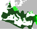 A map showing correct borders
.svg)

Article(s): Roman Empire
Request: In the orthographic projection, the Roman Empire's northern border (from the western edge of the Black Sea to the North Sea needs to be corrected. The northern border of Roman Britain also needs to be slightly adjusted. The second map shows the correct borders. The rest of the borders could also use some cleanup, so anything else that brings it closer to the second map would be appreciated. Swarm X 07:29, 8 February 2011 (UTC)
Graphist opinion(s):
Town of Bergen, New Jersey
Article(s): Bergen City, New Jersey
Request: I just added an 1868 legal boundry description to the Bergen City, New Jersey article of the no-longer-existing Town of Bergen, New Jersey. If you have time, please post a modern map with lines showing the boundary. Also, a map for Bergen Township, New Jersey (1893–1902) and Centre Township, New Jersey, please, using the legal boundry description posted there. Uzma Gamal (talk) 15:45, 8 February 2011 (UTC)
Graphist opinion(s):
Historic map of Arabia
-
Arabia about 1923. Abdul Aziz's domain is in blue with dates of conquest. The Kingdom of the Hejaz, conquered in 1925, is in light green. (The other Hashemite kingdoms of Iraq and Transjordan are also in shades of green)
Article(s): Saudi Arabia,History of Saudi Arabia
Request: The labeling on the map is very small (and can't be read even in History of Saudi Arabia where it's 350px, can they be made bigger to be more readable? The only labels that need to be made bigger are the ones in the main blue area, the green area (labeled Hejaz) on Red sea coast, and the yellow area (labled upper Asir) in the bottom left. There seems to be plenty of space to do it. The other labels in the other areas are not relevant to the articles so can stay small. The other thing is there are dates under the label written in a strange way with year and month running into each other eg "192207". Can they be changed to eg "07/1922" or, preferably, if there is enough room "July 1922" DeCausa (talk) 09:15, 12 February 2011 (UTC)
Graphist opinion(s):
Battle of Wagram map(s)
-
 Helpful map of one of the stages of the battle.
 -
 This is a very detailed map of operations during the 2-day battle. It is overloaded with info, and would need to be broken down, according to the stages of the battle.
 -
 a basic map that could be used in making the requested map. It shows the basic geography of the battlefield.


Article(s): Battle of Wagram (Major expansion of the article to come).
Request: Create a few well-illustrated and catchy maps of the battle. Ideally, 4 maps would be needed (see below). Alexandru Demian (talk) 16:38, 12 February 2011 (UTC)
Hello, I am currently preparing a major expansion of the article about the battle of Wagram. I need a few well-illustrated and complete maps, such as the one you have made for the battle of Gebora. Ideally, four maps would be needed:
- 1. one map showing operations on 5 July: the French crossing of the Danube
- 2. one map showing operations on 5 July: the evening attacks.
- 3. one map showing the early operations on 6 July
- 4. one map showing the French attacks and Austrian retreat late on 6 July.
Some good maps are available here. There are also some very reliable and well illustrated maps of the battle in Ian Castle's "Aspern & Wagram 1809: Mighty Clash Of Empires".--Alexandru Demian (talk) 16:38, 12 February 2011 (UTC)
Graphist opinion:
Map of Masoala National Park
-
 The current, low-res map
 -
 Something similar to this might be nice
 -
 Here's the source
 -
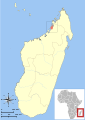 Another possibility


Article(s): Masoala National Park
Request: I would like to replace the low-res map on this article with something better. I recently rewrote Marojejy National Park and plan to eventually re-write this article as well. We clearly need a much better map. – VisionHolder « talk » 16:20, 17 February 2011 (UTC)
Graphist opinion(s):
Gateway Project
Article(s): Gateway Project
Request:
Would be great to have a detailed map of this planned new high speed rail corridor, info for which gives an idea... Djflem (talk) 00:27, 18 February 2011 (UTC)
Graphist opinion(s):
Map of USA with state names.svg needs a more detailed/robust font-family in source SVG
-
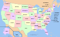 A compass of the United States, with state names.

Article(s): Political_divisions_of_the_United_States
Request: In the source of the file, replace:
font-family:Nimbus Sans L
with:
font-family:'Arial Narrow','Nimbus Sans L',sans-serif;"
This makes the source SVG map more readable where "Nimbus Sans L" is not installed. Tested on a local copy.
Graphist opinion(s): Made the font bold. What do you think about that? Wereldburger758 (talk) 07:18, 22 February 2011 (UTC)
Battle of Attock
-
 Style wished, other style ok too
Article(s): Battle of Attock
Request: Please create a proper battle map, I've uploaded tons of proper battle maps from military sources so I would appreciate it if someone could return the favor. Thank you Profitoftruth85 (talk) 02:19, 22 February 2011 (UTC)
Graphist opinion:
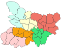
List of Sovereign states and dependent territories in Europe
-
 Guernsey png
 -
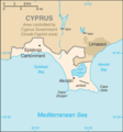
 Akrotiri and Dhekelia location on Cyprus map
 -
 Better Akrotiri
 -
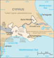 Better Dhekelia


Article(s): List of sovereign states and dependent territories in Europe
Request: Convert the Guernsey and Akrotiri and Dhekelia maps into svg's. Couple of other maps need editing for the article, but this would be a good first step. Thanks, Chipmunkdavis (talk) 15:09, 23 February 2011 (UTC)
Graphist opinion:
Old regions of Libya
-

-
 Et voilà ;)


Article(s): Cyrenaica, Tripolitania, Fezzan
Request: Please create English version of this file. Gryffindor (talk) 07:42, 27 February 2011 (UTC)
Graphist opinion(s):
![]() Done Bourrichon (talk) 13:00, 16 March 2011 (UTC)
Done Bourrichon (talk) 13:00, 16 March 2011 (UTC)
Invasion of Anjouan
-
 Please redraw as svg, and ad an insert showing the islands position in relation to Africa.
 -
 french (original)
 -
 topo in english
 -
 the invasion (more accurate than in the raster one).


Article(s): 2008 invasion of Anjouan
Request: Please redraw as svg, and ad an insert showing the islands position in relation to Africa. Thank. P. S. Burton (talk) 15:46, 2 March 2011 (UTC)
Graphist opinion(s): Note : there is the same request at the french atelier graphique. Bourrichon (talk) 16:45, 7 March 2011 (UTC)
![]() Request taken by Bourrichon.
Request taken by Bourrichon.
![]() Done, but could you check my english translation ? ;) Bourrichon (talk) 16:37, 15 March 2011 (UTC)
Done, but could you check my english translation ? ;) Bourrichon (talk) 16:37, 15 March 2011 (UTC)
- Thank you very much. It looks great. The English translations looks fine to me, but unfortunately I don't have the expertise to be sure. P. S. Burton (talk) 23:09, 21 March 2011 (UTC)
Two maps for Myrrha
-

-
 Myrrha's flight route from her father.


Article(s): Myrrha
Request: I would really like these two maps to be in the same "design" (an SVG map could be cool, but I don't know if that's possible for this sort of map). If you could make two maps that show the routes plus borders of the countries in the early Ancient Greek world it would really be great. Please note that the location of the island Panchaea is up to you - it's a fictional island - but it is likely that those who told the myth of Myrrha imagined it to be around the place where I've put it. Please contact me, regards Mottenen (talk) 19:57, 6 March 2011 (UTC)
Graphist opinion(s):
Baltic Pipeline System-II
-
Description of image
-
2nd image (If there is one)
-
Don't request too many at once, though
Article(s): Baltic Pipeline System-II
Request: This article needs a proper map. Right now it uses scheme which bases on the template of railway line, and the pinpoint map showing pumping stations; however, these maps are ugly and not very user-friendly. The route map of the pipeline is shown at http://www.transneft.ru/objectdata/WebPageImpl/3658/74.gif. It could be also option to show Baltic Pipeline System and Baltic Pipeline System-II at the same map. Beagel (talk) 09:46, 8 March 2011 (UTC)
Graphist opinion(s):
Baltic Pipeline System
-
Description of image
-
2nd image (If there is one)
-
Don't request too many at once, though
Article(s): Baltic Pipeline System
Request: This article uses general map with a number of oil and gas pipelines in Russia. However, a pipeline specific map could be more apropriate. The specific map is at http://www.ecifpa.ru/content.asp?pn=318&lang=en It could be also option to show Baltic Pipeline System and Baltic Pipeline System-II at the same map. Beagel (talk) 09:55, 8 March 2011 (UTC)
Graphist opinion(s):
2009 Russia–Ukraine gas dispute
-
 Countries of Europe gas supply to which was disrupted during Russia-Ukraine gas disputes in 2009

Article(s): 2009 Russia–Ukraine gas dispute
Request: The current map is incorrect as it shows incorrect data concerning several countries (e.g. Turkey, Ukraine). The correct map is located at http://ec.europa.eu/commission_2010-2014/president/news/documents/pdf/energy_en.pdf, page 7. I would like to ask to update the existing map accordingly. Beagel (talk) 10:12, 8 March 2011 (UTC)
Graphist opinion(s):
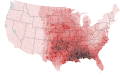
Ages of consent in North America
Article(s): Ages of consent in North America
Request: A map of North America showing the ages of consent for each country. There's a map there, but it is seriously flawed, see the talk page of the article: Talk:Ages_of_consent_in_North_America#New_map. The sources are in the article, each country's age of consent is presented there, with sources, for Mexico there is a table in its section. 188.25.173.128 (talk) 20:15, 8 March 2011 (UTC)
"Zooming in" on the Gulf to see members of the Gulf Cooperation Council
-
 Map showing which nations are members of the Gulf Cooperation Council

Article(s): Gulf Cooperation Council
Request: Please redo the map so that it shows only the Gulf region. The six member nations need to be clearly recognizable (Bahrain, Kuwait, Qatar, Saudi Arabia, Oman, United Arab Emirates), and including the entire world frustrates this basic function. Wareh (talk) 00:06, 18 March 2011 (UTC)
Graphist opinion(s): There's already a crop available listed on that image page, File:Gulfrugby.png, would that work? Kmusser (talk) 14:39, 18 March 2011 (UTC)
- Thanks for the reply; I had not understood what you've pointed out. I've substituted this cropped image at the article, but it's quite pixelated (the cropped image is just 132x123), so it would still be desirable to replace it with an image with the appropriate resolution to be viewed at this closeness. Surely we have a high enough resolution generic world/region map to provide better than 132x123 of this region? Wareh (talk) 14:48, 18 March 2011 (UTC)
French Departments
General question - would it be possible to produce maps of all the French Departments for use in articles relating to France, in a similar way to those of the British counties. Compare the infobox in Lympne Airport to that of Saint-Inglevert Airfield and you will see why this would be desirable. Maybe Pas-de-Calais could be created first as an exercise to see whether this would be possible. Mjroots (talk) 07:11, 19 March 2011 (UTC)
- Looks like they are already in progress by the French wikipedia, see Location maps of France, if you want a specific one you may try asking at the French version of this page. Kmusser (talk) 14:18, 19 March 2011 (UTC)
- My French isn't that good! I tried replacing the pushpin map France with Pas-de-Calais but that only produced an error on preview. Mjroots (talk) 10:21, 20 March 2011 (UTC)
- No one has made a Pas-de-Calais location template yet, and ideally the Pas-de-Calais location map still needs to be SVGified, it looks like they are working on them on the French wikipedia, but not all the departments are done yet. I don't understand the template syntax well enough to write one, but here is one for a different Department. Kmusser (talk) 01:15, 21 March 2011 (UTC)
- My French isn't that good! I tried replacing the pushpin map France with Pas-de-Calais but that only produced an error on preview. Mjroots (talk) 10:21, 20 March 2011 (UTC)
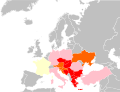
Borders of future Principlity of Albania, proposed by the Provisional Government of Albania in 1913

Article(s): Albanian Vilayet, Provisional Government of Albania and Principality of Albania
Request: Please create a map with borders of future Principlity of Albania, proposed by the Provisional Government of Albania in 1913. There is a map on the page number 20 in the book of Kostandin Cerkezi, "Albania, Past and Present"Antidiskriminator (talk) 18:30, 19 March 2011 (UTC)
- I have created this one based on this map [[3]], it sounds much more neutral than Cerkezi [[4]]. Tell me your suggestions about it.Alexikoua (talk) 09:52, 21 March 2011 (UTC)
- First, I would like to thank you for your efforts. I really appreciate it. I also think that Cerkezi is not a neutral source. It is interesting that the map he drawn is much different than map you provided. Please find my suggestions below:
- In the source section of the image you provided, there is only a link to some web site without details of the source (title of the work, author,...). Are there more details about the source you used?
- It would be good to have some legend explaining what is what, i.e. in the left corner of the image
- The line of the northern frontier fixed by Ambassadors Conference and Boudary Commission 1912-1914 is not drawn according to the source you provided. In the source it goes only downwards after leaving Montenegrin border before reaching Greece
- Towns like Peć, Đakovica, Prizren and all other present in the original source's map should be present in the image too. Not only because it is more informative that way, but because it looks much nicer.
The image would look nicer without thick black and grey lines that are not necessary since there are different colors of the areas proposed by different sides, provided that area of Albania proposed by Russia and France is presented in different color.
- First, I would like to thank you for your efforts. I really appreciate it. I also think that Cerkezi is not a neutral source. It is interesting that the map he drawn is much different than map you provided. Please find my suggestions below:
- I have created this one based on this map [[3]], it sounds much more neutral than Cerkezi [[4]]. Tell me your suggestions about it.Alexikoua (talk) 09:52, 21 March 2011 (UTC)
That is all for now. Once again, thank you very much for your assistance.--Antidiskriminator (talk) 16:12, 21 March 2011 (UTC)
- The map is sourced from the United States of America Department of State, National Archives College Park, so I feel it's the best we have. Tell me if something still needs to be fixed.Alexikoua (talk) 21:28, 24 March 2011 (UTC)
- Thank you very much. I am very satisfied. Thank you.--Antidiskriminator (talk) 21:54, 24 March 2011 (UTC)
- The map is sourced from the United States of America Department of State, National Archives College Park, so I feel it's the best we have. Tell me if something still needs to be fixed.Alexikoua (talk) 21:28, 24 March 2011 (UTC)
-
 Use this map or another that may not be cropped as much

Article(s): Sri Lanka Navy (please add to page when complete; under the organization section)
Request: Please utilize the sources below to create a map depicting the area of operations for the Sri Lanka Navy as best you see fit. Each page has specific geo-locations. Thank you. Evan.oltmanns (talk) 13:38, 23 March 2011 (UTC)
Northwestern Naval Area - http://www.navy.lk/index.php?id=2910
Eastern Naval Area - http://www.navy.lk/index.php?id=98
North Central Naval Area - http://www.navy.lk/index.php?id=95
Northern Naval Area - http://www.navy.lk/index.php?id=96
Southern Naval Area - http://www.navy.lk/index.php?id=97
Western Naval Area - http://www.navy.lk/index.php?id=93
Graphist opinion:
Byzantine-Bulgarian wars 893-927
-
Base map
Article(s): Byzantine-Bulgarian Wars, Battle of Boulgarophygon, Battle of Achelous (917), Simeon I of Bulgaria, Treaty of 927 (when created)
Request: I have created a very rough and ugly map of how I approximately imagine it. The sources are two maps of Atlas of History [5] and [6] (the second is not very clear). The hachures to the west notify the Principality of Serbia which was annexed between 924 and 931; those to the south mark the territorial extension at Byzantine expense in 904 therefore the first black line is the border when Simeon I became ruler in 893; the second one - in 904. The dotted line marks the temporary military border between 913 and 927; while the red line is the border as it was agreed by the peace treaty in 927 and which stayed unchanged until 971.
I am not sure I have cropped the very best base map; you can use another one if it would be better. In my ugly map, I have put the main cities which should be placed in the map. I think that such a map will be useful to illustrate the border changes of that important episode of the Byzantine-Bulgarian war. Regards, Gligan (talk) 16:51, 23 March 2011 (UTC)
For WikiProject Asian Americans
Article(s): Wikipedia:WikiProject Asian Americans and associated uses, such as in the talk page template, userbox, and elsewhere
Request: Requesting an orthographic projection (similar to File:North Atlantic Treaty Organization (orthographic projection).svg ) with the United States (and its territories) and those nations listed in Template:Asian Americans highlighted. Request that the highlights for the United States be that of the Flag of the United States, and the highlights of the Asian Nations either be that of their flags, or multiple shades of a single color. RightCowLeftCoast (talk) 17:46, 23 March 2011 (UTC)
Graphist opinion(s):
Translation of the serbian cyrilic inscription on the map


Request: Would somebody be so kind to create new image with translated serbian cyrilic inscriptions on this image to English:
- Велика Југославија - Great Yugoslavia
- Балканска Федерација - Balkan Federation
- Проширена варијанта Балканске федерације - Expanded version of Balkan Federation
Thanks.--Antidiskriminator (talk) 20:56, 23 March 2011 (UTC)
Graphist opinion(s): ![]() Request taken by Fallschirmjäger. 14:09, 24 March 2011 (UTC)
Request taken by Fallschirmjäger. 14:09, 24 March 2011 (UTC)
 Done - Map translated to English. Regards, Fallschirmjäger ✉ 16:52, 24 March 2011 (UTC)
- Thank you very much.--Antidiskriminator (talk) 17:11, 24 March 2011 (UTC)
- нема проблема :) Fallschirmjäger ✉ 18:59, 24 March 2011 (UTC)
- Thank you very much.--Antidiskriminator (talk) 17:11, 24 March 2011 (UTC)
Malaysian map
-
 Current map
 -
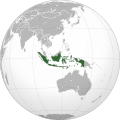 Slightly better, but not perfect positioning
.svg)
.svg)
Article(s): Malaysia
Request: Is it possible to make Malaysia located more centrally? I've tried contacting a couple of people who appear to have made these sorts of maps before, but haven't got a response. Something rotated slightly more towards the west than the Indonesian one would be perfect. Chipmunkdavis (talk) 14:48, 24 March 2011 (UTC)
Graphist opinion:
Map remake
-
 Tornado watch frequency map
 -
 Severe thunderstorm watch frequency map


Article(s): Tornado watch for the former, Severe thunderstorm watch for the latter
Request: I didn't notice this at the time these files were made (refer to this previous GL request), but the county borders are way off from what they are supposed to be. Compare for example the Kansas and Oklahoma county borders (especially Osage County, Oklahoma and Wabaunsee County, Kansas. The borders seem to be generalized, making the counties misshapen. If possible, could someone please remake these maps with better county borders? I will supply the data used to create the maps in .csv format the same as I did with the previous request, so any graphists who take this request will need to email me so I can reply with the data. Thanks in advance, and there will be a barnstar awaiting a job well done. Ks0stm (T•C•G) 03:00, 25 March 2011 (UTC)
Graphist opinion(s):
Blank SVG Robinson Projection Map with Second-Level Subdivisions
-
 1. The base image
 -
 2. A map with the right projection (Robinson), but wrong format (.png) and lacking subdivisions for many countries
 -
 3. A map with the wrong projection (Lambert cylindrical), but right format (.svg) and has all the necessary subdivisions.
 -
 4. A map with the wrong projection (Lambert cylindrical), wrong format (.png), is missing Alaska, and has subdivisions beyond the second level. This is the map currently used in the articles in question.


Article(s): Political division, Administrative division
Request: Blank maps with second-level divisions are useful beyond the two articles in question, but the Lambert cylindrical projection creates an unpleasant shape distortion at the poles (e.g. the third and fourth images). The Robinson projection is superior in this aspect (e.g. the first and second images). If it becomes desirable to create maps with third-level, fourth-level, etc. divisions (as in the fourth image), I feel that they should be created and maintained separately, so that all are available, rather than just the most extensive level of subdivisions. Subdivisions of a country should be grouped so that an entire country can be easily filled. If individual subdivisions need to be filled, then the user can ungroup them. The same goes for smaller subdivisions. There should be some way to visually distinguish second-level subdivisions from first-level subdivisions (unlike the third image). I prefer that subdivisions have thinner outlines than the country they pertain to (e.g. the second image) rather than giving them different outline colors (e.g. the fourth image), but the community may disagree with me on this point. Note that there is a python script available for manipulating the first image that may be useful for this project. Just to be clear, I want the new map to be based on the first image; the other three are only provided for reference and/or comparison. Ninjatacoshell (talk) 16:10, 25 March 2011 (UTC)
Graphist opinion(s):
Label Errors in Caribbean Map
-
 Map of the Caribbean with various label problems

![[3]](http://www.informaworld.com/ampp/image?path=/713634951/771302998/fdps_a_216231_o_f0001g.gif)
![[5]](http://haripetrov.com/chitanka/site/content/pic/00/142/atlas-istoria-11klas-11.jpg)
Articles: Caribbean, Caribbean Sea, Antilles, Battle of the Caribbean, Central banks and currencies of the Caribbean, List of islands in the Caribbean, many others
Request: If you look closely at this map, you will see that many of the place labels have been partially or completely cut off. The problem is most pronounced with Haiti---the country is labeled "ITI", Cap-Haitien has lost its first word, and the label for Port-au-Prince is missing completely. Havana, Cuba has also lost its label, and there are probably other errors I haven't noticed. Apparently any text overlapping the sea was cut off when the image was created. These errors need to be fixed. 69.140.242.23 (talk) 22:23, 25 March 2011 (UTC)
Caracas, Venezuela is also missing its label. It may not matter that some capital cities are unlabeled, since this map seems to be intended mainly to show the countries and islands of the Caribbean, but the labels that are only half missing are actually conveying false information. 69.140.242.23 (talk) 22:30, 25 March 2011 (UTC)