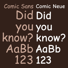
Comic Neue
 | |
| Category | Script |
|---|---|
| Designer(s) | Craig Rozynski with Hrant Papazian |
| Date released | April 2014 |
| License | SIL OFL |
| Design based on | Comic Sans |
| Variations | Comic Neue Angular |
| Website | comicneue |
Comic Neue is a casual script typeface released in 2014. It was designed by Craig Rozynski with Hrant Papazian as a more modern, refined version of the ubiquitous, but often criticized typeface, Comic Sans.[1][2]
Design

Comic Neue was designed by Craig Rozynski, an Australian graphic designer living in Japan, who wanted to create an informal script typeface similar to the controversial Microsoft font Comic Sans, which was created by Vincent Connare in the 1990s.[3][4] Comic Sans has been called "the world's most reviled typeface,"[5] and Rozynski aimed to update Comic Sans to be more suitable to the modern generation and more widely acceptable, including "the typographically savvy."[4] Rozynski based his design on the original glyphs of Comic Sans and have them "beaten into shape" to create a new typeface.[4] He wanted to refine the original letter forms to make them more sophisticated, to create "a version [of the original] you couldn't easily fault", while "maintaining the honesty that made Comic Sans so popular."[4][5][6]
When he first had the idea to "save" Comic Sans, Rozynski thought that the project would take him a month to complete; it actually took three years.[7] He planned the typeface as a joke, but he soon began to take it seriously,[6] commissioning Hrant Papazian of The MicroFoundry to improvements to outlines, spacing, and kerning of all 12 fonts in the family. It was released in April 2014 and a Kickstarter crowdfunding campaign successfully raised $10,000 to expand the typeface to support non-English languages.[7][8] The original typeface can be downloaded for free from its official website, but Rozynski has suggested that he may sell future, more complete releases.[6] He has said he hoped a type foundry or online type library such as Adobe's TypeKit[7] would pick it up.
Variants

The typeface was released in two variants: Comic Neue and Comic Neue Angular. In the latter, the rounded terminals ending each stroke are made angular.[5][9] Rozynski claims that the angular version was "a happy accident".[6] Both variants include bold, regular, and light weights, and each weight is available in roman and italic fonts.[8]
The current (as of December 2022) release 2.51 contains letters for most European languages which use the Latin script.
Response
Commentary on the typeface has been mostly positive.
- Co.Design's John Brownlee felt that Comic Neue succeeded in refining Comic Sans while remaining casual, writing: "If Comic Sans resembles the handwriting of a 10-year-old with excellent penmanship, Comic Neue is the block lettering of that same kid as a high school senior."[5]
- Amanda Kooser of CNET described Comic Neue as "Comic Sans' much more attractive and worldly brother" and opined that the new typeface had successfully redeemed the "much-maligned" original.[9]
- The Washington Post reporter Caitlin Dewey also felt that Comic Neue was an improvement on the original typeface and made Comic Sans "cool again".[10]
- Tyler McCarthy of The Huffington Post simply referred to Comic Neue as "a slightly less horrible version of Comic Sans",[11] while Jacob Kastrenakes described it in The Verge as "a stylishly thin yet still playfully curly font that's generally much nicer to read than Comic Sans".[12]
On the other hand, some people have criticized the font for keeping the original's goofy, amateurish nature.
- Comic book writer Mark Evanier said that while the typeface was an improvement on Comic Sans, it still did not meet the standards of a professional cartoonist. He said the typeface worked well used in upper and lower case together, but not when used in all caps, which was how comic books were typically lettered.[13]
- Tobias Frere-Jones observed in Der Spiegel: ...this new design seems indecisive to me: the capital E is perfectly straight and upright like an engineering drawing, while the lowercase c is still loose and asymmetrical.[14]
- Vincent Connare, the original designer of Comic Sans, thought that Comic Neue was not casual enough.[4]
Rozynski has noted that most criticism of the typeface came from type designers rather than laypeople.[7]
References
- ^ "Get Comic Neue". comicneue.com. Retrieved 2020-04-06.
- ^ "What's so wrong with Comic Sans?". BBC News. 2010-10-20. Retrieved 2020-04-06.
- ^ McCracken, Harry (8 April 2014). "Meet Comic Neue, a Comic Sans-like Typeface Without a Comic Sans-like Reputation". Time. Retrieved 31 July 2014.
- ^ a b c d e Vincent, James (8 April 2014). "Meet Comic Sans' successor: Comic Neue". The Independent. Retrieved 31 July 2014.
- ^ a b c d Brownlee, John (8 April 2014). "Comic Sans Gets A Makeover". Co.Design. Archived from the original on 2022-04-07. Retrieved 31 July 2014.
- ^ a b c d Sinclair, Mark (7 April 2014). "The neue Comic Sans". Creative Review. Archived from the original on 25 June 2014. Retrieved 31 July 2014.
- ^ a b c d Lee, Adrian (11 April 2014). "The man who wants to fix Comic Sans". Maclean's. Retrieved 31 July 2014.
- ^ a b "Comic Neue". ComicNeue.com. Retrieved 31 July 2014.
- ^ a b Kooser, Amanda (10 April 2014). "Comic Neue: Comic Sans typeface for grown-ups". CNET. Retrieved 31 July 2014.
- ^ Dewey, Caitlin (7 April 2014). "This designer just made Comic Sans, the Internet's most hated font, cool again". The Washington Post. Retrieved 31 July 2014.
- ^ McCarthy, Tyler (7 April 2014). "Someone Created A Slightly Less Horrible Version Of Comic Sans". The Huffington Post. Retrieved 31 July 2014.
- ^ Kastrenakes, Jacob (7 April 2014). "Meet the illegitimate child of Comic Sans". The Verge. Retrieved 31 July 2014.
- ^ Evanier, Mark (8 April 2014). "That Face!". NewsFromMe.com. Retrieved 31 July 2014.
- ^ Ole Reißmann (2014-04-09). "Ersatz für die gehasste Comic Sans". Der Spiegel (in German). Retrieved 2022-12-31.
