
Talk:Paul Signac
| This It is of interest to the following WikiProjects: | |||||||||||||||||||||||||||||||||||||||||||||||
| |||||||||||||||||||||||||||||||||||||||||||||||


Untitled[edit]
i ndont no about paul signac and this information isnt helping!!!!! —Preceding unsigned comment added by 195.195.235.12 (talk) 10:50, 4 October 2007 (UTC)
New high res work[edit]

I recently uploaded a new very high-resolution work (right) by Paul Signac at File:Les_Andelys,_by_Paul_Signac,_from_C2RMF_cropped.jpg. Feel free to use if useful. Dcoetzee 21:06, 16 July 2011 (UTC)
Use of packed gallery[edit]
The newer version of the MediaWiki software allows for displaying galleries that take less space and simultaneously show larger thumbnails of images. The way the modern web is moving is towards less wasted space and more content. I suggest we use the modern mode. No rational has been given to any revert. -- CFCF 🍌 (email) 12:52, 6 August 2015 (UTC)
- An utterly inappropriate way to view works of art, the individual spacing in the regular gallery view allows each work the dignity they demand...Modernist (talk) 12:53, 6 August 2015 (UTC)
RfC concerning use of galleries[edit]
The following discussion is closed. Please do not modify it. Subsequent comments should be made on the appropriate discussion page. No further edits should be made to this discussion.

:That is incorrect. This configuration never occurs, except maybe on you telephone. I was unable to reproduce the spacing shown (on a wide variety of devices and resolutions). Coldcreation (talk) 10:04, 13 August 2015 (UTC)
<gallery widths="180px" heights="180px">
Should this article use the new or old gallery format? Arguments for the old is that it gives uniform spacing and allows each work to be seen individually with space around it
Argument for the new is that it uses less space overall allowing for larger images in the same space
Other issues: mobile usability; corruption when viewing non-standard galleries. -- CFCF 🍌 (email) 13:01, 6 August 2015 (UTC); made more neutral by Johnbod (talk) 16:25, 11 August 2015 (UTC)
- New
<gallery mode="packed">
-
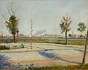
 Road to Gennevilliers, 1883
 -
 Comblat le Chateau. Le Pré. 1886, Dallas Museum of Art
 -
 The Town Beach, Collioure, 1887, Metropolitan Museum of Art New York City
 -
 The Jetty at Cassis, Opus 198, 1889, Metropolitan Museum of Art New York City
 -
 Women at the Well, 1892, Musée d'Orsay, Paris
 -
 The Bonaventure Pine, 1893, is currently at the Museum of Fine Arts, Houston
 -
 The Port of Saint-Tropez, oil on canvas, 1901, The National Museum of Western Art, Tokyo, Japan
 -
 Grand Canal (Venice), 1905, Toledo Museum of Art, Toledo, Ohio
 -
![The Papal Palace, Avignon, oil on canvas, 1909, Musée d'Orsay, Paris[1]](//upload.wikimedia.org/wikipedia/commons/thumb/7/7d/Paul_Signac_Palais_des_Papes_Avignon.jpg/340px-Paul_Signac_Palais_des_Papes_Avignon.jpg) The Papal Palace, Avignon, oil on canvas, 1909, Musée d'Orsay, Paris[1]
The Papal Palace, Avignon, oil on canvas, 1909, Musée d'Orsay, Paris[1] -
 Antibes - Morning, 1914, National Museum, Warsaw


.jpg)
![The Papal Palace, Avignon, oil on canvas, 1909, Musée d'Orsay, Paris[1]](/wiki/File:Paul_Signac_Palais_des_Papes_Avignon.jpg)

- Old
<gallery>
-
 Road to Gennevilliers, 1883
 -
 Comblat le Chateau. Le Pré. 1886, Dallas Museum of Art
 -
 The Town Beach, Collioure, 1887, Metropolitan Museum of Art New York City
 -
 The Jetty at Cassis, Opus 198, 1889, Metropolitan Museum of Art New York City
 -
 Women at the Well, 1892, Musée d'Orsay, Paris
 -
 The Bonaventure Pine, 1893, is currently at the Museum of Fine Arts, Houston
 -
 The Port of Saint-Tropez, oil on canvas, 1901, The National Museum of Western Art, Tokyo, Japan
 -
 Grand Canal (Venice), 1905, Toledo Museum of Art, Toledo, Ohio
 -
![The Papal Palace, Avignon, oil on canvas, 1909, Musée d'Orsay, Paris[2]](//upload.wikimedia.org/wikipedia/commons/thumb/7/7d/Paul_Signac_Palais_des_Papes_Avignon.jpg/180px-Paul_Signac_Palais_des_Papes_Avignon.jpg) The Papal Palace, Avignon, oil on canvas, 1909, Musée d'Orsay, Paris[2]
The Papal Palace, Avignon, oil on canvas, 1909, Musée d'Orsay, Paris[2] -
 Antibes - Morning, 1914, National Museum, Warsaw
Support/Oppose[edit]
- (11 Modern packed / 7 Old)
- Old. Support the older more dignified version...Modernist (talk) 13:02, 6 August 2015 (UTC)
- Modern per nomination rational. Larger images, less wasted space. The modern web is moving towards a higher emphasis on visual content and having tiny image surrounded by loads of gray space is only considered "dignified" because it's what old-school editors are used to. This is a matter of preference, not dignity or clarity. Packed images will not confuse readers as to where boundaries between images are.-- CFCF 🍌 (email) 13:06, 6 August 2015 (UTC)
- Old I must say I don't like the packed ones. Both can have their sizes varied. Johnbod (talk) 15:32, 6 August 2015 (UTC)
- Old. Support non-packed gallery images. The packed mode makes all the images appear to fuse together, with some images much larger than others. Coldcreation (talk) 18:54, 6 August 2015 (UTC)
- Modern It is just an opinion that the 'old' style looks better. Statements like too close together and ...works to be considered individually are aesthetic judgements and I disagree with them. Nyth63 18:59, 6 August 2015 (UTC)
- Old Support the older version. The idea of dignity might be expanded upon here: To crop the image of a painting is to misrepresent it in an important way (unless there is a need to isolate a detail, in which case the caption should explain that it's a detail). A packed gallery makes a new mural out of individual paintings, and that's not much better. The subject of Orchid is orchids, not notable photographs of orchids, so the images may be packed, or cropped to improve composition, or Photoshopped to eliminate background clutter. But Signac's paintings are the very reason he is notable. The jpgs should present the works accurately, as individual objects. It is just an opinion that the space required to do this is wasted space. Ewulp (talk) 02:08, 7 August 2015 (UTC)
- Modern Much more space efficient on smaller screens- when you look at the page on mobile the titles of the paintings are more difficult to pair with the work because of the extra whitespace. More and more of WP's users will be viewing this on mobile devices and I suspect that the new design is intended to account for this. I think aesthetic considerations should be secondary to usability on all devices. --Spasemunki (talk) 05:38, 8 August 2015 (UTC)
- Modern Those examples below are really ugly. Compatibility comes first, seems like WP:IDONTLIKEIT from some people here! MQoS (talk) 12:29, 11 August 2015 (UTC)
- Modern. We are an encyclopedia, not an art gallery though will have articles that describe painters and artists and schools of art and by necessity images of those pieces of art should be present. But we should not be worried about aesthetics here, we're looking for maximum compatibility and usability with all browsers and all readers. There are plenty of other places in real life and on the Internet that if one needs to see the artwork in an aethestic manner that they can go to; WP's use of such images should be utilitarian, not artistic. --MASEM (t) 15:22, 11 August 2015 (UTC)
- (edit conflict) Marginal preference on aesthetic grounds for modern (the idea that paintings should be surrounded by space to be appreciated is a recent one; historically, they were often packed as close as the frames would allow, and to most or all of the height of the wall); but it really doesn't much matter. It's far more important to deal with the disfiguring black lines along the side and bottom of some of the images, and with the WP:OVERLINKING. Justlettersandnumbers (talk) 16:15, 11 August 2015 (UTC)
- Yes paintings were once packed together in certain contexts, but that really didn't last long and was abandoned everywhere, and for good reason. And even then they had frames - typically pretty wide ones. Occasional attempts to revive that hanging style are rarely liked. I agree about overlinking, but that is not an issue here. Johnbod (talk) 16:20, 11 August 2015 (UTC)
- Modern - The images look far far better without all that crap around them!, As an aside when I add galleries even I use the "Modern" format - Just looks more neat & tidy imho. –Davey2010Talk 00:28, 12 August 2015 (UTC)
- Modern - The old galleries were always an ugly scare-away, nice to see someone fixed it. Beforehand, there was mostly a composition. It looked like a catalog, and not of the arty kind. Now you can look at a Signac painting, get some details, and, even see its texture. That works for whoever is here for an impression. Also, if you are looking for something in particular, click on it (it will get bigger). trespassers william (talk) 13:27, 12 August 2015 (UTC)
- Old Per user ColdCreation: "Support non-packed gallery images. The packed mode makes all the images appear to fuse together, with some images much larger than others." Comatmebro User talk:Comatmebro 16:43, 12 August 2015 (UTC)
- Old. The space surrounding the images is not "wasted space" but add a dimension that adds tastefulness. Bus stop (talk) 04:17, 13 August 2015 (UTC)
- Modern. This comes down to personal taste at the end of the day. I see the borders of the old version as wasted space that gives the old gallery a decidedly dated look. ~ RobTalk 19:05, 30 August 2015 (UTC)
- Modern - I feel the practical and technical benefits must outweigh aesthetic preferences. These are encylopedia articles, not art galleries. For the record, I think the images look fine in either version. Lootbrewed (talk) 01:46, 31 August 2015 (UTC)
- Modern feels right. - Cwobeel (talk) 02:24, 31 August 2015 (UTC)
- Oppose packed mode and support "old fashioned"??. First, I don't think we should be calling it modern, at least this is the first time I've seen in mentioned as such, and I do a fair amount with galleries on art pages. The problem with the packed mode is this: it places the images too close together and it's very difficult to differentiate. On this talk page is an example where I experimented with it and it didn't work well at all; in the end I didn't use it. There are other examples where I've experimented and in the end decided against it. I've looked at these images and much prefer the unpacked version because the space around the images is really necessary to separate them from one another. Another issue is that I have some vision issues and it's really difficult to focus on packed galleries, something I've been noticing recently. Packed galleries look swell in some cases, particularly if there's black space or white space around the image's subject, but generally I prefer not to see them for works of art and on artist bio pages. Adding: looking at these types of paintings, with vivid colors, smashed up against each other, is very difficult for the brain to process and differentiate one from another. It gives me a migraine. Victoria (tk) 00:49, 3 September 2015 (UTC)
- Old - Sorry, this hurts my eyes, and in my opinion, crowds the images too much. Closely-spaced art has, I think, some unfortunate connotations which I shan't reference here. Kafka Liz (talk) 00:12, 6 September 2015 (UTC)
- Modern - Summoned here by bot. The modern version is better for smaller screens, more space efficient. The borders on the old version aren't serving any purpose, rather than taking up space. The modern one is more practical and makes the most sense in my opinion. It doesn't really matter what it looks like aesthetically. Cheers, Comatmebro User talk:Comatmebro 17:23, 10 September 2015 (UTC)
Discussion[edit]
- It's very easy to make the images larger in the second gallery; it's a no brainer...Modernist (talk) 13:09, 6 August 2015 (UTC)
- Thats an erroneous opinion, the paintings that are depicted look better - plain and simple...Modernist (talk) 13:17, 6 August 2015 (UTC)
- The problem with the new version is that the images are too close together. We're looking at discrete works as opposed to diptychs/triptychs/series. The framing on the old images allows the works to be considered individually, in the gallery format. Neither format, in my opinion, is ideal, but I am unable to offer an alternative and the old form is preferable when viewing art. I don't understand the idea of "wasted space". This is the internet, not printing. Perhaps there is a technical issue that I am misunderstanding. freshacconci talk to me 14:26, 6 August 2015 (UTC)
- When I refer to wasted space I mean "screen space". I currently run a 5k monitor, but I still find that the images are surrounded by excessive white space. I disagree that only works that are part of series should be displayed in this manner. You are unlikely to discern any detail from the tiny thumbnails anyway. If you wish to view the images in full it can only be done by clicking and accessing the full version. -- CFCF 🍌 (email) 14:41, 6 August 2015 (UTC)
- I completely agree with Freshacconci the mode packed images are too close together in nearly every case...Modernist (talk) 15:35, 6 August 2015 (UTC)
- Packed mode makes horizontal rectangular paintings appear much larger than vertical paintings. See for example, Women at the Well. This painting measures 195 × 131 cm (76.8 × 51.6 in), yet it appears minuscule next to The Jetty at Cassis, Opus 198 and The Bonaventure Pine. In the older gallery mode image sizes are more homogenous. Horizontal works are not blown out of proportion. Coldcreation (talk) 19:05, 6 August 2015 (UTC)
- By removing "per row 5", the images flow accross the entire screen regardless of screen resolution or screen size. See gallery below at various sizes, resolutions. Coldcreation (talk) 22:21, 6 August 2015 (UTC)
- Packed mode makes horizontal rectangular paintings appear much larger than vertical paintings. See for example, Women at the Well. This painting measures 195 × 131 cm (76.8 × 51.6 in), yet it appears minuscule next to The Jetty at Cassis, Opus 198 and The Bonaventure Pine. In the older gallery mode image sizes are more homogenous. Horizontal works are not blown out of proportion. Coldcreation (talk) 19:05, 6 August 2015 (UTC)
Gallery with image size adjusted:
-
 Road to Gennevilliers, 1883
 -
 Comblat le Chateau. Le Pré. 1886, Dallas Museum of Art
 -
 The Town Beach, Collioure, 1887, Metropolitan Museum of Art New York City
 -
 The Jetty at Cassis, Opus 198, 1889, Metropolitan Museum of Art New York City
 -
 Women at the Well, 1892, Musée d'Orsay, Paris
 -
 The Bonaventure Pine, 1893, is currently at the Museum of Fine Arts, Houston
 -
 The Port of Saint-Tropez, oil on canvas, 1901, The National Museum of Western Art, Tokyo, Japan
 -
 Grand Canal (Venice), 1905, Toledo Museum of Art, Toledo, Ohio
 -
![The Papal Palace, Avignon, oil on canvas, 1909, Musée d'Orsay, Paris[3]](//upload.wikimedia.org/wikipedia/commons/thumb/7/7d/Paul_Signac_Palais_des_Papes_Avignon.jpg/220px-Paul_Signac_Palais_des_Papes_Avignon.jpg) The Papal Palace, Avignon, oil on canvas, 1909, Musée d'Orsay, Paris[3]
The Papal Palace, Avignon, oil on canvas, 1909, Musée d'Orsay, Paris[3] -
 Antibes - Morning, 1914, National Museum, Warsaw
I like the 'new' style considerably better. I find it easier to see some detail in the slightly larger images and the eye scans across theme easily distinguishing individual images. The format however is rather irrelevant as they are only thumbnails and presumably, the viewer will click/select the image to enlarge it if they want a better view anyway. This whole argument is then rather pointless especially after trying assign human qualities like dignity to an inanimate object like a painting. Rather pretentious and silly in my opinion. Nyth63 18:59, 6 August 2015 (UTC)
- More silly mumbo-jumbo about dignity. We are just talking about thumbnails here. How can cropping be an issue, when shrinking the image down to a scale that loses most of the detail, is not? That seems to me to be more of an indignity. How is adding a white matte around a tiny little image going to make it more dignified? We are not talking about making changes to the original master artworks. ANY electronic image of an artwork will fall short of the original, so looking for dignity in an minuscule index image is just plain ridiculous. On the whole, the HTML tag gallery is just some anonymous programmer's once-upon-time random word choice for a visual index, nothing at all like a real life art gallery. If you go to an art galley/art museum, you will see that typically it appears that much thought and effort goes into the presentation and arrangement of the works. In that context, I would agree that dignity may be a useful term. But certainly not in a reference work like an encyclopedia. Nyth63 03:21, 7 August 2015 (UTC)
- The space makes it easier to see the images as individual images. I note that you indented your comment, which indicates that you understand the value of space. Even in a reference work like an encyclopedia, we use paragraph breaks and leading to improve readability. And as Modernist demonstrates above, the sizes of images in traditional galleries can be adjusted. Ewulp (talk) 04:46, 7 August 2015 (UTC)
- I understand a lot of things, but what I don't understand is why someone is so hung up on the aesthetics of a frigging index. It just a image-based linked list, not a work of art. The fact that all of the images in the index are same size should indicate that there is no consideration made as the the size or scale of the original work and that those characteristics are totally irrelevant for the purpose of the image gallery. Would this discussion even exist if the the HTML tag had been named something like ImageIndex rather than using the more artsy word gallery? The use of indenting in Wikipedia is only a crutch/kludge to aid in separating individually comments in a quasi-forum that was never designed for a thread-based type of discussions. Nyth63 12:43, 7 August 2015 (UTC)
- There are spaced between the images in the packed version. I would be very surprised if anyone confuses images because of use of this format. As said I believe this entire discussion is about clinging on to something that has been around on account of being used to it. I don't understand why we are so adverse to change. -- CFCF 🍌 (email) 12:27, 7 August 2015 (UTC)
- The space makes it easier to see the images as individual images. I note that you indented your comment, which indicates that you understand the value of space. Even in a reference work like an encyclopedia, we use paragraph breaks and leading to improve readability. And as Modernist demonstrates above, the sizes of images in traditional galleries can be adjusted. Ewulp (talk) 04:46, 7 August 2015 (UTC)
- Your assumption is totally wrong, plain and simple - the images look better with space around them...Modernist (talk) 12:31, 7 August 2015 (UTC)
- I agree with Modernist. It's interesting to note that those in favor of packed images know little about editing art related articles, while those in favor of the standard gallery arrangement are all experts in the field. Furthermore, it is not because something is "new" (or "modern") that it is improved or more appropriate. "Change" is not always positive or for the better. In this case, the standard ("old") gallery format is more appropriate, better and highly effective. Coldcreation (talk) 13:56, 7 August 2015 (UTC)
- This is the exact type of attitude that scares people away from editing Wikipedia. I will have you know I do edit art articles extensively, and you can also see that I have uploaded a number of the images included in the above gallery. Your comments seem to suggest a degree of ownership of these articles. -- CFCF 🍌 (email) 14:06, 7 August 2015 (UTC)
- I agree with Modernist. It's interesting to note that those in favor of packed images know little about editing art related articles, while those in favor of the standard gallery arrangement are all experts in the field. Furthermore, it is not because something is "new" (or "modern") that it is improved or more appropriate. "Change" is not always positive or for the better. In this case, the standard ("old") gallery format is more appropriate, better and highly effective. Coldcreation (talk) 13:56, 7 August 2015 (UTC)
- More silly mumbo-jumbo about dignity. We are just talking about thumbnails here. How can cropping be an issue, when shrinking the image down to a scale that loses most of the detail, is not? That seems to me to be more of an indignity. How is adding a white matte around a tiny little image going to make it more dignified? We are not talking about making changes to the original master artworks. ANY electronic image of an artwork will fall short of the original, so looking for dignity in an minuscule index image is just plain ridiculous. On the whole, the HTML tag gallery is just some anonymous programmer's once-upon-time random word choice for a visual index, nothing at all like a real life art gallery. If you go to an art galley/art museum, you will see that typically it appears that much thought and effort goes into the presentation and arrangement of the works. In that context, I would agree that dignity may be a useful term. But certainly not in a reference work like an encyclopedia. Nyth63 03:21, 7 August 2015 (UTC)
- Get over it and Stop making absurd and false accusations the plain truth is people disagree with your opinions and many of us like Freshacconci (talk · contribs), Johnbod (talk · contribs), Ewulp (talk · contribs), Coldcreation (talk · contribs) and me have essentially created many thousands of edits and done major work on most of the visual arts articles on Wikipedia for many years...Modernist (talk) 14:12, 7 August 2015 (UTC)
- This nonsense of yours: This is the exact type of attitude that scares people away from editing Wikipedia...Modernist (talk) 14:26, 7 August 2015 (UTC)
- Comment: This RfC basically comes down to personal taste. None of the sides have provided viable logical arguments supporting their respective types of gallery. Why is one version termed the "dignified version"? Who judges the dignity of a gallery display? Simply preposterous. As for the argument this is the "way the modern web is moving", it is also absurd. This is an encyclopaedia; if we were to follow the way the web is moving we'd be writing articles in 140 characters and posting dick pics of celebrities. So overall I haven't read any significant arguments either way, hence my inability to either support or oppose this proposal. This is a personal dispute until proper arguments are presented. Regards, FoCuS contribs; talk to me! 17:41, 9 August 2015 (UTC)
- It is not a "personal dispute", but it is a matter of "personal taste", possibly with an element of "personal choice of device" - possibly many views would be different if the editor mainly used different hardware. It is not all "preposterous" to have strong views on such matters, but all should recognise that their views are subjective, and possibly hardware-dependent. Johnbod (talk) 15:10, 11 August 2015 (UTC)
Mobile viewer[edit]


Spasemunki made an excellent point above about how these show up in mobile browsers. I did a test and have uploaded 3 screenshots to commons that display the different examples shown above. (There are no other changes, and the examples are of this page as of today.)
I believe these results are conclusive in saying that the packed mode displays better with the modern gallery format. Also note that the resolution of the phone in question (an LG G4) is 2.5k, which is not representative of most phones. Using an ordinary lower resoltion phone the wasted space between image and caption might actually exceed the range of the screen, resulting in needing to scroll down to see the caption and image in the same screen.
- P.S. I will do a similar test with a lower resolution phone as soon as I get time, and for full disclosure the browser being used is Firefox for android
-- CFCF 🍌 (email) 15:20, 8 August 2015 (UTC)
- Clearly the old looks better - aesthetics do matter when looking at art by the way...Modernist (talk) 15:44, 8 August 2015 (UTC)
- Clearly you are working from an invalid premise. Thumbnails are not art any more than a bibliographical entry is a book. . Nyth63 19:52, 13 August 2015 (UTC)
- Hi Nyth—the thumbnails are not the original work of art. Nevertheless they serve an art educational purpose. Even the thumbnails familiarize the reader with the work of art. This too is art education. Knowing little more than the title of the article, the reader nevertheless derives an art educational experience by seeing the image. The reader familiarizes themselves with the sort of images associated with, in this case, Paul Signac. Bus stop (talk) 00:08, 14 August 2015 (UTC)
- Clearly you are working from an invalid premise. Thumbnails are not art any more than a bibliographical entry is a book. . Nyth63 19:52, 13 August 2015 (UTC)
- Yes, but this is a webpage, not an art gallery. Personal taste isn't a good rationale for inconveniencing mobile users, who are rapidly becoming the largest fraction of the site. This is a classic WP:BIKESHED. My point is that 'I think this looks better' is totally subjective and can't ever be grounds for a consensus. Performance on different display devices is a better criteria for a decision. --Spasemunki (talk) 20:50, 8 August 2015 (UTC)
- That's your opinion. These are images of works of art and it does matter how they appear. The visual arts editors who have weighed in have a completely different point of view than what you can see on your phone...Modernist (talk) 22:19, 8 August 2015 (UTC)
- For works of art, the standard gallery is more versatile, readable and adaptable at varying resolution, scale; on a multitude of devices and on a wide array of screen sizes; in contrast with packed mode. The standard image gallery is favored by Wikipedia editors with extensive experience editing WikiProject Visual arts articles. Consensus has not been attained to change the standard gallery to packed mode. It is now time to archive this discussion and move on. Coldcreation (talk) 03:17, 9 August 2015 (UTC)
- That feels like the entire opposite of what we should be doing. The discussion looks to favor the modern style mode on account of usability. The standard gallery is showing its age in both mobile and on large screens, this is what it looks like on my macbook today (firefox again). -- CFCF 🍌 (email) 21:34, 10 August 2015 (UTC)
- For works of art, the standard gallery is more versatile, readable and adaptable at varying resolution, scale; on a multitude of devices and on a wide array of screen sizes; in contrast with packed mode. The standard image gallery is favored by Wikipedia editors with extensive experience editing WikiProject Visual arts articles. Consensus has not been attained to change the standard gallery to packed mode. It is now time to archive this discussion and move on. Coldcreation (talk) 03:17, 9 August 2015 (UTC)
- Excuse me? This discussion clearly prefers the standard gallery for viewing works of art; apparently you cannot seem to comprehend other points of view - by editors who have made thousands upon thousands of edits and inclusions to visual art articles. It's time to archive this, this nonsense is getting very old....Modernist (talk) 22:44, 10 August 2015 (UTC)
- More likely it is the other way around. I also suggest you avoid WP:Personal attacks and stick to the issue at hand. More and more evidence is being piled on that the modern format is better, and this RfC has been running for only a few days. The standard procedure is to run an RfC through unless consensus is clear. We currently have 3 editors backing the modern version and 4 backing the old version. -- CFCF 🍌 (email) 23:39, 10 August 2015 (UTC)
- There is no "evidence" that the packed mode is better. It is neither more "modern" than the standard gallery, nor more versatile across various devises. And for the record, you've been reminded several times now that editors with extensive experience editing WikiProject Visual arts articles (i.e., Modernist, Johnbod, Ewulp, Freshacconci and myself) prefer the standard to the packed mode for the reasons mentioned above. Yet, you insist that your opinion is "better". Your insisting that the packed mode should replace the current gallery, despite the fact that consensus sways counter to your opinion, is borderline disruptive behavior. You've attempted to pack the gallery images together four times and have been reverted each time. This is disruptive editing at the very least. Your incessant accusations here at Talk are unfounded. Please stop edit warring. This discussion needs to be archived. Coldcreation (talk) 03:06, 11 August 2015 (UTC)
- I have not accused anyone of anything bar creating an exceedingly unwelcome environment to new editors. You are misinterpreting non-consensus to favor your viewpoint. Suggesting to close this RfC prematurely only undermines your opinion.
- As for how the packed/modern mode is better see the images I've linked, and see Spasemunki's arguments above. -- CFCF 🍌 (email) 08:44, 11 August 2015 (UTC)
- There is no "evidence" that the packed mode is better. It is neither more "modern" than the standard gallery, nor more versatile across various devises. And for the record, you've been reminded several times now that editors with extensive experience editing WikiProject Visual arts articles (i.e., Modernist, Johnbod, Ewulp, Freshacconci and myself) prefer the standard to the packed mode for the reasons mentioned above. Yet, you insist that your opinion is "better". Your insisting that the packed mode should replace the current gallery, despite the fact that consensus sways counter to your opinion, is borderline disruptive behavior. You've attempted to pack the gallery images together four times and have been reverted each time. This is disruptive editing at the very least. Your incessant accusations here at Talk are unfounded. Please stop edit warring. This discussion needs to be archived. Coldcreation (talk) 03:06, 11 August 2015 (UTC)
- More likely it is the other way around. I also suggest you avoid WP:Personal attacks and stick to the issue at hand. More and more evidence is being piled on that the modern format is better, and this RfC has been running for only a few days. The standard procedure is to run an RfC through unless consensus is clear. We currently have 3 editors backing the modern version and 4 backing the old version. -- CFCF 🍌 (email) 23:39, 10 August 2015 (UTC)
CFCF: At 12:52, 6 August 2015, (following your edit war stint) you posted your opinion on this talk page, with the silly claim that the "old" gallery is a waste of space, hoping to gain consensus to change to the "modern" packed mode. To date, 11 August 2015, only two other users have shared your belief. Visibly, none of you have any experience with the visual arts content at Wikipedia. If you had, you would have seen that all (or practically all) art related articles use the standard gallery layout. There are reasons for this (see above). It is not because we are unaware of the packed mode. Nor is it because we resist change. It is because illustrations, drawings, photographs and paintings need to be seen as individual artworks, not all crowded, bunched, fused or packed together. This is one of the reasons why you find spaces between paintings hanging in museums and galleries, rather than all hung very close to one another to fill valuable space. Your failure or refusal to "get the point" is both disruptive and wasting time. Coldcreation (talk) 11:56, 11 August 2015 (UTC) |}
Unnecessary heat[edit]
I get the feeling things are getting a little to heated here, and would like to try and bring the discussion down a notch. I think we are all here for the same thing; to build an encyclopedia. Anyway I wanted to dispel one potential confusing factor here, and that is the statement that the traditional galleries are more versatile. That is not correct, and because packed/modern galleries do not include gray space they can be adapted to do things the other can't. I put this together to show off what can be done for the issues with standing images looking smaller:
|
|


What is interesting is that even here the packed mode adapts to the width of the page, so that the images are always as large as possible. (Unfortunately I realized these don't work too well on mobile, but this is just a proof of concept.) -- CFCF 🍌 (email) 23:20, 11 August 2015 (UTC)
- That "Unfortunately I realized these don't work too well on mobile" is a rather serious problem, given that the main objection we're hearing here to the standard gallery seems to be that some people think it doesn't look as good on mobile. Although I have to say, in the screenshot you posted in the "Mobile viewer" section, the right-hand "old 220px" version is a close match of the left-hand "modern" version, and seems fine to me.
- I have attempted, using three different computers and browsers, to reproduce the result seen in your screenshot near the top of this page, with no success. I can't recall if I've ever seen a standard gallery display that badly; such issues would seem to be rather rare.
- Problems with packed galleries are not so rare. As an example: I saw by your edit history that you had done considerable work on Nils Dardel, so yesterday I took a look at the article. All was well until I scrolled down to the packed gallery, which displayed very badly (viewed on a desktop). The jpgs in the "1910s", "1930s", and "1940s" galleries are quite tiny, clustered together of course in packed-gallery fashion like a roll of postage stamps or theater tickets, and incongruously surrounded by vast waste areas of white. The "1920s" gallery was much larger than those above or below it. I found that adjusting the dimensions of my window produced unpredictable variations in the sizes of the various rows, some better and some worse, but the first impression was not good. Tonight I visited the article again and saw exactly the same problems with the "1910s", "1930s", and "1940s" galleries; rather than post a screen shot I would ask other editors to see for themselves. Ewulp (talk) 04:05, 12 August 2015 (UTC)
- The example I have here above doesn't work badly in mobile, it just isn't as good as the other packed mode. It's still better than the traditional mode. Also it isn't difficult to fix, I just haven't had the time to create the template. The Dardel article is still a WIP because I found a resource with a number of very high resolution images, I will fix their sizes once I've uploaded those.
- Quite clearly we are headed towards replacing the old mode with something else. It would be good if we could have a constructive discussion, instead of extolling how bad everything that isn't the mode we've used since 2001 is. -- CFCF 🍌 (email) 10:08, 12 August 2015 (UTC)
Hello? Quite clearly we are not moving in your direction; Just because you insist - on having your way - there are differing points of view...Modernist (talk) 10:47, 12 August 2015 (UTC)
- Currently there are more than twice as many favoring the modern mode as the old one, please don't insult others. -- CFCF 🍌 (email) 12:28, 12 August 2015 (UTC)
Pleonasm[edit]
Perhaps part of the reason there is a divergence of opinion here is that some editors think of an image gallery as nothing more than an index. Two editors have stated this belief very plainly ("it's only an index"; "what I don't understand is why someone is so hung up on the aesthetics of a frigging index") and others have said esthetic concerns are of little value in a gallery. It might be useful to examine these ideas.
Galleries rarely serve as an index; their function is to illustrate an article. Look at Lemon—can anybody explain how that article's gallery performs as an index? It provides visual support to the article; it indexes nothing. The gallery in Signac is a bit more extensive but hardly an index. I doubt that many VA editors would complain if the gallery in Lemon were converted to packed mode. The reason so many are objecting to packed galleries in artists' biographies has to do with a rather special status that images have in these bios, as will be explained.
There are a few artists whose notability is not derived entirely from their art; Leonardo, Samuel F. B. Morse, and Mikalojus Konstantinas Čiurlionis are examples. But most of the countless thousands of artists in wp are notable for the works of art they made and nothing else. The only reason most of them are in Wikipedia is because they made important works of art. This accounts for the special status that images have in artists' biographies. The images provide visual evidence—that cannot be supplied by words alone—of the very reason for notability. That is why the images of artworks in an artist's article are important in a way that images in the biographies of other notable people are not.
Consider Thomas Robert Malthus. The jpg at the top of that article illustrates the man's appearance, but his notability does not rest on anything you see in that image. The fact that he's dressed in a dark coat, the angle at which he balances that book on his knee, the diagonal shadow falling across the wall at the right—these are not what made his reputation. Scrolling down, there is a jpg of the title page of An Essay on the Principle of Population. This book is important for the ideas it contained, not at all because of how it looked.
It's a different matter with a visual artist. Signac's paintings explain his notability, and a painting is its appearance. It is to be looked at. The jpgs in a gallery, although greatly reduced in size from the originals and made up of pixels rather than paint, should represent the work as accurately as possible. Didactic purpose in this case is inseparable from esthetics—to understand art you must view art. To present a group of an artist's paintings in a packed row, butted up against each other like a row of Scrabble tiles, is a disservice to our readers because it's not the way most paintings are intended to be experienced. Signac's paintings are not panels in a strip, they are individual objects. My own observation tends to confirm that many or most readers of our articles never click on an image to view the larger version. In other words, what they see in the gallery is all they're likely to see, which is all the more reason the gallery should be presented with some consideration to proper spacing. I could go on and on about this, so don't tempt me. Ewulp (talk) 07:44, 13 August 2015 (UTC)
- It not an index of the article, but rather an index of the images. Thumbnails are not art. This discussion is not about art. Nyth63 19:37, 13 August 2015 (UTC)
- Hi Nyth—you say "Thumbnails are not art. This discussion is not about art." I think the Paul Signac article falls under the heading of art education. An important part of art education involves familiarizing oneself with important art. When one thinks German Romanticism one thinks Caspar David Friedrich. These are visual connections. Even if your art education goes little beyond this, and mine tends to be limited to visual connections of that sort, that is a meaningful sort of art education. In other words, looking at pictures, and only reading a few words, is art education. Seeing works of art in their actual physical presence is a good idea. But one learns a lot by seeing reproductions as well. Presentation matters. When art is framed for hanging on a wall, consideration is given to a frame that presents the art optimally. When works on paper are framed and presented on mat-board, similarly consideration is given to such factors as how much space should be allowed around the work. Considerations of this nature apply to hanging artwork on a wall. Certain presentations are considered preferable. Our aim in art education at Wikipedia should include giving the reader the best experience within intrinsic limitations of the medium in which the works are displayed. We should aim for making the reader's experience optimally pleasant. We should try to avoid the severe presentation which results from packing the images together too tightly. The images themselves are educational. If one read nothing beside the title of the article, and merely perused the images, I think that too would constitute art education to a not insubstantial degree. Bus stop (talk) 23:42, 13 August 2015 (UTC)
- Are you implying that a roughly 200x200 pixel image is on par with what is hanged at a gallery or museum? The fact remains that the galleries on wikipedia are glorified indexes with teeny tiny thumbnails. There is no way to discern the types of details that you can get by viewing an image in full at a museum, and the idea that the diminutive gray area adds anything is ludicrous. A gallery will hang images at spacing of several meters, something that is impossible in an encyclopaedia. You should not believe the standard gallery has anything more going for it than the fact that it has been around for a number of years. The standard gallery is horribly outdated and persists from the time when it would be too taxing on bandwidth to display a gallery at any decent resolution.
- If readers are so unlikely to look at the entire image by simple clicking on it those readers should at least be given a decent sized preview. The packed gallery is far better and is more efficient, more adaptive to various resolutions, and customises better as well as being more compatible with mobile phones. Wordy arguments without much substance do not make the old outdated gallery any better, and consensus is building to replace it as the standard gallery display.
- Hi Nyth—you say "Thumbnails are not art. This discussion is not about art." I think the Paul Signac article falls under the heading of art education. An important part of art education involves familiarizing oneself with important art. When one thinks German Romanticism one thinks Caspar David Friedrich. These are visual connections. Even if your art education goes little beyond this, and mine tends to be limited to visual connections of that sort, that is a meaningful sort of art education. In other words, looking at pictures, and only reading a few words, is art education. Seeing works of art in their actual physical presence is a good idea. But one learns a lot by seeing reproductions as well. Presentation matters. When art is framed for hanging on a wall, consideration is given to a frame that presents the art optimally. When works on paper are framed and presented on mat-board, similarly consideration is given to such factors as how much space should be allowed around the work. Considerations of this nature apply to hanging artwork on a wall. Certain presentations are considered preferable. Our aim in art education at Wikipedia should include giving the reader the best experience within intrinsic limitations of the medium in which the works are displayed. We should aim for making the reader's experience optimally pleasant. We should try to avoid the severe presentation which results from packing the images together too tightly. The images themselves are educational. If one read nothing beside the title of the article, and merely perused the images, I think that too would constitute art education to a not insubstantial degree. Bus stop (talk) 23:42, 13 August 2015 (UTC)
And the screenshots fill the role of showing editors what it may look like on hardware/software they personally do not have access to.
-- CFCF 🍌 (email) 23:59, 13 August 2015 (UTC)
- (interjected question) Is it secret software? Ewulp (talk) 01:06, 14 August 2015 (UTC)
- I've specified each and every time which browser I am using and on which operating system!? You want me to add that its's Firefox 39 on OSX 10.11 developers beta and Firefox 38.1 on Android LG G4 version 5.1 kernel: 3.10.49!? This is rediculous Ewulp, you aren't winning youself any friends... -- CFCF 🍌 (email) 06:26, 14 August 2015 (UTC)
- Questions not tolerated. Got it. Sorry! Ewulp (talk) 07:36, 14 August 2015 (UTC)
- No, you have not got it. Each time I posted a screenshot I specified which software and which operating system I was using, and I further specified on the image pages (which you are aware you can click the link to). What I do not accept is asking questions with the sole aim of confusing and attempting to smear others. -- CFCF 🍌 (email) 08:39, 14 August 2015 (UTC)
- It is not off-topic to ask about the device from which a screenshot is taken, and in fact you provided such information for this screenshot, which proves that you think such information is relevant to this discussion. The screenshot I was curious about is this one, which I had commented on previously: "I have attempted, using three different computers and browsers, to reproduce the result seen in your screenshot near the top of this page..." The device used for that screenshot is not specified in the caption. I had already checked the documentation before posting and found no information there either. Have I missed some link within the documentation that supplies the details (quite possible), or are you mistaken in stating, "Each time I posted a screenshot I specified which software and which operating system I was using"?
- No, you have not got it. Each time I posted a screenshot I specified which software and which operating system I was using, and I further specified on the image pages (which you are aware you can click the link to). What I do not accept is asking questions with the sole aim of confusing and attempting to smear others. -- CFCF 🍌 (email) 08:39, 14 August 2015 (UTC)
- Questions not tolerated. Got it. Sorry! Ewulp (talk) 07:36, 14 August 2015 (UTC)
- I've specified each and every time which browser I am using and on which operating system!? You want me to add that its's Firefox 39 on OSX 10.11 developers beta and Firefox 38.1 on Android LG G4 version 5.1 kernel: 3.10.49!? This is rediculous Ewulp, you aren't winning youself any friends... -- CFCF 🍌 (email) 06:26, 14 August 2015 (UTC)
- (interjected question) Is it secret software? Ewulp (talk) 01:06, 14 August 2015 (UTC)
- Your reference to "showing editors what it may look like on hardware/software they personally do not have access to" made me wonder what unusual device could give such unusual results. This inspired the jocular tone of my question, which obviously misfired badly, and I should have specified clearly which screenshot I was asking about. I apologize for all of this. It was an attempt to elicit information. I wasn't expecting a shouted response from an editor who is against "unnecessary heat", followed by accusations of ill intent. I don't believe in telepathy, and we shouldn't pretend to read each other's minds. Ewulp (talk) 04:37, 15 August 2015 (UTC)
- Hi CFCF—it is correct that I am not saying that thumbnails equate to far larger images including the image which is the original work of art. Art education involves importantly the familiarizing of a person with types of art. There are better and worse presentations. The packing of images too tightly does not allow the images to breathe and consequently the reader's experience suffers. You seem to be arguing that thumbnails are not actual works of art hanging on a wall. This is true. But similar principles are involved. The space that I think you have earlier argued is wasted space, actually serves a visual purpose. You may not agree. But a similar purpose is served by blank space surrounding artwork in other circumstances, as I tried to explain above. Bus stop (talk) 00:26, 14 August 2015 (UTC)
- Yes the article is about art and an artist, and yes the article is edicational, but that does not make the extremely reduced scale images art. They are a utilitarian artifacts pointing to a larger scale image that themselves are not art either. They are electonic facsimilies that do not show the scale and detail of the original. This discussion is about which version is of more utility, not which is more artistic. Nyth63 00:53, 14 August 2015 (UTC) PS. It seems that you are so embedded in your perspective that you can not see how silly a phrase like allow the images to beathe sounds in context when talking about such a utilitarian inanimate object. Nyth63 01:01, 14 August 2015 (UTC)
- Hi CFCF—it is correct that I am not saying that thumbnails equate to far larger images including the image which is the original work of art. Art education involves importantly the familiarizing of a person with types of art. There are better and worse presentations. The packing of images too tightly does not allow the images to breathe and consequently the reader's experience suffers. You seem to be arguing that thumbnails are not actual works of art hanging on a wall. This is true. But similar principles are involved. The space that I think you have earlier argued is wasted space, actually serves a visual purpose. You may not agree. But a similar purpose is served by blank space surrounding artwork in other circumstances, as I tried to explain above. Bus stop (talk) 00:26, 14 August 2015 (UTC)
- Nyth83, this article is not about cars. Images of cars can be packed like a used car lot. Paintings are different. Coldcreation (talk) 01:05, 14 August 2015 (UTC)
- I doubt that any of the visual arts editors are confused about this distinction: Yes the images in the gallery are images of artworks, not artworks themselves. I wrote: "The images provide visual evidence—that cannot be supplied by words alone—of the very reason for notability. That is why the images of artworks in an artist's article are important ... The jpgs in a gallery, although greatly reduced in size from the originals and made up of pixels rather than paint, should represent the work as accurately as possible" [emphasis added]. They reproduce artworks the same way a color photocopy of your driver's license reproduces your driver's license. The copy is not your license. This is understood.
- CFCF, it is not very realistic to continue dismissing as mere Luddism the concerns expressed very consistently here by Visual Arts editors who by habit and training tend to be attentive to visuals. If the price to be paid for a 5% bigger image on phones is to squash a gallery into an unsightly composite that does not serve our readers—not all of whom have the opportunity to view these works in person, and not all of whom are very familiar with how to look at art—we should not pay that price. Our purpose is educational. Ewulp (talk) 01:09, 14 August 2015 (UTC)
- Who mentioned cars? Yes cars are cars and art is art, but thumbnails are still thumbnails irrespective ot their content. They are not art because thay refer to art. Nyth63 01:27, 14 August 2015 (UTC)
- This has been dealt with above at some length. Ewulp (talk) 01:35, 14 August 2015 (UTC)
- To clarify a possible source of confusion: Visual Arts editors, myself included, have several times during this discussion referred to images of paintings in Wikipedia articles as paintings or art. This is the same verbal shorthand you might use when you say "it's good to hear your voice" to somebody you are speaking with by phone. You don't say "it's good to hear a sound coming from a speaker activated by an electronic impulse initiated by the sound of your voice", because it's cumbersome. Try to believe this...we are not confused about the difference between a thumbnail image and The Raft of the Medusa. Ewulp (talk) 01:55, 14 August 2015 (UTC)
- I think that your analogy with a telephone is a little weak but I will accept your attempt to explain. I am also glad to hear that you can tell the difference between an work of art and a piece of HTML tagging. But can you explain exactly what you mean by a visual art editor?. Is this some kind of secret club of encyclopedia editors that have their own rules about editing that make them different from all of the other regular ol' editors? Maybe this would explain the constant use of artsy buzz words like dignity and breath connected to something so mundane. This type of lingo-speak seems to pervade everything connected with art-related articles irrespective if they are relevant or not. If the packed gallery becomes the preferred style in wikipedia, visual arts related articles are not likely to get an exemption just because some editors feel they are less artistic. BTW, I already figured out what visual arts editors are, I am just trying to point out that it is really a meaningless distinction. Presumably we are all here to build an encyclopedia, not to build cliques. Nyth63 02:54, 14 August 2015 (UTC)
- FWIW - Several editors commenting here are connected to the Wikipedia:WikiProject Visual arts and have been editing here for many years and have created many articles related to the visual arts; perhaps because they understand the subject. We have all contributed in building this encyclopedia, the issue being discussed here has to do with the visual arts...Modernist (talk) 03:16, 14 August 2015 (UTC)
- Hi Nyth—yes, "we are all here to build an encyclopedia". Art education involves acquiring a familiarity with works of art. This is best accomplished by seeing the original work of art, but reproductions serve some purpose too. Good reproductions serve this purpose better than poor reproductions. Computers and tablets and phones have reasonably good displays. Even so-called thumbnails are seeable. It is not as if they are un-viewable. A degree of art education takes place when a reader looks at these so-called thumbnail images. A reader has an idea of what Paul Signac's paintings look like even by seeing thumbnails. Therefore we should aim to optimize the presentation of images of artwork in an article such as this. This is done for an art educational reason. Yes, we are trying to build an encyclopedia—which includes an aim to educate readers about art. Bus stop (talk) 03:23, 14 August 2015 (UTC)
- But on encylcopedia is not about education. It is about reporting facts, hence the need for reference/sources/citations. If you stay to far into the education, you will likely run in the synthesis or original research which is not allowed. If you think that one of the functions of the thumbnails is to allow a preview of the linked larger image (which themselves are in turn, just previews), why would someone argue that is is as good thing to shrink them down even more by placing a matte around them? Nyth63 11:21, 14 August 2015 (UTC)
- Hi Nyth—the "facts", as you call them, are located in the written portion of the article. Art education involves familiarizing oneself with artworks. These are not just any artworks. And in truth, artworks always correlate to "facts" as one can hope, are found in the text of the article. But a mere connection between some "facts" and images constitutes art education. Art movements are often, but not always, predicated on stylistic commonalities. The educated person understands what makes the purely visual components of some art movements "hang together". You can't say the "encyclopedia is not about education" and include "art education" because art education importantly involves recognizing styles, which can only be learned by seeing. You cannot know what Jugendstil is without seeing examples of it. After seeing enough examples of Jugendstil you internalize a grasp of that style. Thus the presentation of images is very important to art education. Bus stop (talk) 11:57, 14 August 2015 (UTC)
- The rants about fact, education, the legitimacy of aesthetics and visualization are not constructive, but I think the purpose of the gallery should be agreed upon. Back to the phone analogy, when someone says "it's good to hear your voice" they mean "it's good enough for our purposes to hear an electrically induced representation of your voice". Now what would be the purpose for which thumbnails are good enough? For me the gallery has two, equally important:
- a. to index the names of the more notable works unto clickable, bigger representations at Commons (maybe ones mentioned in the text, where there no space to show them in parallel). this requires a discernible visual, but it doesn't harm to have more than that.
- b. To allow some quick, wide ranging viewing of the oeuvre, to take in the common features and the general feel (or even more complex interrelation). This, most importantly, cannot be done with the present thumbnails. They are to bad a representation; many look like a white net covers them where the originals' paint smudges are spaced. None of the subtler hues and points come out. I wonder, for what purpose are the standard thumbnails good enough?
- Hi Nyth—the "facts", as you call them, are located in the written portion of the article. Art education involves familiarizing oneself with artworks. These are not just any artworks. And in truth, artworks always correlate to "facts" as one can hope, are found in the text of the article. But a mere connection between some "facts" and images constitutes art education. Art movements are often, but not always, predicated on stylistic commonalities. The educated person understands what makes the purely visual components of some art movements "hang together". You can't say the "encyclopedia is not about education" and include "art education" because art education importantly involves recognizing styles, which can only be learned by seeing. You cannot know what Jugendstil is without seeing examples of it. After seeing enough examples of Jugendstil you internalize a grasp of that style. Thus the presentation of images is very important to art education. Bus stop (talk) 11:57, 14 August 2015 (UTC)
- FWIW - Several editors commenting here are connected to the Wikipedia:WikiProject Visual arts and have been editing here for many years and have created many articles related to the visual arts; perhaps because they understand the subject. We have all contributed in building this encyclopedia, the issue being discussed here has to do with the visual arts...Modernist (talk) 03:16, 14 August 2015 (UTC)
- I think that your analogy with a telephone is a little weak but I will accept your attempt to explain. I am also glad to hear that you can tell the difference between an work of art and a piece of HTML tagging. But can you explain exactly what you mean by a visual art editor?. Is this some kind of secret club of encyclopedia editors that have their own rules about editing that make them different from all of the other regular ol' editors? Maybe this would explain the constant use of artsy buzz words like dignity and breath connected to something so mundane. This type of lingo-speak seems to pervade everything connected with art-related articles irrespective if they are relevant or not. If the packed gallery becomes the preferred style in wikipedia, visual arts related articles are not likely to get an exemption just because some editors feel they are less artistic. BTW, I already figured out what visual arts editors are, I am just trying to point out that it is really a meaningless distinction. Presumably we are all here to build an encyclopedia, not to build cliques. Nyth63 02:54, 14 August 2015 (UTC)
- Who mentioned cars? Yes cars are cars and art is art, but thumbnails are still thumbnails irrespective ot their content. They are not art because thay refer to art. Nyth63 01:27, 14 August 2015 (UTC)
- Re dignity: if one wants to imitate they these paintings are shown in RL galleries, the 'standard' view does a vrey bad job. They are usually set in thick gilded or darkly painted wooden frame with no margin, and often hang on a colored wall. Wide Passe-Partout akin to the esteemed gray squares are used for prints (in my eyes they make the images look like stamps). I'll be surprised if that's the direction our "Modernist" has in mind.
- Re relative size: I didn't try out possibilities, but from examples here it seems there is less room for manipulation with standard mode, as it maximizes all images relative to the one-sized squares. I agree the first implementation of the "packed" mode was a bit too tight, but many other options have now been shown.
- trespassers william (talk) 23:32, 15 August 2015 (UTC)
Looks to me like this discussion should be closed here...Modernist (talk) 10:48, 14 August 2015 (UTC)
- Is it because you have not yet found a good logical argument rather than one based on emotion and personal taste? A statement like Clearly, the old style looks better. certainly does not score any points. Neither does the we are members of the Wikipedia:WikiProject Visual arts clique and we have always done it that way. Nyth63 11:40, 14 August 2015 (UTC)
- My arguments are easy and utterly comprehensive; too bad you fail to understand them, I guess they're over your head...Modernist (talk) 12:44, 14 August 2015 (UTC)
- Modernist, I understand you think so, but the mere fact you say so is trivial. There is ongoing discussion and actually an overweight of editors who favor the new gallery. I suggest you and Coldcreation stop insisting on closure unless you want everything to be blanket-replaced by the modern packed gallery type without any compromize. You are not furthering your cause by insulting those who do not agree with you, and consensus is not decided by insisting the discussion be closed or by insulting the intelligence of the other parties. -- CFCF 🍌 (email) 15:02, 14 August 2015 (UTC)
- CFCF What planet do you come from? At the moment there are 7 editors pro and seven editors against...Modernist (talk) 15:15, 14 August 2015 (UTC)
- If you were to count you would see there are 6 supporting the old mode and 8 supporting the new mode. -- CFCF 🍌 (email) 15:18, 14 August 2015 (UTC)
- Freshacconci makes 7...Modernist (talk) 15:20, 14 August 2015 (UTC)
- Some of your 8 seem to be newbies and/or a sockpuppet...Modernist (talk) 15:21, 14 August 2015 (UTC)
- This is the second sock accusation made here. That is a charge not to be made lightly and, unless you are ready to formally start an investigation, you should seriously consider a retraction. Nyth63 15:51, 14 August 2015 (UTC)
- Seems pretty obvious don't you think. An editor with one day of editing weighs in here; an editor with a grand total of 26 edits and one day...Modernist (talk) 15:55, 14 August 2015 (UTC)
- Ok, now we have yet another personal attack and not addressing the comment about the sock accusation. The accusation is not a valid argument against a persons position and if you feel that there is socking involved, please report it at Wikipedia:Sockpuppet investigations, not in this talk page. If you do not intend to do so, I strongly suggest you redact the accusation. Nyth63 14:58, 15 August 2015 (UTC)
- Stop all of your personal attacks; Read this WP:NPA...Modernist (talk) 15:01, 15 August 2015 (UTC)
- As far as I can see there are no instances whatsoever of personal attack from Nyth83. -- CFCF 🍌 (email) 15:32, 15 August 2015 (UTC)
- Rather ironic that you linked to the NPA policy article. Clearly a statement like Seems pretty obvious don't you think qualifies as a personal attack. A sock puppet accusation can also be considered a personal attack. These would fall under Accusations about personal behavior that lack evidence. Nyth63 17:06, 15 August 2015 (UTC)
- It might be helpful if User:Nyth83 and User:CFCF stopped yakking about terms used by other editors such as "dignity" and "breath". These are not "artsy buzz words" or "lingo-speak" as has been alleged. Bus stop (talk) 17:59, 15 August 2015 (UTC)
- Jargon is a type of language that is used in a particular context and may not be well understood outside of it. Classifying the use of the word breath in context with a discussion about formats for a thumbnail image, as jargon, is certainly not a personal attack. Use of this type of ingroup language is rather obfuscating at best and is certainly not educational unless you were to give a clear explanation of your use of the word. Nyth63 20:10, 15 August 2015 (UTC)
- It might be helpful if User:Nyth83 and User:CFCF stopped yakking about terms used by other editors such as "dignity" and "breath". These are not "artsy buzz words" or "lingo-speak" as has been alleged. Bus stop (talk) 17:59, 15 August 2015 (UTC)
- Rather ironic that you linked to the NPA policy article. Clearly a statement like Seems pretty obvious don't you think qualifies as a personal attack. A sock puppet accusation can also be considered a personal attack. These would fall under Accusations about personal behavior that lack evidence. Nyth63 17:06, 15 August 2015 (UTC)
- As far as I can see there are no instances whatsoever of personal attack from Nyth83. -- CFCF 🍌 (email) 15:32, 15 August 2015 (UTC)
- Stop all of your personal attacks; Read this WP:NPA...Modernist (talk) 15:01, 15 August 2015 (UTC)
- Ok, now we have yet another personal attack and not addressing the comment about the sock accusation. The accusation is not a valid argument against a persons position and if you feel that there is socking involved, please report it at Wikipedia:Sockpuppet investigations, not in this talk page. If you do not intend to do so, I strongly suggest you redact the accusation. Nyth63 14:58, 15 August 2015 (UTC)
- Seems pretty obvious don't you think. An editor with one day of editing weighs in here; an editor with a grand total of 26 edits and one day...Modernist (talk) 15:55, 14 August 2015 (UTC)
- This is the second sock accusation made here. That is a charge not to be made lightly and, unless you are ready to formally start an investigation, you should seriously consider a retraction. Nyth63 15:51, 14 August 2015 (UTC)
- There is a reason why RfCs use a support/oppose section, and so far there are 8 for and 6 against the new format. Consensus is decided upon by the weight of the argument, not the edit-count of those partaking in the discussion. -- CFCF 🍌 (email) 15:25, 14 August 2015 (UTC)
- I would also point out that some of the votes may count less or may be discounted because of general pricipals like per others. If a vote starts out with Per user soandso it is not really an independent vote. There is also a strong element of I don't like it and its variant I just like it going on here also. Comments like the older more dignified version, I must say I don't like the packed ones, and Clearly the old looks better fall into this category. Also arguments stating expertise do not carry weight. Statements like editors who have made thousands upon thousands of edits and inclusions to visual art articles fall into this category. Nyth63 14:35, 16 August 2015 (UTC)
- Yes, I've asked him to weigh in, one way or the other...Modernist (talk) 15:28, 14 August 2015 (UTC)
- You realize that could be WP:Canvassing, and if you've asked him: why are you suggesting the discussion be closed? -- CFCF 🍌 (email) 15:30, 14 August 2015 (UTC)
- It's not canvassing - its clarification. I wanted to close this because it's essentially deadlocked. However I am counting 7; so lets see what develops...Modernist (talk) 15:40, 14 August 2015 (UTC)
Arbitrary break - other possibilities[edit]
- Space increased
The following discussion is closed. Please do not modify it. Subsequent comments should be made on the appropriate discussion page. No further edits should be made to this discussion.
I keep trying to show you that the packed mode is more versatile, and all you do is go back to dignity and breath, without regards to the fact that most modern art sites do now display on anything that looks so out of date or legacy. Wikipedia shouldn't be so resistant to change, and it is luddite when we don't even want to discuss benefits of newer/other forms. Here is another example of what can be done if you skip the stupid gray squares. -- CFCF 🍌 (email) 06:31, 14 August 2015 (UTC)
- Also of note is that the packed gallery is already in widespread use on articles on the visual arts in for example French: fr:Musée des beaux-arts de Houston. -- CFCF 🍌 (email) 06:54, 14 August 2015 (UTC)
- First could you please discuss the benefits of the standard gallery. Ewulp (talk) 07:24, 14 August 2015 (UTC)
- Smaller images - better for a 2004 256k connection.
-- CFCF 🍌 (email) 07:33, 14 August 2015 (UTC)
- Some hints: Allows more space between images, allows jpgs in a single row to display at varied heights. But thanks for the good-faith effort to acknowledge that there is another side to this discussion. My opinion on this matter is close to what Freshacconci said—I am not in love with the look of the standard gallery, but it usually serves much better in my experience. Probably all of us here are well aware that the packed gallery is already in widespread use on articles on the visual arts; I've had to revert them back to standard mode in a few cases when the appearance of the packed gallery was especially dire. The version with wider spaces that you have added here is certainly a step in the right direction. If it is possible to tweak it to preserve all the benefits of the standard gallery, there would be no grounds that I know of for insisting on the standard version. Supporters of the "old" version whom you've rather uncharitably characterized as "old-school editors" who are "averse to change" and clinging to old technology may in fact be waiting for refinements in new technology before we scuttle the current galleries. Ewulp (talk) 09:25, 14 August 2015 (UTC)
- Okay, I'll try to see if I can throw together a template that does this. Getting jpegs to display att different heights in the same row might be a bit difficult without getting it to look weird. (I absolutely aknowledge that there is a different side of the debate, but it would seem at least some editors are rejecting the newer version on principle, some of which have been very aggressive. One actually went around doing some very questionable reverts of my work over at commons: e.g. [:File:Paul_Signac_Palais_des_Papes_Avignon.jpg].) -- CFCF 🍌 (email) 09:45, 14 August 2015 (UTC)
- See the Discussion page. Coldcreation (talk) 18:06, 15 August 2015 (UTC)
- And this one too: File talk:Paul Signac Femmes au puits 1892.jpg. Coldcreation (talk) 19:09, 15 August 2015 (UTC)
- According to your rational for reverting you are the one who is changing images. I have not edited these whatsoever. Please do not assume bad faith. Your own image corrections degrade the image quality and should be placed under a different file name. If you wish I will provide you with TIFF or PNG files, but your changes are your own. Your comments regarding the specific thumbnail you keep linking amount to WP:OR. -- CFCF 🍌 (email) 19:17, 15 August 2015 (UTC)
- And this one too: File talk:Paul Signac Femmes au puits 1892.jpg. Coldcreation (talk) 19:09, 15 August 2015 (UTC)
- See the Discussion page. Coldcreation (talk) 18:06, 15 August 2015 (UTC)
- Okay, I'll try to see if I can throw together a template that does this. Getting jpegs to display att different heights in the same row might be a bit difficult without getting it to look weird. (I absolutely aknowledge that there is a different side of the debate, but it would seem at least some editors are rejecting the newer version on principle, some of which have been very aggressive. One actually went around doing some very questionable reverts of my work over at commons: e.g. [:File:Paul_Signac_Palais_des_Papes_Avignon.jpg].) -- CFCF 🍌 (email) 09:45, 14 August 2015 (UTC)
- Some hints: Allows more space between images, allows jpgs in a single row to display at varied heights. But thanks for the good-faith effort to acknowledge that there is another side to this discussion. My opinion on this matter is close to what Freshacconci said—I am not in love with the look of the standard gallery, but it usually serves much better in my experience. Probably all of us here are well aware that the packed gallery is already in widespread use on articles on the visual arts; I've had to revert them back to standard mode in a few cases when the appearance of the packed gallery was especially dire. The version with wider spaces that you have added here is certainly a step in the right direction. If it is possible to tweak it to preserve all the benefits of the standard gallery, there would be no grounds that I know of for insisting on the standard version. Supporters of the "old" version whom you've rather uncharitably characterized as "old-school editors" who are "averse to change" and clinging to old technology may in fact be waiting for refinements in new technology before we scuttle the current galleries. Ewulp (talk) 09:25, 14 August 2015 (UTC)

<gallery widths="220px" heights="220px">Does not use perrow parameter, seen at Talk:Paul Signac#NA
The old mode is completely non-adaptive and when I use WP on halfscreen mode on my 2560*1080 screen it cuts exactly between 3&4 images per row which creates rediculous amounts of empty space that do nothing but retract from where the images could be. There are pretty much no benefits to using the old mode. (This is a screenshot of ColdCreations suggestion above, using Firefox 39.0 on Windows 10 pro on an LG 25UB55 in halfscreen mode, screenshot taken using Greenshot).-- CFCF 🍌 (email) 08:57, 14 August 2015 (UTC)
- For the sake of discussion I'm also throwing in the below mode with an overlay that includes a link to Image help as well as instructing readers to click on the images. (This one would be by far the easiest to implement.)-- CFCF 🍌 (email) 09:11, 14 August 2015 (UTC)
- Example with image help link and instructions!
 Click on the images to see larger versions
The issue with the images with different proportion being treated or scaled differently (portrait/landscape) is totally irrelevant as ALL of the images are shrunk to the thumbnail format at different scales, irrespective of which gallery style you are using. Nyth63 11:25, 14 August 2015 (UTC)
Ref
|
|---|
{[archive bottom}}
Modification of standard gallery[edit]
The following discussion is closed. Please do not modify it. Subsequent comments should be made on the appropriate discussion page. No further edits should be made to this discussion.
For the record, here is the proposition of Coldcreation (rather than those above). This is a modification of the standard gallery. Three modifications were made: (1) Grey outlines and borders surrounding the images are removed. (2) Captions are closer to respective images. (3) Horizontal rows are moved slightly closer together. This, in my opinion, would be the ideal format (or layout) for the Signac page, and possibly for other image galleries at Wikipedia. This is a screenshot for the purpose of visualization and discussion, so clicking on individual images will not enlarge them.

This proposition has the advantages of both the standard gallery and compact mode, while eliminating any negative aspects. It is a modification of the standard gallery layout, rather than a modification of packed mode. Coldcreation (talk) 15:23, 16 August 2015 (UTC)
In sum[edit]
While neither the standard gallery nor the packed mode are perfect, the standard format appear best poised to evolve toward a more suitable and versatile outcome. The packed mode, while preferred by certain users not directly involved in the visual arts, bares two seemingly insurmountable problems: (a) images too closely packed together, and (b) height adjustment problems for vertical images rendering these considerably smaller than horizontal counterparts. Pending a new evolved standard version (with characteristics shown above), the actual standard gallery should be maintained as the default gallery layout. Without a clear consensus on the topic of the Paul Signac gallery layout (about 50% either way), I motion that this discussion be archived for future discussion on the more general topic of gallery layouts at Wikipedia. Coldcreation (talk) 22:13, 16 August 2015 (UTC)
- Agree that the last version with the mode=nolines option is a good compromise (with minor fear that no one will be happy rather than everyone). You will set the widths and heights a little larger though right? Could you insert widths="190px" heights="150px" or something similar in the example below? Why don't you call for another vote? Nyth63 23:30, 16 August 2015 (UTC)
- I still need to test this on a wide variety of devices and resolutions. I've already started doing so, and a few problems have emerged. More on that soon. Coldcreation (talk) 23:46, 16 August 2015 (UTC)
Nolines mode[edit]
I just found a the "nolines" mode, close to what is portrayed above, but I still have to test it on various devices. It would appear as a cross between the standard and packed modes. Image pixel sizes can be increases just as the standard and packed modes. (For vertical images there still appears some gray background, see Women at the Well):
Gallery[edit]
-
 Road to Gennevilliers, 1883
 -
 Comblat le Chateau. Le Pré. 1886, Dallas Museum of Art
 -
 The Town Beach, Collioure, 1887, Metropolitan Museum of Art New York City
 -
 The Jetty at Cassis, Opus 198, 1889, Metropolitan Museum of Art New York City
 -
 Women at the Well, 1892, Musée d'Orsay, Paris
 -
 Grand Canal (Venice), 1905, Toledo Museum of Art, Toledo, Ohio
 -
 Notre-Dame-de-la-Garde (La Bonne-Mère) Marseilles, 1905-06, Metropolitan Museum of Art
 -
 Antibes le soir, 1914, Musée d'art moderne et contemporain de Strasbourg
 -
 Antibes - Morning, 1914, National Museum, Warsaw
 -
 Golfe-Juan, Worcester Art Museum
_(1905-06,_Marseilles,_Metropolitan_Museum_of_Art_New_York_Collection).jpg)
.jpg)
_-_IMG_7171.JPG)
Gallery[edit]
-
Road to Gennevilliers, 1883
-
Comblat le Chateau. Le Pré. 1886, Dallas Museum of Art
-
The Town Beach, Collioure, 1887, Metropolitan Museum of Art New York City
-
The Jetty at Cassis, Opus 198, 1889, Metropolitan Museum of Art New York City
-
Women at the Well, 1892, Musée d'Orsay, Paris
-
Grand Canal (Venice), 1905, Toledo Museum of Art, Toledo, Ohio
-
 Notre-Dame-de-la-Garde (La Bonne-Mère) Marseilles, 1905-06, Metropolitan Museum of Art
 -
 Antibes le soir, 1914, Musée d'art moderne et contemporain de Strasbourg
 -
Antibes - Morning, 1914, National Museum, Warsaw
-
 Golfe-Juan, Worcester Art Museum
Standard gallery[edit]
This is the gallery currently used in the main article (placed here for comparison)
-
 Road to Gennevilliers, 1883, Musée d'Orsay, Paris
 -
 Comblat le Chateau. Le Pré. 1886, Dallas Museum of Art
 -
 Cassis, Cap Lombard, Opus 196, 1889, Gemeentemuseum Den Haag
 -
 Golfe-Juan, ca. 1896, Worcester Art Museum
 -
 Grand Canal (Venice), 1905, Toledo Museum of Art, Toledo, Ohio
 -
 Notre-Dame-de-la-Garde (La Bonne-Mère) Marseilles, 1905-06, Metropolitan Museum of Art
 -
 The Port of Rotterdam, 1907, Museum Boijmans Van Beuningen
 -
 The Pine Tree at Saint Tropez, 1909, Pushkin Museum, Moscow
 -
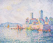 Antibes, 1911, Albertina, Vienna
 -
 Antibes le soir, 1914, Musée d'art moderne et contemporain de Strasbourg


Issues with the nolines mode include misaligned captions, which result from the images being aligned on the top rather than on the bottom. This is unfortunate as it gives a rather messy appearance to the gallery. The standard (traditional, default) gallery does not suffer from this artifact. The irregular spacing is bothersome in the nolines mode, and there is also still a residual gray area surrounding vertical images. When pixel size is increased the space between images remains the same (rather than increasing proportionately), resulting in a compact image gallery (one of the problems of packed mode).
In sum: the standard gallery appears best suited for the Paul Signac article. The current default gallery, with gallery widths="190px" heights="150px" has less problems than the compact mode and the nolines mode. With the current images, this layout reduces the amount of gray area surrounding images to a minimum, images are large enough to see details, captions are aligned. Images are sufficiently separated to be seen as individual works of art. The standard gallery is quite versatile on all screens tested, regardless of size or resolution. The standard gallery is quite versatile on a wide variety of devices tested (iPads, notebooks/laptops, Mac, PC, desktops, mobile phones, e.g., Samsung, iPhone, of varying dimensions). The current gallery should therefor be maintained. I motion to close the debate as it's been active since 12:52, 6 August 2015 with no clear consensus (or viable reasons) for change. Coldcreation (talk) 12:11, 17 August 2015 (UTC)
Gallery images[edit]
I have replaced the File:Paul Signac, 1893, The Bonaventure Pine, oil on canvas, 65.7 x 81 cm, Museum of Fine Arts, Houston.jpg image with File:Paul Signac, 1909, The Pine Tree at Saint Tropez, oil on canvas, 72 x 92 cm, Pushkin Museum, Moscow.jpg. The latter is more representative of Signac's work. In addition, the colors and contrast of the Houston version are excessively pushed, rendering the image of poor quality, even if the megabyte or pixel count is higher than the Pushkin image. Essentially, quality is not solely dependent on image size, but on the accuracy of colors, contrast, hue, etc. with respect to the original work. Coldcreation (talk) 15:03, 18 August 2015 (UTC)
Closure[edit]
This RfC is in favor of the modern mode. I was asked by Bus stop to partake in discussion–but I have presented my arguments repeatedly, and there has been amply time to weigh in. Being the most wordy and frequent debater does not move consensus in your favor. There should be no doubt which is the most supported position.-- CFCF 🍌 (email) 00:57, 2 September 2015 (UTC)
- Hi CFCF—I am sorry if I have been "wordy". I will try to be more succinct. You have not participated in this discussion in two weeks. I thought I made some points in that time. I would appreciate it if you would try to give your reasoned response to the points I've made. Please be aware that we don't simply count votes. Participation in discussion is an important part of resolving a dispute. We don't want to reach an incorrect outcome, do we? So, please try to engage in the dialogue transpiring above. Thank you. Bus stop (talk) 01:28, 2 September 2015 (UTC)
- I've already read your comments–I find them to be reiterations of the previous discussion. Too often are RfCs closed in favor of the less supported position because one side persevered longer, producing more rebuttals and more responses. As little as we count votes–neither do we count the volume or frequency of responses. My points are made, I can not parse any new arguments since my last posting.-- CFCF 🍌 (email) 01:35, 2 September 2015 (UTC)
- CFCF—have I "persevered" or have you failed to engage in dialogue at this RfC in the past two weeks? Bus stop (talk) 01:55, 2 September 2015 (UTC)
- I deliberately chose not to respond for lack of new arguments. I have other commitments that make it impossible to engage here constantly–and responding to each comment with a rebuttal based upon the same points as previously does not strengthen your argument. -- CFCF 🍌 (email) 11:03, 2 September 2015 (UTC)
- CFCF—have I "persevered" or have you failed to engage in dialogue at this RfC in the past two weeks? Bus stop (talk) 01:55, 2 September 2015 (UTC)
- I've already read your comments–I find them to be reiterations of the previous discussion. Too often are RfCs closed in favor of the less supported position because one side persevered longer, producing more rebuttals and more responses. As little as we count votes–neither do we count the volume or frequency of responses. My points are made, I can not parse any new arguments since my last posting.-- CFCF 🍌 (email) 01:35, 2 September 2015 (UTC)
- This RFC is clearly divided; the opposition is essentially the visual arts project - editors who create these articles; and the entire label of modern versus old is total manipulated bullshit. This RFC is essentially mode packed versus non mode packed. Modern v old is nonsense perpetrated to denigrate the non mode packed versions. Enough nonsense...Modernist (talk) 02:20, 2 September 2015 (UTC)
- You speak as if it is a 50/50 divide, but what I see is a small minority of very vocal editors who believe the old mode is better. Please drop it and admit that your side is the minority unsupported one. Also is it up to you to decide who is a member of the visual arts project? I've worked extensively–especially with the images on commons and consider myself a member, and I consider the old mode to be vastly inferior. -- CFCF 🍌 (email) 10:33, 2 September 2015 (UTC)
- This looks like no consensus - get an uninvolved administrator...Modernist (talk) 10:42, 2 September 2015 (UTC)
- You are well aware that you are misinterpreting consensus here–but I'm afraid that may be what it takes. Having an admin close it will increase the chance of the RfC to set precedent for other VA-articles. -- CFCF 🍌 (email) 11:03, 2 September 2015 (UTC)
- CFCF—you refuse to engage in dialogue. This discussion is ongoing yet you have not posted, before today, in over two weeks. You appear to be unconcerned with this article. Your concern seems preternaturally focussed on imposing your will. You speak disparagingly of "old-school editors" but it is "old-school editors" who created, maintain, develop, and care about this article. You are declaring that a method of displaying images at this article is supported by "consensus" yet you are by and large not even participating in the discussion attempting to reveal consensus and resolve the divided opinion about this. Bus stop (talk) 11:07, 2 September 2015 (UTC)
- I have participated; I am participating; I did not respond to repeats of old arguments. Consensus is very clear. -- CFCF 🍌 (email) 12:12, 2 September 2015 (UTC)
- CFCF—you are resorting to disparagement again. This is different from engaging in discussion. I have not repeated "old arguments". You are being dismissive of the process. This is an WP:RfC. It calls for engagement in discussion. You are not benefitting the process by remaining aloof. Bus stop (talk) 12:36, 2 September 2015 (UTC)
- I have participated; I am participating; I did not respond to repeats of old arguments. Consensus is very clear. -- CFCF 🍌 (email) 12:12, 2 September 2015 (UTC)
- CFCF—you refuse to engage in dialogue. This discussion is ongoing yet you have not posted, before today, in over two weeks. You appear to be unconcerned with this article. Your concern seems preternaturally focussed on imposing your will. You speak disparagingly of "old-school editors" but it is "old-school editors" who created, maintain, develop, and care about this article. You are declaring that a method of displaying images at this article is supported by "consensus" yet you are by and large not even participating in the discussion attempting to reveal consensus and resolve the divided opinion about this. Bus stop (talk) 11:07, 2 September 2015 (UTC)
- You are well aware that you are misinterpreting consensus here–but I'm afraid that may be what it takes. Having an admin close it will increase the chance of the RfC to set precedent for other VA-articles. -- CFCF 🍌 (email) 11:03, 2 September 2015 (UTC)
- That is your erroneous opinion...Modernist (talk) 23:43, 2 September 2015 (UTC)
- No it is not, a large majority is in favor of the modern mode. More editors support the mode now than before and there are no new arguments here. If I may ask what new arguments do you believe have been brought forth that had not been mentioned two weeks ago? -- CFCF 🍌 (email) 23:50, 2 September 2015 (UTC)
- Your so-called majority is a near total minority when it comes to editing articles about the visual arts. With 2 exceptions I just see newbies regarding visual art articles. Your opinion is just that - your opinion...Modernist (talk) 23:56, 2 September 2015 (UTC)
- Wikipedia doesn't work that way. Consensus is determined by the weight of argument, not by edit-count. -- CFCF 🍌 (email) 23:57, 2 September 2015 (UTC)
- I reiterate – What new arguments are being brought forth that could fell this overwhelming consensus towards using the modern mode? -- CFCF 🍌 (email) 23:58, 2 September 2015 (UTC)
- The above discussions prove our case beyond a shadow of a doubt that the non mode-packed galleries work best. All you've got is an edit count and your opinion; sorry but your opinion is clearly wrong...Modernist (talk) 00:02, 3 September 2015 (UTC)
- Repeating that assertion is getting you nowhere. -- CFCF 🍌 (email) 00:12, 3 September 2015 (UTC)
- CFCF—you are trying to cut short the discussion about the pros and cons of various possibilities concerning image presentation. You are insisting that consensus is clear and that it favors your argument. But the discussion is not over. It has been going on. You have largely chosen not to participate in that discussion. Bus stop (talk) 01:23, 3 September 2015 (UTC)
- Repeating that assertion is getting you nowhere. -- CFCF 🍌 (email) 00:12, 3 September 2015 (UTC)
- The above discussions prove our case beyond a shadow of a doubt that the non mode-packed galleries work best. All you've got is an edit count and your opinion; sorry but your opinion is clearly wrong...Modernist (talk) 00:02, 3 September 2015 (UTC)
- I reiterate – What new arguments are being brought forth that could fell this overwhelming consensus towards using the modern mode? -- CFCF 🍌 (email) 23:58, 2 September 2015 (UTC)
- Wikipedia doesn't work that way. Consensus is determined by the weight of argument, not by edit-count. -- CFCF 🍌 (email) 23:57, 2 September 2015 (UTC)
- No it is not, a large majority is in favor of the modern mode. More editors support the mode now than before and there are no new arguments here. If I may ask what new arguments do you believe have been brought forth that had not been mentioned two weeks ago? -- CFCF 🍌 (email) 23:50, 2 September 2015 (UTC)
- You have only an edit count on your side and your erroneous opinion...Modernist (talk) 00:15, 3 September 2015 (UTC)
- As I said this looks to me as no consensus with most of the heaviest visual arts contributors against. Each and every article is unique; and what is decided in one article is just that...Modernist (talk) 11:08, 2 September 2015 (UTC)
- By the way - your term modern is one that you have applied erroneously above - the correct term is modepacked...Modernist (talk) 00:04, 3 September 2015 (UTC)
- It is newer, it was introduced in version 23 (I think) of the MediaWiki software. It is adapted to modern browsers, I called it modern – it is a choice I made. No more erroneous than the choice of the developers to have the mode be invoked by adding "mode=packed" to the gallery as a parameter. -- CFCF 🍌 (email) 00:12, 3 September 2015 (UTC)
- I prefer the real term mode-packed...Modernist (talk) 00:17, 3 September 2015 (UTC)
- Several of the "votes" in favor of packed mode either lack meaningful argument (e.g., "feels right"), express personal taste, or express no strong preference ("Marginal preference on aesthetic grounds for modern ... but it really doesn't much matter"). The substantive-seeming issue is compatibility, specifically the size of jpegs on cell phones. Yet an examination of the screenshots in the "Mobile viewer" section above shows no drastic reduction between the left and right views. Holding a ruler to my monitor I find The Papal Palace, Avignon measures 38mm across on the left (packed) and 37mm across on the right (standard 220px). This is trivial. For Antibes - Morning the numbers are 45mm (packed) and 37mm (standard, 220px). In other words, both images on the right are nearly identical in size to The Papal Palace, Avignon in packed mode on the left. As for captions, in all cases they are significantly closer to the jpgs above them than to the jpgs below, making identification easy, so utility is not really an issue there.
- I prefer the real term mode-packed...Modernist (talk) 00:17, 3 September 2015 (UTC)
- It is newer, it was introduced in version 23 (I think) of the MediaWiki software. It is adapted to modern browsers, I called it modern – it is a choice I made. No more erroneous than the choice of the developers to have the mode be invoked by adding "mode=packed" to the gallery as a parameter. -- CFCF 🍌 (email) 00:12, 3 September 2015 (UTC)
- The deficiencies of packed galleries that have been most noted here are the fusing of images together into a single composite, and the very disfiguring smashing of vertical images between horizontal ones. These are not trivial issues. This is from Wikipedia:Image_use_policy#Image_galleries: "The images in the gallery collectively must have encyclopedic value and add to the reader's understanding of the subject ... Just as we seek to ensure that the prose of an article is clear, precise and engaging, galleries should be similarly well-crafted." So the manner of presentation should not be a matter of indifference. An educational purpose is served when we make it plain that the images in a gallery represent individual works, and we should not assume that readers will intuit this when the images are butted against each other in a manner that suggests a polyptych or a comic strip.
- The appearance of a thing may be powerfully affected by something placed close by it. Some space around a picture reduces visual interference. This is not a matter of personal taste; it is a matter of physiology. For entertaining demonstrations of this see Mach bands, Ebbinghaus illusion, and White's illusion. Ewulp (talk) 03:56, 3 September 2015 (UTC)
- Perhalps the discussion has moved on to another venue, but I was following this early, agast. Because we *can* pack images does nopt mean we *should*. I do not see how the new tempate moves us forward. Ceoil (talk) 20:00, 5 September 2015 (UTC)
- Ewulp – stretching your argument to physiology is ridiculous. What you are saying has no basis in science and is simply absurd. Please get me a single source that equates space between images to visual illusions–which is what your links refer to. Illusions apply just as much when space is increased, and effects such as the Checker shadow illusion depend on it. Nonetheless, they are completely irrelevant to the debate.
The support here vastly overshadows the opposition – and there are arguments of increased usability with the modern mode – while arguments for the old are based solely upon personal taste.-- CFCF 🍌 (email) 23:13, 5 September 2015 (UTC)- CFCF—color is affected by the color next to it. Juxtaposition affects color perception. A color is not seen alone; it is seen in relation to the color next to it. The space between images is thus serving a purpose in severing an image from the effects of an adjoining image. The "framing" lines are also serving a related purpose; they are creating a visual "break" between adjoining images. Bus stop (talk) 23:47, 5 September 2015 (UTC)
- Yes it does, but the packed mode includes framing lines. Color constancy will not be improved by a tiny increase of gray area–and rather than add to the perception of the image it retracts because the space left to display the image is much smaller. When weighing the benefit of displaying a larger image in the same space against a tiny image with a large gray border I don't think it's hard to realize which is preferable. There is a reason why we have the MediaViewer for closeups. -- CFCF 🍌 (email) 23:55, 5 September 2015 (UTC)
- The Media Viewer is available for use no matter how thumbnails are displayed on this page therefore I think the availability of the Media Viewer is irrelevant to this discussion. You say that "the packed mode includes framing lines". I believe the framing lines as used in the "packed mode" coincide with the edge of the image; they are not spaced a distance away from the image. In the "non-packed-mode" framing lines hover in a space between images. The added space, plus the framing lines, create a discontinuity that results in a favorable view of thumbnails as distinct, separate images. Bus stop (talk) 00:14, 6 September 2015 (UTC)
- Yes it does, but the packed mode includes framing lines. Color constancy will not be improved by a tiny increase of gray area–and rather than add to the perception of the image it retracts because the space left to display the image is much smaller. When weighing the benefit of displaying a larger image in the same space against a tiny image with a large gray border I don't think it's hard to realize which is preferable. There is a reason why we have the MediaViewer for closeups. -- CFCF 🍌 (email) 23:55, 5 September 2015 (UTC)
- CFCF—color is affected by the color next to it. Juxtaposition affects color perception. A color is not seen alone; it is seen in relation to the color next to it. The space between images is thus serving a purpose in severing an image from the effects of an adjoining image. The "framing" lines are also serving a related purpose; they are creating a visual "break" between adjoining images. Bus stop (talk) 23:47, 5 September 2015 (UTC)
- Ewulp – stretching your argument to physiology is ridiculous. What you are saying has no basis in science and is simply absurd. Please get me a single source that equates space between images to visual illusions–which is what your links refer to. Illusions apply just as much when space is increased, and effects such as the Checker shadow illusion depend on it. Nonetheless, they are completely irrelevant to the debate.
- Perhalps the discussion has moved on to another venue, but I was following this early, agast. Because we *can* pack images does nopt mean we *should*. I do not see how the new tempate moves us forward. Ceoil (talk) 20:00, 5 September 2015 (UTC)
Discussion concerning Lootbrewed's comment[edit]
Moved here from the voting section because that is the wrong place to have it:
This was a response to the comment under the vote section above:
- The "old gallery" is entirely superior. These are not "aesthetic preferences" except in the sense that art images (paintings) are always framed. Almost without exception an image is given a frame. The four lines of a frame echo the rectangularity of the typical art image. They restate the two horizontals and the two verticals that represent the outline of the picture. There is no jargon thrown in here. This is plain English that anyone should understand. The "modern gallery" represents throwing away that emphasis which is is given to paintings by a frame. Bus stop (talk) 02:27, 31 August 2015 (UTC)
- You're humorous. How's that for plain English? Lootbrewed (talk) 03:20, 31 August 2015 (UTC)
- You are counting votes. Consensus is not merely a matter of counting votes. I think that quality of argument should count for something too. Bus stop (talk) 03:36, 31 August 2015 (UTC)
- For the record, the "vote" count started long before I got here for the first time. I simply updated the tally for the convenience of participants. Lootbrewed (talk) 21:08, 31 August 2015 (UTC)
- On subjective matters such as which aesthetic works best in an article, the "substance" of an argument can consist of little more than personal opinion. There isn't a WP:OLDGALLERY to cite here. Counting votes is appropriate in this situation. ~ RobTalk 04:18, 31 August 2015 (UTC)
- BU Rob13—there is a discussion to be had. Some are avoiding the discussion by claiming "lingo" is being used by those supporting tried and true principles of image presentation. Some are avoiding the discussion by claiming that in matters of taste, there can be no disputes. But there are certainly reasons why the proposed method of presentation fails. It is in our interests to present famous works of art in ways that enhance their view-ability. Throughout history and at the present time, imagery is enhanced by framing. It is not so much the ornateness of the frame or its innate attractiveness that matters to the image within the frame. It is the basic lines of the frame—2 horizontals and 2 verticals—that set off the image against its surroundings. I am trying to explain the obvious: frames serve a purpose. I am aware that an article is not an "art gallery". Nevertheless we have an interest in presenting images in the most favorable light. Removing the frame does not help in that endeavor. It only weakens the encyclopedia's coverage of art subjects. Bus stop (talk) 04:44, 31 August 2015 (UTC)
- I agree on to points: a. that a discussion is worthwhile, and since no colliding worldviews are concerned there is a chance of mutual agreement. b. that frames have a purpose. The problem is with the particular frames used in (default parameters-) "standard" view. They show, between each two pictures, many parallel lines grouped together with bright expanses and writings in between. There are so many of them, the eye glides and dosn't know where to stop. They are giving the overall feel of a tight net where some colored areas are the ones separating the avenues, not the other way round. Then on the right (leftovers) and left (sidebar) of the webpage there the very big empty areas the make one feel the miniature in the middle just aren't that important. However, this issue might be one where size matters the most, as the Nolines experiments by User:Coldcreation show. Having about four big images that take up almost all of the width, with slightly above minimum spacing, just draws enough attention (from the details up to the whole? like in a museum?).
- BU Rob13—there is a discussion to be had. Some are avoiding the discussion by claiming "lingo" is being used by those supporting tried and true principles of image presentation. Some are avoiding the discussion by claiming that in matters of taste, there can be no disputes. But there are certainly reasons why the proposed method of presentation fails. It is in our interests to present famous works of art in ways that enhance their view-ability. Throughout history and at the present time, imagery is enhanced by framing. It is not so much the ornateness of the frame or its innate attractiveness that matters to the image within the frame. It is the basic lines of the frame—2 horizontals and 2 verticals—that set off the image against its surroundings. I am trying to explain the obvious: frames serve a purpose. I am aware that an article is not an "art gallery". Nevertheless we have an interest in presenting images in the most favorable light. Removing the frame does not help in that endeavor. It only weakens the encyclopedia's coverage of art subjects. Bus stop (talk) 04:44, 31 August 2015 (UTC)
- You are counting votes. Consensus is not merely a matter of counting votes. I think that quality of argument should count for something too. Bus stop (talk) 03:36, 31 August 2015 (UTC)
- You're humorous. How's that for plain English? Lootbrewed (talk) 03:20, 31 August 2015 (UTC)
- The "old gallery" is entirely superior. These are not "aesthetic preferences" except in the sense that art images (paintings) are always framed. Almost without exception an image is given a frame. The four lines of a frame echo the rectangularity of the typical art image. They restate the two horizontals and the two verticals that represent the outline of the picture. There is no jargon thrown in here. This is plain English that anyone should understand. The "modern gallery" represents throwing away that emphasis which is is given to paintings by a frame. Bus stop (talk) 02:27, 31 August 2015 (UTC)
- There is still place for frames, but look at those natively aroung The Town Beach, Collioure, or Road to Gennevilliers, or the wiki-frames around the ones parallel to the text. They just about make their part without help. Something thin and possibly dark like this can be added to the gallery instead of the cardboards.
- PS one: Lots of more modern arts hang without frames. Maybe they are intimidated, but I don't know if it helps them.
- PS two: don't you feel the user who is contributing "let's close this know" or the like is more of an avoider?
- trespassers william (talk) 12:40, 31 August 2015 (UTC)
- This is simply the iVote section. If you all want to continue a lengthy debate, take it to the Discussion section below. That's what's it's for. Lootbrewed (talk) 20:50, 31 August 2015 (UTC)
- It is true that "Lots of more modern arts hang without frames." But the Signac paintings are 100 years old. And even contemporary art in a Wikipedia article benefits from frames in their presentation to the viewer. Virtually any image benefits from lines echoing the delineation of the (usually rectangular) image. This is somewhat similar to the way scare quotes call attention to a word or phrase. The scare quotes are setting off that word or phrase for special consideration. We have a vested interest in trying to get the reader to take special notice of each image of artwork that we include in an article. If we are going to argue that Wikipedia is not an art gallery or that these thumbnails are hardly impressive in their dimensions and scarceness of detail, then why bother including images of famous paintings at all? I think we all agree that the images are all educational in an art historical kind of way. Therefore it seems like a poor move to reduce their usefulness to the reader by removing the framing lines and the emphasis those lines impart to the image. Bus stop (talk) 00:12, 1 September 2015 (UTC)
- Hi Lootbrewed—there is no need to place value judgements on image presentation possibilities as you do here. "Modern" sounds better than "Old". This causes a value-laden influence that we should be avoiding. I think "Non-mode-packed" and "Mode-packed" are preferable terms for us to be using because they fail to carry implications concerning favorability. Bus stop (talk) 21:09, 5 September 2015 (UTC)
- You are one opinion here, you made up a BS term; and now it is changed, STOP CHANGING OTHER EDITORS INPUT!!!...Modernist (talk) 23:24, 5 September 2015 (UTC)
- The following discussion is closed. Please do not modify it. Subsequent comments should be made in a new section. A summary of the conclusions reached follows.
Gallery redux[edit]
Suggested to remove nested gallery per WP:NOTGALLERY etc. We have collection of images on Commons if editors wish to view them, there is no reason to further clutter the page with media when it is already peppered throughout with examples of the subject's works. Can add to Gallery already present on Commons(!) and link directly with {{Commons}} or {{Commons category}}, the latter of which is already present in article. None of the images have alt-text either. If keeping it, at least decrease the size (they are quite large here) as done with 1750–75 in Western fashion - which is generally accepted to be good example of gallery. Please include alt-text (not captions) describing the media files. -- dsprc [talk] 05:27, 11 September 2015 (UTC)
- There has been enough discussion about this topic and my suggestion would be to drop the matter for several months. Johnuniq (talk) 06:29, 11 September 2015 (UTC)
- I was not party to previous discussion and was instructed by Ewulp to "seek consensus". This topic is not formatting, but if gallery should be included at all given rationale presented above in this section. -- dsprc [talk] 06:35, 11 September 2015 (UTC)
- "Seek consensus" was a bit of a joke; a glance at the discussion above should have discouraged any idea that the involved editors don't want a gallery in this article. A few images of an artist's work in an article about an artist are not clutter. You are encouraged to add any needed alt-text. Ewulp (talk) 06:55, 11 September 2015 (UTC)
- This is ridiculous–of course there should be a gallery–WP:NOTGALLERY even says so! The only reason we have to decrease the size is bandwidth, and that really isn't a very good reason. As for alt-texts WP:JUSTFIXIT. -- CFCF 🍌 (email) 09:24, 11 September 2015 (UTC)
- Yes keep it. Possibly a bit large, but fine by WP:NOTGALLERY. Johnbod (talk) 14:47, 11 September 2015 (UTC)
- "Seek consensus" was a bit of a joke; a glance at the discussion above should have discouraged any idea that the involved editors don't want a gallery in this article. A few images of an artist's work in an article about an artist are not clutter. You are encouraged to add any needed alt-text. Ewulp (talk) 06:55, 11 September 2015 (UTC)
- I was not party to previous discussion and was instructed by Ewulp to "seek consensus". This topic is not formatting, but if gallery should be included at all given rationale presented above in this section. -- dsprc [talk] 06:35, 11 September 2015 (UTC)
The trouble with the reproduction of paintings, exemplified[edit]
-
 1
1 -
2
-
 3
3

.JPG)
Which one of these three reproductions is "the best"? As a thumbnail, n°2 is the most pleasant to look at, with its pastel colours. In full screen mode, n°3 has the highest resolution and the most texture. N°1 has not been taken by a professional, but by an experienced amateur and shows best how people see the painting in a museum, with the artificial lightning. Each version has its merits. But where is the real Signac? --Edelseider (talk) 15:37, 1 August 2017 (UTC)
- C-Class vital articles
- Wikipedia level-5 vital articles
- Wikipedia vital articles in People
- C-Class level-5 vital articles
- Wikipedia level-5 vital articles in People
- C-Class vital articles in People
- C-Class biography articles
- C-Class biography (arts and entertainment) articles
- Unknown-importance biography (arts and entertainment) articles
- Arts and entertainment work group articles
- WikiProject Biography articles
- C-Class France articles
- Mid-importance France articles
- All WikiProject France pages
- C-Class visual arts articles
- WikiProject Visual arts articles
- C-Class anarchism articles
- WikiProject Anarchism articles