3. The image might have fit better in an article about cartoons or greetings. This article is neither.
[[Special:Contributions/2605:E000:141D:C2FD:FDB9:CF27:60ED:4ACC|2605:E000:141D:C2FD:FDB9:CF27:60ED:4ACC]] ([[User talk:2605:E000:141D:C2FD:FDB9:CF27:60ED:4ACC|talk]]) 07:13, 27 March 2020 (UTC)
[[Special:Contributions/2605:E000:141D:C2FD:FDB9:CF27:60ED:4ACC|2605:E000:141D:C2FD:FDB9:CF27:60ED:4ACC]] ([[User talk:2605:E000:141D:C2FD:FDB9:CF27:60ED:4ACC|talk]]) 07:13, 27 March 2020 (UTC)
Revision as of 07:14, 27 March 2020
This is the talk page for discussing improvements to the Social distancing article. This is not a forum for general discussion of the article's subject.
This article is within the scope of WikiProject Sociology, a collaborative effort to improve the coverage of sociology on Wikipedia. If you would like to participate, please visit the project page, where you can join the discussion and see a list of open tasks.SociologyWikipedia:WikiProject SociologyTemplate:WikiProject Sociologysociology articles
This article is within the scope of WikiProject COVID-19, a project to coordinate efforts to improve all COVID-19-related articles. If you would like to help, you are invited to join and to participate in project discussions.COVID-19Wikipedia:WikiProject COVID-19Template:WikiProject COVID-19COVID-19 articles
This article is within the scope of WikiProject Sanitation, a collaborative effort to improve the coverage of Sanitation on Wikipedia. If you would like to participate, please visit the project page, where you can join the discussion and see a list of open tasks.SanitationWikipedia:WikiProject SanitationTemplate:WikiProject Sanitationsanitation articles
This section is empty. You can help by adding to it.
I think this article could use a history section if anyone is inclined to add one. Sdkb (talk) 23:01, 11 March 2020 (UTC)[reply]
I was unable to find much in the way of history other than the references to leprosaria and Leviticus. If you have access to more information, please feel free to add it yourself. Cmacauley (talk) 19:21, 12 March 2020 (UTC)[reply]
There may not be too much history in terms of the development of the concept of social distancing. My thought was more to take a bunch of the examples of the history of the use of social distancing (mostly from the effectiveness section) and consolidate those into a history section, probably ending with a sentence about the coronavirus (which is conspicuously absent from the article currently). Overall, I feel like this article needs some restructuring, but I'm having some trouble articulating to myself exactly what, so I'm trying to figure that out before making too many edits directly. Sdkb (talk) 19:41, 12 March 2020 (UTC)[reply]
Low importance? Really??
Anyone who follows the news these days will have heard repeated references to social distancing from public health experts, and specific discussion of the measures described in this article, which are being implemented in over 100 countries at this time. Cmacauley (talk) 05:05, 12 March 2020 (UTC)[reply]
I upgraded it to mid for Medicine (as someone with expertise in sociology, I think it's importance rating there is appropriate). In my experience, importance ratings are notoriously out-of-date and inconsistent; next time, follow WP:BOLD and go ahead and change it yourself! Sdkb (talk) 19:10, 12 March 2020 (UTC)[reply]
WikiProject importance-rating is always in relative to (or with with-respect-to) the topic of that WikiProject. For Medicine WikiProject, high importance is about the general overview of Medicine (e.g. history of medicine, types of medicine, manufacturing of medicine, content of medicine etc), mid importance is probably medicine as in per individual case or country (e.g. cough medicine, migrane medicine etc), and low importance is those individual name/brand/company of medicine (e.g. panadol, etc). So again, even if one Panadol cause death to a one million people, that medicine will never even achieve top importance in medicine level. in disaster management wikiproject, probably, yes it is high importance. so we need to see the context first. Chongkian (talk) 03:14, 16 March 2020 (UTC)[reply]
It's also neither static, nor intended to reflect the current situation. A good way to view it is whether it will be "high importance" in 10 years. Likely not.. Maybe an overarching outbreak control article should be. Carl Fredrik talk 16:39, 26 March 2020 (UTC)[reply]
Increased visibility of this page
I've wikilinked this article from the intro sections of Coronavirus disease 2019 and 2019-20 coronavirus pandemic, so this page should be getting additional views. I've added a pageviews tracker above so we can see. Sdkb (talk) 19:32, 12 March 2020 (UTC)[reply]
Please feature and animate the EXPONENTIAL not the gaussian
Social media is starting to pass this around and the gaussian doens't match what they are seeing in the mainstream news reports. Media show the exponential because it is number of cases, a count. The gaussian is number of cases per unit of time, a RATE. Inherently hard to understand. Total cases is what the media report and this ... which is a NIFTY ANIMATION by the way ... should match. Why are you showing it? No one without a background in functions & distributions is going to understand how the two relate to each other. Understanding is key to effecting change. If they don't understand it they won't get engaged. Easy to "flatten" the exponential and animate it in exactly the same way. Please make this simple change! THANK YOU.
Perhaps an explanation can be derived from this. Bus stop (talk) 01:29, 15 March 2020 (UTC)[reply]
Bus stop (talk) My advice would be simply create the same animation for the exponential, and put it top of article with suitable brief explanation. Explaining the connection is a mathematical exercise that may ... or may not ... be of interest to sophisticated readers coming here for info about "flatten the curve". If I had to guess I'd say NOT because if someone really wants to understand differentiation & integration of functions there are other great articles for that. This page is more like general reader who wants quick understanding of what the CDC is talking about. And maybe grab that animation to send all over the social media landscape. Now if CDC is getting it wrong too and talking about rates not counts, then we're stuck. :) Thanks for listening.
TheyoungmanandtheC (talk) 05:32, 15 March 2020 (UTC)[reply]
OK I've thought about this some more, and maybe RATE really is what you want. If it's rate that overwhelms the healthcare system.
So an animation that translates rate into count and back again would be very cool! Thanks for what you are doing. TheyoungmanandtheC (talk) 13:00, 15 March 2020 (UTC)[reply]
I think this basically supports the importance of social distancing—at least in one person's opinion. Bus stop (talk) 16:48, 15 March 2020 (UTC)[reply]
This even more pointedly addresses "flattening the curve". Bus stop (talk) 16:55, 15 March 2020 (UTC)[reply]
Which images at the top?
The Lazzaretto of Ancona is an 18th-century building constructed on an artificial island to serve as a quarantine station and leprosarium for the port town of Ancona, Italy.Two lepers denied entrance to town. Woodcut by Vincent of Beauvais, 14th centuryPreventing a sharp peak of infections, known as flattening the epidemic curve, keeps healthcare services from being overwhelmed, and also provides more time for a vaccine/treatment to be developed. Spreading the infections over a longer time frame allows healthcare services to better manage the volume of patients.[1][2]Model showing the importance of early social distancing.
I submit that the "Flatten the curve" gif and caption cogently convey the effectiveness and importance of these measures, leaving readers better informed and wiser. The gif is particularly salient given that the vast bulk of readers of this page are looking to better understand the current response to COVID-19, per the daily pageviews graph at the top of this page. The Lazzaretto is interesting but historical. We're not currently shunning lepers. Adrian J. Hunter(talk•contribs) 21:33, 15 March 2020 (UTC)[reply]
I agree with the image presentation from earlier today, with the "flatten the curve" image at the top. When you look at the page views for this article, it had hardly any until the recent spike due to current conditions. Readers are looking for information relevant to them right now. The graphic provides more relevance than the historical illustrations. Btw, this article was #292 in Top 1000 articles viewed yesterday. Schazjmd(talk) 21:59, 15 March 2020 (UTC)[reply]
The "flatten the curve" graphic should be uppermost in the article. Both of the other images—the "Lazzaretto of Ancona" and the "lepers denied entrance" should be removed from the article as irrelevant. Bus stop (talk) 14:50, 16 March 2020 (UTC)[reply]
Per WP:RECENTISM, it's important to keep historical examples of social distancing. WP is an encyclopedia, not a how-to manual. I'm re-adding them. Sdkb (talk) 04:56, 17 March 2020 (UTC)[reply]
The cartoon looks unprofessional and, well, cartoonish. I've seen on various news sites the same concept represented in a single gif. Perhaps someone could make one that looks less like it belongs on a blog. Here's one that someone could probably convince the creator to release. Natureium (talk) 02:52, 17 March 2020 (UTC)[reply]
Agreed. Sdkb (talk) 04:56, 17 March 2020 (UTC)[reply]
The cartoon looks excellent. This is a perfectly appropriate way to illustrate the concept in question. We are not always required to look dull and boring. The 18th century building and a wood cutting from the 14th century can go in the body. Doc James (talk · contribs · email) 16:36, 17 March 2020 (UTC)[reply]
By the way I am seeing this "flattening the curve" graphics across dozens upon dozens of media outlets and formal publications. That we were one of the earlier sites to start using it is good for us / a positive story. If you havn't spent time looking at this concept I would recommend that you do. Doc James (talk · contribs · email) 16:46, 17 March 2020 (UTC)[reply]
None of the current pictures seem good. None of the cartoons work well for this topic as they all show people engaged in social interaction. The "flatten the curve" one says litle about social distancing - just one line at the end about staying at home. The "stop the spread" one actually shows a crowd of people with two of them making a high-five. The "alternatives" one shows another crowd of people making weird gestures. The Lazaretto one is just a building and so doesn't illustrate the issue well. The "lepers denied" picture seems best in addressing the concept but doesn't illustrate it well. What we need a picture which conveys the concept best. I've been looking around and found some candidates but they don't seem to be CC. I'll keep looking for something similar:
I like the idea of a photo showing people standing far apart. I don't think the photo from the tweet is very visually appealing, though, and it doesn't look freely licensed. Let's keep searching! Sdkb (talk) 22:19, 19 March 2020 (UTC)[reply]
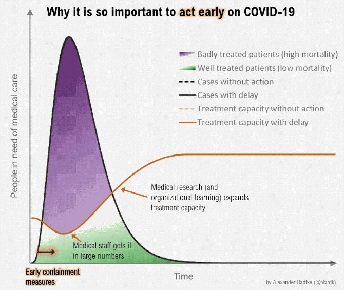
The diagram is more an illustration of why social distancing is important rather than showing social distancing itself. Doc James (talk · contribs · email) 23:39, 19 March 2020 (UTC)[reply]
^Anderson, Roy M; Heesterbeek, Hans; Klinkenberg, Don; Hollingsworth, T Déirdre (March 2020). "How will country-based mitigation measures influence the course of the COVID-19 epidemic?". The Lancet. doi:10.1016/S0140-6736(20)30567-5. A key issue for epidemiologists is helping policy makers decide the main objectives of mitigation—e.g., minimising morbidity and associated mortality, avoiding an epidemic peak that overwhelms health-care services, keeping the effects on the economy within manageable levels, and flattening the epidemic curve to wait for vaccine development and manufacture on scale and antiviral drug therapies.
Is there really a need for this article, when we have a nearly identical double: Isolation (health care)? Tshuva (talk) 15:49, 17 March 2020 (UTC)[reply]
I think so. The articles have different focuses. Isolation is primarily written about the measures taken for a patient/sick person. Social distancing is about society-wide behaviors. Schazjmd(talk) 15:59, 17 March 2020 (UTC)[reply]
The articles aren't identical at all. Isolation (health care) is about isolation of patients inside healthcare facilities, and the precautions that are taken by medical staff. SpicyMilkBoy (talk) 16:04, 17 March 2020 (UTC)[reply]
I am pretty new at this, but I believe it is pretty important too. This will teach people about how to care for themselves out while socializing, which is still important and needed for people to grow during these times. We cant just shut ourselves in a room. Especially when a lot of news outlets and medias are using this term. Now kids will be using this term too, such they will be growing up with it. How do I put my name at the end here.
Hi Victorcyho, to sign your name at the end of any talk page comment, just type 4 tildes: ~~~~. Then when you publish, your signature and a timestamp will be added to your comment. Schazjmd(talk) 20:24, 17 March 2020 (UTC)[reply]
well for examples, we dont have to be scientific about it do we? or get sources? We can put examples of what people are doing now, at stores or malls, or outside. Not everything NEEDS to be ONLY about the United States. Sure this illustrates a bit of New Zealand culture (ie Hongi). This is a possible not a negative thing. Doc James (talk · contribs · email) 16:37, 17 March 2020 (UTC)[reply]
I have reviewed the image and the source. I agree that it is good to share this as examples of ways to greet people that can be done from a distance. JenOttawa (talk) 16:58, 17 March 2020 (UTC)[reply]
A comic about how to greet people doesn't seem to me like encyclopedic content in an article about social distancing. See WP:NOTHOWTO and WP:INDISCRIMINATE — Omegatron (talk) 21:30, 17 March 2020 (UTC)[reply]
I think it's an important part of sending the non-physical greeting message now, and a valuable historical artefact of the kind of social change and communication process that happened in this 2020 pandemic. I don't think being a bit lighthearted is problematic. If campaign and information posters from the 1918 flu pandemic had been in cartoon form, they'd be on that page. It's a sign of the times. Hildabast (talk) 21:37, 17 March 2020 (UTC)[reply]
The oversimplification of the concept of "social distancing" embodied in the graphic is counterproductive. The graphic is misleading. One can violate all of the principles of "social distancing" while still abiding by the instruction provided by the graphic. Additionally, the reader doesn't need instructions in how to nod to a fellow human being, "elbow-bump", or mumble "hey—how ya doing?" Bus stop (talk) 22:42, 17 March 2020 (UTC)[reply]
Well that is the thing. Elbow bump is not listed as it is not appropriate either. So looks like it was useful just there. Doc James (talk · contribs · email) 01:25, 18 March 2020 (UTC)[reply]
This ridiculous cartoon does not add anything encyclopedic to the article. The lack of professionalism is overshadowed by the uselessness of it. Natureium (talk) 22:59, 17 March 2020 (UTC)[reply]
Have trimmed the attribution / logo as those are at commons. Doc James (talk · contribs · email) 04:15, 18 March 2020 (UTC)[reply]
Alternatives to hand shakes is important. It could come under a section titled methods. The CDC/WHO all talk about it. The cartoon would illustrate the text quite effectively. It's easy to recall. Some fun is quite welcome at the moment. I might have a go at looking at "methods". Whispyhistory (talk) 04:27, 18 March 2020 (UTC)[reply]
Yah I now decline to shake peoples hands User:Whispyhistory, both that of fellow staff and of patients. It is really a little jarring and I imagine it will take a few weeks to get use to. I have been using Namaste. Doc James (talk · contribs · email) 00:49, 19 March 2020 (UTC)[reply]
Have there been studies of the spread of infectious diseases in countries where it is customary to touch when greeting compared to those who don't? One imagines it might be significant. Philafrenzy (talk) 11:45, 19 March 2020 (UTC)[reply]
I couldn't find any...but adding one review article on hand shaking. Whispyhistory (talk) 09:55, 21 March 2020 (UTC)[reply]
In my opinion, we're lucky to be able to have these high quality and suitably educational comics in a licensing situation that we can utilise. Wikipedia, as an encyclopedia, is an educational resource, and for STEM subjects, in a lot of cases the educational potential of the articles isn't maximised because of an unnecessarily dry tone. Sceptre (talk) 05:40, 21 March 2020 (UTC)[reply]
Commons files used on this page or its Wikidata item have been nominated for deletion
The following Wikimedia Commons files used on this page or its Wikidata item have been nominated for deletion:
Participate in the deletion discussions at the nomination pages linked above. —Community Tech bot (talk) 09:52, 20 March 2020 (UTC)[reply]
"Social distancing" now known as "physical distancing"
WHO is changing the phrase "social distancing" to "physical distancing" to encourage people to stay connected through online means during the 2019-20 coronavirus pandemic. [1]
Therefore, I recommend changing the article lead from "Social distancing is a set..." to "Social distancing (also known as physical distancing) is a set..." 162.221.124.29 (talk) 02:16, 21 March 2020 (UTC)[reply]
A bot will list this discussion on requested moves' current discussions subpage within an hour of this tag being placed. The discussion may be closed 7 days after being opened, if consensus has been reached (see the closing instructions). Please base arguments on article title policy, and keep discussion succinct and civil.
Strong support and request speedy close — There is no question about it, this terminology will shift fast after the WHO's position statement to this effect [1]. This is not WP:Crystal, and should be very clear to everyone involved — if the World Health Organization uses it there WP:ins't a snowballs chance in hell that it wont be adopted. Social distancing was not in the common vernacular prior to the current crisis so WP:COMMONNAME does not apply. Carl Fredrik talk 07:17, 23 March 2020 (UTC)[reply]
Oppose (for the time being) It's too late, social distancing has already entered the public lexicon. That might change but it also might be too late for the WHO to change it. The WHO doesn't determine how the language is used. Philafrenzy (talk) 10:22, 23 March 2020 (UTC)[reply]
I think you'll find this to be wrong. It's unfortunate if we need to be slow about it. Carl Fredrik talk 10:25, 23 March 2020 (UTC)[reply]
Support. It might help also to make more clear the difference between physical distance and social abstention. Eissink (talk) 12:08, 23 March 2020 (UTC).[reply]
Comment We can include a section on the distinction in the article ("it's not social distancing, it's physical distancing"). People will continue to be social and adapt to the restrictions, but I'm not yet persuaded that "physical distancing" will ever enter common speech the same way "social distancing" has. Sugarcoils (talk) 14:27, 23 March 2020 (UTC)[reply]
Oppose – Just because the term has only been around for a couple of months doesn't mean WP:COMMONNAME can be ignored. A common name for something can easily be established in that time, and that's clearly what's happened. Our opinion on whether the common name is going to change is irrelevant. Wait until it changes, and then request the move. There's no urgency. Smyth (talk) 15:59, 23 March 2020 (UTC)[reply]
Oppose per common name. All the news articles has been referring to it as "social distancing". An op ed hasn't changed that. Natureium (talk) 18:52, 23 March 2020 (UTC)[reply]
Oppose as per common name. Peaceray (talk) 18:58, 23 March 2020 (UTC)[reply]
Waiting for now. There's probably going to be a bot that can change every instance of "social distancing" in all articles, but I think it's wait-and-see right now with what official sources are doing. A few have begun using "physical distancing"[1][2][3] so I'm going to see if the new term catches on. --Tenryuu 🐲 ( 💬 • 📝) 06:43, 24 March 2020 (UTC)[reply]
Support The phrase "social distancing" is a neologism when used in a public health context. For example, the Oxford English Dictionary does not have it – "No dictionary entries found for ‘social distancing’." The OED does have "social distance" but, for that, just gives the established meanings which we have at social distance – the sociological context. The OED does contain other phrases such as "keep your distance" for which it records usage back to Shakespeare.
The public health usage has been criticised as being too vague and conceptual and presumably that's why the WHO is now avoiding it. We should likewise avoid neologisms as they can confuse. We are writing for a very general readership and so should use plain language rather than modish buzzwords. "Physical distancing" isn't perfect because it's something of a neologism too but it's better in making it clear that the point is to keep people physically apart. Andrew🐉(talk) 08:33, 24 March 2020 (UTC)[reply]
Article naming is not based on dictionaries or other language authorities, and for what it's worth I doubt the OED has an entry for "physical distancing" either... 107.190.33.254 (talk) 20:01, 24 March 2020 (UTC)[reply]
Support - social distancing is very confusing and doesn't really mean what it says. Physical distancing will eventually be the new common name. Eventually we have to change the term since it makes more sense, we must physically be distant but not socially. After all, WHO officially renamed it, who are we to oppose it? Hushskyliner (talk) 15:51, 24 March 2020 (UTC)[reply]
Are you basing these predictions upon your own crystalball? Eventually, as you say, we might change the name, but not until it's established that the WHO-proposed term has become the new common name... 107.190.33.254 (talk) 20:01, 24 March 2020 (UTC)[reply]
You probably didn't mean it, but the start of your reply comes across as snarky and uncollegial. It's okay if editors prefer following WHO's latest instead of older sources. We might or might not decide to move the page now, but there's no need to be rude to people who don't share your personal opinion. WhatamIdoing (talk) 20:58, 24 March 2020 (UTC)[reply]
I might have overdone it, but I hope my point remains clear: article naming should be in reaction to a change in common (which is not always equivalent to official) usage, not in prediction of such a change. 107.190.33.254 (talk) 21:40, 24 March 2020 (UTC)[reply]
Oppose - already entered general language, WHO is too late to change it. TyNoOutlet (talk) 19:16, 24 March 2020 (UTC)[reply]
Oppose - The term is already very widely adopted. Ranging from the general public to the media, the government and medical professionals all using the term. Userc11 (talk) 20:25, 24 March 2020 (UTC)[reply]
Oppose per WP:COMMONNAME and the above. Social distancing is the more recognizable use among the general public. For example, while evacuating my city, every single traffic alert sign on the highway said "practice social distancing! Beat COVID-19" so it's what's been the messaging for months now. There is potential for serious harm in muddying the waters with inconsistent messaging. Recommend closing per WP:SNOW. — Wug·a·po·des 22:23, 24 March 2020 (UTC)[reply]
Strong support. While the term 'social distancing' may be in common use, it means something other than the desired behavior. As any high-schooler knows, people can be physically close but socially distant. There are other regrettable connotations to the term, which was hastily invented without adequate forethought. WHO has recognized that 'physical distancing' exactly describes the necessary behavior. A redirect from 'social distancing' should accompany. Twang (talk) 23:52, 24 March 2020 (UTC)[reply]
Support. Social distancing is a horrible term and implies predetermined socialisation rather than just mere physical proximity, such as healthcare workers. · • SUM1 • ·(talk) 22:17, 25 March 2020 (UTC)[reply]
Oppose: Social distancing is the WP:COMMONNAME and so far, there has been no indication that physical distancing is now the common name or even will be the common name. The move request is very much WP:CRYSTAL. Just because "social distancing" turned out to be a bad term doesn't change the fact that it is the common term. Bait30 Talk 2 me pls? 17:06, 26 March 2020 (UTC)[reply]
Perhaps this animation is more clear than the simulation currently used. I have not edited this article before, nor even read it fully, so I'll leave this here. Here is a webm-version (renaming already requested). Greetings, Eissink (talk) 20:05, 22 March 2020 (UTC).[reply]
With social distancing hypothetical spread is avoided, which brings down the rate of transmission of a disease and can stop an outbreak.
We seem to have independently uploaded it with a few hours between us — the only difference being I was bold enough to throw my copy into a bunch of articles at once.
I don't think we ought to remove any of the other images, they complement one another well. Carl Fredrik talk 21:30, 22 March 2020 (UTC)[reply]
I hadn't noticed you used your own upload, when I thanked you for applying. It feels a bit funny, disappointing really, to see someone uploading an image to a page where I had already brought it to attention. While in fact it is of course totally indifferent what file is used, I uploaded it earlier, and sometimes it is nice to get some credits for volunteering and it feels funny to see the 'bolder' one now harvesting. Anyhow, you know how Commons works: not only gets the youngest of duplicates deleted, unless there are good reasons to keep an other version, f.i. when filename and description are more to point and it would be troublesome to copy that all. That said, if it makes you feel good, please refrain from following the normal procedures on Commons. Sometimes the bold have half the world, but I wonder whether it is the better half, so it's yours, Carl Frederik. Eissink (talk) 21:46, 22 March 2020 (UTC).[reply]
Eissink — It will probably be caught up on commons soon enough, I don't have the tools to delete and redirect there. However, it's odd that the upload wizard didn't inform me of the duplicate, which it normally does. However, credit does go to you, as you did find it first. As for mentioning boldness, it wasn't meant as a ploy against you, rather a nod to an influential Wikipedia guideline called WP:Be bold. Carl Fredrik talk 21:58, 22 March 2020 (UTC)[reply]
I failed to connect your words to WP:Be bold, so that's my mistake, and I see that it gives a different flare to your boldness, so excuse me for that. It's okay now, thank you for your message on my Talk page. Eissink (talk) 22:02, 22 March 2020 (UTC).[reply]
Eissink, please also let me encourage you to "Be bold". When you're pretty certain that adding an image will make an article better, please be bold and add the image. If someone disagrees, the conversation can be had later. WhatamIdoing (talk) 18:36, 24 March 2020 (UTC)[reply]
Cartoonishness of graphics
Social distancing reduces the rate of disease transmission and can stop an outbreakPreventing a sharp peak of infections, known as flattening the epidemic curve, keeps healthcare services from being overwhelmedAlternatives to flattening the curveSocial distancing includes eliminating the physical contact that occurs with the typical handshake, hug, or hongi; this illustration offers eight alternatives.
I'm still not totally comfortable with the series of graphics that has taken over the article. They're accessible, yes, but we can be accessible without being cartoonish, and the extremely informal font in particular just doesn't feel appropriate for an encyclopedia, especially for a page on a serious medical topic. They also don't carry as much informational weight or medical authority — for instance, it's clear that for the "alternatives to social distancing" graphic, the artist just drew an arbitrary line saying "okay, if the response is strong but short-term, I'm going to draw cases going up this much". Compare that to something like the excellent (albeit not freely licensed) article the Washington Post put out about this, which uses some statistics and actual simulation to give the results more credence. I'm not going to say we should remove the graphics since I don't know of anything better currently available to replace them with (and yes, I recognize that criticism is cheap), but I do think we ought to recognize that they aren't the ideal, and if something better is created/found, we ought to be open to replacement. Sdkb (talk) 05:12, 24 March 2020 (UTC)[reply]
Note: I've also raised the broader issue of cartoonish graphics over at MOS images to see if they can provide any guidance, and invited folks at the Graphics Lab to join this conversation. Sdkb (talk) 05:24, 24 March 2020 (UTC)[reply]
Coming from the linked discussion above, there is a type of "beggars can't be choosers" here when it comes to freely available media. If we have only one freely available form of media that shows a key a point and it uses a "cartoonish" approach, then either we have to use that or we need someone with the right skills to recreate it with more "formal tone". If there was the choice between formal and informal, we'd always want the more formal tone if possible. --Masem (t) 06:04, 24 March 2020 (UTC)[reply]
Fully agree with Masem. We have no good images that are both simple and non-cartoonish, and while it would be great if someone made simple conceptual images, we can't demand that for now. I'm personally studying this type of modelling, but I'm far from being good enough to create decent illustrations.
I did however suggest we try to contact the creator of the another image, who might be convinced to donate it to Wikipedia. I will look into it. Carl Fredrik talk 11:24, 24 March 2020 (UTC)[reply]
The beggars/choosers point is fair (mirroring what I said above about criticism being cheap). That said, some of the graphics have also been inserted into the main Coronavirus disease 2019 and 2019–20 coronavirus pandemic articles, which gets millions of pageviews per day, so this may be worth putting in effort to address. Perhaps the WP:Graphics Lab could help us out — should we put in a request there? Sdkb (talk) 18:25, 24 March 2020 (UTC)[reply]
Just a note about that Sdkb — if we are to replace them they need: 1. to be just as clear, 2. be able to convey the message also in miniature form (as article illustrations) and 3. to avoid introducing new errors. Some of the reasons that those cartoons are used is also because they're really high quality, and while I hope we could recreate something similar in a different aesthetic — I have my doubts for how easy or quick it will be. It will likely take several tries and need input from the community. Any replacement should go through a talk-discussion, even if it may initially seem uncontroversial. Carl Fredrik talk 21:57, 24 March 2020 (UTC)[reply]
I agree. The images we're putting on this page are unprofessional and unencyclopedic. This isn't a blog. We can link to a blog if we think it is a valuable resource, but we should not be turning wikipedia into a cartoon repository. We are trying to provide information here, not grab attention with catchy animations. Natureium (talk) 16:11, 24 March 2020 (UTC)[reply]
I agree with Sdkb and Natureium and want to add that placing 3 images by the same artist in the lead of the article, plus another one further down, gives an impression of WP:PROMO. Obviously that's not the intention and these images are used because the artist releases their pictures under a free license but I imagine that it raises some eyebrows for people who are not familiar with WP's copyright policy. I don't think we need the "alternatives to flattening the curve" image when we already have the other "flatten the curve" image and I agree with previous commenters that the "alternatives to handshakes" image is not really necessary.
A thought - since the images are freely licensed, we can edit them to make them look more professional: for example, by changing the font or removing the cartoon from the bottom of this image. SpicyMilkBoy (talk) 18:36, 24 March 2020 (UTC)[reply]
Yes, the images could be edited. As for having three by the same artist, regular readers might be surprised to find a consistent style rather than the usual hodgepodge, but they will probably survive that minor shock.
Before anyone spends too much time worrying about having too many images, I think it would be worth reflecting on just how little of the text will be read by most people who visit this page. The more informative images you can add, the more educated readers will become. (Remember: Wikipedia editors are not the audience. Most of us aren't good at writing for a different audience, but we should make an effort. Adding more images than you think we 'need' is one way to write for our readers.) WhatamIdoing (talk) 18:46, 24 March 2020 (UTC)[reply]
I think removing the cartoon from the bottom of that image is at least a start at making it more professional. Natureium (talk) 19:25, 24 March 2020 (UTC)[reply]
I have complained about the graphics by the Spinoff website a number of times already (for example, on the arbitrary line drawn you mentioned, also misrepresenting the sources their graphics are based on), I really don't think we should use them. A few other people like them, but I don't know how long they can keep using them with the number of complaints about these graphics. Hzh (talk) 20:28, 24 March 2020 (UTC)[reply]
I'd like to point out here that Hzh's complaints about the content and message of the images, having nothing to do with the aesthetic, were rejected: here. No comments on the aesthetics however. Carl Fredrik talk 22:05, 24 March 2020 (UTC)[reply]
Nice of you to take the trouble to link it here (especially to one where you likened their diagram to something created by infinite monkeys that happened to agree with something it is not based on), but I did complained about the quality of the social distancing one when they tried to use it on the main article. I couldn't be arsed to look through the huge archive in the talk page there Talk:2019–20 coronavirus pandemic, but do do it yourself since you appear to be interested. Hzh (talk) 22:27, 24 March 2020 (UTC)[reply]
I suspect that we will keep them until someone WP:VOLUNTEERs to make a better one. (You, maybe?) For myself, I don't think that caring about appearances in an article that is only 12 days old is the best use of our energy. WhatamIdoing (talk) 20:55, 24 March 2020 (UTC)[reply]
I share concerns about the cartoonishness of some of these, but I actually really like File:Covid-19-Transmission-graphic-01.gif (the first one). It's not nearly as cartoonish as the others and actually does a wonderful job depicting how individual actions translate into reduced transmission rates without resorting to abstract gaussian distributions or inelastic supply. I would recommend using that (and perhaps only that) unless/until a similar graphic is produced in a style we like. We could, of course, make our own graphics; editors may be interested in the graphics lab. — Wug·a·po·des 22:18, 24 March 2020 (UTC)[reply]
I understand it looks at an odd with other wikipedia articles but at this emergency its absolutely okay as it loks like some emergency "How to" bulletins. Later on more realistic graphic may be added . btw i am comortable with cartoonistic graphics. RIT RAJARSHI (talk) 05:56, 25 March 2020 (UTC)[reply]
Here is a cropped version of the "Flatten the curve" animation:
Thoughts? P.S. I agree with Wugapodes that the transmission image is good. SpicyMilkBoy (talk) 17:19, 25 March 2020 (UTC)[reply]
This is better. Let's cut the cartoons off the bottom and keep the graphs. Natureium (talk) 19:19, 25 March 2020 (UTC)[reply]
Everyone gets all bent out of shape because "cartoons" (quelle horreur! We're a serious encyclopedia here!), but the only real concern I can see here is the fact that the illustrations are animated. Still images, however cartoonish, would be preferrable. --Florian Blaschke (talk) 17:31, 25 March 2020 (UTC)[reply]
At the very least, slow the animations way down. EEng 19:11, 25 March 2020 (UTC)[reply]
Jesus, let me say it again: slow the animations down. The new "billiards" animation is very good, but... I have a degree in applied math, I know exactly what it illustrates, but I had to watch it over and over and over to make sense of it because it's too fast. Slow it down! Way down! EEng 20:28, 25 March 2020 (UTC)[reply]
I disagree with both Florian Blaschke and EEng#s, and do not agree that there is anything wrong with animations, nor that they need to be slowed down. I find the speed is quite pleasant and conveys quite properly the change in the curve. As for the image with the "balls", I don't find it negative that one needs to see it several times to understand it. It's better that it's fast enough that you feel watching it twice is okay. Carl Fredrik talk 20:36, 25 March 2020 (UTC)[reply]
The simple curve flattening, no problem. I'm talking about the "tree" and "billiards" animations, which illustrate important concepts far, but far too quickly for someone (not already familiar with the concepts) to grasp, in one, two, three, or more viewings. Since there's no legend you have to see it once or twice just to figure out the color code ("Um, let's see... blue is the uninfected and OK, red is infected and, no, wait, green is uninfected and black is...") then a few more runs are needed to begin to see the interactions, not to mention there's two simulations side by side running at the same time... Furthermore, there's a real subtlety in that once a dot turns red (infected), it sometimes bounces around a while infecting others, but then goes still to represent being isolated (at home or in hospital); I didn't notice that at first (couldn't notice it, because everything's happening way too fast) and only saw that it's there after I surmised it ought to be there and watched over and over looking for it. EEng 20:47, 25 March 2020
"Flatten the curve" redirects here notice
I'll repeat my statement on my talk page. [Comments are referring to WP:SURPRISE] Most themes covered in the section are mentioned a lot with flattening the curve so it could be assumed they are in the correct place. I think that point could be made for most redirects in my opinion like the 3 million redirects to 2019–20 coronavirus pandemic (2019–20 outbreak of North East Respiratory Syndrome(NERS) (NERS-nCoV) which could be interpreted as something complacently different or Wuhan outbreak which could mean a hole range of things in my opinion). — RealFakeKimT 17:57, 25 March 2020 (UTC)[reply]
I respectfully disagree with that reasoning. Flattening the curve redirects to Social distancing#Effectiveness & there is currently no mention specifically of "Flatten the curve" in that section. We need to provide a soft landing so users know they have arrived at the right place & do not experience WP:SURPRISE. I think that using the redirect template here is appropriate & correct. Peaceray (talk) 18:13, 25 March 2020 (UTC)[reply]
Perhaps the best solution would be the creation of a Flattening the curve article, but until that gets done, let's stick with the redirect template. Peaceray (talk) 18:15, 25 March 2020 (UTC)[reply]
It isn't necessarily true that "flattening the curve" refers to social distancing though, Peaceray. Hand-washing also contributes toward flattening the curve. It might be better to redirect to something such as Pandemic response/Outbreak response measures. Carl Fredrik talk 10:28, 26 March 2020 (UTC)[reply]
While I agree that "flattening the curve" needs its own article or portion of an article, whenever we use the Flattening the curve redirect, we need to tell the user that they have been redirected to a section, particularly when there is no mention of the term in the section. Peaceray (talk) 14:32, 26 March 2020 (UTC)[reply]
I think the redirect template is helpful with the article as it is. But even better (IMO) would be if that first section of Effectiveness briefly described the concept of "flattening the curve" (thus mentioning the term and doing away with the need for the template). Schazjmd(talk) 18:18, 25 March 2020 (UTC)[reply]
Also, see my comments above below about making sure if you get redirected to a section, that section has an illustration of the math. Not the animation.— Vchimpanzee • talk • contributions • 18:49, 25 March 2020 (UTC)[reply]
Someone archived these instead of moving them here.
I keep seeing an illustration of the projected change in the number of cases when social distancing is used. One would be very useful here.— Vchimpanzee • talk • contributions • 15:46, 25 March 2020 (UTC)[reply]
Now I have seen the animated version, but one with the two curves side-by-side, in the proper section, is what I mean.— Vchimpanzee • talk • contributions • 16:03, 25 March 2020 (UTC)[reply]
Non cartoonish leading image
hi friends, i'm based in germany and read the german article about social distancing. problem: the first couple of images were complex and hard to grasp. why so complicated when social distancing is about people keeping at a distance from each other? so i thought, why not create an image which at the first glance shows strangely distanced people in a neutral environment. call it an eyecatcher which tells every visitor: uh, that's what this article is about!
i've seen the discussion about the cartoons in this article. problematic indeed. my image is not cartoonish at all. but it's an illustration, an abstract way to lead the visitor into the article. when i read in → the revert that that image "does not help at all" by User:EEng, i'm puzzled.
the current images are complex to grasp; the first one transports a message about the implications social distancing might have, not about social distancing.
think about it, folks! wikipedia is for everyone, not for academics only. Maximilian (talk) 09:52, 26 March 2020 (UTC)[reply]
I agree with Maximilian Schönherr that some form of stylized image showing physical distance in a crown is a good illustration. I still find that the image with the pink hypothetical branches that are avoided is best, but having those two at the top does seem like a decent way of illustrating the concept while avoiding the cartoonishness that other editors have complained about. Carl Fredrik talk 10:25, 26 March 2020 (UTC)[reply]
Social distance of several people (illustration)
Why would we present the reader with a bleak computer rendering of zombies wandering aimlessly around a moonscape, with what appears to be a nuclear weapon detonating just out of frame to the right, when we could instead show them actual pictures of actual people lined up with appropriate distance between them? EEng 22:41, 26 March 2020 (UTC)[reply]
History
Should we move some of what is in the "effectiveness" section into "history" or vice versa? There is a lot of cross-over. Whispyhistory (talk) 14:20, 26 March 2020 (UTC)[reply]
Spinoff.co.nz
I have removed one of the images from this article for three reasons.
1. Having three (consecutive) images by the same private company (Spinoff.co.nz) comes across as a kind of ad injection.
2. So many animated images distract from the content of the article.
3. The image might have fit better in an article about cartoons or greetings. This article is neither.


.svg)


.gif)

.gif)
.jpg)