
Wikipedia:Graphics Lab/Illustration workshop
| Notice: The Graphics Lab needs more image-people; all are welcome to try their hand at the requests below! |
|---|
This page is deprecated and will not be monitored. Please use one of the three workshop pages. This specific page is {{{1}}}
See also
- Category:Images for cleanup
- Category:Images for redraw
- meta:Philip Greenspun illustration project/Requests
Pennſylvanian state logo
-
 Central shield and eagle crest from here.
 -
 Traced SVG
 -
Updated. Redraw a lot of it, it's much sharper now. (Text and the bottom thing.)


Articels: Many, including Seal of Pennsylvania
Request: SVGify the seal 68.39.174.238 (talk) 00:14, 20 March 2008 (UTC)
Oppinion: How does that work? I wasn't sure how to incorporate the flag part (specific part wanted?), if there is I'll fix it. §tepshep • ¡Talk to me! 02:03, 20 March 2008 (UTC)
- Did you trace the bitmap? --ANONYMOUSPUSSY 10:32, 20 March 2008 (UTC)
No, I use VectorMagic to edit the bitmap, then make it SVG, I pop it into InkScape and make it transparent. It takes all of 15 minutes to get right if anything gets truly messed up. §tepshep • ¡Talk to me! 17:45, 20 March 2008 (UTC)
- It seems to break down the detail though: For one, the ships rigging becomes sortof a blurred blob. 68.39.174.238 (talk) 03:08, 21 March 2008 (UTC)
- And what I meant with the flag was that the ship, plow and grain were already vectorized on the flag, just in a different shaped shield. Same with the eagle. 68.39.174.238 (talk) 03:09, 21 March 2008 (UTC)
Never said you had to use it, just thought I'd offer some help. No harm done? §tepshep • ¡Talk to me! 04:06, 21 March 2008 (UTC)
- Nono, it's fine. If the flag can't be used or noone else does, then your version is still good enough to be used in place of the raster'd seal. 68.39.174.238 (talk) 18:01, 21 March 2008 (UTC)
I've just updated it so the text and the bottom thing is much sharper. --Henrikb4 (talk) 14:46, 12 April 2008 (UTC)
- Nice; is there any way to get the elements off of the flag? They appear much sharper there... 68.39.174.238 (talk) 16:58, 12 April 2008 (UTC)
- Yeah, it would be possible, I might take a look at it--Henrikb4 (talk) 09:13, 13 April 2008 (UTC)
OK, I've taken the boat and plough from the flag. Let me know what you think. --Slashme (talk) 15:56, 2 May 2008 (UTC)
- And now I've sharpened stuff up somewhat. I think this is done now. --Slashme (talk) 09:59, 3 May 2008 (UTC)
- It's been so long I'm just glad to have it done and not "stale"'d. Someone can delete the traced version. 68.39.174.238 (talk) 19:19, 7 May 2008 (UTC)
TB in 2005
-
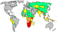 Tuberculosis in 2005
 -
 PNG by Sbw01f


Article(s): Tuberculosis
Request: A better one maybe. → Pepper / ? 20:34, 24 March 2008 (UTC)
- Question: What do the colors mean (IE. Where is the legend)? Also, to whoever takes this: Be very careful, this map is very defective in its borders... 68.39.174.238 (talk) 22:40, 24 March 2008 (UTC)
- The legend is in the image page, Anyway it's this: Cases per 100,000; Red = >300, orange = 200-300; yellow = 100-200; green 50-100 and grey <50. Data from WHO, 2006. [1]
- Yeah, I was filling in Image:BlankMap-World6.svg to export as a PNG and noticed some inconsistencies. For example the area between Pakistan and China, Yemen and above Bangladesh. If they are just meant to be different areas of the same country that's OK but I take the black lines to be borders, which makes no sense in those areas. — ₪₪ ch1902 ₪₪ 23:14, 24 March 2008 (UTC)
- I'd just go with the data and apply it to a blank map. That's what I did with Image:Polio worldwide 2005.png and its companion SVG; the original JPG had several inaccuracies, so I just used the WHO data. Fvasconcellos* (t·c) 02:14, 25 March 2008 (UTC)
- I thought of that too, but upon opening the spreadsheet there are a dozen sheets with different data and I have nooooo idea which sheet or which data it is. Nothing seems to stand out as "cases per 100,000" :-/ — ₪₪ ch1902 ₪₪ 13:40, 25 March 2008 (UTC)
- I see. Maybe 2006 data from the 27th page of this report (http://www.who.int/tb/publications/global_report/2008/pdf/report_without_annexes.pdf) is more useful. → Pepper / ? 15:09, 25 March 2008 (UTC)
- I thought of that too, but upon opening the spreadsheet there are a dozen sheets with different data and I have nooooo idea which sheet or which data it is. Nothing seems to stand out as "cases per 100,000" :-/ — ₪₪ ch1902 ₪₪ 13:40, 25 March 2008 (UTC)
- I'd just go with the data and apply it to a blank map. That's what I did with Image:Polio worldwide 2005.png and its companion SVG; the original JPG had several inaccuracies, so I just used the WHO data. Fvasconcellos* (t·c) 02:14, 25 March 2008 (UTC)
- Yeah, I was filling in Image:BlankMap-World6.svg to export as a PNG and noticed some inconsistencies. For example the area between Pakistan and China, Yemen and above Bangladesh. If they are just meant to be different areas of the same country that's OK but I take the black lines to be borders, which makes no sense in those areas. — ₪₪ ch1902 ₪₪ 23:14, 24 March 2008 (UTC)
Graphist opinion: It appears Sbw01f has produced a PNG from the WHO data—see above. Is this what you had in mind? Fvasconcellos (t·c) 01:12, 15 April 2008 (UTC)
- If the PNG is what was wanted I'll do the SVG for it. Mangwanani (talk) 15:35, 15 April 2008 (UTC)
That's all perfect. → Pepper / ? —Preceding unsigned comment added by PepperIT (talk • contribs) 14:43, 4 May 2008 (UTC)
Demographic history of the United States
-

-
Better style (according to Mangwanani)
-
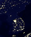 Korean Peninsula at night (A more analogous image, in the author's opinion)


Article(s): Demographic history of the United States
Request: much as I like Twinkle Twinkle Little States... um, yeah. Slow it down and put it on a normal Wiki map background so it doesn't look like the whole thing is a surprise-- Chris (クリス • フィッチ) (talk) 08:48, 3 April 2008 (UTC)
Graphist opinion:
- I'm not a graphist, but a solution to the speed issue would be to include 1x, 2x, 4x, 8x buttons in the description portion of the thumb, each of which leads to a different image that changes at a different speed. This can be done by creating Image:PercentOfUSPopInEachState1x.gif, Image:PercentOfUSPopInEachState2x.gif, Image:PercentOfUSPopInEachState4x.gif, and Image:PercentOfUSPopInEachState8x.gif. The black color is off putting. JohnABerring27A (talk) 15:02, 6 April 2008 (UTC)
Author's opinion:
- こんにちは, I'm the author. Thanks for your interest in this image! Just wanted to let you know that back when I created this image, I tried various speeds, state colors, and background colors. I found that a fast speed was necessary in order to make the movement over the decades most visible... when you slow it down you just can't see the patterns of movement, which is really the whole point of the image. I also found that white --> black was the most intuitive color scheme for the states (brighter = larger share of the population) and easiest for the eye to recognize the subtle shades of difference. And I found that black was the background color that worked best with that. Still, if anyone thinks they can improve, good luck and have fun playing with it! Szu (talk) 05:15, 7 April 2008 (UTC)
- I would change the background color to something else. The northwestern states barely show up on my monitor. 68.39.174.238 (talk) 22:33, 7 April 2008 (UTC)
- They will barely show up on any monitor, and that's on purpose. States with hardly any population are hardly visible; as they get more people they stand out more. That's exactly why I chose black for the background. When I tried other background colors, the black states would become just as visible the brighter ones, drawing attention away from the important action going on in those brighter states. If you do choose another background color I'd hope it would be very dark. Szu (talk) 14:34, 8 April 2008 (UTC)
- I'm sorry but that doesn't make sense. The whole point of the image is to inform people not keep them guessing and thus they need to be able to see the image to be able to use it. If they wanted to guess the information, as will be done on some monitors, they are wasting their time looking at the image as it is as far as I can say. Mangwanani (talk) 19:50, 8 April 2008 (UTC)
- So people who don't know when Idaho, Utah, Montana and Wyoming gained statehood just have to guess at when it's "There's not state here" and when it's "There's a state with no population here"? 68.39.174.238 (talk) 20:17, 8 April 2008 (UTC)
- This image doesn't distinguish between "there's no state here" and "there's a state with no population" because that's not the point of the image. This image is not trying to show when states were admitted to the union; the point of the image is just to show the general movement of population over the decades, which I think it does well and without requiring any guesswork. Still, like I said, if you guys can do better, go ahead and have fun with it! ;-) Szu (talk) 20:51, 8 April 2008 (UTC)
- I'm just going to be blunt about this. I don't think it works. I have added an image of the growth of WWII just as it was the first map I came across that I think works very well in showing its point and timeline. If we could make a new version styled on this I think would be much clearer and less, as Chris called it, Twinkle Twinkle. Mangwanani (talk) 15:46, 9 April 2008 (UTC)
- Thanks for your bluntness. Bear in mind there are other people who do think it works. Also I should say that the fact that you propose a map of WWII conquests as a model suggests that you don't understand the point of the image. This image is not meant to provide detail of a historical event like a military battle or territorial acquisition. It's meant to show a broad social/geographic pattern, just like "Korean Peninsula at night" which I think is much more similar in purpose. But rather than complaining about this image, please go ahead and make your own version. I'll be looking forward to see what you come up with! :-) Szu (talk) 19:12, 9 April 2008 (UTC)
- As I have said before and many times on this page, my graphic skills are limited. I am simply stating that in my opinion the image doesn't work. I also don't see how the Korean Peninsular can be compared to this image. It isn't twinkle twinkle and shows something completely different. Mangwanani (talk) 19:27, 9 April 2008 (UTC)
- I'm sorry, I haven't seen your comments on other images, only this one. On the surface, the WWII map may seem to be more similar: it moves, it's historical, it's a map. But in terms of purpose, "Korean Peninsula at night" is much more similar: it illustrates a broad pattern of human population in a very simple manner; it's not trying to be a precise, detailed record like the WWII map. Szu (talk) 20:00, 9 April 2008 (UTC)
- How can the image "not work" if the purpose meant by Szu is just a general population representation, not a specific...whatever you think it's supposed to be? :-/ James1293 (talk) 19:43, 30 April 2008 (UTC)
- Because it's on a dark background that renders it illegible on many monitors. Is that clear enough? Chris (クリス • フィッチ) (talk) 01:22, 1 May 2008 (UTC)
- We've already addressed that point: the dark states are less visible on purpose so that the light states stand out. This has been posted here for a month now... Is anyone going to make their own version, or not? Szu (talk) 02:15, 2 May 2008 (UTC)
- I was boiling it down for James1293 who didn't understand the above debate. Chris (クリス • フィッチ) (talk) 14:23, 2 May 2008 (UTC)
Request: Hello, it's map, please :
- Please , Thank you ! Cancelos (talk) 12:31, 20 April 2008 (UTC)
Graphist opinion: So you want this to be made into a vector and uploaded to Wikipedia for the Pêra Rocha article? James1293 (talk) 19:47, 30 April 2008 (UTC)
- For english and portuguese article, a map of production , please , Cancelos (talk) 20:44, 1 May 2008 (UTC)
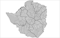
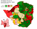
2008 HOA Zimbabwe election, constituency winners map
-
 started version
 -
 The map I started from (wrong)
 -
 PNG municipalities
 -
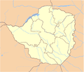 Provinces here too
 -

-
 An example of how this kind of maps look when finished
 -
 An already vectorialized map we can start from
 -
 My Started version ~~~
.svg)


Article: Zimbabwean parliamentary election, 2008
Request: Someone at Talk:Zimbabwean parliamentary election, 2008 requested that a map of the House of Assembly constituency winners be made, and I started work on the project. However, I based my map on a vectorialization of Image:Zim-provinces blank.jpg, which has proven to contain some gross errors forcing me to constantly reshape provinces and constituencies. I'm in exams now and can't afford to put more time on this, so I'm here to ask for help: is someone willing to finish the job?. The current status can be seen on the left. Thanks in advance. Habbit (talk) 10:06, 6 April 2008 (UTC)
Graphist opinion:There are better maps of Zimbabwe on which this can be based. There is also this link here which has all the results and some maps also. Mangwanani (talk) 11:18, 6 April 2008 (UTC)
- Yup, that was the website I was checking to get the results and paint the constituencies as required. The second map you posted (PNG municipalities) looks better, but some municipalities are split in several constituencies, partially due to population sizes, and also some gerrymandering. Habbit (talk) 13:43, 6 April 2008 (UTC)
- Yup. It may well be out of date but that's the way things go sometimes. Does the final image have to be vector? Can I also ask why half of Mashonaland East is missing in your map? Mangwanani (talk) 14:03, 6 April 2008 (UTC)
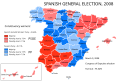
- I would prefer the final image to be vector, as it could be scaled as needed (say, for printing or outside Wikipedia). The final result I was trying for is something like Image:Spanish general election, 2008 - constituency winners.svg. It appears that I chose the wrong map to start with, and I might have overdid the post-vectorization "simplifying" step, so I seemingly cut off part of a province. Thus, it would be better to just start again with another map as the base (Image:Zimbabwe Locator.png looks good), but I won't be able to start in this week, or even month, since I'm in exams right now, that's why I asked for help here. Habbit (talk) 14:20, 6 April 2008 (UTC)
- That's fine. I'm sure we can come up with something. Not sure how good my skills at vector are for this... Mangwanani (talk) 15:03, 6 April 2008 (UTC)
- I have tried but I can't do it. :( My action plan (which I was attempting) was to vectorise the maps from Sokwanele (just the outlines not the colours or the writing) and then once they were all vectorised to slot them neatly into a map of Zimbabwe and then change the colours accordingly to reflect the election results. Mangwanani (talk) 19:39, 6 April 2008 (UTC)
- Well, that's just what I was doing before. I ran into the problem of the bad map I started from (with wrong-shaped provinces), but I believe that doing so with a correct base provincial map should be relatively easy. If no-one else stands up for finishing the map in a week or so (i.e. after I finish my exams), I will restart work with a new base map. Thanks for trying, though! Habbit (talk) 20:17, 6 April 2008 (UTC)
- I have tried but I can't do it. :( My action plan (which I was attempting) was to vectorise the maps from Sokwanele (just the outlines not the colours or the writing) and then once they were all vectorised to slot them neatly into a map of Zimbabwe and then change the colours accordingly to reflect the election results. Mangwanani (talk) 19:39, 6 April 2008 (UTC)
- That's fine. I'm sure we can come up with something. Not sure how good my skills at vector are for this... Mangwanani (talk) 15:03, 6 April 2008 (UTC)
- I would prefer the final image to be vector, as it could be scaled as needed (say, for printing or outside Wikipedia). The final result I was trying for is something like Image:Spanish general election, 2008 - constituency winners.svg. It appears that I chose the wrong map to start with, and I might have overdid the post-vectorization "simplifying" step, so I seemingly cut off part of a province. Thus, it would be better to just start again with another map as the base (Image:Zimbabwe Locator.png looks good), but I won't be able to start in this week, or even month, since I'm in exams right now, that's why I asked for help here. Habbit (talk) 14:20, 6 April 2008 (UTC)
- Yup. It may well be out of date but that's the way things go sometimes. Does the final image have to be vector? Can I also ask why half of Mashonaland East is missing in your map? Mangwanani (talk) 14:03, 6 April 2008 (UTC)
- I made Image:Zimbabwe admin.svg it might be useful. Jackaranga (talk) 20:53, 6 April 2008 (UTC)
- Indeed. It will be extremely useful, since we won't need to create/vectorialize another map of Zimbabwe: just split/join the boundaries for constituencies, and then paint them. Thank you very much!! The only thing we're missing now is a map of the constituencies inside Harare and, iIrc, another province not available in the above website. Habbit (talk) 22:03, 6 April 2008 (UTC)
- Ok, here's my started version. I have vectorised the constituency maps from Sokwanele and inserted them into Jackaranga's map. Mangwanani (talk) 19:32, 9 April 2008 (UTC)
- Is this going how you intended? Before I go any further... Mangwanani (talk) 19:20, 11 April 2008 (UTC)
- Indeed. You're doing a quite wonderful job. My congratulations. Habbit (talk) 13:04, 12 April 2008 (UTC)
- OK, its as done as I can do - can't find a map for the Midlands. It may, nay does, need tyding up a lot around the edges. Additionally, Lake Kariba (partly in black) needs something doing but I'm not sure what. Mangwanani (talk) 17:04, 12 April 2008 (UTC)
- I found constituency maps for the remaining provinces here, which should be easy to correlate with election results sites, thus filling the last voids. Harare will need to be shown enlarged just like Bulawayo (that's why I reserved the 'H' space in my first map and put the color code in another place). About the lake, I'd just forget about it, i.e. show it as part of the constituency next to it. Besides the need for some reconciling of the constituency borders with the provinces, this is a great job. Once again, my compliments. Habbit (talk) 13:31, 13 April 2008 (UTC)
- Sorry, but I really don't have the patience to work with those maps. Sorry. Mangwanani (talk) 14:23, 13 April 2008 (UTC)
- Well, I won't say I'm particularly happy with the coitus interruptus, but still you have gone a long way with this job and I thank you for it. A great map with vectorisations of more than 150 constituencies. My exam streak ends this Wednesday, so I'll take over that night - however, if anyone else in the Graphic Lab wishes to complete this map before, I'll be even happier ^.^ Habbit (talk) 20:29, 13 April 2008 (UTC)
- Just an after-thought and getting ahead of myself, once this is done, can we make a copy that has all the constituencies in grey like the other blank Wikipedia maps for future use... Mangwanani (talk) 15:30, 15 April 2008 (UTC)
- Well, I won't say I'm particularly happy with the coitus interruptus, but still you have gone a long way with this job and I thank you for it. A great map with vectorisations of more than 150 constituencies. My exam streak ends this Wednesday, so I'll take over that night - however, if anyone else in the Graphic Lab wishes to complete this map before, I'll be even happier ^.^ Habbit (talk) 20:29, 13 April 2008 (UTC)
- Sorry, but I really don't have the patience to work with those maps. Sorry. Mangwanani (talk) 14:23, 13 April 2008 (UTC)
- I found constituency maps for the remaining provinces here, which should be easy to correlate with election results sites, thus filling the last voids. Harare will need to be shown enlarged just like Bulawayo (that's why I reserved the 'H' space in my first map and put the color code in another place). About the lake, I'd just forget about it, i.e. show it as part of the constituency next to it. Besides the need for some reconciling of the constituency borders with the provinces, this is a great job. Once again, my compliments. Habbit (talk) 13:31, 13 April 2008 (UTC)
- OK, its as done as I can do - can't find a map for the Midlands. It may, nay does, need tyding up a lot around the edges. Additionally, Lake Kariba (partly in black) needs something doing but I'm not sure what. Mangwanani (talk) 17:04, 12 April 2008 (UTC)
- Indeed. You're doing a quite wonderful job. My congratulations. Habbit (talk) 13:04, 12 April 2008 (UTC)
- Is this going how you intended? Before I go any further... Mangwanani (talk) 19:20, 11 April 2008 (UTC)
- Ok, here's my started version. I have vectorised the constituency maps from Sokwanele and inserted them into Jackaranga's map. Mangwanani (talk) 19:32, 9 April 2008 (UTC)
- Indeed. It will be extremely useful, since we won't need to create/vectorialize another map of Zimbabwe: just split/join the boundaries for constituencies, and then paint them. Thank you very much!! The only thing we're missing now is a map of the constituencies inside Harare and, iIrc, another province not available in the above website. Habbit (talk) 22:03, 6 April 2008 (UTC)
Coat of arms of the Federation of the West Indies
-
best one I could find, can anyone find better?
-
 flag from website, modified
 -
 the source site says "Blue", unless qualified, usually means the same blue as in a Blue Ensign.
 -
found the image, though I suspect it is really done in the orange and dark blue of the flag and the smaller image
-
for coloration of helmet and banding
-
for the birds and torch
-
 for the lion atop the shield
.svg)


Article(s): West Indies Federation
Request: create large usable coat of arms. Also please correct the flag, based on this link here http://www.crwflags.com/FOTW/FLAGS/gb-carib.html -- Chris (クリス • フィッチ) (talk) 00:28, 13 April 2008 (UTC)
Graphist opinion: Comment: The current flag matches the description "in the West Indies Gazette" (mentioned in the FOTW link you provided). Fvasconcellos (t·c) 01:34, 13 April 2008 (UTC)
- Actually, that link says "The official description given in the West Indies Gazette is "Flag approved has blue ground with four white horizontal wavy bars (the top pair of bars being parallel and the lower pair also parallel) and an orange sun in the centre." Not the most enlightening description. "Blue", unless qualified, usually means the same blue as in a Blue Ensign." (orange, not red) Chris (クリス • フィッチ) (talk) 01:45, 13 April 2008 (UTC)
- Wow—that looks distinctly orange to me (more precisely, tangerine). Do you know of a more official source for the image? I couldn't find any... Fvasconcellos (t·c) 14:49, 13 April 2008 (UTC)
- I've checked two monitors at different locations, it's coming through as red as that Guernsey shield below. If it is orange on yours, it needs to be lightened several shades at any rate. Chris (クリス • フィッチ) (talk) 15:54, 13 April 2008 (UTC)
- It's definitely orange, InkScape ran a color check and it's orange (RGBA:ff6600ff). Should it match the flag at the other link exactly, or just change the circle? I added a verson with the web colors. §hep • ¡Talk to me! 19:28, 13 April 2008 (UTC)
- Thank you so much, I appreciate your time! Could you make it the darker blue of the ensign above? Chris (クリス • フィッチ) (talk) 20:16, 13 April 2008 (UTC)
- Switched over the color. §hep • ¡Talk to me! 20:44, 13 April 2008 (UTC)
- Thank you so much for your hard work! Now to the coat of arms... Chris (クリス • フィッチ) (talk) 21:04, 13 April 2008 (UTC)
- Anything bigger to work off of? §hep • ¡Talk to me! 21:07, 13 April 2008 (UTC)
- When I google, I find Communication and Information Sector's Photobank - Watermark of ...Watermark of the Coat of Arms of the West Indies Federation ... Place: Federal Archives Centre, University of West Indies (UWI). Country: Barbados ...
portal.unesco.org/ci/photos/showphoto.php?photo=4626 - 21k and Communication and Information Sector's Photobank - Watermark of ...Watermark of the Coat of Arms of the West Indies Federation. View Smaller Image ... Place: Federal Archives Centre, University of West Indies (UWI) ... portal.unesco.org/ci/photos/showphoto.php/photo/4626/size/big - 21k but I can't get into either of them. Chris (クリス • フィッチ) (talk) 22:06, 13 April 2008 (UTC)
- Before anyone begin on the Coat of arms, please do not incorporate any material from files that came from Vector-images.com. These images have recently been deemed unfree on Commons where they're hosted after additional communication with the company that produced them. We'll only be able to keep files from them of insignia from countries where specific local laws expressly place insignia in the public domain. This is not the case for any of the files linked to above, so please use some other material for the new image. Any images containing code from vector-images.com will automatically be as unfree as the original image, and will have to be deleted again. Valentinian T / C 00:33, 26 April 2008 (UTC)
- does this really belong here, or on a talkpage somewhere? Chris (クリス • フィッチ) (talk) 00:49, 26 April 2008 (UTC)
- It probably belongs somewhere else as well, but creating a new image that will be deleted because it contains copyrighted material would be a waste of time, so just trying to avoid this situation. I just noticed that all three suggested components came from the same problematic source. Valentinian T / C 10:17, 26 April 2008 (UTC)
- does this really belong here, or on a talkpage somewhere? Chris (クリス • フィッチ) (talk) 00:49, 26 April 2008 (UTC)
Eintracht Frankfurt jersey
Article(s):Eintracht Frankfurt
Request: -- Could someone please create the away and the third jersey, respectively. Maybe this template helps you. Template:Football_kit. If you have further questions, don't hesitate to contact me. Help is much appreciated! -Lemmy- (talk) 10:38, 13 April 2008 (UTC)
Graphist opinion:
- Pretty sure that layout is copyrighted. Sorry. /Lokal_Profil 23:29, 19 April 2008 (UTC)
DPRK's coat of arms
-
I kinda started on it a while ago
Article(s): Lots of articles
Request: SVG the coa of North Korea please. Thanks --SelfQ (talk) 13:25, 15 April 2008 (UTC)
Graphist opinion:
- I gave it a stab months ago, just gave up. User:Zscout370 (Return Fire) 03:00, 30 April 2008 (UTC)
- Anyone wish to continue?--SelfQ (talk) 12:04, 30 April 2008 (UTC)
- I might do a little...? James1293 (talk) 19:37, 30 April 2008 (UTC)
- Please go ahead. --SelfQ (talk) 21:27, 30 April 2008 (UTC)
- I might do a little...? James1293 (talk) 19:37, 30 April 2008 (UTC)
decent SVG of the western hemisphere
-
 svg cropped from a projection of a world map (really skewed)
 -
 satellite image with a head-on view (much better)
 -
 Less skewed?


Article(s): many many articles could use a decent SVG of the western hemisphere. one example is Paraguay-United States relations
Request: :Another related request (not urgently needed but this reminded me of something I wanted earlier) - it would be fabulous to have an SVG of the Americas that wasn't super warped. Currently all the base maps of the Americas have this weird skew to them because they're cropped versions of world projections. It would be great if we could have a less distorted map of the Americas. Mangostar (talk) 00:56, 16 April 2008 (UTC) Surprisingly, all the maps of the western hemisphere are horribly skewed. I'm not even really sure where to look to find a decent projection to base a better SVG on (commons doesn't seem to have much). It would be wonderful if we could have a generic western hemisphere SVG for country labeling where it's unnecessary to have the rest of the world, marking the ranges of new world animals, etc. -- Mangostar (talk) 01:07, 16 April 2008 (UTC)
Graphist opinion:
- Rotated the "main" worldmap. This should give a less skewed basis for an Americas only map. I can clean out the other countries later on but exam revision will have to take priority. BTW why cant a "normal" map (such as Image:France Canada Locator.svg) be used for Paraguay-United States relations? /Lokal_Profil 02:39, 16 April 2008 (UTC)
- For that one it's fine because the countries are both very big, but for highlighting very small countries (say Central America or Caribbean) in other articles, when you include the entire world it's very hard to see where the relevant countries even are. Similarly, there are plenty of animals that are just in the western hemisphere, and again including the whole world makes it harder to see what's happening in the relevant part. Mangostar (talk) 15:02, 16 April 2008 (UTC)
- Just tell me the projection you would like and I can make one in about 2 minutes. By the way when you say skewed it is in fact a deliberate choice to try and preserve area rather than angles. You can see different map projections at Map projection Jackaranga (talk) 12:18, 16 April 2008 (UTC)
- That new map made by Lokal is actually really great. (I guess s/he understood from my garbled request that the projection as such wasn't wrong, just where the projection was centered.) A couple little things: Is it possible to make it have the rounded edges-type projection similar to that at Image:BlankMap-World6.svg so that polar stuff isn't so huge? And could someone crop it so you can only see western hemisphere countries? (Sadly/embarrassingly, I have never figured out what I need to do to crop things in Inkscape....) Mangostar (talk) 15:02, 16 April 2008 (UTC)
- It's not possible to have it with the round edges since that "skews" the continents similar to the first image. I can remove the antarctic and "hide" the non-Americas countries but I don't have time to properly remove them (whilst preserving the ISO tag structure) until after exams. /Lokal_Profil 19:44, 16 April 2008 (UTC)
- There, done (once the uploading stops complaining). The only difference between hiding and removing the other countries is the filesize (currently a whopping 3,5MB). I take it it's ok if Iceland is part of the map. /Lokal_Profil 19:56, 16 April 2008 (UTC)
- Thanks for all your help. Maybe later you could consider the rounder projection? I don't think the "skew" would be very bad, because the problem with the original map is that the Americas are all on one side. I guess what I mean is the on the original world map the longitude lines are like <<||>> and when you chop of the non-America part you're left with <<, so it is curved in a strange crescent way. If the Americas were centered, you would get the straighter || part (or really like <> but less severe). Do you understand what I'm getting at?
- File size has now been reduced to a quarter of the original (now ~600kB). I get what you mean but the rounder projection will always be skewed due to the large regions close to the pole (Alaska, Canada, Greenland). Personaly I think this map should prove easier to work with. /Lokal_Profil 18:27, 27 April 2008 (UTC)
- Thanks for all your help. Maybe later you could consider the rounder projection? I don't think the "skew" would be very bad, because the problem with the original map is that the Americas are all on one side. I guess what I mean is the on the original world map the longitude lines are like <<||>> and when you chop of the non-America part you're left with <<, so it is curved in a strange crescent way. If the Americas were centered, you would get the straighter || part (or really like <> but less severe). Do you understand what I'm getting at?
- There, done (once the uploading stops complaining). The only difference between hiding and removing the other countries is the filesize (currently a whopping 3,5MB). I take it it's ok if Iceland is part of the map. /Lokal_Profil 19:56, 16 April 2008 (UTC)
- It's not possible to have it with the round edges since that "skews" the continents similar to the first image. I can remove the antarctic and "hide" the non-Americas countries but I don't have time to properly remove them (whilst preserving the ISO tag structure) until after exams. /Lokal_Profil 19:44, 16 April 2008 (UTC)
- That new map made by Lokal is actually really great. (I guess s/he understood from my garbled request that the projection as such wasn't wrong, just where the projection was centered.) A couple little things: Is it possible to make it have the rounded edges-type projection similar to that at Image:BlankMap-World6.svg so that polar stuff isn't so huge? And could someone crop it so you can only see western hemisphere countries? (Sadly/embarrassingly, I have never figured out what I need to do to crop things in Inkscape....) Mangostar (talk) 15:02, 16 April 2008 (UTC)
Root anatomy
Can you help me with root diagram? There should be numbers instead of words.
-
Root anatomy
Article(s):sk.wikipedia.org
Request: -- Pinky sl (talk) 15:46, 17 April 2008 (UTC)
Graphist opinion:
Albanian language map
Article(s):
Request: put on regular Wiki-style non-ominous map -- Chris (クリス • フィッチ) (talk) 03:54, 18 April 2008 (UTC)
- I agree with the "ominous" part of it. Also, a correction of boundaries and names (Serbia/Montenegro) would be useful. Thanx, 68.39.174.238 (talk) 18:55, 18 April 2008 (UTC)
Graphist opinion:
Nobutaka Machimura

Article(s): Nobutaka Machimura
Request: lighten for detail -- Chris (クリス • フィッチ) (talk) 03:54, 18 April 2008 (UTC)
Graphist opinion:
Crest of Hyrule from JPG to SVG
-
Crest of Hyrule
Article(s): The Legend of Zelda (series)
Request: I would just like this image in SVG, making it look exactly if not very similar to that JPG, as it's a very simple design.--24.109.218.172 (talk) 15:22, 18 April 2008 (UTC)
Graphist opinion: Actually, I just did it myself. I converted it to a SVG in Inkscape. It can be found at Image:Crest of Hyrule.svg.--Suit777 (talk) 15:39, 18 April 2008 (UTC)
- Why is it so... yellow? Shoemaker's Holiday (talk) 15:55, 18 April 2008 (UTC)
- Things in the Zelda universe are always yellow. Look at Image:Triforce.svg for example. I can upload it in black though I guess, though this image is really supposed to be yellow. There, I've created a black version: Image:Crest of Hyrule black.svg.--Suit777 (talk) 16:16, 18 April 2008 (UTC)
- Now I haven't played a Zelda game in a while, but I from what I remember it was more of a gold than a yellow.--Dycedarg ж 03:51, 21 April 2008 (UTC)
- Resolved? Mangwanani (talk) 16:53, 29 April 2008 (UTC)
- Now I haven't played a Zelda game in a while, but I from what I remember it was more of a gold than a yellow.--Dycedarg ж 03:51, 21 April 2008 (UTC)
- Things in the Zelda universe are always yellow. Look at Image:Triforce.svg for example. I can upload it in black though I guess, though this image is really supposed to be yellow. There, I've created a black version: Image:Crest of Hyrule black.svg.--Suit777 (talk) 16:16, 18 April 2008 (UTC)
Al Anbar Governorate
Article(s): Al Anbar Governorate
Request: use same font -- Chris (クリス • フィッチ) (talk) 05:06, 19 April 2008 (UTC)
- Would it be worth it to just request SVGification, or are the borders too messy for that? 68.39.174.238 (talk) 02:12, 2 May 2008 (UTC)
Graphist opinion:
US military bases in the world 2007
-

-
 royal blue
 -
 paler blue
 -
 orange


Article(s): List of United States military bases
Request: change to white background for legibility -- Chris (クリス • フィッチ) (talk) 05:06, 19 April 2008 (UTC) (ps-adding that this should be SVG and use an improved color scheme)
Graphist opinion: Done. Not really an improvement—this should be SVG and use an improved color scheme. Maybe I'll get around to it ;) Fvasconcellos (t·c) 14:28, 19 April 2008 (UTC)
- You're right, some of those islands where there are bases totally fade out. Thank you for thus far, and hoping you'll go farther! Chris (クリス • フィッチ) (talk) 15:17, 19 April 2008 (UTC)
- If someone can put together the data (i.e. which country which colour) then I can create an svg in a few minutes. Hunting through the 11 sources for that info is not something I'm prepared to do though. /Lokal_Profil 19:39, 19 April 2008 (UTC)
+1000
Afghanistan Azores Bahrain Bermuda Belgium Bosnia Bulgaria Canaries Diego Garcia Djibouti Germany Great Britain Guantanamo Bay Iceland Iraq Italy Japan Jordan Kuwait Kyrgyzstan Oman Portugal Romania Serbia South Korea Spain Turkey UAE US
+100
Albania Australia Canada Croatia Colombia Dominican Republic Egypt El Salvador Georgia Greece Greenland Hungary Macedonia Nicaragua Paraguay Peru Philippines Saudi Arabia Singapore Thailand
facility use
Azerbaijan Czech Republic Ecuador Indonesia Kazakhstan Kenya Luxembourg Malaysia Morocco Netherlands Norway Pakistan Panama Poland Senegal Somalia Tajikistan Turkmenistan
- (What does everyone think a better color scheme would be?) Chris (クリス • フィッチ) (talk) 01:30, 21 April 2008 (UTC).
- I'd go with a sort of royal blue for >1000, paler blue for >100, and a shade of orange for contrast. It's pretty "classic" and perfectly colorblind compliant. Fvasconcellos (t·c) 01:52, 21 April 2008 (UTC)
- Were these similar to the shades you had in mind? Chris (クリス • フィッチ) (talk) 02:33, 21 April 2008 (UTC)
- Pretty much, and thanks for the data. If Lokal profil doesn't get around to it tomorrow, I can do it when I get to my other computer :) Fvasconcellos (t·c) 03:22, 21 April 2008 (UTC)
- I'm short on time for the moment so go ahead =). If you use the SVG world map then all you need to do is to list the relevant iso codes using a text editor, see Image:Map of unitary and federal states.svg for an example. /Lokal_Profil 18:32, 27 April 2008 (UTC)
- Excellent. I'm almost done; I can't get the third set of countries to work (must have screwed up some bit of code :), but I'll upload it as soon as it's sorted out. Fvasconcellos (t·c) 23:09, 29 April 2008 (UTC)
- I'm short on time for the moment so go ahead =). If you use the SVG world map then all you need to do is to list the relevant iso codes using a text editor, see Image:Map of unitary and federal states.svg for an example. /Lokal_Profil 18:32, 27 April 2008 (UTC)
- Pretty much, and thanks for the data. If Lokal profil doesn't get around to it tomorrow, I can do it when I get to my other computer :) Fvasconcellos (t·c) 03:22, 21 April 2008 (UTC)
Macedonia

Article(s): Macedonia naming dispute
Request: update to show present borders and SVGify -- Chris (クリス • フィッチ) (talk) 05:06, 19 April 2008 (UTC)
Graphist opinion:
Oil palm

Article(s): Oil Palm
Request: carefully fix minor halftoning [this is at 400 dpi, and I think all that's needed is a slight blur, and maybe a sharpen after.], fix edges. These are the natural colours, I believe, except maybe that funny pink in the title at the top. Shoemaker's Holiday (talk) 15:48, 19 April 2008 (UTC)
- I'll get this with a Fourier transform as soon as I can (it preserves a bit more high frequency than a blur). Time3000 (talk) 16:55, 20 April 2008 (UTC)
- I am getting there, but it's a bit slow going because the image is so huge. Time3000 (talk) 11:52, 5 May 2008 (UTC)
Peterloo Massacre
-
 A map showing the contingents sent to the Peterloo Massacre. PNG format.
 -
 SVG
SVG


Article(s): Peterloo Massacre
Request: requires an SVG conversion. -- --Jza84 | Talk 21:39, 19 April 2008 (UTC)
Graphist opinion:
- I'll take this. Renata (talk) 21:48, 19 April 2008 (UTC)
- Ok, how's that? Renata (talk) 23:02, 19 April 2008 (UTC)
- Some of the placenames are obscured by the arrows. Any chance of reducing/re-aligning the text size to stop item conflict? --Jza84 | Talk 23:15, 19 April 2008 (UTC)
- Please note that Mediawiki doesn't support the arrowheads. You will have to convert them to paths. That should also fix som of the alignment issues. /Lokal_Profil 23:25, 19 April 2008 (UTC)
- Ghr, ok, fixed arrows. But I do give up re fonts. They just render so differently on my screen than on Commons... If anyone feels like playing with it... Renata (talk) 01:14, 20 April 2008 (UTC)
- Fonts are always problematic. Even though Mediawiki supports DejaVu Sans it still renders it differently from Incscape. A quick and dirty fix would be to convert te text to paths as well. The previous version in the history is always available if someone want's to fix the font issues. /Lokal_Profil 15:50, 20 April 2008 (UTC)
- All fixed now. I reduced the text size and moved them around a bit to make it more readable and converted all texts to paths. —PolishName 12:20, 24 April 2008 (UTC)
- Fonts are always problematic. Even though Mediawiki supports DejaVu Sans it still renders it differently from Incscape. A quick and dirty fix would be to convert te text to paths as well. The previous version in the history is always available if someone want's to fix the font issues. /Lokal_Profil 15:50, 20 April 2008 (UTC)
- Ghr, ok, fixed arrows. But I do give up re fonts. They just render so differently on my screen than on Commons... If anyone feels like playing with it... Renata (talk) 01:14, 20 April 2008 (UTC)
- Please note that Mediawiki doesn't support the arrowheads. You will have to convert them to paths. That should also fix som of the alignment issues. /Lokal_Profil 23:25, 19 April 2008 (UTC)
- Some of the placenames are obscured by the arrows. Any chance of reducing/re-aligning the text size to stop item conflict? --Jza84 | Talk 23:15, 19 April 2008 (UTC)
- Ok, how's that? Renata (talk) 23:02, 19 April 2008 (UTC)
Hail to the Chief


Article(s): Hail to the Chief
Request: trim out or clean off beige spraypaintry -- Chris (クリス • フィッチ) (talk) 07:30, 20 April 2008 (UTC)
Graphist opinion: Is this okay? miranda 05:13, 27 April 2008 (UTC)
- Sorry for being unclear. The point is to get the beige off, even if the image has to be greyscaled. Chris (クリス • フィッチ) (talk) 05:33, 27 April 2008 (UTC)
- In light of the new info, how's that? §hep • ¡Talk to me! 01:35, 30 April 2008 (UTC)
- Wonderful, please overwrite original, thanks! Chris (クリス • フィッチ) (talk) 04:56, 30 April 2008 (UTC)
- Can't, I saved it as a PNG which is superior to a GIF. §hep • ¡Talk to me! 19:39, 30 April 2008 (UTC)
- Ah, thanks, sorry, please mark the orivinal vva, thanks! Chris (クリス • フィッチ) (talk) 01:39, 1 May 2008 (UTC)
Fire classes logos
Please create a svg file for each of the fire classes logos present in the following image :
-
 Class A
 -
 Class B
 -
 Class C
 -
 Class C #2
 -
 Class D
 -
 Class K - I am unhappy with the pan


Article(s): to improve the tab on the page Fire classes. We have also logo in svg on the french wikipedia... see here
Request: -- Gdgourou (talk) 17:47, 20 April 2008 (UTC)
Graphist opinion:
- Done first one. Note that it is very hard to determine how the details should look like because of low resolution. Renata (talk) 19:29, 20 April 2008 (UTC)
- Looks quite good to me—these are standard on Brazilian fire extinguishers (though usually color coded), see e.g. here. I believe the "log" closest to the boards should be a rolled-up blanket or newsprint, etc. Fvasconcellos (t·c) 19:46, 20 April 2008 (UTC)
- Here's Class D (had to do the easy one, sorry :) Fvasconcellos (t·c) 20:02, 20 April 2008 (UTC)
- Playing the part of the devils advocate: How about the copyright for those original images? If they are copyrighted then any derivative image (sucha as the class A above) will also be copyrighted. /Lokal_Profil 20:45, 20 April 2008 (UTC)
- It would be hard to believe these icons are copyrightable. The point of them is so that everyone uses them. Renata (talk) 20:59, 20 April 2008 (UTC)
- The star isn't copyrightable but al the others are. And unless they explicitly have been made free (US gov?) they are copyrighted. /Lokal_Profil 20:07, 22 April 2008 (UTC)
- It would be hard to believe these icons are copyrightable. The point of them is so that everyone uses them. Renata (talk) 20:59, 20 April 2008 (UTC)
- Playing the part of the devils advocate: How about the copyright for those original images? If they are copyrighted then any derivative image (sucha as the class A above) will also be copyrighted. /Lokal_Profil 20:45, 20 April 2008 (UTC)
- Here's Class D (had to do the easy one, sorry :) Fvasconcellos (t·c) 20:02, 20 April 2008 (UTC)
- Looks quite good to me—these are standard on Brazilian fire extinguishers (though usually color coded), see e.g. here. I believe the "log" closest to the boards should be a rolled-up blanket or newsprint, etc. Fvasconcellos (t·c) 19:46, 20 April 2008 (UTC)
- Ok, I am done. Unless someone can figure out a way to draw a better pan for Class K. Renata (talk) 20:59, 20 April 2008 (UTC)
- Wow, very nice work—welcome to the Lab! And all in the time it took me to draw one more :D Fvasconcellos (t·c) 21:06, 20 April 2008 (UTC)
- I like your flames better :) They are "fatter" :P And I suppose I should rename my stuff according to your naming scheme... Renata (talk) 21:18, 20 April 2008 (UTC)
- Thanks to and for all... It's very good (also the pan ;-)). No matter for the naming... --Gdgourou (talk) 10:54, 21 April 2008 (UTC)
- I like your flames better :) They are "fatter" :P And I suppose I should rename my stuff according to your naming scheme... Renata (talk) 21:18, 20 April 2008 (UTC)
- Wow, very nice work—welcome to the Lab! And all in the time it took me to draw one more :D Fvasconcellos (t·c) 21:06, 20 April 2008 (UTC)
Waffen-SS unit insignia
-
Collage of SS collar patches
Article(s): SS unit insignia
Request: Could someone make individual SVG patches out of this? also, can someone make out some of the text? Thanks --SelfQ (talk) 23:31, 20 April 2008 (UTC)
Graphist opinion:
- Those words are division numbers. It seems that we have all the insignia for Waffen-SS divisions, but not collar patches. Renata (talk) 17:08, 21 April 2008 (UTC)
- My bad. I was thinking collar patches but didnt type it. fix'ed.--SelfQ (talk) 19:57, 21 April 2008 (UTC)
- Looking at the Waffen-SS pics, could they be SVG or is there a law thingy prohibiting it? Mangwanani (talk) 18:24, 22 April 2008 (UTC)
- Most Waffen-SS images and symbols are public domain, and the legal thingy is only for Germany, and since wikipedia is not hosted in Germany I dont think there is a problem, right?--SelfQ (talk) 19:45, 23 April 2008 (UTC)
- Looking at the Waffen-SS pics, could they be SVG or is there a law thingy prohibiting it? Mangwanani (talk) 18:24, 22 April 2008 (UTC)
- My bad. I was thinking collar patches but didnt type it. fix'ed.--SelfQ (talk) 19:57, 21 April 2008 (UTC)
- I'm pretty sure that law is for noneducational use. 68.39.174.238 (talk) 21:17, 24 April 2008 (UTC)
- So it can be done right?--SelfQ (talk) 16:35, 29 April 2008 (UTC)
- I'm pretty sure that law is for noneducational use. 68.39.174.238 (talk) 21:17, 24 April 2008 (UTC)
- I'm no lawyer, but I don't think German laws apply to us... 68.39.174.238 (talk) 19:14, 7 May 2008 (UTC)
Northwest passage
Article(s): Northwest passage
Request: lighten image -- Chris (クリス • フィッチ) (talk) 04:01, 21 April 2008 (UTC)
Graphist opinion:
Mitch Hedberg
Article(s): Mitch Hedberg
Request: lighten for detail -- Chris (クリス • フィッチ) (talk) 04:01, 21 April 2008 (UTC)
Graphist opinion:
Nephron of the Kidney diagram
-
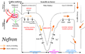 Diagram of the nephron (the main functional unit) of the human kidney, labeled in Polish and saved in PNG format

Article(s): Kidney
Request: Please redraw this diagram in SVG format, including English-language labels. Optionally, it could be made more visually appealing through the use of a more pleasing and professional color scheme. I do not speak Polish so someone who does will need to translate the labels, or alternately a biology subject-matter expert will need to be involved to create correct English-language labels without translation from Polish. Killdevil (talk) 20:40, 21 April 2008 (UTC)
Graphist opinion:
Rhodesia
Article(s): Rhodesia
Request: lighten for detail -- Chris (クリス • フィッチ) (talk) 04:18, 22 April 2008 (UTC)
Graphist opinion:
Northwest Territories License Plate

Article(s): U.S. and Canadian license plates
Request: trim out for clear background, replace bolts with empty boltholes -- Chris (クリス • フィッチ) (talk) 04:18, 22 April 2008 (UTC)
Graphist opinion:
Spear of Lugh

Article(s): Spear of Lugh
Request: straighten and trim -- Chris (クリス • フィッチ) (talk) 04:18, 22 April 2008 (UTC)
Graphist opinion:
UTA TRAX system map
-
 Image in question

Article(s): UTA TRAX
Request: I'm not sure if this qualifies for this page, but with the extension of the northern part of the lines this map needs to be updated. The Delta Center station is now the Arena station, and three new stations have been added at the north end of the Sandy/Salt Lake line and University line. If you need a source for the map, find it here: [2] There was a better image but it seems it's been pulled down. Thanks - CountyLemonade (talk) 04:28, 23 April 2008 (UTC)
- Also, with the linked map, the "hub" by the intersection of 600 West and 200 South is the third new station, the Central station. Thanks - CountyLemonade (talk) 04:14, 24 April 2008 (UTC)
Ignore the above link given, here's a much better pdf: [3] CL — 16:42, 27 April 2008 (UTC) Graphist opinion:
Order of the Rising Sun
-
 SVG - Correct?

Article(s): Order of the Rising Sun
Request: enlarge for detail, no reason for it to be so miniscule -- Chris (クリス • フィッチ) (talk) 05:07, 23 April 2008 (UTC)
Graphist opinion: I've had a go at this by converting to SVG. I couldn't find a better image on google to work from, so I made the assumption that there wasn't actually a cross in the center of the circle and that's just an unfortunate pixel effect from scaling it up. The SVG looks odd in comparison, but the "rays" are the same angles. If I'm wrong and it should be a cross or needs some other changes, then just let me know :) — ₪₪ ch1902 ₪₪ 17:49, 24 April 2008 (UTC)
- I have asked the original uploader to weigh in, and am seeking a physical picture now. Thank you so much, thus far! Chris (クリス • フィッチ) (talk) 20:57, 24 April 2008 (UTC)
- I do not have a physical photo of the rosette, but what I can attest, the SVG looks like a good start. User:Zscout370 (Return Fire) 03:27, 25 April 2008 (UTC)
- But as for the cross, it is intentional. Rosettes are made in a specific way. User:Zscout370 (Return Fire) 03:29, 25 April 2008 (UTC)
- I do not have a physical photo of the rosette, but what I can attest, the SVG looks like a good start. User:Zscout370 (Return Fire) 03:27, 25 April 2008 (UTC)
Government Warehouse

Article(s): Government Warehouse
Request: lighten for detail -- Chris (クリス • フィッチ) (talk) 05:07, 23 April 2008 (UTC)
Graphist opinion:
OFCCP Seal
-
 Seal of OFCCP
 -
 SVG version
 -
 SVG with redone letters


Article(s): Office of Federal Contract Compliance Programs
Request:
- Redraw the circles.
- Redo the text
- Redraw the eagle and shield if possible (if not that's okay
Image not available electronically, but scanned from an older document. Thanks. --evrik (talk) 19:25, 23 April 2008 (UTC)
Graphist opinion: Here is the SVG version, does it need any colours -- Cradel 13:38, 24 April 2008 (UTC)
- The circle and all in it will need to be white and the writing could be typed out rather than traced. Mangwanani (talk) 14:53, 24 April 2008 (UTC)
- The circle in is white but i only traced the letters-- Cradel 15:09, 24 April 2008 (UTC)
- Black and white is fine. Would it be possible to type out the letters so they come out cleaner? Also, is there any way to sharpen the lines on the eagle and shield? Many thanks! --evrik (talk) 19:17, 24 April 2008 (UTC)
- My monitor shows the transparency. That's what I meant by white. Mangwanani (talk) 15:42, 25 April 2008 (UTC)
- Actually there was a background but I forgot to change the opacity, anyway I fixed it now -- Cradel 22:04, 25 April 2008 (UTC)
- I took a shot at redoing the letters; not sure if they feel like they match the eagle but you can use it if you think it's better. The eagle was taken directly from Cradel's version... doing any better with that is well beyond me. Carl Lindberg (talk) 07:12, 27 April 2008 (UTC)
- My monitor shows the transparency. That's what I meant by white. Mangwanani (talk) 15:42, 25 April 2008 (UTC)
- Black and white is fine. Would it be possible to type out the letters so they come out cleaner? Also, is there any way to sharpen the lines on the eagle and shield? Many thanks! --evrik (talk) 19:17, 24 April 2008 (UTC)
- The circle in is white but i only traced the letters-- Cradel 15:09, 24 April 2008 (UTC)
- Well, unless someone wants to take a crack at cleaning up the eagle pixel by pixek, I think it looks much better. Thank you, all. --evrik (talk)
Kuni Tomoko

Article(s): Prince Fushimi Hiroyasu
Request: fix texture chatter -- Chris (クリス • フィッチ) (talk) 05:39, 24 April 2008 (UTC)
Graphist opinion:
Hermann Göring
-

-
conceivably this could also be used, but there's a color reversal in the middle
.jpg)
Article(s): Hermann Göring
Request: fix glare, even out coloration -- Chris (クリス • フィッチ) (talk) 05:39, 24 April 2008 (UTC)
Graphist opinion:
World 820

Article(s): History of Tibet
Request: put on regular Wiki-style white or clear background -- Chris (クリス • フィッチ) (talk) 05:39, 24 April 2008 (UTC)
- And change Tauregs to Tuaregs. --ANONYMOUSPUSSY 16:55, 3 May 2008 (UTC)
Graphist opinion:
| PNG | |||||||||||||||||||||||
 |
 |
||||||||||||||||||||||
| SVG | |||||||||||||||||||||||
Article(s): Phaistos Disc
Request: SVG versions of the various Phaistos Disc characters. -- Ptcamn (talk) 12:08, 24 April 2008 (UTC)
- I left off the stroke mark (Image:Phaistos glyph 46.png). This one still needs to be SVGified. --Ptcamn (talk) 07:29, 25 April 2008 (UTC)
Graphist opinion: I've got all 45 as SVG images from an extended unicode font and am uploading them now, it'll just take a while to do 45 manually and check they are correct! — ₪₪ ch1902 ₪₪ 17:38, 24 April 2008 (UTC)
- Some of them are being clipped at the edge, I'll sort those out as soon as I can. — ₪₪ ch1902 ₪₪ 18:32, 24 April 2008 (UTC)
- Hey, I know those first three guys! ;) Chris (クリス • フィッチ) (talk) 04:23, 25 April 2008 (UTC)
- I think we're gonna need a bot to add the {{vva}} tag to all the raster images. Mangwanani (talk) 15:40, 25 April 2008 (UTC)
- A lot of the SVGs are cut off. 3 (right side) 7 (bottom) 8 (right) 12 (bottom) 15 (bottom) 23 (right) 25, 26 & 28 (bottom) 34 (right) 38 (bottom AND right), 40 (right), 45 (right) Shoemaker's Holiday (talk) 17:33, 26 April 2008 (UTC)
- I think we're gonna need a bot to add the {{vva}} tag to all the raster images. Mangwanani (talk) 15:40, 25 April 2008 (UTC)
- Hey, I know those first three guys! ;) Chris (クリス • フィッチ) (talk) 04:23, 25 April 2008 (UTC)
23 and 28 are especially bad. Shoemaker's Holiday (talk) 17:39, 26 April 2008 (UTC)
- They render fine in Firefox, it looks like MW's ImageMagick rendering again... Time3000 (talk) 12:38, 27 April 2008 (UTC)
- It looks like there are fractional values for the "width" and "height" attributes near the top of the SVG file. Those seem to cause problems with MW's renderer. I usually just round those up to the nearest full integer value (unless it's like .004 or something, then round down). You can probably just put in the pixel sizes which come out anyways. When I do that, MW's renderer seems to work just fine. Carl Lindberg (talk) 02:22, 28 April 2008 (UTC)
- They were all generated by a script which did a "fit canvas to selection or drawing" on the lot and gave the decimal widths and heights. I'll fix those images today. — ₪₪ ch1902 ₪₪ 17:10, 29 April 2008 (UTC)
- It looks like there are fractional values for the "width" and "height" attributes near the top of the SVG file. Those seem to cause problems with MW's renderer. I usually just round those up to the nearest full integer value (unless it's like .004 or something, then round down). You can probably just put in the pixel sizes which come out anyways. When I do that, MW's renderer seems to work just fine. Carl Lindberg (talk) 02:22, 28 April 2008 (UTC)
Burmese language requests
-

-
#1 Traced? not good in any way, please overwrite
-
 #2 From font-closest to needed
 -
 #3 Other Version-also good


Article(s): all sorts of Burmese language requests
Request: SVGify -- Chris (クリス • フィッチ) (talk) 03:59, 25 April 2008 (UTC)
Graphist opinion: There was already an SVG version in use, but it looked traced. Rather than overwrite it, I uploaded a new one converted from a unicode font with burmese characters in it — ₪₪ ch1902 ₪₪ 10:56, 25 April 2008 (UTC)
- I also created one based on the jpg with Inkscape-- Cradel 10:59, 25 April 2008 (UTC)
- I'd go with yours, that font did not scale up at all well! — ₪₪ ch1902 ₪₪ 11:49, 25 April 2008 (UTC)
- Please overwrite what I have labeled #1 with the much better #2, thanks! Chris (クリス • フィッチ) (talk) 13:57, 25 April 2008 (UTC)
- I don't think we can overwrite since the images have different licenses (I don't think you can put a license on letters and geometric shapes...) can't we just use #2 with the existing name? — ₪₪ ch1902 ₪₪ 17:07, 29 April 2008 (UTC)
- The thing is, #1 is absolutely horrible wrong, it needs to be either deleterd or overwritten. If overwritten, the licenses can also be overwritten very easily. It needs to go, it is incorrect and has no place on the 'pedia. Chris (クリス • フィッチ) (talk) 04:53, 30 April 2008 (UTC)
Rangoon coat of arms
Article(s): Yangon
Request: SVGify -- Chris (クリス • フィッチ) (talk) 03:59, 25 April 2008 (UTC)
Graphist opinion: This is going to be physically impossible without a higher quality version (or someone that knows the CoA). James1293 (talk) 21:48, 29 April 2008 (UTC)
weird question?


Article(s):
Request: Does Wikipedia have, or is it possible to develop through coding or elsewise, a customizable [[Image:___|200px|thumb]] type box for odd-shaped pictures like the one above? -- Chris (クリス • フィッチ) (talk) 03:59, 25 April 2008 (UTC)
Graphist opinion: According to me (and Wikipedia:Picture tutorial): unfortunately not. --ANONYMOUSPUSSY 09:24, 25 April 2008 (UTC)
- the white space could be made transparent, if saved to a different format Thisglad (talk) 09:27, 25 April 2008 (UTC)
- Would someone be willing to make a transparent-space version of this? Thanks! Chris (クリス • フィッチ) (talk) 13:59, 25 April 2008 (UTC)
- I forget what all formats hold a transparent, so made it a GIF for now. Sorry the cut's not perfect, that's the best I got. §hep • ¡Talk to me! 05:30, 26 April 2008 (UTC)
- Would someone be willing to make a transparent-space version of this? Thanks! Chris (クリス • フィッチ) (talk) 13:59, 25 April 2008 (UTC)
- Thanks! Would a PNG be preferable for this kind of an image? Chris (クリス • フィッチ) (talk) 06:47, 26 April 2008 (UTC)
- But the frame would still be a rectangle, FYI... --ANONYMOUSPUSSY 16:43, 26 April 2008 (UTC)
- Yeah, I got that. What is the best format for this? Chris (クリス • フィッチ) (talk) 16:54, 26 April 2008 (UTC)
- What about this version, It's definitely not perfect but I'm sure someone better at cloning images from a source point could make a much better one -- Cradel 20:10, 26 April 2008 (UTC)
- It looks good, but if you're going to make that major of a change, you really, really should label the photo as being modified on its image page. Also, the image is obviously not in copyright, either in America or Japan, so the information on the page should reflect this. Shoemaker's Holiday (talk) 09:39, 27 April 2008 (UTC)
- Really nice job :] 220.135.4.212 (talk) 14:00, 27 April 2008 (UTC)
- It looks good, but if you're going to make that major of a change, you really, really should label the photo as being modified on its image page. Also, the image is obviously not in copyright, either in America or Japan, so the information on the page should reflect this. Shoemaker's Holiday (talk) 09:39, 27 April 2008 (UTC)
- What about this version, It's definitely not perfect but I'm sure someone better at cloning images from a source point could make a much better one -- Cradel 20:10, 26 April 2008 (UTC)
Blank maps
-
 roundy
 -
 rectangulary


Article(s): templates for others
Request: I have looked and I can't find any so could someone make these maps have no borders please. If they exist feel free to hit me with a wet fish. -- Mangwanani (talk) 16:46, 25 April 2008 (UTC)
Graphist opinion:
Suture diagrams
.png)
.png)
The first one is Image:Types of Stitches used in sutures, from Dictionnaire Encyclopédique des Sciences Médicales (1884).png - it's obviously too large, but once it's divided into two, it'll be fine.
Article(s): For use in Suture
Request: Fix perspective distortion from curvature of book, remove shadow. I can do the cleanup of all that ink that bled over from the facing page if you can get me that far, but please do NOT shrink its resolution before I do that cleanup. Shoemaker's Holiday (talk) 00:43, 26 April 2008 (UTC)
Graphist opinion:
- Just an observation: I would suggest splitting the stitch image into four separate images. Renata (talk) 01:03, 27 April 2008 (UTC)
- Er, so, anyone up to doin' it? =)
Luther Halsey Gulick

Article(s): Luther Halsey Gulick
Request: trim out framing and lighten around head -- Chris (クリス • フィッチ) (talk) 06:53, 26 April 2008 (UTC)
Graphist opinion:
Artaxiad standard
-
-
Image:Artaxiad flag WIP.svg Can someone please fix this thumbnail? --James1293

Article(s): Artaxiad Dynasty, scads of others
Request: lighten for detail and SVGify, this is supposed to be a flag -- Chris (クリス • フィッチ) (talk) 05:02, 27 April 2008 (UTC)
Graphist opinion: The beak(s) are going to be almost impossible, but I'm working on the rest at the moment James1293 (talk) 20:25, 29 April 2008 (UTC)
- ---Ok, I have the sun done, will upload work in progress tomorrow :-)---James1293 —Preceding unsigned comment added by James1293 (talk • contribs) 00:30, 30 April 2008 (UTC)
- Ok, I uploaded the WIP. I've made several (unsucessful) attempts at tracing the bird; I guess I'm just not good at doing organic-type-tracing :-) --(note that the original gif is behind it for overlaying comparison). -- James1293 (talk) 20:33, 30 April 2008 (UTC)
- The linked image didn't get uploaded it it breaks on MediaWiki, but the sun look very good in InkScape! Good job so far. §hep • ¡Talk to me! 23:33, 30 April 2008 (UTC)
- Ok, I uploaded the WIP. I've made several (unsucessful) attempts at tracing the bird; I guess I'm just not good at doing organic-type-tracing :-) --(note that the original gif is behind it for overlaying comparison). -- James1293 (talk) 20:33, 30 April 2008 (UTC)
View on Taiwan's Valley
-
 View on Taiwan's Valley

Article(s): Taiwan
Request: This image is really nice, but, sadly, we can notice 3 electric line on the sky. Make disapear this 3 lines would be great. Since it's a clear improvement, please upload the corected image up on the same image on commons (using the same file name). Many thanks. -- 220.135.4.212 (talk) 13:57, 27 April 2008 (UTC)
Graphist opinion: but the lines are realy there, would that not be distorting the true a bit? it would be like removing a scar from someones face to make there biography look beter, right?--SelfQ (talk) 14:50, 27 April 2008 (UTC)
- No, it's a matter of perspective, if the photo was taken from a slightly different angle, the lines wouldn't appear. Minor mods like this are done all the time by the GL. Chris (クリス • フィッチ) (talk) 16:29, 27 April 2008 (UTC)
- I still request the clean up : the electrical lines are out of topic in this picture of natural mountain. These 3 lines are Chart junk (polution), if the photograph wanted to take picture of human building, he probably just had to turn his camera to the right, to take picture of a village. user:220.135.4.212 —Preceding unsigned comment added by 140.122.97.172 (talk) 10:39, 28 April 2008 (UTC)
Flag of the Union of South American Nations
-
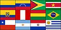 USAN flag
 -
 Start
Start


Article(s): Union of South American Nations, Dutch language
Request: SVG, it sould be extreemly simple, just add the SVGs of the flags together in the correct position and presto!-- SelfQ (talk) 14:47, 27 April 2008 (UTC)
Graphist opinion: I'm on it. Mangwanani (talk) 17:36, 27 April 2008 (UTC)
- Here's a start. Mangwanani (talk) 17:58, 27 April 2008 (UTC)
- The last ones are Image:Flag of Brazil.svg, Image:Flag of Venezuela.svg and Image:Flag of Argentina.svg. Don't forget to credit all of the sources for your images in the image description. Also the coat of arms in Ecuador's flag seems sqashed. Could try Image:Flag of Ecuador.svg instead. /Lokal_Profil 18:42, 27 April 2008 (UTC)
- That is the flag I used. Brazil and Argentina are corrupted. Don't know what happened with Venezula... Mangwanani (talk) 15:34, 28 April 2008 (UTC)
- Oh ye, its corrupted too. Mangwanani (talk) 15:37, 28 April 2008 (UTC)
- It's probably a naming problem. Brazil, Venezuela and Chile probably all have definitions/elements called "star" (or star1 etc). Both Argentina and Uruguay probably have definitions/elements called sun. That's my first guess anyhow. The problem with the Ecuadorian flag is that it is wider then the others. When it's squashed the CoA should remain unsquashed (but still centered). /Lokal_Profil 19:15, 28 April 2008 (UTC)
- Pass Mangwanani (talk) 19:55, 29 April 2008 (UTC)
- My suggestion is just stick with the civil variants as much as possible, just like it was done with Peru. User:Zscout370 (Return Fire) 02:51, 30 April 2008 (UTC)
- I think it would be best to stick as close to the original as posible, you would not add another star to the flag of the EU just because it would be easier to make. I would have thought this would be a snap, clearly I underestimated my knowledge of SVG's. My apologies. --SelfQ (talk) 21:37, 30 April 2008 (UTC)
- It still can be done, I just need to find time to hack at it. User:Zscout370 (Return Fire) 21:40, 30 April 2008 (UTC)
- If it hasn't been done by the time my exams are over I will give it a shot. My plan was to rename the definitions. I.e. open the brasil falg in a text editor and replacing every occurence of "star" by "br-star" and similar for the other clashes. But if anyone gets around to it before then thats great too =) /Lokal_Profil 09:31, 1 May 2008 (UTC)
- It still can be done, I just need to find time to hack at it. User:Zscout370 (Return Fire) 21:40, 30 April 2008 (UTC)
- I think it would be best to stick as close to the original as posible, you would not add another star to the flag of the EU just because it would be easier to make. I would have thought this would be a snap, clearly I underestimated my knowledge of SVG's. My apologies. --SelfQ (talk) 21:37, 30 April 2008 (UTC)
- My suggestion is just stick with the civil variants as much as possible, just like it was done with Peru. User:Zscout370 (Return Fire) 02:51, 30 April 2008 (UTC)
- Pass Mangwanani (talk) 19:55, 29 April 2008 (UTC)
- It's probably a naming problem. Brazil, Venezuela and Chile probably all have definitions/elements called "star" (or star1 etc). Both Argentina and Uruguay probably have definitions/elements called sun. That's my first guess anyhow. The problem with the Ecuadorian flag is that it is wider then the others. When it's squashed the CoA should remain unsquashed (but still centered). /Lokal_Profil 19:15, 28 April 2008 (UTC)
- Oh ye, its corrupted too. Mangwanani (talk) 15:37, 28 April 2008 (UTC)
- That is the flag I used. Brazil and Argentina are corrupted. Don't know what happened with Venezula... Mangwanani (talk) 15:34, 28 April 2008 (UTC)
- The last ones are Image:Flag of Brazil.svg, Image:Flag of Venezuela.svg and Image:Flag of Argentina.svg. Don't forget to credit all of the sources for your images in the image description. Also the coat of arms in Ecuador's flag seems sqashed. Could try Image:Flag of Ecuador.svg instead. /Lokal_Profil 18:42, 27 April 2008 (UTC)
- Here's a start. Mangwanani (talk) 17:58, 27 April 2008 (UTC)
Good article star
-
 Featured article star
 -

-
 GA star


Article(s): Wikipedia talk:Good articles#Redesign of symbols
Request: Create an 'empty star' image based on Image:Featured article star.svg, and upload at Image:Good article star.svg. This would keep the black border around the star, but the rest would be blank. This is for a proposed replacement for the Good article symbol.-- Pharos (talk) 22:13, 27 April 2008 (UTC)
Graphist opinion:I created one , Q:does the inside have to be transperant or have a color - Cradel 12:51, 28 April 2008 (UTC)
- Could the plus be aligned with vertical? Currently it looks like one of those optical illusions. 68.39.174.238 (talk) 14:27, 30 April 2008 (UTC)
- I've tried that, but I think it looks better like this -- CD 17:54, 3 May 2008 (UTC)
Jigme Khesar Namgyal Wangchuck

Article(s): Jigme Khesar Namgyal Wangchuck
Request: lighten for detail -- Chris (クリス • フィッチ) (talk) 05:38, 28 April 2008 (UTC)
Graphist opinion: Anything of an improvement? It seems way too garish, although it's much sharper now. Less adjustment was practically useless. Fvasconcellos (t·c) 19:38, 28 April 2008 (UTC)
- Perhaps the answer may be to cut the background away, like was done with the Steve Jobs photo several months ago? Chris (クリス • フィッチ) (talk) 21:08, 28 April 2008 (UTC)
- Its hard to determine where the background starts because of the black colour of the hair - Cradel 19:59, 29 April 2008 (UTC)
- If you look at it on an LCD monitor from an interesting angle you can see the border. Mangwanani (talk) 19:57, 2 May 2008 (UTC)
- Its hard to determine where the background starts because of the black colour of the hair - Cradel 19:59, 29 April 2008 (UTC)
Coat of arms of Gagauzia
-
 GIF
GIF -
PNG
-
 for color scheme
 -
 based on


Article(s): Coat of arms of Gagauzia
Request: SVGify, colors described at Coat of arms of Gagauzia -- Chris (クリス • フィッチ) (talk) 05:38, 28 April 2008 (UTC)
Graphist opinion:
In the mean time, I've removed the transparency from the GIF image and uploaded a transparent version in PNG format; that way at least it scales down better. By the way, looking at the color levels on the original GIF (and in particular the few "blacker-than-black" pixels around the banner), I have a suspicion that this may have originally been a color image that someone converted to grayscale. Anyone have any idea about the original colors? —Ilmari Karonen (talk) 19:53, 29 April 2008 (UTC)
- He said, "colors described at Coat of arms of Gagauzia." I could not find a colored version on Google as a model... James1293 (talk) 20:08, 29 April 2008 (UTC)
- I think he meant the articel on the Coat (Or the FotW page it references). 68.39.174.238 (talk) 14:26, 30 April 2008 (UTC)
- The article states "...white field, the yellow semi-circle of the rising sun. The shield is framed by golden spikes, themselves surrounded by a representation of the flag of Gagauzia. In the lower part, beyond the limits of the shield, is a conventional representation of grapevine leaves and grapes. The shield is surmounted by three five-pointed golden stars forming an equilateral triangle." I have added the flag for the color scheme. Chris (クリス • フィッチ) (talk) 14:57, 2 May 2008 (UTC)
Ceylon
Article(s): Coat of arms of Sri Lanka
Request: SVGify -- Chris (クリス • フィッチ) (talk) 21:28, 28 April 2008 (UTC)
Graphist opinion: Couldn't elements from Image:Coat_of_arms_of_Sri_Lanka.svg be used instead of tracing this entirely? Or does it need to look older/different from the current CoA...? I'll do a little work; if anyone else decides to work on this, please post. James1293 (talk) 20:00, 29 April 2008 (UTC)
- I can't speak for the original requester, but the lion could probably be taken from the current coat without much trouble. 68.39.174.238 (talk) 14:24, 30 April 2008 (UTC)
Burma flag
.png)
Article(s): Burma
Request: SVGify -- Chris (クリス • フィッチ) (talk) 21:02, 29 April 2008 (UTC)
Graphist opinion: I had a go at it, I used the other Burma peacock, if it should be blue instead of green let me know. On a side note I hope something is up with the ImageMagic stuff, because all of the SVGs I see are really jagged. §hep • ¡Talk to me! 22:47, 29 April 2008 (UTC)
- I think it is supposed to be slightly bluer, but that is splendid thus far! It seems every new government changed the color. Chris (クリス • フィッチ) (talk) 05:04, 30 April 2008 (UTC)
- Sorry, the peackock or the flag itself? I set the background so it's pretty much the same, peacock need bluer as well? §hep • ¡Talk to me! 19:49, 30 April 2008 (UTC)
- Sould the blue from the Ensign not match the blue from the Union Jack like this:

Blue Ensign - --SelfQ (talk) 22:04, 30 April 2008 (UTC)
- That's what I had originally. I don't have a clue. If it is it's easy to revert. §hep • ¡Talk to me! 23:31, 30 April 2008 (UTC)
- Sould the blue from the Ensign not match the blue from the Union Jack like this:
- Sorry, the peackock or the flag itself? I set the background so it's pretty much the same, peacock need bluer as well? §hep • ¡Talk to me! 19:49, 30 April 2008 (UTC)
- The peacock should be blue instead of green, is what I meant, sorry for being unclear. Chris (クリス • フィッチ) (talk) 01:32, 1 May 2008 (UTC)
- IMO the coloring didn't come out great. I left the original underneath the blue one if anyone else wants to crack at it. §hep • ¡Talk to me! 20:15, 1 May 2008 (UTC)
Madan Mohan Malaviya
Article(s): Madan Mohan Malaviya
Request: rotate to straight -- Chris (クリス • フィッチ) (talk) 21:02, 29 April 2008 (UTC)
Graphist opinion:
Bekaa Valley
-
 Picture of the Bekaa Valley

Article(s): Bekaa Valley
Request: Can someone downsample this? Thanks, SpencerT♦C 21:48, 30 April 2008 (UTC)
Graphist opinion:
Norman Rockwell

Article(s): Norman Rockwell
Request: remove some glue staining around face -- Chris (クリス • フィッチ) (talk) 01:55, 1 May 2008 (UTC)
Graphist opinion:
faces have little feature


Article(s): several
Request: lighten for detail, the faces have little feature -- Chris (クリス • フィッチ) (talk) 01:55, 1 May 2008 (UTC)
Graphist opinion:
Sudan political regions
-

-
 SVG basis
 -
how about something like this for color scheme? The colors seem to go well together
-
 Start
Start


Article(s): Southern Sudan
Request: using less weird colors -- Chris (クリス • フィッチ) (talk) 01:55, 1 May 2008 (UTC)
Graphist opinion:
- Found an SVG basis for a new map. /Lokal_Profil 09:44, 1 May 2008 (UTC)
- This looks like a somewhat wonky trace (no offense to the author); perhaps The Map Library has a more accurate file? As for the color scheme, any preference? Fvasconcellos (t·c) 18:11, 1 May 2008 (UTC)
- There are som nice maps there but my .shp to .svg converter couldn't deal with them =( /Lokal_Profil 20:15, 1 May 2008 (UTC)
- This looks like a somewhat wonky trace (no offense to the author); perhaps The Map Library has a more accurate file? As for the color scheme, any preference? Fvasconcellos (t·c) 18:11, 1 May 2008 (UTC)
- How about something like this for color scheme? The colors seem to go well together, and are generally neutral. Chris (クリス • フィッチ) (talk) 01:02, 2 May 2008 (UTC)
- Here's a start with the colour scheme suggested by Chris. Mangwanani (talk) 19:55, 2 May 2008 (UTC)
- Very good, thank you! The stripe about 2/3 of the way down seems intentional, explained in the article itself as "Boundary of Abyei at 10°22'30"N as decided by the Abyei Boundary Commission". Chris (クリス • フィッチ) (talk) 04:37, 3 May 2008 (UTC)
- Will see to it... Mangwanani (talk) 16:24, 5 May 2008 (UTC)
- A map of the administrative divisions of Sudan. Jackaranga (talk) 12:19, 6 May 2008 (UTC)
- Not very detailed though. Jackaranga (talk) 12:22, 6 May 2008 (UTC)
- Its different to the current ones and the blank version in the gallery is more alike to the raster than the aforementioned link. Mangwanani (talk) 18:39, 6 May 2008 (UTC)
- The actuall subdivisions don't seem to agree. What's the source for the image? /Lokal_Profil 17:11, 8 May 2008 (UTC)
- No idea. Ask Jackaranga or the requestor... Mangwanani (talk) 18:48, 8 May 2008 (UTC)
- The actuall subdivisions don't seem to agree. What's the source for the image? /Lokal_Profil 17:11, 8 May 2008 (UTC)
- Its different to the current ones and the blank version in the gallery is more alike to the raster than the aforementioned link. Mangwanani (talk) 18:39, 6 May 2008 (UTC)
- Not very detailed though. Jackaranga (talk) 12:22, 6 May 2008 (UTC)
New World Regions
-
 First stab

Article(s): WAGGGS-Western Hemisphere Region, image used on several language iterations: it:AMGE-Regione dell'Emisfero Occidentale, vi:Vùng Nữ Hướng đạo Tây Bán Cầu (WAGGGS)
Article(s): WOSM-Interamerican Region, image used on several language iterations: it:OMMS-Region Interamericana), sv:Amerikanska scoutregionen (WOSM), vi:Vùng Hướng đạo Liên Mỹ (WOSM), zh:世界童軍運動組織美洲區
Request: SVGify using Image:BlankMap-World-162E-flat.svg as a base map, include in gold Hawaii, Guam, American Samoa, the Northern Marianas, the Marshall Islands, Micronesia and Palau; only leave Greenland, Cuba and French Guiana grey in region, all other Pacific islands gold -- Chris (クリス • フィッチ) (talk) 01:55, 1 May 2008 (UTC)
Graphist opinion:
- Uploaded a first cut for the map, please tell me if you want the left hand border further to the right or to the left. /Lokal_Profil 09:56, 1 May 2008 (UTC)
- If you could trim Iceland off the right side, and then trim that same depth off the left side, that would be a good trim. Thank you for your help! Chris (クリス • フィッチ) (talk) 16:32, 1 May 2008 (UTC)
- Iceland is gone, also trimmed a tad of the left side but wasn't sure how much was needed. /Lokal_Profil 20:26, 1 May 2008 (UTC)
- If you could trim Iceland off the right side, and then trim that same depth off the left side, that would be a good trim. Thank you for your help! Chris (クリス • フィッチ) (talk) 16:32, 1 May 2008 (UTC)
- That's great for perspective right there, please remove the blank space all the way around so the thumbnail will shoe up larger, thank you! Chris (クリス • フィッチ) (talk) 23:38, 1 May 2008 (UTC)
- Done, converting country list to list of iso codes will have to wait until next week though. /Lokal_Profil 00:30, 2 May 2008 (UTC)
- That's all right, take your time, thank you so much, you do such nice work!
- Also, would you put a squared-off white background under eastern Greenland, so it is not an odd-shaped graphic? Thank you! Chris (クリス • フィッチ) (talk) 00:40, 2 May 2008 (UTC)
- Wouldn't it be better to move the right hand side edge in a bit even though that means cutting Greenland in half? Then Africa wouldn't be "unrealistically hidden" and since Australia is already cut and since Greenland isn't highlighted anyway... /Lokal_Profil 16:48, 2 May 2008 (UTC)
- No, because Greenland is geographically part of North America, the topic of the map, and Africa is not. Chris (クリス • フィッチ) (talk) 04:34, 3 May 2008 (UTC)
Flag of Anna-Paulowna
-
 Flag of Anna-Paulowna

Article(s): Anna Paulowna
Request: SVG please. -- SelfQ (talk) 21:58, 1 May 2008 (UTC)
Graphist opinion:
scale poorly, SVGify
Article(s): several
Request: all scale poorly, SVGify -- Chris (クリス • フィッチ) (talk) 00:24, 2 May 2008 (UTC)
Graphist opinion:
Scout Association of Japan
Article(s): Scout Association of Japan
Request: put on regular Wiki-style white or clear background, lighten for detail -- Chris (クリス • フィッチ) (talk) 00:24, 2 May 2008 (UTC)
Graphist opinion: I think a whole new image would be the best option. Mangwanani (talk) 16:08, 2 May 2008 (UTC)
- Agreed, but failing that... Chris (クリス • フィッチ) (talk) 04:30, 3 May 2008 (UTC)
McCain


Article(s): John McCain
Request: Hi, the image with black background is a cropped version of the original, and the image with blue background is further revised by me. Is the revised image okay? It seems like bad composition to have a black jacket on a black background. Are there any policies that discourage us from changing the background in the official photo of a living person?
And here's a request: would you please see if you can do a better cut-out than I did, and also use a better background color than I used (the blue seems too bright and distracting)? Any other improvements would be welcome too. Thx.-- Ferrylodge (talk) 19:33, 4 May 2008 (UTC)
- A standard white background would probably be best for this image... Mangwanani (talk) 16:23, 5 May 2008 (UTC)
- Can the Graphic Lab please go ahead and install a white background, then?Ferrylodge (talk) 18:11, 5 May 2008 (UTC)
- I should think so. I'm waiting on new software and unless someone gets there before me I shall have a go... Mangwanani (talk) 18:37, 6 May 2008 (UTC)
- Thanks. And for whatever it may be worth, I think a lighter shade of blue would be better, because McCain has white hair which will blend into a white background. But a white background would be better than black.Ferrylodge (talk) 19:10, 6 May 2008 (UTC)
- Maybe you could duplicate the background from the Obama pic?Ferrylodge (talk) 21:09, 6 May 2008 (UTC)
- I should think so. I'm waiting on new software and unless someone gets there before me I shall have a go... Mangwanani (talk) 18:37, 6 May 2008 (UTC)
- Can the Graphic Lab please go ahead and install a white background, then?Ferrylodge (talk) 18:11, 5 May 2008 (UTC)
- A standard white background would probably be best for this image... Mangwanani (talk) 16:23, 5 May 2008 (UTC)
Graphist opinion:
- This is a relatively straightforward foreground crop. Check out the background edit version I've added to the gallery. The background was a number of gradients layered together, using the color pallet of the Obama background, in order to mimic that look. The Navy Blue background is a good try, but the crop could have been tighter, and the software produced JPG artifacts around the cropped area (which are visible even in the thumbnail). Hopefully my version is satisfactory. -Andrew c [talk] 16:30, 8 May 2008 (UTC)
- Thanks Andrew c. It looks good. The only remaining question I have is one of policy: is there any reason why a biography of a living person (BLP) should stick with the cropped original, instead of using the revised cropped original that you have produced?Ferrylodge (talk) 20:46, 8 May 2008 (UTC)
- Thanks again for your work on this Andrew c. Unfortunately, it appears that the article will continue to use the black on black photo.Ferrylodge (talk) 04:13, 9 May 2008 (UTC)
Pikachu
Article(s): Pikachu
Request: This SVG image is derived from a CDR file, which can be found here. Because I thought it would look good in the article, I reverted it to SVG. I also reduced the size of it, which seem to have caused quiet an aliasing problem. As you can see in the file history, Tkgd2007 already tried to fix it, but unfortunately it didn't work, so I reverted. Is there anyone who can fix this aliasing? Preferably, the picture should look exactly like the CDR image. -- Face 21:23, 4 May 2008 (UTC)
Graphist opinion:
Just for the record, Tkgd2007 has commented on this issue here. - Face 21:54, 4 May 2008 (UTC)
- This happens when high-resolution (or SVG) images get scaled down, perhaps it could be fixed with a lower resolution PNG -- CD 10:16, 7 May 2008 (UTC)
Brades, Monserrat
-
 Description of image
 -
Without Davy Hill
-
With Davy Hill

Article(s): Brades, Monserrat, Geography of Montserrat
Request: Our article on Montserrat does not have a map which shows the location of the de facto capital, the map in the Brades article is low quality, the map on Geography of Montserrat also does not have that village shown. The Google Earth seems to show that it would be between Gerald's and Davy Hill on this map. -- Rmhermen (talk) 18:39, 5 May 2008 (UTC)
Graphist opinion: Does any of these work ? , in the first one I removed Davy Hill because having both cities/towns didn't look that well, but I uploaded both so you decide which is better (the location of Brades was taken from the article ) -- CD 12:00, 7 May 2008 (UTC)
Interpol
-
The Interpol logo.
Article(s): Interpol, William Higgitt
Request: SVG and put on a clear background --SelfQ (talk) 11:56, 6 May 2008 (UTC)
Graphist opinion:
- Not sure it's worth turning this into ans SVG since it is a copyrighted logo and the same would go for the derivative SVG. /Lokal_Profil 17:09, 8 May 2008 (UTC)
- Yup as long as you find it in vector format already and don't make a vector version yourself based on the raster version it is fine to have SVG. You can look for vector versions in PDF documents for example. Jackaranga (talk) 20:14, 8 May 2008 (UTC)
Dominican coat

![[2]](http://rideuta.com/images/SLhubTRAX.jpg)
.jpg)
Articels: Politics of the Dominican Republic and others
Request: Two: The blue on the tassel in the center should match the other blues, and the bible should have some writing on it in Spanish ("Y la verdad nos hará libres"). 68.39.174.238 (talk) 02:36, 8 May 2008 (UTC)
Oppinion: Like that? §hep • ¡Talk to me! 23:35, 8 May 2008 (UTC)