:::::Well said. I'd also point out that current warming is happening on a time scale that those older charts do not include, as they smooth data over time periods of thousands to millions of years. If you honor that smoothing function, current warming wouldn't show up at all.
:::::Well said. I'd also point out that current warming is happening on a time scale that those older charts do not include, as they smooth data over time periods of thousands to millions of years. If you honor that smoothing function, current warming wouldn't show up at all.
:::::Also, the impacts of climate change are going to be felt by life on Earth today, so what's relevant is the time period that life on Earth evolved to live in. Data prior to a few million years back may be interesting in an academic sense, but it's irrelevant to the concerns of life on Earth today. [[User:Efbrazil|Efbrazil]] ([[User talk:Efbrazil|talk]]) 19:54, 28 February 2024 (UTC)
:::::Also, the impacts of climate change are going to be felt by life on Earth today, so what's relevant is the time period that life on Earth evolved to live in. Data prior to a few million years back may be interesting in an academic sense, but it's irrelevant to the concerns of life on Earth today. [[User:Efbrazil|Efbrazil]] ([[User talk:Efbrazil|talk]]) 19:54, 28 February 2024 (UTC)
::::::I understand. I'll have a more thorough look at our section
::::::Temperature records prior to global warming
::::::and Main articles: [[Climate variability and change]]; [[Temperature record of the last 2,000 years]]; and [[Paleoclimatology]]
::::::and see how these articles are fitting together and come back. [[User:Lukewarmbeer|Lukewarmbeer]] ([[User talk:Lukewarmbeer|talk]]) 21:58, 28 February 2024 (UTC)
To view an answer, click the [show] link to the right of the question. To view references used by an answer, you must also click the [show] for references at the bottom of the FAQ.
Q1: Is there really a scientific consensus on climate change?
Q2: How can we say climate change is real when it's been so cold in such-and-such a place?
A2: This is why it is termed "global warming", not "(such-and-such a place) warming". Even then, what rises is the average temperature over time – that is, the temperature will fluctuate up and down within the overall rising trend. To give an idea of the relevant time scales, the standard averaging period specified by the World Meteorological Organisation (WMO) is 30 years. Accordingly, the WMO defines climate change as "a statistically significant variation in either the mean state of the climate or in its variability, persisting for an extended period (typically decades or longer)."[2]
Q3: Can't the increase of CO2 be from natural sources, like volcanoes or the oceans?
A3: While these claims are popular among global warming skeptics,[3][4] including academically trained ones,[5][6] they are incorrect. This is known from any of several perspectives:
Current human emissions of CO2 are at least 100 times larger than volcanic emissions. Measurements of CO2 levels over the past 50 years do not show any significant rises after eruptions.[7] This is easily seen in a graph of CO2 concentrations over the past 50 years: the strongest eruption during the period, that of Mount Pinatubo in 1991, produced no increase in the trend.
Atmospheric oxygen content is decreasing at a rate that agrees with the amount of oxygen being used to burn fossil fuels.[9]
If the oceans were giving up some of their carbon dioxide, their carbon dioxide concentration would have to decrease. But instead we are measuring an increase in the oceans' carbon dioxide concentration, resulting in the oceans becoming more acidic (or in other words, less basic).[10]
Q4: I think the article is missing some things, or has some things wrong. Can I change it?
A4: Yes. Keep in mind that your points need to be based on documented evidence from the peer-reviewed literature, or other information that meets standards of verifiability, reliability, and no original research. If you do not have such evidence, more experienced editors may be able to help you find it (or confirm that such evidence does not exist). You are welcome to make such queries on the article's talk page but please keep in mind that the talk page is for discussing improvements to the article, not discussing the topic. There are many forums that welcome general discussions of global warming, but the article talk page is not such a forum.
Q5: Why haven't the graphs been updated?
A5: Two reasons:
There are many images used in the articles related to global warming, and there are many reasons why they may not be updated with the latest data. Some of the figures, like the Global Warming Map, are static, meaning that they are intended to show a particular phenomenon and are not meant to be updated frequently or at all. Others, like the Instrumental Temperature Record and Northern Hemisphere Sea Ice Extent Anomalies, use yearly data and thus are updated once per year—usually in mid- to late-January, depending upon when the data is publicly released, and when a volunteer creates the image. Still others, like Mauna Loa Carbon Dioxide, use monthly data. These are updated semi-regularly.
However, just because an image is 6 months or a year old does not mean it is useless. Robert A. Heinlein is credited with saying, "Climate is what you expect, weather is what you get", meaning that climate is defined as a long-term average of weather, usually about 30 years. This length was chosen to eliminate the year-to-year variations.[11] Thus, in terms of climate change, any given year's data is of little import.
Q6: Isn't climate change "just a theory"?
A6: People who say this are abusing the word "theory" by conflating its common meaning with its scientific meaning.
In common usage, "theory" can mean a hunch or guess, but a scientific theory, roughly speaking, means a coherent set of explanations that is compatible with observations and that allows predictions to be made. That the temperature is rising is an observation. An explanation for this (also known as a hypothesis) is that the warming is primarily driven by greenhouse gases (such as CO2 and methane) released into the atmosphere by human activity. Scientific models have been built that predict the rise in temperature and these predictions have matched observations. When scientists gain confidence in a hypothesis because it matches observation and has survived intense scrutiny, the hypothesis may be called a "theory". Strictly speaking, scientific theories are never proven, but the degree of confidence in a theory can be discussed. The scientific models now suggest that it is "extremely likely" (>95%) to "virtually certain" (>99%) that the increases in temperature have been caused by human activity as discussed in the IPCC Fifth Assessment Report. Global warming via greenhouse gases by human activity is a theory (in the scientific sense), but it is most definitely not just a hunch or guess.
Q7: Does methane cause more warming than CO2?
A7: It's true that methane is more potent molecule for molecule. But there's far less of it in the atmosphere, so the total effect is smaller. The atmospheric lifetime of methane (about 10 years) is a lot shorter than that of CO2 (hundreds to thousands of years), so when methane emissions are reduced the concentration in the atmosphere soon falls, whereas CO2 accumulates in the atmosphere over long periods. For details see the greenhouse gas and global warming potential articles.
Q8: How can you say there's a consensus when lists of "skeptical scientists" have been compiled?
A8: Consensus is not the same as unanimity, the latter of which is impractical for large groups. Over 99% of publishing climate scientists agree on anthropogenic climate change.[1] This is an extremely high percentage well past any reasonable threshold for consensus. Any list of "skeptical scientists" would be dwarfed by a comparably compiled list of scientists accepting anthropogenic climate change.
Q9: Did climate change end in 1998?
A9: One of the strongest El Niño events in the instrumental record occurred during late 1997 through 1998, causing a spike in global temperature for 1998. Through the mid-late 2000s this abnormally warm year could be chosen as the starting point for comparisons with later years in order to produce a cooling trend; choosing any other year in the 20th century produced a warming trend. This no longer holds since the mean global temperatures in 2005, 2010, 2014, 2015 and 2016 have all been warmer than 1998.[12]
More importantly, scientists do not define a "trend" by looking at the difference between two given years. Instead they use methods such as linear regression that take into account all the values in a series of data. The World Meteorological Organisation specifies 30 years as the standard averaging period for climate statistics so that year-to-year fluctuations are averaged out;[2] thus, 10 years isn't long enough to detect a climate trend.
Q10: Wasn't Greenland much warmer during the period of Norse settlement?
A10: Some people assume this because of the island's name. In fact the Saga of Erik the Red tells us Erik named the new colony Greenland because "men will desire much the more to go there if the land has a good name."[13] Advertising hype was alive and well in 985 AD.
While much of Greenland was and remains under a large ice sheet, the areas of Greenland that were settled by the Norse were coastal areas with fjords that, to this day, remain quite green. You can see the following images for reference:
Q11: Are the IPCC reports prepared by biased UN scientists?
A11: The IPCC reports are not produced by "UN scientists". The IPCC does not employ the scientists who generate the reports, and it has no control over them. The scientists are internationally recognized experts, most with a long history of successful research in the field. They are employed by various organizations including scientific research institutes, agencies like NASA and NOAA, and universities. They receive no extra pay for their participation in the IPCC process, which is considered a normal part of their academic duties.
Q12: Hasn't global sea ice increased over the last 30 years?
A12: Measurements show that it has not.[14] Claims that global sea ice amounts have stayed the same or increased are a result of cherry picking two data points to compare, while ignoring the real (strongly statistically significant) downward trend in measurements of global sea ice amounts.
Arctic sea ice cover is declining strongly; Antarctic sea ice cover has had some much smaller increases, though it may or may not be thinning, and the Southern Ocean is warming. The net global ice-cover trend is clearly downwards.
Q13: Weren't scientists telling us in the 1970s that the Earth was cooling instead of warming?
A13: They weren't – see the article on global cooling. An article in the Bulletin of the American Meteorological Society has reviewed the scientific literature at that time and found that even during the 1970s the prevailing scientific concern was over warming.[15] The common misperception that cooling was the main concern during the 1970s arose from a few studies that were sensationalized in the popular press, such as a short nine-paragraph article that appeared in Newsweek in 1975.[16] (Newsweek eventually apologized for having misrepresented the state of the science in the 1970s.)[17] The author of that article has repudiated the idea that it should be used to deny global warming.[18]
Q14: Doesn't water vapour cause 98% of the greenhouse effect?
A14: Water vapour is indeed a major greenhouse gas, contributing about 36% to 70% (not 98%) of the total greenhouse effect. But water vapour has a very short atmospheric lifetime (about 10 days), compared with decades to centuries for greenhouse gases like CO2 or nitrous oxide. As a result it is very nearly in a dynamic equilibrium in the atmosphere, which globally maintains a nearly constant relative humidity. In simpler terms, any excess water vapour is removed by rainfall, and any deficit of water vapour is replenished by evaporation from the Earth's surface, which literally has oceans of water. Thus water vapour cannot act as a driver of climate change.
Rising temperatures caused by the long-lived greenhouse gases will however allow the atmosphere to hold more vapour. This will lead to an increase in the absolute amount of water vapour in the atmosphere. Since water vapour is itself a greenhouse gas, this is an example of a positive feedback. Thus, whereas water vapour is not a driver of climate change, it amplifies existing trends.
Q15: Is the fact that other solar system bodies are warming evidence for a common cause (i.e. the sun)?
A15: While some solar system bodies show evidence of local or global climate change, there is no evidence for a common cause of warming.
A 2007 National Geographic article described the views of Khabibullo Abdusamatov, who claims that the sun is responsible for global warming on both Earth and Mars.[19] Abdussamatov's views have no support in the scientific community, as the second page of the National Geographic article makes clear: "'His views are completely at odds with the mainstream scientific opinion,' said Colin Wilson, a planetary physicist at England's Oxford University. [...] Amato Evan, a climate scientist at the University of Wisconsin, Madison, added that 'the idea just isn't supported by the theory or by the observations.'"[20]
There is no reliable source claiming that Jupiter is warming. However, observations of the Red Spot Jr. storm suggest Jupiter could be in a period of global climate change.[21][22] This is hypothesized to be part of an approximately 70 year global climate cycle, characterized by the relatively rapid forming and subsequent slow erosion and merging of cyclonic and anticyclonic vortices that help transfer heat between Jupiter's poles and equator. The cycle works like this: As the vortices erode, heat exchange is reduced; this makes the poles cool down and the equatorial region heat up; the resulting temperature difference destabilizes the atmosphere, leading to the creation of new vortices.[23][24]
Pluto has an extremely elliptical orbit with a period of about 248 years. Data are sparse, but two data points from 1988 and 2002 indirectly suggest that Pluto warmed between those two dates.[25] Pluto's temperature is heavily influenced by its elliptical orbit – it was closest to the sun in 1989 and has slowly receded since. Because of thermal inertia, it is expected to warm for a while after it passes perihelion (similar to how a sunny day's warmest temperatures happen during the afternoon instead of right at noon). No other mechanism has so far been seriously suggested. Here is a reasonable summary, and this paper discusses how the thermal inertia is provided by sublimation and evaporation of parts of Pluto's atmosphere. A more popular account is here and in Wikipedia's own article.
Q16: Do scientists support climate change just to get more money?
A16: No,
Scientists participate in international organizations like the IPCC as part of their normal academic duties. They do not receive any extra compensation beyond possibly for direct expenses.
Scientific grants do not usually award any money to a scientist personally, only towards the cost of his or her scientific work.
There is not a shortage of useful things that scientists could study if they were not studying global warming.
Understanding our climate system better brings benefits independent of global warming. For instance, more accurate weather predictions save a lot of money (on the order of billions of dollars a year), and everyone from insurance agents to farmers wants climate data.[26][27] Scientists could get paid to study climate even if global warming did not exist.
Q17: Doesn't the climate vary even without human activity?
A17: It does, but the fact that natural variation occurs does not mean that human-induced change cannot also occur. Climate scientists have extensively studied natural causes of climate change (such as orbital changes, volcanism, and solar variation) and have ruled them out as an explanation for the current temperature increase. Human activity is the cause at the 95 to 99 percent confidence level (see the IPCC Fifth Assessment Report for details). The high level of certainty in this is important to keep in mind to spot mention of natural variation functioning as a distraction.
Q18: Should we include the view that climate change will lead to planetary doom or catastrophe?
A18: This page is about the science of climate change. It doesn't talk about planetary doom or catastrophe. For a technical explanation, see catastrophic climate change, and for paleoclimatic examples see PETM and great dying.
Q19: Is an increase in global temperature of, say, 3 degrees Celsius (5.4 degrees Fahrenheit) important?
A19: Though it may not sound like much, a global temperature rise of 3 degrees Celsius (5.4 degrees Fahrenheit) is huge in climate terms. For example, the sea level rise it would produce would flood coastal cities around the world, which include most large cities.
Earth's climate has varied significantly over geological ages. The question of an "optimal temperature" makes no sense without a clear optimality criterion. Over geological time spans, ecosystems adapt to climate variations. But global climate variations during the development of human civilization (i.e. the past 12,000 years) have been remarkably small. Human civilization is highly adapted to the current stable climate. Agricultural production depends on the proper combination of soil, climate, methods, and seeds. Most large cities are located on the coast, and any significant change in sea level would strongly affect them. Migration of humans and ecosystems is limited by political borders and existing land use. In short, the main problem is not the higher absolute temperature but the massive and unprecedentedly fast change in climate and the related effects on human societies. The IPCC AR6 WG2 report has a detailed discussion of the effects of rapid climate change.
Q20: Why are certain proposals to change the article discarded, deleted, or ignored? Who is/was Scibaby?
A20:Scibaby is/was a long term abusivesock-master (or coordinated group of sock masters) who has created 1,027 confirmed sock puppets, another 167 suspected socks, and probably many untagged or unrecognized ones. This page lists some recent creations. His modus operandi has changed over time, but includes proposing reasonably worded additions on the talk page that only on close examination turn out to be irrelevant, misinterpreted, or give undue weight to certain aspects. Scibaby is banned, and Scibaby socks are blocked as soon as they are identified. Some editors silently revert his additions, per WP:DENY, while others still assume good faith even for likely socks and engage them.
Q21: What about this really interesting recent peer-reviewed paper I read or read about, that says...?
A21: There are hundreds of peer-reviewed papers published every month in respected scientific journals such as Geophysical Research Letters, the Journal of Climate, and others. We can't include all of them, but the article does include references to individual papers where there is consensus that they best represent the state of the relevant science. This is in accordance with the "due weight" principle (WP:WEIGHT) of the Neutral point of view policy and the "Wikipedia is not an indiscriminate collection of information" principle (WP:IINFO) of the What Wikipedia is not policy.
Q22: Why does the article define "climate change" as a recent phenomenon? Hasn't the planet warmed and cooled before?
A22: Yes, the planet has warmed and cooled before. However, the term "climate change" without further qualification is widely understood to refer to the recent episode and often explicitly connected with the greenhouse effect. Per WP:COMMONNAME, we use the term in this most common meaning. The article Climate variability and change deals with the more general concept.
Q23: Did the CERN CLOUD experiment prove that climate change is caused not by human activity but by cosmic rays?
A23: No. For cosmic rays to be causing global warming, all of the following would have to be true, whereas only the italicized one was tested in the 2011 experiment:[28]
Solar magnetic field must be getting stronger
The number of cosmic rays reaching Earth must be dropping
Cosmic rays must successfully seed clouds, which requires:
Cosmic rays must trigger aerosol (liquid droplet) formation,
These newly-formed aerosols must grow sufficiently through condensation to form cloud-condensation nuclei (CCN),
The CCN must lead to increased cloud formation, and
Cloud cover on Earth must be declining.
Perhaps the study's lead author, Jasper Kirkby, put it best: "...it [the experiment] actually says nothing about a possible cosmic-ray effect on clouds and climate, but it's a very important first step."[29]
Q24: I read that something can't fix climate change. Is this true?
A24: Yes, this is true for all plausible single things including: "electric cars", "planting trees", "low-carbon technology", "renewable energy", "Australia", "capitalism", "the doom & gloom approach", "a Ph.D. in thermodynamics". Note that it is problematic to use the word "fix" regarding climate change, as returning the climate to its pre-industrial state currently appears to be feasible only over a timeframe of thousands of years. Current efforts are instead aimed at mitigating (meaning limiting) climate change. Mitigation is strived for through the combination of many different things. See Climate change mitigation for details.
^Peterson, T. C.; et al. (2008). "The Myth of the 1970s Global Cooling Scientific Consensus". Bulletin of the American Meteorological Society. 89 (9): 1325. Bibcode:2008BAMS...89.1325P. doi:10.1175/2008BAMS2370.1.
^Gwynne, Peter (28 April 1975). "The Cooling World". Newsweek. p. 64.
This article is within the scope of WikiProject Antarctica, a collaborative effort to improve the coverage of Antarctica on Wikipedia. If you would like to participate, please visit the project page, where you can join the discussion and see a list of open tasks.AntarcticaWikipedia:WikiProject AntarcticaTemplate:WikiProject AntarcticaAntarctica articles
This article is within the scope of WikiProject Arctic, a collaborative effort to improve the coverage of Arctic on Wikipedia. If you would like to participate, please visit the project page, where you can join the discussion and see a list of open tasks.ArcticWikipedia:WikiProject ArcticTemplate:WikiProject ArcticArctic articles
This article is within the scope of WikiProject Climate change, a collaborative effort to improve the coverage of Climate change on Wikipedia. If you would like to participate, please visit the project page, where you can join the discussion and see a list of open tasks.Climate changeWikipedia:WikiProject Climate changeTemplate:WikiProject Climate changeClimate change articles
This article is within the scope of WikiProject Effective Altruism, a collaborative effort to improve the coverage of topics relevant to effective altruism on Wikipedia. If you would like to participate, please visit the project page, where you can join the discussion and see a list of open tasks.Effective AltruismWikipedia:WikiProject Effective AltruismTemplate:WikiProject Effective AltruismEffective Altruism articles
This article is within the scope of WikiProject Geography, a collaborative effort to improve the coverage of geography on Wikipedia. If you would like to participate, please visit the project page, where you can join the discussion and see a list of open tasks.GeographyWikipedia:WikiProject GeographyTemplate:WikiProject Geographygeography articles
Talk:Climate change is part of WikiProject Geology, an attempt at creating a standardized, informative, comprehensive and easy-to-use geology resource. If you would like to participate, you can choose to edit this article, or visit the project page for more information.GeologyWikipedia:WikiProject GeologyTemplate:WikiProject GeologyGeology articles
This article is within the scope of WikiProject Globalization, a collaborative effort to improve the coverage of Globalization on Wikipedia. If you would like to participate, you can edit the article attached to this page, or visit the project page, where you can join the project and see a list of open tasks.GlobalizationWikipedia:WikiProject GlobalizationTemplate:WikiProject GlobalizationGlobalization articles
This article is within the scope of WikiProject Sanitation, a collaborative effort to improve the coverage of Sanitation on Wikipedia. If you would like to participate, please visit the project page, where you can join the discussion and see a list of open tasks.SanitationWikipedia:WikiProject SanitationTemplate:WikiProject Sanitationsanitation articles
This article is within the scope of WikiProject Science Policy, a collaborative effort to improve the coverage of Science policy on Wikipedia. If you would like to participate, please visit the project page, where you can join the discussion and see a list of open tasks.Science PolicyWikipedia:WikiProject Science PolicyTemplate:WikiProject Science PolicyScience Policy articles
This article is within the scope of WikiProject Weather, which collaborates on weather and related subjects on Wikipedia. To participate, help improve this article or visit the project page for details.
This article is within the scope of WikiProject Spoken Wikipedia, a collaborative effort to improve the coverage of articles that are spoken on Wikipedia. If you would like to participate, please visit the project page, where you can join the discussion and see a list of open tasks.Spoken WikipediaWikipedia:WikiProject Spoken WikipediaTemplate:WikiProject Spoken WikipediaSpoken Wikipedia articles
This article has previously been nominated to be moved.
RM, Global warming → Climate change, Not moved, 11 June 2018, discussion
RM, Global warming → Climate change, Moved, 21 August 2020, discussion
Other talk page banners
This page has agreed on a consistent citation style. Please follow those standards when adding sources. Ask on the talk page if you need help or have questions.
This article has been viewed enough times in a single year to make it into the Top 50 Report annual list. This happened in 2007 and 2008.
This article has been viewed enough times in a single week to appear in the Top 25 Report4 times. The weeks in which this happened:
This article was reviewed by The Denver Post on April 30, 2007. Comments: "a great primer on the subject", "Following the links takes the interested reader into greater and greater depth, probably further than any traditional encyclopedia I've seen", pleasantly surprised how the main articles "stick to the science and avoid confusing the reader with political controversy.", wishes Wikipedia offered better links to basic weather science. Please examine the findings. For more information about external reviews of Wikipedia articles and about this review in particular, see this page.
This article is written in British English, which has its own spelling conventions (colour, travelled, centre, defence, artefact, analyse) and some terms that are used in it may be different or absent from other varieties of English. According to the relevant style guide, this should not be changed without broad consensus.
This page has archives. Sections older than 60 days may be automatically archived by Lowercase sigmabot III when more than 8 sections are present.
Revised Numbers from ESSD for Global GHG Emissions
The June 2023 ESSD Indicators of Global Climate Change 2022 report on pp.2298-2230 indicates a significantly lower amount of global GHG emissions (55 vs 59 Gt) compared to the current values shown in the article, which are from AR6 WGIII. The ESSD authors seem to have very meticulously described the differences in accounting methods between their work and the AR 6WGIII report, with the implication being that their figure is an improved estimate. I think we should consider posting that revised figure for 2021 of 55 GtCO2e, but wonder -what do others think? It's a fairly significant difference. Femke? Dtetta (talk) 05:44, 26 October 2023 (UTC)[reply]
Yeah, those are the top scientists doing this type of work, so definitely an improvement over what we have now. I'm not quite convinced we need to show that number in the article however, as it's inside baseball. Even as a climate mitigation researcher, these numbers don't say that much to me. —Femke 🐦 (talk) 16:12, 26 October 2023 (UTC)[reply]
Understand - One thing to consider is that the report by this group (as I understand it) is now considered something of a “technical reference” for the COPs, so it might be nice to have the WP article consistent with that, since I believe WP is also considered a reference (to some extent) in those talks. But I agree the absolute numbers themselves don’t have as much meaning as, say, the trends, and whether we will be seeing declines in emissions soon. Dtetta (talk) 16:31, 26 October 2023 (UTC)[reply]
Revise “Physical Drivers of Climate Change” (ERF) graphic”?
I’d also like to suggest that we revise the current "Physical drivers of climate change" graphic with an adapted version of Figure 2a (p. 2305) in the ESSD paper. I think there are several advantages to adapting that graphic to replace the current one.
It’s more current and based on improved information.
Grouping aerosols into one row seems an improvement, as does showing one row for other well-mixed GHGs. One change that might be worthwhile would be to list the halogens separately, given the text currently devoted to the effect of the Montreal Protocol.
The positive ERF ERF associated with tropospheric ozone seems more clear.
Their treatment of albedo provides a nice distinction between the negative ERF of land-use along with the positive ERF of black carbon. IMO this integrates better with the text of the article.
I like showing the total anthropogenic ERF, which has increased significantly from AR6 estimates, although I’m guessing others don’t, which is why it’s not in the current graphic, despite being in earlier IPCC reports. That value (and it's increase over time) seems to be a key factor in the "Human and natural drivers" line in the "Global surface temperature" graphic in the lead, which is a connection I find a little hard to make in the current article.
I think we could avoid including the current positive solar ERF in ESSD Figure 2a, since the text itself clarifies that this is a single year estimate, and that the overall post 1750 solar ERF is minimal. I think we can also ignore the specific ERF values given to the right of the graphic, as we do in the current graphic in the article.
On a related note, we need to be clearer on the historical effect of periodic volcanic eruptions post 1750, as shown in Fig 2b and in AR6. In the second paragraph of the "Solar and volcanic activity" subsection, we make contradictory statements. The first sentence states that these have been the largest natural forcing in the industrial era. The fourth sentence seems to be stating the opposite.
Curious to see Ozone called out so prominently, whereas the IPCC does not include that at all. It's also not clear why water vapor is separated out, as presumably that's a feedback and not a driver. Perhaps the ESSD graphic is showing overall changes in the climate system rather than drivers of climate change (so they are including feedbacks).
In general, the current graphic is a high profile SPM graphic from the IPCC, not buried on page 2305 somewhere, and I prefer using the higher profile summary graphics as they've had more eyes on them. We'd also have a lot of work to boil down the ESSD graphic while maintaining font sizes and clarity.
As for other issues, the existing graphic separates methane, which is important as it's clearly the second most important gas, really weird that the ESSD aggregated that into well mixed gases. I also don't see a significant advantage in grouping aerosols. At best, replacement would be a wash as I see it, so I vote no. Efbrazil (talk) 18:04, 1 November 2023 (UTC)[reply]
AR6 WG1 does in fact mention the ERF of ozone on page TS 36. From my readings, ozone is treated differently than most other GHGs, given the extent to which it’s a short term gas and so does not fit into the well mixed category, which is why ESSD lists it separately.
This graph not buried somewhere. It’s simply one page in a 32 page article, the pagination being used is like in many journals - it does not mean that this is some 2,400 page report. I don’t think the IPCC graphic is any easier to spot than this the ESSD one if you look at each report/paper in it’s entirety.
Re: the number of eyes that have looked at the ESSD graph, I suspect there’s a lot of peer review that goes into the ESSD annual reports, which I believe are considered authoritative international assessments, similar to the IPCC reports. I think many of these authors are also involved in the IPCC reporting. These reports may not be quite as extensively reviewed as IPCC reports, but they have the advantage of being more current. The authors note that there have been significant changes in IPCC ERF estimates between successive reports, so in that sense more current figures are better.
I think the whatever graphic is used here could do more to support the text, or at least clearly identify the main ERF factors. The greenhouse gases as ERF factors are listed, but not much else (the aerosol list doesn’t really jibe with the article text). Maybe the details in this graphic aren’t all that important to show, and it's not even needed. I think we would be better off with simply using figure SPM 2b as the graphic rather than the current figure, which is pretty much taken from figure SPM 2c. For me 2b does a better job of depicting the main factors presented in the text (GHGs, other human drivers, and natural causes). And the ESSD graphic does an even better job of supporting the various themes, including solar and ozone.
Since there doesn’t seem to be any interest in revising this graphic - would folks be opposed to me recreating the ESSD graphic? I would probably not do this on my own, but am thinking of trying to recruit a local high school student with graphic skills who has an interest in climate change.
Request: Can someone provide a link to the specific ESSD document? Thanks. (I can do the graphics if needed... no need to recruit a high school student!) —RCraig09 (talk) 04:07, 28 November 2023 (UTC)[reply]
Merci (I was thrown off by reference to "pp.2298-2230"). I assume this discussion refers to Fig 2(a) on p. "2305". If you come to a specific consensus, I'm willing to do the graphic... maybe almost as well as a high school student! —RCraig09 (talk) 06:44, 28 November 2023 (UTC)[reply]
Thanks for the offer RCraig09:) Would be interested in your thoughts regarding the merits in this discussion as well. So far it’s just me and Efbrazil. Dtetta (talk) 14:41, 28 November 2023 (UTC)[reply]
There are several competing rationales above, and it seems that the decision on which graphic to include boils down to which rationale to choose. Bottomline: assuming the IPCC and ESSD are comparably reliable, I'd favor the most recent (ESSD) graphic as being most up-do-date and presumably created with prior knowledge of the earlier (IPCC) chart. Details of which elements to include are debatable, but I tend to be inclusionist in this regard: include 'em all! I can work out minor issues like font size and arrangement. —RCraig09 (talk) 20:53, 28 November 2023 (UTC)[reply]
Just trying to put this to bed. Does it make sense for RCraig09 to try to replace the current “Physical Drivers of Climate Change” graphic with the one from the ESSD paper? As he points out, there are a variety of ways of looking at this. IMO the current graphic does highlight the role of GHGs, aerosols, and albedo - but it misses ozone, doesn’t give a good sense of human vs natural causes, and is somewhat incongruous with some of the text. It seems like RCraig09 and I are in favor of changing the graphic, and Efbrazil would prefer keeping it. EMsmile - it was hard to tell from your comments where you stood on this - do you have a preference? Clayoquot and Femke - any thoughts? Others? Dtetta (talk) 15:57, 6 December 2023 (UTC)[reply]
I guess another question is whether we want to mention stratospheric/tropospheric ozone in the text itself. Dtetta (talk) 16:07, 6 December 2023 (UTC)[reply]
To avoid duplicated effort, be aware: I'm within an hour of uploading a new Radiative forcing / Physical drivers chart based on the ESSD data. —RCraig09 (talk) 16:30, 6 December 2023 (UTC)[reply]
Great-thanks! Dtetta (talk) 17:11, 6 December 2023 (UTC)[reply]
Thanks for the ping. I cannot make heads or tails of this discussion unfortunately. Could someone please put the graphics you are trying to choose from on this talk page? Clayoquot (talk | contribs) 17:44, 6 December 2023 (UTC)[reply]
The new 6 Dec graphic breaks out the GHGs, breaks out albedo (I think I'll add a footnote-like explanatory legend at bottom), and includes solar because some deniers think it's the sun that's causing GW (!). I've de-emphasized the confidence interval bars, and instead used gradient colors to be friendlier for our non-techy audience. I can add dots along the confidence bars to denote the best estimates, if you think that's important. I'm not sure if ozone is properly called a greenhouse gas per se; I can change if needed. —RCraig09 (talk) 17:57, 6 December 2023 (UTC)[reply]
Option C: ESSD Figure 2a
Thanks! Here is the original graphic from the ESSD paper. I can see pros and cons for all three. WIll comment in more detail later today. Clayoquot (talk | contribs) 18:30, 6 December 2023 (UTC)[reply]
The ESSD paper doesn't have it in degrees celsius then? Easier unit to understand. —Femke 🐦 (talk) 20:50, 6 December 2023 (UTC)[reply]
(I just added Option A, B, and C labels to the graphics).
- I find Option A easiest to understand. Showing degrees of warming rather than W/sq metre is more intuitive. In Option B, I understand the argument for having "Total anthropogenic" as a bar but it adds complexity. I understand the point of including "Solar" but (before looking it up) I do not understand what the word "Solar" by itself means in this context. Usually "Solar" by itself means solar electricity generation.
- In Option B, I really like the fade-out to represent uncertainty.
- Having a bar for contrails and aviation-induced cirrus is critical. The magnitude of this problem is a relatively recent discovery that the public under-appreciates, and it's role is expected to grow.
- In Option B, I have a lot of questions about the category of "Albedo (particles)". Is this where the warming from contrails went? If yes, I don't think it is correct to call it albedo. I am struggling to understand what kinds of particles this is referring to.
- For all options, it should made clearer that the graph refers to cumulative effects. Contrails, for instance, are a bigger contributor now than they have been historically.
Some explanations: In Options B and C, it's definitely total human-caused and not natural+human-caused. Any questions as to what Option B means (albedo entries, etc), can be understood by looking at Option C; I did some abbreviating of Option C to form Option B, which has apparently caused some confusion. I can change "solar" to "solar energy" or "sunlight", to clarify what's in Option C. I excluded contrails as it was such a small contributor, but it can be added in anticipation of it possibly becoming more dominant. I don't know if there's a linear conversion between W/m2 and °C, but especially for a lay audience the units don't matter as much as the realization that GHGs are the main drivers, and the total human contribution dwarfs solar influence. —RCraig09 (talk) 02:41, 7 December 2023 (UTC)[reply]
Agree with Femke, impact in Celcius (A) is easier to understand.
For option B: put the range in the vertical middle of the bar, as done in A and C.
Option B has 4 ways to group: A { and text colour for GH gases, () to split Albedo and 'total' for human caused. Please select one and stick to it.
Option C (page 11 of the PDF) visually gives the false impression that only Methane, Nitrous oxide and Halogens add up.
A, B and C lack a visual connection between total and parts.
Show, don't tell. Let the graphic show that all drivers add up. A stacked bar is hard with the ranges, but it can be done similar to a Gantt_chart where parts add up in time.
Keep each driver on a new line, but let a driver start horizontally where the previous one ended, similar to a finish-to-start in a Gantt chart.
No bar for human caused total, just the range will do.
Sort drivers by impact, Aerosols, Albedo, ... Ozone, CO2.
The result will be a C shaped graph. Uwappa (talk) 11:32, 7 December 2023 (UTC)[reply]
Simple alternative:
y-axis: impact in Celcius
x-axis: drivers, sorted big to small, negative ones at the end
Thanks so much for that great job with the graphic,RCraig09, and for your thorough explanation of the nuances involved with how this information is presented. Also thanks to folks who have contributed to the discussion.
Regarding degrees Celsius versus ERF, I agree with RCraig09 that the relative size of the various contributors is what people will look at, rather than drawing down and seeing what the X axis value/unit is per se. But it would be nicer if that axis showed centigrade rather than ERF. Re: the ERF-temperature relationship itself, my understanding is that total global temperature change scales roughly linearly with total net forcing, and that climate sensitivity expresses/determines that general ratio. I imagine the IPCC authors used some ratio number for constructing their charts in SPM 2, but I have not been able to figure out what that exact ratio they used is. Probably best if Femke confirms this.
Regarding Clayoquot’s question on the aerosol particles category, I believe that’s black carbon. And it might be easiest in the option B graphic to just label it that way, since that’s how we talk about it in the text.
It would be nice to add contrails to the graph, as Clayoquot suggests, but if in fact they are an increasingly important and critical category, I think it would be more important to have a brief mention of that in the text itself. I don’t see contrails discussed there.
Version 2 of Option 2 B is uploaded (17:25, 7 Dec 2023). I've explained albedo in a "footnote", simplified description of the horizontal axis, and further de-emphasized the confidence interval bars—all for our predominantly non-techy reading audience. I haven't yet added contrails because, frankly, it's a lot of work that may go to waste if this chart isn't used. I haven't changed to offset-stacking because it complicates the chart and makes comparisons harder. —RCraig09 (talk) 17:33, 7 December 2023 (UTC)[reply]
Craig, I'm not sure what problem you are trying to solve here. The IPCC SPM graphic is extremely high profile so it has been fully vetted and still represents best science. The version we have renders well on smartphone / thumbnail, is vector, is accessible, and is globalized. Any reduction in font sizes relative to width is a clear step backwards. Given the ocean of text above I don't even know what's being proposed at this point. This whole exercise strikes me as a solution in search of a problem. Efbrazil (talk) 17:55, 7 December 2023 (UTC)[reply]
I agree that some editors have expanded the discussion with digressions, asides, and alternatives. Originally, I pursued the ESSD version in response to Dtetta's original (03:18, 30 Oct 2023) post far, far above. I have clarified the new graphic in response to pertinent suggestions (only footnotes and W/m2 are small text), and was hoping discussion would converge. —RCraig09 (talk) 19:16, 7 December 2023 (UTC)[reply]
Yep, the classic problem of extensive discussion obscuring clarity. I'm just confused at this point as to what's being proposed and why. Like I searched on "Option 2" and don't see that anywhere. If you're not replacing the graphic I made anymore then all good, but otherwise I have concerns. Efbrazil (talk) 21:30, 7 December 2023 (UTC)[reply]
Oops, I meant Option B (not "2"), which is not too far above. Option C (source) is the basis for my Option B. User:Dtetta seemed to favor a graphic based on Option C; maybe we should wait for his more specific reasoning. —RCraig09 (talk) 21:45, 7 December 2023 (UTC)[reply]
RCraig09 - thanks again for all of your great work on this! IMO the graphic you created (Option B) is an excellent substitute for the current graphic. It better supports the text, is more visually appealing, provides a more complete and balanced presentation of the major drivers, and illustrates an important distinction between human and natural causes. I prefer your modifications (Option B) to just going with the original ESSD graphic (Option C). I would leave the decision to post it and replace the current graphic to you, depending on your sense of where this discussion ends up. If possible, a bar representing contrails might still be helpful. Dtetta (talk) 22:22, 7 December 2023 (UTC)[reply]
The quantities shown are very different than in the IPCC SPM graphic. Methane contribution is radically different, and Nitrogen oxide goes from a substantial negative to positive. The science has not changed in the last year around these measures, which means the charts are looking at different measures. We should understand what those differences are. For instance, they could be looking at cumulative impact to date, current impact this year, or net impact going into the future (so that CO2 ranks much higher than methane, which has a short life span). Do you understand why the measures are so different? Absent understanding, I trust an IPCC SPM graphic to be more accurate for what scientists would like to see conveyed to the public as the graphic is the high profile way scientists communicate with policy makers.
Graphically, the main drawback of the new graphic is the tiny fonts relative to image width. The majority of our viewers are on smartphone, and most of the remainder will only ever look at a thumbnail view. Wikipedia standards for thumbnail graphics is that they should not be more than upright=1.35 for accessibility reasons (or they can be full width but not in the lead). You need to show both graphics at upright=1.35, and at that width it will be clear that the new graphic is not legible to most users. The fonts in the existing image resemble those on a wikipedia page at that scale.
In terms of text, "Land Use" is likely inaccurate as it is shown as a dampening effect, so it cannot include deforestation. In the graphic I made Femke and I changed that to irrigation and albedo to be accurate. Also, "solar warming" is inaccurate, as all global warming is solar. I assume what it is trying to convey is differences in the intensity of sunlight, but I am surprised that the new graphic would say there is a net gain there. The IPCC said it's an insignificant factor. Efbrazil (talk) 00:33, 8 December 2023 (UTC)[reply]
Efbrazil-thanks for those comments. I will defer to Craig to resolve your graphic concerns and the solar labelling issue. Regarding your other comments:
On the emissions estimates, the authors very thoroughly document how their estimates are different from the most recent AR6 estimates, and why the current ones are an improvement. I think if you read the article you’ll find answers to the emission related questions that you are posing.
Regarding land use effects, in the article itself we have long described the net effect of land use change as a slight cooling, due to surface changes in albedo, which is consistent with the ESSD graphic (and the current graphic as well, in the “irrigation and albedo” row). The other components of land use change is its contribution to greenhouse gases, which obviously has a warming effect, as you point out, but it’s not broken out in either the current graphic or the ESSD graphic per se; those land use change emission increases are just part of the total GHG emission estimates, I believe. Perhaps that label in the new graphic should be clarified to say “Land use albedo”, or something similar.
And regarding the solar issue, IPCC AR6 WGI Chapter 3.3.1.1.2 describes solar as having a minor role, but not an insignificant one.Dtetta (talk) 01:56, 8 December 2023 (UTC)[reply]
Substantively, I won't jump into a disagreement as to which source is more reliable; I think they may be talking about apples and oranges to some extent. Graphically, I originally chose a 16x9 aspect ratio to reduce vertical height occupied in articles, and because longer bars better distinguish among the factors. I do appreciate what you, Efbrazil, say about font size for people who won't click-to-enlarge, and I can make Option B shaped more like a square and also add contrails data. —RCraig09 (talk) 17:28, 8 December 2023 (UTC)[reply]
The problem is that I don't see a point in continuing with the new graphic. I prefer the existing graphic as do uwappa and clayoquat. I don't see how change is warranted here, especially when there are so many glaring problems that need to be fixed. Like see the discussion at Attribution of recent climate change. If you want me to tweak the existing graphic in some way please let me know what it is, that could be more fruitful than pursuing a replacement. Efbrazil (talk) 17:50, 8 December 2023 (UTC)[reply]
I think I have made a good case for why the graphic Craig has created is preferable. I don’t see any posts that have pointed out flaws in the arguments I presented. I agree that there should be a strong level of support before the current graphic is replaced. And I don’t mean to discount all the good work Efbrazil and Femke did to create the original graphic. However, the science based, non-graphical criticisms that have been raised (ozone, land use, solar, differences in GHG depictions) seem to be based on reading neither the ESSD article nor the relevant parts of the IPCC reports that should inform this discussion. It’s disappointing to see these conversations occur in this kind of fact-limited context. In the future, I would ask that you more thoroughly research the available information on a specific issue before you opine on it. And again, thanks Craig for being willing to put all that effort into developing an improved graphic based on the best available current information. Apologies if I have caused you to waste your time and talent. I hope that some additional editors will eventually see the value in it. Dtetta (talk) 18:37, 8 December 2023 (UTC)[reply]
For graphical comparison, I've created and uploaded Version 3 of Option B. I added aircraft contrails, and changed to "Solar variability" as that's probably what the source meant by "solar"; be specific with any correction you think is needed. I think that prior questions about interpreting ESSD abbreviations have been dealt with, and that User:Uwappa and User:Clayoquot's opinions were more nuanced and not definitively in favor of the IPCC graphic. Again, it may be a question of IPCC apples vs ESSD oranges. I favor the ESSD's summation of TotalHuman and comparison to SolarVariability, as being the most instructive for current public awareness. —RCraig09 (talk) 23:55, 8 December 2023 (UTC)[reply]
Yes, this is a step forward. Still, some suggestions:
In a graph about warming, use degrees Celcius. It will make it possible to compare the total against the 1.5 and 2.0 C aims of the Paris agreement. Be careful with the combination of negative numbers and cooling. What is -2 cooling, is that +2 heating? The words 'cooling' and 'warming' seem redundant, remove them.
right align the green names of gases. Keep names close to the bars, just like the black drivers. Use just one colour for text labels. The { suffices for the grouping.
The border around the graph between the white and light grey acts as a visual barrier between label and bar. Why not have one background colour as in option A to keep labels and bars visually connected. Worth a try: all light grey background, vertical white grid lines.
sort the gases by impact, large to small: carbon dioxide, ozone, methane, halogens, Nitrous oxide. The sorting will help: what are the major drivers? Which are minor?
Sort the other drivers too: black carbon, contrails, land use, aerosols.
Option A has thick (0.5) and thin (0.1) vertical grid lines that help to scale a bar.
reduce the height of the bars to a size equal to the lowercase character height.
remove the horizontal dotted lines as they visually compete for attention with the bars and ranges. The quite narrow graph does not need horizontal lines to guide the eye.
put the range indicator in the vertical center of a bar, as done in option A. The current grey is too subtle, hard to see. Use a darker shade of grey or dark red/blue. The black in option A is too dark.
Add some vertical space above the total to set it apart. Try to remove the bar for the total, just keep the range. It will visually distinguish it from the other bars.
Version 4 is uploaded. 1. Not done: unknown conversion from W/m2 to Celsius. 2. Not done: GHG names are left-aligned to allow for foreign-language translations to spill harmlessly to right rather than leftward atop the "{". 3. Blue and red tinted backgrounds are re-introduced (forgotten in Version 3). 4.5.6.7. Stylistic; not done. 8. Done. 9. Not done, since confidence intervals will distract and confuse non-techy lay readers. 10. Stylistic; not done. —RCraig09 (talk) 07:07, 9 December 2023 (UTC)[reply]
Earlier I said, "Overall I prefer Option A, then C" and this has been interpreted as "not definitively in favor" of Option A. So to be clear, I definitively favor Option A. The sourcing of Option A is top-notch: We all consider the latest IPCC reports to be a gold standard because the process that goes into them ensures they have wide acceptance in the scientific community. The sheer quantity of process involved creating IPCC reports always makes them a little bit behind the latest research and the Wikipedia community is OK with that. It takes a very strong argument to choose another source to replace the latest IPCC report, and I haven't seen a strong-enough argument yet.
I also like how Option A has more detail. I really dislike how the Option B at first glance suggests that "land use" is overall cooling and you have to read and understand a footnote to see that that might not be the case. The main raison d'etre of Option C seems to be that it compares the anthropogenic total to solar variability. I'm not sure how important it is to convey this in a graph, but if you feel it's important a cleaner solution would be to add a graph containing ONLY "total anthropogenic" and "solar variability". Clayoquot (talk | contribs) 22:11, 9 December 2023 (UTC)[reply]
I'm sorry for misinterpreting your earlier post, Clayoquot. Re sourcing: the two sources give viewers essentially the same impression re the relative makeup of causes of global warming, and are of comparable reliability, but critically: this graphic is about what causes global warming. Importantly, Option B shows the casual viewer that it's humans that cause current GW, not solar variability as some deniers think. Never lose sight of the fact that our target audience is the lay reader of a public encyclopedia, not a Ph.D. candidate review committee looking to critique microscopic discrepancies between scientific organizations. And Option A's "irrigation and albedo", and breakdown into seldom-discussed aerosols, aren't friendlier than Option B's useful, plain-language footnote. —RCraig09 (talk) 23:28, 9 December 2023 (UTC)[reply]
This preference for IPCC reports over this ESSD report, based on the IPCC reports being some sort of gold standard for climate change analysis, has now been claimed by a couple of different editors in this thread. IMO this is a distinction without a difference. As this post by one of the ESSD report authors states, virtually all of these indidviduals are involved in the recent IPCC report series. You can also verify this by searching individually by the author’s name and the word “IPCC”. The idea that a group of 50 IPCC level authors is producing less reliable work because they are doing it outside the IPCC reporting cycle is simply not credible, IMO. Femke attested to the high quality of this group’s work in her October 26 post. Moreover, these same IPCC authors point out in detail in the article precisely how and where their work differs from AR6, and the manner in which they have improved upon the latest AR6 WGI figures relevant to this discussion. If, in fact, the “Wikipedia community” is ok with with aspects of CC research that have been shown by these IPCC authors to be outdated in certain details (in the paper it’s clear that it’s only some aspects of AR6 WGI that these authors are updating), that’s a sad reflection on the community. But I am not presuming to speak for the WP community at large.
I can understand Clayoquot’s concern about how the ESSD graphic and Option C can give the impression that land use has an overall cooling effect, and in turn discount the role that AFOLU emissions play in global warming. However, that is also an issue with the current graphic and text. I would imagine that the text is what most people read, and it clearly talks about land use change having a cooling effect in terms of albedo changes (that was one of the first subsections I worked on back in 2019). At that time I had also created additional text that tried to clarify these distinctions, but that text was later removed and some of it moved to the earlier subsection on greenhouse gases, which has the effect of muddling this issue somewhat.
Going back to the graphics themselves, I have a hard time believing that any general reader would even understand what the combined term “irrigation and albedo” in the current graphic actually means (the actual label in SPM 2b is “Land use reflectance and irrigation”, and that combination term is certainly not clarified anywhere in the article’s text, so the current graphic is short of the mark on this issue as well, and therefore I don’t think it’s a valid reason for considering Option A as superior to Option C. If the label in Option C is changed to Land use-albedo (or land use reflectance, like in SMP 2b), IMO that would make the graphic/text relationship consistent, and should help make it clear that this row in the graphic is not contradicting the warming effect of AFOLU GHG emissions. Dtetta (talk) 07:02, 10 December 2023 (UTC)[reply]
I have been keeping an eye on this discussion for a while, but I was too preoccupied with working on the Greenland ice sheet article to participate earlier. Now, the discussion has become very dense, and I am not sure if I can contribute to it meaningfully.
However, what I would like to do is ask the participants in this discussion to take a look at the attribution graphics which are currently used in scientific consensus on climate change. There are several, two of which had already been present, and I have added another one, which is primarily used in articles which describe the effect of sulfate particulates, such as global dimming. However, that one is quite old, and I am a little concerned it may contradict the newer ones on certain details.
And if anyone here would like to comment on some other questions raised on that article's talk page, I would really welcome that too, regardless of which opinion you would express. InformationToKnowledge (talk) 18:43, 11 December 2023 (UTC)[reply]
So a specific concern with the existing graphic is using the word "albedo". Albedo is arguably jargon, and is not entirely accurate as I believe the measure is just looking at human caused changes, not feedbacks like the loss of snow and ice cover. In defense of albedo, it is mentioned in the article many times, including in the section where the graphic is.
"Land use reflectance" is word salad that you need to untangle to mean "relectance of the land surface to sunlight as a result of land use changes", and I'm not sure people will make that translation in their head. It is also arguably confusing, as "land use" is almost always tied up in the idea of emission changes as the result of deforestation.
How about if we change the item to this:
Irrigation and albedo*
And add a footnote at the bottom saying this:
* Humans caused changes to the reflectivity of Earth's surface Efbrazil (talk) 19:29, 11 December 2023 (UTC)[reply]
Looking more thoroughly at the IPCC report, it appears that Option C (the unmodified ESSD figure) is an updated version of a figure that in fact already exists in IPCC AR6 WGI. It is Figure 7.6 in AR6 WGI Chapter 7.3.5.2. I think an argument could be made for modifying the solar ERF in Option B (0.06) and using the value from AR6 WGI Fig.7.6 instead (0.01), as the value that the ESSD authors use is from a single year (2022). Either way, depicting solar as having a minor (but not negligible) role is consistent with the IPCC AR6 language. It’s also clear from figure 7.6 how closely linked these authors are with the IPCC work.
Also worth noting is that in the “More frequent extreme weather with global warming” graphic RCraig09 created also used detailed data from body of the IPCC report, rather than just the SPM summary information, to create a graphic that was superior to the one in the SPM portion of the IPCC report, IMO. I say that because I think even Figure 7.6 as it currently exists is superior to the current graphic (Option A) in terms of supporting the text in the article, Option C (the unmodified ESSD figure) is superior to Figure 7.6 for the reasons cited in the ESSD paper, and Option B is yet a further improvement thanks to Craig’s great work. Dtetta (talk) 03:28, 13 December 2023 (UTC)[reply]
Alternative: temperature rise and drivers in same chart
Another thought, a graph that shows temperature rise in time and the contributing factors
per year: stacked bars for contributing factors. One stack with cooling factors going down, one next to it, starting at the cooling low, with stacked heating factors.
Change “Attribution of recent temperature rise” to “Causes of global warming”
Is there a reason we can’t change the title of Section 3 to “Causes of global warming”? The current title seems overly technical and also euphemistic. Dtetta (talk) 23:44, 21 November 2023 (UTC)[reply]
I'll follow this discussion with interest as I've also wondered in the past what "attribution of" really means and if it's something that native English speakers understand more easily than non-native speakers like myself. Is it a "lay person friendly" term?
While looking at that section I came across this sub-section: "Solar and volcanic activity" and wonder why the two are lumped together. I think they should be split in two sub-sections because volcanic activity is clear, whereas solar activity is less clear (and not really a key attribution of recent temperature rise"; see also here: https://en.wikipedia.org/wiki/Attribution_of_recent_climate_change#Factors_that_are_not_key_attributions_of_recent_climate_change ) Isn't that solar activity thing something that the deniers like to throw into the ring but it's really a dead horse regarding the recent global warming? Then why put it at the same level and together with volcanic activity? EMsmile (talk) 08:49, 22 November 2023 (UTC)[reply]
Solar and volcanic activity and the two natural drivers of any note, and the 3 paragraphs of text discuss them together in that context. I don't see a real advantage in breaking them apart. Efbrazil (talk) 18:56, 22 November 2023 (UTC)[reply]
"Causes" isn't correct as the section includes feedbacks, which are climate sensitivity factors, not causes of warming. All the scientific papers use the word attribution and our sub article is called "Attribution of recent climate change". Attribution is a matter of breaking temperature increase down into constituent elements precisely, whereas causes can just be a list of triggers. I also like "recent temperature rise" instead of "global warming", as the section focuses on breaking down factors in the temperature change. I understand the desire for accessibility, but I think precision is better here. Efbrazil (talk) 18:54, 22 November 2023 (UTC)[reply]
(a) It's a little weird, but not "wrong", to group solar" and "volcanic together. I would distinguish them into separate subsections, but it's not a huge issue as they are secondary to GHG as a driver. (b) More importantly, the section title, "Attribution of recent temperature rise" is nicely descriptive, and is very broad—broader then Causes of global warming—and so it's not fatal or inaccurate to include feedbacks as a subsection. (c) I think a section name change to "Causes of recent temperature rise" is both friendlier-to-laymen, and accurate. —RCraig09 (talk) 21:32, 22 November 2023 (UTC)[reply]
I appreciate Efbrazil’s point that attribution is a precise way of describing the different factors being discussed here. But If “causes” was truly an incorrect term in this context, I don’t think it would be the term of choice for the NASA webpage titled: The Causes of Climate Change. And they are talking about the same kinds of “lines of evidence” reasoning that we discuss in this subsection. The IPCC uses “attribution”, and I’m sure there are a number of peer reviewed scientific papers on this topic that use that term as well. But for a website that is supposedly aiming for a high school level audience, it seems like a more common, but still accurate word, such as “causes” or “drivers”, is a better choice. We use “drivers” a number of times, so that would also seem to be a viable candidate. I prefer “causes”, as it seems like the more common way this issue is described. Dtetta (talk) 07:16, 23 November 2023 (UTC)[reply]
Re: the term “global warming”, vs “temperature rise” we now use those terms interchangeably, with “temperature rise” in the Section 2 title, “global warming” the Subsection 2.1 title, and “temperature rise” again in the Section 3 title. I wonder if “temperature rise” was originally selected because the earlier title of the entire article was “global warming”, and earlier editors did not want to repeat the title as part of a section? To me it’s clearly a euphemistic way of describing what’s going on, but I would be fine with RCraig09’s proposal. Dtetta (talk) 14:54, 23 November 2023 (UTC)[reply]
Where do we stand with this now? Do we have a consensus to change the section title to ""Causes of recent temperature rise""? EMsmile (talk) 09:22, 1 December 2023 (UTC)[reply]
It has been changed to "Causes of recent temperature rise" (suggested by me 21:32 22 Nov, agreed to by Dtetta 14:54 23 Nov). —RCraig09 (talk) 21:52, 1 December 2023 (UTC)[reply]
That's good. It says now in that section: "Main article: Attribution of recent climate change". Wouldn't this also make the case for changing that sub-article also to "Causes of recent temperature rise"? There's been a bit of a discussion on that article's title and focus on its talk page but we seem to be a little "stuck" there. EMsmile (talk) 11:23, 18 December 2023 (UTC)[reply]
Why "physical" climate model?
Is there a reason why we use the wording "physical climate model" in several instances, instead of just "climate model"? Are we distinguishing it from a "chemical climate model" or a "mathematical climate model"? Note that in the article on climate model, the term "physical climate model" does not appear. EMsmile (talk) 09:24, 1 December 2023 (UTC)[reply]
The article makes the distinction in 2 sentences- "A climate model is a representation of the physical, chemical and biological processes that affect the climate system." and "A subset of climate models add societal factors to a simple physical climate model." Efbrazil (talk) 17:57, 1 December 2023 (UTC)[reply]
Still not clear to me. I suggest dropping the "physical" here for simplicity reasons "Physical climate models are unable to reproduce the rapid warming observed in recent decades when taking into account only variations in solar output and volcanic activity." Note that elsewhere in the article we usually just say "climate model", not "physical climate model". If we think that the term physical climate model was important for our layperson readers then why doesn't it appear even once in the article on climate model?
Also what do we mean exactly with "to a simple physical climate model"? In which sense is it "simple"? There is nothing simple about most climate models as far as I can see. EMsmile (talk) 11:18, 18 December 2023 (UTC)[reply]
Reducing energy use?
I am challenging this statement in the lead that it is necessary to reduce enrgy use, because it is wrong or at least not the only way to reduce emissions. A "or" instead an "and" would fix that.
See the section on "Reducing and recapturing emissions", which captures the issue.All major pathways to staying under 2.0 C require both a switch to low carbon energy sources and also energy conservation. While it is certainly possible to meet targets only through conservation or only through a switch to low carbon energy sources, taking those approaches will be far more painful socially and economically. Efbrazil (talk) 22:05, 3 December 2023 (UTC)[reply]
Efbrazil, sources in the lead use the term "energy efficient". Can you quote which source is saying reduced energy use with page numbers and quotes? Bogazicili (talk) 22:36, 14 December 2023 (UTC)[reply]
See further down. I agree that reduced is a problem, that's not the issue, it's just figuring out the correct text to use instead. Efbrazil (talk) 01:02, 17 December 2023 (UTC)[reply]
The sentence "Reducing emissions requires reducing energy use..." might suggest that global energy demand needs to go down, whereas as far as I know the sources discuss demand reduction in specific contexts where there are ways to reduce demand relatively painlessly. "Reducing emissions requires measures to conserve energy..." would be more accurate. Clayoquot (talk | contribs) 06:37, 15 December 2023 (UTC)[reply]
I agree that "reducing" is problematic as it is not accurate for developing economies.
I don't want "or" to replace "and", since no pathways frame the issue as a choice between the alternatives- this is a "both" situation.
I think "measures to conserve" is a problematic because people's eyes will glaze over when reading that and it is also not inclusive enough. Energy conservation does not capture lifestyle changes like living in cities, eating less meat, consuming less, right to repair movements, and so forth. In other words, energy conservation is just one way to limit energy use.
How about we replace "reducing energy use" with "limiting energy use"? The overall sentence would then be "Reducing emissions requires both limiting energy use and generating electricity from low-carbon sources rather than burning fossil fuels." I added "both" to make it clear the "and" is intentional and to force both ideas into people's minds. Objections to that as a solution? Efbrazil (talk) 19:53, 15 December 2023 (UTC)[reply]
Actually, to take my proposal a bit further, I think the current sentence is a bit awkward in ending with " rather than burning fossil fuels". The idea should be attached to "Reducing emissions", not to the last past of the sentence that talks about electrification. So let me amend my proposal to this:
Reducing emissions requires phasing out fossil fuel use by both limiting the use of energy and generating electricity from low-carbon sources. Efbrazil (talk) 00:43, 17 December 2023 (UTC)[reply]
I think that this is a lot better than the previous proposal, as the word "limiting" can very easily be interpreted as more restrictive than "reducing", and bring to mind things like energy quotas that are not part of any mainstream proposal I'm aware of. At the same time, I believe it can be made better still. Here is my proposal:
Reducing emissions to stabilize the global temperatures requires replacing fossil fuel use with energy from low-carbon sources. Building low-carbon sources takes time, and a phaseout of fossil fuels fast enough to avoid severe effects of climate change would also close the gap through reductions in global energy demand.
I think this version should finally be unambiguous about both the aims, the methods and the reasoning behind them. InformationToKnowledge (talk) 12:44, 17 December 2023 (UTC)[reply]
Fair point about the word limiting, although the suggested wording says reducing global demand is a goal, which it isn't. The issue is reducing demand in first world countries so that fossil fuel sources can actually be phased out, instead of having renewable energy be additive. We also need to be mindful of overall length, as the lead is already near the limit of what is acceptable. I'm also not a fan of framing demand reduction as a purely transitional issue, since demand reduction can be a long term solution in the developed world in particular. How about this:
Reducing emissions requires phasing out fossil fuel use. This can happen by reducing demand in developed countries, conserving energy, and generating electricity from low-carbon sources.Efbrazil (talk) 19:16, 17 December 2023 (UTC)[reply]
Contribution of various mitigation measures to decarbonization in the IEA Net Zero Emissions Scenario "Reducing demand" is better than "limiting" for the reasons mentioned above. Re Energy conservation does not capture lifestyle changes - actually it does, as described in the Energy conservation article that we already link to. Energy conservation can be broadly thought of as technical efficiency plus behavioural change. I understand the concern about people's eyes glazing over so I'll propose a solution for this.
Demand reduction is not just for developed countries which host 17% of the world's population; there is lots of opportunity in developing countries as described in sources like this one.
To solve the eyes-glazing-over problem, well we probably can't 100% solve it but it will help a lot if we give behavioural change wp:due weight. Mainstream high-quality sources give demand reduction a relatively minor role in decarbonizing the energy system: In the IEA's pathway it's 24% and in IRENA's pathway it's 25%. Behavioural change is a fraction of these fractions. The IEA Net Zero Emissions Scenario says "8% of emissions reductions stem from behavioural changes and materials efficiency gains that reduce energy demand, e.g. flying less for business purposes."
We should not be saying in Wikipedia's voice that reducing emissions requires phasing out fossil fuel use, as this is controversial. In general, the word "requires" for mitigation options implies higher certainty than exists in the higher-quality literature. We should also avoid suggesting that the proposed magnitude of increase for nuclear power is on par with the magnitude of wind and solar build-out.
Strategies to reduce fossil usage involve generating electricity cleanly, using electricity to power transportation, heat buildings, and operate industrial facilities, and conserving energy. The electricity supply can be made cleaner and more plentiful by vastly increasing deployment of wind, and solar power, alongside other forms of renewable energy and nuclear power.
Reads good - that change looks like an improvement to me Chidgk1 (talk) 16:45, 18 December 2023 (UTC)[reply]
That's generally an improvement, but I still have concerns.
"Reduce fossil fuel use" is too weak, as it could just mean a 5% reduction. There are no pathways that don't involve the substantial phase out of fossil fuel use. I think it is OK to leave the words "phase out" as we are not being prescriptive and saying it must be done in all cases, but rather the sentence is saying what actions that direction requires.
I think we need to give a bit more prominence to energy conservation. Two words at the end of a list is not 25% of the attention, and I think it's arguable that the issue deserves more than 25% of the attention. The wealthiest 10% are responsible for 50% of global emissions, while the bottom 50% are responsible for 8%. If global consumption keeps rising then renewable energy will just supplement fossil fuels rather than supplanting them. There is both a pathways issue here and also a social justice issue here.
To fix things I propose going back to "phase out" and then beginning the list with "conserving energy" rather than ending with that. So here's the proposal:
Your first point makes sense. It sounds like the only issue for which we aren't on the same page yet is where to put "conserving energy" to give it due weight. I'll think about this one some more. Clayoquot (talk | contribs) 00:51, 19 December 2023 (UTC)[reply]
I've put in what you suggested for now. Cheers, Clayoquot (talk | contribs) 21:48, 20 December 2023 (UTC)[reply]
Just chiming in to say I like the new wording, in case anyone tries to change this part in the future. Bogazicili (talk) 06:55, 20 January 2024 (UTC)[reply]
@Uwappa: This article is about climate change itself. The 1.5° threshold is relevant, and the date of reaching that threshold is a secondary issue, and the changes in predictions of reaching that threshold is a third issue further removed from climate change itself. We can tell you're putting a lot of work into graphics (and this one is very clever), but I think this graphic is not adequately relevant to this highest-level article, which is already very, very long. Another issue is that it is hard for most readers to WP:Verify the accuracy of the chart since it requires an external tool that relies on one organization's data; especially in highest-level articles, we're careful to present exactly what sources explicitly state. Sorry, but I'm not sure where this graphic can find a home on Wikipedia. —RCraig09 (talk) 15:49, 9 January 2024 (UTC)[reply]
Unfortunately, I have to agree to a certain extent. It's a very cool graph, but I don't know if there's a way to get it on a Wikipedia article. Professor Penguino (talk) 08:46, 12 January 2024 (UTC)[reply]
BBC reports: "World's first year-long breach of key 1.5C warming limit"
That is a 12 month period, a year, not the 20 year average yet. Uwappa (talk) 06:37, 8 February 2024 (UTC)[reply]
Primary image updated to include 2023 data released today
I switched from using a 10 year average comparison to NASA's "trend" comparison, going from 1973 to 2023 using annual temperatures. Results are similar but hopefully a bit more accurate and easier to understand. Updates involved stomping on internationalization unfortunately. For more info, see the image description, and let me know if you see any issues. Efbrazil (talk) 19:57, 12 January 2024 (UTC)[reply]
Brill, thanks! Wdym with stumping on internationalisation? Looks more smooth this new graph :). I'm not sure what the 'annual' is doing in the figure. An annual trend would be something like 0.02C/year of GW, right? —Femke 🐦 (talk) 20:07, 12 January 2024 (UTC)[reply]
Thanks! I just removed "annual" from the graphic, you're right that it was confusing. I was trying to say that the trend was based on annualized data, but it read like it was a measure of annual temperature changes instead. Also a few other minor tweaks in there, like saying "over the past" instead of "in the last".
The wikimedia file had been updated a few times for internationalization purposes. I had to regenerate the files from source, so those edits were lost.
The caption to the image I struggled with a bit too, feel free to critique. It's kind of redundant with the image title as it exists, but I didn't want to go too verbose either. Efbrazil (talk) 21:23, 12 January 2024 (UTC)[reply]
Current level of warming in lead, suggested changes
Text now in lead:
Many climate change impacts are already felt at the current 1.2 °C (2.2 °F) level of warming.
The lead does not define the word current , neither does the chapter Terminology.
Current could mean:
now, today, this month, this year, 2024, which seems to match "are already felt" and this quote from this BBC article "2023 confirmed as world's hottest year on record": "It raises the possibility that 2024 may even surpass the key 1.5C warming threshold across the entire calendar year for the first time, according to the UK Met Office."
somewhere in a 20 years period, as in this quote from Copernicus: For the rest of 2023, global daily temperature anomalies above 1.5°C became a regular occurrence, to the point where close to 50% of days in 2023 were in excess of 1.5°C above the 1850-1900 level. This does not mean that we have surpassed the limits set by the Paris Agreement (as they refer to periods of at least 20 years where this average temperature anomaly is exceeded) but sets a dire precedent. This 20 years average matches the definition given in Modelling.
Suggestions:
Make text in the lead unambiguous: In 2023, at 1.48 °C (2.66 °F) level of warming, many climate change impacts were felt already.[1]
Move the '20 years' definition from Modelling to either Terminology or Impact.
Detail current and future impacts in the chapter 'Impacts'. Split it into 3 subchapters which include text currently in "Tipping points and long-term impacts"
For #1 that's good sourcing and I like the idea, but I think the sentence can be better structured so that we're not containing impacts to 2023, but rather just specifying the temperature in that year. How about this:
Many climate change impacts are being felt at the current level of warming, which is at 1.48 °C (2.66 °F) as of 2023. Efbrazil (talk) 22:26, 15 January 2024 (UTC)[reply]
Agree, impacts should not be contained to 2023. Be cautious with "current level of warming". That could be interpreted as the 20 year average of 2004-2023 where the +1.48 °C was in 2023, the warmest year on record.
Alternative:
Many climate change impacts have been felt in recent decades, with 2023 as the warmest year on record at +1.48 °C (2.66 °F). Uwappa (talk) 23:47, 15 January 2024 (UTC)[reply]
I think there's a substantial misunderstanding here. As indeed said in the Copernicus link, "current" refers to the 20-year average: not "somewhere" within 20 years, but an average of all those years. The reason why an average is important, is because the temperature of any given year can vary by up to 0.2 °C (0.36 °F) in either direction. You can see this on practically any global temperature graph. You can see this in the AR6:
It is likely that well-mixed GHGs contributed a warming of 1.0°C to 2.0°C, other human drivers (principally aerosols) contributed a cooling of 0.0°C to 0.8°C, natural drivers changed global surface temperature by –0.1°C to +0.1°C, and internal variability changed it by –0.2°C to +0.2°C.[2]: 5
Other papers confirm that the 0.2 °C (0.36 °F) difference can indeed occur from one year to another:
At the time of writing, that translated into 2035–2045, where the delay was mostly due to the impacts of the around 0.2 °C of natural, interannual variability of global mean surface air temperature[3]
What this means is that a year at 1.48 °C (2.66 °F) is just about what we would expect from the temperature average of about 1.28 °C (2.30 °F). We would not really be able to start talking about an 1.5 °C (2.7 °F) average until there are years at 1.7 °C (3.1 °F).
I suppose that if this point can confuse even veteran editors of the WikiProject, it should probably be somewhere in this article. I'll let the editors who have spent more time on this article than me decide where it should go. InformationToKnowledge (talk) 07:34, 16 January 2024 (UTC)[reply]
Replying to Uwappa text, getting closer, although I don't think it is necessary to say "decades". Maybe just this:
Many climate change impacts have been felt in recent years, with 2023 as the warmest year on record at +1.48 °C (2.66 °F).
Replying to the point InformationToKnowledge makes about how much smoothing should be applied to define "current" temperature, I think we can put that aside as an issue for the lead, especially since Uwappa's text no longer says "current". The issue gets complicated as the "current" temperature most correctly applies to the trend line and not simply averaged years, and that can easily be higher than the temperature of any particular year as temperatures are rising (as was the case in 2022 for instance). We could add a digression on that issue somewhere later on in the article, but I don't think it belongs in the lead. Efbrazil (talk) 17:01, 16 January 2024 (UTC)[reply]
Efbrazil, a second thought: 'Recent' would require a definition too. So it is not any better than 'current'. 'Recent years' could falsely imply that no impacts were felt, 10, 20 years ago. An alternative, make the 20 years explicit:
In the past 20 years, averaging at +1.2 °C (2.2 °F), many climate change impacts have been felt, with 2023 as the warmest year on record at +1.48 °C (2.66 °F). Uwappa (talk) 12:41, 17 January 2024 (UTC)[reply]
I generally like this, but a possible issue with this phrasing is that to some, it may imply that the impacts weren't felt until the past 20 years. This might be even better:
In the past 20 years, temperatures averaged at +1.2 °C (2.2 °F) and 2023 was the warmest year on record at +1.48 °C (2.66 °F). Climate change impacts have become apparent as many historical [weather] records were broken.
I placed square brackets around "weather" because that word is serviceable, but I would ideally prefer a term which would also convey that the other preindustrial records we don't normally think of as weather - i.e. ice sheet loss - have also been broken. I would appreciate it if others could come up with one. InformationToKnowledge (talk) 13:18, 17 January 2024 (UTC)[reply]
I believe the proposed text reflects a basic misreading of the source. The source for 20 years is simply talking about using a 20 year smoothing average for temperature trends, not saying that we average the last 20 years and call that "current", or that there must be 20 years of data before we can say we've exceeded 1.5 C. Further, change didn't start to magically happen 20 years ago- there is no magic cutoff date. Put another way, impacts in the last few years are much greater than the impacts were 20 (or 21) years ago.
I think the best wording is what I proposed up above. Scoping to "recent years" makes it clear that we are not talking about a few days or a few decades, but rather a few years closing in on today. That sets the scope correctly without being pedantic about the issue. Efbrazil (talk) 17:22, 17 January 2024 (UTC)[reply]
Efbrazil, I would love to agree with you. I am so sorry to bring bad news: Yes, the Copernicus source does say we need 20 years of data before we can say we have exceeded 1.5C. See "Current could mean", point 2 above with the quote from Copernicus and a link to the source.
"Even though the temperature will need to stay at or above 1.5 °C for 20 years to pass the threshold defined by the Paris agreement..."
So, Have one "cool" hour at just +1.49 °C and we start a fresh count for 20 years? This seems totally ridiculous. As there is no source given for the 20 years, I've searched the primary source, the text of the Paris agreement and found the 1.5 C limit on page 22, article 2.1.a. I did not find anything about a 20 year period. I did not find anything either on how the "the increase in the global average temperature" is measured.
I think we should ignore the "20 years" for the moment, remove it from the chapter Modelling. I support your proposed text for the lead, please include a ref to the BBC article. Uwappa (talk) 22:59, 17 January 2024 (UTC)[reply]
Thanks for the research. The Copernicus source that we're all talking about is just a single parenthetical, so I'm glad we're going back to source documents. The AR6 TS has this text:
Timing of crossing 1.5°C global warming: Slightly different approaches are used in SR1.5 and in this Report. SR1.5 assessed a likely range of 2030 to 2052 for reaching a global warming level of 1.5°C (for a 30-year period), assuming a continued, constant rate of warming. In AR6, combining the larger estimate of global warming to date and the assessed climate response to all considered scenarios, the central estimate of crossing 1.5°C of global warming (for a 20-year period) occurs in the early 2030s, in the early part of the likely range assessed in SR1.5, assuming no major volcanic eruption. (Section TS.1.3, Cross-Section Box TS.1)
Further: The time when a given simulation reaches a GWL, for example, +2°C, relative to 1850–1900 is taken as the time when the central year of a 20-year running mean first reaches that level of warming.
So I think my interpretation is correct with regards to the IPCC, and Copernicus was just sloppy in their wording. I'll make the updates tomorrow if there's no objections. Efbrazil (talk) 23:41, 17 January 2024 (UTC)[reply]
"It's also important to note that the Paris Agreement does not specify how many years should make up this long-term trend, which dataset should be used, and which time period makes up the pre-industrial period. That means different scientists, governments and groups might come to different conclusions about when Earth passes this critical threshold.".
It's ... astonishing. I expected an unambiguous definition for the +1.5C limit. It just does not exist. Uwappa (talk) 00:08, 18 January 2024 (UTC)[reply]
Seen your improvements in Modelling. Thanks. As different groups might come to different conclusions: Make it clear which organisation comes up with a forecast, expectation, etc. Updated Modelling, made it clear that it is IPCC's expectations. Uwappa (talk) 00:35, 18 January 2024 (UTC)[reply]
Sure, that works, although we do use IPCC as the gold standard in this article. Anything not explicitly scoped to one source or the other is usually from the IPCC as it represents the latest consensus science.
Back to the 1.5 C Paris thing, there are some remarkable gaps in these reports. This is a digression, but one issue that bothers me is that older IPCC reports would talk about how much emissions would cause how much warming, and then would have high uncertainty in their models because of carbon cycle unknowns. Newer reports base all their modeling on RCP values, which are CO2 equivalent concentrations in the atmosphere, which is a sleight of hand that allows them to ignore the issue of the carbon cycle. It might seem a little wonky of a complaint, but it cut the uncertainty in half when they did that. To my way of thinking, they should still be talking more directly about what people are doing vs how the planet is reacting. Efbrazil (talk) 00:41, 18 January 2024 (UTC)[reply]
Tweaking reports, definitions, a soothing 20 year average, won't change the reality that people experience.
In 2023 reality kicked in at +1.48C. People have experienced heatwaves, droughts, floods,cyclones, failed crops, etc. 2024 already started way warmer than 2023. So it would not surprise me if 2024 is the first of many years above +1.5, even if CO2 emissions would be zero tomorrow, which they won't. Looking at 2024 could even have many days above +2.0C. Serious climate change is not something of a distant future, it is current.
What this climate change article can do:
List the impacts of +1.5C and +2.0C, as mentioned in my point 3 above.
Find sources to keep graphs such as , , up to date, so people see the current reality. How close are we are to the limits?
Again, I think that the point which I have been trying to make earlier has been missed.
That is, that when published scientific literature describes "impacts of +1.5C", it does not mean impacts in any single year where the average temperature is just over 1.5C. Instead, it refers to impacts which would be certain to occur in a climate where the annual temperature is in the +1.3-1.7C range (and the majority of years are obviously around +1.5C) - because the annual temperature is always in this kind of range in any climate. Likewise, "impacts at +2.0C" really means "impacts at +1.8-2.2C", at +2.7C means at +2.5-2.9C", etc. This is also where the average, however, defined, comes in.
This is also the point which apparently really needs to be clarified in either modelling or terminology. InformationToKnowledge (talk) 15:30, 18 January 2024 (UTC)[reply]
That's well said. Since you are focused on the connection to impacts, perhaps that's the section where it best belongs. Perhaps you could add a sentence to the last paragraph of impacts / environmental effects, where 1.5 C impacts are discussed? Efbrazil (talk) 20:00, 18 January 2024 (UTC)[reply]
I did some reorganization and there is now a section titled "future global temperatures" that leads with this issue. I hope that scratches the itch. Efbrazil (talk) 20:11, 20 January 2024 (UTC)[reply]
Great! Suggestion: move the time related chapters together:
2. Global temperature rise
2.1 Prior to global warming
2.2 Current temperature rise
2.3 Future global temperatures
3. Causes of global temperature rise
4. Modelling Uwappa (talk) 08:55, 21 January 2024 (UTC)[reply]
Yeah, I get the argument for that, and was mulling the same thing yesterday. Thanks for the nudge. I made the change to put future temperatures in that section, but kept "prior" as the last item, as I think it is arguably there to offer context for the two prior sections, not as something that is meant to stand on its own. I get the appeal of being sequential, but in this case I think it's better to lead with the topic of the article. Take a look and see if it works for you... Efbrazil (talk) 18:38, 21 January 2024 (UTC)[reply]
It is an improvement to have temperature together in one chapter. Thank you.
For me the current setup is confusing, a roller-coaster in time, swinging backwards, forwards, forward again, and ends with going backwards and forwards:
2 Global temperature rise starts with a link to a main article going 2000 years back in time.
Chapter 2 itself describes the present and recent history. It also describes some impacts on glaciers, arctic and Gulf stream which should be in chapter Impact.
The text about the present lacks a 'current' subchapter heading.
2.1 forwards to the near future, 2023-2027, early 2030s, where 2023 isn't future anymore.
2.2 backwards millions of years, then forwards to pre-industrial times.
I strongly prefer to keep changes in sequence as change is a process in time. Mix up time and change is mixed up.
What I would like to see:
Provide overview of past and present with the graph at the top of chapter '2. Global temperature rise'. It will show 2000 years of history and the current rapid rise. That graph is like a summary of the whole chapter. That graph is currently misplaced in "Temperature records prior to global warming".
sequential subchapters for past, present and future. Tell the same story as the graph: climate change used to be a slow process. The speedy temperature rise of current climate change is exceptional.
Move impacts to the chapter 'Impacts'. A tough one: The chapter 'Impacts' could follow the same sequential structure. What were impacts of previous climate changes? What are current impacts? Which impacts will happen at +1.5C? Which at +2.0C?
A probably too radical alternative: Create main chapters 2. past, 3. present and 4. future, each having their own subchapters temperature and impacts.
The subchapter of past > temperature will describe slow climate changes in the past. Past > Impacts will describe impact of ice ages.
The subchapter of present > Impacts will describe current impacts of the rapid temperature rise.
The chapters on Modelling and tipping points can be subchapters of 4 Future. The subchapter future > Impacts will describe impacts at +1.5C, +2.0C and beyond.
I added a section header for "Differences by region", as that's the last 2 paragraphs of the first section. Hopefully that's a clear incremental improvement for now.
I can see the argument for moving graphics around as well. The trouble is moving back the 2000 year temperature trace to the first section (where it used to be) probably requires cutting a graphic by RCraig09, either ocean heat content or warm / cold records. I'm hesitant to trample his work, maybe he could chime in here?
If we are to resequence the entire section like you say then I think it will take more time and thought. A rewrite is probably required to some extent so that the section tells a story and hopefully uses less words in the process. I'm certainly open to that, but want to be careful. Maybe I'll tackle it tomorrow unless somebody else does first. Efbrazil (talk) 21:44, 21 January 2024 (UTC)[reply]
(I'm frankly not following details of the previous discussion but...) Generally, since so many readers "only look at the pictures", I'm disinclined to eliminate charts. Specifically, re Global temperature rise, I think it's important to emphasize both the degree and the depth of warming that are the very basis of climate change. Re the degree, a "...Record temperatures" chart seems very convincing; and re depth, the ocean heat content graphic is enlightening. Detail: Re "...Record temperatures", one of the newer charts at Commons User:RCraig09/Charts of record temperatures might be more appropriate than the "September records" chart. —RCraig09 (talk) 22:37, 21 January 2024 (UTC)[reply]
No need or desire to cut graphics. Graphics help to tell the story from past via present to future:
Do we have to feature what is effectively an RCP8.5 graphic (the "projected changes" one) so prominently? I would say that at the minimum, modifying the caption to clarify that point would be necessary, but since this graphic was apparently created by @Efbrazil, surely an SSP4.5 one can also be made? (Or a three-image one, with SSP4.5 in between the two presently existing images?) InformationToKnowledge (talk) 09:35, 22 January 2024 (UTC)[reply]
Unfortunately an SSP4.5 image was not produced by the IPCC. They only published the extremes. I actually wrote them to complain about the issue and got back a mealy mouthed excuse. I figured neither of the two RCP limits are reasonable at this point, so showing both of them is OK as people can imagine the point in the middle. Efbrazil (talk) 17:59, 22 January 2024 (UTC)[reply]
Alright, if that's the case, then I have expanded a caption with a version of the explainer I have used in other captions whenever 8.5-only graphics are available. InformationToKnowledge (talk) 18:16, 22 January 2024 (UTC)[reply]
^Samset, B. H.; Fuglestvedt, J. S.; Lund, M. T. (7 July 2020). "Delayed emergence of a global temperature response after emission mitigation". Nature Communications. 11. doi:10.1038/s41467-020-17001-1.
Graphics / charts
(Breaking out discussion re graphics and charts so it's not buried in the preceding section)
A. September only
B. All months
C. Ratios
D. Shares (total 100%)
E. Raw numbers, stacked
Per the above, it's important to prominently emphasize both the degree and the depth of warming that are the very basis of climate change, with "degree" being the more important of the two. Re degree, I'm thinking the second or third graphic should replace the first ("September") graphic.
What is everyone's preference?
Separately: I've changed the ocean heat content chart to a red color scheme since ~red=warm. —RCraig09 (talk) 17:09, 22 January 2024 (UTC)[reply]
Agree with replacement, the choice of September is arbitrary and could be construed as cherry picking data to make a point. I'm partial to the second graphic as it's not just another hockey stick graph. Seeing the cold record decline is helpful. One thing that isn't clear to me from the second graphic is why the warm and cold trace lines extend forward to current year, but don't extend backwards to the beginning of the time period (that issue applies to the September graphic as well though). Efbrazil (talk) 18:04, 22 January 2024 (UTC)[reply]
Additionally, it is not clear to me why "cold records" start so elevated over warm records. Shouldn't they start at a similar level, since the baseline would be pre-industrial? Efbrazil (talk) 18:23, 22 January 2024 (UTC)[reply]
The solid lines in the first two graphics are ten-year trailing averages, so the ten-year-average doesn't exist until the tenth year (here, 1959). Separately, I'm not sure "why" cold records start higher, but I-don't-make-the-news-I-only-report-it; though I note there was a cooling trend during mid-century. The charts aren't temperature graphs per se, but are based on new high records and new low records that have nothing to do with comparison to a pre-industrial baseline. —RCraig09 (talk) 18:39, 22 January 2024 (UTC)[reply]
I could theorize that localized smog was prevalent at that time and led to localized cooling that led to a lot of cold records, while modest heating was spread globally and so produced fewer records. The overall temperature graph doesn't go down by much in that time, so you'd need a localized effect. That's just a theory though; maybe records for cold temperatures just got better or something. See this for instance:
Would be nice to see an official explanation. Efbrazil (talk) 19:00, 22 January 2024 (UTC)[reply]
To correctly show a ten year average you should be plotting against the central year the average is based on, correct? So the average should begin 5 years after the start of data and end 5 years before the end of data. Efbrazil (talk) 00:20, 23 January 2024 (UTC)[reply]
Suggestions to make less "busy":
use small light blue dots for cold records.
for warm records also use dots, light red, no black border. No need for 2 shapes as colour is already differentiating.
remove red/blue background colour below lines
replace dashed grid lines by thin solid light grey lines. Alternative: light grey background, solid white grid lines.
move legenda for records outside graph, as already done for lines. Replace "Thick lines are" by a short red and blue line, like in graph "Ratios". Remove the "(plotted annually)"
simplify y-axes description to "Earth surface", the percentage is already in y axes values
y-axis: percentage of earth, blue: cold records, red: warm record
Old years will have a lot of blue, recent years will have a lot of red. Simplified example with just 3 years:
1
2
3
4
5
6
7
1950
1980
2020
% surface with cold record
% surface warm record
The chart could show 100% by adding categories as: colder than usual, normal, warmer than usual. The result will be a graph similar to , but with a meaningful y-axis.
Another idea, leading to a similar design: show a stacked bar per year showing how recent records were broken.
height of bar segment: number of days, e.g. 208 days with broken that year' in 2023
I've uploaded Version 3 of Chart B, which has less dominantly colored dots—to reduce busy-ness. Other suggested changes were either not necessary to reduce busy-ness, were hard to implement in SVG, or were not color-blind friendly.
Your suggestions make me think it might be good to have a stacked bar chart of percentages of new record highs (red) and new record lows (blue). It's like a more balanced, comprehensive alternative to Chart C.
We're getting lost in details and endless alternatives... To focus discussion, please let me know which chart's approach you all think is best used in this high-level article. —RCraig09 (talk) 05:26, 24 January 2024 (UTC)[reply]
This will probably rock your boat even more, but still: A chart in the chapter "Warming since the Industrial Revolution" should show more than number of record days.
Please show eh, well, ... warming since the industrial revolution. How much warmer has it been?
for each year the number of days per warming range, e.g. in buckets of half degree Celsius.
colour codes, dark blue for much colder, dark red for much warmer.
The number of record days will show in a different way. Only recent years will have bar segments with the hottest colours, e.g 2023 is the first year shortly peaking above +2C and will have the highest number of days above 1.5C. Uwappa (talk) 14:31, 24 January 2024 (UTC)[reply]
@Uwappa: My boat is definitely rocked. Over the years here, I've learned this community favors simpler graphics that clearly convey (usually) one concept per graphic. I've come around to agreeing with that view, since we're communicating with the general public in a layman's encyclopedia—not trying to impress our Ph.D. advisor. I've just added some relatively simple bar charts above, as Charts "D" and "E". If you have radically new suggestions, please place them in a separate sub-section. —RCraig09 (talk) 20:46, 24 January 2024 (UTC)[reply]
Chart E is really easy to read, decreasing blue, increasing red. Too easy, well done!
Small suggestion: reduce visual noise, replace dashed grid lines by solid lines in a lighter shade of grey. The chart will be ready to go and replace the current
I'll start a new section with the radical idea: a chart showing warming since the industrial revolution in the chapter "Warming since the Industrial Revolution". Uwappa (talk) 17:33, 25 January 2024 (UTC)[reply]
Craig- I'm copying this comment from up above because I think you missed it:
To correctly show a ten year average you should be plotting against the central year the average is based on, correct? So the average should begin 5 years after the start of data and end 5 years before the end of data. Efbrazil (talk) 17:13, 24 January 2024 (UTC)[reply]
@Efbrazil: Sorry for not responding earlier. I'm aware of both "centered" moving averages and "trailing" moving averages. I've always used trailing moving averages, as they visually convey that the chart is up to date. Yes, I realize that the Ocean Heat content chart uses centered moving averages, but that is only because one of the sources provided only that data.) In any event, it's a formal consideration to be tackled after the substantive decision re what's most appropriate to include in this article (I've just uploaded new bar charts "D" and "E", above), indirectly inspired by Uwappa.) —RCraig09 (talk) 20:54, 24 January 2024 (UTC)[reply]
The problem with 10 year trailing moving average is it shows the average as of 5 years ago as being the average today, which is simply incorrect. Lowess smoothing or something like that is good, although Excel doesn't natively do that. One thing you can do in Excel is use forecast.linear to smooth the last 5 data points in either direction, then use a moving average in the middle. Efbrazil (talk) 18:36, 25 January 2024 (UTC)[reply]
Hmmm... I'm not fully grasping Lowess-ing, and Excel doesn't generate the curves (my spreadsheets generate the actual curves)... I am debating whether to center-justify (as in File:1955- Ocean heat content - NOAA.svg) or simply amend legends to read "...trailing moving average" to resolve any ambiguity. 19:13, 25 January 2024 (UTC) The question is likely moot for this particular article, since the bar chart seems to be the chosen replacement for the September-only graphic. —RCraig09 (talk) 19:22, 25 January 2024 (UTC)[reply]
The way forecast.linear works in excel is that it fits a linear line to data you have, then uses that to estimate data points outside of that interval. It works well for extending a moving average to the extents of the data as the central data point in the linear fit will be the same value as the moving average.
Partly for my own understanding, I figured things out in Excel formula world. Say you are doing a 9 year moving average on a data set that goes from B2 to B101 (100 years).
This will give you the moving average for cells B6 through B97 in a way that lets you paste the formula anywhere:
Although separate columns might be better so you can keep track of things. Really terrible that Excel in 2024 doesn't support the most basic of trend line options. Welcome to monopoly world. Efbrazil (talk) 20:23, 25 January 2024 (UTC)[reply]
I'm not comfortable presenting a chart trace with "ends" that are based on fewer data points than everything between the ends. Before I jump in to studying Excel in this regard, can you tell me (yes/no): are your four coding examples exactly literal? This coding seems simpler. —RCraig09 (talk) 21:20, 27 January 2024 (UTC)[reply]
Narrow discussion re natural-vs-observed chart
@Efbrazil and Uwappa: and others: Reactivating discussion about the natural-vs-observed chart . I think (a) the smoothed average should be more dominant than the choppy annual temp values, (b) the annual values should be dots, not continuous-choppy, and (c) the not-understood-by-laymen green confidence interval should be eliminated or made much less dominant. Focus; please start another (sub)section for digressions or tangents. 20:28, 9 February 2024 (UTC)[reply]
I agree. These 2 charts now overlap quite a bit.
years, 20 year smoothing, natural drivers
years, 20 year average, extrapolation
My suggestion: merge the designs of those two charts:
yes, downplay years to small dots, maybe connected by a thin line
yes, show a dominant line, but stick to the IPCC compatible 20 year average
Swap the F and C scales, so recent years are easy to compare against +1.5C
show an extrapolation of the straight line since the 70s to the +1.5C limit
alternative: do show the green confidence interval, but remove the dark green line.
A combined chart would tell a complete story:
since the mid 70s observed temperatures are beyond natural drivers.
since the 70s the 20 year average is almost a straight line going up
the year 2023 was close to the +1.5C limit, such hotter-than-average has happened before
current expectation: it will take another decade before the average crosses the +1.5C limit.
I do not want to switch yearly data from a clear line to points or something faded out for reasons I've gone over several times now, please see prior discussions for details.
Not sure what this means, there is already a 20 year average in the first chart.
I'd be fine swapping celcius and fahrenheit keys. Note there is already a celcius-only version of the first chart for localization purposes, so that wouldn't change.
I do not want to present data that does not exist and is not sourced. People can use their imagination.
I have a version in the works that added the confidence information to the key in response to an ask, I plan to include that in the next version.
I, also, am against extrapolation and superfluous dark lines at "1.5" etc, and favor simplicity (in graphics... and on Talk Pages). Efbrazil, I don't know what "the key" is (a legend that would add complexity?). Efbrazil, I couldn't locate your response re dots for annual data, as there are 74 instances on this 281KByte Talk Page of the text string, "efbrazil (talk)". —RCraig09 (talk) 06:57, 10 February 2024 (UTC)[reply]
The key is the place where I describe what the 3 line colors are. I just add a fourth thing talking about what the shaded area means. Doesn't garbage up the chart much.
Regarding shifting one or more lines to points, sorry for being vague. I get grumpy repeating myself, which is one of several reasons why I was a lousy people manager. But that's besides the point.
Anyhow, one place we discussed it was in the section "Global temperature and forces graphics updated". Pasting my comments in here from there:
Good question about changing the annual line to points. I agree it could make sense if there weren't the "Natural drivers only" line, but with that line there I don't think the change is a good idea. They should either both be points or neither, and I don't think natural drivers should be changed to points and a trend line because the value is in showing how the annual fluctuations mirror the natural driver fluctuations (and that's how the IPCC presented the data).
I don't know that the black line being most visible is bad, as that's the only real data here. It used to be all we showed in this graphic. The trend line and natural drivers lines are additions meant to provide context and aren't real data. The IPCC just switched from a 30 year to a 20 year trend line for instance (from AR5 to AR6), so those lines are kind of fungible off shoots of the real data, which is the black line. The red trend line is topmost in z-order, for what that's worth, but you are right that the black line is higher contrast and so more visible. Efbrazil (talk) 16:24, 10 February 2024 (UTC)[reply]
Thanks for explaining, @Efbrazil: ● I think Uwappa and I are talking about emphasis (trends) and de-emphasis (confidence intervals), and not removal of items. ● Eyeballing, the annual temp line versus the natural drivers line do not in fact visually correlate on a year-to-year basis, so our (esp. lay) audience could not possibly notice an annual correlation re internal variability. ● Separately, the annual temp values are themselves averages of millions+ of measurements, and are thus not "real data" any more than smoothed data; it's the (smoothed) trends that are substantively important for this top-level CC article. ● Few IPCC publications are oriented toward a lay audience, so techy/academic details of IPCC graphic presentation should not govern us here. ● (my diff, FYI). ● Aside: consider the simplified labeling (no "key"), and many fewer tick marks, as in (no need to respond). —RCraig09 (talk) 18:14, 10 February 2024 (UTC)[reply]
Yeah, fair enough though that a 20 year average and a 1 year average are both showing real data. I guess we could show monthly or daily data if we wanted to. Since this is a climate change article I can see the argument for featuring the 20 year line and deemphasizing the 1 year line, like you say. Thanks for explaining that.
I'm still uncomfortable reducing annual temps to a scatter plot though. An annual line is how natural drivers are shown, is what is typically shown online / in the press, and is what I think our audience will want to see. Nobody talks about the 20 year average. Also, I do see a partial correlation between annual temps and natural drivers- a lot of the peaks and valleys are the same. Interesting that the lines are even more closely correlated using the data set for the graph you came up with, particularly volcanic influences. We could call out the issue in the caption.
Would you be happy with a revision that changed the emphasis towards the 20 year line? You've persuaded me on that count. Efbrazil (talk) 19:27, 10 February 2024 (UTC)[reply]
Yessireebob, see for an example of how annual values can straddle smoothed lines. Separately, I again urge a much lighter shade of confidence-interval-green so lay readers aren't distracted/confused. PS - Exploding the key/legend into separate labels alongside respective traces—like —simplifies the chart (the "xx-year smoothing" label is not needed here, and can be added to the Commons file description page). PPS - I'd zap the superfluous tickmarks per my 18:14 comment. —RCraig09 (talk) 21:33, 10 February 2024 (UTC)[reply]
Thanks Craig, I'll look to integrate all this next week. Efbrazil (talk) 19:46, 11 February 2024 (UTC)[reply]
New version uploaded. I tried several things and went with a version that is maybe more incremental than you would like. Changes:
Celcius and Fahrenheit flipped
Red line is much more bold now, black line much thinner
Clarified in key that the black line is the annual average
Clarified in key that natural drivers includes both the estimate and the error range
I tried moving the labels next to the lines but it made things worse IMHO. One issue is that you can't really point to an error range. Another problem is that the red and black lines are effectively in the same spot. Finally, putting labels next to lines would mean moving the natural line descriptions to the bottom, and I didn't want to do that as it either meant extending the chart or squeezing it or cutting the 2.0 C number (which is a target and should stay IMHO). While I agree that labels next to lines is a good goal in general, I think the existing key does the job and is clear with the text colored the same as the lines.
I also tried moving the 20-year smoothing to be the top line item in the key, but the trouble is that's based on the annual averages and I wanted to keep the "2023" text, to make it clear the chart is current. Given that, the whole thing reads better with the sequencing that is there.
Hopefully what's there is acceptable as a compromise. Efbrazil (talk) 21:22, 12 February 2024 (UTC)[reply]
Great improvements!
As the dark green and light green visually connect, you may want to try a lighter shade of red to de-emphasize the years, visually connecting years with the 20-years smoothing. I expect the thick red line can be thinner when combined with lighter red years. Uwappa (talk) 22:11, 12 February 2024 (UTC)[reply]
The temperature traces in the 16:11 12 Feb version are a mild improvement; however, the green natural drivers error range area is still pointlessly dominant for our lay audience and could be halved in darkness of tone. Separately, the growing legend/key complicates things for lay readers: ● "up to 2023" is superfluous, ● the entire "20 year smoothing" entry is techy detail that's unneeded outside academia (compare ), ● the "estimate and error range" phrase is confusing to laymen. Taken together, the green error range area, the still-too-dominant annual temp trace, and the verbose and techy legend/key, essentially double the complexity of what should be a simple-concept chart showing the important quantities: (1) smoothed temperature and (2) natural drivers. They are THE point of the chart. Happily, cutting the key to two simple entries allows the two entries to be placed alongside the two important traces (OK to keep less-dominant annual temp and less-dominant green error range area, without naming them in text). Separately: the unnecessary (0.1°) micro-tick marks remain, but the useful gridlines that once spanned the chart width have gone missing. Substantively, I thought the average 2023 avg temp was between 1.4 and 1.5 °C, but the chart shows it under 1.4. (Sincerely, Simon Cowell) —RCraig09 (talk) 22:58, 12 February 2024 (UTC)[reply]
Thanks Uwappa! Good point to connect the 20 year and annual averages by using the same color. I played around with reds, but the difficulty with red is that very light red can't be rendered as a text color while remaining visible, and red on it's own draws the eye more than black on its own. I tried going with shades of gray but then the text isn't easy to read. It's best if the annual average is black because of that. To help a bit I just made the red line a tick darker.
Craig is sadly less positive. Point by point:
The green confidence darkness varies by monitor- much brighter and it won't show up a lot of the time. It is also important information to convey and I have already greatly lightened it from source material.
I do not want to remove "up to 2023" as people wanting to know what the annual trace line goes up to will find that valuable, plus it makes it clear how current the chart is.
20-year smoothing is accurate- the technical term would be "LOESS line" or "LOESS smoothing", which is what NASA puts on their charts. There's a balance to strike between being too technical and being open to misinterpretation, and I think where the chart is now strikes the right balance.
I disagree with your characterization of "the important qualities" and "THE point of the chart". Annual temperature line is extremely important and, if you want simplification, is really the only line we should be showing. Error range is also important as when temperatures exit that range it means scientists are confident that human factors are responsible; natural drivers is a modeled number and it can be presented differently.
I removed the spanning lines as they are no longer necessary since celcius is on the right hand side. I removed the .1 tick marks from Fahrenheit but not celcius, as it's important to show exact how far along temperatures are. I had them on Fahrenheit mostly to match celcius.
Regarding temperatures, I am pulling data from NOAA and normalizing it to the 1850-1900 average. Time scale is 12 months. This is the source. This past year was 1.35 C but the 20 year line is only up to 1.2 at this time. If you have a better data source please share it. I was using NASA temperatures, but they don't go back to 1850. Thoughts?
I love the swapped C and F labels. It it now very clear that recent years are close to +1.5C. It now even triggers discussion on what the most recent temp should be, good!
An other idea to visually join the year lines: Use the same, or very similar red for both. But.. .make both a bit transparent so you can see them both, even when they cross. I think you could safely half the linewidth of the individual years, so the 20 year line gets the focus, while years remain visible. Your previous version of red (#FF0000) has my preference. You may create one legend entry for both year lines, with a straight thick and jumping thin line as legend icon.
You could move 2023 to a smaller tick on the very end of the x-axis, as done in . See its sources for temperatures that do go back to 1850.
For me the main story the chart is telling is: Until the 40s year temperatures were within natural range. Since the 70s the average temperature goes up, in a straight line. Since the 80s it is outside natural range. Individual years are already approaching the +1.5 limit.
For me the main things missing remain: where is the IPCC 20 year average? When is it expected to cross +1.5C? I know we disagree on this point.
@Efbrazil: Normalized data for 2023 from six sources is listed in the "Data for Version 16 (through 2023)" section (expandable text) on the file description page of . It reads: "1.44 1.4 1.44 1.44 1.43 1.48". Original Met Office source with six links to six datasets: https://climate.metoffice.cloud/temperature.html —RCraig09 (talk) 22:14, 13 February 2024 (UTC)[reply]
Thanks Craig! Looking at that data the difference between the sources is how they estimate temperatures back in the 1800s, so the issue is what the 1850-1900 average is, not so much the temperature trace since then. Since the IPCC is our bible I'll look at that tomorrow. Do you happen to know what source they use? Efbrazil (talk) 01:07, 14 February 2024 (UTC)[reply]
That Met Office source nicely aggregates and normalizes the six datasets. The source states "Dataset anomalies are calculated relative to a 1981 to 2010 baseline and offset by 0.69°C, which is the best estimate difference for that period from the 1850-1900 average given in the IPCC sixth assessment report." (It's in the caption to the chart titled "Annual global mean temperature difference from pre-industrial conditions", and you can get down to the data itself by clicking on, you guessed it, "Get the data". :-D ) —RCraig09 (talk) 04:23, 14 February 2024 (UTC)[reply]
Averaging the data sets sound reasonable, but I don't know that simple averaging is the best way to do things, and it seems like original research since there's no official source behind that averaging. What I really want to know is what the IPCC did. Do you know?
What I did previously is use the NASA dataset (which starts in 1880) and then offset it by what the IPCC says about averages in current times vs the 1850-1900 time frame. The IPCC says this in AR6 WG1 SPM pp5 A.1.2:
Global surface temperature was 1.09 [0.95 to 1.20] °C higher in 2011–2020 than 1850–1900, with larger increases over land (1.59 [1.34 to 1.83] °C) than over the ocean (0.88 [0.68 to 1.01] °C). The estimated increase in global surface temperature since AR5 is principally due to further warming since 2003–2012 (+0.19 [0.16 to 0.22] °C).
So, given that, it's easy to do the offsets. I could go back to that methodology, but somebody complained that the data I was showing didn't go back to 1850, which is why I switched to the NOAA data set. Trouble then being that if your data goes back to 1850 you can't really fudge the baseline to match the IPCC- you need to use the actual average from 1850-1900.
I was never advising averaging the six datasets. Since the main purpose of the present chart is to compare observed temp versus natural drivers, I think that any of the 1850+ datasets would be fine, especially since they all have greater than 99.1% correlation (see correlations). —RCraig09 (talk) 05:56, 15 February 2024 (UTC)[reply]
The issue though is that the data sets do differ in the 1850-1900 range. If you average NOAA 2011-2020 compared with NOAA average from 1850-1900 you get a temperature anomaly of 1.02 C, but the IPCC says it should be 1.09 C. I don't know what data set the IPCC is using to say 1.09 C. Efbrazil (talk) 16:38, 15 February 2024 (UTC)[reply]
The 1850 temperatures in are -0.08, 0.09, and -0.23, implying a range of 0.09-(-0.23)=0.32°C and an average of -0.07°C. True, these numbers are noticeably different from the "0" line (vertical center of the "natural forces" area for 1850). My quick Google-search of site:ipcc.ch didn't yield a simple answer to which dataset the IPCC is using (all charts were more complicated: example). However, the main point of your chart is to show divergence in recent decades, not precision in 1850. So I'm not worried about the particular choice of dataset. —RCraig09 (talk) 18:27, 15 February 2024 (UTC)[reply]
OK, is what I did is go back to the NASA dataset and then offset according to the IPCC declaration on the temperature delta in the years 2011-2020. Note graph now starts in 1880 (when NASA data set starts). Like you say, we shouldn't be getting hung up on the years 1850-1880 but we should be honoring the IPCC definition of anomaly. This also allows me to show the time axis in 20 year increments, instead of 50 year increments. Efbrazil (talk) 18:46, 16 February 2024 (UTC)[reply]
to Efbrazil's data choice. —RCraig09 (talk) 21:54, 16 February 2024 (UTC)[reply]
Is Column 8 (H) what you are looking for? It is documented as:
Global Surface Temperature Anomalies (GSTA) relative to 1850-1900 ... Uwappa (talk) 20:19, 16 February 2024 (UTC)[reply]
Thanks! I had forgotten about that data source. The nature part of the chart is in fact from that data set, but of course it ends at 2000. I needed temperature data going up to present (2023). I wasn't comfortable merging data sets, although maybe that would be best (using IPCC data to 2020, then NASA data for the last 3 years). I'd like to leave the graph as it is now if you are OK with that, as I don't think changing data sets again will help much. I've decided that whether the data starts in 1880 or 1850 doesn't much matter. Efbrazil (talk) 21:26, 16 February 2024 (UTC)[reply]
An alternative to visually connect the years and 20-years lines:
Use the same red for both, just make the years very thin, e.g. line width 0.5 Uwappa (talk) 17:40, 16 February 2024 (UTC)[reply]
I tried that, but it is helpful having them be different colors in the key (so the text color is all you need to identify the line). I think what is there now works pretty well. Efbrazil (talk) 21:28, 16 February 2024 (UTC)[reply]
+ I can prepare a substitute version if that would make things easier. —RCraig09 (talk) 18:13, 13 February 2024 (UTC)[reply]
I don't think so; I understand your concerns- we are disagreeing mostly on substance mostly here. The changes you have suggested that I have not adopted are ones that I don't think improve the graphic. Efbrazil (talk) 18:55, 13 February 2024 (UTC)[reply]
Chart for global warming since the industrial revolution
Chapter "Warming since the Industrial Revolution" could show a chart that shows global warming since the industrial revolution:
The chart shows decades of daily temperature anomalies against the preindustrial level. Temperature increases in time, leading to a stream of new warmth records.
Old years are blue. These are the coldest years at the bottom.
Recent years are red. These are the hottest year at the top.
2023 shows as an exceptional hot year, breaking a lot of warmth records since June, months above +1.5C since Sep and even peaking above +2.0C in November.
@Uwappa: I love this Copernicus approach—for dramatizing temperature extremes in one year. However, this article already has longstanding incumbents File:Global Temperature And Forces With Fahrenheit.svg and File:Common Era Temperature.svg which show longer-term temperatures in greater perspective. The Copernicus focus approaches a violation of WP:NOTNEWS, and in this high-level article, the greater perspective is most appropriate. —RCraig09 (talk) 19:08, 25 January 2024 (UTC)[reply]
Yes, I know the drill.
2023 was just one extreme year. It was just one year, it may cool down in years to come. Nothing to worry about until the IPCC reports a multi decade average crossing the +1.5 and +2.0C limits. Climate is long term, so let us happily ignore the alarming warming of 2023 and satisfy for charts such as and with temperatures till 2020 .
high sea surface temperatures smashing previous record
record low sea ice
an average global +1.48°C, hottest year on record
record number of days above the +1.5°C limit
first peak above +2.0°C.
Because... that would be news. Uwappa (talk) 05:18, 26 January 2024 (UTC)[reply]
Certainly 2023 temperatures are news worthy, but they are not yet significant to the overall story of climate change. Depressed temperatures the few years prior to 2023 made 2023 much more likely. The IPCC uses a 20 year average to estimate temperatures, because year to year there are significant variations. We need to be careful not to be alarmist and cherry pick data- remember that "an inconvenient truth" spent a ton of time focused on the recent active hurricane season, but that was an outlier and really discredits the film in retrospect. Put another way, would you have advocated for a version of this chart in 2022, prior to last year's temperature spike?
It's a good point that the graphs we are using should be updated though. I'll look to do that. Efbrazil (talk) 18:18, 26 January 2024 (UTC)[reply]
Yes, I would have advocated this graph in 2022, had I known of its existence at the time. The graph is a design marvel:
80+ years of daily global temperature anomalies. That is a massive amount of data in one chart. It is an excellent design.
despite the massive amount of data, still easy on the eye. The bands of red, white, blue are easy to see. Old years are blue, those are the years at the cool bottom. Recent years are red, those are the years at the warm top. It is very easy to see that temperatures have been going up the last 80+ years. It truly shows decades of global warming in a split second.
Vertically the days of one month can be compared, e.g. blue Januaries of the 1940s against red Januaries of the 2020s. It is easy to see that it is not just one particular season that warms up, it is all months, all year round.
And yes it shows that 2023 was an exceptionally hot year as it jumps out of bandwidth of 'normal' warming. Time will tell if this was an 'just' and exception or the first year of accelerated warming. Please read the section "A warning for 2024 and beyond at BBC" with these quotes:
"It raises the possibility that 2024 may even surpass the key 1.5C warming threshold across the entire calendar year for the first time, according to the UK Met Office." and
"The year 2024 could be warmer than 2023 - as some of the record ocean surface heat escapes into the atmosphere"
"it highlights the concerning direction of travel, with each hot year bringing the world closer to passing 1.5°C over the longer term".
It is very significant to the overall story of climate change to approach the 1.5°C and 2.0°C limits. Those limits are key elements of the Paris agreement for a reason, see chapter Tipping points and long-term impacts. The chart shows that daily temperatures already crossed +1.5°C and even +2.0°C. Yes, that is 'just' daily temperatures, 'just' a warning, not a confirmed multi decade average yet. Yet effects of temperatures at +1.5°C won't wait for a multi decade average. In 2023 some short term effects were felt already.
For now I suggest to update the chapter "Warming since the Industrial Revolution":
insert the the chart and describe that it shows 80+ years of global warming, with the pre industrial level as base line. Suggestion: create an image gallery after the first paragraph with , and .
update the second paragraph "Multiple independent instrumental datasets show ... are rising by about 0.2 °C per decade", mentioning the +1.48°C average of 2023. Describe that 2023 could have been an exception or the start of accelerated future warming. Time will tell.
The next chapter, "Future global temperatures", already describes: "...a 20 year temperature average ... it expects that 1.5 °C limit to be exceeded in the early 2030s". That is fine already. Uwappa (talk) 20:28, 26 January 2024 (UTC)[reply]
The overall trend line for temperatures already predicted 2023, as 2021 and 2022 were depressed. See this graph, which is what the update will look like:
The lowess line is 5 year based and it actually shows temperature increases slowing down currently. The 20 year average rate of increase has been remarkably steady and well correlated with greenhouse gas concentrations, which is why the IPCC uses that. It smoothes out the el nino and la nina effects in particular.
Like Craig, I disagree with adding the annual spark line chart to the other two charts Craigs already made. As Craig said, it excessively emphasizes the most recent year. Efbrazil (talk) 20:53, 26 January 2024 (UTC)[reply]
@Uwappa: Your enthusiasm is impressive, but in general I think you'll have better results here if you focus on simplicity in charts and brevity in comments/suggestions. In answer to your specific 19:12 27 Jan suggestion: combining too many ideas in one chart (mixing past values, averages of past values, projections to future values, comparisons to thresholds) also risks running afoul of WP:SYNTH... in addition to requiring frequent updates. —RCraig09 (talk) 21:34, 27 January 2024 (UTC)[reply]
Thank you. Please feel free to simplify this chart, remove future values and update it yearly:
Thanks! Regarding the data, can you comment on the source more? Nice to have it going back to 1850, but I would like to know how reliable that is. I have been pulling from the public NASA dataset instead, located here, the rebaselining to the IPCC 1850-1900 average:
Regarding the trend line, there is an issue that the line stubs out 10 years before today, which leads to the impression that temperatures are lower than they are. I have been working on calculating a 20-year lowess smoothing line instead, which will extend to the limits of the data set. Efbrazil (talk) 17:49, 29 January 2024 (UTC)[reply]
Great, you are welcome! The straight yellow line since the 70s surprised me. Based on news reports I expected a curve going up, accelerated heating. But no, you were right with your 'remarkably steady'.
The early ending (and late starting) yellow line and continuing-till-present blue dots tell the right story: While 2023 got close to the 1.5C limit, it will take another decade before we know the average for 2023 conform the IPCC definition. I suggest to leave the chart the way it is and explain the blue-yellow year-range difference in the text. That will counter a lot of speculation currently in the news: 2024 will break the +1.5C limit.
Can you recommend a url of an IPCC CSV file? I'll be happy to draw a fresh chart based on an other source data though it won't change the chart much. In a previous version of the chart, a line connected the blue dots and that line was very similar to the black line in . The line was also similar to the first chart version, based on NASA data. Uwappa (talk) 20:28, 29 January 2024 (UTC)[reply]
In the interests of avoiding wasted effort, I point to the large number of charts that are already in Commons categories: Hockey_stick_temperature_graph, Global_warming_graphs and Climate_change_diagrams. I'm not seeing what would be accomplished by having another chart. Also, the possible WP:SYNTH issue I mention above, hasn't been dealt with. Separately, I think that the smoothed average, being more indicative of meaningful global warming, should be more dominant (darker) than the choppy annual values. —RCraig09 (talk) 21:11, 29 January 2024 (UTC)[reply]
Well, well, well RCraig09. OK, so let me address WP:SYNTH. Be careful. You may want to skip my answer as it might rock your boat again, but anyway, here we go:
WP:SYNTH is about reaching or implying a conclusion not explicitly stated by any source. The chart does not present any conclusion. It is a chart presenting data, not text describing a conclusion. The text for the image caption is yet to be defined. Any conclusion would be in the mind of the reader, not in the chart. That is similar to a reader arriving at a personal conclusion after reading a text. Я не занимаюсь контролем над разумом.
WP:OI (scroll down a little bit, it is just below WP:SYNTH) encourages Wikipedians to upload own images. It makes me happy to see that the idea of dots and lines is so well received, you already proposed it for . Good cooperation, well done!
There is no rule that images should be based on only one source, just as there is no rule that text of one paragraph should have only one source. An image like , with data from several sources is fine. is based on data from just one source, which renders the synthesis concern, well eh, ... Fill in the dots yourself.
Computing a 20 year average is a routine calculation, primary school level. It does not qualify as original research. Please read WP:CALC.
Thank you for your comment about the dominance of the yellow line for the 20 year average. The yellow line is now blue and the dots are smaller. Is the line now sufficiently dominant (darker) for you?
The main issue was what value would such a chart add to those already in existence, and which currently-used chart it should replace. I'm hoping to avoid your doing numerous versions of a chart, if it doesn't supersede an existing graphic (which could also add various horizontal lines, including 1.5°, and 2.0°(?), and 2.7°(?) where do we stop?). You're definitely right about WP:CALC, but the SYNTH issue has to do with the purpose/meaning of adding miscellaneous dominant horizontal line(s) whose relevance must be explained somewhere: adding explanations to the chart itself clutters it, and adding to captions cannot be readily policed if it is added by multiple editors across multiple articles in multiple languages. PS is sourced to a single page. —RCraig09 (talk) 04:46, 30 January 2024 (UTC)[reply]
So you are worried about my time? That should not be your worry. I suggest you focus on spending your own time well. Your suggestions on improving the chart have been welcome. Thank you.
Are you worried that an inferior graphic will be replaced? Are you worried that it may replace one of your graphics? I have not made such a suggestion. Replacing inferior graphics should not be a worry. It should something to strive for.
Are you worried that the +1.5 and +2.0 C limits are miscellaneous, hard to explain? Really??? See 4th paragraph of the article. News about those limits is hard to miss. It seems ridiculous but I have added article 2.1.(a) of the Paris agreement as a source for the two horizontal lines.
Are you worried that a future caption may describe: The 20 year average is approaching the +1.5 limit of the Paris agreement? Sorry, but that caption is not there yet and it would not be a new conclusion. Feel free to write the future caption yourself.
Are you worried that global warming will pass +2.0C in the near future? Well, that is worry I do share, especially since Nov 2023 peaked above +2.0C already. For now I suggest we stop at 2.0C, the upper limit of the Paris agreement. Worry about adding new limits only when a new agreement sets new limits. I do not expect that to happen any time soon.
Are you worried that this chart may get popular in many language versions of Wikipedia? Well, I take that as a compliment. Feel free to police the caption in all languages if it does get popular. My advice: Have a bit of faith in your fellow Wikipedians.
I am not a psychologist, but I do suggest you stop worrying about future edits that might never happen. Cross a bridge when your get there.
Let us go back to the main issue:
Chapter "Warming since the Industrial Revolution" could show a chart that shows global warming since the industrial revolution.
Any new suggestions to further improve the chart? Uwappa (talk) 09:34, 30 January 2024 (UTC)[reply]
Best chart candidates
I would like to say that this needs input of other editors, but this discussion is now almost hopelessly impenetrable for anyone else. May I suggest updating the section directly above this one (Graphics/charts) with all the newly proposed charts, then moving that section to the end of talk page? It now looks as if you two have very different idea on what makes a chart good, and it would be great if other editors had more of a chance to compare all the proposals side-by-side. InformationToKnowledge (talk) 10:06, 30 January 2024 (UTC)[reply]
Go for it in a new topic! But please leave discussion above intact. Proposed candidates are:
It shows the long term trend since the 1940s with an incredible amount of daily temperatures anomalies against the pre industrial level. The blue-white-red colour coding for old->recent shows the long term trend: it is getting warmer. It also highlights the recent 2023, the hottest year on record with its many days of 2023 peaking above the Paris levels.
a simpler design with a long term focus on the 20 year average against +1.5 and 2.0 limits. It does show yearly average anomalies since 1850, but years are not the focus. There is no highlight of the most recent year. It lacks daily anomalies, so it does not show any day-based peaks above the limits. It tells: while years jump up and down, the increase of the 20 year average is quite steady since the 1970s, almost a straight line. Recent year averages are close to the +1.5C limit but no year has crossed the limit yet. The latest 20 year average is a decade old and roughly half a degree from the +1.5 limit.
Bottomline: given already prominently shows warming since the industrial revolution, doesn't add substantive content beyond horizontal line(s)—especially in an already-crowded highest-level article. —RCraig09 (talk) 16:56, 30 January 2024 (UTC)[reply]
Added 'limit' to +1.5 and +2.0 C Y-axis labels in Uwappa (talk) 07:14, 31 January 2024 (UTC)[reply]
Alright, I have added a subheading to potentially help other editors participate in the selection process. This is my opinion to date.
There is certainly enough space in the article for one more temperature-related chart. Consider that Climate change#Differences by region is currently lacking a chart next to it, which certainly sticks out. Normally, I would suggest moving down to that section, as its caption makes clear that it is already concerned with regional changes ("In recent decades, new high temperature records have substantially outpaced new low temperature records on a growing portion of Earth's surface").
However, this comes second to rectifying a much larger omission: the lack of the SSP graphics. After a reader sees the temperature rise to date, they would have to scroll all the way down to Climate change#Reducing and recapturing emissions in order to find out how much warming is actually expected! This is completely unacceptable, so we need to place the SSP temperature projections from now to 2100 at the start of that section ASAP!!
If we do that, we probably wouldn't have enough space to keep in Climate change#Future global temperatures. I think we might be able to both move that graphic upwards and downwards, to "Differences by region". We would just have to use a paragraph or so to explain how new cold records can still occur in spite of the overall warming trend. For now, this point does not appear to be made anywhere in the article, which is quite an omission. (And yes, the language of "Differences by region") talks about the present, and the graphic technically shows the future, but at this point, the +1.5C is already less than a decade away even according to the IPCC, so it wouldn't matter as much. Further, seeing +1.5C next to +4C in terms of regional temperature change and then immediately seeing the graph explaining that one of those is inevitable and another is very much not is likely to be very effective at conveying the idea.
If we can manage this (or if we just remove outright, if it comes to that - after all, we already have the page image to show that warming is different depending on the area), then there would be free space at the start of Climate change#Warming since the Industrial Revolution to place one of the options. I find that first two options are both far' more valuable than the third one. I would strongly agree that provides nearly all of the same information - and it happens to look a lot better as well.
(This and the following suggestions may or may not workable under WP:IMAGEOR.) In theory, we can move the +2.07 label from the first option to the second. Doing this would leave us with all the strengths and no weaknesses of the two.
If allowed, I would also like to highlight the previous peak - the one which apparently occurred in February/March of 2020, around 1.8C. Digging into Copernicus posts from around that time would probably reveal a graph with such a label.
Also in theory, but we can simply highlight the degree limits on the left side of : i.e. larger font, different colours (yellow-orange for 1.5 and shades of red for 2 and 2.5 instead of the current white for lower values, etc.) and/or subtly change the colour of their horizontal lines on the grid to match whatever colour is assigned to them.)
Finally, I would STRONGLY prefer that any graph which aims to highlight how close we are to the 1.5C and 2C limits also includes the SSP graphs until around 2050-2060, thus showing when we are actually expected to officially reach those temperatures. Simply highlighting the limits and leaving our readers to extrapolate the trend mentally is NOT a good idea. The only scenario where I would prefer option 3 to option 1 is if WP:IMAGEOR makes this impossible to do for one, but not the other.InformationToKnowledge (talk) 08:25, 31 January 2024 (UTC)[reply]
Having considered all the options above, I simply ended up going ahead and doing what I considered necessary with those graphics, and several others that were clearly missing. I hope you all like it. InformationToKnowledge (talk) 20:31, 31 January 2024 (UTC)[reply]
The black graph is not readable at Wikipedia's thumbnail size * 1.35, so will require some tweaking before it's ready for prime time. Agree with ITK (8) about not making our readers extrapolate in their minds . —Femke 🐦 (talk) 20:48, 31 January 2024 (UTC)[reply]
Added to : +1.5C expected in 2033. Uwappa (talk) 23:06, 31 January 2024 (UTC)[reply]
Moving red+orange map from lead
Since there are three graphics in the lead, causing spillover into the "Terminology" section, I propose moving the longstanding map graphic down to the specifically appropriate /* Differences by region */ subsection that now (3 Feb 2023) has no graphic at all. —RCraig09 (talk) 18:31, 3 February 2024 (UTC)[reply]
I have thought about this too, but on the other hand, it is a really good image to present to our readers immediately. I don't remember that "most readers only see the lead" finding in detail, but @EMsmile can probably name it.
My idea was to keep that map where it is, and instead add to "Differences by region". Its entire first paragraph only really talks about the distribution of energy imbalance, so that graphic would be fitting. InformationToKnowledge (talk) 19:33, 3 February 2024 (UTC)[reply]
I also subscribe to the most-readers-only-look-at-the-pictures theory... Here, doesn't focus on overall global warming (the article's main topic) nearly as well as the line chart does. Meanwhile, is dreadfully techy, with parenthetic pairs, quantitative ranges, jargon, all requiring substantial geekxplanation for our lay audience to decipher. —RCraig09 (talk) 19:54, 3 February 2024 (UTC)[reply]
I don't have a link at my fingertips regarding what readers read but I am 99% sure that I read somewhere that "most readers only read the lead" (or something like that). Pictures are important as well of course but I think the text of the lead is very important. I quite like the image that I2K proposed and wouldn't rule it out on the basis of being "dreadfully techy". It does convey that climate change is actually quite complex and goes way beyond just an increase in temperatures.
Currently we have 3 images in the lead (which is actually a lot). Two of them are about temperature only, the third one is a collage of 3 effects of climate change. I am not sure if it shows the best 3 possible examples. E.g. coral bleaching has several causes, not just the marine heatwaves; nutrient pollution is another important one. And can the bulk of our readers relate to corals, other than those who like scuba diving and snorkelling? Doe the bulk of the people understand the impact of bleached corals on fisheries and biodiversity loss? I doubt it. The 4-image collage that we use at effects of climate change could be repeated here (although it also uses the coral example). But overall, that probably adds too many images to the lead.
I would favour something along the lines of (if needed, a simpler version of it) but something that does make a reference to the water cycle and the Earth's energy balance would be good, not just graphs of temperature going up. EMsmile (talk) 10:19, 5 February 2024 (UTC)[reply]
OK, and what are your thoughts on what should be in the (currently imageless) "Differences by region"?
When I first started making major edits here, I placed your (Copernicus) graph to where is right now, and moved that bar chart to "Differences by region", but this has been reverted. My second proposal was to use , although there are objections to it as well. The third proposal I have is , because that section does mention melting ice. (Though not as much as it should - there is actually nothing in it about melting mountain ice caps or the mountains in general, now that I think about it.) That graphic is also already .svg, which should remove one of the major objections raised about the other graphics. InformationToKnowledge (talk) 12:26, 5 February 2024 (UTC)[reply]
There is no need to have an image in each an every section. Yes, would work well in "Differences by region", but it does too fine a job illustrating global warming in the lead.
I do love , but... I do not work for Copernicus. It is not my design.
About the other images currently in the lead:
could go to "2.2 Warming since the Industrial Revolution". Suggestions: replace 20 year smoothing by IPCC's 20 year average. Highlight +1.5 and +2.0 limits. Extrapolate 20 year average to +1.5C in 2033. De-emphasize yearly averages, use just dots. See for inspiration.
I strongly urge everyone to focus on one topic, and avoid tangents and digressions and diversions. To resolve issues, discussions should converge, not diverge. —RCraig09 (talk) 17:51, 5 February 2024 (UTC)[reply]
Repeating the narrow issue: Since there are three graphics in the lead, causing spillover into the "Terminology" section, I propose moving the longstanding map—which shows global warming differences by region—down to the specifically appropriate /* Differences by region */ subsection that now (8 Feb 2023) has no graphic at all. Please focus your responses. —RCraig09 (talk) 18:17, 8 February 2024 (UTC)[reply]
Support per original post. Replies: The red/orange chart would still be fairly prominent (in the third desktop-screenful); there's no need to purposely emphasize the less-than-useful perception that GW+CC are complicated, and the red/orange map is a better section summary than a glacial ice chart. —RCraig09 (talk) 18:17, 8 February 2024 (UTC)[reply]
Stongly Oppose This graphic starkly presents the impact on the globe, showing the key issue of very uneven warming. It is clear data from NASA that people can get their head wrapped around. The graphic has also been updated for 2023 data and includes a Celcius only version that has been localized into many languages. I also see no spillover into the terminology section on a laptop screen, although perhaps on giant desktops there is an issue. Further, 2/3rds of our viewers are on smartphone, for which this is entirely not an issue.
While I would rather see no cuts from the lead, if something must be cut, it should probably be the effects collage. That collage explodes into many images on smartphone and is a very partial list of impacts. We already have 2 effects collages later in the article, so the content could just be moved there. Efbrazil (talk) 18:40, 8 February 2024 (UTC)[reply]
GW(redirect) and CC (broadly) are the key issues for lead, not "uneven" warming "stark"ly (alarmist?) presented. —RCraig09 (talk) 18:59, 8 February 2024 (UTC)[reply]
Starkly meaning clearly. It brings the issue home to people as they can see where they are on the globe and see what the change has been for them over the last 50 years. The map helps drive the point home much more clearly than a chart or picture of a forest fire will. Also, different effects / temperatures in different areas is an issue that is discussed in the second paragraph of the lead. Efbrazil (talk) 19:33, 8 February 2024 (UTC)[reply]
I'm not sure a color-coded map distinguishing local warming of a degree or two makes global climate change—whose effects are not limited to those localities—clear. —RCraig09 (talk) 20:13, 8 February 2024 (UTC)[reply]
Areas of the antarctic have cooled while the artic has warmed by over 4 degrees celcius. The issue is not subtle. The image also makes it clear that land is warming most quickly. Finally, the map makes it very clear the issue is real, not just a graph or he said / she said or a forest fire taken out of context. This graphic is the most compelling graphic we have on the topic, and I can't imagine why you'd want to hide it. Efbrazil (talk) 21:22, 8 February 2024 (UTC)[reply]
I was going to say that the average reader isn't going to recognize land vs. sea, arctic vs. other, etc. ... but I decided to just add this to the image's caption so that they do understand what they're seeing. PS - The map's "alt" caption was actually more specific, already! PPS - I wasn't trying to "hide" it. —RCraig09 (talk) 03:53, 9 February 2024 (UTC)[reply]
That works, thanks! Efbrazil (talk) 15:31, 9 February 2024 (UTC)[reply]
If you are concerned about too many images in the lead, we should really be cutting the "effects of climate change" collage. The images can be merged into the impact galleries. Is that something you can get behind? Efbrazil (talk) 19:33, 8 February 2024 (UTC)[reply]
Image gallery = another issue. —RCraig09 (talk) 20:13, 8 February 2024 (UTC)[reply]
If the complaint driving this ask is too many images in the lead, then the question is how to address that issue. Effects of climate change is 3 separate images on smartphone, which is the vast majority of our users. So cutting those images makes a much bigger improvement to the issue than cutting the first image. Efbrazil (talk) 21:12, 8 February 2024 (UTC)[reply]
Though many climate-related articles start out with image collages, I'm OK with moving the small collage lower, per ordinary editing. —RCraig09 (talk) 03:57, 9 February 2024 (UTC)[reply]
I agree with the proposal by Efbrazil to move the collage "effects of climate change" to later in the article (after checking for overlap/repetition). Having 5 images in the lead (2 separate ones plus a 3-image collage) is too many for the lead of a Wikipedia article, in my opinion. In addition to it being really hard to pick out 3 "representative" images for the effects of climate change... EMsmile (talk) 21:40, 8 February 2024 (UTC)[reply]
Someone else should make that proposal. My personal preference is to leave all the images in, but if there is a consensus that a cut needs to happen, that's the cut I'd make. Efbrazil (talk) 15:36, 9 February 2024 (UTC)[reply]
I've moved those 3 images about effects of climate change from the lead down to the main text (seemed like there was a mild consensus forming on that). That set of 3 images does double up a bit with other photos later (there is another one on wildfire, drought and coral reefs) but perhaps that is OK like that. EMsmile (talk) 16:40, 10 February 2024 (UTC)[reply]
Oppose : = Globe + 50 years of warming = Global warming. Good, keep it! Uwappa (talk) 19:08, 8 February 2024 (UTC)[reply]
Ocean heat content graphics
I must say that to me, a lot of the chart discussions on this page are somewhere between bemusing and dispiriting, because as important as graphics are for getting the point across, too many discussions seem about choosing between very good and slightly better - all while so many related, highly relevant pages have been languishing without graphics or with insuffficient graphics for a very long time. This even involves pages with similar (or greater) views to this one, like the recently merged ENSO.
At the risk of perpetuating this, I would like to ask editors' opinion on the graphics from this two-week old paper (Communications, so the license is BY). All of them seem very good at a glance, but I would like to ascertain if you think any of them should replace the current heat content graph, or perhaps go somewhere else in this article (or simply illustrate ocean heat content.) InformationToKnowledge (talk) 20:01, 29 January 2024 (UTC)[reply]
My impression of the Nature Communications graphics is that they are overly complex and techy for use in a high-level article in a layman's encyclopedia. After years interacting on these pages, I've come to value clean and crisp graphics that portray one major concept per image. To simplify for the layman, I generally prefer avoiding jargon, and excluding or minimizing the distraction of uncertainty ranges. —RCraig09 (talk) 20:55, 29 January 2024 (UTC)[reply]
Global temperature and forces graphics updated
The fahrenheit and non-fahrenheit versions have been updated. Changes:
Observed data extended from 2020 to 2023
Added a 20-year smoothing line to match IPCC basis for estimating GGE impact on global temperatures
Removed confusing human+natural drivers trace (which is also now going out of date)
The 20-year smoothing was the most work. I did a 20-year moving average, then matched the lowess line smoothing value to that. Advantage of lowess is it extends to the limits of the data set (instead of cutting off 10 years before the end of the data set). Efbrazil (talk) 21:16, 29 January 2024 (UTC)[reply]
Definitely, an improvement. Minor suggestions for the future: I suggest changing the annual values to dots, and making the smoothed curve more dominant since the trend is more important than yearly variations . . . lightening the uncertainty range of the natural forces (which is less important than the natural forces themselves, and distracting or confusing to the lay reader) would make the uncertainty range less dominant. On reflection, it's somewhat inconsistent to show an uncertainty range for natural drivers, when there is also an uncertainty range for each observation, however small. —RCraig09 (talk) 21:28, 29 January 2024 (UTC)[reply]
Thanks! Good question about changing the annual line to points. I agree it would make sense if there weren't the "Natural drivers only" line, but with that line there I don't think the change is a good idea. They should either both be points or neither, and I don't think natural drivers should be changed to points and a trend line because the value is in showing how the annual fluctuations mirror the natural driver fluctuations (and that's how the IPCC presented the data).
As for uncertainty, I don't have data on the uncertainty for observed data, so I can't show that information. In more recent years I expect that uncertainty is close to zero. Natural drivers uncertainty is presented because that's how the IPCC presents the data and it helps to make clear that observations are really no longer explainable by natural drivers as of the 1980s or so. Efbrazil (talk) 00:15, 30 January 2024 (UTC)[reply]
@Efbrazil: I think it's OK to use dots for annual temperatures (since they're measurements) but despite inconsistency a line for natural drivers (since they're theoretically derived). I was only suggesting to make the green uncertainty interval much less dominant (lighter green or less opaque) so that the chart is friendlier for >90% of our readers but still satisfies scientific purists. —RCraig09 (talk)
I agree. Use red dots for annual values. Those dots will 'surround' the red line nicely and the 20-year line will be more the focus of attention. Also, it will make the chart less busy and make it easier to compare the red and green line.
I am not sure about smoothing. It is ingenious, but does not match the IPPC definition of a 20 year average.
Also, the light green area is not explained as being an uncertainty range. Is is relevant enough? The green line looks 'certain' but it can't be. Omit either the uncertainty or the green line? Uwappa (talk) 21:46, 29 January 2024 (UTC)[reply]
See above in my reply to Craig for the issue with going to annual data points instead of a line. The light green area is explained in the details for the image if you click in, but I agree it's a little odd that it's not explained in the caption or key. I'll give that some thought. Overall, I'm presenting the data the same way the IPCC did. Efbrazil (talk) 00:17, 30 January 2024 (UTC)[reply]
The black line is now overshouting the red line.
Alternative: change the black line to a thin, light red line or maybe light grey, with a bit of red, e.g. #E7C1C1. The 'red' and 'light red' colours will work together, as a team. Uwappa (talk) 00:34, 30 January 2024 (UTC)[reply]
True, but I don't know that the black line being most visible is bad, as that's the only real data here. It used to be all we showed in this graphic. The trend line and natural drivers lines are additions meant to provide context and aren't real data. The IPCC just switched from a 30 year to a 20 year trend line for instance (from AR5 to AR6), so those lines are kind of fungible off shoots of the real data, which is the black line. The red trend line is topmost in z-order, for what that's worth, but you are right that the black line is higher contrast and so more visible. Efbrazil (talk) 00:54, 30 January 2024 (UTC)[reply]
True, the black line is the only real data. That is why the black line could be changed to red dots, but the green line can not.
Real data is the wrong question. The question should be: what is more important, what deserves more attention, individual years or the long term general trend? See for another example of real data and trends.
Yes I know, it feels awkward to de-emphasize real data. That is like letting go of a solid true core of data, a Wikipedian unworthy. It was weird to do for but it worked amazingly well. See older versions of that chart for how a line was far worse than dots. Please try offline and upload a new version only if you like the result. Uwappa (talk) 01:23, 30 January 2024 (UTC)[reply]
Some additional thoughts:
The graph in the IPCC report is frozen in time. Such a report ships and the design iterations for graphics stop, no further improvements possible. At Wikipedia there is no deadline, no freeze. So you have the opportunity to design graphics that are improved versions of the ones in the golden standard of IPCC reports.
Do stick to source data, source definitions. It feels wrong, possibly even original research, to present a line that is not the 20 year average as used by the IPCC. The current chart may lead to the false conclusion that the current 20 year average is at +1.2C. It is not, it will be unknown for another decade. The line should stop 10 years before now. Alternative: show a thinner line for the last 10 years, indicating an estimate. But that does not feel right either, is too much like predicting the future, WP:CRYSTAL.
As and start to look similar, would it be an idea to add the +1.5 and +2.0C limits to ? Uwappa (talk) 10:03, 31 January 2024 (UTC)[reply]
I will add to the key an item talking about uncertainty in natural variability
I tried it out and do not want to remove the trace line for actual temperature readings, for several reasons:
That is how the IPCC presented the data in their report and how NASA reports annualized temperature data as well and how we have previously presented this data
Having a line above the natural variability line makes it clear how natural variation has influenced the variability in global temperatures (they fluctuate the same ways as a rule)
This is the actual data- we could cut all the other lines, but this needs to stay
Regarding the 20 year smoothing line being LOWESS instead of 20 year moving average:
The line does not say it is using the IPCC definition, and the IPCC never presents a graph with the 20 year average, it just talks about the number.
The NASA numbers we are plotting include a 5-year LOWESS average to show smoothing, all I am doing is setting that to 20 years to match the IPCC.
LOWESS traces the 20 year mean line with minimal error; if I wasn't telling you it was LOWESS based you couldn't tell by looking at it
LOWESS is what is often used so you can say when a trend line passes a threshold- years later when all data is in you can issue correctives
I think what's there now is helpful and accurate, and I would rather delete the line than show a moving average line that stubs out 10 years before current times.
I forgot to respond to the issue of emphasizing the 1.5 and 2.0 C limits. I will make the celcius horizontal grid lines darker. The numbers are already there so I don't know that it helps to make them red and blinking or whatever (there's already a lot going on in the graph). Efbrazil (talk) 20:27, 1 February 2024 (UTC)[reply]
As 2024 started way warmer than 2023, with SST already at record level in January, the question will come back again an again: Are we there yet? Have we crossed the +1.5C limit already? I think the graph should give an answer that is compatible with the IPCC definition of a 20 year average.
Alternative, inspired by InformationToKnowledge and Femke in talk Best chart candidates: show an extrapolation extending the 20 year average, the IPCC compatible answer: We don't know yet. Our current expectation is 203x. Wait a decade and you will have our answer for 2023.
See latest version of for how this could look:
till 2023: yearly average, dots with thin line, dancing around the average
till 2013: the 20 year average, thick line
2014-203x: expectation, lighter shade thick line, when will 20 year average cross 1.5C?
Please ensure the article doesn't become too large
Long paragraphs full of numbers are not easy to read (meeting 1a of the featured article criteria). The article is moving away from it <9000 words word length + decent readiability scores we so carefully managed. Quite a few of the new sentences added had length problems (>25/30 words, making them tough to read).
Even though it's nice to point our readers to all the articles we have, adding too much makes the article difficult to digest and cluttered. For instance, a "further reading" should contain too many links, at most 2, preferably 1.
I'm not objecting to everything in the recent edits, but please add it slowly, so that it's easy to start BRD cycles only for smaller bits. And keep in mind that most of our readers do not have academic reading capabilities. —Femke 🐦 (talk) 20:41, 31 January 2024 (UTC)[reply]
I agree generally with Femke on this issue. Example: the Copernicus graphic focuses on 2023, blurring all previous years, and is an inappropriate space hog for this high-level article. Separately, the "Causes of recent global temperature rise" (with subsections) is 4-5 desktop screenfuls long, and could be shortened, with full details moved to a new "Causes of climate change article proposed in the presently named Attribution of recent climate change article (please contribute to that [Renaming discussion)]. —RCraig09 (talk) 17:15, 1 February 2024 (UTC)[reply]
Thanks pointing that out. I reverted the copernicus edit, that seemed out of line with the discussions we've been having. Some edits happening here have been too aggressive and need to go through discussion first. Efbrazil (talk) 19:04, 1 February 2024 (UTC)[reply]
The article bloat is an issue; I reverted the food section edits just on account of overall word count issues, plus the addition of a graphic that wasn't up to standard. Anything you can do to help out with reviewing and reverting recent edits is helpful. Efbrazil (talk) 20:08, 1 February 2024 (UTC)[reply]
Agreed. At an absolute minimum, incremental edits, with specific edit comments, are a necessity in this high-level article (not the first time this issue has been raised). Is it better to simply revert to a version that pre-dated the recent flurry of edits? —RCraig09 (talk) 20:37, 1 February 2024 (UTC)[reply]
It's a mix of good and bad. So long as things calm down now I don't know that a full revert is needed, but if you can take time to see what's been done that would be very helpful. I need to stop for today at least. A couple of the new (to this article) graphics have good content but need to have their graphic qualities fixed up and be converted to svg and so forth. Efbrazil (talk) 21:07, 1 February 2024 (UTC)[reply]
I would like to point out that right before the start of my recent edits, the article's prose size was at 8692 words. Its "peak" size, just recently, was at 9007 words. Now that the food section has been reverted, it is at 8828 words.
Your mileage may vary and all that, but I do not think that going 7 words over the apparent limit - words which could almost certainly have been trimmed from the other sections of the article - should be described as "bloat" or "word count issue". Not when extremely important detail is lost in the process. Seeing a 136-word difference described as grounds for rollback is...unusual, to put it mildly. InformationToKnowledge (talk) 20:40, 1 February 2024 (UTC)[reply]
What I actually find surprising, is that for all the exhausting talk about charts and graphics on this page for the past several weeks, .svg format being a requirement has not been mentioned once. There are .jpg and .png files in this articles which long predate my edits - i.e. or InformationToKnowledge (talk) 20:45, 1 February 2024 (UTC)[reply]
JPG and PNG are just worse then SVG, not prohibited. Rasterized content cannot be localized easily, is not accessible, and does not scale well to different screen sizes. For images with no text it is fine though. Another issue is that image text and content should be legible in thumbnail and smartphone view (resembling the size of page text as closely as possible). There are variations from the standard, but we don't want to chunk in stuff that's way off the mark as a rule. Efbrazil (talk) 20:51, 1 February 2024 (UTC)[reply]
I think the main point that EfBrazil, RCraig09 and Femke are making towards your recent edits, I2K, is this (as copied from Efbrazil's edit summary: "a full section rewrite shouldn't be one edit. Please be incremental in your edits". For this high level article (FA as well), you need to be far more careful than with all the other articles that we are working on together.
My suggestion is to always describe your intentions on the talk page first and then to edit incrementally. One or two sentences at a time. Or, if the entire section needs rewriting, get consensus on the talk page first. I think in this instance you are intending to bring in content from effects of climate change on agriculture which you improved and updated a lot (with regards to food security issues), right? EMsmile (talk) 20:47, 1 February 2024 (UTC)[reply]
Questionable phrasing in the present [01.02.2024] article
Some of these examples are in the lead, so literally cannot be altered without notification here as is policy, and I suppose incrementalism means I should name the others here as well.
Amplified warming in the Arctic has contributed to melting permafrost, glacial retreat and sea ice loss. Permafrost does not melt; it thaws. Scientific literature very specifically uses terms "permafrost thaw". Further, that sentence, which starts with "Amplified warming in the Arctic", somehow cites The Guardian article about Antarctica. (The changes to Southern Ocean overturning circulation I have been working on the other week.)
Additional warming will increase these impacts and can trigger tipping points, such as the melting of the Greenland ice sheet. I really do not like this wording, as it implies that the ice sheet did not start melting yet. I think it may not necessarily be the best tipping point to cite in the lead, because the all alternatives also seem misleading in some way - i.e. "collapse" would imply a fast process rather than a millennia-long one, while "irreversible melting" would not be very accurate now that studies suggest much of the melting could be reversed with relatively limited carbon dioxide removal (limited next to what preserving the WAIS would require, that is, as we at least would not have to enter a "colder-than-preindustrial" state.) I am leaning towards citing the Amazon Rainforest instead, as the process ("die-off/dieback to a grassy savannah state irreversible on human timescales) seems easier to explain. (Though, there is potentially the issue where it can be tipped through "normal" deforestation alone.)
The Northern Hemisphere and the North Pole have warmed much faster than the South Pole and Southern Hemisphere. The Northern Hemisphere not only has much more land, but also more seasonal snow cover and sea ice. As these surfaces flip from reflecting a lot of light to being dark after the ice has melted, they start absorbing more heat. Local black carbon deposits on snow and ice also contribute to Arctic warming. Arctic temperatures are increasing at over twice the rate of the rest of the world. Melting of glaciers and ice sheets in the Arctic disrupts ocean circulation, including a weakened Gulf Stream, further changing the climate
My main issue with the above is the similarity of this wording, in "Differences by region", with this paragraph in "Climate change feedback"
Another major feedback is the reduction of snow cover and sea ice in the Arctic, which reduces the reflectivity of the Earth's surface. More of the Sun's energy is now absorbed in these regions, contributing to amplification of Arctic temperature changes. Arctic amplification is also melting permafrost, which releases methane and CO2 into the atmosphere. Overall, climate feedbacks are expected to become increasingly positive.
If we want to talk about bloat, wouldn't it be a good idea to try talking about ice-albedo feedback in only one section, and not two?
There are further issues here:
"over twice the rate of the rest of the world" is dated phrasing, as numerous studies now use 3-4 times faster figure. (See the article on amplification.)
"Gulf Stream" and AMOC are not equal to each other, and we should not use these terms interchangeably in a top-level article. Further, if we mention AMOC, we should also mention its Southern Ocean twin, though the entire section would have to be more generally worded.
Once again, permafrost does not "melt".
"climate feedbacks are expected to become increasingly positive" is potentially strongly misleading wording to any reader who does not know that the net sum of feedbacks is expected to remain negative. I believe we talked about this before on Talk: Climate change feedback.
Around half of human-caused CO2 emissions have been absorbed by land plants and by the oceans. Climate change increases droughts and heat waves that inhibit plant growth, which makes it uncertain whether this carbon sink will continue to grow. Soils contain large quantities of carbon and may release some when they heat up. As more CO2 and heat are absorbed by the ocean, it acidifies, its circulation changes and phytoplankton takes up less carbon, decreasing the rate at which the ocean absorbs atmospheric carbon. Overall, at higher CO2 concentrations the Earth will absorb a reduced fraction of our emissions. AR6 WG1, even in its SPM, makes it very clear that the reduced fraction will be from an increased amount of emission, and the gross amount of carbon absorbed will be higher than now. In the currently existing paragraph, this fact is...not obvious.
The 2017 United States-published National Climate Assessment notes that "climate models may still be underestimating or missing relevant feedback processes". - This statement is nearly 7 years old. What would be the appropriate venue to search for the newer alternative. NCAR5? AR6? Something else?
Global sea level is rising as a consequence of glacial melt, melt of the Greenland ice sheets and Antarctica, and thermal expansion. There is one Greenland ice sheet. In this sentence "glacial melt, melt of the" is not an obvious distinction without looking at the link name - which I believe is frowned upon. If readability is so important, why not just settle for "due to thermal expansion and the melting of glaciers and ice sheets?"
Over the 21st century, the IPCC projects that in a very high emissions scenario the sea level could rise by 61–110 cm. Increased ocean warmth is undermining and threatening to unplug Antarctic glacier outlets, risking a large melt of the ice sheet and the possibility of a 2-meter sea level rise by 2100 under high emissions Wondering if the focus on high scenario only appropriate. Unsure if "unplug" is necessarily the most obvious or understandable phrase. I am also surprised that this section uses NCAR 2017, and not the 2300 sea level rise graphic.
Higher atmospheric CO2 concentrations have led to changes in ocean chemistry. An increase in dissolved CO2 is causing oceans to acidify. Seems like much or all of the first sentence may be cut?
An example is the collapse of West Antarctic and Greenland ice sheets, where a temperature rise of 1.5 to 2 °C may commit the ice sheets to melt, although the time scale of melt is uncertain and depends on future warming. In the past year, there have been several new lines of evidence suggesting that the WAIS is already committed to melting. Conversely, at least one paper found that much of GrIS would remain at 1.5C. "time scale of melt is uncertain and depends on future warming" - should we be so hesitant that we avoid saying it'll generally take thousands of years? (see tipping points in the climate system and the material in that article based on Armstrong McKay et al., 2022)
Some large-scale changes could occur over a short time period, such as a shutdown of certain ocean currents like the Atlantic meridional overturning circulation (AMOC) "short time period" is fairly WP:WEASEL in this context. Is 15 years (fastest possible timeline according to Armstrong McKay et al., 2022) "short" on a geological timescale? Certainly. Is that what a reader is likely to think when they see this phrase? Unlikely. That's before we get to the more likely timescale (50 years, according to the same.)
With worst-case climate change, models project that almost one-third of humanity might live in extremely hot and uninhabitable climates. "Live"... in "uninhabitable" climates? This wording is clearly self-contradictory. I looked at the cited reference, and, to be fair, it used a similar wording - perhaps even too similar.
"Worst-case scenario models that assume business-as-usual approaches to climate change predict that nearly one-third of the global population will live in extremely hot (uninhabitable) climates, currently found in less than 1% of the earth’s surface mainly in the Sahara."
I'll leave you to decide if this paraphrasing is too close or not. I'll also point out that the reference for that claim in the paper does not seem to use the phrase "uninhabitable", so dropping this word may be acceptable if it avoids self-contradictory structure.
As of 2021, based on information from 48 national climate plans, which represent 40% of the parties to the Paris Agreement, estimated total greenhouse gas emissions will be 0.5% lower compared to 2010 levels, below the 45% or 25% reduction goals to limit global warming to 1.5 °C or 2 °C, respectively Is this for year 2021 emissions specifically? If yes, does this belong in a top-level article in 2024? InformationToKnowledge (talk) 22:05, 1 February 2024 (UTC)[reply]
Thanks for doing this. Regarding the greenland ice sheet, I made an incremental change for now to indicate the melting is of the entire ice sheet. The Amazon Rainforest is more compelling, but as you said deforestation is the larger threat there, at least in the short term. It is best to cite examples that are exclusive to climate change. I'll add more comments here as I integrate changes. It looks like some of your suggestions were already processed by others. Efbrazil (talk) 18:37, 2 February 2024 (UTC)[reply]
Regarding the redundancy of albedo being mentioned in both "Differences by region" and "Climate change feedback", I think the sections are mostly making different points, although there is necessarily some overlap. The regional section is talking about how climate change is uniquely impacting the arctic / gulf stream, while the feedbacks section is talking about albedo and methane from permafrost and so forth.
Having said that, if you see a way to trim some content there then go ahead and make an incremental edit. To be clear, there's no problem with you making edits so long as they aren't a flood, don't introduce poor quality graphics, are incremental, and don't add significantly to the article word count. If you can work in those parameters then all good. Efbrazil (talk) 18:52, 2 February 2024 (UTC)[reply]
As for the rest, I'll comment briefly here, but they are all content areas and I think you can just go in and make changes, just be incremental and careful. I'll briefly address the issues as I see them here. I'm numbering them for ease of reference:
re: over twice the rate of the rest of the world: If you have a source to update this then go ahead
re: "Gulf Stream" and AMOC are not equal to each other, and we should not use these terms interchangeably in a top-level article: I don't see the existing text using them interchangeably. Be careful minimize word count additions and acronyms (AMOC). Saying gulf stream is desirable as it's the familiar term.
If you want to change "melt" to "thaw" everywhere nobody is going to complain
"climate feedbacks are expected to become increasingly positive" is trying to relay the AR6 statement that the change in feedbacks will be in the warming direction going forward for the rest of this century. Maybe could be worded better?
re: AR6 WG1, even in its SPM, makes it very clear that the reduced fraction will be from an increased amount of emission: You can maybe just check the reference and change "Overall, at higher CO2 concentrations" to "Overall, at higher CO2 emissions".
re: The 2017 United States-published National Climate Assessment notes that "climate models may still be underestimating or missing relevant feedback processes". - This statement is nearly 7 years old. What would be the appropriate venue to search for the newer alternative. NCAR5? AR6? Something else?: AR6 is our go to for consensus science on the issue, but I don't recall it speaking to the issue. You could simply cut the statement as being out of date, or leave it in since it is at least explicit about the date of the information.
re: Global sea level is rising as a consequence of glacial melt, melt of the Greenland ice sheets and Antarctica, and thermal expansion. There is one Greenland ice sheet. In this sentence "glacial melt, melt of the" is not an obvious distinction without looking at the link name - which I believe is frowned upon. If readability is so important, why not just settle for "due to thermal expansion and the melting of glaciers and ice sheets?": Good change; since the original text was incorrect, I just made this edit.
Regarding ice sheet melt and using high estimate, I agree it is best to use a moderate estimate like 2.0 C or 3.0 C instead. For timelines, we generally try to keep things focused on this century because that's what's most relevant and important. We'll all be dead by 2100, and it's hard to say what technology will be in play next century.
Regading the ocean chemistry comment, I'd look to move that to the first sentence of the paragraph, so it introduces the full content of the paragraph. Wikipedia and this article often have the problem of sourcing resulting in disjointed sentences and paragraphs.
Sure, if there's new sources saying the WAIS could already be tipped then add those and update the content.
AMOC shutdown timescale: Feel free to be specific if you have a source with a number.
My reading of "one-third of the global population will live in extremely hot (uninhabitable) climates" is that they are saying those people will need to migrate as they won't be able to live there, but I agree the wording is less than ideal. I wouldn't mind cutting the content as it is just one study, not consensus science that we try to focus this article on.
As of 2021,...: If you want to update content then go for it. Otherwise 2021 is still pretty recent and doesn't need to be trimmed as yet.
I acted on all of this besides 4 (will have to decide on reference choice), 6 (will have to dig through the reports later), 12 (since a separate discussion on it broke out further down) and 13 (does not seem worth changing yet.)
I guess 9 is partial since I'm not sure on how you intended to restructure that entire paragraph.
For 2, I came up with a fairly unusual approach to avoid acronyms and mention both overturning circulations.
For 5, I went for stronger changes to wording, but I think they work fairly well.
For 10, the number of references is likely too large, but I would like to leave the choice on which ones to remove to someone else.
For 11, I didn't commit too much detail to AMOC timescale, since it's effectively the most controversial tipping point right now, and instead used a recent reference to rewrite the sentence on GrIS melting as well.
In Impacts > Environmental 'thawing of glaciers' seems wrong.
Unlike soil, glaciers do not remain solid when warming up, they melt, solid ice turns into liquid water. Uwappa (talk) 09:52, 4 February 2024 (UTC)[reply]
Yes, I have no idea how that ended up there. Please change, if you haven't already. InformationToKnowledge (talk) 10:01, 4 February 2024 (UTC)[reply]
This is the comparison between the section as it is now (and as it was a little earlier)
The WHO calls climate change the greatest threat to global health in the 21st century. Extreme weather leads to injury and loss of life, and crop failures to malnutrition. Various infectious diseases are more easily transmitted in a warmer climate, such as dengue fever and malaria. Young children are the most vulnerable to food shortages. Both children and older people are vulnerable to extreme heat. The World Health Organization (WHO) has estimated that between 2030 and 2050, climate change would cause around 250,000 additional deaths per year. They assessed deaths from heat exposure in elderly people, increases in diarrhea, malaria, dengue, coastal flooding, and childhood malnutrition. Reductions in food availability and quality alone could lead up to 530,000 deaths between 2010 and 2050. By 2100, 50% to 75% of the global population may face climate conditions that are life-threatening due to combined effects of extreme heat and humidity.
Climate change is affecting food security. It has caused reduction in global yields of maize, wheat, and soybeans between 1981 and 2010. Future warming could further reduce global yields of major crops. Crop production will probably be negatively affected in low-latitude countries, while effects at northern latitudes may be positive or negative. Up to an additional 183 million people worldwide, particularly those with lower incomes, are at risk of hunger as a consequence of these impacts. Climate change also impacts fish populations. Globally, less will be available to be fished. Regions dependent on glacier water, regions that are already dry, and small islands have a higher risk of water stress due to climate change
and the version I rewrote, and which was just reverted.
The World Health Organization (WHO) calls climate change the greatest threat to global health in the 21st century. They estimated that between 2030 and 2050, climate change could cause around 250,000 additional deaths per year. They assessed factors such as coastal flooding, deaths from heat exposure in elderly people, increased transmission of pathogens behind infectious diseases such as malaria, diarrhea and dengue fever and childhood malnutrition. In the early 21st century, less than a third of the global population lives in areas where combinations of extreme heat and humidity that can kill people (particularly children and the elderly) occasionally occur, such as during the 2003 European heatwave. By 2100, these areas will expand to cover 50% to 75% of the population.
Climate change is affecting food security. Global fishery yields will decline as every degree of warming reduces total fish biomass. By 2050, global livestock headcounts could decline by 7-10%, as less animal feed will be available. Global yields of staple crops have also been negatively affected by climate change, and the impacts will become worse as the warming increases, in spite of the CO2 fertilization effect. The risk of years with crop failures in multiple areas would also increase significantly even under low emissions. By 2050, between 8 and 80 million extra people would be at risk of hunger due to climate change, compared to its absence. However, total crop yields to date have been increasing due to improved farming practices and agricultural expansion. Under low and intermediate emissions, these developments are expected to continue to improve food security in most hunger-prone regions like Sub-Saharan Africa and South Asia. Food security is unlikely to improve under high emissions. Between 2010 and 2050, around 530,000 deaths could be caused by increases in malnutrition under high emissions. This mortality would be around 70% lower under low emissions.
Climate change would not affect agricultural land equally. Small islands and regions that are already dry or dependent on glacier water have a higher risk of agricultural water stress due to climate change. Impacts on crop production may be positive at northern latitudes, but are likely to be negative in low-latitude countries. Some places may stop being able to support agriculture and livestock rearing outright: by 2100, areas which currently account for 5% agricultural production are likely to stop being suitable under low emissions, while under high emissions, they would account for 31%. For livestock, 8% and 34% would become unsuitable. Those projections do not account for potential shifts of agriculture to other areas. Worldwide decreases in land suitable for agriculture would be less pronounced, but they are still expected, particularly after 2100.
A quick summary of the differences.
Removed the four sentences between "the greatest threat to global health" and "250,000 additional deaths per year" because by and large, they said the same thing as the "they assessed" sentence.
Added the present-day baseline for "climate conditions that are life-threatening" because that statistic can be read very differently in the absence of that information. Following that, I felt I had to expand on the idea further. Perhaps some of that explanation can be cut, but I do not see how we can avoid using the baseline.
My sentence on fisheries actually has the same wordcount as the two sentences in the current article, and I believe it is a more accurate and encyclopaedic phrasing.
Added a mention of AR6 livestock projections, since not mentioning impacts on livestock at all is untenable.
Phrasing on reduced crop yields is fairly similar and about the same size. The greatest difference is the mention of CO2 fertilization effect and that it doesn't overcome negative effects, which I consider to be an important point.
Mentioned the increase of compound (multi-breadbasket) crop failures, which is clearly important.
"Up to 183 million" figure, cited to the 2019 IPCC special report, was undated, and I decided AR6 year 2050 figure was superior.
Increase in total global yields to date is a fact. Anyone who doubts can check Our World in Data, or refer to the studies which mention that yield declines have been statistically extracted from the increasing trend. It's also practically necessary context for the next part.
The same World Bank report which is cited in the article for the "130 million in poverty by 2030" figure also has a graphic on page 4 which appears to unequivocally state exactly what I wrote in that section.
Springmann study was awfully mis-cited earlier: until recently, this Featured Article claimed it estimated annual mortality of 530,000 rather than over 40 years, which does not appear supported by its text in any way. I further clarified that "Adoption of climate-stabilisation pathways" phrase in that paper seems to make it clear the 530,000 figure was for RCP 8.5 or thereabouts.
The additional sentences about agricultural land potentially becoming unsuitable are admittedly awkwardly phrased now that I look at it. I also do not know how we can justify omitting those projections outright.
So, what are the other editors' opinions about this section? InformationToKnowledge (talk) 22:39, 1 February 2024 (UTC)[reply]
I made some changes:
1) Removed 530,000 figure and Up to 183 million parts, changed those with AR6 (8-80 million by 2050).
2) Re-worded extremely hot and uninheritable climate parts, so the wording is less close to the wording used by the source.
I'm also ok with expanding the explanation for the heat and humidity part, using 2003 European heatwave as an example. Bogazicili (talk) 12:08, 2 February 2024 (UTC)[reply]
I appreciate your efforts. However, I do not fully agree with either change. To be fair, there is a lot of complexity with underlying research.
1) I agree with removing the AR5 "183 million" part, but not the 530,000 figure. For one thing, it is actually cited in AR6 as well (subsection "7.3.1.9.2 Climate Change, Carbon Dioxide, Diets, and Health") Secondly, it actually looks at the subject completely differently. It suggests that nearly all of those deaths would be caused not by hunger, but lack of vitamins and other micronutrients due to reduced availability of fruits and vegetables. This is very different from most model projections, which only look at the four staple crops, and this is likely the reason the IPCC found it worth citing.
Secondly, I'll have to admit to an embarrassing error. The earlier description of the study in this article, which I thought was egregiously wrong
Over 500,000 more adult deaths are projected yearly by 2050 due to reductions in food availability and quality.
Was actually more accurate than what I replaced it with. The study is paywalled and has a remarkably ambiguous abstract. It never uses words like "yearly" or "annually", and this sentence
The model projects that by 2050, climate change will lead to per-person reductions of 3·2% (SD 0·4%) in global food availability, 4·0% (0·7%) in fruit and vegetable consumption, and 0·7% (0·1%) in red meat consumption. These changes will be associated with 529 000 climate-related deaths worldwide (95% CI 314 000–736 000), representing a 28% (95% CI 26–33) reduction in the number of deaths that would be avoided because of changes in dietary and weight-related risk factors between 2010 and 2050.
Convinced me that the paper must be talking about the entire 2010-2050 period. It wasn't until I saw AR6 cite it as "an additional 529,000 deaths a year by 2050" that I realized this was wrong, and the original was more accurate.
However, focusing on the 530,000 figure might be missing the larger point - which is that this study still expects the overall number of deaths from hunger to go down, substantially. If 529,000 deaths reduces the number of lives saved by 28%, then that number is around 2 million, and the net figure is a decrease of ~1.5 million. The full text says as much:
Climate change reduced the number of avoided deaths
It also confirms that this is under RCP8.5: for RCP2.6, it is around 150,000, and for RCP4.5, some 350,000-400,000 depending on the SSP. This largely confirms the point I tried to make when citing year 2014 World Bank report in the version which was reverted.
So, I am not sure what would be the best way to cite this paper in the article, but it's clear that we cannot ignore it outright.
2) The main issue I highlighted here was that "live...in uninhabitable climates" is an obvious contradiction - if people can live in a place, it is, by definition, not uninhabitable. I looked at the source study (the one which first made this claim that was subsequently cited by our reference) again, and I confirmed that it never says "uninhabitable".
What it does say is "1 to 3 billion people are projected to be left outside the climate conditions that have served humanity well over the past 6,000 y" in the abstract, and similar phrases later in the text.
The study is often interpreted as if it suggests that all of those people would not actually live in those climates and migrate elsewere, but it does not actually explicitly say that at any point. If anything, it repeatedly suggests the opposite.
Populations will not simply track the shifting climate, as adaptation in situ may address some of the challenges, and many other factors affect decisions to migrate.
and
As the potentially most affected regions are among the poorest in the world, where adaptive capacity is low, enhancing human development in those areas should be a priority alongside climate mitigation.
and
Obviously, our hypothetical redistribution calculations cannot be interpreted in terms of expected migration.
It's probably a good idea to read the entire paper before considering how to handle it. Perhaps, we should also cite it directly, instead, or at least in addition to, the review article we are currently citing. I think one thing is clear - the current sentence in the article
With worst-case climate change, models project that almost one-third of humanity might live in Sahara-like uninhabitable and extremely hot climates - does not really address the issues raised.
My suggestions are:
Drop both "live" and "uninhabitable". Something like "almost one-third of humanity might end up in climates as hot as the Sahara Desert" is more accurate to the paper and should leave no room for misunderstandings. After that, we can attach "and those climates are unlikely to support permanent populations" or something like that to the end of that sentence.
Specify the timeline. It feels incredible, but the article just says this, but does not actually note by when. In the original paper, this projection is for 2070. It seems like the review dropped that part, however.
Potentially specify the full range. The review only cites the worst case, but the original paper says "1 to 3 billion people" (i.e. RCP 2.6 to RCP 8.5) and the supporting information clarifies that it'll be around 2 billion under RCP 4.5 Yes, it will add a few words, but it should be worth it.
P.S. I am sorry to say this, but way you cited AR6 for the year 2050 figure is not accurate either.
Your phrase: Under a high emission scenario, climate change is expected to place an extra 8 to 80 million people at risk of hunger by 2050.
AR6: Climate change impacts could increase the global number of people at risk of hunger in 2050 by 8 million people under a scenario of sustainable development (SSP1) and 80 million people under a scenario of reduced international cooperation and low environmental protection (SSP3), with populations concentrated in sub-Saharan Africa, South Asia and Central America
Base SSPs are not emission scenarios - they are purely about development and geopolitics, and are only associated with emission projections later - SSP2-4.5, SSP5-8.5, etc. I.e. the IPCC's implication seems to be that those changes in development and geopolitics would affect vulnerability from hunger due to climate change a lot more than the actual extent of climate change, at least for the next few decades. The wording I used in the lead of Effects of climate change on agriculture - climate change is expected to place an extra 8 to 80 million people at risk of hunger by 2050 (depending on the intensity of future warming and the effectiveness of adaptation measures - may not be the ideal rephrasing of this, but it is certainly a lot closer to its meaning. InformationToKnowledge (talk) 14:40, 2 February 2024 (UTC)[reply]
AR6 WG2: "for example, between 8 million under SSP1-6.0 to up to 80 million people under SSP3-6.0." So those are 6 C projections. That's why I said high emissions. But I'm also ok with the wording on Effects of climate change on agriculture. Bogazicili (talk) 15:37, 2 February 2024 (UTC)[reply]
...I just remembered I never updated my download of AR6 WG2 from the Final Draft they presented in early 2022 to the current, full version they quietly uploaded a lot later. You are right, one of the edits they made was specifying "-6.0" for both SSPs in that sentence. And yes, RCP 6 is a fairly high emission scenario, so your wording might actually be better. I'll have to think about it more.
Finally, I would like to note that if by "6 C", you mean +6C warming then not quite. 6 stands for RCP 6.0, which was the least-often used of the four pre-SSP scenarios, and nowadays, if studies go beyond the "2.6/4.5/8.5" trifecta, they usually use SSP3-7.0. Still, according to , RCP 6.0 would result in about 3.2 C by 2100 (and 2C by 2050 or thereabouts, which is more immediately relevant to this agricultural projection). After 2300, it would apparently fluctuate between 5 and 6 C up until at least 2500, and probably well beyond that too. (Remember that the figure is relative to 2000-2019, so it needs to be increased by 1 degree to be compared to increases from preindustrial.) InformationToKnowledge (talk) 16:14, 2 February 2024 (UTC)[reply]
P.S. It now feels really tempting to describe the projection as An extra 8 to 80 million people would be at risk of hunger if global warming reaches 2°C by 2050, depending on the extent of socioeconomic development and adaptation.If this doesn't cross into WP:SYNTH, I probably would do just that. InformationToKnowledge (talk) 16:23, 2 February 2024 (UTC)[reply]
Speaking generally, I like your changes to the first paragraph, but I think you have way too much content here on food security. The second and third paragraphs just don't say much. At most, agricultural land management will need to change and some foods like meat and fish may become more expensive. Correct me if I'm wrong, but food security looks like a much less signficant issue than other impacts like heat waves, flooding, and fire. If it were me, I'd look to combine the second and third paragraphs and cut half the content there. Efbrazil (talk) 20:06, 2 February 2024 (UTC)[reply]
Alright, this is the revised version. Down to two paragraphs (though the second could certainly be split into two smaller ones), and it should hopefully be clear enough to address your misperception about this topic's significance.
In the early 21st century, less than a third of the global population lives in areas where combinations of extreme heat and humidity that can kill people (particularly children and the elderly) occasionally occur, such as during the 2002 India heatwave. By 2100, these areas will expand to cover 50% to 75% of the population. The World Health Organization (WHO) calls climate change the greatest threat to global health in the 21st century. They concluded that it would increase the transmission of pathogens behind infectious diseases such as malaria, diarrhea and dengue fever, and add to deaths from coastal flooding, heat exposure in elderly people, and childhood malnutrition. Between 2030 and 2050, these factors could cause around 250,000 additional deaths per year. Under a warming of 4 °C, agricultural labourers in Sub-Saharan Africa, Southeast Asia and South America will often experience too much heat stress to work. In the worst-affected areas, this could reach 250 days a year.
Global fishery yields will decline as every degree of warming reduces total fish biomass. By 2050, global livestock headcounts could decline by 7-10%, as less animal feed will be available. Crop yields are already getting negatively affected by stronger heatwaves and water stress, but globally, this has so far been strongly outweighted by greater farm productivity and agricultural expansion. This is expected to continue into the near future, and there'll most likely be fewer malnutrition-related deaths in 2050 than now. At higher warming levels, climate risks to agriculture will increase substantially after 2050. By 2100, total land area suitable for key staple crops would decline by over 10% with high emissions. Total land area includes wilderness like forests and plains. Out of areas already used for agriculture and livestock rearing, around a third may stop being suitable under high emissions.
The first paragraph is larger, because I moved the part about agricultural labour from the inequality section, since it just seems to fit better here. The total size of the paragraph is about the same as it is now, and the first paragraph in "Inequality" would obviously become a lot smaller.(I think it would be a good idea to add a bit more detail about other economic impacts to that paragraph instead, like the skyrocketing insurance costs?)
In the second, I avoided most specific numbers around 2050 since they would be less important than the countervailing progress trend anyway. On the other hand, I rephrased the agricultural land part to make it clear just what is being lost. If you look at one graphic from my reference for total crop area, Lyon et al, 2021, you'll see that what it considers suitable agricultural land (whether now or in the future) includes the entirety of the Amazon rainforest, all of the boreal forests and eventually, the thawed tundra. To make the point even clearer, I found a fascinating study from France which suggests that the country would likely end up ploughing some of its forests in the future, particularly with high emissions. So, yes, it seems like we can offset the impact of climate change in this way, but it'll be a disaster for biodiversity.
And if you think that it would be better to split the second paragraph in two (probably at the "Higher warming levels" mark), then I would strongly suggest mentioning increase in short-term crop failure events again. The earlier, even larger version, which was reverted by Femke, mentioned a paper which found that if global food exports dropped by 10%, 55 million would lose over 5% of their calorie intake, and if Russia, the US and Thailand had sufficiently bad harvests to forbid food exports, 200 million people would. Even if 5% does not sound like much, you probably aware of the connections between poor harvests in 2010, food export bans and the Arab Spring. I am not sure on the best way to phrase this point within our size limits, but it would be unfortunate if we failed to mention that climate-driven events do not have to starve (a lot of) people to death to substantially increase instability. InformationToKnowledge (talk) 13:32, 3 February 2024 (UTC)[reply]
P.S. I forgot to mention that I changed the 2003 European heatwave to a 2002 Indian heatwave, because a more careful look at the explanatory article for that paper (including an embedded infographic) suggests that it did not consider Europe vulnerable at present under its methodology! (With the commentary in the article instead seeming to bring up the 2003 heatwave as an example of the study's limitations.) Since it does consider India vulnerable, that event would be truer to the paper's text. (We really need to at least find an image for that heatwave, though, even if the text is already dramatic enough.) InformationToKnowledge (talk) 13:36, 3 February 2024 (UTC)[reply]
The malnutrition issue has lot more to do with equitable food distribution than it does with production. Right now the vast majority of our arable land is used for livestock, livestock feed, or fuel supplements. We also waste at least a third of the food we produce.
Here is a rewrite of what you did, edit summary is down below:
The World Health Organization (WHO) calls climate change the greatest threat to global health in the 21st century. Deaths will be caused by coastal flooding, childhood malnutrition, exposure to heat and humidity, and from increased transmission of infectious diseases such as malaria, diarrhea and dengue fever. Between 2030 and 2050 these factors could be causing 250,000 additional deaths per year, particularly threatening children and the elderly. Deadly heat waves such as the 2022 India–Pakistan heat wave will expand their range and could go from threatening 1/3rd of the world's population to about 2/3rds of it by 2100.
Global fishery yields will decline as every degree of warming reduces total fish biomass. By 2050, global livestock headcounts could decline by 7-10%, as less animal feed will be available. Crop yields are already getting negatively affected by stronger heatwaves and water stress, but globally, this has been strongly outweighted by greater farm productivity. This is expected to continue into the near future, but climate risks to agriculture will increase substantially at higher warming levels. Heat stress prevents agricultural labourers from working, and if warming reaches 4 °C then laborers in tropical zones could be unable to work 250 days per year. Out of areas currently used for agriculture and livestock rearing, a third may stop being suitable for use under high emission scenarios.
First paragraph changes:
I combined the first two sentences of the first paragraph and moved them to later. The WHO statement is a better introductory sentence, and the first two sentences were awkward and wordy as written.
Resequenced the sentence on health threat enumeration by WHO
The statement about heat stress to those working should really not be limited to 4 C. I assume that the 4 C statement is meant for the 250 days a year metric, so I combined those sentences.
The structure of the paragraph now goes from minimal impact (2030 to 2050) to more (2100 average) to extreme (4 C) and has fewer words.
My understanding is that agricultural land use has actually been declining lately, as efficiencies in farming increase yields per acre. If you have a source proving me wrong then great, but for now I just deleted "agricultural expansion".
There was some grammatical issues I fixed
This issue will be one of distribution, not production, so I cut it: "fewer malnutrition-related deaths in 2050 than now"
Total land area available for agriculture is much less interesting than loss of existing agricultural land, so I cut total land area so the focus could be on existing agricultural land.
As food and land has less content overall, I moved the sentence on agricultural labor back into it.
Added to the article. The only real change I made was to the last sentence; from a third may stop being suitable for use to a third may stop being usable by 2100, both specifying the date and making the wording less awkward.
Strictly speaking, I believe that the apparent peaking of agricultural land had been very recent, while the references about impacts of climate change on historical yields started detecting it from 1981. Back then, net expansion had still been ongoing. However, this point is too minor to quibble over in such a high-level article. InformationToKnowledge (talk) 19:13, 3 February 2024 (UTC)[reply]
With this done, any suggestions regarding the other discussion here, about the "human niche" study and Sahara-like climates? I actually found a reference which appears to question at least some of its premises, but it has attracted much less attention than the original study (so far), so I am unsure on how to handle it, at least for this article. InformationToKnowledge (talk) 19:13, 3 February 2024 (UTC)[reply]
Great! Glad we came together on this so quickly.
Regarding this sentence: With worst-case climate change, models project that almost one-third of humanity might live in Sahara-like uninhabitable and extremely hot climates
Like you say, the alamist studies and language attract the media attention, not the corrections or qualifications to those studies. Ideally, look for an IPCC source talking about desertification in the likely 2 C to 3 C range and use that as basis to present the issue. The general issue is simply that deserts are likely to expand in many areas and displace arable land. Efbrazil (talk) 22:03, 3 February 2024 (UTC)[reply]
I re-added 8 to 80 million part. We can also add something like "depending on the effectiveness of adaptation measures" (given the range is for SSP1-6.0 to SSP3-6.0), but this might be redundant. I also returned the previous wording for "life-threatening due to combined effects of extreme heat and humidity" part. The example chosen seemed random. "combined effects of extreme heat and humidity" seems more descriptive than just saying deadly heatwaves with a random example. Also about 2/3rds is problematic (did you just average out 50% to 75%?) Bogazicili (talk) 16:26, 4 February 2024 (UTC)[reply]
Regarding climate niche, AR6 WG2 p.153:
"The rather narrow climatic niche favoured by human societies over the last 6000 years is poised to move on the Earth’s surface at speeds unprecedented in this time span (IPCC, 2021a), with consequences for human well-being and migration that could be profound under high-emission scenarios (Xu et al., 2020). This will overturn the long-lasting stability of interactions between humans and domesticated plants and animals as well as challenge the habitability for humans in several world regions (Horton et al., 2021) (medium confidence)."
I think something about climate niche should be mentioned in the article. Bogazicili (talk) 16:40, 4 February 2024 (UTC)[reply]
We would probably need to do a deep dive into all the heat stress/wet bulb literature at some point. Incredibly, I am not even sure if there is even a Wikipedia article which is the accepted go-to place to cover it? (Effects of climate change on human health seems like it might be the closest one.)
The main issue I found the last time I looked at the subject, is that there are actually multiple different metrics of heat stress, which appear to have only partial overlap, yet even the recent major studies can still use all of those. To show you what I mean:
There is wet bulb temperature, which is the one our readers of a certain age are likely to be the most aware of, in large part "thanks" to The Ministry for the Future.
There is the "mean annual temperature", which is what the human niche study used - the study cited by the IPCC in the quote you provided. (And is also the metric which had been at least partially questioned in a study published about 6 months after that IPCC report.)
There is the Universal Thermal Climate Index, which is what had been used by Lyon et al. 2021. For the record, their graphic of 2100-2500 changes might be the single best illustration for this section, since my earlier food-related graphics have been rejected for one reason or another.
And then, there are whatever calculations the "50% to 75%" study used to arrive at their figures, because it's certainly not any of the three above. These are just the papers I know of, and I wouldn't be surprised to find even more.
So, it's a fairly complex subject to work on. The reason why I REALLY don't like your "life-threatening due to combined effects of extreme heat and humidity" wording is because nowadays, a lot of readers will read that and think it refers to areas that will be subject to scenes like the opening of The Ministry for the Future (a depiction which appears to be about as accurate as The Day After Tomorrow). As opposed to well, the paper defining it as an area which can have heatwaves that will kill at least one person. Except, the paper is not even good at that, because by that logic Europe would also already be in that zone after 2003, but in the paper, it isn't.
If we can't think of a proper clarification, then just tossing that paper entirely and instead writing a sentence on any one of the studies which use less-confusing metrics might be the best possible solution. Even if we keep the mention of that study, the current wording is untenable. InformationToKnowledge (talk) 10:29, 5 February 2024 (UTC)[reply]
"Deaths will be caused by coastal flooding, childhood malnutrition, exposure to heat and humidity, and from increased transmission of infectious diseases such as malaria, diarrhea and dengue fever" is also problematic, because this is not an exhaustive list of death causes due to climate change. Those are just some of the factors cited in WHO estimate. But WHO estimate is not an exhaustive list of climate change deaths. I'm going to restore previous wording, until a consensus can be reached. Bogazicili (talk) 16:53, 4 February 2024 (UTC)[reply]
Again, some of the wording is worse than previous version. Eg: "This is expected to continue into the near future". This is so vague, and has bunch of sources cited. What is expected to continue? Greater farm productivity outweighing climate change losses? This is what world bank source says [1]:
" Lower crop yields and higher food prices.
Modeling studies suggest that climate change
could result in global crop yield losses as large
as 5 percent in 2030 and 30 percent in 2080,
even accounting for adaptive behaviors such
as changed agricultural practices and crops,
more irrigation, and innovation in higher
yield crops (Biewald et al., forthcoming;
Havlík et al., forthcoming). Over the short
term, climate change will also create some
benefits, but mostly in cold and relatively rich
countries, while poorer regions will be the
most negatively affected. The expected yield
losses are likely to translate into higher agri
cultural prices; and climate change will make
it more difficult, even with more trade, to
ensure food security in regions like Sub
Saharan Africa and South Asia. In a world
with rapid population growth, slow economic
growth, and high GHG emissions (that is, a
scenario in which global temperatures
increase by approximately 4oC by 2100),
food availability in these regions could pla
teau at levels far below current levels in devel
oped countries (figure O.2)."
So I reverted the text in that section to what it was before edits by InformationToKnowledge (which included my edits) and then Bogazicili. Here is what it was after edits by Bogazicili, which I do not like as it has major readability issues, including run on sentences and repeated information:
I'm fine with the substance of Bogazicili's concerns, but we need to come up with new text that incorporates them and is also readable. Let's try to get to consensus here before going live with edits. Efbrazil (talk) 21:52, 4 February 2024 (UTC)[reply]
Efbrazil, can you quote repeated information and run on sentences in that version? Your reversion seems to be not justified and lack adequate explanation. Also I found your edit summary weird. What was exactly unreadable [2]? Bogazicili (talk) 22:05, 4 February 2024 (UTC)[reply]
Here are my concerns with the text as it had become:
The death issues are enumerated, then the same laundry list of issues are enumerated a second time in the WHO statement. There is no need for the redundancy there.
The last 2 sentences of the first paragraph are both way too long to be readable and digestible.
The old wording simply says "Childhood malnutrition", while the new wording pads the content with an entire extra sentence saying "Young children are the most vulnerable to food shortages".
While I could have tried to patch those things up, I think the text as it had become was worse than what we had previously. I just hope one of us can propose text here that we all agree to rather than thrashing on page. Efbrazil (talk) 22:21, 4 February 2024 (UTC)[reply]
Efbrazil, first of all, did you read what you reverted to? First and 3rd points are in the current version, which you reverted to. I had restored them to original earlier version myself. Bogazicili (talk) 22:26, 4 February 2024 (UTC)[reply]
The thing about the World Bank quote is that it appears to be calculating those losses relative to an ideal counterfactual future without climate change, as opposed to calculating them relative to the present day, which is what most people will immediately assume. Same goes for the IPCC "8 to 80 million people" estimate. Likewise, in the quote, "food availability in these regions could plateau at levels far below current levels in developed countries", the key word is developed. If you look at the figure on page 4, you'll see that the only scenario where the graph of food availability in Sub-Saharan Africa and Southeast Asia doesn't go up throughout the century is the one where there is both 4C climate change andCO2 fertilization effect does not work (and by now, we know well enough it does - see the figure in that article). Even then, it simply stays at about the same level as now. This is also confirmed by the Springmann paper in The Lancet, where most people only pay attention to the "~540,000 deaths" part, yet those at most offset a third of the lives which would be saved relative to now.
Granted, both the World Bank reference and the Springmann paper are from 2016. Out of what you called "a bunch of sources cited", the most recent one, from 2021, says the following:
Across five representative scenarios that span divergent but plausible socio-economic futures, the total global food demand is expected to increase by 35% to 56% between 2010 and 2050, while population at risk of hunger is expected to change by −91% to +8% over the same period. If climate change is taken into account, the ranges change slightly (+30% to +62% for total food demand and −91% to +30% for population at risk of hunger) but with no statistical differences overall.
It also makes a similar point in this figure (whose licensing appears prohibitive): under the extensive development pathways (the "perfect" SSP1, baseline SSP2 and even the "screw nature, extract everything to benefit all humans" SSP5), population at risk of hunger would greatly decline under all warming pathways, from lowest to highest. Under the "instability" pathway (SSP3) and the "rich countries prosper, poor suffer" pathway (SSP4), there is a chance the population at risk of hunger increases even in the complete absence of further climate change (NOCC).
Considering space limitations, this might be the best wording. (Bolded parts represent what I changed relative to what was recently reverted from the article.)
The World Health Organization (WHO) calls climate change the greatest threat to global health in the 21st century. In 2019 (?), they assessed deaths from coastal flooding, childhood malnutrition, exposure to heat and humidity, and from increased transmission of infectious diseases such as malaria, gastroenteritic diarrhea and dengue fever. Between 2030 and 2050 these factors could be causing 250,000 additional deaths per year, particularly threatening children and the elderly. Days with high heat stress are unsuitable for outdoor work, and if the warming reaches 4 °C, then up to 250 days per year would become unsuitable in some tropical zones. [Additional sentence on heatwaves/heat stress here - either the one we had recently, or based on a completely different paper.]
Global fishery yields will decline as every degree of warming reduces total fish biomass. By 2050, global livestock headcounts could decline by 7-10%, as less animal feed will be available. Crop yields are already getting negatively affected by stronger heatwaves and water stress, but globally, this has been strongly outweighted by greater farm productivity. Between 2010 and 2050, the number of people at risk of hunger will be far more affected by socioeconomic developments than climate change. It is expected to increase by up to 30% if there is stagnation or major instability in the developing countries, and will decrease by hundreds of millions otherwise, substantially reducing annual deaths from malnutrition. Climate risks to agriculture increase after 2050 at higher warming levels. Out of areas currently used for agriculture and livestock rearing, a third may stop being usable by 2100 under high emission scenarios.
Reasoning for these changes: besides what I already mentioned above, I took into account the point that climate change can cause deaths in other ways too, and those were simply the ones WHO looked at during that year (probably 2019.) I also think it's important to clarify that "diarrhea" is not a disease "in and of itself", but it is often caused by various diseases which all cause inflammation known as gastroenteritis. For heat stress at 4C, the figure really applies to all outdoor work - it was reasonable to specify agricultural workers when it was in the paragraph on food, but not so much otherwise. What really should be specified instead is that 250 days was the upper limit which would apparently be limited to the most unlucky locations, not a blanket impact across all tropics.
InformationToKnowledge (talk) 11:34, 5 February 2024 (UTC)[reply]
P.S. I would still like to talk about short-term shocks to food supply from (multiple) breadbasket failures somewhere in this section. That, and I would ideally like to mention CO2 fertilization effect, and the reductions in crop micronutrient content it causes/global micronutrient deficiencies it can cause, but I am not sure on how to fit both of those. Hopefully, it would become easier if the section on Causes is shrunk. InformationToKnowledge (talk) 12:11, 5 February 2024 (UTC)[reply]
InformationToKnowledge, I disagree with above changes, a lot of information is lost. You are suggesting a massive re-write without adequately explaining reasoning. Some of my objections:
1) Why did "Extreme weather leads to injury and loss of life," got taken out for example?
2) "Various infectious diseases are more easily transmitted in a warmer climate, such as dengue fever and malaria." and then the WHO numbers are not repetition. One is explaining why there is an increase, the other is giving a number. "dengue fever and malaria" as examples from the earlier sentence can be taken out however.
3) What happened to "By 2100, 50% to 75% of the global population may face climate conditions that are life-threatening due to combined effects of extreme heat and humidity."?
3) Why did 8 to 80 million people at risk of hunger by 2050 got taken out? Yes, population at risk of hunger may "decrease by hundreds of millions otherwise" in total because a lot of countries do get more developed. Why is this more relevant rather than just looking effects of climate change? I mean you complained about baseline being "ideal counterfactual future without climate change, as opposed to calculating them relative to the present day". But why would you compare 2050 with present day without accounting for the development of countries? 8 to 80 million is a more simple number, because it isolates effects of climate change. However, I'm more open to this change after wording changes. Your wording didn't make it clear that upper limit rose from 8% to 30% due to climate change. It made it sound like " stagnation or major instability in the developing countries" was the only factor. Misleading.
4) Why did "30 to 50%" numbers got removed for labour capacity reductions? The source doesn't specify this is just for food workers, although previous sentence talks about it.
5) Why did "it has caused reduction in global yields of maize, wheat, and soybeans between 1981 and 2010." got removed?
6) Second paragraph does not accurately reflect the World Bank Source above
You are suggesting massive re-write of a version that's been stables for years, and I do not see the rationale for change. Definite no. We can go over some sentences one by one, like the at risk of hunger sentence. But I'm disagreeing with the proposed wholesale change. Bogazicili (talk) 15:17, 5 February 2024 (UTC)[reply]
InformationToKnowledge, also, given how you are proposing these massive changes, going over them is very time consuming. Moving forward, would you mind making these big change suggestions in one of the following formats:
Basically including both the current version and your suggested change, and striking out removals and bolding additions. This is very helpful, and multiple editors used something like this when suggesting big changes. Bogazicili (talk) 16:38, 5 February 2024 (UTC)[reply]
I made a deeper revert to stable version, while talk page discussions go on. Just made 2 changes, which I don't think are controversial. Bogazicili (talk) 17:40, 5 February 2024 (UTC)[reply]
Firstly, it's unfortunate that you aren't following this discussion very closely, because a substantial fraction of the current suggested wording has been there after @Efbrazil edited my earlier proposals. See this revision. Efbrazil also signed off on my previous addition, which you reverted, so need to take up those questions with them as much as you do with me.
Essentially, about half of your questions can be answered very simply - because I keep getting told that we are running out of article space, so any real additions would have to come at the expense of something else. Thus, we need to condense and prioritize.
I'll address the basic points first, and then I'll show the revised text.
1) Why did "Extreme weather leads to injury and loss of life," got taken out for example? - Because it's an extremely general and a very obvious statement, which does not even have a real number attached to it. It does not add any real value to the collage in the lead showing wildfires as an example, to the "Climate change impacts on the environment" gallery showing the Australian wildfires and, most of all, to the Extreme weather figure from the IPCC directly above this section already showing a massive increase in extreme weather. If you really want to keep this wording, I would suggest moving it to that graphic's caption instead.
2) "Various infectious diseases are more easily transmitted in a warmer climate, such as dengue fever and malaria." and then the WHO numbers are not repetition. One is explaining why there is an increase, the other is giving a number. One of my proposed sentences literally says {tq|from increased transmission of infectious diseases}}. The fact that the climate is getting warmer is said so many times throughout the article that any reader who would have made it to this section does not need it spelled out again. Efbrazil also believes that readers can make this connection for themselves. And it's not even a good explanation either, since it does not say what increases transmission in a warmer climate.
3) [I] What happened to "By 2100, 50% to 75% of the global population may face climate conditions that are life-threatening due to combined effects of extreme heat and humidity."? - It's potentially a sentence I placed in square brackets: [Additional sentence on heatwaves/heat stress here - either the one we had recently, or based on a completely different paper.] I wrote very detailed comment on why we may not want to cite that particular paper (which will be 7 years old this year) and instead use any one of the newer and better-defined papers in this revision.
3) [II] But why would you compare 2050 with present day without accounting for the development of countries? Because, this article is aimed for a general reader. Here a couple of relevant examples of the mindset of many general readers.
Some public polling shows that beliefs in civilizational collapse or even human extinction have become widespread amongst the general population in many countries. In 2021, a publication in The Lancet surveyed 10,000 people aged 16–25 years in ten countries (Australia, Brazil, Finland, France, India, Nigeria, Philippines, Portugal, the UK, and the US): one of its findings was 55% of respondents agreeing with the statement "humanity is doomed".[1]
In 2020, a survey by a French think tank Jean Jaurès Foundation found that in five developed countries (France, Germany, Italy, the UK and the US), a significant fraction of the population agreed with the statement that "civilization as we know it will collapse in the years to come"; the percentages ranged from 39% in Germany and 52% or 56% in the US and the UK to 65% in France and 71% in Italy.[2]
The people who think this way do not expect there to be any real development of countries by 2050. Not acknowledging that these people now make up a significant fraction of our readers is tantamount to wilful blindness.
8 to 80 million is a more simple number, because it isolates effects of climate change. - Again, it's not simple when it relies on "common sense" assumed knowledge which potentially a majority of readers no longer possess. (If we assume that those ~52% of people from the UK/US who said civilization will collapse in that French poll are representative of English Wikipedia, which isn't the worst assumption to make.) Secondly, we already have both effects of climate changeandeffects of climate change on agriculture This overview article needs to give the most basic facts, which, in this case is the net effect here. The details relative to an ideal state are already present in effects of climate change on agriculture and they can stay there.
Why did "30 to 50%" numbers got removed for labour capacity reductions? Because I was repeatedly told that the article must stay under 9000 words, and I have already made some additions elsewhere that brought it closer to the limit, yet which I consider more necessary than this wording. (I.e. mentioning the Southern Ocean overturning circulation tipping point or the committed increase in ocean deoxygenation.) The article was at 8692 words before I started making edits. Before your reversions, it was at 8822 words. Now, it is at 8913 words. As I said, it seems like we might shorten it elsewhere quite a bit, but a few days ago, it didn't seem that way, so I had to compromise.
5) Why did "it has caused reduction in global yields of maize, wheat, and soybeans between 1981 and 2010." got removed? Same reasons as in 3). a) this isn't effects of climate change on agriculture, where mentioning specific crops and dates is appropriate detail; b) it is very likely that declines occurred in other crops - those three are simply the ones we have the best data for; c) it does not specify how large the decline was, leading our readers to assume any number. d) it does not specify that this was relative to climate-free counterfactual; e) The new sentence, Crop yields are already getting negatively affected by stronger heatwaves and water stress conveys a similar amount of information (more in fact, as it explains what caused the reductions), while avoiding all of the issues above.
6) Second paragraph does not accurately reflect the World Bank Source above a) You haven't specified what exactly you meant; b) year 2021Nature meta-analysis is a far more important source than the year 2016 World Bank report anyway.
More discussion of food and health
I wasn't aware of using table format for making comparisons, so there it is.
1st paragraph
Late January wording
The proposal (bolded parts are the most recent revisions)
....The WHO calls climate change the greatest threat to global health in the 21st century. Extreme weather leads to injury and loss of life, and crop failures to malnutrition. Various infectious diseases are more easily transmitted in a warmer climate, such as dengue fever and malaria. Young children are the most vulnerable to food shortages. Both children and older people are vulnerable to extreme heat. The World Health Organization (WHO) has estimated that between 2030 and 2050, climate change would cause around 250,000 additional deaths per year. They assessed deaths from heat exposure in elderly people, increases in diarrhea, malaria, dengue, coastal flooding, and childhood malnutrition. By 2100, 50% to 75% of the global population may face climate conditions that are life-threatening due to combined effects of extreme heat and humidity.
....The World Health Organization (WHO) calls climate change the greatest threat to global health in the 21st century. In 2019 (?), they assessed deaths from coastal flooding, childhood malnutrition, exposure to heat and humidity, and from increased transmission of infectious diseases such as malaria, gastroenteritic diarrhea and dengue fever. Between 2030 and 2050 these climate-driven factors could be causing 250,000 additional deaths per year, particularly threatening children and the elderly. Days with high heat stress are unsuitable for outdoor work. If the warming reaches 4 °C, then up to 250 days per year would become unsuitable in some tropical zones, and their overall labour capacity will decline by 30 to 50%. [Additional sentence on heatwaves/heat stress here - either the one on the left, or based on a completely different paper.]
2nd paragraph
Late January wording
The proposal (bolded parts are the most recent revisions)
....Climate change is affecting food security. It has caused reduction in global yields of maize, wheat, and soybeans between 1981 and 2010. Future warming could further reduce global yields of major crops. Crop production will probably be negatively affected in low-latitude countries, while effects at northern latitudes may be positive or negative. Up to an additional 183 million people worldwide, particularly those with lower incomes, are at risk of hunger as a consequence of these impacts. Climate change also impacts fish populations. Globally, less will be available to be fished. Regions dependent on glacier water, regions that are already dry, and small islands have a higher risk of water stress due to climate change
....Global fishery yields will decline as every degree of warming reduces total fish biomass. By 2050, global livestock headcounts could decline by 7-10%, as less animal feed will be available. Crop yields are already getting negatively affected by stronger heatwaves and water stress, but globally, this has been strongly outweighted by greater farm productivity. Between 2010 and 2050, the number of people at risk of hunger will be far more affected by socioeconomic developments than climate change. It can increase if there is stagnation or major instability in the developing countries - by up to 30% if these conditions occur under high emissions. This number will decrease by hundreds of millions otherwise, substantially reducing annual deaths from malnutrition. Climate risks to agriculture increase after 2050 at higher warming levels. Out of areas currently used for agriculture and livestock rearing, a third may stop being usable by 2100 under high emission scenarios, while fewer than 10% will under low emissions.
I would hope I have already adequately explained the reasons for these changes, but just in case:
We don't really need to talk about latitudes in this high-level article (rather than the "effects of" one) if we can't even do it with certainty.
Likewise, the sentence on areas which may stop being usable outright, with specific estimates, is far more important than the one on water stress, which gives too much attention to the obvious (dry areas will have more water stress? Who knew?) without providing specific numbers.
183 million figure is fairly bad, even besides the "present-day vs. ideal 2050" discussion. It comes from SROCC (now 5 years old), and I don't remember seeing it in the AR6, suggesting it got overwritten between then and now. Further, it does not provide a date, rendering it nearly useless.
Not commenting on content (which I'm sure you're right about). Can we try to keep paragraphs to around 100 words? Much longer paragraphs impede readability. There are so many numbers in that text too, so even I am getting lost in here. I really hope you take the feedback to heart that number-heavy text is not easy to digest, and that Wikipedia has a lot of non-academic readers. —Femke 🐦 (talk) 20:24, 5 February 2024 (UTC)[reply]
InformationToKnowledge, thanks for the response. Again, would you mind striking out parts that you suggest deleting? Again, the format is hard to keep track of.
1) You said "- Because it's an extremely general and a very obvious statement". We do put obvious statements here, this is an encyclopedia. We do not assume prior knowledge. High school kids might be reading this article. We do not jump directly to complicated stuff. Those are more appropriate for detailed subarticles. See Wikipedia:Featured article criteria and Wikipedia:Summary_style
2) Again, "various infectious diseases are more easily transmitted in a warmer climate" is the general science. WHO just looked at malaria, diarrhea and dengue fever. WHO 250k number does not include an exhaustive list of all infectious diseases that are more easily transmitted with warming climate. It's also not the place to explain the general science. I'd keep "Various infectious diseases are more easily transmitted in a warmer climate" (general science) and simply say " increases in diarrhea, malaria, dengue" in later sentence.
3) I disagree with your rationale. The current wording better represents what the sources say. We try to best represent what the sources say in this article. By your own admission, you seem more concerned about your own assumptions about what readers might think
(You said: "The reason why I REALLY don't like your "life-threatening due to combined effects of extreme heat and humidity" wording is because nowadays, a lot of readers will read that and think it refers to areas that will be subject to scenes like the opening of The Ministry for the Future (a depiction which appears to be about as accurate as The Day After Tomorrow" [3]).
4) More about your own assumptions about "relevant examples of the mindset of many general readers". Sources usually compare future projections with a base case scenario, and that base case scenario is usually NOT today with nothing changing. However, we can do compare to today without Wikipedia:No original research, eg: "which currently affects 30% of the global population" [4]
5)The point that some decline has already occurred is very important. It also comes from IPCC. That also seems contrary to what you were claiming that it was offset by "greater farm productivity". If there are two conflicting reliable sources, both should be there. See: Wikipedia:Neutral point of view.
6)Again, your paragraph is misleading. Upper limit rose from 8% to 30% due to climate change. By upper limit, I mean the bolded ranges below:
"Across five representative scenarios that span divergent but plausible socio-economic futures, the total global food demand is expected to increase by 35% to 56% between 2010 and 2050, while population at risk of hunger is expected to change by −91% to +8% over the same period. If climate change is taken into account, the ranges change slightly (+30% to +62% for total food demand and −91% to +30% for population at risk of hunger) but with no statistical differences overall."
Upper limit change is solely due to climate change, not due to "stagnation or major instability in the developing countries". Although the authors do say "no statistical differences overall", however we also have the IPCC source giving numbers. Both needs to be included per Wikipedia:Neutral point of view. Bogazicili (talk) 20:45, 5 February 2024 (UTC)[reply]
Femke, sure will keep that in mind. Not making any suggestions yet, just wanted to outline my concerns about new suggestions with respect to Wiki policies. Bogazicili (talk) 20:45, 5 February 2024 (UTC)[reply]
Oh, and InformationToKnowledge, regarding your concerns about civilizational collapse surveys, you might want to instead address them in Climate_change#Public_awareness_and_opinion section. Put the information about public opinion polls, and then what the scientists say in that section maybe, instead of trying to edit the rest of the article trying to conform to a specific POV. Bogazicili (talk) 21:16, 5 February 2024 (UTC)[reply]
Bogazicili As you might have noticed, I am under multiple competing pressures here. I need to:
Add information which was absent from the section in spite of its undeniable importance. (The whole reason this is happening in the first place.)
Keep each paragraph small enough, as pointed out by Femke just earlier.
Keep entire article below 9,000 words.
With these pressures, trade-offs need to be made. I did what you suggested, and crossed out words/sentences to be removed in the old version - as well as bolding the new information to be added. Parts which are in quotes have been rephrased between the two versions.
Late January wording
The proposal
....The WHO calls climate change the greatest threat to global health in the 21st century. ~~Extreme weather leads to injury and loss of life, and crop failures to~~ "malnutrition". ~~Various~~ "infectious diseases are more easily transmitted" ~~in a warmer climate, such as~~ "dengue fever and malaria". "Young children are the most vulnerable to food shortages. Both children and older people are vulnerable to extreme heat". The World Health Organization (WHO) "has estimated that between 2030 and 2050, climate change would cause around 250,000 additional deaths per year. They assessed deaths from heat exposure in elderly people, increases in diarrhea, malaria, dengue, coastal flooding, and childhood malnutrition." ???By 2100, 50% to 75% of the global population may face climate conditions that are life-threatening due to combined effects of extreme heat and humidity.???
....The World Health Organization (WHO) calls climate change the greatest threat to global health in the 21st century. In 2019 (?), "they assessed deaths from coastal flooding, childhood malnutrition, exposure to heat and humidity, and from increased transmission of infectious diseases such as malaria, gastroenteritic diarrhea and dengue fever. Between 2030 and 2050 these climate-driven factors could be causing 250,000 additional deaths per year, particularly threatening children and the elderly." Days with high heat stress are unsuitable for outdoor work. If the warming reaches 4 °C, then up to 250 days per year would become unsuitable in some tropical zones, and their overall labour capacity will decline by 30 to 50%.[Additional sentence on heatwaves/heat stress here - either the one on the left, or based on a completely different paper.]
2nd paragraph
Late January wording
The proposal (bolded parts are the most recent revisions)
....~~Climate change is affecting food security.~~ "It has caused reduction in global yields:" ~~of maize, wheat, and soybeans between 1981 and 2010.~~ "Future warming could further reduce global yields of major crops." ~~Crop production will probably be negatively affected in low-latitude countries, while effects at northern latitudes may be positive or negative. Up to an additional 183 million people worldwide, particularly those with lower incomes, are at risk of hunger as a consequence of these impacts.~~ "Climate change also impacts fish populations. Globally, less will be available to be fished." ~~Regions dependent on glacier water, regions that are already dry, and small islands have a higher risk of water stress due to climate change~~
...."Global fishery yields will decline as every degree of warming reduces total fish biomass." By 2050, global livestock headcounts could decline by 7-10%, as less animal feed will be available. "Crop yields are already getting negatively affected" by stronger heatwaves and water stress, but globally, this has been strongly outweighted by greater farm productivity. Between 2010 and 2050, the number of people at risk of hunger will be far more affected by socioeconomic developments than climate change. It can increase if there is stagnation or major instability in the developing countries - by up to 30% if these conditions occur under high emissions. This number will decrease by hundreds of millions otherwise, substantially reducing annual deaths from malnutrition. "Climate risks to agriculture increase after 2050 at higher warming levels." Out of areas currently used for agriculture and livestock rearing, a third may stop being usable by 2100 under high emission scenarios, while fewer than 10% will under low emissions.
As Femke has already pointed out, some of the wording I added in the last revision, in large part to address your concerns, is making some paragraphs too long, so at least one revision to cut some wording will be necessary. I have already written out the reasons for the changes I made in my previous message, so please ensure you check it before asking further questions.
Now...
1) and 2): When we are struggling with word counts, both within a paragraph and within an entire article, duplicative/explanatory wording is just less important than wholly new information. Like facts about the effects on livestock (completely absent in the older version) or about areas becoming unusable (much better and more concrete than the vague sentences about latitudes and water stress.) And as I said, the sentence on extreme weather & injury/loss of life can simply be moved to a caption of the extreme weather figure directly above it. If anything, more readers will see it there.
3 and 4): First and foremost, "which currently affects 30% of the global population" is NOTWP:OR by ANY means. It is taken directly from the Carbon Brief reference, which I have added in one of the revisions prior to the one you pointed to, yet which you had now removed with your reversions. That reference is also what provides explanations about what that paper actually means and why it's never been a particularly good citation.
Secondly, how can you possibly write we do not assume prior knowledge, and then immediately assume that all our readers know that Sources usually compare future projections with a base case scenario, and that base case scenario is usually NOT today with nothing changing? We are always making some assumptions about what our readers may or may not to know, particularly when struggling against word counts. The idea that our readers wouldn't understand extreme weather kills people without having it spelled out, yet would intuitively know that figures like "8 to 80 million" or "up to 183 million" are relative to a better future world and not relative to present seems bizarre.
Besides, even if we assume that most readers know that development will be doing a lot to improve food availability, we are still inherently making assumptions about how much they think/know it will improve if we don't spell out the numbers. Thus, it's just easier to write something closer to my wording in the first place. Like you said High school kids might be reading this article. The most reliable reference on the subject to date suggests that 55% of this approximate demographic thinks "humanity is doomed". That makes it fairly clear which base knowledge they are lacking.
5) The point that some decline has already occurred is very important. It also comes from IPCC. That also seems contrary to what you were claiming that it was offset by "greater farm productivity". - Unless I am misreading this, it seems like even you are getting caught up in the differences between what the present wording seems to say, and the reference's actual base case. I found the IPCC's reference, and it makes it very clear that the decline is again relative to a counterfactual world with no climate change, and that there has been an overall increase, which is what the globally, this has been strongly outweighted by greater farm productivity wording in my article is getting at.
From the abstract:
Here, we estimate the impacts of climate change on the global average yields of maize, rice, wheat and soybeans for 1981–2010, relative to the preindustrial climate. We use the results of factual and non-warming counterfactual climate simulations performed with an atmospheric general circulation model that do and do not include anthropogenic forcings to climate systems, respectively, as inputs into a global gridded crop model.
From a section near the end:
Although the present study assesses the impacts on the average yields for 1981–2010, our results have implications for the observed yield trends. Yield increases driven by technological improvements have been a predominant trend worldwide during the last half century. These increasing yield trends are common across the historical and non-warming crop simulations (Figure S3), as these trends have been driven to a greater degree by socio-economic factors than by climatic factors. Importantly, the estimated yield impacts in recent years are larger than those of previous years, because warming is the primary climatic driver of the estimated yield impacts (Figures 7 and 8). Therefore, when the estimated yield impacts are negative, the increasing yield trends have slowed down compared to those obtained under the non-warming conditions. When the impacts are positive, the increasing yield trends have accelerated relative to those obtained under the non-warming conditions.
And I don't know if this should be cited in the article, but this chart shows beyond doubt that the yields for those and other crops are larger now than they were in 1981. Hence, the negative effect was obviously offset.
6) Upper limit change is solely due to climate change, not due to "stagnation or major instability in the developing countries". I don't know if you looked at the 2021 paper's Extended Data Figure already, but I strongly suggest you do it now. That figure clarifies that any increases in hunger only have a chance to occur in the scenarios of instability (SSP3) and stagnation of the developing world (SSP4). 30% is at the upper end of an error bar for a scenario which combines stagnation (SSP-4) with very high emissions (RCP 8.5), with the median figure a much smaller increase. The same level of high warming (RCP 8.5) risks a lower upper-end increase in the instability scenario SSP3 (the median is no change), and produces large declines in the other scenarios.
Thus, socioeconomic changes are far more important than the 2010-2050 warming, according to the study. The wording in the suggested version reflects that. - Between 2010 and 2050, the number of people at risk of hunger will be far more affected by socioeconomic developments than climate change. It can increase if there is stagnation or major instability in the developing countries - by up to 30% if these conditions occur under high emissions. This number will decrease by hundreds of millions otherwise, substantially reducing annual deaths from malnutrition. This phrasing is probably too long now, but the bulk of it should certainly be kept.
Further, while it's going to be very difficult to explain this in the article, it should also be noted that this combination is extremely unlikely, because it effectively requires that massive quantities of fossil fuels are extracted and burnt every year (RCP 8.5), yet this somehow fails to benefit the developing world economically. When the IPCC uses RCP8.5 now, it's almost always in combination with SSP5 (massive fossil-fuelled development), since the developing countries would have to be the ones responsible for a huge bulk of the new coal pits/wells and new thermal power plants, cars, etc. - else there is no demand to produce those massive, continually accelerating emissions in the first place.
Finally, thanks for the suggestion about expanding the Climate_change#Public_awareness_and_opinion section. Unfortunately, it'll require at least 2-3 sentences, and I don't think I can add that until a similar amount is cut elsewhere in the article.InformationToKnowledge (talk) 07:07, 6 February 2024 (UTC)[reply]
InformationToKnowledge, the answer is long, I can't read or respond to all of it now. And you are simply repeating many of your suggestions. I also don't know why you aren't striking out parts you suggest to be deleted like this.
3 and 4): I know "which currently affects 30% of the global population" is not OR, that is what I had meant. And that was my suggestion too. It was in the version I changed before Efbrazil reverted.
Here's my suggestion for first paragraph. Additions are in bold:
The World Health Organization (WHO) calls climate change the greatest threat to global health in the 21st century.[228] Extreme weather leads to injury and loss of life,[229] and crop failures to malnutrition.[230] Various infectious diseases are more easily transmitted in a warmer climate, such as dengue fever and malaria.[231] Young children are the most vulnerable to food shortages. Both children and older people are vulnerable to extreme heat.[232] The World Health Organization (WHO)WHO has estimated that between 2030 and 2050, climate change would cause around 250,000 additional deaths per year due to several selected causes of death.They assessed deaths from heat exposure in elderly people, increases in diarrhea, malaria, dengue, coastal flooding, and childhood malnutrition.[233] By 2100, 50% to 75% of the global population may face climate conditions that are life-threatening due to combined effects of extreme heat and humidity, up from 30% currently affected by such conditions.
I only added "up from 30% " as a new number, but I had also deleted this [5] in that paragraph, so that should satisfy Femke with respect to not too many numbers in the paragraphs.
For the second paragraph, I need to go over the sources.
"Days with high heat stress are unsuitable for outdoor work. If the warming reaches 4 °C, then up to 250 days per year would become unsuitable in some tropical zones, and their overall labour capacity will decline by 30 to 50%" information is currently in Inequality section, it should stay there. Bogazicili (talk) 15:04, 6 February 2024 (UTC)[reply]
Sorry for dropping out of this discussion for a bit, I was busy IRL. To be clear, my concern is simply that we not thrash the page and come up with text that is readable and has consensus. I see Bogazicili is direct editing again, I will try to work with everyone that way, but if we start going in circles again then we need to revert and come back here. Efbrazil (talk) 17:45, 6 February 2024 (UTC)[reply]
InformationToKnowledge, looks like Efbrazil ignored the above discussion and changed the wording in first paragraph, please keep that in mind when responding to my above suggestion. Bogazicili (talk) 20:07, 6 February 2024 (UTC)[reply]
Sorry if I missed something- a lot has been said. What in particular did I do that's controversial? I thought the edits I did were pretty incremental and safe. Feel free to back something out if you disagree. Efbrazil (talk) 22:05, 6 February 2024 (UTC)[reply]
Efbrazil, btw, can you also fix your run-in sentence, given that you frequently complain about them:
Your edit [6]: "Heat stress can prevent labourers from working, and if warming reaches 4 °C then labour capacity in those regions could be reduced by 30 to 50%" Bogazicili (talk) 17:26, 9 February 2024 (UTC)[reply]
Fair enough, I broke it into 2 sentences and clarified that the labourers in question are outdoor. Efbrazil (talk) 19:17, 9 February 2024 (UTC)[reply]
InformationToKnowledge, for the "but globally, this has been strongly outweighted by greater farm productivity" part in your suggestion, can you provide a quote from the source ("IPCC AR6 WG2 2022, p. 727")? That was the source in this version [7]. I skimmed through that page, but couldn't find it. Can read more carefully tomorrow too, but a quote would be helpful. Bogazicili (talk) 23:40, 11 February 2024 (UTC)[reply]
That is information suggested first by InformationToKnowledge, so they should speak to it. My contribution above was mostly wordsmithing and focusing content. Efbrazil (talk) 17:31, 12 February 2024 (UTC)[reply]
@Efbrazil:, I know, that's why I had pinged InformationToKnowledge in my response above. But thanks for confirming you were ok with that suggestion without checking sources. Bogazicili (talk) 16:58, 13 February 2024 (UTC)[reply]
The statement is primarily true with exceptions for time frame and geographical area, so I wasn't fussing over the source at the time. I personally only check sources on content I don't write if I don't know the content to be true. You can go ahead and check sources on everything and good for you if you do. Efbrazil (talk) 17:49, 13 February 2024 (UTC)[reply]
@Efbrazil: nope, the overall paragraph was not correct or neutral. Bogazicili (talk) 18:55, 13 February 2024 (UTC)[reply]
I'll let you sort that with I2K. Efbrazil (talk) 19:00, 13 February 2024 (UTC)[reply]
Right, minor error: it was actually page 728. The quote is: Global yields of major crops per unit land area have increased 2.5- to 3-fold since 1960. Plant breeding, fertilisation, irrigation and integrated pest management have been the major drivers, but many studies have found significant impacts from recent climate trends on crop yield (high confidence)InformationToKnowledge (talk) 12:17, 13 February 2024 (UTC)[reply]
@InformationToKnowledge:, Ok, so this was your edit: Crop yields are already getting negatively affected by stronger heatwaves and water stress,[236] but globally, this has been strongly outweighted by greater farm productivity.[237][8]. So that was WP:OR. Because while the productivity has increased, there is no information about the change in size of land area. Also, later in the page in WG2, it says this The combined effects of heat and drought decreased global average yields of maize, soybeans and wheat by 11.6%, 12.4% and 9.2%, respectively (Matiu et al., 2017).. So, nope, the productivity gain has not outweighed all negative effects. We can note productivity increase in another wording though. But your deletion of It has caused reduction in global yields of maize, wheat, and soybeans... part to ONLY add growing productivity [9] was biased.
Your next sentence says this:
This is expected to continue into the near future,[238][239][240][241] but climate risks to agriculture will increase substantially at higher warming levels.[242][243][82]
I also find that rather biased, since the first source p.4 says this:
Lower crop yields and higher food prices.
Modeling studies suggest that climate change
could result in global crop yield losses as large
as 5 percent in 2030 and 30 percent in 2080,
even accounting for adaptive behaviors such
as changed agricultural practices and crops,
more irrigation, and innovation in higher
yield crops (Biewald et al., forthcoming;
Havlík et al., forthcoming). Over the short
term, climate change will also create some
benefits, but mostly in cold and relatively rich
countries, while poorer regions will be the
most negatively affected. The expected yield
losses are likely to translate into higher agri
cultural prices; and climate change will make
it more difficult, even with more trade, to
ensure food security in regions like Sub
Saharan Africa and South Asia. In a world
with rapid population growth, slow economic
growth, and high GHG emissions (that is, a
scenario in which global temperatures
increase by approximately 4oC by 2100),
food availability in these regions could pla
teau at levels far below current levels in devel
oped countries (figure O.2)
So as early as 2030, we might see overall crop yield losses despite increasing productivity. I'll go over the remaining sources and make a suggestion for second paragraph this week. Bogazicili (talk) 16:58, 13 February 2024 (UTC)[reply]
@InformationToKnowledge: also, in your suggestion [10], there are several primary sources [11][12][13]. (or were you quoting from their lit review sections?) There's no need to use primary sources since there's a lot of research on climate change. Secondary sources such as IPCC or World Bank or this study you had added [14] are preferred. There was this primary study [15] before, but it was supported by this secondary source [16]. But that was taken out anyway after you pointed out the mistake (thanks for pointing that out btw). Bogazicili (talk) 19:44, 13 February 2024 (UTC)[reply]
@Bogazicili It is unfortunate that you appear to have overlooked much of what I wrote on this talk page to focus only on my past edits. It seems like I'll have to repeat myself again.
there is no information about the change in size of land area. Agricultural land area had been consistently increasing up until very recently. It might have peaked in the past decade because efficiency gains allowed for some it to be rewilded, at least for now, but it had been increasing up until then. My earliest rewrite (the one you can see at the start of "Food and health" heading on this talk page) actually phrased it as total crop yields to date have been increasing due to improved farming practices and agricultural expansion, but then @Efbrazil objected to that wording. If that is your main objection, this can be referenced rather easily.
Also, later in the page in WG2, it says this I am going to repeat my earlier suggestion that you should double-check the references in AR6 quotes before bringing them up. This is what their reference, Matiu et al., 2017actually says:
Since the focus of this study was on year-to-year climate variability and not climate change, long-term trends in both crop yields and climate were removed, such that time is not a confounding variable anymore. Consequently, impacts of climate change on crop yields [78] or impacts of climate change on climate variability [9] could not be considered.
I.e. that paper compares warm and dry years with an average year. It is not about any increase in heat and drought caused by climate change. Thus, it is largely irrelevant here. I have already shown you this link before, but there it is again: a secondary source which proves beyond doubt that total crop yields have increased greatly. I guess I can add that reference in the latest edit once we agree on the wording.
So as early as 2030, we might see overall crop yield losses despite increasing productivity. - We have already talked about this. What makes you think that this entire paragraph refers to overall crop yield losses? Here are both of its references - Biewald and Havlík. Key quotes from those which prove that the paragraph doesn't, in fact, mean overall losses.
In all three regions under consideration (Middle East and North Africa, South Asia, and Sub‐Saharan Africa), the average yield of food crops decreases with climate change compared to no climate change
and
Food availability would decrease globally by 3% under the climate stabilization scenario compared to reference levels by 2030.
And once again, look at what figure 0.2 on the same page of the same source shows: a consistent increase in calorie availability throughout the century under all but a single scenario, where there is more of a plateau after 2030. (And that scenario of no CO2 fertilization is now contradicted by more and more studies - see the latest research on fertilization's observed benefits.)
Lastly,
There's no need to use primary sources since there's a lot of research on climate change. Secondary sources such as IPCC or World Bank or this study you had added [14] are preferred.
I would have to disagree a little here. The World Bank reference in particular is now 10 years old, and it often cites 15-20 year old research. There are now whole new generations of both climate and agricultural models that were not available when that reference was written. Those differences are important - i.e. consider this reference, which explains how much they matter. I cite that paper in the agriculture article, but not here, because its abstract only gives detailed information on two major crops and even then inconsistently, so I don't know how to fit it effectively into this article, but I am open to suggestions. Likewise, Lyon et al., 2021 is genuinely groundbreaking, with no previous climate research considering such timescales in terms of their implications for agriculture. Unless a secondary reference which discusses its agricultural projections (the ones I have seen to date usually focus on its other projections about temperatures, humidity, etc.) is found, I strongly suggest keeping it. I am more open to disregarding Janssens et al. 2020 and Wing et al., 2021, but I would not make a final judgement until we approach more consensus on the text.
Finally, I have already admitted that at first, I was wrong about that study cited by NEJM. However, when considered in full, the study actually supports the point that there'll be less hunger by 2050. See this talk page revision. InformationToKnowledge (talk) 09:31, 14 February 2024 (UTC)[reply]
InformationToKnowledge, apologies for the delay in my response, I got sidetracked in other articles. Will respond this week. Bogazicili (talk) 22:22, 21 February 2024 (UTC)[reply]
InformationToKnowledge,
You said: Also, later in the page in WG2, it says this I am going to repeat my earlier suggestion that you should double-check the references in AR6 quotes before bringing them up. This is what their reference, Matiu et al., 2017 actually says:
I appreciate how through you are, but for Wikipedia purposes, this doesn't work. Most of us do not have the time or expertise to check IPCC's sources and decide they misinterpreted it. IPCC reports are a reliable secondary source. However, if you find another reliable secondary source, that can also be added. If you don't trust me on this, you can check: WP:V. Anyway, I moved higher in WG2 to summary for policy makers or technical summary. Those are the parts where it gives a more executive summary, using a variety of sources. Here's my suggestion:
The World Health Organization (WHO) calls climate change the greatest threat to global health in the 21st century.[229] Extreme weather leads to injury and loss of life.[230] Various infectious diseases are more easily transmitted in a warmer climate, such as dengue fever and malaria.[231] Crop failures can lead to food shortages and malnutrition, particularly effecting children.[232] Both children and older people are vulnerable to extreme heat.[233] The WHO has estimated that between 2030 and 2050, climate change would cause around 250,000 additional deaths per year due to various selected causes. They assessed deaths from heat exposure in elderly people, increases in diarrhea, malaria, dengue, coastal flooding, and childhood malnutrition.[234] By 2100, 50% to 75% of the global population may face climate conditions that are life-threatening due to combined effects of extreme heat and humidity,[235] which currently affects 30% of the global population.[17] [Days with high heat stress and labor are in below subsection]
Climate change is affecting food security.Despite overall increase in agricultural productivity, climate change have reduced water and food security, and have curtailed agricultural productivity growth.[IPCC AR6 WG2 Summary for Policymakers p.9] Agricultural productivity was negatively affected in mid- and low-latitude areas, while various high latitude areas were positively affected. [IPCC AR6 WG2 Summary for Policymakers p.9]It has caused reduction in global yields of maize, wheat, and soybeans between 1981 and 2010.[236]Global yields of maize, wheat, and soybeans have decreased.[source change: IPCC AR6 WG2 p.728]. Fisheries have been negatively affected in various regions.[IPCC AR6 WG2 Summary for Policymakers p.9]Future warming could further reduce global yields of major crops.[237] Crop production will probably be negatively affected in low-latitude countries, while effects at northern latitudes may be positive or negative.[238]Up to an additional 183 million people worldwide, particularly those with lower incomes, are at risk of hunger as a consequence of these impacts.[239]Climate change also impacts fish populations. Globally, less will be available to be fished.[240] Regions dependent on glacier water, regions that are already dry, and small islands have a higher risk of water stress due to climate change.[241] By 2050, climate change may affect tens to hundreds of millions of people in terms of undernourishment and nutrition-related diseases;[IPCC AR6 WG2 Technical Summary p. 60] change in population at risk of hunger may be positive or negative depending on various climate change and socioeconomic scenarios.(new meta-analysis study) Beyond 2040, there will be increasing risks to food and water availability, and human health.[IPCC AR6 WG2 Summary for Policymakers pp. 14-15].
So changes:
1) Reduces length in first paragraph.
2) gives context for heat and humidity ("which currently affects 30% of the global population")
3) Adds increase in agricultural productivity in second paragraph
4) Gives more executive summary in second paragraph, with mostly SPM and TS.
5) Incorporates study you found [18]
6) Might make further minor copy editing, and also will need to check against close paraphrasing again. Bogazicili (talk) 22:58, 25 February 2024 (UTC)[reply]
@Bogazicili The IPCC did not "misinterpret" anything. However, a misintepretation can well occur when a single sentence in the report is read on its own and out of context of the surrounding paragraphs. It seems like I'll have to remind you of this context.
Ortiz-Bobea et al. (2021) analysed agricultural total factor productivity (TFP), defined as the ratio of all agricultural outputs to all agricultural inputs, and found that, while TFP has increased between 1961 and 2015, the climate change trends reduced global TFP growth by a cumulative 21% over a 55-year period relative to TFP growth under counterfactual non-climate change conditions. Greater effects (30–33%) were observed in Africa, Latin America and the Caribbean (Figure 5.3). Climate variability is a major source of variation in crop production (Ray et al., 2015; Iizumi and Ramankutty, 2016; Frieler et al., 2017; Cottrell et al., 2019)(Table SM5.1). Weather signals in yield variability are generally stronger in productive regions than in the less productive regions (Frieler et al., 2017), where other yield constraints exist such as pests, diseases and poor soil fertility (Mills et al., 2018; 5.2.2). Nevertheless, yield variability in less productive regions has severe impacts on local food availability and livelihood (high confidence) (FAO, 2021).
Climate-related hazards that cause crop losses are increasing (medium evidence, high agreement) (Cottrell et al., 2019; Mbow et al., 2019; Brás et al., 2021; FAO, 2021; Ranasinghe et al., 2021). Drought-related yield losses have occurred in about 75% of the global harvested area (Kim et al., 2019b) and increased in recent years (Lesk et al., 2016). Heatwaves have reduced yields of wheat (Zampieri et al., 2017) and rice (Liu et al., 2019b). The combined effects of heat and drought decreased global average yields of maize, soybeans and wheat by 11.6%, 12.4% and 9.2%, respectively (Matiu et al., 2017). In Europe, crop losses due to drought and heat have tripled over the last five decades (Brás et al., 2021), pointing to the importance of assessing multiple stresses. Globally, floods also increased in the past 50 years, causing direct damages to crops and indirectly reduced yields by delaying planting, which cost 4.5 billion USD in the 2010 flood in Pakistan and 572 million USD in the 2015 flood in Myanmar (FAO,2021).
So, this sentence is inside a paragraph where the preceding sentences talk about heatwaves and drought reducing yields in general. The previous paragraph has a sentence which specifically mentions "climate variability" - the annual differences between years with heatwaves and drought (or floods) and good agricultural years. Even if we forget about the text of the primary reference, a major hint that it does not refer to effects of climate change specifically is that these figures are undated. Basically every single time when the IPCC uses numbers to describe the actual impacts of climate change, it provides a baseline - i.e. "increased in the past 50 years" in the following sentences.
Nevertheless, all of this is semantics when compared to the most definitive argument.
However, if you find another reliable secondary source, that can also be added.
I did, and I provided it twice, in my comments on the 6th and 14th February. I'll link it again; please do not make me do this for the fourth time!
Now, here is my edit of your proposal.
The World Health Organization (WHO) calls climate change the greatest threat to global health in the 21st century.[229] Extreme weather leads to injury and loss of life.[230] Crop failures can lead to food shortages and malnutrition, particularly effecting children.[232] Both children and older people are vulnerable to extreme heat. The WHOIt has estimated that between 2030 and 2050, climate change would cause around 250,000 additional deaths per year due to various selected causesimpacts such as increased levels of extreme heat, greater frequency of extreme weather and changes in disease transmission.Lethal infectious diseases such as dengue fever and malaria are more easily transmitted in a warmer climate.[231] By 2100, 50% to 75% of the global population may face climate conditions that are life-threatening due to combined effects of extreme heat and humidity, which currently affects 30% of the global population.30% of the global population currently live in areas where extreme heat and humidity can be potentially lethal, (CB reference) particularly to children and the elderly.[233] By 2100, 50% to 75% of the global population would live in such areas.[235]
Despite overall increase in agricultural productivity, climate change have reduced water and food security, and have curtailed agricultural productivity growth.Agricultural and socioeconomic changes had been increasing global crop yields since the middle of the 20th century, [Our World in Data reference] but climate change has already slowed the rate of yield growth.[IPCC AR6 WG2 Summary for Policymakers p.9] Agricultural productivity was negatively affected by climate change in mid- and low-latitude areas, while various high latitude areas were positively affectedand positively at high latitudes. [IPCC AR6 WG2 Summary for Policymakers p.9] Global yields of maize, wheat, and soybeans have decreased. Fisheries have been negatively affected in various regions.[IPCC AR6 WG2 Summary for Policymakers p.9] Regions dependent on glacier water, regions that are already dry, and small islands have a higher risk of water stress due to climate change.[241] By 2050, climate change may affect tens to hundreds of millions of people in terms of undernourishment and nutrition-related diseases; change in population at risk of hunger may be positive or negative depending on various climate change and socioeconomic scenarios.By 2050, the number of people suffering from undernourishment and the associated health conditions is likely to decrease by tens to hundreds of millions, but some combinations of severe climate change and low socioeconomic development may increase that number instead. (2021 meta-analysis) By 2050, global livestock headcounts could decline by 7-10% under 2C of warming, as less animal feed will be available.[IPCC AR6 WG2 p.748] Extreme weather events adversely affect both food and water security, and climate change increases their frequency.[IPCC AR6 WG2 Summary for Policymakers p.9][230] Beyond 2040, there will be increasing risks to food and water availability, and human health.[IPCC AR6 WG2 Summary for Policymakers pp. 14-15].If the emissions remain high, food availability will likely decrease after 2050 due to diminishing fisheries and livestock counts, and due to more frequent and severe crop failures.[IPCC AR6 WG2 p.797]
Explanation for the changes:
1) I still don't like that we mention the WHO in the first sentence of the paragraph, then have three vaguely connected sentences, and then we mention the WHO again. This structure should make it clearer that the really vague "various selected causes" actually refers to extreme heat, extreme weather and disease transmission specifically. I decided to add "Lethal" to the sentence about malaria and dengue fever to underline the same point.
2) I also don't like how the paragraph first mentions extreme heat in its third sentence, then mentions other things, then jumps back to extreme heat at the end. Thus, I combined mentions of extreme heat into a single sentence.
3) "Agricultural productivity" is a somewhat vague and academic wording, so I used the simpler and more easily understood phrase, backed up by the OWID reference. Moved the phrase about food and water security a few sentences lower to improve paragraph flow.
4) Simplified the wording (and hopefully reduced close paraphrasing as well) in the sentence on latitudes.
5) Since we know that the sentence on the "decrease" in yields for those three crops misread the reference, I have removed it.
6) I removed the sentence on glacier water and small islands, because reference 241 is that awful thing which happens on Wikipedia sometimes - two disparate references jammed into one. One of those is a primary source from 2016, and the other one is AR5. I suggest writing another sentence on water scarcity based on AR6 specifically, without trying to retain this wording.
7) The sentence on changes by 2050 is both really hard to parse and is far too non-committal, suggesting uncertainty where it doesn't exist. We shouldn't be afraid of summarizing what the references as a wholeactually say.
8) Re-added a sentence on changes to livestock by 2050, because there is no reason to neglect them.
9) Clarified that the WG2 SPM primarily meant impacts on food and water security from extreme weather events.
10) It doesn't make sense to suddenly mention the 2040 baseline after the rest of the section (and of the article) uses 2050, simply because of WG2 SPM (and only SPM). It also doesn't really make sense to mention health again at the end of a paragraph focused on food up until this point. Replaced that sentence with one summarizing likely impacts on food production after 2050 based on WG2. InformationToKnowledge (talk) 14:50, 27 February 2024 (UTC)[reply]
Impacts section
Bold proposal, let tipping points define the structure of the chapter 'Impacts':
5. Impacts
5.1 Current impacts till +1.5 °C
5.2 Impacts +1.5 - 2.0 °C
5.3 Impacts beyond +2.0 °C
The current overlap between environment, nature and food will seize to exist. It will be easy to avoid duplicate text. Impacts of a tipping point will flock together. Uwappa (talk) 07:58, 5 February 2024 (UTC)[reply]
I feel that if we did something like that, we would probably want to follow a similar structure as . However, that is a little besides the point for now, as it seems like no real notable addition to this page can be made right now without running into size limits. I have been deeply skeptical of that Causes of Climate change renaming proposal (see "Please ensure" heading from a couple days ago), but if there's anything which might be make supportive of it, it's the promise that with several hundreds of words moved out and article space expanded, we would finally be able to avoid neglecting or oversimplifying certain impacts. InformationToKnowledge (talk) 09:55, 5 February 2024 (UTC)[reply]
I don't think this proposed structure would work and serve our readers well. There would also be a lot of repetition between those sub-sections (unless you'd make it "Additional impacts beyond +2 deg C". But for lay person readers things like 1 or 2 degrees plus don't mean much. I think they start listening and relating more when it's about increased severity of floods and droughts etc (and therefore, I would reflect that in the sub-section headings).
Regarding moving some content from the "causes" section to a possible new article on causes of climate change I would be in favour of that. EMsmile (talk) 10:08, 5 February 2024 (UTC)[reply]
Agreed with EMsmile. Plus I don't think you can separate them that easily. What dates are those C's? Impacts +1.5 - 2.0 C by 2050? That would be also under Impacts beyond +2.0 C by 2100 etc. Bogazicili (talk) 16:21, 5 February 2024 (UTC)[reply]
It will be good in my opinion to write a separate page climate change degree by degree specially dedicated to this with link from the page climate change. But it will not be good to change the section inside the summary page because it should talk not only about the impacts by degees but also abour many other things.
There is some table about this in the page IPCC Sixth Assessment Report in the section about important finding of WG 1 group, we can add it to the page.
Yeah, that works for me, and makes more sense than a separate article. Just so long as we don't bloat the Impacts section in this article. Efbrazil (talk) 17:56, 6 February 2024 (UTC)[reply]
Suggestion to condense the section on "causes"
We talk a lot about space constraints here. And I think that is good; the article shouldn't get too big. Suggestion to generate more space: let's take the plunge and move some content from the "causes" section to causes of climate change. This would free up a lot of space for other content. See also move discussion here: https://en.wikipedia.org/wiki/Talk:Attribution_of_recent_climate_change#Requested_move_29_January_2024 (which has been "stuck" and sadly no inputs from uninvolved editors yet (but I am not surprised; it's not easy for an uninvolved editor to get their heads around it; I think we need to resolve it ourselves). EMsmile (talk) 09:08, 6 February 2024 (UTC)[reply]
That would be great. But it's a highly technical section, so I'm not sure who's going to do it. It's also been stable for a long time. Bogazicili (talk) 15:58, 6 February 2024 (UTC)[reply]
Bold suggestion: Prune, prune, prune the whole chapter down to just a list. No background. Little explanation. No history. No-where-does-it-come-from. No expectations. No what-to-do-about-it. Provide all of that in other chapters, other pages. Move feedback mechanisms to modelling. Keep it simple, no jargon, no abbreviations. Just list the causes.
Sort the list. Main, long term factors first. Put small impact factors last.
Carbon dioxide and methane are the main greenhouse gases that trap heat near the Earth's surface.
Deforestation. Living trees remove carbon and cool by evaporation. Dead trees release CO2 and can't cool anymore.
El Niño causes spikes upto several years while La Niña causes cooling.
Vulcanic eruptions have a negligible impact for just several years.
The received energy from the sun has not really changed since 1880.
The word count will reduce dramatically. Uwappa (talk) 16:41, 6 February 2024 (UTC)[reply]
I don't want this section to become "just a list". It's important to have this section be clear and stand alone. We need to lay the foundation before launching into impacts. I wouldn't want to see the overall word count of the section drop by more than half.
Here is a proposal for cut downs on reading through the sections as they are now:
The intro to the section: This is good framing and I wouldn't change it
Greenhouse gases: The first 4 paragraphs I wouldn't change. The last paragraph on the carbon cycle could be merged into the section Reducing and recapturing emissions / Carbon sequestration. We'd then just add one sentence to the first or second paragraph of Greenhouse gases that mentions carbon sequestration as an issue.
Land surface changes: This is the other cause that deserves top level billing and I wouldn't change it at all.
Other factors: All remaining sections I'd stuff into a new section called "Other factors". That includes existing sections called "Aerosols and clouds", "Solar and volcanic activity", and "Climate change feedback". None of those are "causes" of climate change, so they don't belong as a subtitle under "Causes of Climate Change". I'd reduce all those sections to 1 paragraph each so that "Other factors" is 3 or 4 paragraphs long.
So that cuts 4 or 5 paragraphs total. Thoughts? Efbrazil (talk) 18:30, 6 February 2024 (UTC)[reply]
Given Attribution of recent climate change is in a poor state, and this article is FA, I'd suggest a conservative approach, certainly not chopping off large portions. Bogazicili (talk) 20:13, 6 February 2024 (UTC)[reply]
I've just added the section sizes table to the talk page at the top. It shows that the biggest section is the one on causes (although not by far). This is a hint for me that some trimming of that section could be a good move. The fact that Attribution of recent climate change (possibly future causes of climate change) is in a bad state should not stop us from making such changes.
I like Efbrazil's suggestion of "other factors" (or better wording?) as "Climate change feedback" shouldn't be on the same level as "greenhouse gas emissions" with regards to causes.
The fact that this section has been "stable for a long time" shouldn't stop us from taking a hard critical look at it to see if it can be improved.
I disagree with Uwappa's suggestion. A mere list wouldn't do it justice. But a section with fewer and shorter sub-sections would. EMsmile (talk) 21:13, 6 February 2024 (UTC)[reply]
It used to be called 'drivers of climate change' before, which made the feedback section work there. Other factors work if we don't rename the section back to how it was. —Femke 🐦 (talk) 21:17, 6 February 2024 (UTC)[reply]
For now I stuffed those sections into a new "Other factors" section, to help clarify that they aren't causes. I didn't want to revisit the section title name, as that change was a long debate. Efbrazil (talk) 21:36, 8 February 2024 (UTC)[reply]
Promote "3.3 Other factors" to "4 Other factors", so "3. Causes" will be have just 2 subheadings: "3.1 Greenhouse gases" and "3.2 Land surface changes"? Uwappa (talk) 21:48, 8 February 2024 (UTC)[reply]
Other factors doesn't make sense as a stand alone section, it would need to be something like "Other factors influencing climate", but then you're getting into a laundry list that is already covered in Climate variability and change. I kind of like it where it is, being subordinate to causes. Makes it clear we aren't forgetting these complicating factors, but also makes it clear they aren't the cause. Efbrazil (talk) 22:46, 8 February 2024 (UTC)[reply]
It's all not ideal... But maybe we could call the sub-section just that: "Complicating factors"? I think that could add some clarity.EMsmile (talk) 23:50, 8 February 2024 (UTC)[reply]
I guess I don't see "complicating factors" as better than "other factors". All it means to me is other + complicated. The other factors are not really "complicating" as they can, in fact, be ignored. They are just background noise or feedbacks that complicate modeling, but don't complicate understanding the cause of climate change. Some stuff like solar variability we're discussing mostly because it's been a red herring used by climate deniers. Maybe you could clarify what you don't like about "other factors"? Efbrazil (talk) 01:21, 9 February 2024 (UTC)[reply]
How about same terminology as and move feedback to Modelling?
3. Natural variability
3.1 El Niño & La Niña
3.2 Solar and volcanic activity
3.3 Aerosols and clouds
4. Human forces
4.1 Greenhouse gases
4.2 Land surface changes
5. Modelling
5.1 Climate change feedback
Describe Natural variability first, before Human forces? Uwappa (talk) 10:39, 9 February 2024 (UTC)[reply]
Aerosols are human caused, clouds are not. Also, this is an article on climate change, not natural variability, so I don't think that topic deserves top billing.
I thought about combining other factors with modelling but I think it's best to keep all the factors influencing climate grouped together. How to model those factors is really a separate topic.
The only idea that kind of makes sense to me is renaming "Other factors" to "Other factors influencing global temperatures". That would help with clarity but is wordy. I also don't know if that scratches your itch, as you didn't jump on that idea when I suggested it in edit comments.
So, again, I just don't see the problem with things as they are now. It is an appropriate hierarchy that makes it clear what's important, plus it groups all forces influencing climate. Can you please clarify what the problem is, instead of looking for a solution? Efbrazil (talk) 15:26, 9 February 2024 (UTC)[reply]
The problem is (but it's maybe only a minor problem) that things appear under "Causes" which are not actually causes. Namely these: Aerosols and clouds; Solar and volcanic activity; Climate change feedbacks (as Femke pointed out earlier, they are drivers and the section used to be called drivers). Now perhaps it doesn't matter for lay persons (drivers and causes are kind of similar...) or perhaps we want to make sure we make it very clear (?) (even for me as a layperson I have to think twice if aerosols is a cause or not; since the aerosols are also emitted by human activities...).
So therefore, a sub-heading 1 with the title "other factors" glosses over this too much. Maybe "Other factors that act as drivers but are not causes " as a section heading (too long, I know). Or "Other related drivers". Or "drivers that interact with causes". Or lift it up to become its own main level heading called "Drivers apart from causes" or "Other drivers"?
And since Uwappa mentioned ENSO: the articles does mention climate variability a few times but has no dedicated sub-heading 1 for that. I am wondering if we need one. Could also be a sub-heading 2. EMsmile (talk) 14:42, 10 February 2024 (UTC)[reply]
I agree that we should get that article renamed and fixed up before doing much to this article. Maybe some edits here could be moves of content to that article though. Regardless, the renaming should happen first. Efbrazil (talk) 21:24, 8 February 2024 (UTC)[reply]
Could you please indicate at Talk:Attribution of recent climate change which of the proposed options you favour? I am just trying to move things along. It's been stuck for a long time (and no uninvolved editors have shown up yet). EMsmile (talk) 23:52, 8 February 2024 (UTC)[reply]
Sure, thanks for the ping Efbrazil (talk) 01:13, 9 February 2024 (UTC)[reply]
By now, I would actually support something much closer to the suggestion of @Uwappa then what the other editors seem to be proposing. This is because I have done my best to combine this section of this article and the relevant parts of the "attribution" article in my draft of the article on "Causes of climate change", which can now be viewed at my sandbox. Editors are encouraged to comment on that draft wherever they find it convenient, or even edit it directly. If there are no strong objections to the structure of that draft, then I would like to reduce the section here to a cogent summary of that article once it goes live. InformationToKnowledge (talk) 12:16, 13 February 2024 (UTC)[reply]
British English?
I want to add the language template on this talk page. I think the article should get the British English tag, right (mainly written in British English?)? If so, I've spotted some American spellings which I would then change to British English. See WP:ENGVAREMsmile (talk) 21:07, 6 February 2024 (UTC)[reply]
Yes indeed. And I table that we need better pavements to get petrolheads out of their old bangers. Also bangers should be veggie. Chidgk1 (talk) 17:57, 8 February 2024 (UTC)[reply]
Should the effects collage be restored to the lead?
Please vote below whether you Support or Oppose having the effects collage (shown on the right) restored to the lead, as it was here before being edited out. The argument for cutting it was simply "too many images in the lead". Arguments for restoring it are that we don't have a visual presentation of effects until much later, plus the lead is long and is followed by a definitions section that does not have images, so I don't know that having lots of images in the lead is a problem. As an introductory article visuals are important. Efbrazil (talk) 20:39, 17 February 2024 (UTC)[reply]
Support keeping in it. The balance between graphs (technical & scary) and images (accessible) is worse than it was previously. I'm pretty sure I wouldn't get consensus for it, but if we want to be closer to normal practice with the number of figures in the lead, I would skip the very first one. (minor Point of order, we don't vote, but !vote on Wikipedia, as these things are still discussions even with bolded declarations). —Femke 🐦 (talk) 20:43, 17 February 2024 (UTC)[reply]
Mild support. As overflow into the non-image-bearing /*Terminology*/ section does not seem to bother most other editors, it's fine to replace the image collage in the lead (but not lower in the article, where subsections under /*Impacts*/ already contain two five-image image collages that include a wildfire, coral and drought). —RCraig09 (talk) 21:54, 17 February 2024 (UTC)[reply]
Neutral The collage was fine where it was before deletion, showing impacts in chapter Impacts. The current 2 graphs in the lead show temperature change. What the lead of Climate Change should show is a climate change graph. For example: What are the climate changes, pre-industrial versus current of Tokyo, Delhi or Shanghai? Uwappa (talk) 18 February 2024 (UTC)
Oppose. Not surprisingly, I am opposed to restoring it (as I was the one who took it out in the first place). I don't understand why this article should need 5 images in the lead when other featured articles on Wikipedia manage to stick closer to the convention of having just one representative image (or an image collage of 4). Couldn't we devise an image collage of 4, just like at effects of climate change on agriculture? It could be a mixture of graphs and images, but in a 2 x 2 collage. If people insist that the 3-image collage of effects need to be in the lead, can we take another closer look if the choice of images is really ideal? Each of the images shown also has other causes, not just climate change. So I think it's hard to explain it all with the short caption. I especially find the coral bleaching image problematic, as coral bleaching has a range of causes (also nutrient pollution). Plus, it only speaks to those people who have ever seen colourful corals in real life (like scuba divers, or locals) or in movies... One could argue that a more important image on effects would be one showing an extreme weather event, like a flood from an intensified hurricane, or a photo showing a heatwave. By the way, the 4 image collage at effects of climate change is also not the best; I am not sure about the one showing an abandoned village in Mali; again, there could be all sorts of causes for that. I think the causal link is not clear. Also it says there "bleached coral caused by ocean acidification and heating" which I think is unclear and possibly wrong (do we have evidence that the ocean acidification is already now contributing to coral bleaching?) EMsmile (talk) 11:11, 18 February 2024 (UTC)[reply]
I'm very happy to re-look at the 3 images in a separate discussion. I think this should ideally be a 4-image collage; I believe one image may have been removed due to something like copyright, and we started out with four.
I don't think a 4-image collage with a graph can be made accessible. The text would not be readable for a reasonable size of a 4-image collage. —Femke 🐦 (talk) 18:55, 18 February 2024 (UTC)[reply]
Like Femke says, we do not want charts and graphs shrunk down so the content is not longer visible in thumbnail view. A lot of work has gone into making the charts and graphs readable in thumbnail and smartphone views. Regarding other points raised above:
There are major benefits to having all the images, and the only drawback seems to be "it's not conventional". We should care about the user experience, not what's conventional.
The vast majority of our users are on smartphone, and for them whether the content is a collage or separate images makes no difference, as the images are shown the same way. The articles "effects of climate change" and "effects of climate change on agriculture" will have 4 or 5 images in the lead for the vast majority of our users.
Whether the images should be changed is really a separate discussion like Femke says. Briefly, heatwaves, hurricanes, and floods all happened before climate change of course, so they have the same issue you are raising with coral. Heatwaves are hard to show visually. Hurricanes and climate change is a very mixed story we shouldn't lead with. Floods are a serious issue and could be added in place of drought or fire. Coral I would want to keep as it is likely the ecosystem being most damaged by climate change currently and the science shows that virtually all coral reefs are vulnerable this century to destruction by the combination of temperature change and acification.
What is in the Effects of Climate Change collage should be discussed on the talk page there.
Support Likely obvious as I brought this forward for discussion. I just don't see any harm in having more images in the lead, and I see major benefits in having a visual presentation of effects early on. Efbrazil (talk) 18:41, 18 February 2024 (UTC)[reply]
As per request above I am starting a new section to discuss and revisit the choice of images for the effects in the lead. I think we should have a 2 x 2 collage and maybe - to make our lives easier and for efficiency reasons - simply take the same collage as is used at effects of climate change (or make them the same at the end of the discussion). I copy my concerns about the current group of 3 from above: EMsmile (talk) 23:59, 18 February 2024 (UTC)[reply]
Each of the images shown also has other causes, not just climate change. So I think it's hard to explain it all with the short caption. I especially find the coral bleaching image problematic, as coral bleaching has a range of causes (also nutrient pollution). Plus, it only speaks to those people who have ever seen colourful corals in real life (like scuba divers, or locals) or in movies... One could argue that a more important image on effects would be one showing an extreme weather event, like a flood from an intensified hurricane, or a photo showing a heatwave. By the way, the 4 image collage at effects of climate change is also not the best; I am not sure about the one showing an abandoned village in Mali; again, there could be all sorts of causes for that. I think the causal link is not clear. Also it says there "bleached coral caused by ocean acidification and heating" which I think is unclear and possibly wrong (do we have evidence that the ocean acidification is already now contributing to coral bleaching?) - I could put this on the talk page of effects of climate change but it might be more efficient to discuss both issues together here, and to use the same 4 images and caption in both articles. EMsmile (talk) 23:59, 18 February 2024 (UTC)[reply]
Also copied from above is Femke's reply "I'm very happy to re-look at the 3 images in a separate discussion. I think this should ideally be a 4-image collage; I believe one image may have been removed due to something like copyright, and we started out with four" EMsmile (talk) 23:59, 18 February 2024 (UTC)[reply]
Also copied from above is Efbrazil's reply: "Briefly, heatwaves, hurricanes, and floods all happened before climate change of course, so they have the same issue you are raising with coral. Heatwaves are hard to show visually. Hurricanes and climate change is a very mixed story we shouldn't lead with. Floods are a serious issue and could be added in place of drought or fire. Coral I would want to keep as it is likely the ecosystem being most damaged by climate change currently and the science shows that virtually all coral reefs are vulnerable this century to destruction by the combination of temperature change and acidification." EMsmile (talk) 23:59, 18 February 2024 (UTC)[reply]
The image collage does not show climate change. It shows effects of climate change, which is fine for the lead of Effects_of_climate_change.
The current 2 graphs show change of temperature, global warming. Neither shows temperatures since 1850.
Revolutionary idea: The lead of climate change should show... an image that depicts climate change, differences between a pre-industrial climate and its current version. Yes I know, it is a big step. At the moment Climograph at the English Wikipedia does not yet have graphs such as
Take those climate graphs one step further, create an original image that shows climate change:
a pre-industrial climate versus the current climate.
What are the climate changes?
Which months are drier?
Which are wetter?
Which months are hotter?
Which are cooler?
Jumping 2 steps forward: Show the impact with background colours. Which months are moving into a 'red' danger zone, agriculture not possible anymore? Which months are moving towards green? Uwappa (talk) 08:45, 19 February 2024 (UTC)[reply]
The current lead images crystalize the issue of hotter temperatures, their location, and their cause. The effects collage then shows some effects of those hotter temperatures, which include droughts and fire and ecosystem damage. I'm not sure how it can be said the current lead images don't focus on climate change.
This is an introductory article and the lead in particular should be targeted at a middle school level of education. I don't support going to a more confusing, graduate level set of images.
In general, the only changes I think could make sense here are updating the effects collage. Maybe somebody could make a proposal with updated images that include an image on storm intensification, maybe from the 2022 Pakistan floods. Efbrazil (talk) 17:31, 19 February 2024 (UTC)[reply]
Impact section has 4 subsections:
5.1 Environmental effects
5.2 Tipping points and long-term impacts
5.3 Nature and wildlife
5.4 Humans
Maybe we can have an image for each. For tipping points, we can put an image representing one of the tipping points likely before 2C (in dark red) here [19]. The images suggested by EMsmile might already cover all 4 subsections. Bogazicili (talk) 22:09, 21 February 2024 (UTC)[reply]
Efbrazil, how current lead images don't focus on climate change? It is the difference between temperature change and climate change.
Temperature is a major part of climate. Climate involves many other things too numerous to capture in one or two images or charts, which is why you have a "?" graphic above. Also, after a renaming/move a few years ago, "global warming" redirects here, so temperature is probably the most important aspect of climate change. —RCraig09 (talk) 15:43, 26 February 2024 (UTC)[reply]
Seconding what Craig said. Also, I'm not sure what you are expecting people to learn from looking at the "one climate" image. I don't see a monthly breakdown as interesting. For showing precipitation changes, the soil moisture map that is later in the article works better, as precipitation changes will be a highly localized phenomena. That image is unfortunately a bit too technical for the lead I think, as it shows standard deviations of moisture change and is a projection at 2 C. We want to keep the lead squarely focused on the basics. Efbrazil (talk) 19:05, 26 February 2024 (UTC)[reply]
Two variables is a big mental step from: only one variable matters for a climate and that is temperature.
The question mark: What would the big brother of a thermopluviogram look like, a climate change diagram showing long term changes in temperature and precipitation? What would your design be for a simple diagram that suits the lead of climate change?
Alternative: a 'precipitation change over the past 50 years' globe, similar to that complements .
Suggestion: swap green for blue, the colour of water. Uwappa (talk) 20:36, 26 February 2024 (UTC)[reply]
Uwappa: I don't think you are convincing anybody here on the thermopluviogram or any other highly technical type of graph. I'm not that keen on another graph in the lead, but the precipitation change over 50 years is quite nice. —Femke 🐦 (talk) 20:48, 26 February 2024 (UTC)[reply]
I think that consensus here over the years is to resist foundational changes in how things are charted. Warming stripes were resisted because they were new and too simplistic; conversely, climograms are resisted because they're new and techy (and describe only two dimensions of climate change rather than one—not much of an improvement). I'm afraid we have to be ~conventional in our communication, especially in high-level articles, mostly because our audience is lay people who are not eager to learn new charting methods. —RCraig09 (talk) 04:34, 27 February 2024 (UTC)[reply]
I am not suggesting a thermometer, thermopluviogram or any highly technical graph. Here is a rephrase of the question:
Two possible answers to the question
"What would a climate change diagram look like":
Four periods of each 30 years. Each period is hotter and drier than the previous, with the exception of 1941-1970 which was hotter but drier.
Climate change in Paris 1881-2000 by month. All months are hotter. Most months are wetter, but summer months June and August are drier.
Suggestion: zoom out. These are diagrams for just one city. What would a diagram look like for a country, a continent, earth? My answer: same style of diagrams can be used, just feed them with other data.
Uwappa (talk) 08:10, 28 February 2024 (UTC)[reply]
Long-term chart
Talking of graphs and charting I'm minded to include this (from NOAA) to introduce a long term context.
What do you think?
Extremely long time frames like the one you linked to are more likely to be confusing to a lay audience, as they could make it appear that climate change is no big deal in the grand sweep of planetary history. What's important about climate change is how it relates to life on Earth today (including us), not how it relates to our planetary history of solar, atmospheric, and geological processes.
I think the best "long" time frame to add would be from when modern humans evolved, which is about 300K years ago. Ideally the smoothing would be a 20 year interval, to match the IPCC definition of climate. We have this high resolution data from the last 2K years, maybe it could be extended back further. The trouble is that data sets going back further are less reliable and don't have annualized data. Efbrazil (talk) 18:48, 27 February 2024 (UTC)[reply]
I'm not sure providing a long time frame for context is going to mislead anyone.
Can you help me understand why that would be the case. Lukewarmbeer (talk) 17:51, 28 February 2024 (UTC)[reply]
Current global warming, which is "only" 1.4+ °C in comparison, looks dwarfed by changes millions of years ago. This visual juxtaposition gives layman viewers the impression the current global warming is trivial, which it's not. —RCraig09 (talk) 18:00, 28 February 2024 (UTC)[reply]
Well said. I'd also point out that current warming is happening on a time scale that those older charts do not include, as they smooth data over time periods of thousands to millions of years. If you honor that smoothing function, current warming wouldn't show up at all.
Also, the impacts of climate change are going to be felt by life on Earth today, so what's relevant is the time period that life on Earth evolved to live in. Data prior to a few million years back may be interesting in an academic sense, but it's irrelevant to the concerns of life on Earth today. Efbrazil (talk) 19:54, 28 February 2024 (UTC)[reply]
I understand. I'll have a more thorough look at our section


_-_global_warming.svg)


 2024 could even have many days above +2.0C. Serious climate change is not something of a distant future, it is current.
 ,
,  ,
,  at the top of chapter '2. Global temperature rise'. It will show 2000 years of history and the current rapid rise. That graph is like a summary of the whole chapter. That graph is currently misplaced in "Temperature records prior to global warming".


_-_Global_warming_-_NOAA.svg)
_-_Global_warming.svg)


 less "busy":
 does exactly that. (newer version available with 1.5 and 2.0C emphasized ) Record days are easy to spot: the lowest/highest at the time.
 is really easy to read, decreasing blue, increasing red. Too easy, well done!


 (no need to respond). —RCraig09 (talk) 18:14, 10 February 2024 (UTC)
 for an example of how annual values can straddle smoothed lines. Separately, I again urge a much lighter shade of confidence-interval-green so lay readers aren't distracted/confused. PS - Exploding the key/legend into separate labels alongside respective traces—like
  . See its sources for temperatures that do go back to 1850.
 . It reads: "1.44 1.4 1.44 1.44 1.43 1.48". Original Met Office source with six links to six datasets: https://climate.metoffice.cloud/temperature.html —RCraig09 (talk) 22:14, 13 February 2024 (UTC)
 is to compare observed temp versus natural drivers, I think that any of the 1850+ datasets would be fine, especially since they all have greater than 99.1% correlation (see correlations). —RCraig09 (talk) 05:56, 15 February 2024 (UTC)
.png)
 with temperatures till 2020 .
 ,
,  .
. Uwappa (talk) 10:35, 28 January 2024 (UTC)
 , with data from several sources is fine.
  is based on data from just one source, which renders the synthesis concern, well eh, ... Fill in the dots yourself.
 It shows the long term trend since the 1940s with an incredible amount of daily temperatures anomalies against the pre industrial level. The blue-white-red colour coding for old->recent shows the long term trend: it is getting warmer. It also highlights the recent 2023, the hottest year on record with its many days of 2023 peaking above the Paris levels.
 a simpler design with a long term focus on the 20 year average against +1.5 and 2.0 limits. It does show yearly average anomalies since 1850, but years are not the focus. There is no highlight of the most recent year. It lacks daily anomalies, so it does not show any day-based peaks above the limits. It tells: while years jump up and down, the increase of the 20 year average is quite steady since the 1970s, almost a straight line. Recent year averages are close to the +1.5C limit but no year has crossed the limit yet. The latest 20 year average is a decade old and roughly half a degree from the +1.5 limit.
 in Climate change#Future global temperatures. I think we might be able to both move that graphic upwards and
  to "Differences by region". Its entire first paragraph only really talks about the distribution of energy imbalance, so that graphic would be fitting. InformationToKnowledge (talk) 19:33, 3 February 2024 (UTC)
 doesn't focus on overall global warming (the article's main topic) nearly as well as the
  is right now, and moved that bar chart to "Differences by region", but this has been reverted. My second proposal was to use
  , because that section does mention melting ice. (Though not as much as it should - there is actually nothing in it about melting mountain ice caps or the mountains in general, now that I think about it.) That graphic is also already .svg, which should remove one of the major objections raised about the other graphics. InformationToKnowledge (talk) 12:26, 5 February 2024 (UTC)

 and
and 
 for another example of real data and trends.
 or
or  InformationToKnowledge (talk) 20:45, 1 February 2024 (UTC)
 , RCP 6.0 would result in about 3.2 C by 2100 (and 2C by 2050 or thereabouts, which is more immediately relevant to this agricultural projection). After 2300, it would apparently fluctuate between 5 and 6 C up until at least 2500, and probably well beyond that too. (Remember that the figure is relative to 2000-2019, so it needs to be increased by 1 degree to be compared to increases from preindustrial.) InformationToKnowledge (talk) 16:14, 2 February 2024 (UTC)
 . However, that is a little besides the point for now, as it seems like no real notable addition to this page can be made right now without running into size limits. I have been deeply skeptical of that Causes of Climate change renaming proposal (see "Please ensure" heading from a couple days ago), but if there's anything which might be make supportive of it, it's the promise that with several hundreds of words moved out and article space expanded, we would finally be able to avoid neglecting or oversimplifying certain impacts. InformationToKnowledge (talk) 09:55, 5 February 2024 (UTC)
 and move feedback to Modelling?


![A dry lakebed in California, which is experiencing its worst megadrought in 1,200 years.[1]](/wiki/File:California_Drought_Dry_Lakebed_2009.jpg)


 one temperature
 temperature change

 one climate
 climate change
 that complements
  temperature change
 one climate
 Four periods of each 30 years. Each period is hotter and drier than the previous, with the exception of 1941-1970 which was hotter but drier.
 Climate change in Paris 1881-2000 by month. All months are hotter. Most months are wetter, but summer months June and August are drier.

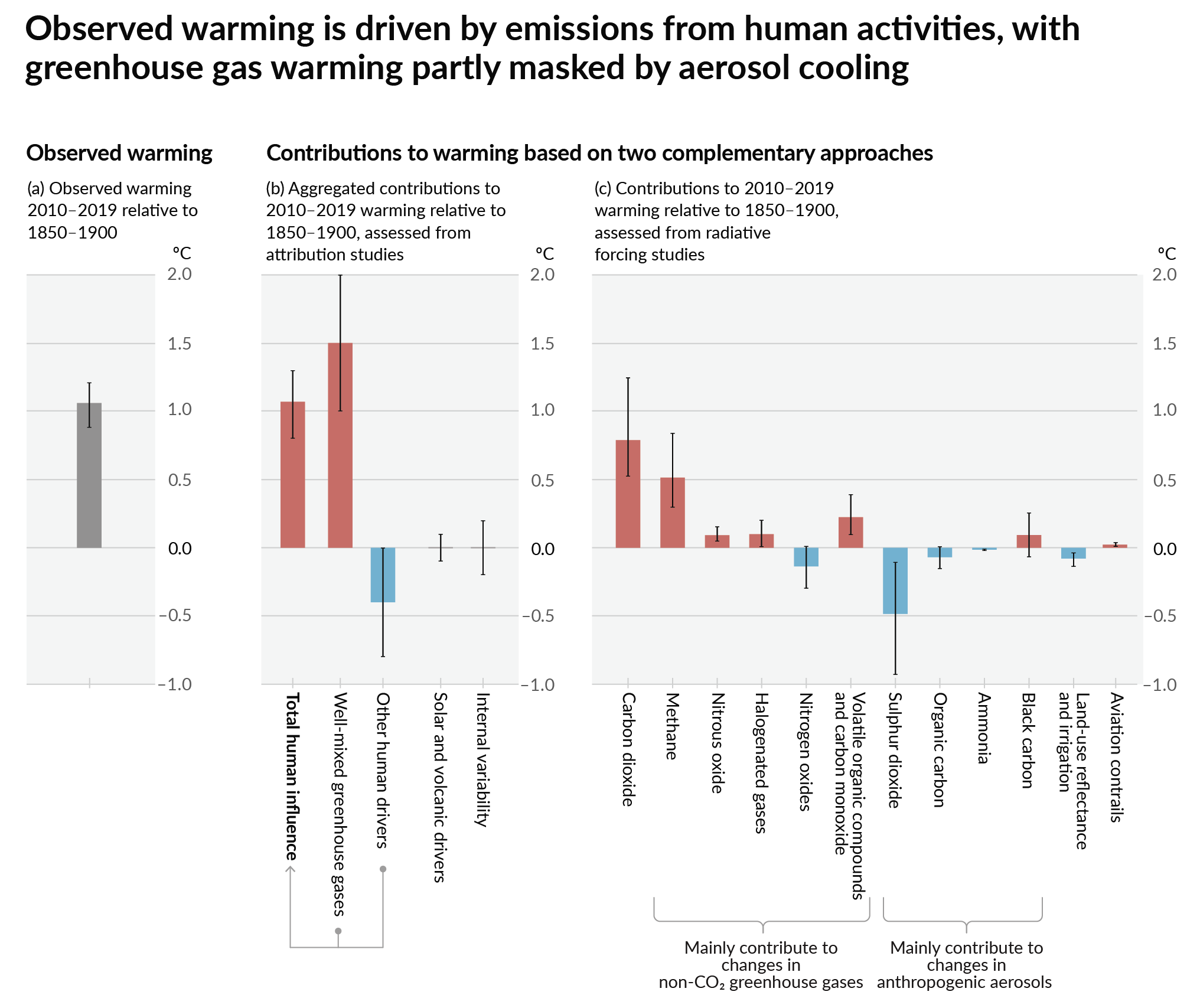
![[19]](https://en.wikipedia.org/wiki/Tipping_points_in_the_climate_system#/media/File:Tipping_points_2022_list.jpeg)