Futura (typeface)
 | |
| Category | Sans-serif |
|---|---|
| Classification | Geometric sans-serif |
| Designer(s) | Paul Renner Edwin W. Shaar (Extra Bold, Extra Bold Italic) |
| Foundry | Bauer Type Foundry |
| Date created | 1927 |
| Re-issuing foundries | Intertype |
Futura is a geometric sans-serif typeface designed in 1927[1] by Paul Renner. It was designed as a contribution on the New Frankfurt-project. It is based on geometric shapes that became representative of visual elements of the Bauhaus design style of 1919–33.[2][3] It was commissioned as a typeface by the Bauer Type Foundry, in reaction to Ludwig & Mayer's seminal Erbar of 1922.[1]
Futura has an appearance of efficiency and forwardness. Although Renner was not associated with the Bauhaus, he shared many of its idioms and believed that a modern typeface should express modern models, rather than be a revival of a previous design. Renner's design rejected the approach of previous sans-serif designs (now often called grotesques), which were based on the models of signpainting, condensed lettering and nineteenth-century serif typefaces, in favour of simple geometric forms: near-perfect circles, triangles and squares. It is based on strokes of near-even weight, which are low in contrast. The lowercase has tall ascenders, which rise above the cap line, and uses a single-story 'a' and 'g,' previously more common in handwriting than in printed text. The uppercase characters present proportions similar to those of classical Roman capitals.[4]
Release
The family was originally cast in Light, Medium, Bold, and Bold Oblique fonts in 1928. Light Oblique, Medium Oblique, Demibold, and Demibold Oblique fonts were later released in 1930. Book font was released in 1932. Book Oblique font was released in 1939. Extra Bold font was designed by Edwin W. Shaar in 1952. Extra Bold Italic font was designed in 1955 by Edwin W. Shaar and Tommy Thompson. Matrices for machine composition were made by Intertype.
Despite its clean geometric appearance, some of Futura's design choices recalled classic serif typefaces. Unlike many sans-serif designs intended for display purposes, Futura has quite a low x-height, reducing its stridency and increasing its suitability for body text.[a] The original Futura design concept included small capitals and old-style figures. These were dropped from the original metal issue of the type and first offered digitally by Neufville Digital under the Futura ND family;[citation needed] small caps are also available in the URW++ digitisation.
The design of Futura avoids the decorative, eliminating nonessential elements, but makes subtle departures from pure geometric designs that allow the letterforms to seem balanced.[6] This is visible in the apparently almost perfectly round stroke of the o, which is nonetheless slightly ovoid, and in how the circular strokes of letters like b gently thin as they merge with the verticals.
Renner's original plan was for two versions: a more conventional version suitable for general use, and a more eccentric, geometric lower case based on the circle and triangle.[7] This plan was scrapped, although the characters did appear on an early specimen and more recently on at least one digitisation.[8]
Futura was immediately very successful, due to its combination of classicism and modernity. It spawned a range of derivative geometric sans-serif typefaces from competing foundries, particularly in the United States. In the UK it was overshadowed by Gill Sans, which became popular for similar reasons in the UK and came to define 1930s and 40s printing. While more humanist, it also has geometric leanings which are particularly visible in the capitals.
Usage

Futura remains an important typeface family and is used on a daily basis for print and digital purposes as both a headline and body font. The font is also used extensively in advertisements and logos, notably by IKEA (until 2010), Supreme, Party City, Volkswagen, Royal Dutch Shell, Crayola and HP in their print ads.[citation needed] Particularly until the 1950s it was used extensively by the publishing industry as a general purpose font.
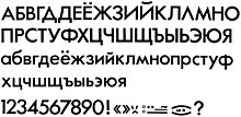
A Cyrillic variant of the Futura Medium typography was made by Anatoli Muzanov for the 1980 Summer Olympics held in Moscow.[9]
For example, the font is used for the title logo of the 1999 film American Beauty. It was also used in various TV shows including Doug, Lost, Warehouse 13, the American version of Sesame Street, etc. Futura is also featured ubiquitously throughout the film adaptation of V for Vendetta, used for everything from the title logo and ending credits, to signs, newspapers, computer screens and other props. Wes Anderson is also fond of the font and has used it in some of his films. Futura was also Stanley Kubrick's favorite typeface.[10]
A bold version of the font was used for NBC Sports on-screen graphics from 1989-91, and would be used by CBS Sports from 1992-6.
In 1997, the Pittsburgh Steelers (an American Football team) switched to rounded numbers on the jersey to match the number font (Futura Condensed) on their helmets. In 2012 the newly formed Western Sydney Wanderers Football Club use Futura on their logo and club documentation.

Futura is used on the current TV5 (Philippines) logo and is also Animax Asia's main typeface. All three of Vampire Weekend's albums use Futura on the covers, with the first two being exclusively Futura. The Boston Celtics' championship banners are also in Futura Condensed. 2008 science fiction-fantasy film City of Ember features Futura Medium in many prints through the story. The condensed version is the main font in the 2011 role-playing video game The Elder Scrolls V: Skyrim, as well as being used extensively throughout the Watchmen graphic novel as well as the movie based on it. The Medium version is a font used predominantly alongside the Stratum 2 font in the 2014 racing video game Driveclub. In season 2 of Stargate: Universe, episode "Common Descent – Part 1" the ancestors of the crew state that one of the two continents was named "Futura". There are several references to the name being a font in the episode. RAI, the Italian public service broadcaster, also uses this font from 2000. Futura also served as the typeface for UK television series Utopia's title cards, coloured white upon a neon yellow background (neon green in season two).
More recently, Futura has seen widespread use in many films and video games; Destiny and Wolfenstein: The New Order both use Futura on their covers, with Wolfenstein using the font throughout the in-game menus also. The 2013 film Gravity and 2014 films Interstellar and Gone Girl also use Futura on their theatrical release posters.
Later metal type versions
Futura Condensed
Futura Condensed is a condensed version of the original Futura font family. Bold and bold oblique fonts were released in 1930. Medium, medium oblique, extra bold, and extra bold oblique fonts were released in 1936. Light and light oblique fonts were released in 1950.
Futura Display (Futura Schlagzeile)

Released in 1932, Futura Display uses more angular strokes, resulting in rectangular letter forms.
This is also the font used on the covers of the classic Region 2 Doctor Who DVD covers.
Futura Black
Released in 1936, Futura Black is an alternate design that uses stencil letter forms.[1] The two most known uses of the font are the public safety departments of the city of Boston, and the title sequence of the ABC hour-long sitcom The Love Boat.
Steile Futura
Steile Futura was Paul Renner's attempt to create a typeface that would be closer to the nineteenth century sans serifs than to the geometric model. During the course of development, Renner developed several intermediate versions. Some of the early design could be found in the experimental font called Renner-Grotesk, which appeared as a trial type casting from the Stempel type foundry in 1936. Renner kursiv, a true italic companion to the regular version, was made after Stempel had been taken over by Bauer in 1938.
The work on the type family continued in the 1940s, but Renner's poor health had slowed down the development. Renner started to work again on this project in 1951 under the name of Steile Futura (steil in German means "upright" or "steep").
The font family released by Bauer consist of mager (light), halbfett (medium), fett (bold), kursiv halbfett (medium italic), and kursiv fett (bold italic). The font family was released in 1952–53. It was sold in German, English, Spanish, and French markets as Steile Futura, Bauer Topic, Vox, Zénith respectively.[11]
The font family has rounder letters than Futura Display. For the first time, italic type features are incorporated in the italic fonts. The fonts incorporate handwriting features, especially in italic version. Its bold weight has been digitised by Berthold.[12]
Futura Inline
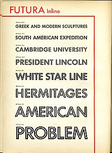
An 'inline' version with a line drawn through each letter.
Digitisations

With the demise of hot metal typesetting, Futura has been redrawn in digital formats. Because of complex licensing agreements, there is no one digital version of Futura but several, each with different features. (Some releases may be re-drawings or upgraded versions of earlier digital releases.) Releases of Futura exist from Linotype, Bitstream, URW++ (several), Elsner+Flake and many others under that name, and by many other companies under others because of rights issues. For example, Fontsite's (including Futura Black and Poster) is renamed as 'Function'.[13][14][15]
As with all metal type revivals, converting Futura into a digital format poses interpretative challenges. Metal type fonts could be made differently for each text size, so a variety of metal and phototype versions of Futura exist on which a revival could potentially be based. In addition, revivals will need to add characters not present in the original Futura like the Euro sign and Cyrillic, and therefore do not all have the same character set.
Futura revivals may also decide to make design changes, like replacing Futura’s straight 'j' with a more conventional substitute as URW's revival does. Scangraphic's revival notably includes optical sizes, with a tighter-spaced design (SH) created for headlines and a more spread-out version (SB) for body text sizes.[16][17] As an assessment of the decisions involved, a wide-ranging review by Stephen Coles of digitisations of Futura and its competitor geometrics noted that Bitstream's "abandons some of the strict geometry in favour of a more harmonious whole, but it may not be the Futura you were expecting," and that URW's Futura Nr. 2 was "Possibly optimized for small text: it’s wider, ascenders shorter, counters larger, and apertures more open. Conversely, round glyphs (a, g, e,) are more true to the circle. This attribute doesn’t make this a great text face, but if you want that strict geometry, No. 2 delivers."[18][19]
Futura ND

This version is based on the original sources of the Bauersche Giesserei, which had passed its typefaces to its Barcelona branch, Fundición Tipográfica Bauer SL. Released in 1999 by Neufville Digital – a joint venture of Fundición Tipográfica Bauer SL and Visualogik Technology & Design b.v – it includes small capitals and the old-style figures that had not been made in metal types.
Neufville Digital issued Futura, Futura Black, Futura Condensed, and Futura Display (Futura Schlagzeile) under the Futura ND family.[20] A limited release with some weights and features missing is bundled with OS X.
ParaType version
The ParaType fonts added Cyrillic characters. They were developed at ParaType (ParaGraph) in 1995 by Vladimir Yefimov. They came in only Light, Book, Medium, Demi weights.
Futura PT
This version is based on the previous ParaType design by Vladimir Yefimov (see below), expanded to include 7 weights, with Book, Medium, Bold, Extra Bold weights for condensed fonts. Additional Cyrillic styles were developed in 2007 by Isabella Chaeva.[21]
Futura Futuris
Futuris is a redesign at ParaType (ParaGraph) in 1991 by Vladimir Yefimov that includes Cyrillic characters. Condensed styles were added in 1993 by Vladimir Yefimov and Alexander Tarbeev. It is available in Light, Medium, Bold, Black (without oblique) weights, while condensed fonts were made in Bold, Extra Bold, all without obliques. Also available are Cameo Extra Bold (black in reverse), Shadow Light, Shadow Extra Bold (black with shadow), Volume Light.[22]
Futura Eugenia
This version is based on the Futura Black, but designed at the Polygraphmash type design bureau in 1987 by Elvira Slysh.[23]
Bukra
Bukra is an Arabic variant designed by Pascal Zoghbi. It consists of Bukra Extra Bold, which was used as an Arabic display typeface for Ibn Battuta Mall in Dubai as a complement for Futura Extra Bold. The design was based on Kufi script, but using shortened descenders. The name Bukra itself is a phonetic representation of one way to express "tomorrow" or "in the future" in some Arabic cultures.
URW++
Unusually, URW has two main digitisations, Futura and Futura No. 2. Futura 1 has the larger range of weights with some unusual versions like stencil and shadowed designs, while Futura No. 2 has, amongst other differences, a conventional 'j' in all the non-condensed weights apart from demi-bold, but no italics except in some bold weights. According to URW, No. 2 is based on Letraset's version.[24] It has also released some styles as Futura 3 and 7.
Futura Classic
This release by Gert Wiescher is notable for presenting the original alternate characters planned by Renner.[25] They have also appeared on a digitisation of Twentieth Century, Monotype's competitor to Futura, a release which allows them to be mixed and matched with the more standard characters and small caps.[26]
Influence on other typefaces
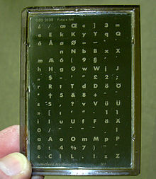
Though Erbar was the first of the new geometric sans-serif faces, the enormous success of Futura fostered the creation of many new geometric sans-serif faces by competing foundries including Kabel, Metro, Vogue, Spartan by Linotype, Twentieth Century by Monotype and Airport by Baltotype. Some were near identical copies as in Spartan and Twentieth Century but others were uniquely different, including Nobel and Kabel.
In Germany the designer Arno Drescher created the family Super Grotesk, which became very popular in East Germany after the war.[27][28] Stephen Coles has described FontFont's Super Grotesk digitisation as surprisingly useful, noting that its digitisation is unusually well-hinted allowing good display on Windows computers.[29][18] It also features a conventional 'j'. Another German competitor, also recently digitised by FontFont, was Friedrich Bauer's Bauer Grotesk, issued by J. D. Trennert & Sohn and then Genzsch & Heyse.[30][31]
Typeface designer Adrian Frutiger acknowledges Futura as one of his inspirations for his 1988 typeface Avenir. More recently Futura has been the basis of Ikea Sans and Opel Sans, fonts designed (for Ikea and Opel, respectively) by Robin Nicholas.[32][unreliable source?]
The subway system of the city of Toronto has their own Toronto Subway Font based on Futura.
Tasse is a revival of Steile Futura.
Beteckna is inspired by Futura.
Brandon Grotesque is inspired by Futura but with an unusually low x-height, giving it a more elegant appearance for uses such as headings and display settings.[33] Designed by Hannes von Döhren of HVD Fonts, it is the main corporate font of Comedy Central.[34] In 2014, von Döhren released Brandon Text, a tighter version intended for body text.[35]
Braggadocio is based on Futura Black.
The 2000 typeface Gotham is similarly geometric and based on 1920s signage.
Passata is a modernised version of Futura specifically designed to replace Futura as the corporate branding font of Aarhus University.
References
- ^ a b c Download Futura® font family – Linotype.com
- ^ The Bauhaus Designer Paul Renner. Creativepro.com.
- ^ Kupferschmid, Indra. "True Type of the Bauhaus". Fonts In Use. Retrieved 3 October 2015.
- ^ Ulrich, Ferdinand. "Types of their time – A short history of the geometric sans". FontShop. Retrieved 19 August 2015.
- ^ Frere-Jones, Tobias. "MicroPlus". Frere-Jones Type. Retrieved 1 December 2015.
- ^ Moore, Ian. "Making Geometric Type Work". Typographica. Retrieved 3 October 2014.
- ^ Walters, John (2013). Fifty Typefaces That Changed the World. Hachette. ISBN 9781840916492.
{{cite book}}:|access-date=requires|url=(help) - ^ Loxley, Simon (2006). Type: The Secret History of Letters. I.B.Tauris. ISBN 9780857730176.
{{cite book}}:|access-date=requires|url=(help) - ^ "Olympic Report" (PDF). 1981. Retrieved January 31, 2016.
- ^ Ronson, Jon (27 March 2004). "Citizen Kubrick". The Guardian.
- ^ About Steile Futura. Mitja-m.com.
- ^ "Steile Futura BQ". Linotype. Berthold. Retrieved 1 October 2015.
- ^ "Function Pro". Fontspring. Fontsite. Retrieved 1 October 2015.
- ^ "Function Deco". Fontspring. Fontsite. Retrieved 1 October 2015.
- ^ "Function Display". Fontspring. Fontsite. Retrieved 1 October 2015.
- ^ "Futura SH". MyFonts. Scangraphic. Retrieved 2 October 2015.
- ^ "Futura SB". MyFonts. Scangraphic. Retrieved 2 October 2015.
- ^ a b Coles, Stephen. "Alternatives to Futura". Fontshop. Retrieved 2 October 2015.
- ^ Coles, Stephen. "Comments on Quora". Quora. Retrieved 2 October 2015.
- ^ "Futura ND". MyFonts. Neufville Digital. Retrieved 1 October 2015.
- ^ "Futura PT". MyFonts. Paratype. Retrieved 1 October 2015.
- ^ "Futura Futuris". MyFonts. Paratype. Retrieved 1 October 2015.
- ^ "PT Futura Eugenia". Fontshop. ParaType. Retrieved 1 October 2015.
- ^ "URW Futura No. 2". YWFT. Retrieved 2 October 2015.
- ^ "Futura Classic". MyFonts. Wiescher Design. Retrieved 3 October 2015.
- ^ "LTC Twentieth Century". MyFonts. Lanston Type Company. Retrieved 3 October 2015.
- ^ "FF Super Grotesk". FontFont. Retrieved 2 October 2015.
- ^ "Typoart Super Grotesk". Elsner & Flake. Retrieved 2 October 2015.
- ^ Coles, Stephen. "Twitter post". Twitter. Retrieved 3 October 2015.
- ^ "Bauer Grotesk Reloaded". FontFont. Retrieved 3 October 2015.
- ^ "FF Bauer Grotesk". FontFont. Retrieved 3 October 2015.
- ^ Hausschriften-Liste. Typografie.info.
- ^ MyFonts (2011). "Brandon Grotesque". Retrieved 27 October 2011.
- ^ "Fonts in Use: Comedy Central". Fonts in Use. Retrieved 4 October 2014.
- ^ Rendle, Robin. "Brandon Text". Typographica. Retrieved 11 July 2015.
Further reading
- Alexandre Dumas de Rauly, Michel Wlassikoff, Futura Une gloire typographique, Paris, Éditions NORMA, 2011, ISBN 978-2-915542-39-4. Template:Fr icon
- Burke, Christopher, Paul Renner: the art of typography. London: Hyphen Press, 1998. ISBN 0-907259-12-X.
- Garfield, Simon. Just My Type. Gotham Books, London; 2011. ISBN 978-1-59240-652-4.
- Haley, Allen. Type: Hot Designers Make Cool Fonts. Rockport Publishers Inc, Gloucester; 1998. ISBN 1-56496-317-9.
- Jaspert, Berry and Johnson. Encyclopaedia of Typefaces. Cassell Paperback, London; 2001. ISBN 1-84188-139-2.
- Lawson, Alexander S., Anatomy of a Typeface. Godine: 1990. ISBN 978-0-87923-333-4.
- Meggs, Philip. B and McKelvey, Roy. Revival of the Fittest: Digital Versions of Classic Typefaces. RC Publications; 2002. ISBN 1-883915-08-2.
- Ronson, Jon. "Citizen Kubrick", The Guardian, London, March 27, 2004.
External links
- Typowiki: Futura
- Fonts In Use: Futura
- Commentary by Stephen Coles on Futura digitisations and variants
- Book in french about the history of the Futura typeface.
- Identifont: Futura Black
- Identifont: Futura Display
- Berthold Fonts: Steile Futura – Berthold BQ version
- ParaType Futura: Futura, Futura PT, Futura Eugenia, Futura Futuris
- MyFonts: Futura ND, Futura No. 2
- The Guardian's visual review of Futura
- The Futura Story on Fonts.com
