Twelve basic principles of animation

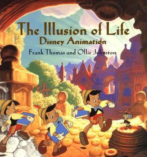
Disney's twelve basic principles of animation were introduced by the Disney animators Ollie Johnston and Frank Thomas in their 1981 book The Illusion of Life: Disney Animation.[a][1] The principles are based on the work of Disney animators from the 1930s onwards, in their quest to produce more realistic animation. The main purpose of these principles was to produce an illusion that cartoon characters adhered to the basic laws of physics, but they also dealt with more abstract issues, such as emotional timing and character appeal.
The book has been referred to by some as the "Bible of animation",[2] and some of its principles have been adopted by traditional studios. In 1999, The Illusion of Life was voted the "best animation book[...] of all time" in an online poll done by Animation World Network.[3] While originally intended to apply to traditional, hand-drawn animation, the principles still have great relevance for today's more prevalent computer animation.
The 12 principles of animation
Squash and stretch

rigid, non-dynamic movement of a ball is compared to a "squash" at impact and a "stretch" during the fall and after the bounce. Also, the ball moves less in the beginning and end (the "slow in and slow out" principle).
The purpose of squash and stretch[4] is to give a sense of weight and flexibility to drawn or computer-animated objects. It can be applied to simple objects, like a bouncing ball, or more complex constructions, like the musculature of a human face.[5][6] Taken to an extreme, a figure stretched or squashed to an exaggerated degree can have a comical effect.[7] In realistic animation, however, the most important aspect of this principle is that an object's volume does not change when squashed or stretched. If the length of a ball is stretched vertically, its width (in three dimensions, also its depth) needs to contract correspondingly horizontally.[8]
Anticipation

Anticipation is used to prepare the audience for an action, and to make the action appear more realistic.[9] A dancer jumping off the floor has to bend the knees first; a golfer making a swing has to swing the club back first. The technique can also be used for less physical actions, such as a character looking off-screen to anticipate someone's arrival, or attention focusing on an object that a character is about to pick up.[10]
Staging
This principle is akin to staging, as it is known in theatre and film.[11] Its purpose is to direct the audience's attention, and make it clear what is of greatest importance in a scene;[12] Johnston and Thomas defined it as "the presentation of any idea so that it is completely and unmistakably clear", whether that idea is an action, a personality, an expression, or a mood.[11] This can be done by various means, such as the placement of a character in the frame, the use of light and shadow, or the angle and position of the camera.[13] The essence of this principle is keeping focus on what is relevant, and avoiding unnecessary detail.[14][15]
Straight ahead action and pose to pose
These are two different approaches to the drawing process. Straight ahead action scenes are animated frame by frame from beginning to end, while "pose to pose" involves starting with drawing key frames, and then filling in the intervals later.[12] "Straight ahead action" creates a more fluid, dynamic illusion of movement, and is better for producing realistic action sequences. On the other hand, it is hard to maintain proportions and to create exact, convincing poses along the way. "Pose to pose" works better for dramatic or emotional scenes, where composition and relation to the surroundings are of greater importance.[16] A combination of the two techniques is often used.[17]
In computer animation
Computer animation removes the problems of proportion related to "straight ahead action" drawing; however, "pose to pose" is still used for computer animation, because of the advantages it brings in composition.[18] The use of computers facilitates this method and can fill in the missing sequences in between poses automatically. It is still important to oversee this process and apply the other principles.[17]
Follow through and overlapping action

Follow through and overlapping action is a general heading for two closely related techniques which help to render movement more realistically, and help to give the impression that characters follow the laws of physics, including the principle of inertia. "Follow through" means that loosely tied parts of a body should continue moving after the character has stopped and the parts should keep moving beyond the point where the character stopped only to be subsequently "pulled back" towards the center of mass or exhibiting various degrees of oscillation damping. "Overlapping action" is the tendency for parts of the body to move at different rates (an arm will move on different timing of the head and so on). A third, related technique is "drag", where a character starts to move and parts of them take a few frames to catch up.[12] These parts can be inanimate objects like clothing or the antenna on a car, or parts of the body, such as arms or hair. On the human body, the torso is the core, with arms, legs, head and hair appendices that normally follow the torso's movement. Body parts with much tissue, such as large stomachs and breasts, or the loose skin on a dog, are more prone to independent movement than bonier body parts.[19] Again, exaggerated use of the technique can produce a comical effect, while more realistic animation must time the actions exactly, to produce a convincing result.[20]
The "moving hold" animates between two very similar positions; even characters sitting still, or hardly moving, can display some sort of movement, such as breathing, or very slightly changing position. This prevents the drawing from becoming "dead".[21]
Slow in and slow out
The movement of objects in the real world, such as the human body, animals, vehicles, etc. needs time to accelerate and slow down. For this reason, more pictures are drawn near the beginning and end of an action, creating a slow in and slow out effect in order to achieve more realistic movements. This concept emphasizes the object's extreme poses. Inversely, fewer pictures are drawn within the middle of the animation to emphasize faster action.[12] This principle applies to characters moving between two extreme poses, such as sitting down and standing up, but also for inanimate, moving objects, like the bouncing ball in the above illustration.[22]
Arc
Most natural action tends to follow an arched trajectory, and animation should adhere to this principle by following implied "arcs" for greater realism. This technique can be applied to a moving limb by rotating a joint, or a thrown object moving along a parabolic trajectory. The exception is mechanical movement, which typically moves in straight lines.[23]
As an object's speed or momentum increases, arcs tend to flatten out in moving ahead and broaden in turns. In baseball, a fastball would tend to move in a straighter line than other pitches; while a figure skater moving at top speed would be unable to turn as sharply as a slower skater, and would need to cover more ground to complete the turn.
An object in motion that moves out of its natural arc for no apparent reason will appear erratic rather than fluid. For example, when animating a pointing finger, the animator should be certain that in all drawings in between the two extreme poses, the fingertip follows a logical arc from one extreme to the next. Traditional animators tend to draw the arc in lightly on the paper for reference, to be erased later.
Secondary action
Adding secondary actions to the main action gives a scene more life, and can help to support the main action. A person walking can simultaneously swing their arms or keep them in their pockets, speak or whistle, or express emotions through facial expressions.[24] The important thing about secondary actions is that they emphasize, rather than take attention away from the main action. If the latter is the case, those actions are better left out.[25] For example, during a dramatic movement, facial expressions will often go unnoticed. In these cases, it is better to include them at the beginning and the end of the movement, rather than during.[26]
Timing
Timing refers to the number of drawings or frames for a given action, which translates to the speed of the action on film.[12] On a purely physical level, correct timing makes objects appear to obey the laws of physics. For instance, an object's weight determines how it reacts to an impetus, like a push: a lightweight object will react faster than a heavy one.[27] Timing is critical for establishing a character's mood, emotion, and reaction.[12] It can also be a device to communicate aspects of a character's personality.[28]
Exaggeration
Exaggeration is an effect especially useful for animation, as animated motions that strive for a perfect imitation of reality can look static and dull.[12] The level of exaggeration depends on whether one seeks realism or a particular style, like a caricature or the style of a specific artist. The classical definition of exaggeration, employed by Disney, was to remain true to reality, just presenting it in a wilder, more extreme form.[29] Other forms of exaggeration can involve the supernatural or surreal, alterations in the physical features of a character; or elements in the storyline itself.[30] It is important to employ a certain level of restraint when using exaggeration. If a scene contains several elements, there should be a balance in how those elements are exaggerated in relation to each other, to avoid confusing or overawing the viewer.[31]
Solid drawing
The principle of solid drawing means taking into account forms in three-dimensional space, or giving them volume and weight.[12] The animator needs to be a skilled artist and has to understand the basics of three-dimensional shapes, anatomy, weight, balance, light and shadow, etc.[32] For the classical animator, this involved taking art classes and doing sketches from life.[33] One thing in particular that Johnston and Thomas warned against was creating "twins": characters whose left and right sides mirrored each other, and looked lifeless.[34]
In computer animation
Modern-day computer animators draw less because of the facilities computers give them,[35] yet their work benefits greatly from a basic understanding of animation principles, and their additions to basic computer animation.[33]
Appeal
Appeal in a cartoon character corresponds to what would be called charisma in an actor.[36] A character who is appealing is not necessarily sympathetic; villains or monsters can also be appealing. The important thing is that the viewer feels the character is real and interesting.[36] There are several tricks for making a character connect better with the audience; for likable characters, a symmetrical or particularly baby-like face tends to be effective.[37] A complicated or hard to read face will lack appeal or 'captivation' in the composition of the pose or character design.
Notes
a. ^ The twelve principles have been paraphrased and shortened by Nataha Lightfoot for Animation Toolworks.[12] Johnston and Thomas themselves found this version good enough to put it up on their own website.[38]
References
- ^ Thomas, Frank; Ollie Johnston (1997) [1981]. The Illusion of Life: Disney Animation. Hyperion. pp. 47–69. ISBN 978-0-7868-6070-8.
- ^ Allan, Robin. "Walt Disney's Nine Old Men & The Art Of Animation". Animation World Network. Archived from the original on November 2, 2013. Retrieved October 21, 2011.
- ^ "List of Best Animation Books". Animation World Network. Archived from the original on September 3, 2009. Retrieved October 21, 2011.
- ^ Johnston & Thomas (1981), p. 47.
- ^ Johnston & Thomas (1981), pp. 47–51.
- ^ De Stefano, Ralph A. "Squash and stretch". Electronic Visualization Laboratory, University of Illinois at Chicago. Retrieved June 26, 2008.
- ^ Willian (July 5, 2006). "Squash and Stretch". Blender. Archived from the original on February 16, 2009. Retrieved June 27, 2008.
- ^ Johnston & Thomas (1981), p. 49.
- ^ De Stefano, Ralph A. "Anticipation". Electronic Visualization Laboratory, University of Illinois at Chicago. Retrieved June 27, 2008.
- ^ Johnston & Thomas (1981), pp. 51–2.
- ^ a b Johnston & Thomas (1981), p. 53.
- ^ a b c d e f g h i Lightfoot, Nataha. "12 Principles". Animation Toolworks. Archived from the original on June 9, 2016. Retrieved June 27, 2008.
- ^ Johnston & Thomas (1981), pp. 53, 56.
- ^ Johnston & Thomas (1981), p. 56.
- ^ Willian (July 5, 2006). "Staging". Blender. Archived from the original on February 16, 2009. Retrieved June 28, 2008.
- ^ Johnston & Thomas (1981), pp. 56–8.
- ^ a b Willian (July 5, 2006). "Straight Ahead Action and Pose to Pose". Blender. Archived from the original on May 4, 2007. Retrieved June 28, 2008.
- ^ De Stefano, Ralph A. "Straight Ahead Action and Pose-To-Pose Action". Electronic Visualization Laboratory, University of Illinois at Chicago. Retrieved June 28, 2008.
- ^ Johnston & Thomas (1981), pp. 59–62.
- ^ Johnston & Thomas (1981), p. 60.
- ^ Johnston & Thomas (1981), pp. 61–2.
- ^ Willian (July 5, 2006). "Slow In and Out". Blender. Archived from the original on February 16, 2009. Retrieved June 28, 2008.
- ^ Johnston & Thomas (1981), pp. 62–3.
- ^ Johnston & Thomas (1981), pp. 63–4.
- ^ De Stefano, Ralph A. "Secondary Action". Electronic Visualization Laboratory, University of Illinois at Chicago. Retrieved June 28, 2008.
- ^ Johnston & Thomas (1981), p. 64.
- ^ De Stefano, Ralph A. "Timing". Electronic Visualization Laboratory, University of Illinois at Chicago. Retrieved June 28, 2008.
- ^ Johnston & Thomas (1981), pp. 64–5.
- ^ Johnston & Thomas (1981), p. 65-6.
- ^ Willian (June 29, 2006). "Exaggeration". Blender. Archived from the original on February 7, 2009. Retrieved June 28, 2008.
- ^ De Stefano, Ralph A. "Exaggeration". Electronic Visualization Laboratory, University of Illinois at Chicago. Retrieved June 28, 2008.
- ^ Johnston & Thomas (1981), pp. 66–7.
- ^ a b Willian (July 5, 2006). "Solid Drawing". Blender. Archived from the original on July 19, 2011. Retrieved June 15, 2010.
- ^ Johnston & Thomas (1981), p. 67.
- ^ Lasseter, John (August 1987). "Principles of traditional animation applied to 3D computer animation". ACM SIGGRAPH Computer Graphics. 21 (4): 35–44. doi:10.1145/37402.37407.
- ^ a b Johnston & Thomas (1981), p. 68.
- ^ Willian (June 29, 2006). "Appeal". Blender. Archived from the original on December 1, 2008. Retrieved June 28, 2008.
- ^ Thomas, Frank; Ollie Johnston (2002). "Animation Tips: Principles of Physical Animation". Frank and Ollie. Retrieved July 4, 2008.
Further reading
- Bancroft, Tom; Glen Keane (2006). Creating Characters with Personality: For Film, TV, Animation, Video Games, and Graphic Novels. Watson-Guptill. ISBN 978-0-8230-2349-3.
- Kilmer, David (September 28, 1999). "Disney's ILLUSION OF LIFE tops best animation books poll". Animation World Network. Archived from the original on November 25, 2015. Retrieved June 16, 2021.
- Lasseter, John (July 1987). "Principles of Traditional Animation applied to 3D Computer Animation". ACM Computer Graphics. 21 (4): 35–44. doi:10.1145/37402.37407.
- Mattesi, Mike (2002). Force: Dynamic Life Drawing for Animators, Second Edition. Focal Press. ISBN 978-0-240-80845-1.
- Osipa, Jason (2005). Stop Staring: Facial Modeling and Animation Done Right (2nd ed.). John Wiley & Sons. ISBN 978-0-471-78920-8.
- Whitaker, Harold; John Halas (2002). Timing for Animation. Focal Press. ISBN 978-0-240-51714-8.
- White, Tony (1998). The Animator's Workbook: Step-By-Step Techniques of Drawn Animation. Watson-Guptill. ISBN 978-0-8230-0229-0.
External links
- The illusion of life, a simple animated illustration of the twelve principles.
