
Wikipedia:Featured picture candidates: Difference between revisions
→Current nominations: Added nomination |
|||
| Line 50: | Line 50: | ||
<!-- Place new nominations at the TOP of the group. --> |
<!-- Place new nominations at the TOP of the group. --> |
||
<!-- Make sure you followed all the instructions on Wikipedia:Featured_picture_candidates/Nomination_Procedure--> |
<!-- Make sure you followed all the instructions on Wikipedia:Featured_picture_candidates/Nomination_Procedure--> |
||
{{Wikipedia:Featured picture candidates/Lion in Namibia}} |
|||
{{Wikipedia:Featured picture candidates/Christmas Tree Cluster}} |
{{Wikipedia:Featured picture candidates/Christmas Tree Cluster}} |
||
{{Wikipedia:Featured picture candidates/Map of Jupiter}} |
{{Wikipedia:Featured picture candidates/Map of Jupiter}} |
||
Revision as of 02:22, 20 October 2006
|
Featured pictures are images that add significantly to articles, either by illustrating article content particularly well, or being eye-catching to the point where users will want to read its accompanying article. Taking the adage that "a picture is worth a thousand words," the images featured on Wikipedia:Featured pictures should illustrate a Wikipedia article in such a way as to add significantly to that article, according to the featured picture criteria. If you believe an image should be featured, please add it below to the current nominations section. Conversely, if you believe that an image should be unfeatured, add it to the nomination for delisting section. For promotion, if an image is listed here for seven days with four or more supporting votes (including the nominator), and the consensus is in its favor, it can be added to the Wikipedia:Featured pictures list. Consensus in Featured picture candidates is generally regarded to be a two-third majority in support. Note however that anonymous votes are generally disregarded, as are votes of sockpuppets. If necessary, decisions about close votes will be made on a case-by-case basis. The archive contains all votes and comments collected on this page, and also vote tabulations.
|
Featured picture tools: |
Nomination procedureIf you wish to add an image to this page please see Wikipedia:Featured picture candidates/Nomination Procedure Supporting and opposing
Votes added early in the process may be disregarded if they do not give any reasons for the opposition. This is especially true if the image is altered during the process. Editors are advised to monitor the progress of a nomination and update their votes accordingly. Please remember to be civil, not to bite the newbies and to comment on the image, not the person. Is my monitor calibrated correctly? In a discussion about the brightness of an image, it is necessary to know if the computer display is properly adjusted. Displays differ greatly in their ability to show shadow detail. There are four dark grey circles in the adjacent image. If you can discern three (or even four) of the circles, your monitor can display shadow detail correctly. If you see fewer than three circles, you may need to adjust the monitor and/or computer display settings. Some displays cannot be adjusted for ideal shadow detail. Please take this into account when voting.  On a gamma-adjusted display, the four circles in the color image blend into the background when seen from a few feet away. If they do not, you could adjust the gamma setting (found in the computer's settings, not on the display), until they do. This may be very difficult to attain, and a slight error is not detrimental. Uncorrected PC displays usually show the circles darker than the background. Note that on a LCD display (laptop or flat screen) the viewing angle strongly affects these images. Click on the images for more technical info. Editing candidatesIf you feel you could improve a candidate by image editing, please feel free to do so, but do not overwrite or remove the original. Instead, upload your edit with a different file name (e.g. add "edit" to the file name), and display it below the original nomination. Edits should be appropriately captioned in sequential order (eg, Edit 1, Edit 2, etc) and describe the modifications that have been applied. | |
- To see recent changes, purge the page cache
- Your comments are also appreciated on images at Picture peer review.
Current nominations

A nicely framed shot; appears in lion ;-), and yaaaay created the image (from Flickr). SFC9394 reviewed the original image.
- Nominate and support. - Tewy 02:20, 20 October 2006 (UTC)
- Support My only wish is for a tighter crop, the lion would then have had much more impact on the viewer - Adrian Pingstone 07:22, 20 October 2006 (UTC)
SupportSupport Both Very sharp. | AndonicO 11:47, 20 October 2006 (UTC)- Support
OriginalEdit 2.I uploaded a crop, but I think it loses too much in size, so I'll stick with the original.Edit 2 has improved contrast. NauticaShades 20:50, 20 October 2006 (UTC) - Support uncropped in==one. Loses contrast on the cropped one.--Húsönd 02:49, 21 October 2006 (UTC)
- Support Original Even looks good with the crop, but it looks better if you stick with the original. Hello32020 19:56, 21 October 2006 (UTC)
- Support Original: Aside from the contrast problem, I think the crop is a bit too tight. - JPM | 04:25, 22 October 2006 (UTC)
- Support original. Cropped one looks tight. — Ambuj Saxena (talk) 19:21, 22 October 2006 (UTC)
- Support cropped (edit 1). - Samsara (talk • contribs) 15:55, 23 October 2006 (UTC)
- Support Original king size. - Darwinek 19:47, 24 October 2006 (UTC)
- Support even though it look like a zoo shot. howcheng {chat} 23:40, 24 October 2006 (UTC)
- Support original I like the lion's mane contrasted with the grass, and the slight off-center-ness of the original.Harborsparrow 19:31, 26 October 2006 (UTC)
- Support - This is a
fuckingawesome pic. I would love to see it on the front page. --Marktheprices 23:50, 26 October 2006 (UTC) - Support the original. Better composition, better resolution. --Lysytalk 12:48, 27 October 2006 (UTC)
 Support Original or Edit 2 - great subject and execution. Would have been nice in slightly higher res, but this is good too. --Fir0002 11:03, 28 October 2006 (UTC)
Promoted Image:Lion waiting in Namibia.jpg --KFP (talk | contribs) 18:30, 28 October 2006 (UTC)

- This picture was taken by Nasa's Spitzer Space Telescope, and appears in the article Star cluster. As it was "Image of the day" on the Nasa web-page, the captions are very detailed. I am nominating this picture for it's good quality and good captions (which can later be added to the article).
- Nominate and Support | AndonicO 01:02, 20 October 2006 (UTC)
- Weak oppose. Sharp with minimal grain, but there what look to be stitching erros running vertically across the image. Oh, and why are the stars blue? --Tewy 01:40, 20 October 2006 (UTC)
- Because this is not a visible light photo, Spitzer observes infra-red wavelengths. So there is no reason for the stars to appear in their actual colours - Adrian Pingstone 07:32, 20 October 2006 (UTC)
- Or the stars may just be blue, there are blue stars, such as the Pleiades. Imaninjapirate 00:40, 23 October 2006 (UTC)
- Oppose As Tewy mentions there is a vertical stitching error on the left. This is odd in organisations as expert as NASA/JPL/Caltech but maybe they didn't want to adjust the brightnesses for scientific reasons. However that rules the picture out for me - Adrian Pingstone 07:32, 20 October 2006 (UTC)
- Comment: We can fix that stitching error, if it's the only reason for opposing... --Janke | Talk 09:45, 20 October 2006 (UTC)
- Comment I don't know how to fix a stich error, perhaps one of you (or Fir0002) could do it? | AndonicO 11:49, 20 October 2006 (UTC)
- Comment I'm not sure if I see the stiching errors. I see some a number of vertical bands just above and to the left of the brightest star, and one strange vertical band to the right of that same star. Is that what everyone is talking about?--Andrew c 16:39, 20 October 2006 (UTC)
- Comment: (1) Please add the source URL of the web page where you downloaded this from. (2) Please consider uploading public domain/free use images to the Commons instead. Thanks. howcheng {chat} 17:46, 20 October 2006 (UTC)
- The URL is http://www.nasa.gov/multimedia/imagegallery/image_feature_476.html.
- By uploading to the Commons, do you mean uploading there before here, or just there? | AndonicO Talk 18:09, 20 October 2006 (UTC)
- See Wikipedia:Uploading images#How to upload. It basically says that when an image is uploaded to Commons, it can be used on all the wikis, rather than just the English Wikipedia. --Tewy 18:23, 20 October 2006 (UTC)
- Oh, so now I should upload it to the Commons too? | AndonicO Talk 18:33, 20 October 2006 (UTC)'
- Yes, and when that's done, I'll delete it from here. howcheng {chat} 20:41, 20 October 2006 (UTC)
- Oh, so now I should upload it to the Commons too? | AndonicO Talk 18:33, 20 October 2006 (UTC)'
- See Wikipedia:Uploading images#How to upload. It basically says that when an image is uploaded to Commons, it can be used on all the wikis, rather than just the English Wikipedia. --Tewy 18:23, 20 October 2006 (UTC)
 Oppose - There are already two featured pictures that are very similar..
  &
&  . The first is way better than the candidate, and the second is similar in quality.. but I wouldn't vote the second in now anyway. Beyond that, it does look like a christmas tree. (upside down, of course.) drumguy8800 C T 18:52, 20 October 2006 (UTC)
- That is not a reason to oppose a picture. You should vote on the quality of the image itself, not the fact that two incredibly different shots of the universe exist as FPs already. Besides, we are running low on unique FPs to use as FPD. ♠ SG →Talk 22:50, 24 October 2006 (UTC)
- Comment Ok, it's on the Commons now 2264.jpg. By the way, I like this picture better than the second one you show there Drumguy. | AndonicO Talk 23:33, 20 October 2006 (UTC)
- Support Extremely spectacular, looks brilliant. TheJosh 03:22, 22 October 2006 (UTC)
- Abstain It is a good picture, but I cannot vote for it due to the softness of all the features, the monochromatic nature of the stars, and the stitching problems. HighInBC (Need help? Ask me) 14:47, 27 October 2006 (UTC)
Not promoted --KFP (talk | contribs) 18:29, 28 October 2006 (UTC)

- This picture well illustrates the rings of Jupiter, as well as the south pole (which I didn't know existed). It says on the Nasa page that it is the most detailed map of Jupiter ever made. It was constructed with images taken by Cassini, and appears in the article Jupiter. The captions are also very good, as it was "Image of the day" on the Nasa page.
- Nominate and Support | AndonicO 23:55, 19 October 2006 (UTC)
- Oppose There are no rings on Jupiter (Saturn has the rings). The pic is of the globe of Jupiter, viewed looking down onto the planet's south pole. Not striking for me, the side views are more interesting and show the clouds even better - Adrian Pingstone 07:39, 20 October 2006 (UTC)
- Actually there are rings on all four of the gas giants in our solar system, but Saturn's are obviously the most prominent. See Rings of Jupiter Imaninjapirate 00:37, 23 October 2006 (UTC)
- weak Support I don't mind the polar view - it is certainly more unusual, and provides information beyond what is seen in the standard perspective. My hesitation comes from wondering about how much distortion there is near the equator, and how far up the map goes lattitude-wise. btw - Jupiter does have rings, just not charismatic ones. Debivort 08:08, 20 October 2006 (UTC)
- Oppose. I'd prefer another projection. Yes, Jupiter has rings, but they are practically invisible. What you see in this image are the cloud belts. --Janke | Talk 08:38, 20 October 2006 (UTC)
- Comment Yes, that is what I meant, belts (I think they call them bands sometimes too). Sorry for the mistake. | AndonicO 09:48, 20 October 2006 (UTC)
- Comment what is that weird blurry circle at the very center of the image?--Andrew c 15:59, 20 October 2006 (UTC)
- I'm not sure; it seems like it is some kind of supermassive crater or something of that kind (which is of course impossible). It is probably there to cover up something, maybe a gap which none of the Cassini pictures could fill in. | AndonicO Talk 18:04, 20 October 2006 (UTC)
- If I had to guess, it's just a color fill put in by NASA. Remember, the satellite isn't straight below the South Pole looking up at the planet, it's at an angle, so the viewing angle grows more and more extreme the closer the shot gets to the pole (You can see the stitching where they merged the composite images around the pole ). I'm guessing the angle was far too shallow to get any real image data from the pole itself. Severnjc 18:09, 20 October 2006 (UTC)
- Strong Support. Clearly encyclopedic- and if it made NASA's pic of the day it can certainly make Wikipedia's Borisblue 00:05, 22 October 2006 (UTC)
- Yes, that's what I thought when I nominated it; I didn't understand why I hadn't a support yet. | AndonicO Talk 09:03, 22 October 2006 (UTC)
- When we see a planet, we want a perspective that shows it as a 3-D object. This one forces the vision to accept it as a 2-D one. This can be confusing to the viewer. I am not sure many people would relate Jupiter to this image. — Ambuj Saxena (talk) 19:27, 22 October 2006 (UTC)
- Yes, I understand, but then again, should the captions not explain? Are the captions not explaining? Besides, 3-D images are common, a map of a planet is a rarity, at least I've never seen one before. Should a good quality picture that is not too common, and presents an often seen planet in a differant way not be featured? I should think so. | AndonicO Talk 22:20, 22 October 2006 (UTC)
- Weak support There is nothing wrong in utilizing a polar ortographic projection to represent Jupiter. We use it often with Earth and it is the way it really looks when seen from very far away. The problem for me is the colouring of the image which seems dull. Both for aesthetical and reading purposes contrast between the various layers should be enhanced. - Alvesgaspar 22:41, 22 October 2006 (UTC)
- If you look at it closely, you will find a new appreciation for Jupiter's colors. It almost looks like liquified marble; It is far from dull or bland. Look closer, you'll see what I mean. | AndonicO Talk 22:49, 22 October 2006 (UTC)
- Oppose Doesn't illustrate subject clearly. Poor proyection selection to illustrate a planet ( for the same reasons it makes no sense to take a pic of the earth from the pole to illustrate it's features).Nnfolz 22:54, 22 October 2006 (UTC)
- But having Jupiter on a map in the same oval way they portray earth wouldn't be good. Imagine consentric rings on an oval map: it would seem more distorted than earth's, because the streching and bending of the rings would be very obvious, as opposed to continents, which break the curvature. In this manner, these terrible defects are avoided, and unless you would actually like to see a much distorted map of Jupiter, with wavy rings, on the main page, this is the best option. | AndonicO Talk 23:43, 22 October 2006 (UTC)
- To portray a planet I think a view from its ecuator its always best. check this image out to see what I mean:

Although not not qualifiying to be a FP due to size i think this image illustrates the subject more clearly. Nnfolz 11:47, 23 October 2006 (UTC) - Yes, I understand and accept the fact that that picture is more striking and beautiful, but nowhere near as encyclopedic. I've seen tons of pictures like that one, and I'd like to see more, but this, I've never seen. Since the nominated picture is of good quality, and, as NASA says (see captions), it is "the most detailed map of Jupiter", It surely deserves nomination. By the way, the edje of the map is Jupiter's equater, if that is what it is called, just like polar maps of earth. | AndonicO Talk 12:04, 23 October 2006 (UTC)
- To portray a planet I think a view from its ecuator its always best. check this image out to see what I mean:

- Comment This discussion is meaningless! We use different map projections for different purposes, knowing that geometric distortion is unavoidable. Obviously, the polar regions are much better represented in an azimuthal projection (ortographic or not) than in a cylindrical one. - Alvesgaspar 12:02, 23 October 2006 (UTC)
- Comment I know we use different proyections for different things. I just posted that to illustrate a different point from that one.Nnfolz 12:37, 24 October 2006 (UTC)
- Comment But don't you think that the best map of Jupiter (or it's southern hemisphere), should be included as the best of Wikipedia? I think the FP criteria fits this picture like a glove. | AndonicO Talk 13:33, 24 October 2006 (UTC)
- Comment I know we use different proyections for different things. I just posted that to illustrate a different point from that one.Nnfolz 12:37, 24 October 2006 (UTC)
- There a few things that need to be taken care of first. The first thing is that the image description page lacks source description. It just says the image is from NASA, but the specific page information is missing.
Also, I see that the image was edited using Adobe Photoshop CS Windows, which is very unlikely to be NASA's pet software.Also, the image is very clearly enhanced to a great deal. One doesn't expect to find the pole of a planet so brightly illuminated, and without shadow on any side. The whole disc seems to have nearly equal illumination intensity. The image description page should clarify the way image was reconstructed (by NASA)and further edits by the Photoshop editor.— Ambuj Saxena (talk) 14:18, 24 October 2006 (UTC)
- Is there a way to contact NASA? | AndonicO Talk 09:54, 25 October 2006 (UTC)
- We can at least see what the source page on NASA's website has to say about the image. Please mention it on the Image description page. I have struck out invalid concerns raised by me. — Ambuj Saxena (talk) 15:13, 25 October 2006 (UTC)
- Comment I checked, and there are already 2 pictures of Jupiter from a "3-d" perspective. Aside from this one, there are no maps of Jupiter (2-d). This one would be better anyways, unless Nasa lied ;-) | AndonicO Talk 16:45, 26 October 2006 (UTC)
- Support Perspective provide unussual view of planet. HighInBC (Need help? Ask me) 14:40, 27 October 2006 (UTC)
Not promoted. howcheng {chat} 16:43, 27 October 2006 (UTC)

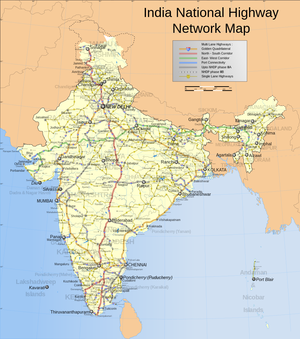
Nomination is pretty self explanatory. This is the only complete and comprehensive map of the Indian national highway network found on the entire web.
Appears in Indian highways, Golden Quadrilateral, National Highways Authority of India, National Highways Development Project, List of National Highways in India.
There are two versions, one is just the road network and the other one is imposed on a population density map and appears in Indian highways.
- Nominate and support
both versions. - PlaneMad|YakYak 10:50, 19 October 2006 (UTC) - Oppose. Disagree with format of map (svg). A static map like this one shouldn’t be scalable: if you reduce the scale, the lettering and other cartographic symbols might become illegible and the image crowded; if you enlarge it, you are suggesting a precision (and accuracy) that the map doesn’t have. Note that topographic maps of the same region, but with different scales, have different detail and symbology (different levels of “generalization”, as cartographers say). Also, the image available for Wikipedia articles (and for this analysis) is too small to appreciate the details. I will review my opinion if map is presented with a specific size and scale -- Alvesgaspar 11:28, 19 October 2006 (UTC)
- Comment, IMO the advantage of using svg is to pack more details into the file, as an end user can download it and zoom in to see the details which is not possible for a png map. I have used specific sizes for the fonts so that state names, state capitals, commercial cities and tourist towns are visible in the raster version. Only to see the smaller towns do you nedd to open the svg file -- PlaneMad|YakYak 11:37, 19 October 2006 (UTC)
- SVGs specify a recommended display size; there's no need to use a raster-based format to address this problem. And note that more detail doesn't necessarily mean larger size; on high-DPI printers, more detail is necessary to sharply print the same size, and SVG provides that. Redquark 13:22, 19 October 2006 (UTC)
- This is true, the format is preferable for maps. HighInBC (Need help? Ask me) 00:13, 20 October 2006 (UTC)
- Question and Comment Which is the image under evaluation? If both, please create fresh nomination. As for the size of the images, I'm still complaining that it is not enough for the present purpose (reviewing) and for normal use in an article. As far as I know, the MSI Explorer does not suppor svg and it is not practical to download the file just to look at it (in the case the user has an application capable of reading svg, which I don't). If, as Redquark states, svg's specify a recommended size, that size should be immediately available and a scale should be specified for it. -- Alvesgaspar 15:05, 19 October 2006 (UTC)
- Comment Cannot vote as there are 2 pictures. One picture per nom please. HighInBC 15:36, 19 October 2006 (UTC)
- Support Excellent. HighInBC 19:20, 19 October 2006 (UTC)
- Comment You dont necessarily need a svg plugin (native support with IE7 firefox and opera9), you can view the enlarged raster version as i mentioned above -- PlaneMad|YakYak 18:00, 19 October 2006 (UTC)
- Very very few Wikipedia users (not us editors, but the folks who actually use Wikipedia) have SVG support and therefore cannot view this at the proper magnification. MapMaster 21:53, 19 October 2006 (UTC)
- Strong support. This is what a map on Wikipedia should look like. It's very informative and the legend on the description page makes it even better. The SVG format is just perfect for this. –Gustavb 19:12, 19 October 2006 (UTC)
- Support. Great map, right format! I just cannot believe anyone would ask for a raster version. As stated in the image upload instructions the peferred (and technologically superior) format for this kind of illustration is SVG. Benefits of SVG include easier editing, including translations of text labels (there are more Wikipedias than just the English one), and high quality printing (SVG provides infinite resolution). --Dschwen 21:29, 19 October 2006 (UTC)
- Support because this is a beautiful map. However, for most Wikipedia viewers it is not at all useful. If you view it on anything but the largest size, you just can't read anything. But in order to view it at the proper size for reading, you need some sort of SVG support/plug-in. In fact, when I try to view at the proper size on my computer without SVG support, my browser (IE6) abends. Nonetheless, the map is beautiful at any size and I believe maps need more support here in Wiki-land. MapMaster 21:53, 19 October 2006 (UTC)
- Support, with hesitation; Alvesgaspar brings up a good point about being overly-precise. But I nonetheless think this is one of the few maps that qualify for FP. It's highly detailed, in SVG, and looks professional. --Tewy 00:00, 20 October 2006 (UTC)
- Comment - I’m not being overly precise. It is easy to agree that this is a beautiful map. But aesthetics is not the only criterion to be taken in consideration (its not even a very relevant one in this context). In Cartography accuracy (positional accuracy and also thematic accuracy) are key quality elements we should consider when evaluating a map. Of course we really don’t have here the means, or the knowledge, to assess the accuracy of maps. But at least we should look at some basic cartographic principles, instead of only beauty, when assigning a FP quality tag to a map. One of the most important is the objective of the map because it has direct consequences on the way it is constructed: is it designed to be put in a wall, to be used in a computer display or to be pasted, as an illustration, in a A4 page? My insistence that a size and a scale should be clearly stated is not a futile obstinacy: I was just trying to get an answer to that question. I don’t really care about the format of the picture file provided it serves well our objectives. It should be clear by now that I’m not an old reactionary trying to avoid the use of superior technologies. I am a map lover and believe, like others, that “maps need more support here in Wiki-land”. - Alvesgaspar 08:56, 20 October 2006 (UTC)
- PS. Another informatiom that should be given in the legend is the map projection. It looks like an azimuthal projection (either equidistant or equal-area) but I'm not sure. - Alvesgaspar 10:16, 20 October 2006 (UTC)
- Comment The map is primarily a computer document, but you need at least an A3 print to see the details, i guess. But the beauty of the format is that however large you scale it up, it wont deteriorate one bit. You must understand that India is one huge country and much like the US but with hundreds of more cities. There is now way i can make a map of the primary road network that can be appreciated in a thumbnail, you have to view the full version to get an idea of the scale of it all, much like this one. And the SVG format was a necessity to make a map of this kind. If i had made this map in PNG of appropriately high resolution, it will be over 3mb in size. And being SVG, the map is open source. Image:India_roadway_map.svg#SVG_Support. Projection has been mentioned under notes. -- PlaneMad|YakYak 10:44, 20 October 2006 (UTC)
- Weak support very meticulous and detailed map. However, I am not that fond of how the state names are a tint and run across other text. However, it is still encyclopedic, high resolution, and frankly overwhelmingly detailed.--Andrew c 16:01, 20 October 2006 (UTC)
- Comment-I do not understand why the Raster version on the image page is a completely different image than the full size SVG. The state names do not show up, the key is compeltely different, the highway lines are different. What's the deal with that?--Andrew c 16:04, 20 October 2006 (UTC)
- Comment Apparently a thumbnail cache problem, should be ok now -- PlaneMad|YakYak 07:14, 22 October 2006 (UTC)
- Support. mstroeck 21:49, 21 October 2006 (UTC)
- Support. Extremely detailed map. Prefessional work by Planemad. An additional legend, with explaination of green, yellow, and red coloured roads would be great. — Ambuj Saxena (talk) 19:37, 22 October 2006 (UTC)
- Comment Will do that when i get back home next week. -- PlaneMad|YakYak 01:42, 23 October 2006 (UTC)
Promoted Image:India roadway map.svg howcheng {chat} 16:45, 27 October 2006 (UTC)

An eye-catching view from a not-well-known touristic destination.
What article it appears in: Cunda_Island Who created the image: User:Towsonu2003
- Self-Nominate and support. - Towsonu2003 22:19, 18 October 2006 (UTC)
- Oppose uhmm no, the focus of this photograph is a boat, which it isn't exactly a great picture of; not the island. drumguy8800 C T 22:23, 18 October 2006 (UTC)
- Fixed the language, which was confusing you as per "the focus of this photograph is a boat" Towsonu2003 22:43, 18 October 2006 (UTC)
- Oppose. Doesn't show the island well at all. howcheng {chat} 22:49, 18 October 2006 (UTC)
- Ahhh, now I see the problem... It is not the Cunda Island that you're seeing, it is the view *from* Cunda Island. Fixed descriptions now... (English not mother tongue...) Towsonu2003 23:27, 18 October 2006 (UTC)
- Still oppose -- nice vacation picture, but not of featured quality. howcheng {chat} 17:24, 23 October 2006 (UTC)
- Ahhh, now I see the problem... It is not the Cunda Island that you're seeing, it is the view *from* Cunda Island. Fixed descriptions now... (English not mother tongue...) Towsonu2003 23:27, 18 October 2006 (UTC)
SupportWeak support It is a "certain view" of the island and, by the way, a very good picture.--Alvesgaspar 23:33, 18 October 2006 (UTC)- Oppose. A little grainy, and the subject isn't clear. It demonstrates neither the island nor the boat very well. --Tewy 02:17, 19 October 2006 (UTC)
- Oppose Sloping - Adrian Pingstone 16:31, 19 October 2006 (UTC)
- Oppose. Ack Tewy and Adrian. On the pro side, the light was nice. Unfortunately I don't like the framing (I'd have pointed the cam down a bit), and I don't think it adds that much to the article. --Dschwen 21:35, 19 October 2006 (UTC)
- Weak support Would look better with a little bit less of sky.--Húsönd 02:51, 21 October 2006 (UTC)
- Oppose I don't think this is great picture 'cause this picture doestn't show island very well only boats and sky. Daniel5127 (Talk) 03:13, 21 October 2006 (UTC)
- Oppose - The caption talks about the island, yet the island is in the background. The boat is the main focus of the picture, but not of the description. N4nojohn 16:25, 21 October 2006 (UTC)
- Comment. I'm not sure why people don't read the discussion before voting. Towsonu2003 has already said this is not a photo OF the island, but a photo FROM the island. However, for this reason, the photo is really not very informative about the island. --jjron 10:20, 22 October 2006 (UTC)
Not promoted --KFP (talk | contribs) 23:53, 26 October 2006 (UTC)


This photo is high resolution, good image quality, and highly encyclopedic. It appears on the Atlantis Paradise Island page, and was created by N4nojohn.
- Nominate and support. - Johnnyc21 20:47, 18 October 2006 (UTC)
- Oppose - It needs to be rotated, it isn't exactly clear, and the rock in the front is boring, also the colors are rather washed out. drumguy8800 C T 22:25, 18 October 2006 (UTC)
- Oppose. Dull lighting and blown clouds. --KFP (talk | contribs) 23:11, 18 October 2006 (UTC)
- Oppose both. An improvement with the edit, but there's not much that can be done to raise this to FP quality; the lighting is too poor. --Tewy 02:11, 19 October 2006 (UTC)
- Oppose both. Maybe I could live with the poor lighting but not with the tilted verticals. -- Alvesgaspar 10:15, 19 October 2006 (UTC)
- Oppose per above. Not good enough to be featured. | —The preceding unsigned comment was added by AndonicO (talk • contribs) .
- Oppose due to overblown sky. HighInBC 15:42, 19 October 2006 (UTC)
- Oppose Tilted verticals are not acceptable in a longshot. They could have been pulled straight in a photo editor in a few seconds - Adrian Pingstone 16:35, 19 October 2006 (UTC)
Not promoted --KFP (talk | contribs) 23:53, 26 October 2006 (UTC)

This image is not only huge and good quality, but it has a lot of encyclopedic and historical value as well as being pleasing to the eye. Taken by NASA, it appears in Hurricane Katrina, Meteorological history of Hurricane Katrina, List of storms in the 2005 Atlantic hurricane season, and Robert F. Kennedy, Jr.
- Nominate and support. - NauticaShades 20:19, 18 October 2006 (UTC)
- Support --tomf688 (talk - email) 22:01, 18 October 2006 (UTC)
- weak oppose - detail and information are impressive, but stitching seams are obvious and quite frequent. Debivort 22:16, 18 October 2006 (UTC)
- Oppose. I don't think it's stitching per se -- it's probably something to do with the satellite's imaging sensors (especially noticeable in the upper right corner). Compare this to the existing hurricane FP Image:Cyclone Gafilo.jpeg which doesn't have these flaws. howcheng {chat} 22:54, 18 October 2006 (UTC)
- Support Wonderful image, very important to have as an FP. I honestly thought this was already featured.--
Chilifix01:38, 19 October 2006 (UTC) - Weak oppose. A significant subject, but the quality isn't what it could be for a hurricane image. --Tewy 02:14, 19 October 2006 (UTC)
- Support. Quite impressive and generally cool. TheJosh 10:11, 19 October 2006 (UTC)
- Support Historically important, generally high quality, impressive scope. I like that the shoreline has been added so you can see the storm does fill the Gulf from FL to the Yucatan. --Bridgecross 13:56, 19 October 2006 (UTC)
- Support. Unlike the image of Catrina, the clouds maintain their color and are distinguishable. Also love the perspective (simple is good) and the wide view of the shoreline.--HereToHelp 00:11, 21 October 2006 (UTC)
- Oppose, the processing artifacts are annoying. The apparent stitching which is most noticeable in the corners is an artifact of the NASA processing, the raw data is available here (large jpg) and is significantly distorted. We have many, many similar images available, (see commons:Category:NASA MODIS images of tropical cyclones). This one is merely average in terms of its quality, we should select the ones without significant processing flaws. In addition to this, the storm is cutoff (the rainbands to the east). The fact this is of Katrina doesn't offset the fact that there are better images of other storms available.--Nilfanion (talk) 08:21, 21 October 2006 (UTC)
- Oppose. It's not centered, and overall quality isn't that good. Hurricanehink (talk) 17:16, 21 October 2006 (UTC)
- Who said anything about it having to be centered? In my opinion, it makes the composition more interesting. NauticaShades 20:48, 21 October 2006 (UTC)
- Weak Support It isn't centered, but what can you do? The picture is significant when one thinks of what's going on while the picture is being taken. And it's visually impressive. Gracenotes T § 21:41, 24 October 2006 (UTC)
- Weak oppose per Nilfanion. The quality is lacking compared to other images of other storms. --Coredesat 22:00, 24 October 2006 (UTC)
Not promoted --KFP (talk | contribs) 23:52, 26 October 2006 (UTC)

I've been hanging around FPC for a while, and I figured it was time I actually nominated something, so here's my first shot. This photo is high resolution, good image quality, and highly encyclopedic. It appears in Chestnut-sided warbler and List of Kansas birds. It was created by Mdf.
- Nominate and support. - Pharaoh Hound (talk) 18:33, 18 October 2006 (UTC)
- Weak oppose. It's a beautiful photo of a beautiful bird, but I'm still going to oppose because it doesn't have enough depth of field. The chest and one leg are slightly out of focus, and the tail is completely out of focus.
- Oppose Excellent try, but the out-of-focus tail spoils it - Adrian Pingstone 18:55, 18 October 2006 (UTC)
- Oppose - This user has some mutch better pictures, say this one--Niro5 20:02, 18 October 2006 (UTC)
- is it nominated? no?
- Support I like the out of focus tail, it gives some motion to the pic Towsonu2003 22:33, 18 October 2006 (UTC)
- I thin the tail is not blurred because it's moving, but just because it's out of focus. Stephen Turner (Talk) 12:27, 19 October 2006 (UTC)
- Neutral. Sorry, but the DOF... --Tewy 02:22, 19 October 2006 (UTC)
- Comment. Darn, didn't notice the DOF when I looked at it, but I definitely see the problem now. Oh well, I'll keep looking. Thanks very much to everyone for the comments. --Pharaoh Hound (talk) 12:11, 19 October 2006 (UTC)
Not promoted --KFP (talk | contribs) 23:51, 26 October 2006 (UTC)

American Gothic, a portrait of government cleaning woman Ella Watson, is possibly Gordon Parks' best known photograph. Parks later said of the image:
- I had experienced a kind of bigotry and discrimination here that I never expected to experience. ... At first, I asked her about her life, what it was like, and so disastrous that I felt that I must photograph this woman in a way that would make me feel or make the public feel about what Washington, D.C. was in 1942. So I put her before the American flag with a broom in one hand and a mop in another. And I said, "American Gothic"--that's how I felt at the moment. I didn't care about what anybody else felt. That's what I felt about America and Ella Watson's position inside America. [1]
Roy Stryker, Parks' supervisor at the Farm Security Administration, told him "that picture could get us all fired."
- Nominate and support. - Davepape 03:45, 18 October 2006 (UTC)
- Pedantic oppose The only article it's currently used in is Gordon Parks, but as a matter of showing Gordon Parks himself it obviously fails because he's not even in the image. It's a great image, but it needs a better connection to the text, illuminating or informing some aspect. Night Gyr (talk/Oy) 16:39, 18 October 2006 (UTC)
- To me that sounds almost like complaining that Hokusai doesn't appear in In the Hollow of a Wave :) - Parks' significance is in his work, not in what he looked like. But I agree that the photo merits greater discussion in the text, and have now worked to expand that (in Parks' article as well as in American Gothic). --Davepape 20:30, 18 October 2006 (UTC)
- What it basically comes down to is "Do we feature every excellent free work of art in wikipedia?" It's a great image, but what does it add to us as an encyclopedia? If that's the case, there are hundreds of PD paintings that could be featured. This one needs some addition value beyond being an excellent work. Night Gyr (talk/Oy) 14:33, 19 October 2006 (UTC)
- To me that sounds almost like complaining that Hokusai doesn't appear in In the Hollow of a Wave :) - Parks' significance is in his work, not in what he looked like. But I agree that the photo merits greater discussion in the text, and have now worked to expand that (in Parks' article as well as in American Gothic). --Davepape 20:30, 18 October 2006 (UTC)
- Support. Powerful photograph. I was actually thinking about making an article for it, but wasn't really able to find any real sources that really discussed the image itself and its impact. howcheng {chat} 22:14, 18 October 2006 (UTC)
- I found several sources, but none so far that go into great detail on its impact. If you want to look some more, JSTOR & Lexis/Nexis provide a few articles; in books, Fleischhauer's Documenting America, 1935-1943 and Biel's American Gothic talk about it a bit. --Davepape 18:10, 19 October 2006 (UTC)
- Support. Good scan of a historically important photograph. NauticaShades 13:00, 19 October 2006 (UTC)
- Support for the reasons above. We do occasionally feature PD art, and I would like to see us do it more. For all the PD art that is potentially available, the vast majority of it isn't available at the kinds of resolution and quality that we want (i.e., as high as reasonably possible, as in this case).--ragesoss 22:30, 22 October 2006 (UTC)
- Support for historicism and symbolism.Harborsparrow 19:37, 26 October 2006 (UTC)
Promoted Image:Gordon Parks - American Gothic.jpg howcheng {chat} 16:46, 27 October 2006 (UTC)


The picture is large, clear, sharp, and is very pleasing to the eyes. The picture looks unique and is of very high quality, and makes the Barred Owl article look very good. Along with the previous qualities, it is also infomative. It clearly allows viewers to see a Barred Owl, in a natural setting. The picture was created by Mdf.
NOTE: a larger version has been uploaded and is (3072x2048) if you dont see this force a refresh in your browser
- Nominate and support. - Dark jedi requiem 20:50, 17 October 2006 (UTC)
It's a lovely picture, but it's a little smaller than the generally accepted standard for featured pictures (see WP:WIAFP). Maybe you could contact the uploader and see if he has a larger one that he would be willing to upload? Stephen Turner (Talk) 21:02, 17 October 2006 (UTC)Oppose This is a wonderful photo, but the resolution just isn't high enough. If high-res version is uploaded, I'll change to support.--Zantastik talk 22:11, 17 October 2006 (UTC) Change to Support of new, higher-res version.--Zantastik talk 21:55, 18 October 2006 (UTC)Oppose. Size.--Tewy 23:18, 17 October 2006 (UTC)- Support. It has a high level of detail, good composition, and is encyclopedic. --Tewy 21:53, 18 October 2006 (UTC)
- Oppose As per above. --Midnight Rider 02:55, 18 October 2006 (UTC)
Oppose. As has already been said, too small, but very nice.Diliff | (Talk) (Contribs) 10:59, 18 October 2006 (UTC)- Support. I'm still getting the small version when viewing it full sized, but even the preview image looks substantially better. Diliff | (Talk) (Contribs) 19:09, 18 October 2006 (UTC)
- Just clear your page cache, and it should give you the larger version. NauticaShades 19:24, 18 October 2006 (UTC)
- Support. I'm still getting the small version when viewing it full sized, but even the preview image looks substantially better. Diliff | (Talk) (Contribs) 19:09, 18 October 2006 (UTC)
OpposeSupport The pic I get by clicking on the thumb is 800 px across which is fine. However the supposedly big one at 1536px across (which would be big enough) is actually 768 px across (which is not big enough). Is my browser (IE6) playing tricks? Weird! Something has happened in the half hour since I wrote that and now I get the 1536 pic - Adrian Pingstone 13:46, 18 October 2006 (UTC)- Support I'm getting it at full size (1536px) and it is a great picture! - Alvesgaspar 13:57, 18 October 2006 (UTC)
- Support now that we have a bigger one. Stephen Turner (Talk) 14:19, 18 October 2006 (UTC)
- Comment I'm still just getting the smaller version. Tried clearing the page cache and reloading the photo page itself. If I get to see the higher res version then I'll support. Can someone verify that this has not reverted to the smaller version, or is it my browser? --Bridgecross 15:18, 18 October 2006 (UTC)
- IE6 is giving me the 1536 pic just fine - Adrian Pingstone 15:31, 18 October 2006 (UTC)
- Got it, and Support —The preceding unsigned comment was added by Bridgecross (talk • contribs) .
- IE6 is giving me the 1536 pic just fine - Adrian Pingstone 15:31, 18 October 2006 (UTC)
- Support. --KFP (talk | contribs) 15:33, 18 October 2006 (UTC)
- Comment My laptop is bringing up the 1000+ Dark jedi requiem 16:20, 18 October 2006 (UTC)
- Support. If you are getting the small version, it's definitely a browser issue. Mdf just uploaded a larger version [2]. howcheng {chat} 17:22, 18 October 2006 (UTC)
- Oppose edit 1. The composition of the original is much better. howcheng {chat} 17:53, 24 October 2006 (UTC)
- Support. The high-resolution version is much better. NauticaShades 19:24, 18 October 2006 (UTC)
- Support Towsonu2003 22:34, 18 October 2006 (UTC)
- support nice. -Ravedave (help name my baby) 02:18, 19 October 2006 (UTC)
- Support - Great photo. N4nojohn 21:13, 19 October 2006 (UTC)
- Support Fantastic photo. Hello32020 19:58, 21 October 2006 (UTC)
- Support for all the points enumerated by the nominator. ~MDD4696 18:02, 22 October 2006 (UTC)
- Support I like the off-center composition, the muted background, and the focus is just in the right plane. --Janke | Talk 16:53, 23 October 2006 (UTC)
- Support Edit 1 and Original I thought a crop can help since much of the space adds nothing to the subject. But still it doesn't make a big difference for me. Also changed the colors a bit --Arad 00:03, 24 October 2006 (UTC)
- Support original, oppose edit 1' — I feel the cropping is excessive; the original shot is perfect as it is. ♠ SG →Talk 06:24, 24 October 2006 (UTC)
![[2]](https://commons.wikimedia.org/w/index.php?title=Special%3ALog&type=&user=Mdf&page=Image%3AStrix-varia-005.jpg)
- Support original, oppose edit 1' ack SG - Alvesgaspar 08:02, 24 October 2006 (UTC)
- Support original, oppose edit 1 – I like the use of the rule of thirds in the original; it brings a sense of lonliness, quietness, or wildness (as in free animal, not crazy) to the owl which the straight-on crop does not exude. The close crop is good for a scientific discussion of the species, but the original is better to demonstrate their -- character, for lack of a better word. — Editor at Large(speak) 17:37, 25 October 2006 (UTC)
- Support original, oppose edit 1. The original strikes me as more intersting, compositionally. --Zantastik talk 06:07, 26 October 2006 (UTC)
- Support original for superior composition. -- CountdownCrispy ( ? 07:47, 26 October 2006 (UTC)
- Support original i like the full context; lovely.Harborsparrow 19:40, 26 October 2006 (UTC)
- Support original and Oppose Edit 1. The original is so striking, the edit loses my interest.--DaveOinSF 06:49, 27 October 2006 (UTC)
Promoted Image:Strix-varia-005.jpg howcheng {chat} 16:47, 27 October 2006 (UTC)
Reasons for nominating: This is a flattering detail shot of the Unité, providing good detail of the irregular, blocky facade. It is in good resolution, with no visible artifacts, and excellent contrast, also showing the building contrasted against a blue sky. This angled view showcases the colorful walls of the balconies, which a head-on shot would not capture. The composition is centered on the Hotel Le Corbusier on the third floor, which has a distinct yet in-style appearance. The photo's angle also showcases the building's imposing size. Unlike in many photos of brutalist structures, the concrete is bright and has good tone.
The Unité itself is noteworthy as one of French architect Le Corbusier's most famous works, which was replicated by him throughout Europe. His designs, especially that of this building, are credited as starting the Brutalist architecture movement.
What articles it appears in: Unité d'Habitation and Brutalist architecture
Who created the image: Andy Wright [3]
- Nominate and support. - Keith D. Tyler ¶ (AMA) 18:06, 17 October 2006 (UTC)
- Oppose Strange angle, and cuts off part of the building. Sorry. Dark jedi requiem 20:11, 17 October 2006 (UTC)
- Oppose. Subject cut off. --Tewy 23:19, 17 October 2006 (UTC)
- Oppose The building is falling on me (leanage), and the only purpose brutalist architecture serves is to remind us never to go down that road again. drumguy8800 C T 03:12, 18 October 2006 (UTC)
- Oppose Not enough of the building shown, I can't get a feeling for its true size - Adrian Pingstone 13:50, 18 October 2006 (UTC)
- Oppose a little too crowded Towsonu2003 22:35, 18 October 2006 (UTC)
- Oppose - per above, its too crowded and can't get a feel of the total building from this photo. N4nojohn 21:30, 19 October 2006 (UTC)
- Oppose Weird angle. The subject is cut off. Duran 03:40, 24 October 2006 (UTC)
Not promoted --KFP (talk | contribs) 21:45, 24 October 2006 (UTC)
.jpg)


Created by Joaquim Alves Gaspar - uploaded and nominated by Alvesgaspar. I nominate this picture for the simplicity and balance of its composition. The two-dimensional silhouette is brought into 3-D world by the light dimly reflected in the ground. The photo was taken in 1968 with a Rolleicord-type camera, those with twin lenses and square negatives. Because the negative is lost a scanned image of a paper copy was made, only corrected for scratches and white dots. This is a minimalist picture whose only thrill is to guess whether the old man is moving toward us or away from us... In a technically-driven forum like this one, it should have little chances...
- Nominate and support. - Alvesgaspar 14:07, 17 October 2006 (UTC)
- Question - what article does this illustrate? Without illustrating an article, and image is ineligible for FPC I believe. Debivort 14:21, 17 October 2006 (UTC)
- Well, the featured pictures criteria really refers to adding value to an article. But are you sure that all FP were taken from existing articles? As far as I know there is no such imposition. In the present case, I think the picture illustrates well the old photographic technique of "contre-jour" (I might write an article on this...). --Alvesgaspar 14:43, 17 October 2006 (UTC)
- I added the image to Contre-jour, which should make it eligible. Redquark 14:57, 17 October 2006 (UTC)
- Merci bien :) -- Alvesgaspar 15:27, 17 October 2006 (UTC)
- Support - good historic picture. --Ineffable3000 22:27, 17 October 2006 (UTC)
- Comment: this picture has no historical value. Redquark 23:13, 17 October 2006 (UTC)
- Weak oppose. I like the composition, and it demonstrates Contre-jour well enough, but a scan from paper is bound to have impurities, and this one just isn't clear enough for me to support. And since this has little or no historical value, I would prefer to see a color image for the encyclopedic aspect. I'm sure there are more examples out there. --Tewy 23:28, 17 October 2006 (UTC)
- Support. It demonstrates Contre-jour very well and the fact that the subject is artistic and describes a concept rather than an object/location means that I don't think it has be clear, accurate or colourful to be a good candidate - only relevent and representative of the concept. The only issue I have is that it could be cropped slightly, but thats just my opinion. Diliff | (Talk) (Contribs) 11:27, 18 October 2006 (UTC)
- Support I like it, it's a very good example of Contre Jour - Adrian Pingstone 13:52, 18 October 2006 (UTC)
- Question - my laptop LCD often lets me see strange detail in image shadows. I noticed that the texture of the tunnel floor is visible through the legs of the person in the photo. Is this transparency a typical effect of Contre-jour? I've illustrated this by selecting the darkest regions of the guy and boosting the brightness and contrast (see detail image). If this aspect is expected using this photographic technique, I will support image. Debivort 20:00, 18 October 2006 (UTC)
- You are kiding, right?... The only translucent part of the silhouette is the top of the man's hat. What you see in your laptop either is magic or ... some artifacts created by the manipulation of the image. You might well support the image just for its beauty.... -- Alvesgaspar 20:31, 18 October 2006 (UTC)
- Well, I can replicate the same 'artifacts' in photoshop, so it is definitely the image and not just his PC. How do you explain that the lines on the path correspond BEHIND the silhouette of the man? I'm assuming good faith for now, but you must admit, it looks fishy. Diliff | (Talk) (Contribs) 21:42, 18 October 2006 (UTC)
- I can't explain. You are the expert. -- Alvesgaspar 22:48, 18 October 2006 (UTC)
- Also, the left foot looks awkward.. the line that I must assume is a highlight on a shiny shoe is a straight line out onto the picture. That would either mean it's been scanned and there was something wrong with the original image (a cut, scrape, etc) or .. I don't know? It was just placed on top of the image? drumguy8800 C T 23:37, 18 October 2006 (UTC)
I say...that Jimbo has been secretly altering key images on Wikipedia. It's all part of his plot to instill subliminal messages into the mind of the viewer. This is simply one of those images—a mind control device. --Tewy 02:53, 19 October 2006 (UTC)- THIS MESSAGE HAS BEEN CENSORED BY THE CABAL FOR YOUR PROTECTION. PLEASE GO ABOUT YOUR BUSINESS AS NORMAL. Night Gyr (talk/Oy) 06:16, 19 October 2006 (UTC)
- Thank you for protecting me from myself, father! Diliff | (Talk) (Contribs) 07:02, 19 October 2006 (UTC)
- You are most welcome. But didn't I tell you so many times not to accuse people of doing bad things without solid evidence? By the way, son, I've noticed that the rules of this place forbid biting newbies. But they say nothing about biting vets, am I right?... -- Alvesgaspar 09:16, 19 October 2006 (UTC)
- THIS MESSAGE HAS BEEN CENSORED BY THE CABAL FOR YOUR PROTECTION. PLEASE GO ABOUT YOUR BUSINESS AS NORMAL. Night Gyr (talk/Oy) 06:16, 19 October 2006 (UTC)
- Also, the left foot looks awkward.. the line that I must assume is a highlight on a shiny shoe is a straight line out onto the picture. That would either mean it's been scanned and there was something wrong with the original image (a cut, scrape, etc) or .. I don't know? It was just placed on top of the image? drumguy8800 C T 23:37, 18 October 2006 (UTC)
- Info I'm joining two more images: the first (Legs macro) is a macro photo of the offending detail in the paper copy; the second (Legs scan) is a fresh scan of the same detail. As you can see, the artifacts are quite visible in the scanned version but absent in the macro photo. Conclusion: it is caused by the scanning process. Did any of you ever heard of Occan's Razor? :) -- Alvesgaspar 08:45, 19 October 2006 (UTC)
- Or maybe the old man is just a ghost! Spoooooky... NauticaShades 14:49, 20 October 2006 (UTC)
- Fair enough, but in this case, Occam's Razor might suggest that the simplest explanation is that you manipulated the image so don't invoke it too rashly ;-). The only thing I can think of is that, similar in concept to a laser printer drum keeping an electrostatic 'image' for a short period of time, the scanner's photoreceptors have scanned along the lines and not reset their charges quickly enough for the sharp contrast. But then again, when I think about it, surely 'white' would result in a charge and black in a lack of charge, meaning there would be even less chance of it imprinting the silhouette. I can't really explain it. Diliff | (Talk) (Contribs) 09:04, 19 October 2006 (UTC)
- This is a Canon Lide scanner, which means the light source is made of LED's. Is it relevant? -- Alvesgaspar 09:19, 19 October 2006 (UTC)
- I don't think the light source is relevent, just the photoreceptors and the process of how they record light as the scanning mechanism moves across the photo. Diliff | (Talk) (Contribs) 09:33, 19 October 2006 (UTC)
- This is a Canon Lide scanner, which means the light source is made of LED's. Is it relevant? -- Alvesgaspar 09:19, 19 October 2006 (UTC)
- Fair enough, but in this case, Occam's Razor might suggest that the simplest explanation is that you manipulated the image so don't invoke it too rashly ;-). The only thing I can think of is that, similar in concept to a laser printer drum keeping an electrostatic 'image' for a short period of time, the scanner's photoreceptors have scanned along the lines and not reset their charges quickly enough for the sharp contrast. But then again, when I think about it, surely 'white' would result in a charge and black in a lack of charge, meaning there would be even less chance of it imprinting the silhouette. I can't really explain it. Diliff | (Talk) (Contribs) 09:04, 19 October 2006 (UTC)
- Info I have re-scanned the image, this time after rotating it 90º. The artifacts are gone! I think you might be right about the delay of the photo receptors. -- Alvesgaspar 10:04, 19 October 2006 (UTC)
- I'm glad that has solved the problem. I was going to suggest that it might depend whether the lines were parallel or perpendicular to the direction that the scanning head moved. Looks like that was the answer. Have you replaced the original image? As long as it is fundimentally the same (minus the artifacts) then it should be no problem to just overwrite the existing file rather than upload a new one for comparison. Diliff | (Talk) (Contribs) 10:18, 19 October 2006 (UTC)
- I'm afraid that won't be possible, the paper copy doesn't fit in the scanner that way. -- Alvesgaspar 10:36, 19 October 2006 (UTC)
- What if you scan it in halves and put the halves together in Photoshop? howcheng {chat} 20:44, 20 October 2006 (UTC)
- You are kiding, right?... The only translucent part of the silhouette is the top of the man's hat. What you see in your laptop either is magic or ... some artifacts created by the manipulation of the image. You might well support the image just for its beauty.... -- Alvesgaspar 20:31, 18 October 2006 (UTC)
- Support Towsonu2003 22:35, 18 October 2006 (UTC)
- Support (An amazing picture) reason: simplicity, contrast, balance. One of the best photographs I have ever seen Xunex
- Neutral - I dislike the presence of the scanning artifact, but would support a version without it. Debivort 19:33, 19 October 2006 (UTC)
- Info - It's fair. I have replaced the original with a slightly edited version in which most of the artifacts were corrected. This is the best I could do. - Alvesgaspar 22:55, 19 October 2006 (UTC)
- In the future, you shouldn't remove the original nomination; just add an edit. And that edit should be uploaded to commons, as was the original. One question: why did you crop the top? ♠ SG →Talk 06:29, 24 October 2006 (UTC)
- OK, I'll do that. Yes, the second version is a little shorter, I'm sorry. The problem is I did not work on the first version but on the original image that came out of the scanner. Anyway, I think it is better this way and I had at least two comments suggesting a crop at the top. - Alvesgaspar 08:12, 24 October 2006 (UTC)
- Support Great image of a person. Dont know why it already isn't a pic of the day already. Bill g
- Support – although you can't (I couldn't) immediately tell that it is a photographer holding a camera, the beauty of the shot and the exemplary use of framing, shape, and simplicity make this a very worthy candidate. — Editor at Large(speak) 17:44, 25 October 2006 (UTC)
- I can tell because I still remember! - Alvesgaspar 18:44, 25 October 2006 (UTC)
Promoted Image:The photographer new.jpg howcheng {chat} 16:50, 27 October 2006 (UTC)


This is a mosaic stitched panorama I took of the Radcliffe Camera in Oxford on the weekend. It is one again extremely high resolution (3137x4605) and detailed, clear and quite an interesting view of a beautiful building. There is an existing FP of this building, but I feel that this FPC is far superior in many ways (resolution, exposure) and the old FP would be a good candidate for de-listing should this one be supported (and perhaps even if it isn't - the existing FP is below resolution standards at 500x667).
- Nominate and support. - Diliff | (Talk) (Contribs) 06:57, 17 October 2006 (UTC)
- Strong Support. Amazing quality, good encyclopedic value.
But is that tilt I see?NauticaShades 07:40, 17 October 2006 (UTC)- I don't think so. I didn't take the photo from exactly straight-on so I think it is a perspective illusion rather than tilt. All of the columns/windows seem to be straight, or at least they're tilting on either side by the roughly same degree due to the perspective. Diliff | (Talk) (Contribs) 08:29, 17 October 2006 (UTC)
- You're probably right. NauticaShades 10:34, 17 October 2006 (UTC)
- I don't think so. I didn't take the photo from exactly straight-on so I think it is a perspective illusion rather than tilt. All of the columns/windows seem to be straight, or at least they're tilting on either side by the roughly same degree due to the perspective. Diliff | (Talk) (Contribs) 08:29, 17 October 2006 (UTC)
- Comment I don't know if it is an illusion or not but the building seems deformed, as if the shot were made with a wide angle lens. The effect is not very pleasant for me. -- Alvesgaspar 08:45, 17 October 2006 (UTC)
- Well it must be an illusion, as the building is not deformed. ;-) Due to the distance between the viewpoint and the subject, a wide(ish) angle of view is necessary to fit the subject comfortably into the frame. This is unavoidable for the subject. This 'deformity' (it is commonly called perspective distortion) is worse (although different) if you take a photo from ground level. The difference is that we are more used to seeing things from ground level so the distortion we see such photos is generally disregarded. I think this FPC image is a more interesting angle, though. Diliff | (Talk) (Contribs) 09:57, 17 October 2006 (UTC)
- Oppose Incredibly sharp and I like the lighting, however I agree with Nautica, there is a fairly obvious lean. Also agree with Alvesgaspar about the deformity (especially in comparison to the existing FP) - similar to the Roman baths shot, I'm sure this could have been taken as a single shot, avoiding the distortion and still uploaded at a sufficient res (12 megapixel) to more than justify FPC requirements. Just as a side note - any idea why this section is so much sharper than this bit? --Fir0002 10:19, 17 October 2006 (UTC)
- First of all, the lean is not obvious: it's most likely an optical illusion. Secondly, I really don't see the distortion you are talking about. NauticaShades 10:36, 17 October 2006 (UTC)
- There isn't a major difference in sharpness between those two crops that I can see, but it could be explained by a slight focus difference between frames (was set to autofocus, not manual) or perhaps slight blur (it was handheld) but it is reasonably negligible. As for the distortion, the difference between the roman baths image and this image is that there would be no significant difference between taking it with a single shot as opposed to a panorama as they were both stitched with rectilinear perspective. The only distortion in the image is the same distortion you would get with a normal rectilinear lens. The roman baths were stitched with a spherical perspective, meaning the same sort of distortion as a fish-eye lens. In comparing to the existing FP, I can't see any significant difference in the disortion (but of course the existing FP is so small it is difficult to see much detail at all). To summarise, this image has all the same attributes as a single rectilinear photo in terms of perspective distortion so that argument is kinda moot. As for the lean, can you demonstrate and quantify it? As I mentioned previously, if there is an actual lean it is pretty negligible. Any perceived lean is more likely to be due to the photo not being taken directly in front of the doors (so that the doors do not line up with the windows or spire exactly). If there is a lean, it is probably less than 0.5% - likely less than other architectural images that have passed FPC. Is this really a reason to oppose? Diliff | (Talk) (Contribs) 10:46, 17 October 2006 (UTC)
- No I agree the difference in sharpness is neglible I was just interested. My main concern was the tilt/distortion factor. If you're not using Firefox, get it, and then open your image and the existing image in two tabs and flick b/w the two and I think you'll see what I mean by distortion. The existing one looks fairly natural (to me anyway) and your one seems to bulge down the middle/bottom. As for lean I calculate it to be at least 1 degree horizontally and a lot vertically. Vertical lean could be just perspective but still gives the image an unbalanced look - which is definetly not an attribute diserable for an architectural image! Key points in the example - I think that the center of the door in the bottom should be in alignment with the spire at the top - note center verticle line. The bulge at the base can be see on the left and right lines. Line at base of dome shows horizontal lean. --Fir0002 11:03, 17 October 2006 (UTC)
- Well, the crop of the window is not a good basis for comparison because as I mentioned previously, it is not in the centre of the view of the building and as the building is circular, of course it is going to tilt as it is somewhat rotated around. Thats like saying a disc's circumference isn't horizontal when viewed slightly from above. As for the other image, I can see what may be a very slight tilt to the right - I'll re-stitch it tonight (or just rotate the existing image) to see if it will improve things. You are right, vertical lean is perspective and that will be the case with ANY image that is photographed at anything remotely wide angle due to basic laws of physics - any object viewed from angle will result in parallel lines diverging. This can be corrected when stitching by setting the centre point at the horizon but it will then distort other parts of the image as it bends those lines straight. You simply cannot avoid distortion of some kind in photography - you can only minimise it by taking photos with a long telephoto lens at a large distance (not very practical!). I still maintain that it is a pretty petty reason to oppose though, but you're entitled to your opinion ;-). Diliff | (Talk) (Contribs) 11:26, 17 October 2006 (UTC)
- OK fair enough, I not pretending to understand all physics behind stitching panos etc, but the fact remains is that the existing FP manages to get a near perfect straight line from spire to center of door. Perhaps you could have moved position a little? Anyway thanks for agreeing to entitle me with my opinion ;-) --Fir0002 22:24, 17 October 2006 (UTC)
- Well, the crop of the window is not a good basis for comparison because as I mentioned previously, it is not in the centre of the view of the building and as the building is circular, of course it is going to tilt as it is somewhat rotated around. Thats like saying a disc's circumference isn't horizontal when viewed slightly from above. As for the other image, I can see what may be a very slight tilt to the right - I'll re-stitch it tonight (or just rotate the existing image) to see if it will improve things. You are right, vertical lean is perspective and that will be the case with ANY image that is photographed at anything remotely wide angle due to basic laws of physics - any object viewed from angle will result in parallel lines diverging. This can be corrected when stitching by setting the centre point at the horizon but it will then distort other parts of the image as it bends those lines straight. You simply cannot avoid distortion of some kind in photography - you can only minimise it by taking photos with a long telephoto lens at a large distance (not very practical!). I still maintain that it is a pretty petty reason to oppose though, but you're entitled to your opinion ;-). Diliff | (Talk) (Contribs) 11:26, 17 October 2006 (UTC)
- No I agree the difference in sharpness is neglible I was just interested. My main concern was the tilt/distortion factor. If you're not using Firefox, get it, and then open your image and the existing image in two tabs and flick b/w the two and I think you'll see what I mean by distortion. The existing one looks fairly natural (to me anyway) and your one seems to bulge down the middle/bottom. As for lean I calculate it to be at least 1 degree horizontally and a lot vertically. Vertical lean could be just perspective but still gives the image an unbalanced look - which is definetly not an attribute diserable for an architectural image! Key points in the example - I think that the center of the door in the bottom should be in alignment with the spire at the top - note center verticle line. The bulge at the base can be see on the left and right lines. Line at base of dome shows horizontal lean. --Fir0002 11:03, 17 October 2006 (UTC)
- Support. Note that the picture hasn't been taken from directly in front (compare the sides). This could account for the apparent horizontal lean on the centre window. Either way it's not a big deal. ed g2s • talk 11:14, 17 October 2006 (UTC)
OpposeNeutral The shooting position is obviously the origin of the apparent distortion of the building and other geometrical problems. I understand that, no matter what solution was adopted (a series of shots or a single shot with a wide angle lens), the result would be basically the same. So, we can't blame the photographer for his choices, except the position of the camera (but I suspect that nothing can be done about that...). But aesthetical considerations, although subjective, are also relevant. And I think the building looks ugly in this picture. -- Alvesgaspar 12:44, 17 October 2006 (UTC)- I would say that "ugliness" is quite subjective, and I also do not see what you are talking about at all: I just don't see how the Radcliffe looks ugly in this circumstance. NauticaShades 15:14, 17 October 2006 (UTC)
- Neither do I. I don't think this image looks significantly different (aside from quality) than the original FP and it received glowing reviews. Obviously standards have increased a little since then but this is one of the landmark sites of Oxford and I think it looks pretty impressive from any angle, but viewing it from above ground level allows a better view of its position relative to the city. In the end, beauty is in the eye of the beholder, but at least it seems the majority can still appreciate this one. Diliff | (Talk) (Contribs) 15:38, 17 October 2006 (UTC)
- Not really ugly, I must confess (I've changed my vote to "neutral"). The problem is most of your pictures are superb!... --- Alvesgaspar 16:20, 17 October 2006 (UTC)
- I would say that "ugliness" is quite subjective, and I also do not see what you are talking about at all: I just don't see how the Radcliffe looks ugly in this circumstance. NauticaShades 15:14, 17 October 2006 (UTC)
- Comment - Apparentely, there is some freedom in choosing the camera position. At least, it is possible to center the door! Also, it seems that the existing FP was taken from a slightly lower position -- Alvesgaspar 23:05, 17 October 2006 (UTC)
- Correct, it was possible to center the door, and I thought I was pretty centered at the time. ;-) The problem was that it was a VERY old tower and there was just barely enough room for people to squeeze past me, so I was fairly limited in my ability to take my time and line everything up perfectly. I am happy to admit this image isn't geometrically aligned perfectly, but I still believe that the pros outweigh the cons ;). Diliff | (Talk) (Contribs) 06:57, 18 October 2006 (UTC)
- Support Wow, what a lot of talk! I'll just cut through it and say I like it, even with a few non-worrying leans - Adrian Pingstone 13:57, 18 October 2006 (UTC)
- Support. howcheng {chat} 17:32, 18 October 2006 (UTC)
- Support - it certainly is better than the one it is replacing. If someone else wants to get a diliff quality picture that doesn't have a one degree slant, I would support that one in this one's place.--Niro5 19:55, 18 October 2006 (UTC)
- Support. As far as I can tell the distortion is minimal, and may have been unavoidable. --Tewy 00:50, 20 October 2006 (UTC)
- Support - As far as i know, this photo is good. Arad 18:56, 21 October 2006 (UTC)
- Support – very nice picture. If the lean is really a problem, all it would take is a slight rotation and crop to make the edges straight again; I could do it in about 3 1/2 seconds if needed. — Editor at Large(speak) 17:49, 25 October 2006 (UTC)
Promoted Image:Radcliffe Camera, Oxford - Oct 2006.jpg --KFP (talk | contribs) 20:35, 26 October 2006 (UTC)

I had taken many pictures of temple last weekend. I am nominiating this one since this one is front-facing one of the lot. It is high resolution, adds greatly to the Malibu Hindu Temple article.
- Nominate and support. - Ganeshk (talk) 05:30, 17 October 2006 (UTC)
- Oppose Poor lighting, and not the best composition with the traffic light and the roof of a car in the bottom center. --Fir0002 10:40, 17 October 2006 (UTC)
- I agree with both your comments. It was taken a little too early in the morning. I will try to take a picture of better composition and lighting in my next visit. I will try to get this picture in particular. It will avoid getting the cars. Do you think that picture is a better one? - Ganeshk (talk) 14:34, 17 October 2006 (UTC)
- Oppose. As per Fir0002. Washed out colours too. Witty lama 12:28, 17 October 2006 (UTC)
- I am new to technical side of the photography. Do you have any suggestions to avoid washed out colors. I have a Canon PowerShot 500. Is it even worth it to try FPC with pictures from it? :) Please advise. Regards, Ganeshk (talk) 14:34, 17 October 2006 (UTC)
- You are certainly up against the 8-ball with a lower quality P&S camera, but it by no means disqualifies you. To avoid washed out colours, you have to be quite selective about the weather and the time of day you photograph in. A photo taken on a day with grey clouds and no blue sky is likely to result in either a washed out white sky or a dark foreground and dull colours. Ideally, you will have blue skies (which are actually darker in relation to the landscape than on a dull grey day, where the clouds are somewhat lit up by sunlight but disperse the light in all directions so less of it hits the ground). If you do take a photo on a sunny day, it helps to take the photo facing away from the sun, so the sunlight is hitting the subject directly and you are less likely to get strong shadows or the sun blowing out the sky in the background of the photo. Hope that helps. Diliff | (Talk) (Contribs) 11:49, 18 October 2006 (UTC)
- Oppose per Fir0002.Dark jedi requiem 20:14, 17 October 2006 (UTC)
- Oppose YAAAAY PARKING LOT drumguy8800 C T 03:04, 18 October 2006 (UTC)
- Oppose - per above. Cars and light take away from the temple. 172.147.172.179 21:08, 19 October 2006 (UTC)
- Oppose. Dull lighting and distractions. Sorry. --Tewy 00:37, 20 October 2006 (UTC)
- Oppose. Rather uninteresting, and bad composition. NauticaShades 16:16, 22 October 2006 (UTC)
Not promoted --KFP (talk | contribs) 21:41, 24 October 2006 (UTC)


Since plant photos appear to be all the rage at the moment, I figured I'd toss this one in for my second FP attempt. As the caption says it is a picture of crab apple fruits and leaves, appearing on that page. It is, curiously, the only crab apple photo of any significant resolution or quality. To preemptively answer at least one question, the highlights on the fruits are caused by the sun, not a flash.
NOTE: Although by the numbers, this should be promoted, most people didn't have a very strong opinion about it, so I'd like to see some more discussion before applying a result. howcheng {chat} 16:55, 27 October 2006 (UTC)
- Nominate and support. - Severnjc 02:57, 17 October 2006 (UTC)
- Support I like this pic, excellent colour, good depth of field - Adrian Pingstone 14:03, 18 October 2006 (UTC)
- Weak oppose. I like the composition, but I think it's slightly overexposed. It looks too bright to me. howcheng {chat} 17:36, 18 October 2006 (UTC)
- Just uploaded an edited version with the levels brought down a bit. How does it compare? Severnjc 03:36, 19 October 2006 (UTC)
Weak support either. Not an incredible amount of detail on the individual fruit, and the picture could have used some softer light, but it's still a good shot. --Tewy 00:52, 20 October 2006 (UTC)- Weak oppose both. I can't see this appearing on the front page. --Tewy 19:15, 27 October 2006 (UTC)
- So-so support for the second, not terrific, but pretty good. Hello32020 20:00, 21 October 2006 (UTC)
- Weak oppose - the depth of field is superb and it's a technically excellent photograph. However, it doesn't jump out at me and shout "make me a featured picture, CountdownCrispy!" and in that respect I just don't think it exemplifies Wikipedia's best photos. -- CountdownCrispy ( ? 22:35, 23 October 2006 (UTC)
- Support; great picture, FA standard.--Andeh 00:35, 24 October 2006 (UTC)
- We're FP over here ;-). --Tewy 02:04, 24 October 2006 (UTC)
- Weak support for original, but I also support edit 2. ♠ SG →Talk 22:59, 24 October 2006 (UTC)
- Weak oppose both. - Ack User:CountdownCrispy. Technically perfect, no WoW. - Alvesgaspar 10:13, 28 October 2006 (UTC)
- Weak Oppose Original, Weak Support Edit. I don't know if I'm still allowed to vote, but I just thought I'd add a little more weight. NauticaShades 20:42, 28 October 2006 (UTC)
- Oppose Barely large enough, but actual fruit does not have enough pixels. HighInBC (Need help? Ask me) 03:34, 1 November 2006 (UTC)
- Comment - I like the photo but I believe any featured picture of a plant/flower should include the species or cultivar name. This should be available as it was photographed in a botanic gardens.--Melburnian 08:24, 1 November 2006 (UTC)
Not promoted. howcheng {chat} 01:09, 2 November 2006 (UTC)


I took both these images and not sure which to put forth so putting both forth. :) Both appear on Jaguar.
- Note: Just so that it's clear, these are two separate photos. The head shot is not a crop of the sitting photo.
- Second note: These are not fake nor are they of a stuffed animal. It is a living, breathing Jaguar at the milwaukee zoo at an indoor exhibit with a painted background. And, yes, he stood there just like that for no less than 15 minutes which is why some may think it was stuffed.
- Nominate and support. - Cburnett 00:40, 17 October 2006 (UTC)
- So far, I'd go with head shot #2 (with color correction) as my prefered (if I had to pick) one since background is blurred enough that its paintedness isn't as noticable. Cburnett 19:25, 17 October 2006 (UTC)
- Oppose A great subject with good colour and composition but it is a bit too blurry. --Midnight Rider 02:34, 17 October 2006 (UTC)
- Support Sitting - Great photo. I don't see any blurring. Iorek85 04:44, 17 October 2006 (UTC)
- Support Edit 3/4 Head Shot, Edit 1 Standing. I don't really mind which, as they are both good quality and encyclopedic. I do, however, oppose the falsely colored orginals and head shot edit 1. NauticaShades 07:35, 17 October 2006 (UTC)
- Support
Edit 1, Head shotEdit 3 or 4- Top shot, sharp and natural looking despite the zoo setting. --Fir0002 07:40, 17 October 2006 (UTC)
- Good job with the color correction Diliff, but would have liked to see some sharpening, so have applied some. --Fir0002 22:32, 17 October 2006 (UTC)
Weak Support Head Shot Edit 1.. The headshot minimises the visibility of the somewhat fake looking background, but I think the white balance is a bit off. I know the white fur is not literally white, but it should be a bit less pastey yellow I think. Looks like it was shot indoors with incandescent lighting or something. Would likely support a corrected edit.
Diliff | (Talk) (Contribs) 08:46, 17 October 2006 (UTC)
Support Head Shot Edit 2. Good improvement, white not too white. Diliff | (Talk) (Contribs) 10:52, 17 October 2006 (UTC)Oppose all. Diliff | (Talk) (Contribs) 12:44, 17 October 2006 (UTC)- This is getting laughable! I should probably not be quite so reactive.
Support Head Shot Edit 2. Diliff | (Talk) (Contribs) 13:12, 17 October 2006 (UTC)
- This is getting laughable! I should probably not be quite so reactive.
- Weak support edit 2 head shot. Nice, but a bit blurry. --Pharaoh Hound (talk) 12:27, 17 October 2006 (UTC)
Oppose . Wow, people regularly oppose zoo shots and based on unnatural surroundings but a stuffed jaguar in front of a photo wallpaper gets nodded through? Not by me. --Dschwen 12:31, 17 October 2006 (UTC)- It's stuffed? No wonder it had such a blank expression.. ;-) It fooled me at first glance, but I can see your point now. I'm going to have to agree with you. A nicely out of focus fake background was borderline, but dead animal in a fake environment is taking it a bit far, particularly since it doesn't actually disclose it in the image. Diliff | (Talk) (Contribs) 12:44, 17 October 2006 (UTC)
- STUFFED? Are you kidding me? That Jaguar is just as real as any of the other animals I saw at the milwaukee zoo. Just because I took a picture of an animal who was practically posing doesn't mean you have to insult me and call me a liar. What the hell happened to assume good faith around here? Dschwen pulls out this baseless accusation and Diliff joins in before I can even respond... Wow. Cburnett 13:04, 17 October 2006 (UTC)
- I apologise and will reverse my vote again. ;-). At first I was sceptical about Dschwen's claims but you have to admit, it does look a bit stunned. That said, it is a quality photo (shame about the background as he mentioned), and I'm back to a support. Diliff | (Talk) (Contribs) 13:12, 17 October 2006 (UTC)
- Thank you. :) Cburnett 13:31, 17 October 2006 (UTC)
- Yeah, sorry, the verdict was a little half-cocked, but that blank stare totally fooled me. --Dschwen 15:41, 17 October 2006 (UTC)
- Funny I thought the same thing but did some research and decided it was a well posed subject. -Ravedave (help name my baby) 02:32, 18 October 2006 (UTC)
- I apologise and will reverse my vote again. ;-). At first I was sceptical about Dschwen's claims but you have to admit, it does look a bit stunned. That said, it is a quality photo (shame about the background as he mentioned), and I'm back to a support. Diliff | (Talk) (Contribs) 13:12, 17 October 2006 (UTC)
- Support Edit 2 head shot. Oh boy, reading the whole discussion plus the angry reaction on my talk page... ...I just convulsed with laughter. Sorry again. Upon close examination the headshot actually looks pretty good (with color correction) and the photo wallpaper is blurred anyways. --Dschwen 16:11, 17 October 2006 (UTC)
- I stand by edit2 as I feel the color improvement outweighs the tiny blown out parts. Tha cat looks pink in edit3 and 4. --Dschwen 07:18, 18 October 2006 (UTC)
- And two other pics in the article support this. The fur also looks white in those. --Dschwen 22:05, 18 October 2006 (UTC)
- I stand by edit2 as I feel the color improvement outweighs the tiny blown out parts. Tha cat looks pink in edit3 and 4. --Dschwen 07:18, 18 October 2006 (UTC)
- Support Edit 4 head shot; Edit 1 sitting. I like stuffed animals (just kidding :-) ) | AndonicO 01:05, 18 October 2006 (UTC)
- Oppose both. Sorry, I don't like the expression of the animal. Also think that background is distracting in all versions. -- Alvesgaspar 11:31, 18 October 2006 (UTC)
- Support edit 2, oppose other edits. Agree with Dschwen -- it's just too pink in the other edits, although I like Fir's sharpening. A sharpened edit 2 would be best IMHO. howcheng {chat} 22:59, 18 October 2006 (UTC)
- Head shot: Weak oppose edit 2; Oppose original, edit 3, and edit 4. I oppose the head shot because there is not yet an edit that I like. The original is a wonderful picture besides the colors, and only edit 2 has corrected this problem. But edit 2 overdid it and has blown highlights. Edits 3 and 4 great except that they haven't done justice to the white fur (there's that pink tinge). --Tewy 01:03, 19 October 2006 (UTC)
- Sitting: Oppose original; Weak oppose edit 1. All this one really does is show the front of the animal (I would prefer to see more of the side), and doesn't have the detail in the face that the head shot does. Once again, edit 1 helps the colors, but has blown highlights. --Tewy 01:03, 19 October 2006 (UTC)
- Comment. For next time I suggest seperate pictures have either seperate nomination pages or seperate headings. This page got a little ugly with all the edits. --Tewy 01:03, 19 October 2006 (UTC)
Not promoted --KFP (talk | contribs) 23:10, 24 October 2006 (UTC)

The soft lighting and selective focus makes this quite an interesting image IMO. Makes a perfect lead image on the Onion article
- Support Self Nom. --Fir0002 22:21, 16 October 2006 (UTC)
- Comment. I am not voting yet, because I am not on my good monitor, but the image seems too light/bright. I can see that the highlights are not blown, but the amount of contrast between the background and the highlights is distracting. Also the DoF is a little shallow. It looks pretty with the background onions out of focus, but the tip of the foreground onion is blurred. For encyclopedic purposes, it may have been better going for a smaller aperture so we could see the detail on all the onions. The photo looks professional, like stock photography, sure, but I'm torn on if something like that is encyclopedic.--Andrew c 22:55, 16 October 2006 (UTC)
- I have taken a photo to try and address these issues. Since it is one of my first images, I have posted a request for comment (peer review) at Wikipedia:Picture peer review/Yellow onions. Input would be greatly appreciated.--Andrew c 16:35, 17 October 2006 (UTC)
- Support. Another great photo by Fir. As far as the DoF, I think the artistic slant is good and doesn't make the image unencyclopedic. The foreground onion is clean enough -- though there is a bit of detail lost at the tip. Adding the variety to the caption would be good. — Preceding unsigned comment added by Cody.pope (talk • contribs)
- Oppose per Andrew c's reasoning. It looks overly bright and DOF is too shallow. Would suggest a similar picture taken at a smaller aperture, less exposure, and maybe have one of the onions peeled or partially peeled? More encyclopedic that way. Compositionally it's very nice, and agree it would make a nice stock photography-type image if the brightness were dialed down. -- Moondigger 00:58, 17 October 2006 (UTC)
- Oh, that sounds good. Maybe cut one of the onions in half to get a cross section? Yeah.--Andrew c 01:36, 17 October 2006 (UTC)
- Weak Oppose It's a good photo, but I think it could better illustrate the concept if there were two onions in focus, rather than just the one. As it is we only get a clean shot of half an onion, while the rest are just background without adding any real information. Severnjc 02:45, 17 October 2006 (UTC)
- Oppose. For encyclopedic porposes it would be nice to have one of them cut in half, and a slightly higher DOF. --Dschwen 06:18, 17 October 2006 (UTC)
- Weak Oppose. Agree with Dschwen about having one of them cut in half to reveal the layers of the onion. Otherwise a pretty classy shot - a minor issue is the texture of the surface in the shadow of the onion but not big problem obviously. Diliff | (Talk) (Contribs) 08:51, 17 October 2006 (UTC)
- Support--James 16:42, 17 October 2006 (UTC)
- Weak oppose. Good composition, but the DOF and lighting could be improved. I'd like to see more contrast, and possibly the inner layers. --Tewy 02:28, 19 October 2006 (UTC)
- Weak support Good picture, but a cross section of the onion would be a very encyclopedic addition. HighInBC (Need help? Ask me) 16:44, 23 October 2006 (UTC)
Not promoted --KFP (talk | contribs) 17:21, 23 October 2006 (UTC)

I nominate these picture for the unusual and lively colours of the cones and leaves, seeming to announce Spring. The photo was taken by Joaquim Alves Gaspar in April 2005, in a mountainous region of Portugal (Serra da Estrela)
- Nominate and support. - Alvesgaspar 17:37, 16 October 2006 (UTC)
- Oppose Unfortunately the only part of this picture in focus is the leaves above the cones and not the cones themselves - Adrian Pingstone 20:42, 16 October 2006 (UTC)
- Oppose - the highlights from the flash are clearly visible giving this a very plasticy look, also there's motion blur in the back and gausian blur in the front. Poor quality. drumguy8800 C T 21:00, 16 October 2006 (UTC)
- Oppose per Drumguy. The highlights from the flash clash too much with the white on the underside of the leaves, especially. Severnjc 02:48, 17 October 2006 (UTC)
- Oppose. Blown highlights, blur/focus issues. --Tewy 00:54, 20 October 2006 (UTC)
Not promoted --KFP (talk | contribs) 17:21, 23 October 2006 (UTC)

- Although saying the quality is lacking is an understatement, it is extremely important, historical, encyclopedic, unique, and will never, ever, be taken again (compare to
 ). It appears in the article Apollo 11. It was uploaded by User:Rmhermen, but I do not know the original photographer. This picture was taken from the TV footage on Goldstone Station.
- Nominate and Support | AndonicO 16:43, 16 October 2006 (UTC)
- Oppose Actual NASA photos are easy to obtain and are of much higher quality than this one -- why not search their site to find a better photo? SteveHopson 17:28, 16 October 2006 (UTC)
- Oppose, unless this is really the best picture of the event. Otherwise, weak support per nom. --Billpg 17:29, 16 October 2006 (UTC)
- Comment Alright, I'll try to find a better one. | AndonicO 17:41, 16 October 2006 (UTC)
- Oppose I well remember watching this on UK TV in 1969 but I hope we can get a better picture than this - Adrian Pingstone 20:44, 16 October 2006 (UTC)
- Oppose There is apparently some talk of converting the proprietary format used by the moon lander video cameras into something useable. If that happens then we may get a good quality picture of this.Seano1 21:02, 16 October 2006 (UTC)
- Comment No, nothing turns up looking even remotly similar. Probably because it's a picture of the TV set. | AndonicO 23:55, 16 October 2006 (UTC)
- Oppose The idea is good but the picture is ridiculously bad. I'm sure there is a better picture of this. --Midnight Rider 02:36, 17 October 2006 (UTC)
- Oppose. Per Seano1, NASA has yet to digitize any of the original video (or at least hasn't released it). Here's the low down on the pic: "S69-42583 (20 JULY 1969) --- Astronaut Neil A. Armstrong, Apollo 11 commander, descends the ladder of the Apollo 11 Lunar Module (LM) prior to making the first step by man on another celestial body. This view is a black and white reproduction taken from a telecast by the Apollo 11 lunar surface camera during Extravehicular Activity (EVA). The black bar running through the center of the picture is an anomaly in the television ground data system at the Goldstone Tracking Station." There’s plenty of good pics that aren't this first moment. Because NASA will probably digitize this, we should wait to add it as a featured pic. --Cody.Pope 02:38, 17 October 2006 (UTC)
- Oppose. Poor quality considering there may be better ones out there. If someone finds one and I might reconsider. --Tewy 01:44, 20 October 2006 (UTC)
- Strong oppose Historical value does not change the fact that this is a photograph of a monitor. Originals do exist and will become available. This is replacable. HighInBC (Need help? Ask me) 16:41, 23 October 2006 (UTC)
Not promoted --KFP (talk | contribs) 17:25, 23 October 2006 (UTC)
- Comment I doubt there exists (or will exist) any higher quality version of this image. NASA has realy not yet released original video footage, but this is image from it. --Li-sung 20:44, 29 October 2006 (UTC)

Mdf created several beautiful pictures of birds. Many pictures deserve to be featured. This is one of them and appears in the article Cyanocitta.
- Nominate and support. - Olegivvit 16:08, 16 October 2006 (UTC)
- Support This picture is very nice, a good nominee. Sharp, clear, and crisp. | AndonicO 16:14, 16 October 2006 (UTC)
- (edit conflict)Weak oppose - the white blends in too well with the colour of the bird, and the snow is distracting. Great photo otherwise... --Thelb4 16:15, 16 October 2006 (UTC)
- Support Most of the charm of this picture is the fact it only uses tones of gray and blue. Besides, it is crisp and clear. --Alvesgaspar 18:13, 16 October 2006 (UTC)
- Support. Stunning picture, and good encyclopedic value. A tiny bit of blown highlights, but that's to be expected with snow. If anything, in my opinion, the things Thelb4 talked about make it a better picture. NauticaShades 20:18, 16 October 2006 (UTC)
- Support Pure magic - Adrian Pingstone 20:47, 16 October 2006 (UTC)
- Support. Wonderful colors and detail. Redquark 21:16, 16 October 2006 (UTC)
- Weak Support In terms of picture, this is beautiful. However, in terms of how unique it is, I'm not so sure. My own opinion.--Steven 01:04, 17 October 2006 (UTC)
- Support per above. Great detail.--HereToHelp 01:34, 17 October 2006 (UTC)
- Support - amazing! —Khoikhoi 02:17, 17 October 2006 (UTC)
- Support Very nice and pretty. What would make it better is if it was more zoomed in to the bird and less of the surrounding picture is visible. --Midnight Rider 02:39, 17 October 2006 (UTC)
- Support There's a bit of grain when you look closely, but that's pretty much part and parcel to an image at this resolution. Excellent picture. Severnjc 02:49, 17 October 2006 (UTC)
- Support. Amazingly crisp focus on the bird. I don't think I could take a picture like that even if I had $5000 worth of photo gear. (Besides, the bird would probably fly away first.) --Elkman - (Elkspeak) 04:28, 17 October 2006 (UTC)
- Support Superb image - would love to see more of Mdf's stuff on FPC --Fir0002 10:20, 17 October 2006 (UTC)
- Support. Amazing detail of the bird with perfect colouration and focus. Bulbabean 14:16, 17 October 2006 (UTC)
- Support. Nice picture. Since the birds chest is slightly grey it allows a contrast from the snow. (Guess I don't find the snow distracting) Dark jedi requiem 20:25, 17 October 2006 (UTC)
- Support. I've never voted before, but this is such a fantastic shot - I can't resist! tiZom(2¢) 22:54, 17 October 2006 (UTC)
- Support. Amazing picture. Calibas 18:22, 18 October 2006 (UTC)
- Support - Great photo of Blue Jay. Johnny C. 23:56, 18 October 2006 (UTC)
- Support. Crisp and clean, despite the blown highlights on the snow. --Tewy 01:35, 20 October 2006 (UTC)
- Support Very sharp image. Hello32020 20:02, 21 October 2006 (UTC)
- Strong support Wonderful picture, you can see the individual snow crystals on the birds beak. And the downy feathers on it's belly. The tail is soft on focus, but that is forgivable to me. HighInBC (Need help? Ask me) 16:38, 23 October 2006 (UTC)
Promoted Image:Cyanocitta-cristata-004.jpg howcheng {chat} 17:56, 24 October 2006 (UTC)

A picture of various slices of citrus fruits. Taken by Scott Bauer of the Agricultural Research Service. It's relatively good quality, and quite encyclopedic. Appears in Citrus and Sphere packing.
- Nominate and support. - NauticaShades 13:02, 16 October 2006 (UTC)
- Support Grapefruits, Oranges, Limes & Lemons, I've tried them all (being from Florida). These look good to me. | AndonicO 15:28, 16 October 2006 (UTC)
- Oppose There is a lot of "dust" on the fruits AND on the white background. The lime on the lower left corner as a bit of a fruit under it that is very displeasing to the eye (that way it is made, it almost look like a stitching error, even if it's not that). This picture feels also like it could use a little more contrast and seems to lack resolution. PYMontpetit 17:10, 16 October 2006 (UTC)
- Oppose this image looks horrid at 100%. Like it has been artificially enlarged and posterized (or maybe it was converted from a GIF or something with a very limited bit/color field).--Andrew c 23:00, 16 October 2006 (UTC)
- Don't be silly. You could have easily looked at the original image (a 1MB JPEG file) to verify that no enlargement has taken place: rather the original image was cropped to its present size, the background was deliberately overexposed to get rid of the film grain, and furthermore it was denoised and sharpened. Had you actually looked at the original image, you would have seen that it doesn't have good contrast and tonal range to begin with (the median pixel value is 216), which is not surprising given that it was shot directly against an illuminated surface. --MarkSweep (call me collect) 02:48, 17 October 2006 (UTC)
- Hey, I was just saying what it looked like. As if it had been enlarged and posterized. We both agree the image was originally poor, and you can't make magic out of something like that. The 'effects' and retouching don't help, so I still oppose it, even if it wasn't actually enlarged (but just looks it).--Andrew c 03:28, 17 October 2006 (UTC)
- Don't be silly. You could have easily looked at the original image (a 1MB JPEG file) to verify that no enlargement has taken place: rather the original image was cropped to its present size, the background was deliberately overexposed to get rid of the film grain, and furthermore it was denoised and sharpened. Had you actually looked at the original image, you would have seen that it doesn't have good contrast and tonal range to begin with (the median pixel value is 216), which is not surprising given that it was shot directly against an illuminated surface. --MarkSweep (call me collect) 02:48, 17 October 2006 (UTC)
- Weak oppose -- too much dirt/dust. Clean it up and I'll support. howcheng {chat} 17:41, 18 October 2006 (UTC)
Guys, This is already a wikipedia featured picture --Vircabutar 04:14, 20 October 2006 (UTC)
- Are you sure? It's a commons FP, I don't think it's a Wikipedia one. --jjron 07:31, 20 October 2006 (UTC)
- Oppose At first glance I wanted to support this, but a full resolution the noise and dust are too great. And this is not a FP here, but on the commons, which has different FP criteria. HighInBC (Need help? Ask me) 16:36, 23 October 2006 (UTC)
Not promoted --KFP (talk | contribs) 17:22, 23 October 2006 (UTC)

I took this back in July and liked the result but didn't get around to nominating it until now. It is a 4 segment stitched panorama taken vertically. It is high resolution, detailed, and shows a very typical Amsterdam canal, with compact housing, road transportation and canal transportation all well represented. It is used as the lead image in the Amsterdam article. Diliff | (Talk) (Contribs) 10:58, 16 October 2006 (UTC)
- Nominate and support. - Diliff | (Talk) (Contribs) 10:58, 16 October 2006 (UTC)
- Support. As usual, the quality is stunning. This is the kind of picture someone might post an oversaturated edit for, but let's hope they don't. NauticaShades 11:53, 16 October 2006 (UTC)
- I told you! NauticaShades 07:37, 17 October 2006 (UTC)
- Support Whenever you nominate one of your pictures, Diliff, you already know no one will oppose because they're PERFECT. | AndonicO 15:24, 16 October 2006 (UTC)
- Support Beautiful, very encyclopedic... brilliant. If I had one qualm it would be the clouds left by aeroplanes in the sky, but other than that... great photo. --Thelb4 16:18, 16 October 2006 (UTC)
- Oppose sorry to be the one to say this. The photo is nearly flawless in regards to exposure, resolution, detail, etc. However, it just doesn't have the wow factor for me. It isn't that interesting or visually stunning. Therefore, I don't see it as a FP, even if it is executed well.--Andrew c 23:04, 16 October 2006 (UTC)
- Support Encyclopedic as well as a nice picture. --Midnight Rider 02:41, 17 October 2006 (UTC)
- Support wooooo I'm very impressed.. so much detail. How entertaining, I feel like I'm there. drumguy8800 C T 03:01, 17 October 2006 (UTC)
- Support edit 2 for saturation (and impressionistic appeal). The preceding was in jest. Support original. –Outriggr § 03:22, 17 October 2006 (UTC)
- Hey, thats what the canals looked like after sampling the local mushrooms (just kidding)! Diliff | (Talk) (Contribs) 08:57, 17 October 2006 (UTC)
- Oppose. I'm sorry, but I agree with Andrew c, thought the photo is technically very good, the subject doesn't have any resonance. If you could get a photo without so many cars (for example) that would make it less busy. Witty lama 12:34, 17 October 2006 (UTC)
- It's a city, I thought the cars juxtaposed against the boats were part of the charm. drumguy8800 C T 16:28, 17 October 2006 (UTC)
- Plus its an encyclopedia, aesthetical reasons for the choice of subject should not distort the view of reality too much. --Dschwen 17:12, 17 October 2006 (UTC)
- Oppose, per Andrew c. --James 16:44, 17 October 2006 (UTC)
- Weak support for the great quality and detail. The thumbnail doesn't make me go wow (which kind of can be read between the lines in WP:WIAFP). --Dschwen 17:12, 17 October 2006 (UTC)
- Support. --KFP (talk | contribs) 15:35, 18 October 2006 (UTC)
- Support. howcheng {chat} 17:51, 18 October 2006 (UTC)
- Support GeeJo (t)⁄(c) • 09:06, 22 October 2006 (UTC)
- Oppose. Plain composition. - Samsara (talk • contribs) 16:10, 23 October 2006 (UTC)
- support Technically excellent picture. HighInBC (Need help? Ask me) 16:33, 23 October 2006 (UTC)
- Oppose - there are just too many messy elements in this photo (the sky and cars for instance). It's not a pretty enough shot. -- CountdownCrispy ( ? 22:37, 23 October 2006 (UTC)
- I would have said that the cars were part of reality and should therefore be included in the image. To suggest with the photo that the whole city of Amsterdam typically travels by boat would be very misleading. This image is a very typical canal scene demonstrating both means of transport. It might not be the stereotypically 'pretty' Venice canal shot, but Venice isn't Amsterdam. I suppose it depends what you want to show in an image. Pretty is all well and good, but it still has to add value to the article and removing important items because they are messy is unencyclopaedic. Diliff | (Talk) (Contribs) 08:35, 24 October 2006 (UTC)
Promoted Image:Amsterdam Canals - July 2006.jpg howcheng {chat} 17:57, 24 October 2006 (UTC)
Nice panorama of the Grand Canyon, meets all requirements; Appears in Grand Canyon, Created by Digon3
- Nominate and support. - Thegreenj 01:39, 16 October 2006 (UTC)
- Edit - Sharpened, removed grain, slight increase in saturation. drumguy8800 C T 03:02, 16 October 2006 (UTC)
- Oppose both. Both are fairly blurry, and I think I see some stitching flaws in the sky. I can understand that atmospheric conditions at the time of the shot would prevent a crystal clear image, but even the very foreground (on the bottom) is blurry. The edit helps to improve some flaws, but not enough for my support. I also don't like the people on the lower left. --Tewy 03:32, 16 October 2006 (UTC)
- (surely right? - anon)
- I must not have been paying attention. *lower right* :). --Tewy 21:44, 16 October 2006 (UTC)
- (surely right? - anon)
SupportNeutral The bluriness appears to be caused by atmospheric haze, an unavoidable phenomena when you consider that the background in this photograph is probably 10-15 miles distant. This photo does an excellent job of illustrating the scope of the grand canyon. Also, the people in the lower right, if anything, serve to add scale to the image. Severnjc 06:07, 16 October 2006 (UTC)- After seeing Diliff's I have to agree that this simply isn't the same level of quality. If it's not suitable for FP status, this one certainly isn't. Severnjc 04:08, 17 October 2006 (UTC)
- Oppose The quality is not satisfactory for an FPC. Maybe it is heat haze but that doesn't concern the viewer, who just wants to see a sharp pic - Adrian Pingstone 08:22, 16 October 2006 (UTC)
- Oppose. The grand canyon is a difficult subject to photograph (short of renting a plane and flying down the middle of the canyon, that is) but this image isn't the best that we can offer. I personally subjectively prefer my panorama, also on that article, but I wouldn't necessarily nominate it for FPC as it isn't that good either. Diliff | (Talk) (Contribs) 09:22, 16 October 2006 (UTC)
- Oppose. One of the source images is out of focus (there is a visible transition between a sharp and and a blurry region right of the center), and there is a weird blending error in the sky, looks like a stain due to water spotting. The removal o the people is done badly and is just unnecessary manipulation. If this spot is frequented by tourists, so be it, its part of the message of the picture. --Dschwen 11:28, 16 October 2006 (UTC)
- Oppose. Haze can usually be fixed. - Samsara (talk • contribs) 16:12, 23 October 2006 (UTC)
- Oppose per focus/transition HighInBC (Need help? Ask me) 16:31, 23 October 2006 (UTC)
Not promoted --KFP (talk | contribs) 17:22, 23 October 2006 (UTC)

Sol, as viewed from under an oxygen/nitrogen atmosphere at 1 AU. I personally prefer the human view of this star rather than the "orange" pictures normally used, such as the recent sun/earth comparison.
Used in Sun, Star, Solar System and Blue supergiant along with a variety of userboxes; (1, 2, 3, 4 and 5.)
Do not, under any circumstances, look directly at the Sun with the naked eye or through any conventional lens or glass.
- Nominate and support. - Billpg 14:04, 15 October 2006 (UTC)
- I support this unique image. Mgiganteus1 14:17, 15 October 2006 (UTC)
- Oppose I don't understand the purpose of this image. It dosn't seem to show the actual ball of the sun and only shows optical flare caused by too bright a light shining into the camera. So it's not a picture of the sun but of the rays and other optical artefacts produced in the camera. Sorry, but I can see no encyclopedic value whatever in this picture - Adrian Pingstone 15:09, 15 October 2006 (UTC)
- Oppose Blown highlights in the sun :) j/k. Actually, I can oppose for relatively low resolution and grainy jpg artifacts throughout the image. I have no problem with an image illustrating "the Sun as seen from Earth" if labeled as such. That seems encylopedic to me. --Bridgecross 15:32, 15 October 2006 (UTC)
- Oppose per arpingstone. --Thelb4 19:45, 15 October 2006 (UTC)
- Oppose This image isn't so much the sun as the artifacts produced by the camera when looking at the sun. Also, a part of the encyclopedic value of a photo is that it shows something people normally couldn't otherwise see. Unless they're living deep underground or in England, people can see the sun any time they want. Severnjc 21:50, 15 October 2006 (UTC)
- Oppose There is nothing encyclopedic about this picture because its what we see. If I wanted to see this picture I would go and look at the sun. No information is given from the picture and its not visually appealing. --Midnight Rider 00:12, 16 October 2006 (UTC)
- Oppose As several people have already said, this isn't even the sun, so much as lens flare, aside from the low image quality. Thegreenj 00:21, 16 October 2006 (UTC)
- Oppose. Not the best Wikipedia has to offer. --Tewy 03:19, 16 October 2006 (UTC)
- Strong Oppose A few days ago, someone tried to have a bit of fun with an image of number 42 (supposdly the answer to whatever). When I saw this image, I thought it'll be a good joke for FPC. This image is seriously not unique, poor quality, can be taken from anywhere on earth by any human being alive with any color camera, and it's not the best wikipedia can offer. Maybe this is a joke too? Arad 04:21, 16 October 2006 (UTC)
- I'm quite serious, I assure you. I like this picture. --Billpg 11:41, 16 October 2006 (UTC)
- Strong opposed This isn't a decent picture. 1. It's not unique. 2.It's not the finest work possible of the sun (an actual picture of the sun from Nasa etc would be even better. 3. It does not truely contribute much to the article, everyone has most likely seen this sun to know what a sun is without the picture. Again, a Nasa picture would be more suitable. --Steven 01:01, 17 October 2006 (UTC)
- Comment - wouldn't it be interesting to use a camera obscura to get a good image of the sun? Just an idea--Niro5 18:44, 17 October 2006 (UTC)
- Oppose - Rather boring photo. . 23:57, 18 October 2006 (UTC)
Not promoted --NauticaShades 16:28, 22 October 2006 (UTC)

Not only is this image quite exquisite in my opinion, but is carries much historical value. It was taken by Wilson Bentley, the first person known to photograph snowflakes. He did so by catching an individual snowflake on a blackboard, rushing it onto some black velvet, which he would then potograph using a bellows camera he had attached to a microscope. It is used in Water, Ice, Snow, Snowflake, Crystallization, Johnson State College, and Wilson Bentley of course.
- Nominate and support. - NauticaShades 08:59, 15 October 2006 (UTC)
- Support Generally a cool image and of some historic importance.
It would be nice if the scan were a little better.--Cody.Pope 19:10, 15 October 2006 (UTC)- Comment Actually, looking it over more closely, it isn't so much the scan as the original quality of the images. Given the context however, I have no problem with is.--Cody.Pope 19:24, 15 October 2006 (UTC)
 Support, very encyclopedi-c, and just a plain cool photo!. --Thelb4 20:09, 15 October 2006 (UTC)
- Support Excellent encyclopedic and historical value. As an added bonus, it's also very similar to those optical illusions where the white space in the intersections between plates appears darker than the white around it! Severnjc 22:01, 15 October 2006 (UTC)
- Support. Considering the time it was taken, this is a very nice series of photographs. I like the simple layout as well as the variation and relative detail in the individual snowflakes. --Tewy 03:09, 16 October 2006 (UTC)
- Support. When I saw it in the article I assumed it would be a featured picture. Too bad 895 is cut off, though. └ OzLawyer / talk ┐ 14:11, 16 October 2006 (UTC)
- Support Nice encyclopedic picture --PYMontpetit 17:33, 16 October 2006 (UTC)
- Support Lovely - and everyone of them unique:-) --Mcginnly | Natter 23:45, 16 October 2006 (UTC)
- Support per high quality and encyclopedic value. HighInBC (Need help? Ask me) 16:30, 23 October 2006 (UTC)
Promoted Image:SnowflakesWilsonBentley.jpg howcheng {chat} 17:57, 24 October 2006 (UTC)

Note: Many of the early oppose votes were due to size. However, a higher resolution version was uploaded. Older voters, please update your votes accordingly.
- Nominate and support. - Tdxiang 03:56, 15 October 2006 (UTC)
Oppose. This is too small. Please familiarize yourself with WP:WIAFP. NauticaShades 09:07, 15 October 2006 (UTC)
- Support. High-res version is much better. NauticaShades 20:11, 16 October 2006 (UTC)
- Oppose As Nautica says the pic is too small to be considered, it's only 640 pixels wide, we need at least 1000 - Adrian Pingstone 09:25, 15 October 2006 (UTC)
- Oppose Very nice composition, if it were 3x size and res it would be a candidate. --Bridgecross 15:34, 15 October 2006 (UTC)
- Support nice composition and color, stands out niceley -dafodil- 3:40, 15 October 2006 (MDT)
- Oppose
Very nice image, but as noted above, it's just too small. Severnjc 22:03, 15 October 2006 (UTC)Size is fixed, but the new size brings out the tremendous amount of grain, particularly on the leaves. No change to my vote. Severnjc 03:58, 26 October 2006 (UTC) - Support. I've replaced the 640 pixel version by the 300 dpi copy from the source (USDA web page).
- Comment - The image meta data says "(2790x1851, 947 KB)" but it only loads at 640. I like the image a lot and would like to see a large version. Debivort 06:46, 16 October 2006 (UTC)
- This is weird. The preview version on the image page is smaller than the full resolution. How is that possible? NauticaShades 11:55, 16 October 2006 (UTC)
- The "high res" version is not only smaller than the preview version: it is brighter and differently cropped, too. Perhaps re-uploading the high res version would help? --KFP (talk | contribs) 13:34, 16 October 2006 (UTC)
- It seems to work now. For me, anyway. NauticaShades 20:11, 16 October 2006 (UTC)
- The "high res" version is not only smaller than the preview version: it is brighter and differently cropped, too. Perhaps re-uploading the high res version would help? --KFP (talk | contribs) 13:34, 16 October 2006 (UTC)
- This is weird. The preview version on the image page is smaller than the full resolution. How is that possible? NauticaShades 11:55, 16 October 2006 (UTC)
- Comment - The image meta data says "(2790x1851, 947 KB)" but it only loads at 640. I like the image a lot and would like to see a large version. Debivort 06:46, 16 October 2006 (UTC)
- Support This is a great picture! Please re-upload it so we can make it a Featured Picture. :] Jellocube27 14:35, 16 October 2006 (UTC)
- Weak oppose - I can see the full version now, and like it a lot, except for the graininess on the leaves, particularly on the left. What is the group-think about down-sampling these days? Debivort 00:47, 17 October 2006 (UTC)
- Oppose. Apart from noise and soft focus (which could be resolved by downsampling, but please don't, the mediawiki software already does it for us) I think the exposure is too crass, and the image all in all is a bit too dark. --Dschwen 17:17, 17 October 2006 (UTC)
- Support This shows everything about fruit Lychee and It would be better like size 640 pixel. Daniel5127 (Talk) 03:15, 21 October 2006 (UTC)
- Oppose. Too dark. howcheng {chat} 17:27, 23 October 2006 (UTC)
- Oppose - Good picture but not extraordinary. - Alvesgaspar 09:23, 24 October 2006 (UTC)
- Oppose. Unexceptional, and too much noise. --Dante Alighieri | Talk 18:31, 24 October 2006 (UTC)
- Oppose as per above. -- CountdownCrispy ( ? 15:40, 25 October 2006 (UTC)
- Oppose -- It's a good subject, but it's just too dark. Would probably support a lighter version. tiZom(2¢) 14:47, 26 October 2006 (UTC)
- Oppose -- Just don't think it's FP material.--DaveOinSF 06:52, 27 October 2006 (UTC)
Not promoted. howcheng {chat} 15:57, 27 October 2006 (UTC)


Great picture of the old part of Lucerne and the Reuss river. Appears in the Lucerne and Reuss River articles. It is going to be a commons FP. Photo taken by Simon Koopmann
- Nominate and support. - Digon3 01:04, 15 October 2006 (UTC)
- Oppose Blurry buildings and trees. Focus seems to be on the river and not the town. --Midnight Rider 01:44, 15 October 2006 (UTC)
- Edit sharpened drumguy8800 C T 21:38, 15 October 2006 (UTC)
- Comment While I hate JPEG compression artifacts as much as the next person, this image doesn't seem to have been compressed at all. Surely reducing it to a 9-10 quality will still result in an artifactless image that isn't 6.7MB? Severnjc 22:05, 15 October 2006 (UTC)
- My bad, fixed. drumguy8800 C T 22:11, 15 October 2006 (UTC)
- Oppose. Overexposed, oversharpened, unclear subject. --Tewy 03:44, 16 October 2006 (UTC)
- Comment - what's unfortunate is that one of Lucerne's major landmarks [4] is literally just behind those trees. The photo is also right next to a piece of art/historical waterwhel thing. Strange point of view...Stevage 10:56, 16 October 2006 (UTC)
- Oppose. Framing.50% is just water, also ack Tewy. --Dschwen 11:32, 16 October 2006 (UTC)
- Oppose. It wasn't oversharpened or oversaturated, it was just taken with a point-and-click. NauticaShades 11:49, 16 October 2006 (UTC)
- Support. Beautiful composition, lively colours, sharp image. What else is needed? -- Alvesgaspar 17:58, 16 October 2006 (UTC)
- Support Great picture, they could make a Ravensburger puzzle out of this one.--Húsönd 02:59, 21 October 2006 (UTC)
![[4]](https://de.wikipedia.org/wiki/Bild:Jesuitenkirche_luzern.jpg)
Not promoted

Vertical segments correspond to leap seconds. Red part of graph was prediction (future values) at the time the file was made.
Graph showing the difference between UTC (based on an atomic clock with leap seconds) and UT1 (based on the movement of the Earth). This graph illustrates the effect of leap seconds, along with why there have been so few leap seconds in the past several years.
Used in Leap second, Coordinated Universal Time and DUT1.
- Nominate and support. - Billpg 16:04, 14 October 2006 (UTC)
- Weak oppose. It's in SVG, looks good, and demonstrates the concept, but I don't think it's the best Wikipedia has to offer. I also don't like the very short "predicted" segment at the end. It should either have a relatively long predicted segment, or none at all. This type of graph will have to be updated every year or so to remain accurate. --Tewy 17:40, 14 October 2006 (UTC)
- Oppose. Yeah I guess it's encyclopedic, but it's certainly not pleasing to the eye, or at least mine. Robert 23:44, 14 October 2006 (UTC)
- Comment As an idea for a different graph, I'd like to see a cumulative chart of measured deviation from 0 leapseconds, with a second jagged line representing the official UTC time (including the effects of leapseconds). This one just looks like a jittery line, and makes it hard to grasp the actual variance over time. Night Gyr (talk/Oy) 09:01, 16 October 2006 (UTC)
- Oppose. Ordinary science graph. The maximum value of the ordinate axis should be 1.0, not 0.8. -- Alvesgaspar 20:42, 17 October 2006 (UTC)
- Just out of curiosity, what's wrong with the value 0.8? - Adrian Pingstone 07:52, 20 October 2006 (UTC)
- Nothing really wrong as a matter of fact. But it is a common practise in scientific graphs to use "round" numbers whenever possible or adequate, with the aim of facilitating reading and interpretation. It is also a common practise to extend the ordinate axis a little beyond the extreme values, I believe for aesthetical reasons. - Alvesgaspar 10:30, 20 October 2006 (UTC)
- Leap seconds are intended so that the difference never goes beyond +/- 0.9 seconds. --Billpg 12:57, 20 October 2006 (UTC)
- I apologize if this is in the wrong place or I'm doing this wrong, I'm new to editing...But is there a possibility someone could point me to a graph of all the data since 73? I'd be curious to see, in a plain and simple graph, if there are any patterns or trends there. --Curious 10:36, 01 April 2007 (EST)
Not promoted --NauticaShades 16:21, 22 October 2006 (UTC)

Found it while browsing this article. Just a really nice image and I think it depicts the article well.
- Nominate and support. - Code E 21:03, 13 October 2006 (UTC)
- Note: I have just uploaded the full-quality version from the DOD website; there are no JPEG artifacts anymore. ♠ SG →Talk 12:38, 14 October 2006 (UTC)
- Support - Very dramatic, sharp focus. Flash is saturated, but I don't really mind. (And: he just totally r0x0rd the dood next to him ZOMG!)Debivort 21:29, 13 October 2006 (UTC)
Oppose.The blown highlights are unavoidable, but there are still JPEG artifacts, and the rocket launcher isn't clearly depicted (only the projectile and its backblast). --Tewy 23:52, 13 October 2006 (UTC)- Wait, I'm confused. You think the projectile and blast are clear, but the launcher isn't? It seems the complete opposite for me. The jpeg artifacts you see, are they places outside the sky? If they are only in the sky, they could be easily fixed. Debivort 02:50, 14 October 2006 (UTC)
- The launcher is obscured by the person holding it, the other part (I'm not sure what it is) is obscured by the hill, and the second person is distracting from the subject. Sure, you can make out that a projectile is escaping at a high rate of speed, and that a soldier is holding it as the backblast shoots out of the back, but I'd like to see more details of the launcher itself (what's to say this isn't a different kind of launcher?). But that wasn't the main reason for my oppose. If you look around the edges of the soldier using the rocket launcher, you'll see the artifacts I'm talking about. --Tewy 03:12, 14 October 2006 (UTC)
- After looking over the image more carefully, I've decided that the problems I've pointed out aren't that serious, so I'll change my vote. --Tewy 03:12, 14 October 2006 (UTC)
- Weak oppose. --Tewy 03:12, 14 October 2006 (UTC)
- Wait, I'm confused. You think the projectile and blast are clear, but the launcher isn't? It seems the complete opposite for me. The jpeg artifacts you see, are they places outside the sky? If they are only in the sky, they could be easily fixed. Debivort 02:50, 14 October 2006 (UTC)
- Well, it is an AT-4 rocket launcher (as stated in the source provided in it's description) but I don't think it's that hard to tell it isn't anyway. Also, the article it's used in is about Shoulder-launched missle weapons, not just that specific model. One of the main reasons I chose it because I thought it represented the article well.
- As for the jpeg artifacts, there is a little there, yes, but it's not very noticeable in my opinion. Code E 12:01, 14 October 2006 (UTC)
- Strong Support — Excellent shot! I've just replaced the image with the unedited original from the DOD website, so the above concerns should now be addressed. ♠ SG →Talk 12:38, 14 October 2006 (UTC)
- Strong Support It is an very nice picture where you can actually see the power in these weapons in the picture. --Mailerdaemon 17:08, 14 October 2006 (UTC)
- Oppose. The timing is good but in my opinion the composition is not. --KFP (talk | contribs) 19:53, 14 October 2006 (UTC)
- Oppose. Still JPEG artifacts, bad composition. NauticaShades 21:07, 14 October 2006 (UTC)
- Support - As per Mailerdaemon --ZeWrestler Talk 20:13, 15 October 2006 (UTC)
- Support The artifacts that I can see are very minor, and besides, this isn't something that you can just go out and snap another photo of. Severnjc 22:09, 15 October 2006 (UTC)
- Support The photo is very dramatic, good quality, and very encyclopedic. Hello32020 01:58, 16 October 2006 (UTC)
- Strong Support Composition is very much a matter of opinion. I think that the encyclopedic value of this image well overrules any aesthetic flaws someone else may see in it. Jellocube27 14:39, 16 October 2006 (UTC)
- Support A very good picture. |
- Oppose. Poor composition. Redquark 21:20, 16 October 2006 (UTC)
- Support The blown highlights are unavoidable in a shot like this. Seano1 21:31, 16 October 2006 (UTC)
- Oppose. The composition makes it look like the soldier is firing the missile into the ground. Spebudmak 02:08, 17 October 2006 (UTC)
- Oppose. Poor composition. Witty lama 12:37, 17 October 2006 (UTC)
- Oppose per above. howcheng {chat} 22:16, 18 October 2006 (UTC)
- Support - Great shot of rocket launcher in use. . 00:00, 19 October 2006 (UTC)
Not promoted (11 support / 6 oppose / 1 weak oppose) --KFP (talk | contribs) 20:45, 20 October 2006 (UTC)

This photo was taken from Tokyo Bay. It uses many techniques used in photography as seen in Night photography. The photo has limited grain, strong colors, and many great subjects included. The main reason I nominated (user:Picturetokyo) is to share with the rest of the world.
- Nominate and support. - Picturetokyo 12:09, 13 October 2006 (UTC)
- Oppose. The lights are all overexposed. Also, needs a better filename. howcheng {chat} 16:01, 13 October 2006 (UTC)
- Oppose agree with Howcheng. It isn't a well executed photo unfortunately. The composition is not concise and it doesn't really add much the article. Diliff | (Talk) (Contribs) 22:01, 13 October 2006 (UTC)
- Oppose. Per above; overexposed, doesn't show the entire subject. --Tewy 23:43, 13 October 2006 (UTC)
- Oppose per above. Plus the lighting is not the best. T REXspeak 01:33, 14 October 2006 (UTC)
- Support Nice night shot. Exposure is fine, although it could use some darkening and maybe a touch of sharpening. Noise is very well controlled. Doesn't have to show entire subject. Fg2 01:37, 14 October 2006 (UTC)
- Oppose - per above, poor lighting. N4nojohn 00:02, 19 October 2006 (UTC)
Not promoted --KFP (talk | contribs) 20:37, 20 October 2006 (UTC)
.jpg)
.jpg)
Another lovely insect image from User:Aka of two Mason bees (presumably) mating, along the same lines as his Anthomyiidae picture. Clear, sharp, good exposure. What more could you ask for? Oh, and it's featured on Commons too.
.jpg)
- Nominate and support. howcheng {chat} 00:11, 13 October 2006 (UTC)
- Comment - I like the subject alot, but it seems like there is something funky with the bit-depth, it's like the image is only made with 32 colors or something. Do we have access to the original?Debivort 01:21, 13 October 2006 (UTC)
- I did not reduce the number of colors, but it's a little bit noisy. -- Aka 08:56, 13 October 2006 (UTC)
- Support Depicts the subject clearly and pleasently. It looks to have the full color gamut, not sure what Debivort is refering too. HighInBC 03:47, 13 October 2006 (UTC)
- Look closly at the abdomen of the lower bee, and you might see what he means. NauticaShades 07:31, 13 October 2006 (UTC)
- Yeah, I included a full-size crop of the odd areas. Debivort 21:21, 13 October 2006 (UTC)
- Look closly at the abdomen of the lower bee, and you might see what he means. NauticaShades 07:31, 13 October 2006 (UTC)
- Oppose. While there is some amazing detail, the blown highlights on/through the hair, particularly on the top bee is very offputting. As Debivort said, I also find the colours a little unusual, but not sure what the cause is, it could well be natural. Aka does such great photos I don't like opposing them, but for mine, this is not up with his best. --jjron 08:23, 13 October 2006 (UTC)
- Oppose I don't like being critical on such a lovely photo but, for me, the focus is not quite good enought for FPC - Adrian Pingstone 09:48, 13 October 2006 (UTC)
- Neutral Not bad, but not all that great either. As for "mating (presumably)", if I can remember correctly, all bees are female, exept the occasional male, who (or which) mates only with the queen, dying soon after. If one of these bees is a queen, I can't tell. | AndonicO 15:01, 16 October 2006 (UTC)
- Support this thing is really great. Nielswik(talk) 10:46, 17 October 2006 (UTC)
- Support, inspite of not being perfectly focused and because this is a great subject and uncommon (rare?) oportunity. -- Alvesgaspar 15:44, 17 October 2006 (UTC)
*Neutral, with caveat I would like verification of the "alleged mating" part before I put in my vote for Support. If it is what it is, then i'll support it. If not, I will oppose. And I am unanimous in that. --293.xx.xxx.xx 02:25, 18 October 2006 (UTC)
- Oppose Query not answered and verified, opposed on that account. —The preceding unsigned comment was added by 293.xx.xxx.xx (talk • contribs) .
- Oppose because of graininess/color issue. What is the "mating issue?" They are pretty clearly mating. Debivort 22:22, 18 October 2006 (UTC)
- Support Towsonu2003 22:39, 18 October 2006 (UTC)
Not promoted --KFP (talk | contribs) 20:40, 20 October 2006 (UTC)
_2.jpg)
_2.jpg)
A very clear and sharp image of the face of a Common Raccoon so that the "mask" can be easily discerned. Taken by Benutzer:Darkone and used in the animal's article. This is a Commons featured picture.
- Nominate and support. howcheng {chat}
- Support Like you said, very clear and sharp. Very visually appealing too. --Midnight Rider 01:46, 13 October 2006 (UTC)
- Support. While it doesn't show the entire body, it does show the face in high detail. --Tewy 02:34, 13 October 2006 (UTC)
- Weak support Overly tight cropping, and wandering depth of field. But a wonderful picture. HighInBC 03:49, 13 October 2006 (UTC)
- Support, beautiful detail. Phoenix2 04:10, 13 October 2006 (UTC)
- Support. Excellent detail. — BRIAN0918 • 2006-10-13 06:55Z
- Support. Vibrissae, anyone? NauticaShades 07:29, 13 October 2006 (UTC)
- Oppose. While I agree with most of the sentiments above, I find the crop just too tight. In particular I don't like the ears being chopped off. --jjron 08:25, 13 October 2006 (UTC)
- Support Excellent pic. Contrary to what Jjron would prefer a good closeup on an animal is refreshing - Adrian Pingstone 11:13, 13 October 2006 (UTC)
- Support The mask is an important feature of a racoon and this picture clearly demonstraits that feature. -Ravedave (help name my baby) 14:48, 13 October 2006 (UTC)
- Support Very clear and sharp picture. Hello32020 20:24, 13 October 2006 (UTC)
- Support Great detail, visually appealing and adds significantly to the article it is in. T REXspeak 01:35, 14 October 2006 (UTC)
- Weak Support Great snapshot of the face, but it would be nice to see a bigger photo; this looks cropped Thegreenj 02:30, 14 October 2006 (UTC)
- Oppose; too chopped down, where's the body?--Andeh 23:13, 14 October 2006 (UTC)
- oppose, cropped WAY too tight, even the whiskers are partially cropped if you're trying to illustrate that. Night Gyr (talk/Oy) 17:53, 15 October 2006 (UTC)
- No, it's trying to illustrate the raccoon's mask. howcheng {chat} 22:05, 15 October 2006 (UTC)
- That was just triggered by all the vibrissae comments above, it's not anywhere near as good a picture for them as the one we just promoted. As for the face, the way it just blurs off to the right makes the face/head indistinct from a part of the body that I'm pretty sure is not directly connected to it. Night Gyr (talk/Oy) 23:58, 15 October 2006 (UTC)
- Oppose per Night Gyr and jjron. Too, cropped, however good it is. I would change to a Strong Support if an uncropped version can be found. | AndonicO 14:55, 16 October 2006 (UTC)
- There was no cropping, I shot it in that way. Darkone 12:19, 20 October 2006 (UTC)
- Support. If you want uncropped check Common Raccoon. There are two full body shots. --Dschwen 12:39, 17 October 2006 (UTC)
- Support. Great picture with superb detail. I think it would loose charm if not cropped only to the face. -- Alvesgaspar 20:46, 17 October 2006 (UTC)
Promoted Image:Raccoon (Procyon lotor) 2.jpg NauticaShades 21:33, 21 October 2006 (UTC)

I feel this image fulfills all of the FP criteria apart from perhaps quality, although at a downsampled size it displays nicely. It adds more to the article than the other images because of the angle, which depicts the body of the butterfly instead of just the wings.
- Self-Nominate and support. - Chrisbayley 17:17, 12 October 2006 (UTC)
- Oppose Extremely narrow depth of field, lower right wings and upper left antennae out of focus. Could be a bit crisper for such a tight shot. --Bridgecross 17:29, 12 October 2006 (UTC)
- Oppose Kinda blurry in certain areas. Did they fail to use the macro lense? --Midnight Rider 01:48, 13 October 2006 (UTC)
- Oppose. Blown highlights on the subject, shallow DOF, and not as sharp as it could be. Quality is a big factor in FP, so despite the good composition of this image, I don't think it's FP-worthy. --Tewy 02:48, 13 October 2006 (UTC)
- Oppose Slightly blurry - Adrian Pingstone 11:15, 13 October 2006 (UTC)
Not promoted --KFP (talk | contribs) 17:40, 20 October 2006 (UTC)

Created by User:Geographer.
This is one of the most stunning pictures I have ever seen. I think it really speaks for itself, but it certainly meets and exceeds all the criteria in Wikipedia:What is a featured picture?. I am blown away by the overall effect of this picture -- its composition and balance, and the color of the sky are remarkable.
It appears in the Statue of Liberty article.
- Nominate and support. - Robert 23:47, 11 October 2006 (UTC)
- Oppose. Lens flare reduces contrast, noise prominent throughout the image, white balance obviously off, overall unsharp and not terribly encyclopedic. In thumbnail it's pretty (other than the white balance), but at full resolution it's not FP material. -- Moondigger 00:51, 12 October 2006 (UTC)
- Oppose per Moondigger. I agree completely. I don't see how a backlit subject and a blown out sun is encyclopedic. --Andrew c 02:45, 12 October 2006 (UTC)
- Comment and this is encyclopedic? I don't get it.
- The mad scientist picture is a caricature that represents a stock fictional character. It perfectly exemplifies the stereotypical mad scientist. Thus, it's encyclopedic. This image shows a backlit Statue of Liberty. No detail on the statue can be seen. No information about its location in relation to Manhattan be determined. You can't even tell it's on an island. It's certainly pretty, however, so its emotional impact (especially given your preconceptions about the statue) is strong, but its encyclopedic value is almost nil. howcheng {chat} 23:59, 16 October 2006 (UTC)
- Comment and this is encyclopedic? I don't get it.
- Oppose. Black and white is bad enough at removing encyclopedic value, but sepia? Also, the lens flare is much too distracting. NauticaShades 09:25, 12 October 2006 (UTC)
- I don't think it's been sepia-toned. The combination of full sun in the frame, backlighting, and incorrect white balance make it look almost sepia, though. -- Moondigger 15:27, 12 October 2006 (UTC)
- Oppose Blurred - Adrian Pingstone 14:16, 12 October 2006 (UTC)
- Oppose. While I agree that the composition and color are interesting, I don't think this image is either sharp or encyclopedic enough to become a featured picture. --Tewy 02:39, 13 October 2006 (UTC)
- Oppose. While this is a fine picture, it does not really contribute anything nor explains anything. And i think those are some of the requirements for a picture to be a featured picture. DifiCa 21:50, 13 October 2006 (UTC)
- Oppose per above. It's not that great. We shoud send Diliff or Fir to NYC :-). | AndonicO 14:49, 16 October 2006 (UTC)
- Weak oppose. It's a pitty resolution is so bad. I think the composition is great. -- Alvesgaspar 20:48, 17 October 2006 (UTC)
- Oppose it could have been a perfect one, but there is glow under the lady's feet and low resolution makes it not-crispy clear Towsonu2003 22:41, 18 October 2006
- Oppose. Not very encyclopedic, its a bit on the small side, and there's noise throughout the entire picture. Marblewonder 00:44, 20 October 2006 (UTC)
Not promoted --KFP (talk | contribs) 17:41, 20 October 2006 (UTC)
This photo illustrates the sharp, powerful jaws and strong cage of the Umbrella Cockatoo as well as its 92% tame personality. People new to cockatoos and other kinds of parrots seem to think the birds can be carried on the shoulder. However, that is not a good idea because the creatures are sometimes in a bad mood. What article it appears in: Umbrella Cockatoo &Wikipedia:List of images/Nature/Animals/Birds Who created the image: User:Chuck Marean
- Nominate and support. - Chuck Marean 20:42, 11 October 2006 (UTC)
- Oppose. Please read the requirements for a FP. This is way too small, and has many other shortcomings. --Janke | Talk 20:45, 11 October 2006 (UTC)
- Oppose per Janke and insofar as, notwithstanding the image's general deficiencies, I am unable to appreciate why the image is thought to merit FP status, if only because the nominator provides absolutely nothing consistent with Wikipedia:Featured picture candidates/Nomination Procedure to explain why FP promotion is in order; indeed, the nomination consists solely of a restatement of that which is on the image's description page. In any event, in order that the nominator might address specific objections, I would suggest that the image, contra Wikipedia:What is a featured picture?, is not of high quality (the cage is a distracting feature; were the image to be tightly of the cage and the bird situated therein, there might be some justification, but here the image means to depict the bird and is unnecessarily complicated by the cage), is not particularly unique and surely not representative of Wikipedia's best work, is not particularly pleasing to the eye (in view of its graininess and lighting, which I suppose also fit under the not of high quality objection), and doesn't include a particularly useful caption (this surely can be remedied—People new to cockatoos and other kinds of parrots seem to think the birds can be carried on the shoulder. However, that is not a good idea because the creatures are sometimes in a bad mood could surely use work—but the other problems are more severe). Joe 20:58, 11 October 2006 (UTC)
- Oppose Falls far short of FP requirements. (Nominator should compare other bird images which have achieved FP status) --ZimZalaBim (talk) 21:24, 11 October 2006 (UTC)
- Oppose This is a joke picture I think. This doesn't meet a single guideline for being a featured picture. Gold Nitrate 07:05, 12 October 2006 (UTC)
- Comment - Unfortunately not a joke, but likely a good faith lack of understanding of policy (given nominator's edit history). --ZimZalaBim (talk) 08:08, 12 October 2006 (UTC)
- Strong Oppose. Absolutely abismal. Please familiarize yourself with the FPC process before nominating this kind of thing. NauticaShades 09:22, 12 October 2006 (UTC)
- Comment. Is this the first time an image has been nominated both for Deletion & FP at the same time (other than for copyright reasons)? Actually, in response to some of the above comments, I think that it may have been nominated here partly to avert deletion, rather than as a joke. No vote. --jjron 13:11, 12 October 2006 (UTC)
- Oppose Utterly ridiculous nomination - Adrian Pingstone 14:19, 12 October 2006 (UTC)
- Oppose Cage bars not parallel. --Bridgecross 15:57, 12 October 2006 (UTC)
- Oppose It's called a white crested Cockatoo, but I don't see a crest. Also everything above. Severnjc 18:39, 12 October 2006 (UTC)
- Oppose Looks like a snapshot from a home video of a pet bird. --Midnight Rider 01:49, 13 October 2006 (UTC)
- As ridiculous as a white chocolate smelting furnace - April fools is 6 months away, mate. Even so, the photo was taken on 17 April this year - can you decide whether you were late or early? —Vanderdecken∴ ∫ξφ 09:46, 13 October 2006 (UTC)
Not promoted --ZimZalaBim (talk) 06:47, 20 October 2006 (UTC)
.jpg)
I wonder why this image isn't featured yet. Beautiful lighting, good focus and very pleasant to the eye.
The image appears in the folllowing mainspace articles: Saturn V, Spaceflight, Apollo 4 and Arthur Rudolph.
The image was photographed by NASA and therefore is public domain.
- Nominate and support. - Michaelas10 (T|C) 18:10, 11 October 2006 (UTC)
- Oppose. Below the resolution requirements. The amounts of editing that NASA has done possibly detracts from the encyclopedic value of the photo. --Pharaoh Hound (talk) 18:39, 11 October 2006 (UTC)
- Oppose. Much too small. NauticaShades 18:42, 11 October 2006 (UTC)
- I've uploaded a higher resolution image. Michaelas10 (T|C) 18:58, 11 October 2006 (UTC)
- Still below the requirements.--Andrew c 21:16, 11 October 2006 (UTC)
- Please read WP:WIAFP. howcheng {chat} 21:16, 11 October 2006 (UTC)
- Yeah I am aware of it. Is there any way to increase the resolution of the picture without lowering it's quality? Michaelas10 (T|C) 21:19, 11 October 2006 (UTC)
- Please read WP:WIAFP. howcheng {chat} 21:16, 11 October 2006 (UTC)
- Still below the requirements.--Andrew c 21:16, 11 October 2006 (UTC)
- Unfortunately, no. There is a finite amount of information coded digitally as colored pixels in each image. If an image gets bigger, there is no way to create more new information to fill in the gaps. As the WIAFP page states, NASA has a vast quantity of high resolution images, so it is surprising that this one is so small (which makes me think there may be a bigger version somewhere). Here is a list of all the Saturn V images that I could find, with multiple resolution options. I couldn't find this image.--Andrew c 21:49, 11 October 2006 (UTC)
- I see.. none of these image, however, are of featured quality. Michaelas10 (T|C) 21:58, 11 October 2006 (UTC)
- Not to mention it's not in any article. NauticaShades 20:21, 16 October 2006 (UTC)
- I see.. none of these image, however, are of featured quality. Michaelas10 (T|C) 21:58, 11 October 2006 (UTC)
- Unfortunately, no. There is a finite amount of information coded digitally as colored pixels in each image. If an image gets bigger, there is no way to create more new information to fill in the gaps. As the WIAFP page states, NASA has a vast quantity of high resolution images, so it is surprising that this one is so small (which makes me think there may be a bigger version somewhere). Here is a list of all the Saturn V images that I could find, with multiple resolution options. I couldn't find this image.--Andrew c 21:49, 11 October 2006 (UTC)
- Comment: We already have a featured Saturn V picture of good quality : Apollo 17 The Last Moon Shot -Glaurung 05:56, 12 October 2006 (UTC)
- That's superior to this one. The top of the tower gets a bit dark there...but it's still better.--HereToHelp 01:48, 17 October 2006 (UTC)
Not promoted --KFP (talk | contribs) 17:41, 20 October 2006 (UTC)

I found this image while browsing Wikipedia and was relatively surprised it wasn't featured. It is high resolution and high quality and doesn't have any obvious flaws, but most importantly it captures the subject, the sculpture, at an angle so perfect that it is nearly impossible to find the "break" in the sculpture, which is actually completely disjoint. The only problems I can see is that the info page might need a bit of work, and it could be retouched/cropped as needed.
- Nominate and support. - — Dark Shikari talk/contribs 12:52, 11 October 2006 (UTC)
- Oppose. Not the fault of the photographer, but the background spoils the image. Since you can't take this photo from another viewpoint, it's hard to do anything about it. Oh, by the way, the left corner of the triangle has a strange irregularity, so it's certainly not "perfect". --Janke | Talk 15:08, 11 October 2006 (UTC)
- I guess that's true. I didn't consider the background for exactly that reason: there's no other viewpoint the photo can be taken from. — Dark Shikari talk/contribs 15:51, 11 October 2006 (UTC)
- Oppose. First of all, for encyclopedic purposes, it would be very helpful to have a side by side shot of the profile, in addition to the facing view (so the reader can understand how the illusion is created). I agree the background is also distracting. A solution may be to use a telephoto lens to help blur the background, and focus in on the subject. In addition, this photo is cropped poorly if the subject is the triangle.--Andrew c 16:08, 11 October 2006 (UTC)
- Oppose Editing damage on left side of photo. See the 'Impossible Lamppost' --Bridgecross 16:13, 11 October 2006 (UTC)
- Well spotted - Adrian Pingstone 11:19, 13 October 2006 (UTC)
- Oppose per above. howcheng {chat} 18:38, 11 October 2006 (UTC)
- Oppose. Per Bridgecross. NauticaShades 18:41, 11 October 2006 (UTC)
- Oppose Building in the background distracts from the subject. --Midnight Rider 01:50, 13 October 2006 (UTC)
- Support. I think that's delightful. Unless there's a better image of a physically-created impossible triangle? Whatever the specific image, I think this concept is definitely cool enough to be featured when done well. --Masamage 20:44, 15 October 2006 (UTC)
- Comment I think this image would get a lot more support if someone cropped it to eliminate the flaw on the left side and some of the distracting background. — Dark Shikari talk/contribs 21:03, 15 October 2006 (UTC)
- Any word from the guy who uploaded it? --Masamage 00:03, 16 October 2006 (UTC)
- Comment I think this image would get a lot more support if someone cropped it to eliminate the flaw on the left side and some of the distracting background. — Dark Shikari talk/contribs 21:03, 15 October 2006 (UTC)
- Woah! I can't believe I missed that for over a year! I've fixed it now. - Gobeirne 06:39, 24 October 2006 (UTC)
- Oppose The cut up lamppost on the left rules it out for FPC - Adrian Pingstone 08:39, 16 October 2006 (UTC)
- Oppose. Yep, someone slipped with the smear brush :-). Apart from this glitch the picture is fairly unexciting, has a busy background which makes the subject hard to see. It's a decent pic to illustrate the subject but not FP in my opinion. --Dschwen 12:57, 17 October 2006 (UTC)
Not promoted --KFP (talk | contribs) 17:42, 20 October 2006 (UTC)

Nominated because it shows - in an very well done photograph - a wonderful example of modern skyscraper architecture (designed by Helmut Jahn). The picture appears in the Deutsche Post article (not all that fascinating an article in itself). It was created by Thomas Robbin (German wikipedia user).
- Nominate and support. - MadMaxDog 08:12, 11 October 2006 (UTC)
- Support Looks good to me, but I'm no expert. Terri G 11:40, 11 October 2006 (UTC)
- Oppose, a backlit subject kills the details on the subject. Way too much shadow for an enyclopedic photo (look at the trees in the bottom left, to bad you can't have fill flash on a structure so large, ha). The airplane trail, and the leaves at the top don't help either.--Andrew c 16:15, 11 October 2006 (UTC)
- I think the leaves HELP, because they add to the picture composition. MadMaxDog 05:50, 12 October 2006 (UTC)
- Weak support - while I feel that 1) the shadowing only affects the trees which are not the subject of the image, 2) the leaves contribute to the framing as MMDog indicated, I also feel that 3) the subject matter is of everyday experience, 4) it is by no means a stunning image of a building, and 5) I'm not sure it would generate all that much interest in an article. Leads me to weak support. Debivort 10:03, 12 October 2006 (UTC)
- Oppose. For an image of a single building to be featured, it would usually be a pretty outstanding photo of a fairly unique building. I'm not sure that either of these apply. I don't mind the 'framing' leaves, but I don't like the placement of the tree on the left - a better angle could probably have been found if the photographer wasn't trying to hide the sun behind the building. --jjron 13:46, 12 October 2006 (UTC)
- Support - New version with increased midtones and sharpness. Trees frame the off-center image nicely. —dogears (talk • contribs) 00:21, 15 October 2006 (UTC)
- Oppose and Comment - Actually this photo is not really bad, but as mentioned above, a picture of a single building should be really amazing to be FP. The leafs and the clouds are no problem, but the quality is not really good and the edit made it worst. By the way, this form of architecture is not MODERN anymore. Actually the modern architecture is really different now. --Arad 04:26, 16 October 2006 (UTC)
- Weak Oppose per Andrew c and jjron. Good picture and all, but, it lacks something. I don't like the tree on the left; the one on the upper right corner actually adds to the picture, though. Overall, just misses FP status. | AndonicO 14:31, 16 October 2006 (UTC)
- Oppose The edit is horrible, look at the grass and the quality of the leaves on the tree. The first picture isn't so bad, it just isn't awe-inspiring enough to be an FP. drumguy8800 C T 03:02, 18 October 2006 (UTC)
- Weak oppose original, oppose edit 1. The original isn't very detailed, and the backlit lighting doesn't help. And the edit did strange things to the grass and other areas. --Tewy 01:30, 20 October 2006 (UTC)
- Oppose--Vircabutar 04:10, 20 October 2006 (UTC)
Not promoted --KFP (talk | contribs) 17:43, 20 October 2006 (UTC)
Nominations older than 7 days - decision time!

For a relatively common bird it is surprising that there are nearly no good photos of it on commons or elsewhere. That said, despite being pretty tame, they are still tricky subjects to photograph. I particularly like the posture of the bird in this image.
- Support Self Nom. --Fir0002 08:24, 10 October 2006 (UTC)
- Support. Amazing quality and encyclopedic value. It's featured in my book. NauticaShades 10:16, 10 October 2006 (UTC)
- Support Definitely does the job in my book. Staxringold talkcontribs 10:49, 10 October 2006 (UTC)
- Support Although I would like to have seen the picture clipped a little more (for me, there's a litle too much dead space on the right) - Adrian Pingstone 15:21, 10 October 2006 (UTC)
- Disagree, it is a completely by the book composition (rule of thirds). The attention grabbing face of the bird is dead on on an intersection point. And it looks balanced. --Dschwen 14:30, 11 October 2006 (UTC)
- My opinion is that on a "record" shot of an animal (which how I see this pic) it should fill the frame. Of course if this pic is regarded as something more artistic than a record shot, then you are correct - Adrian Pingstone 11:26, 13 October 2006 (UTC)
- Disagree, it is a completely by the book composition (rule of thirds). The attention grabbing face of the bird is dead on on an intersection point. And it looks balanced. --Dschwen 14:30, 11 October 2006 (UTC)
- Neutral. I agree with Adrian Pingstone, It could use a crop. Witty lama 19:30, 10 October 2006 (UTC)
- Weak Oppose - I have seen better. --Ineffable3000 20:50, 10 October 2006 (UTC)
- Ok, where? Because from what I've seen on commons, and the previous image that headed the House Sparrow article (Image:SparrowsMaleFemale.jpg) the alternatives are pretty poor. --Fir0002 22:18, 10 October 2006 (UTC)
- Oppose dito, the background is disturbing. All the time I'm asking myself what it is ;). I have no fantasy :/. Darkone 21:17, 10 October 2006 (UTC)
- Support All right, the House Sparrow is a rather ordinary looking bird. But this is a very high quality photo of said un-interesting bird. Hence it is encyclopedic for the article. I have also seen better pictures (of other subjects). I have no fantasy. --Bridgecross 22:48, 10 October 2006 (UTC)
- Oppose. A fine looking bird, but the background is quite distracting. I can't help wondering what that is back there - a television? Whatever it is, it draws attention away from the subject and seems incongruous. Also, the banding in the out of focus area is distracting. I agree this image is better than what can be found of this subject on Wikipedia and Commons, but it still doesn't seem like FP material to me. -- Moondigger 00:34, 11 October 2006 (UTC)
- Very weak oppose. It's a technically great shot, but the composition, namely the background, ruins it for me. It's tricky to get a neutral background in an urban setting, but it could be better. --Tewy 01:55, 11 October 2006 (UTC)
- Strong Support - the background is unnatural, but the sparrow is largely an urban bird. Just as it would be strange to see a pidgeon or cockroach in front of a field of flowers, so too would it be strange to see a sparrow there. Background, with its industrial look, adds to the encyclopedic value, imho. Debivort 08:51, 11 October 2006 (UTC)
- I have no objection to an urban setting. Rather, I find the background distracting because I can't figure out what that is back there. It looks vaguely like a television, and that's incongruous because televisions wouldn't normally be found outdoors next to a ledge. I realize it's most likely not a television, but nonetheless it is distracting. -- Moondigger 13:30, 11 October 2006 (UTC)
- Comment FWIW, that's actually the headlights of a car --Fir0002 22:14, 11 October 2006 (UTC)
- Aah. I can definitely see them as headlights. I had originally seen it as a TV on something like a patio table, maybe with a brick wall surrounding the table. Maybe we should nominate the background for an article on Rorschach inkblot tests. I would definitely support the second sparrow image that has been mentioned below. Debivort 10:08, 12 October 2006 (UTC)
- Comment FWIW, that's actually the headlights of a car --Fir0002 22:14, 11 October 2006 (UTC)
- I have no objection to an urban setting. Rather, I find the background distracting because I can't figure out what that is back there. It looks vaguely like a television, and that's incongruous because televisions wouldn't normally be found outdoors next to a ledge. I realize it's most likely not a television, but nonetheless it is distracting. -- Moondigger 13:30, 11 October 2006 (UTC)
- Support Personally I couldn't care less about the background, when the bird is so sharp it almost looks 3D, how can your eye fail to be drawn to it. Terri G 18:58, 11 October 2006 (UTC)
- Support well, if it is a house sparrow a non natural looking background seems appropriate to me. After all it is blurred enough to make the sharp and detailed bird stand out. The only minor flaw I see is that the shape of the beak is a little obscured in this full frontal view. --Dschwen 14:28, 11 October 2006 (UTC)
- Weak support - A great photo, but I'd prefer a closer crop to eliminate some of that distracting background area and also to focus your eyes on the bird better when at thumbnail size. - CountdownCrispy ( ? 15:39, 11 October 2006 (UTC)
- Oppose. The sparrow is quite sharp and detailed but I actually prefer the female sparrow taken by Fir0002 from the article. The composition is better and it stands out more against the background than this one, which is one of the main reasons for my opposition to this image, so in that sense I agree with Tewy and Moondigger. Diliff | (Talk) (Contribs) 15:48, 11 October 2006 (UTC)
- Comment I agree that the other image is superior, both for the less-distracting background and for the fact that the profile gives us a better idea of the details of the bird's head and beak. I suggest it be nominated separately. -- Moondigger 17:53, 11 October 2006 (UTC)
- Weak Support. Good resolution and excellent quality, however, just like what CountdownCrispy said, I prefer a closer crop. Acs4b 07:47, 13 October 2006 (UTC)
- Support background is a tad dodgy. But the picture still looks very good and is perfect for articles. Nobleeagle [TALK] [C] 08:16, 13 October 2006 (UTC)
- Support I remember seeing this picture on Fir's user page not too long ago; I was impressed with the quality. As to whether this image is better, possibly if we had a vote. It would be close, but I like this one better. Good work Fir0002. | AndonicO 10:43, 13 October 2006 (UTC)
- Strong Support Very appealing composition, very good resolution, very illustrative of a Sparrow! I feel that everyone who is in opposition to this photo commented solely based on personal aesthetic values. Jellocube27 14:17, 14 October 2006 (UTC)
- Of course we are, which is exactly how you too are judging it! - Adrian Pingstone 08:41, 16 October 2006 (UTC)
- Support but crop. --Masamage 20:46, 15 October 2006 (UTC)
- Oppose, but only because you have made a better alternative. The other female photo is heaps better, and it still shows the urban environment. Good work with these, they are great. --liquidGhoul 05:28, 17 October 2006 (UTC)
- Support Towsonu2003 22:42, 18 October 2006 (UTC)
Promoted Image:Sparrow on ledge.jpg --KFP (talk | contribs) 12:37, 24 October 2006 (UTC)

Renominated image as was added late to this nomination and although did gain some support, many voters did not respecify their vote. So I've renominated it seperately.
- Oppose Obviously I'm probably biased, but I prefer the existing seagull FP as it looks more interesting and doesn't have it's highlights blown. --Fir0002 23:21, 7 October 2006 (UTC)
- Weak support. The sky is a little noisy, and the highlights are almost blown, but both are acceptable (barely) by my personal standards. As for redundancy, it looks like a completely different species than Fir's image so that doesn't seem to be a problem either.--Andrew c 05:46, 8 October 2006 (UTC)
- Support. Not only does this illustrate a different seagull, but who's to say there can't be more than one gull FP? NauticaShades(talk) 11:49, 8 October 2006 (UTC)
- Weak oppose. I like the simplicity of the composition, but the blown highlights ruin it for me. --Tewy 17:43, 8 October 2006 (UTC)
- Support, why not. There still is a lot of feather structure in the light parts and the bird was bright, just as the fish scales below were probably bright. And yes, Fir, you are biased, as am I, and thus I prefer this picture which has a more natural setting. --Dschwen 18:47, 8 October 2006 (UTC)
- Weak support Great image, a little over blown. HighInBC 14:55, 9 October 2006 (UTC)
- Support. Nice detail. — BRIAN0918 • 2006-10-13 06:58Z
- Comment No offense, but the bird "droppings" in the first gull FP was the first thing in that picture to get my attention, not the bird itself. This is strikingly different. --293.xx.xxx.xx 02:38, 18 October 2006 (UTC)
- Well, we all poop, don't we ;-) --Dschwen 21:38, 19 October 2006 (UTC)
- But seriously, that was the first thing that caught my eye. Not the bird, but the shit. --293.xx.xxx.xx 08:03, 20 October 2006 (UTC)
- Well, we all poop, don't we ;-) --Dschwen 21:38, 19 October 2006 (UTC)
- Support Fir0002's image appears to be a different species (the beak is noticably smaller and is a different color, the plumage pattern is different, the relative size of the feet are different and the coloration of the feet is different).. and, Fir000w's picture has duller coloration. I'm not sure what's better, piles of bird droppings or concrete.. also, I don't agree that the highlights are blown on this nominee, it is a white bird and what is pure white but.. a highlight? drumguy8800 C T 00:35, 19 October 2006 (UTC)
- Support - It is certainly a different species and the photo has great quality. - Alvesgaspar 08:44, 21 October 2006 (UTC)
Promoted Image:Gull ca usa.jpg - 7/1.5 --NauticaShades 09:45, 22 October 2006 (UTC)


Closing some noms today and realized just how few fish FP's there are. This pic shows a Pennant fish in the Melbourne Aquarium. It's sharp and has a nice background (not easy in an Aquarium!) and shows an interesting (at least I think) fish.
- Support Self Nom. --Fir0002 11:15, 7 October 2006 (UTC)
- Support. I only like the orginal though, the edits are too pixelated. Great encyclopedic value and good quality. The only issue is the slight blown highlights, but those are hard to avoid considering the fish reflecting scales. NauticaShades(talk) 11:22, 7 October 2006 (UTC)
- Support edit
12 (see my comments further down). I brought out some detail in the pelvic fins, which are almost black in the original. Nice fish! Edible? ;-P PS: Horrible problems with wiki tha past two days - up & downloads stall or break, has anyone else noticed? --Janke | Talk 13:16, 7 October 2006 (UTC)
- PPS: Fir, I liked your first version better (on commons image page), the unsharp masking you used to bring out the scales did strange things to the background! If you can get back the original background and still keep the better scales, I could make new fins for you... ;-) --Janke | Talk 13:28, 7 October 2006 (UTC)
- Nice edit... I mean that doesn't look realistic at all! ;-)--Fir0002 05:37, 8 October 2006 (UTC)
- Support (Original - I don't get what's going on with the edit Janke, I can't even see it). Lovely photo. However can I suggest this pic be added to the Butterflyfish article as well or instead, as despite its resemblance to the Moorish Idol, and its mention in that article, it's not even in the same Family. Until there's an article on Heniochus, or this actual species, Butterflyfish is about as close as I can find on Wikipedia. --jjron 13:47, 7 October 2006 (UTC)
- As mentioned, I brought detail to the black fins (and the scales above them). However, this can be seen only when viewed in full size (I hope you did), on a properly calibrated monitor (I hope yours is)... --Janke | Talk 17:11, 7 October 2006 (UTC)
- No, I mean I literally can't see Edit 1, even when I try to open just its image page, but it must just be me for some reason cos obviously others can see it (can see Edit 2). --jjron 07:51, 8 October 2006 (UTC)
- Do you see three (or even four) dark gray circles in the calibration image? If not, your monitor doesn't display shadow detail well. --Janke | Talk 07:59, 8 October 2006 (UTC)
- No, I mean I literally can't see Edit 1, even when I try to open just its image page, but it must just be me for some reason cos obviously others can see it (can see Edit 2). --jjron 07:51, 8 October 2006 (UTC)
- Suppport - Looks great --ZeWrestler Talk 16:18, 7 October 2006 (UTC)
- Support
edit 1edit 2 — I told you already, man. Try a career in photography. ♠ SG →Talk 17:49, 7 October 2006 (UTC) - Weak oppose. Its not a bad photo and I agree that they're difficult take good photos of, but I can't help but think that the background bokeh isn't realistic looking. Is that really how it looked out of camera or did you blur it, Fir0002? Diliff | (Talk) (Contribs) 18:20, 7 October 2006 (UTC)
- No blur applied, that's how it looked. Can't tell you off hand, but I'd have been using a pretty large aperture due to the low light which would have contributed to the bg blur I suppose. --Fir0002 23:08, 7 October 2006 (UTC)
- I think the BG looks manipulated in the original, too. To me, it appears to be unsharp masking with large radius, to bring out the scales. Fir fixed it in edit 2. --Janke | Talk 08:02, 8 October 2006 (UTC)
- No blur applied, that's how it looked. Can't tell you off hand, but I'd have been using a pretty large aperture due to the low light which would have contributed to the bg blur I suppose. --Fir0002 23:08, 7 October 2006 (UTC)
Support either original or edit 1. I opened two windows and flipped back and forth between the original and the edit, and the only visible difference I see (at full size) is the lightening of the fins. If there really is a difference in the two backgrounds, my monitor isn't properly calibrated, because I don't notice a thing.Oh, and Janke, Fish are friends, not food. --Tewy 20:38, 7 October 2006 (UTC)
- ;-) --Fir0002 23:08, 7 October 2006 (UTC)
- It appears that not all people agree with that... ;-) --Janke | Talk 06:49, 8 October 2006 (UTC)
- PS: The bg is the same in original and edit 1, see comment below. --Janke | Talk 08:24, 8 October 2006 (UTC)
- It appears that not all people agree with that... ;-) --Janke | Talk 06:49, 8 October 2006 (UTC)
- ;-) --Fir0002 23:08, 7 October 2006 (UTC)
- Support edit 2. Better background, and the fins are shown. --Tewy 17:27, 8 October 2006 (UTC)
- Support edit 2 nice pic, the edit is nice cause you get to see the fins. -Ravedave (help name my baby) 03:21, 8 October 2006 (UTC)
- Comment: Yes, edit 2 is what I "wanted". Fir: if you can get all supporters of edit 1 to switch to edit 2, you can remove my edit 1, since the change there is incorporated in edit 2, even if not quite as clearly. Tewy: edit 1 is done from the displayed original, but there was an earlier version which is in edit 2 now - I definitely like the background better in that one. I think edit 2 also addresses Diliff's concern. --Janke | Talk 06:44, 8 October 2006 (UTC)
Promoted Image:Pennant coralfish melb aquarium edit2.jpg --KFP (talk | contribs) 18:18, 20 October 2006 (UTC)
Older nominations requiring additional input from voters
These nominations have been moved here because consensus is impossible to determine without additional input from those who participated in the discussion. Usually this is because there was more than one edit of the image available, and no clear preference for one of them was determined. If you voted on these images previously, please update your vote to specify which edit(s) you are supporting.
Closing procedure
When NOT promoted, perform the following:
- Place the following text at the bottom of the WP:FPC/subpage:
- {{FPCresult|Not promoted| }}
- Do NOT put any other information inside the FPCresult template. It should be copied and pasted exactly.
- Move the nomination entry to the bottom of the October archive. This is done by simply moving the line {{Wikipedia:Featured picture candidates/Image name}} from this page to the bottom of the archive.
- Remove the {{FPC}} tag from the image and any other suggested versions. If any of those images were on Commons, be sure to tag the description pages with {{missing image}}.
When promoted, perform the following:
- Place the following text at the bottom of the WP:FPC/subpage:
- {{FPCresult|Promoted|Image:FILENAME.JPG}}
- Replace FILENAME.JPG with the name of the file that was promoted. It should show up as:
- Promoted Image:FILENAME.JPG
- Do NOT put any other information inside the FPCresult template. It should be copied and pasted exactly.
- {{FPCresult|Promoted|Image:FILENAME.JPG}}
- Move the nomination entry to the bottom of the October archive. This is done by simply moving the line {{Wikipedia:Featured picture candidates/Image name}} from this page to the bottom of the archive.
- Add the image to Template:Announcements/New featured pages - Date, then alphabetical order
- Add the image to Wikipedia:Goings-on - newest on bottom
- Add the image to the appropriate section of Wikipedia:Featured pictures - newest on right and remove the oldest from the left so that there are always three in each section.
- NOTE: Because animated GIFs usually cannot be resized properly, do not add them to this page.
- Don't forget to update the count too.
- Add the image to the proper sub-page of Wikipedia:Featured pictures - note the two sections (wikipedian / non-wikipedian) - newest on bottom
- You might want to use Template:FP: {{subst:FP|file=|description=|at=|by=}} (note: description is optional; if it's the same as the article, leave it out)
- Add the image to Wikipedia:Featured pictures thumbs - newest on top
- Update the picture's tag, replacing {{FPC}} with {{FeaturedPicture|''Image name''}} (the "Image name" parameter will link back to the FPC discussion), and remove {{FPC}} from alternatives of the promoted image. If the alternatives were on Commons, be sure to tag the description page with {{missing image}}.
- Notify the nominator by placing {{subst:PromotedFPC|Image:file_name.xxx}} on the nominator's talk page. For example: {{subst:PromotedFPC|Image:Blue morpho butterfly.jpg}}
- If the image was created by a Wikipedian, place {{subst:UploadedFP|Image:file_name.xxx}} on the creator's talk page. For example: {{subst:UploadedFP|Image:Blue morpho butterfly.jpg}}
Nomination for delisting
Here you can nominate featured pictures you feel no longer live up to featured picture standards. Please leave a note on the original uploader and/or nominator's talk page to let him know the delisting is being debated. The user may be able to address the issues and avoid the delisting of the picture.
- Note: Please use Delist or Keep as your vote.
- If consensus is to keep status then archive nomination for removal on archive page and optionally leave a note on the picture's talk page, also note your conclusion on the bottom of the removal candidacy section.
- If consensus is to remove status then replace the {{FeaturedPicture}} tag with {{FormerFeaturedPicture|discussion page}} (replace "discussion page" with the name of the discussion page), also note your conclusion on the bottom of the removal candidacy section. Also remove the image from the appropriate sub-page of Wikipedia:Featured pictures and the appropriate section of Wikipedia:Featured pictures thumbs. Don't forget to decrement the count at the top of Wikipedia:Featured pictures too.
- Note that delisting an image does not equal deleting it. Delisting from FP in no way affects the image's status in its article(s).

Too distorted, blown highlights.
- Delist. - KFP (talk | contribs) 23:48, 17 October 2006 (UTC)
- Delist per nom. howcheng {chat} 22:17, 18 October 2006 (UTC)
- Delist per nom. --Steven 01:11, 19 October 2006 (UTC)
- Keep. A pity to delist this picture inspite of blown highlights. I don't think distortion is a problem, it reminds me of a M. C. Escher painting! -- Alvesgaspar 11:18, 19 October 2006 (UTC)
- Delist I always wondered how that got to be a featured picture in the first place. | AndonicO Talk 18:16, 20 October 2006 (UTC)
- Delist - how did this get through the first time? Yeuch. —Vanderdecken∴ ∫ξφ 10:45, 22 October 2006 (UTC)
- Keep the Earth revolves around a sun. Deal with it. drumguy8800 C T 01:11, 24 October 2006 (UTC)
- What does the earth revolving around the sun have to do with it? HighInBC (Need help? Ask me) 01:12, 24 October 2006 (UTC)
- Delist Per blown highlights and distortion. HighInBC (Need help? Ask me) 01:12, 24 October 2006 (UTC)`
- Delist per nominator. -- Moondigger 21:37, 24 October 2006 (UTC)
- Question Are the bridges actually curved like this in reality? -Arad 22:22, 24 October 2006 (UTC)
- Not nearly to this extreme, although the approach to the Brunnel bridge is quite curved.Laïka 22:31, 24 October 2006 (UTC)
- Delist; confusing. Laïka 22:31, 24 October 2006 (UTC)
- Delist per nom. Yuck. -- CountdownCrispy ( ? 22:33, 24 October 2006 (UTC)
- Question wheres the original nom? -- Coasttocoast 23:29, 24 October 2006 (UTC)
- Here. --KFP (talk | contribs) 23:33, 24 October 2006 (UTC)
- Thanks, lol it seems that every picture there has been delisted :D -- Coasttocoast 00:04, 25 October 2006 (UTC)
Delisted. --KFP (talk | contribs) 23:42, 26 October 2006 (UTC)

Not only is this image too small for today's standards, but it is not very good quality (DOF too shallow), and strangely cropped
- Delist. - NauticaShades 20:35, 16 October 2006 (UTC)
- Delist per nom. --KFP (talk | contribs) 21:03, 16 October 2006 (UTC)
- Delist per nom. --Steven 00:57, 17 October 2006 (UTC)
- Delist per nom. Duran 23:30, 17 October 2006 (UTC)
- Delist Not to mention the glare spot.--HereToHelp 00:14, 21 October 2006 (UTC)
Delisted --KFP (talk | contribs) 20:48, 23 October 2006 (UTC)
Suspended nominations
This section is for Featured Picture candidatures whose closure is postponed for additional editing, rendering, or copyright clarification.