
Talk:Climate change: Difference between revisions
→Subsection: Concise opinions on specific article names: To Efbrazil: GW and CC *are* different concepts |
→Subsection: Concise opinions on specific article names: GW still used a lot; eliminating GW from title altogether would obscure GW vs CC distinction. |
||
| Line 1,102: | Line 1,102: | ||
:: @Efbrazil, I disagree with your (apparent) premise that GW and CC are the same concept. Properly defined, they are different. Per the newly-organized second paragraph ([https://en.wikipedia.org/w/index.php?title=Global_warming&type=revision&diff=923848497&oldid=923808677 this diff]), the concepts are '''''are ''''' different concepts, even though readers arrive at this article from two directions (readers ''''''using''''' both "GW" and "CC"). The "and" in "GW and CC" contrasts these two different concepts. —[[User:RCraig09|RCraig09]] ([[User talk:RCraig09|talk]]) 03:47, 1 November 2019 (UTC) |
:: @Efbrazil, I disagree with your (apparent) premise that GW and CC are the same concept. Properly defined, they are different. Per the newly-organized second paragraph ([https://en.wikipedia.org/w/index.php?title=Global_warming&type=revision&diff=923848497&oldid=923808677 this diff]), the concepts are '''''are ''''' different concepts, even though readers arrive at this article from two directions (readers ''''''using''''' both "GW" and "CC"). The "and" in "GW and CC" contrasts these two different concepts. —[[User:RCraig09|RCraig09]] ([[User talk:RCraig09|talk]]) 03:47, 1 November 2019 (UTC) |
||
*'''Climate change''' as this is BY FAR the most universally used term, conforms to [[WP:CONCISE]], and is consistent with many, many other WP articles/categories that already have "climate change" (not "global warming") in their titles (such as [[Climate change denial]]). The content here can be distinguished with the separate broader topic covered at [[climate change (general concept)]] by hatnotes in both articles. [[User:UnitedStatesian|UnitedStatesian]] ([[User talk:UnitedStatesian|talk]]) 19:41, 31 October 2019 (UTC) I'd be happy with this as well, I just didn't want to overreach. [[User:Efbrazil|Efbrazil]] ([[User talk:Efbrazil|talk]]) 19:57, 31 October 2019 (UTC) |
* '''Climate change''' as this is BY FAR the most universally used term, conforms to [[WP:CONCISE]], and is consistent with many, many other WP articles/categories that already have "climate change" (not "global warming") in their titles (such as [[Climate change denial]]). The content here can be distinguished with the separate broader topic covered at [[climate change (general concept)]] by hatnotes in both articles. [[User:UnitedStatesian|UnitedStatesian]] ([[User talk:UnitedStatesian|talk]]) 19:41, 31 October 2019 (UTC) I'd be happy with this as well, I just didn't want to overreach. [[User:Efbrazil|Efbrazil]] ([[User talk:Efbrazil|talk]]) 19:57, 31 October 2019 (UTC) |
||
:: Though you are correct that "CC" is definitely gaining favor (even in popular use), as Femke notes above<sup>(19:21, 31 Oct)</sup> the U.S. is slow to adopt; more importantly, since "GW" and "CC" are '''''not <u>properly</u>''''' interchangeable,<sup>(see my above 03:47 1 Nov post)</sup> to eliminate "GW" altogether would obscure this still-important distinction from arriving readers. Maybe when use of "GW" effectively disappears, the article name can change. —[[User:RCraig09|RCraig09]] ([[User talk:RCraig09|talk]]) 04:07, 1 November 2019 (UTC) |
|||
Revision as of 04:07, 1 November 2019
| This is the talk page for discussing improvements to the Climate change article. This is not a forum for general discussion of the article's subject. |
Article policies
|
| Find sources: Google (books · news · scholar · free images · WP refs) · FENS · JSTOR · TWL |
| This page has agreed on a consistent citation style. Please follow those standards when adding sources. Ask on the talk page if you need help or have questions. |
| This page is not a forum for general discussion about Climate change. Any such comments may be removed or refactored. Please limit discussion to improvement of this article. You may wish to ask factual questions about Climate change at the Reference desk. |
| This article has been viewed enough times in a single week to appear in the Top 25 Report 4 times. The weeks in which this happened: |
| Discussions on this page often lead to previous arguments being restated. Please read recent comments, look in the archives, and review the FAQ before commenting. |
Frequently asked questions
Q1: Is there really a scientific consensus on climate change?
A1: Yes. The IPCC findings of recent warming as a result of human influence are explicitly recognized as the "consensus" scientific view by the science academies of all the major industrialized countries. No scientific body of national or international standing presently rejects the basic findings of human influence on recent climate. This scientific consensus is supported by over 99% of publishing climate scientists.[1]
Q2: How can we say climate change is real when it's been so cold in such-and-such a place?
A2: This is why it is termed "global warming", not "(such-and-such a place) warming". Even then, what rises is the average temperature over time – that is, the temperature will fluctuate up and down within the overall rising trend. To give an idea of the relevant time scales, the standard averaging period specified by the World Meteorological Organisation (WMO) is 30 years. Accordingly, the WMO defines climate change as "a statistically significant variation in either the mean state of the climate or in its variability, persisting for an extended period (typically decades or longer)."[2] Q3: Can't the increase of CO2 be from natural sources, like volcanoes or the oceans?
A3: While these claims are popular among global warming skeptics,[3][4] including academically trained ones,[5][6] they are incorrect. This is known from any of several perspectives:
Q4: I think the article is missing some things, or has some things wrong. Can I change it?
A4: Yes. Keep in mind that your points need to be based on documented evidence from the peer-reviewed literature, or other information that meets standards of verifiability, reliability, and no original research. If you do not have such evidence, more experienced editors may be able to help you find it (or confirm that such evidence does not exist). You are welcome to make such queries on the article's talk page but please keep in mind that the talk page is for discussing improvements to the article, not discussing the topic. There are many forums that welcome general discussions of global warming, but the article talk page is not such a forum. Q5: Why haven't the graphs been updated?
A5: Two reasons:
Q6: Isn't climate change "just a theory"?
A6: People who say this are abusing the word "theory" by conflating its common meaning with its scientific meaning.
In common usage, "theory" can mean a hunch or guess, but a scientific theory, roughly speaking, means a coherent set of explanations that is compatible with observations and that allows predictions to be made. That the temperature is rising is an observation. An explanation for this (also known as a hypothesis) is that the warming is primarily driven by greenhouse gases (such as CO2 and methane) released into the atmosphere by human activity. Scientific models have been built that predict the rise in temperature and these predictions have matched observations. When scientists gain confidence in a hypothesis because it matches observation and has survived intense scrutiny, the hypothesis may be called a "theory". Strictly speaking, scientific theories are never proven, but the degree of confidence in a theory can be discussed. The scientific models now suggest that it is "extremely likely" (>95%) to "virtually certain" (>99%) that the increases in temperature have been caused by human activity as discussed in the IPCC Fifth Assessment Report. Global warming via greenhouse gases by human activity is a theory (in the scientific sense), but it is most definitely not just a hunch or guess. Q7: Does methane cause more warming than CO2?
A7: It's true that methane is more potent molecule for molecule. But there's far less of it in the atmosphere, so the total effect is smaller. The atmospheric lifetime of methane (about 10 years) is a lot shorter than that of CO2 (hundreds to thousands of years), so when methane emissions are reduced the concentration in the atmosphere soon falls, whereas CO2 accumulates in the atmosphere over long periods. For details see the greenhouse gas and global warming potential articles.
Q8: How can you say there's a consensus when lists of "skeptical scientists" have been compiled?
A8: Consensus is not the same as unanimity, the latter of which is impractical for large groups. Over 99% of publishing climate scientists agree on anthropogenic climate change.[1] This is an extremely high percentage well past any reasonable threshold for consensus. Any list of "skeptical scientists" would be dwarfed by a comparably compiled list of scientists accepting anthropogenic climate change. Q9: Did climate change end in 1998?
A9: One of the strongest El Niño events in the instrumental record occurred during late 1997 through 1998, causing a spike in global temperature for 1998. Through the mid-late 2000s this abnormally warm year could be chosen as the starting point for comparisons with later years in order to produce a cooling trend; choosing any other year in the 20th century produced a warming trend. This no longer holds since the mean global temperatures in 2005, 2010, 2014, 2015 and 2016 have all been warmer than 1998.[12]
More importantly, scientists do not define a "trend" by looking at the difference between two given years. Instead they use methods such as linear regression that take into account all the values in a series of data. The World Meteorological Organisation specifies 30 years as the standard averaging period for climate statistics so that year-to-year fluctuations are averaged out;[2] thus, 10 years isn't long enough to detect a climate trend. Q10: Wasn't Greenland much warmer during the period of Norse settlement?
A10: Some people assume this because of the island's name. In fact the Saga of Erik the Red tells us Erik named the new colony Greenland because "men will desire much the more to go there if the land has a good name."[13] Advertising hype was alive and well in 985 AD.
While much of Greenland was and remains under a large ice sheet, the areas of Greenland that were settled by the Norse were coastal areas with fjords that, to this day, remain quite green. You can see the following images for reference:
Q11: Are the IPCC reports prepared by biased UN scientists?
A11: The IPCC reports are not produced by "UN scientists". The IPCC does not employ the scientists who generate the reports, and it has no control over them. The scientists are internationally recognized experts, most with a long history of successful research in the field. They are employed by various organizations including scientific research institutes, agencies like NASA and NOAA, and universities. They receive no extra pay for their participation in the IPCC process, which is considered a normal part of their academic duties. Q12: Hasn't global sea ice increased over the last 30 years?
A12: Measurements show that it has not.[14] Claims that global sea ice amounts have stayed the same or increased are a result of cherry picking two data points to compare, while ignoring the real (strongly statistically significant) downward trend in measurements of global sea ice amounts.
Arctic sea ice cover is declining strongly; Antarctic sea ice cover has had some much smaller increases, though it may or may not be thinning, and the Southern Ocean is warming. The net global ice-cover trend is clearly downwards. Q13: Weren't scientists telling us in the 1970s that the Earth was cooling instead of warming?
A13: They weren't – see the article on global cooling. An article in the Bulletin of the American Meteorological Society has reviewed the scientific literature at that time and found that even during the 1970s the prevailing scientific concern was over warming.[15] The common misperception that cooling was the main concern during the 1970s arose from a few studies that were sensationalized in the popular press, such as a short nine-paragraph article that appeared in Newsweek in 1975.[16] (Newsweek eventually apologized for having misrepresented the state of the science in the 1970s.)[17] The author of that article has repudiated the idea that it should be used to deny global warming.[18] Q14: Doesn't water vapour cause 98% of the greenhouse effect?
A14: Water vapour is indeed a major greenhouse gas, contributing about 36% to 70% (not 98%) of the total greenhouse effect. But water vapour has a very short atmospheric lifetime (about 10 days), compared with decades to centuries for greenhouse gases like CO2 or nitrous oxide. As a result it is very nearly in a dynamic equilibrium in the atmosphere, which globally maintains a nearly constant relative humidity. In simpler terms, any excess water vapour is removed by rainfall, and any deficit of water vapour is replenished by evaporation from the Earth's surface, which literally has oceans of water. Thus water vapour cannot act as a driver of climate change.
Rising temperatures caused by the long-lived greenhouse gases will however allow the atmosphere to hold more vapour. This will lead to an increase in the absolute amount of water vapour in the atmosphere. Since water vapour is itself a greenhouse gas, this is an example of a positive feedback. Thus, whereas water vapour is not a driver of climate change, it amplifies existing trends. Q15: Is the fact that other solar system bodies are warming evidence for a common cause (i.e. the sun)?
A15: While some solar system bodies show evidence of local or global climate change, there is no evidence for a common cause of warming.
Q16: Do scientists support climate change just to get more money?
A16: No,
Q17: Doesn't the climate vary even without human activity?
A17: It does, but the fact that natural variation occurs does not mean that human-induced change cannot also occur. Climate scientists have extensively studied natural causes of climate change (such as orbital changes, volcanism, and solar variation) and have ruled them out as an explanation for the current temperature increase. Human activity is the cause at the 95 to 99 percent confidence level (see the IPCC Fifth Assessment Report for details). The high level of certainty in this is important to keep in mind to spot mention of natural variation functioning as a distraction. Q18: Should we include the view that climate change will lead to planetary doom or catastrophe?
A18: This page is about the science of climate change. It doesn't talk about planetary doom or catastrophe. For a technical explanation, see catastrophic climate change, and for paleoclimatic examples see PETM and great dying. Q19: Is an increase in global temperature of, say, 3 degrees Celsius (5.4 degrees Fahrenheit) important?
A19: Though it may not sound like much, a global temperature rise of 3 degrees Celsius (5.4 degrees Fahrenheit) is huge in climate terms. For example, the sea level rise it would produce would flood coastal cities around the world, which include most large cities.
Q20: Why are certain proposals to change the article discarded, deleted, or ignored? Who is/was Scibaby?
A20: Scibaby is/was a long term abusive sock-master (or coordinated group of sock masters) who has created 1,027 confirmed sock puppets, another 167 suspected socks, and probably many untagged or unrecognized ones. This page lists some recent creations. His modus operandi has changed over time, but includes proposing reasonably worded additions on the talk page that only on close examination turn out to be irrelevant, misinterpreted, or give undue weight to certain aspects. Scibaby is banned, and Scibaby socks are blocked as soon as they are identified. Some editors silently revert his additions, per WP:DENY, while others still assume good faith even for likely socks and engage them. Q21: What about this really interesting recent peer-reviewed paper I read or read about, that says...?
A21: There are hundreds of peer-reviewed papers published every month in respected scientific journals such as Geophysical Research Letters, the Journal of Climate, and others. We can't include all of them, but the article does include references to individual papers where there is consensus that they best represent the state of the relevant science. This is in accordance with the "due weight" principle (WP:WEIGHT) of the Neutral point of view policy and the "Wikipedia is not an indiscriminate collection of information" principle (WP:IINFO) of the What Wikipedia is not policy. Q22: Why does the article define "climate change" as a recent phenomenon? Hasn't the planet warmed and cooled before?
A22: Yes, the planet has warmed and cooled before. However, the term "climate change" without further qualification is widely understood to refer to the recent episode and often explicitly connected with the greenhouse effect. Per WP:COMMONNAME, we use the term in this most common meaning. The article Climate variability and change deals with the more general concept. Q23: Did the CERN CLOUD experiment prove that climate change is caused not by human activity but by cosmic rays?
A23: No. For cosmic rays to be causing global warming, all of the following would have to be true, whereas only the italicized one was tested in the 2011 experiment:[28]
Q24: I read that something can't fix climate change. Is this true?
A24: Yes, this is true for all plausible single things including: "electric cars", "planting trees", "low-carbon technology", "renewable energy", "Australia", "capitalism", "the doom & gloom approach", "a Ph.D. in thermodynamics". Note that it is problematic to use the word "fix" regarding climate change, as returning the climate to its pre-industrial state currently appears to be feasible only over a timeframe of thousands of years. Current efforts are instead aimed at mitigating (meaning limiting) climate change. Mitigation is strived for through the combination of many different things. See Climate change mitigation for details. References
|
 | Climate change is a featured article; it (or a previous version of it) has been identified as one of the best articles produced by the Wikipedia community. Even so, if you can update or improve it, please do so. | |||||||||||||||||||||
| This article appeared on Wikipedia's Main Page as Today's featured article on June 21, 2006. | ||||||||||||||||||||||
| ||||||||||||||||||||||
| A news item involving Climate change was featured on Wikipedia's Main Page in the In the news section on 11 October 2018. |
| This article is of interest to multiple WikiProjects. | ||||||||||||||||||||||||||||||||||||||||||||||||||||||||||||||||||||||||||||||||||||||||||||||||||||||||||||
Please add the quality rating to the {{WikiProject banner shell}} template instead of this project banner. See WP:PIQA for details.
Please add the quality rating to the {{WikiProject banner shell}} template instead of this project banner. See WP:PIQA for details.
Please add the quality rating to the {{WikiProject banner shell}} template instead of this project banner. See WP:PIQA for details.
Please add the quality rating to the {{WikiProject banner shell}} template instead of this project banner. See WP:PIQA for details.
Please add the quality rating to the {{WikiProject banner shell}} template instead of this project banner. See WP:PIQA for details.Please add the quality rating to the {{WikiProject banner shell}} template instead of this project banner. See WP:PIQA for details.
Please add the quality rating to the {{WikiProject banner shell}} template instead of this project banner. See WP:PIQA for details.
Please add the quality rating to the {{WikiProject banner shell}} template instead of this project banner. See WP:PIQA for details.
Please add the quality rating to the {{WikiProject banner shell}} template instead of this project banner. See WP:PIQA for details.
| ||||||||||||||||||||||||||||||||||||||||||||||||||||||||||||||||||||||||||||||||||||||||||||||||||||||||||||


This article has been mentioned by multiple media organizations:
|
| This article was reviewed by The Denver Post on April 30, 2007. Comments: "a great primer on the subject", "Following the links takes the interested reader into greater and greater depth, probably further than any traditional encyclopedia I've seen", pleasantly surprised how the main articles "stick to the science and avoid confusing the reader with political controversy.", wishes Wikipedia offered better links to basic weather science. Please examine the findings. For more information about external reviews of Wikipedia articles and about this review in particular, see this page. |
| Guild of Copy Editors | ||||
| ||||
Daily page views
|
| The contentious topics procedure applies to this page. This page is related to climate change, which has been designated as a contentious topic. Editors who repeatedly or seriously fail to adhere to the purpose of Wikipedia, any expected standards of behaviour, or any normal editorial process may be blocked or restricted by an administrator. Editors are advised to familiarise themselves with the contentious topics procedures before editing this page. |
|
Index 1, 2, 3, 4, 5, 6, 7, 8, 9, 10 11, 12, 13, 14, 15, 16, 17, 18, 19, 20 21, 22, 23, 24, 25, 26, 27, 28, 29, 30 31, 32, 33, 34, 35, 36, 37, 38, 39, 40 41, 42, 43, 44, 45, 46, 47, 48, 49, 50 51, 52, 53, 54, 55, 56, 57, 58, 59, 60 61, 62, 63, 64, 65, 66, 67, 68, 69, 70 71, 72, 73, 74, 75, 76, 77, 78, 79, 80 81, 82, 83, 84, 85, 86, 87, 88, 89, 90 91, 92, 93, 94, 95, 96 |
|
This page has archives. Sections older than 45 days may be automatically archived by Lowercase sigmabot III when more than 8 sections are present. |
Tipping points clouds
I've just removed the 2019 study that predicted a tipping point in cloud cover because:
- It's not a secondary source, so we should be critical to start with
- After speaking to an expert on cloud physics today, it became clear to me that the study has assumptions that might make it not that valid to the real world. From the cited source: Some of the large-scale interactions, including how oceans exchange heat and energy with the atmosphere, were simplified or neglected, he says. This makes it hard to know the precise carbon dioxide levels at which stratocumulus clouds become unstable.
- The study extrapolates from one spot to a global estimate. This extrapolation is done in a simplified way and quite some experts believe that this artificially introduces a tipping point, while reality is more smooth: Discussion in Science. Femke Nijsse (talk) 7 June 2019 (UTC)
Warming stripes: prominence, mobile compatibility and citations
@RCraig09: recently added two high-quality warming stripes data visualisations into the article. I myself think it's not a problem, maybe even good, if we include popular data visualisation methods. The German wiki does the same: they show the warming spiral. Since there was no consensus to add warming stripes to the see also section, I'd like to assess whether there is consensus to add it as a figure. I see a couple of small problems with the current implementation
- Prominence: by adding two figures, the figure gets quite a bit of prominence. I think I'd remove the local one, as the interpretation of differences is not that easy for a lay public. The comparison North and South is easier to interpret
- Mobile compatibility: the wording above/right doesn't work on a small screen
- References: they don't comply with the agreed citation style, but let's not worry about that till we have solved the other two objections.
Femke Nijsse (talk) 15:50, 21 August 2019 (UTC)
- It's a paradox that warming stripes are "popular visualization methods" yet you think they are "not that easy for a lay public" to interpret. I think both are easily interpreted by the public—that's their design and purpose! Given the choice between the two graphics, however, I would keep the "stacked" graphic since it conveys both regional distinctions (vertically) and global similarities (horizontally) with a thoroughness and immediacy I've never seen illustrated, anywhere, by any graphic. Secondarily, the North-vs.-South graphic was chosen because it corresponds to pre-existing text in the second paragraph of the section, and epitomizes (is the broadest example of) the section's title, "Regional trends", like no other graphic I've seen, on Wikipedia at least.
- 1. Re prominence: they're merely part of the "Regional trends" section, which happens to be early in the article. The graphics aren't a good fit for the "See also Regional effects..." linked page since that sub-article is ultra-specific; so one or both warming stripes should remain here, methinks.
- 2. Re mobile compatibility & 3. Referencing: I concur with Femkemilene to fix later.
- —RCraig09 (talk) 18:54, 21 August 2019 (UTC)
- I think the standard warming stripes are easy to understand, I like them. Derivative work (for instance my design here: https://www.nature.com/nclimate/volumes/9/issues/8) can be more confusing. We had a discussion in the office when the local striping 'tapestry' came out about why Europe is so more variable, compared to the Americas. In 'your' (excellent!) warming stripes page, a possible reason is lead bare: Europe has small countries, so that you'd statistically expect more variation. But maybe I'm reading too much into this and non-scientific contributors might indicate better whether it's clear. I do think that you can put in in the background section of regional effects.
- NEAG proposed we make the 'observed temperature' section a bit more broad, dealing with other observed heating (deep ocean, ice melt). Adding the figures is the opposite direction. I'm good with either way, but I though I might make you two aware of these different possible directions of improvement of the article. Femke Nijsse (talk) 19:22, 21 August 2019 (UTC)
- Hardly a paradox. Given the the campaign to promote warming stripes it is a reasonable question whether they are actually, genuinely popular, or merely promoted. And difficulty of interpretation is likely a retarding factor. Note that I am not saying they can't be useful, and perhaps they are useful scientifically, but a graphic that requires some training to understand is not suitable for a general, non-expert readership. (Same reason why we don't use seismic reflection diagrams.) On the otherhand, if there is some simple explanation that makes them accessible, fine, we can always use good graphics.
- It might be warranted to strengthen the "Observed temperature" section (given the widespread disbelief in global warming), but how would adding "figures" be "in the opposite direction"? ♦ J. Johnson (JJ) (talk) 21:21, 21 August 2019 (UTC)
- No training needed for the default graph I'd say, that's not a worry I have. In the opposite direction by making the text more focused on surface temperatures, instead of making it broad. Femke Nijsse (talk) 21:26, 21 August 2019 (UTC)
- Well, you're a scientist, and probably a quick learner. So did you really understand these warming stripes figures right off the bat, the very first time? Or could there have been a little bit of learning? I have in mind that way, way back computer users had to be taught that "entering" something meant typing it it and then pressing the key marked "Enter". Or the instructions in old telephone books on how to "dial" a telephone. So simple that the instance of learning is soon forgotten, and the knowledge seems "intuitive". ♦ J. Johnson (JJ) (talk) 22:39, 21 August 2019 (UTC)
- - First, the word popular was clearly meant in the sense of "layman-oriented"—and not in the sense of "everybody-loves-them"; and that "everybody-loves-them-popularity" (what you call "genuinely popular") is as irrelevant as the social media campaign that promoted awareness of global warming and, obviously, not of the (free) graphics themselves. What is relevant here is that it is a paradox to claim that a layman-oriented graphic has "difficulty of interpretation".
- - Second, the graphics were broadcast by >100 meteorologists to the general public. Again: the graphics were designed for non-scientists to intuitively understand!!! The laymen I've shown one to, understood it immediately with none of the "training" you mention. The larger (stacked) graphic—again, the broadest yet most detailed GW diagram I've ever seen—itself has explanatory legends, but could, if necessary, be readily explained in a single sentence—in case the existing legends and the simple North-South example aren't deemed enough.
- - Third, the "Regional effects..." See-also-article deals with the effects of GW, and not global temperature change itself. I chose these two graphics as being specifically applicable to this article's section title, "Observed temperature changes"/"Regional trends". —RCraig09 (talk) 02:54, 22 August 2019 (UTC)
- About the learning: the same goes for knowing how to read a line graph, which we've added prominently in this article. More technical knowledge is needed for those and it's a well-known fact that these graphs are often misinterpreted by a lay public. Less training is needed to see blue is cold, red is warm in those warming stripes. I'm now convinced they can stay in if we can address points 2 and 3, but would like to hear from other frequent editors. Femke Nijsse (talk) 08:50, 22 August 2019 (UTC)
- Indeed. I have never found it entirely credible that some people don't (allegedly!) understand line graphs, but they likely didn't have engineers for parents.
- The "red" and "blue" conventions are learned, though so commonly understood they can (generally) be presumed. The smaller warming stripes diagram at Global warming#Regional tends is readily seen as a comparison of two strip charts (more precisely, "one and a half dimension" bar charts). But while it is reasonable enough to us nerdy types that those are likely time series (and presumably "recent" on the right?), it is not all the case that it's obvious to others. On a basic principle of communication of information that chart is faulty in not labeling the axis. (At the very least, I would expect the beginning and ending years at each end of the chart.) While the larger chart has labels, it is scrunched down so much that they are not legible, and many readers (most?) will miss enlightenment simply because they're not curious enough about those little squiggles to enlarge the figure. If that graphic is to be used it needs to be large enough to be legible. And the smaller one needs to be labelled.
- But even with those fixes I am still not convinced that these are better than standard line graphs. Keep them if you insist, but I would want to see them paired with the corresponding line graphs. At the very least that would be a kind of Rosetta Stone for two different graphical techniques, which could work in both directions. ♦ J. Johnson (JJ) (talk) 21:42, 22 August 2019 (UTC)
- - North-South graphic: The just-modified legend (diff) explains the North-South graphic completely, essentially "labeling the axis".
- - Stacked graphic: Given the textual legends, the main thrust of the 'stacked' graphic is also apparent even for those you call "not curious enough" to (gasp!) click on it. For "the curious", the 'stacked' graphic's inherent image legend details what is possibly the broadest yet most detailed GW graphic ever produced—for which a ~200-line (what you call) "standard" line graph would be a confused mountainous jumble of jagged line segments.
- - "Better?"For immediate perception of general concepts—appropriate for an overview article such as this—warming stripes are tailor-made. —RCraig09 (talk) 23:23, 22 August 2019 (UTC)
I'm an old guy. A few years ago I took a bunch of undergrad classes thinking of starting a medical related career but that petered out. But the experience provides me with recent anecdotal observation that is relevant here. My classmates (mostly 18-24) tended to stiffen up when they had to read a simple graph with an x-y axis. So I'd just like to say that when someone says it's obvious or it's intuitive the sentiment might be predicated on education that is now so internalized the fact that it was learned is forgotten and the application of the training is entirely subconscious. But anyone who has mastered the conventional X-y type of graph, and knows to study the labels on the x y axis to figure out what is being conveyed.... that person is able to apply the same skill set to any other form of visual presentation. So in my view the is/is-not intuitive discussion sort of misses the point. All of these presentations require a baseline of knowledge to comprehend. If our target audience is college and per WP:ONEDOWN we try to write for highschool level, let's presume A-level high-school students. Such students can read graphs, no matter how they are constructed. As for how these are used in this article, at most I think we should have one and hope the curious go to the article(s) where we go into more depth with more examples. NewsAndEventsGuy (talk) 13:07, 23 August 2019 (UTC)
- Perceptive observations about the psychology of learning, NaEG! Concerning your last sentence, though, I think the inclusion/exclusion of graphics should be based on their substantive content (and accessibility, also) more than on their data visualization style per se, as not to exalt form over substance: who would arbitrarily limit the number of line charts or heat maps in an article? For "A-grade" high schoolers, warming stripes—which are essentially a one-dimensional heat map—are probably more accessible. —RCraig09 (talk) 15:23, 23 August 2019 (UTC)
- thanks for the compliment, and I guess maybe I would "arbitrarily limit heat maps or line charts" in this top level and summary article. The topic is broad enough that arguably significantly different things might want to be conveyed, and one could make the case for using a graphic for each. But I'd like to save the nuances and breakdowns and sub-thisses and sub-thatsses for our sub-articles. I don't have an example of excessive use in mind, just mouthing off about a general point about generalized summations at our top article. NewsAndEventsGuy (talk) 15:52, 23 August 2019 (UTC)
For the record (not to revert or argue): The most recent expressed opinions seem to be:
- Femke wrote "they can stay ... but would like to hear from other frequent editors."
- J. Johnson was concerned about legibility and readability and what's the "best" graph, but wrote "Keep them if you insist".
- Tdslk—visiting from WP:GOCE—wrote that the stacked graphic "is very difficult to figure out".
- NewsAndEventsGuy preferred a single instance of a graph, but wrote that "A" high school "students can read graphs, no matter how they are constructed"
- I say: The "simpler" (North-South) graphic plus the textual image descriptions for both, made the stacked graphic trivially easy to understand—not "better" for all purposes, but actually more appropriate for general readers precisely because the graphics are visual and intuitive. In essence, the stacked graphic is both the most comprehensive (~195 countries) and most detailed (x ~118 annual readings, each) global warming graphic I have ever seen, and is readily understandable in less than a minute—to those who try. There is resistance to anything "new", but we should not surrender to that resistance when it takes mere seconds to read the legends and understand the graphics. —RCraig09 (talk) 16:44, 27 August 2019 (UTC)
- It's generally best to not include argumentation in summations, but other than that this seems a fair summation of views. I would note that my objections – and possibly Tdslk's as well – are potentially addressable. ♦ J. Johnson (JJ) (talk) 20:48, 27 August 2019 (UTC)
.png)
_-_derived_from_Ed_Hawkins.png)
.png)
Same description applies.
- To J. Johnson (JJ) (and others): Are you implying that increasing the size and readability of the in-image text legends (axis labels) on the "stacked" graphic, would take care of your concerns and you'd support its re-introduction into this article? (i.e., Is it worth my generating such a graphic? I would enlarge the continent names along the vertical axis, and the years along the horizontal axis — but the country names would have to remain tiny). Link to existing Commons image. —RCraig09 (talk) 20:28, 2 September 2019 (UTC)
- My objection is that they are not clear in what they communicate (i.e., it is not clear how to read them), and in my initial comment I said: "
if there is some simple explanation that makes them accessible, fine
". And subsequently I provided specific criticism, which, if fixed, would likely make the figures more readable. I can't say whether such work would completely address my concerns without seeing the result. ♦ J. Johnson (JJ) (talk) 21:23, 2 September 2019 (UTC)
- My objection is that they are not clear in what they communicate (i.e., it is not clear how to read them), and in my initial comment I said: "
- Alrighty then! I'm requesting consensus from J. Johnson (JJ), Femke Nijsse and NewsAndEventsGuy etc. re whether the new graphic, with enlarged legends and added explanation, sufficiently overcomes objections. I continue to think it encapsulates global warming in both breadth and depth, and is painfully simple—ideal for an encyclopedia. —RCraig09 (talk) 03:34, 8 September 2019 (UTC)
Thanks for this! I think that my issue with complexity was to explain the regional differences and the patterns in the figure, which is a whole new topic. I think I disagreed with JJ about warm/cold not being clear. blue is cold, red is warm is quite obvious to me. Furthermore, NEAG indicated that he would like to focus this section more on a broader set of observations than only surface temperature, which I agree with (maybe not to the same extent, I only want a slight refocus). A fourth figure about basically the same thing does not add much, imo. Maybe try and find a different page? Femke Nijsse (talk) 09:54, 8 September 2019 (UTC)
- My earlier point was not that the red-blue convention is not clear, but that it is learned. In this new graph it is probably not necessary to state "Blues = cooler", simply put a blue "Cooler" on the left and red "Warmer" on the right. (That much I think most readers can figure out.) Likewise, "Time" is not necessary, now that the labels are big enough to see without having to dive into the figure. Nor is it necessary to explain that in the caption, which is a step removed from the graphic. What might be added is the reference point to which these colors are relative, or even the range. (The bar in the original version showed the range, but not the reference point, nor even the scale.)
- Does the caption really need to explain this is a "comprehensive color graphic"? Is that not obvious? And instead of "in each of almost 200 countries" etc., could it not say something like "Measurements from 188 countries [or whatever the number is] (grouped by continent) show a global trend of approximately 2°[?] C warming in the past century"? ♦ J. Johnson (JJ) (talk) 20:00, 8 September 2019 (UTC)
- @RCraig09, thanks for those tweaks, that's really cool, this version is very nice. I agree with JJ's apple-polishing suggestions. NewsAndEventsGuy (talk) 22:54, 8 September 2019 (UTC)
- Thanks, Femke Nijsse, J. Johnson (JJ), and NewsAndEventsGuy. Your discussions have made me "step back" and have a broader perspective, and I note:
- 1. The top chart, the line chart File:Global_Temperature_Anomaly.svg, is detailed in time (1880-2018), but lacks detail in space (geography)
- 2. Conversely, the second chart, the heat map File:Change_in_Average_Temperature.png, is detailed in space (global map), but lacks much detail in time (comparing temperature change between only two time periods). Actually, it belongs in the "Regional trends" subsection rather than at the top of the article.
- 3. Significantly, the new "stacked" graphic is comprehensive in both time (1901-2018) and space (detailed down to country level).
- 3a. Accordingly, the new "stacked" graphic best summarizes the subject of the article—global warming! It singlehandedly captures the crucial observation that warming occurs differently in different regions, but the globe is in a consistent warming trend over time.
- 3b. Femke, the new "stacked" graphic does not repeat what other figures do. It has more information, condensed in single graphic. With larger legends and new captions, it's easy for readers to understand.
- 3c. Yes, it is bold of me to suggest that the "stacked" graphic belongs at or near the top, and not merely in a subsection.
- 4. JJohnson, I'm feeling whipsawed by your indications of what was once hard to understand, and what is now obvious. In any event, since warming stripes are "new", I favor including more explanation in legends and captions, but of course that's routine editing, balancing understandability with technical completeness.
- 5. NaEG, I understand your desire to discuss trends other than surface-level temperatures, but that is a separate sub-topic that can be dealt with separately, perhaps by supplementing the "Regional trends" sub-section.
- 6. Afterthought: I could add a global-level warming stripe (extracted from this Hawkins-color-scheme example) to the bottom of the "stacked" graphic—to ensure that localities and the global average are explicitly juxtaposed.
- Regrets for the verbiage, but the more I think about this graphic, the more important I think it is. —RCraig09 (talk) 05:09, 9 September 2019 (UTC)
- 7. Supplemental: Femke's new graph, File:Temperature_reconstruction_last_two_millennia.svg (with a 2,000-year perspective), could be at the top, to supplement the stacked graphic's 118-year detailed representation. —RCraig09 (talk) 17:32, 9 September 2019 (UTC)
- Thanks, Femke Nijsse, J. Johnson (JJ), and NewsAndEventsGuy. Your discussions have made me "step back" and have a broader perspective, and I note:
- That which I have said needs some explanation, or at least an explanatory, readable label, and that which does not need explanation, apply to different elements.
- As my explanations and suggestions seem to discomfort you I will henceforth not bother with them. ♦ J. Johnson (JJ) (talk) 21:06, 9 September 2019 (UTC)
- Discussion continued below, in the section, "Re-arranging & adding figures near top; ..." —RCraig09 (talk) 20:06, 17 September 2019 (UTC)
Replace figure with something like in this report
The following figure is now used in the article
.png)
I think this figure is too full, maybe doesn't convey latest research (2012), and doesn't convey that well how much of a break in policy is needed to go to 2 degrees. I found the following UNEP report on Twitter today with better figures: https://wedocs.unep.org/bitstream/handle/20.500.11822/22070/EGR_2017.pdf. How about we try to get figures similar to the one on page xvii or page 59?
The copyright statement from the report states (correction from previous edit):
This publication may be reproduced in whole or in part and in any form for educational or non-profit services without special permission from the copyright holder, provided acknowledgement of the source is made. UNEP would appreciate receiving a copy of any publication that uses this publication as a source.
Femke Nijsse (talk) 20:31, 28 August 2019 (UTC)
- Sorry to bring bad tidings, but don't think "non-profit only" will do – see Commons FAQ, "The licenses must allow for commercial use and the creation of derivative works." If you can use the [non-copyright] data to make a figure and upload it under a free license, that will be great. . . dave souza, talk 21:25, 28 August 2019 (UTC)
- Noooooh. For future reference, does in any form imply that we can use it for derivative works? I did interpret it that way, but wasn't sure whether that is correct. I only have a vague idea where I can get the data, so it'll be a while before I've created this figure. Do you think it's worth pursuing? Femke Nijsse (talk) 06:27, 29 August 2019 (UTC)
- I'm not an expert, but think that the data the UNEP report has published is not copyright, and it's fair use to list that data. The particular graphic design is copyright, but graphing the data is ok if using your own design of weight, colour and font. Had a related problem with the hockey stick graph where I wanted to show historic graphics and wrote to the IPCC asking for permission, but their copyright agreement with the authors forbade that. It's ok to plot a graph using the same data or one by someone else using the same data when they agree their own copyright version can be published under an open license (that page mentions the procedure), or even a fake graph which the Wegman Report put in the public domain as a US government publication. So, you don't really need to research the data, get it from the report and make your own figures as long as the graphics are clearly different. You can always try getting UNEP to agree to open licensing, but the IPCC wouldn't agree. . . dave souza, talk 16:22, 29 August 2019 (UTC)
- Noooooh. For future reference, does in any form imply that we can use it for derivative works? I did interpret it that way, but wasn't sure whether that is correct. I only have a vague idea where I can get the data, so it'll be a while before I've created this figure. Do you think it's worth pursuing? Femke Nijsse (talk) 06:27, 29 August 2019 (UTC)
- Dave is spot-on. Images ("graphics") are copyrightable, data (generally) is not. And when permissions are keyed to "educational" or "non-profit" it's really another way of saying "not for commercial use". And WP content must be okay for commercial use. The one exception is "fair use": in some cases, where there is no alternative – typically book covers – a reduced image can be used. But it's a pain in the neck to get permission. ♦ J. Johnson (JJ) (talk) 19:17, 29 August 2019 (UTC)
- P.S. Re the question raise: I think that figure is.. well, perhaps not so much as too full as too scattered, not conveying a clearly evident message. ♦ J. Johnson (JJ) (talk) 19:34, 29 August 2019 (UTC)
I've sent a request for permission to the UN and to the original creator of the figure, using one of the example letters to do so. Wikipedia say 50% of requests are honoured. If it doesn't work, I'll ask the original creator for the data he used to recreate my own version. Femke Nijsse (talk) 10:21, 30 August 2019 (UTC)
- Update: the email address of UN seems to not exist or smth, got error back. Don't know whether the original creator can give permission for the figure to be used. Femke Nijsse (talk) 10:25, 30 August 2019 (UTC)

As I didn't get a response and was tired of waiting, I made my own figure. This only contains the information of TOTAL CO2 emission reduction, no info about the different technological possibilities to reach this type of emission reduction. Any suggestions for improvement before I add it? Femke Nijsse (talk) 15:57, 22 September 2019 (UTC)
- Big question: shall I add something like business as usual? The new SSPs have a better definition of what that is than the bare RCP scenarios. Femke Nijsse (talk) 16:03, 22 September 2019 (UTC)
- A couple of ideas on a first look-over. 1) Add a vertical dashed line at the current (helps to distinguish historical reality from the projected need. 2) Yes, add the projected "business as usual" line. The caption could say something about "this is where we are going, these are where we need to go". 3) Revise the title. To me, "consistent with" seems to suggest "well, that's fine", where perhaps a more accurate message is "this is what we damn well MUST match in order to be consistent with" the Paris Accords. Perhaps "required for"? Perhaps I'll have some better ideas later. ♦ J. Johnson (JJ) (talk) 19:19, 22 September 2019 (UTC)
Current citation work (September, 2019)
The main work in August was working on the rest of the AR4 citations, which I have just finishing uploading at WP:IPCC citation/AR4. Not absolutely complete, but I think complete enough for nearly all CC article needs. And although very much reviewed and checked and tested I have no expectation of perfection, so I would not mind at all if fresher eyes would see what I might have missed.
At this point the older recommendations at Talk:IPCC Fourth Assessment Report/citation and Talk:IPCC Fifth Assessment Report/citation should be deprecated, decommissioned, and perhaps deleted. I'm not certain the best way of handling that.
I have commented at #Peer review? (above) on some of the remaining citation work I think needs to be done. ♦ J. Johnson (JJ) (talk) 21:35, 4 September 2019 (UTC)
- You indicated you'd be tackling the remaining citation work next week right? Thanks again for that, really appreciate to have that burden taken off of me :). Femke Nijsse (talk) 22:01, 4 September 2019 (UTC)
- Yes, I think I'm on track for that. Might even start tomorrow. ♦ J. Johnson (JJ) (talk) 00:07, 5 September 2019 (UTC)
- Well, a bit of setback, as I am feeling rather daunted by what I have found. Extracting the full citations is hard enough when all the text run together. It's substantially harder when the template itself includes quoted text. This applies also to harv templates, where text is being incorporated using the
|ps=parameter. Which is absolutely pointless when using any Harv template as such; I suspect 'ps=' exists only so sfn can misuse it in the same way as 'ps=' is misused in the {cite} templates. (I am more strongly convinced that it and 'quote=' ought to be deprecated and suppresed.) Anyway, the use of sfn templates would explain why, of the ~70 named-refs in the article, about 20 of them are singletons. Which can't be suppressed without checking the whole atticle for any dependent refs. All of this is firing me up for banning all named-refs (regardless of how they are used). Which might preclude the use of sfn templates. That wouldn't really be a loss, but some editors might complain.
- Well, a bit of setback, as I am feeling rather daunted by what I have found. Extracting the full citations is hard enough when all the text run together. It's substantially harder when the template itself includes quoted text. This applies also to harv templates, where text is being incorporated using the
- I am also wondering if we could delete all (or most?) instances of 'quote=' and 'ps='. That comes from an older practice of including a whole passage from the source where to support a partial quote or paraphrase in the text. It might be a good idea to review each case to see if the quote is really necessary. (Anyone want that task?)
- And I am contemplating how to proceed. It might be easier to remove all named-refs first, so changes in a section don't cut-off something in a different section. And tonight might a good time to make some applesauce. :-) ♦ J. Johnson (JJ) (talk) 23:04, 6 September 2019 (UTC)
- I may have left the more difficult ones still in the text, sorry for that. All okay with you taking the quotes out of the harv templates and/or throwing them away completely. I've deleted quite a few of them without giving it much space in edit summaries.
- I'm okay with you removing named-refs if you feel strong about it. I'm not okay, absolutely not, with banning it. Since we've established this citation standard, I don't think a single new person correctly used it. Even when I posted on their talk page in a request to fix their citations, they did improve them, but none managed to actually comply with our standard. This only gets worse if we add another demand to the list. Plus: whenever people make a mistake with deleting named-refs, a bot comes really fast to clean it. Femke Nijsse (talk) 07:19, 7 September 2019 (UTC)
- Initially I dove in at the lead, which appears to be the most challenging patch of issues. I'm going to try starting at the end and working back. If I resolve all of the non-singleton named-refs the singletons can be cleaned out pretty easily. Hopefully VE and sfn won't keep adding them.
- The first quote I looked at closely (Montlake 2019) shows a variance with what is stated in the text. I spent ten minutes last night trying find a better formulation, then decided to ignore it. I have been a little concerned about losing some information, but if that should be an issue we could always recover them from the history. So I gather we're okay deleting them, and restore if and when necessary.
- Passing editors don't know about the standards (yet); it may take a little while to get folks up to speed. One of my tasks is to arrange for a notice that pops up in the edit box. I didn't do it earlier as I reckoned it wouldn't sit well to tell editors there is a standard before the article is largely in complaince with that standard. (I think we're nearly there!) Also, we might want to give the standard another look. Polishing it up a bit might help "sell" the concept.
- Another idea I've had is a template that could be added to non-conforming edits that puts a message on the editor's Talk page on the lines of "
Thank you for your edit. However, it needs to be brought into conformance with this article's citation standards; please see ....
" But I don't know if that is even possible. ♦ J. Johnson (JJ) (talk) 21:12, 7 September 2019 (UTC)
- Another idea I've had is a template that could be added to non-conforming edits that puts a message on the editor's Talk page on the lines of "
- Please don't remove quotations from references where they provide immediate clarification of what the inline citation is referring to, and allow searching of the source for the relevant text. The latter is important when trying to find a particular point in large documents. In highly contested topics, quotations are invaluable for explaining the basis of text, and in aiding scrutiny of its basis on sources. . . dave souza, talk 09:17, 8 September 2019 (UTC)
@Dave. I think you might be right for some quotations in the lede, but many of the quotations don't seem to add much. They've been used as well to creep in some POV content. I think they can be useful if they're from scientific articles that are usually not accesible, or from offline books that are not easily checked. Femke Nijsse (talk) 09:48, 8 September 2019 (UTC)
- @ Femke, thanks; agree – it's a judgment call and quotes should be kept where they're useful, deleted where they're POV creep . . , dave souza, talk 10:50, 8 September 2019 (UTC)
- Okay. The same argument also applies re page numbers, as many sources are not searchable. Part of the problem here is that often the quotes seem to have been grabbed haphazardly. E.g., the Montlake 2019 citation had a quote that did not support some text. But it was covered in the Abstract, so I reckoned that to be okay. This gets into what I suggested earlier, about verifying everything back to the sources. I'd rather not have to do that when I'm fixing citations.
- "POV" can creep in anywhere. Is there any particular problem with quotes in notes? ♦ J. Johnson (JJ) (talk) 20:26, 8 September 2019 (UTC)
- You're doing an immense amount already so not a priority when fixing citations, but before FA review, someone's going to have to verify all citations and quotes. The "quotation in citation" option works well and is easy to implement, as far as I can tell notes is just another way of achieving the same thing. . . dave souza, talk 06:35, 9 September 2019 (UTC)
- I think the specific form of "quotation in a citation [template]" does not work well, and really is not easier than simply appending the quote after the citation. (Even better is to prepend the quote, as the general convention is that a citation follows the quote.) A case in point of not working well: when I searched for missing terminal punctuation in the notes a simple search for instances of "
}}</ref>" was not sufficient; I had to also check whether the closing braces were for a template and parameter that would supply a termnating period, or some other template that does not. Which was made harder when there was a longish bit of text being quoted. ♦ J. Johnson (JJ) (talk) 00:30, 10 September 2019 (UTC)- That sounds ok, for example ref name="AR5 WG1 SPM p4">{{Harvnb|IPCC AR5 WG1 Summary for Policymakers|2013|p=4|ps =: Warming of the climate system is unequivocal..... [shortened for talk purposes! ..}} would become ref name="AR5 WG1 SPM p4"> Warming of the climate system is unequivocal...etc. .. [{{Harvnb|IPCC AR5 WG1 Summary for Policymakers|2013|p=4}} – that looks reasonably easy to change. Note the "ref name=" system is used so the same quote and reference can be used in two different contexts. Hope that works for you, haven't checked how it affects the terminating period. . . . dave souza, talk 15:25, 10 September 2019 (UTC)
- I think the specific form of "quotation in a citation [template]" does not work well, and really is not easier than simply appending the quote after the citation. (Even better is to prepend the quote, as the general convention is that a citation follows the quote.) A case in point of not working well: when I searched for missing terminal punctuation in the notes a simple search for instances of "
- You're doing an immense amount already so not a priority when fixing citations, but before FA review, someone's going to have to verify all citations and quotes. The "quotation in citation" option works well and is easy to implement, as far as I can tell notes is just another way of achieving the same thing. . . dave souza, talk 06:35, 9 September 2019 (UTC)
- "POV" can creep in anywhere. Is there any particular problem with quotes in notes? ♦ J. Johnson (JJ) (talk) 20:26, 8 September 2019 (UTC)
- Sort of fine, except for the named-ref ("ref name=") business. Your example is better presented (switching to chapter 1 for brevity) as replacing
- <ref>{{Harvnb|IPCC AR5 WG1 Ch1|2013|p=95|ps= : Science may be stimulated ....}}</ref>
- with
- <ref>"Science may be stimulated ...." {{Harvnb|IPCC AR5 WG1 Ch1|2013|p=95}}.</ref>
- Which works just fine. (Though "Harv" might be better for the latter. And both could be augmented with
|loc=§1.2.) In the latter the opening and closing braces are closer together, making it easier to identify the template and its parameters, and the terminal punctuation is explicit and right where it is expected. Any needed quotation is done right well outside of the citation, and doing it in the citation only makes matters more complicated.
- Sort of fine, except for the named-ref ("ref name=") business. Your example is better presented (switching to chapter 1 for brevity) as replacing
- If two contexts really need exactly identical citation – which suggests they could be redundant – then the citation should be duplicated, not the note. Though I would modify the notes so they are not exactly duplicate. This cute little trick of making something appear in more than one place is not needed, and is no end of trouble. ♦ J. Johnson (JJ) (talk) 22:34, 10 September 2019 (UTC)
A small problem with how we have structured the "Non-technical sources" section: essentially it is divided into sections by periodical (taken broadly), which leaves no way to add a single book or article for which is not a periodical. Strictly speaking each periodical should be a main entry, with the items under it sub-entries prefixed with the doubled "**". (See example.) I'm going to attempt a mass edit to implement that. ♦ J. Johnson (JJ) (talk) 22:35, 8 September 2019 (UTC)
Apropos of the question NAEG asked in the following section: okay, sometimes I will tackle content where it is not verified. Like the edit I am about to make, where content taken from AR4 WG2 Ch18 about heat-related mortality left off two important caveats. ♦ J. Johnson (JJ) (talk) 19:32, 14 September 2019 (UTC)
- @JJ: For me it works best if you could put some tag in the text. Mortality is quite well researched, important, and some improved statement should remain in the text. I'm not not always paying sufficient attention to edit summaries. Femke Nijsse (talk) 23:10, 14 September 2019 (UTC)
- I just noticed your comment. I took out that statement for several reasons, including being limited to Australia, and having only medium confidence. While mortality might now be "quite well researched", in the source provided (AR4) there was no indication of that. Also, for the purpose of showing significant effects from GW there were better examples. Of course, unless we are showing the situation at a particular time we should be using the latest and greatest sources, which is now AR5. ♦ J. Johnson (JJ) (talk) 20:40, 19 September 2019 (UTC)
- The statement in AR5 about this is more encompassing, and iirc in SR15 even more. I'll dig up some more recent research, but this topic seems to be consistently mentioned in sources about CC, that I do think it has the prominence to appear in this article. I'll add some more updated thing back when I've got the time next week. Femke Nijsse (talk) 20:47, 19 September 2019 (UTC)
- That will be good. Thanks. ♦ J. Johnson (JJ) (talk) 21:46, 19 September 2019 (UTC)
"Citation standards" review
After reviewing the citation standards I propose making, in the "Full citations" section, the following addition (item "p", regarding newspapers) and tweaks.
- Full citations
+ a: Every source to have exactly one full citation with
completefull bibliographic details.+ a': "Full bibliographic details" requires attribution of authorship, date, and title.
+ b:
ThoseFull citations are put in the "Sources" section (not in the text, not in <ref> tags).+ c: For consistent formatting, templates are used for full citations.
+ d:
There are two systems of formatting in Wikipedia: Citation Style 1 and 2 (CS1 and CS2). CS1 formatting style is preferred here: use {{cite xxx}} templates, or {{citation}} with|mode=cs1.+ d: Full citations to be formated as Wikipedia "CS1" style. Use {{cite xxx}} templates, or {{citation}} with
|mode=cs1.+ d': {Cite} templates
to includeneed|ref=harv(or similar) to enable linking from short-cites(see f).+ e:
Reports with different authors/editors for the chapters and full report (such as the IPCC) can be cited using a separate full citation for the chapters and the full report.+ e: Full citations for sources contained in a work (such as separately written chapters in a report) need not include the details of the work if they include a link to a full citation for the work.
+ e': Citation of IPCC reports should be done as recommended at WP:IPCC citation.
+ p: Full citations of newspapers and similar periodicals (but not journals) should be listed chronologically under the publisher.
+ f: Dates in DMY format
+ g: Multiple authors: only the first five need be listed. If more than four
add "set|display-authors=4"|display-authors=to 4.+ h: For human authors and editors, use
|last=and|first=or equivalent separate name parameters, not|author=or|editor=. Use|author=for group or institutional authors.+ i: Initialization, or not, of authors' personal names per source.
I'll have suggestions for the rest tomorrow. ♦ J. Johnson (JJ) (talk) 23:51, 10 September 2019 (UTC)
- I'm okay with all of your edits, except the removal of the explanation of CS1 and CS2. 99% of editors will have no idea what that means, and please please let's make it as easy as possible, even if that mixes statement of the standard a bit with explanation. Femke Nijsse (talk) 08:32, 11 September 2019 (UTC)
- Please remind me, where is this list going to appear? NewsAndEventsGuy (talk) 10:43, 11 September 2019 (UTC)
- You can find it in: Talk:Global warming/Citation standards, which also includes some example of how to actually do it. This is linked at the top of talk page (This page has agreed on a consistent citation style blah blah). We were also thinking of providing a link to this page in the editing screen (which now only screams Discretionary sanctions).
- (This probs goes against guidelines, but innovatingly having multiple tabs on top of this talk page would really be lovely. We can cram things that are interesting, but not directly relevant (such as Denver Post review) into a separate tab. We could alternatively make one of our archives dedicated to outdated/historical top banners. This way the FAQ and the citation standard are more obvious). Femke Nijsse (talk) 13:50, 11 September 2019 (UTC)
- I bet there are some eds who are masters at cleaning up that stuff in a sexy way without inventing any new wiki toys. Maybe ask for help at the V:Pump? NewsAndEventsGuy (talk) 14:25, 11 September 2019 (UTC)
- (This probs goes against guidelines, but innovatingly having multiple tabs on top of this talk page would really be lovely. We can cram things that are interesting, but not directly relevant (such as Denver Post review) into a separate tab. We could alternatively make one of our archives dedicated to outdated/historical top banners. This way the FAQ and the citation standard are more obvious). Femke Nijsse (talk) 13:50, 11 September 2019 (UTC)
- Having additional "tabs" at the top of the page – such as "Read/Edit/New section" etc. — is not a matter of any guidelines, but of the underlying Wikimedia software. Which I suspect is not an option. On the other hand, an edit notice (in the editing window) can link to the standards, and should suffice. More on this later. ♦ J. Johnson (JJ) (talk) 20:30, 11 September 2019 (UTC)
- I think it's more like 50%, but still: There's a question of just how much explanation of CS1 is warranted. (Is "a WP citation formatting style" sufficient?) I think a wikilink could suffice, but the obvious candidate (HELP:CS1) is more about using the templates than what the style is. (HELP:CS2 is a bit more informative, but linking to CS2 to explain CS1 would undoubtedly spur many "fixes".) I think we really need a good, little essay explaining the CS1/CS2 style differences, which could be a fun project, but a bit tricky, and not likely to show up any time soon. So: the floor is open for suggestions. ♦ J. Johnson (JJ) (talk) 20:36, 11 September 2019 (UTC)
- I have inserted "Wikipedia" in 'd' to qualify "CS1", which may help. I think a wikilink would be most helpful, but, as before, I don't see anything useful to link to. If we find there is any confusion on the point we could put a brief explanation in the (yet to be written) explanatory text. ♦ J. Johnson (JJ) (talk) 19:49, 14 September 2019 (UTC)
[Belated insertion of introductory sentence.]
I propose that the remainder of the citation standards be split between short-cites and notes, and augmented (new items bolded), as follows.
- Short-cites
- j: In-line citation of content to be done with short-cites (such as created with {{harvnb}} templates or similar).
- l: In-line citations
toshould show location (e.g., page or section number) of cited material within the source.
- q: Short-cites for IPCC reports should be as recommended at WP:IPCC citation.
- r: Short-cites for periodical articles (including non-peer-reviewed news articles in journals) may use an identifier that combines the publication's name and date. (See examples.)
- Notes
- s: In-line citations and explanations are usually placed in notes (created using the
<ref>...</ref>tags).
- n: Use of named-refs (the "<ref name=" construct) to duplicate notes is strongly discouraged.
- m: We don't use the {{rp}} template, which inserts a number directly into the main text.
- k: All notes, including {{Reflist}},
to beshould appear in the "Notes" section.
- t: All of the in-line citations and explanations pertinent at a given point in the text should be bundled into a single note.
Not yet perfect, but striving for better. Comments? ♦ J. Johnson (JJ) (talk) 21:08, 11 September 2019 (UTC)
- Again, I'm against strongly discouraging named refs. Let's just discourage it without a adjective? The word pertinent can be changed into about, so that people without an academic education can understand. Rest of it, nice! Femke Nijsse (talk) 07:50, 12 September 2019 (UTC)
- To paraphrase Lord of the Rings, The way is shut. It was made by the Harv and the Harv keep it. The way is shut! So instead
- Delete n and m
- Add New editors are strongly encouraged to learn the citation guidelines above, and all editors are asked to convert any nonconforming citations to this system.
- NewsAndEventsGuy (talk) 10:06, 12 September 2019 (UTC)
- Femke: I thought "strongly" was your addition, no? Well, I am strongly for discouraging named-refs. Even more so today, as I just reverted an extended edit by RL0919 that undid a bunch of my previous work by re-introducing named-refs. I can put up with named-refs being introduced initially (because an editor used sfn?), but I am pretty annoyed at havng my work undone. (And hot enough that today might not be a good time to argue about it.)
- Perhaps we can strike "strongly", but "n" should be kept, as nmaed-refs are endless trouble. We should also keep "m", as 1) we really don't use {rp} (which is a bit of hint), and 2) we really shouldn't use it. It is an ugly bit of mystification that is quite unnecesary.
- NAEG's "New editors ..." statement is not actually a standard. But a good comment, and I like it well enough I have already added it. ♦ J. Johnson (JJ) (talk) 19:20, 12 September 2019 (UTC)
- Was strongly my addition? If so, I've changed my mind a bit towards not wanting to scare off people new to the citation standards. I'm okay with named-refs and okay with the compromise to discourage it. Femke Nijsse (talk) 10:51, 16 September 2019 (UTC)
Use of {rp}
So let's consider {{rp}}. Is there any reason we should allow it? ♦ J. Johnson (JJ) (talk) 21:09, 13 September 2019 (UTC)
- While in general I don't mind {{rp}}, we're already using short-cites, so there is no advantage here. Let's be clear and not use it. Femke Nijsse (talk) 10:48, 16 September 2019 (UTC)
- Yes: let's be clear about not using it.
- In our previous discussion of this NAEG was inclined to use {rp} as being intuitive, but in his last comment on this (above, at 23 August) he allowed that "intuitive" is learned. Some years ago I argued against it, but I don't know if we need to present an argument (or rationale). Let's just say we don't use it, and hopefully that will be sufficient. Any instance of someone using it is indicative of other problems, such as not understanding the use of short-cites. ♦ J. Johnson (JJ) (talk) 22:33, 16 September 2019 (UTC)
Examples
What's our specific purpose for the examples? A quick explanation of how to use harvnb for those that don't want to click over to {{harvnb}}? Examples illustrating the standards? (And I should add an example of citing newspapers, but I haven't worked out just how to fit it in.) Reassurance? ♦ J. Johnson (JJ) (talk) 22:24, 13 September 2019 (UTC)
All three of those yes! :). Also showing the nice formatting we use. Femke Nijsse (talk) 10:46, 16 September 2019 (UTC)
- and formatting pictorially to set up a sexy visually attractive comparison with examples of what NOT to do NewsAndEventsGuy (talk) 19:58, 16 September 2019 (UTC)
- I understand the concept of "visually attractive comparison", but not clear on specifics. Also, sometimes it is best to not show "wrong" examples as that may reinforce the image. But I'll see what I can come up with. ♦ J. Johnson (JJ) (talk) 22:40, 16 September 2019 (UTC)
How about adding
- ~~New editors are to be THANKED for any RS-based addition that passes bare minimum WP:Verification. It's OK to ask them to reformat their additions to match this protocol, but in the interest of editor retention and [{WP:DONTBITE]], experienced editors are encouraged to either try to teach editors about these standards or just fix citation formatting. Either way, do not revert otherwise acceptable additions purely on the basis of citation formatting. NewsAndEventsGuy (talk) 20:03, 16 September 2019 (UTC)
- Quite aside from the mistaken notion that "bare minimum WP:Verification" guarantees inclusion, or this red-herring of reversions "
purely on the basis of citation formatting
": perhaps you would take on the task of thanking new editors, and teaching them about these standards? ♦ J. Johnson (JJ) (talk) 22:53, 16 September 2019 (UTC)
- Quite aside from the mistaken notion that "bare minimum WP:Verification" guarantees inclusion, or this red-herring of reversions "
I have revised Talk:Global warming/Citation standards as discussed, and resequenced the enumeration. And am working up some examples. ♦ J. Johnson (JJ) (talk) 21:41, 19 September 2019 (UTC)
And I have just finished revising the "Examples" section – now "Tutorial with examples" — to concisely and clearly cover all of the basic cases. ♦ J. Johnson (JJ) (talk) 00:17, 5 October 2019 (UTC)
Additional work needed (September)
The small "Food and water" section (under "Effects/Humans") needs revision. Partly because half of it relies on a derivative EPA webpage now withdrawn (which I am about to tag), and partly because the points cited are Afro-specific. I would be very surprised if a more global view could not be found in AR5 WG2, which is, after all, the successor to AR4 WG2 sources the EPA report was based on. ♦ J. Johnson (JJ) (talk) 20:17, 15 September 2019 (UTC)
- Thanks for pointing it out. Should have some time maybe this week to tackle this. AR5 WGII has a very annoying structure, where all regions are treated separately. Some problems are more accute in certain regions, but that's not always that easy to distill from the reports. I'm sure all the information is there, so I'll dig a bit (or I'll try to find some review papers discussing this). Femke Nijsse (talk) 10:43, 16 September 2019 (UTC)
- Thanks. Summarizing so broadly can be challenging, but that's why we're paid so grandly. Right? :-]
- I haven't looked closely, but doesn't the WG2 SPM have a suitable summary? ♦ J. Johnson (JJ) (talk) 23:01, 16 September 2019 (UTC)
- It might be my lack of expertise here, but I find the WG2 summary vague in quite a few aspects. I'll have a closer look at it & at other reliable sources. Femke Nijsse (talk) 10:46, 17 September 2019 (UTC)
BTW: while I am thankful for all the work you are doing, I am particularly thankful to see the Met Office bit about "Arctic sea ice" gone. That looked to be definitely obsoleted by later work, and even dubious. Which is a persistent problem – I'm seeing quite a few really soft bits that need not only re-writing, but even re-researching. I'm glad I don't have to do it all myself! ♦ J. Johnson (JJ) (talk) 21:51, 25 September 2019 (UTC)
- I spent quite some time trying to find an updated version of that claim, but it seems that this metric (when is Arctic ice-free for first time) is not really used that much anymore, but instead at what temps do we get ice-free summers. There is little inertia in the Arctic sea ice, so it does make sense to frame it in this way. I'm really happy that you're tagging all these claims, as I've been working on failed verification for this article for too long to still see what's wrong. At some point, we must have found all errors, right? Femke Nijsse (talk) 11:25, 26 September 2019 (UTC)
- Yes, at some point. Though as you know, the challenge is not so much in the finding (which is why we need in-source location), but fixing, replacing, and/or re-writing. But I think we are making good progress. And I think I'll have some stuff just for you later today. :-) ♦ J. Johnson (JJ) (talk) 19:51, 26 September 2019 (UTC)
- Dang, didn't get it done. Sorry. Okay, likely tomorrow. ♦ J. Johnson (JJ) (talk) 00:02, 27 September 2019 (UTC)
- SROCC is in! These are all marked as "DRAFT" (I have adjusted your short-cites) because (per the IPCC) they are "Subject to Copyedit". Case in point: you may notice a discrepancy in the author listing for chapter 4. The draft did not alphabetize them, contrary to the other chapters and other information on-line; I am anticipating they will be alphabetized. When there is a finished, published report I'll add the new (and possibly revised) forms, and the existing short-cites can be switched as they are verified. ♦ J. Johnson (JJ) (talk) 00:18, 28 September 2019 (UTC)
Re-arranging & adding figures near top; changing "Regional trends" to "Sub-global trends"
Per the discussion in the above section on "Warming stripes:..." involving Femke Nijsse, J. Johnson (JJ), and NewsAndEventsGuy, I propose some changes:
- Click at right to show/hide proposed image arrangement
Click at right to show/hide proposed image arrangement
|
|---|
|
TOP:
Add to TOP: Two millennia of mean surface temperatures according to different reconstructions from climate proxies, each smoothed on a 15 year time scale, with the instrumental temperature record starting in 1858 in black. Add to TOP: Most recent 118 years: Global warming trends since 1901, with almost 200 countries grouped by continent, demonstrate how warming occurs differently in different regions, but that the global average (bottom graphic) is in a warming trend.  Add to SUB-GLOBAL TRENDS: Average global temperature changes exhibit geographic variation in temperature changes from a 1951—1980 average to 2014—2018.  Keep in SUB-GLOBAL TRENDS: Land vs. sea: Annual temperature anomalies (thin lines) and smoothed data (thick lines) for average temperatures over land (red line) and ice-free sea (blue line). .png) Keep in SUB-GLOBAL TRENDS: Warming stripe graphics (( blue=cool, red=warm) exhibit greater recent temperature anomalies for the Northern Hemisphere[] than for the Southern Hemisphere[] 1880 (left) — 2018 (right) ) .png) Add to SUB-GLOBAL TRENDS: Warming stripe graphics show how temperature changes have differed for different layers of the earth's atmosphere. |

- Adding to TOP: a long-term (Femke's two-millenia) chart — a comprehensive overview of globe as a whole
- Adding to TOP: an intermediate-term (comprehensive color array — benefits described in this diff).
- Rename the "Regional trends" subsection to be "Sub-global trends" (or similar) to broaden the concept along lines suggested by NewsAndEventsGuy to not just look at surface temperatures.
- Moving the existing heat map from the top down to "Sub-global trends" since it only compares two "snapshots" of the earth—much less time-wise information than the new color-array image
- Keep the land-vs-sea graphic in "Sub-global trends"
- Keep the north-vs-south Hemisphere in "Sub-global trends"
- Add new atmospheric layers image to "Sub-global trends"
- Reasoning:
- R1. The proposed "Top" images summarize global warming both as completely and concisely as possible
- R2. The "Sub-global trends" (or similar) images show various dimensions of global warming.
- R3. I favor extra legends & captions for warming stripes; though they are simple, they are "new".
- R4. My captions are preliminary; feel free to edit them above to avoid disruption to the article itself. —RCraig09 (talk) 04:49, 17 September 2019 (UTC)
- Thanks for your radical proposal! Some first thoughts (don't have time to properly address everything now, sorry). With all the work you've been doing, I'm wondering whether it's time for a sub-article. We have to make tough choices in what figures to use, and there is a wide range of information about sub-global warming. Maybe something like: global warming patterns, delving into all the things that your figures address.
- Long term to TOP: I'm not that keen on this (yet), but don't know why.. Maybe because it's just not the image we typically use?
- I'm not in favour of adding the comprehensive array, for reasons previously stating (too full, it took me quite some time to understand the differences in variability). (Sorry I changed my mind on this)
- I'm okay with rename, but maybe an even better name can be found. (I've been staring at the regional trends name, and haven't come up with better one, so I'll go for your improved name).
- I'm not married to that heat map. I'm trying to get a better figure for mitigation, and if it's good, we could put that one there. One figure showing climate change, the other one what we 'have to' do against it in the lede would be good.
- I'm against adding more figures about temperatures at different location (height f.i.). I'm convinced this article is about as long as we want it to be and adding more stuff (be it figures or text) would deteriorate the article. Also, while warming at different heights is important to understand the greenhouse effect, it's not that important for most living creatures and is typically absent from short descriptions of climate change like our article. Femke Nijsse (talk) 08:00, 17 September 2019 (UTC)
- Withdraw. I applaud everyone's interest here, but I'm swamped and have to let this issue go. I trust the outcome, whatever it is, will be great, carry on NewsAndEventsGuy (talk) 12:41, 17 September 2019 (UTC)
- Thanks; my further thoughts:
- a. I agree about restricting length of the article, so I can concur with omitting the "atmospheric layers" graphic.
- b. The most important concepts we can convey on the all-important "first impression" are short-term and long-term global warming, in proper perspective. Therefore I propose:
- > Moving Femke's 2,000-year graphic to the top (is a good lead-in and perspective to the existing 1880-2018 graph). Maybe precede with a 7,000- or 16,000-year graphic?
- > Moving the heat map down to "Regional trends" sub-section
- > Simplifying captions to summarize what they imply rather than discuss technical details (regression, confidence level, proxies, etc.) Those technical explanations can be put in a new "Technical notes" section above the present "Notes" (reference) listing (example: Warming stripes#Technical notes).
- > Femke, I'm not sure of what kind of graphic could show "mitigation" — keeping in mind WP:NOTCRYSTAL
- c. Another important concept to convey is how global warming varies (geographically and otherwise). I continue to believe the colored array presents the best summary, yet the most detail, of any global warming diagram I've ever seen. Now that legends are larger and the caption is clearer , I think it's readily understandable in addition to being eye-catching for our general audience (the purpose of climate stripes in the first place). I think it's much easier to understand blue-and-red, than local regression -and- Lowess smoothing. But I sense opposition to whatever is "new" or "different" and I acquiesce in leaving it out of this generic article for so long as that is the apparent consensus. —RCraig09 (talk) 03:29, 19 September 2019 (UTC)
- b. I'm not entirely certain that 2x warming is the most important thing for an article about climate change. It has many more aspects than only the observed warming. Maybe here again, the fact that this article is called global warming, but is actually about the broader term of climate change, might lead to our disagreement. This article mainly follows the scope of the IPCC reports + some 'non-science' content (history f.i.). You can see that they don't focus on paleoclimate in their synthesis report summary for policymakers, giving us a good indication that we shouldn't overly emphasize either.
- > Currently, there are no graphs of the entire Holocene that are of good enough scientific standards to be added here. They are outdated, and were a bit iffy back then (there wasn't enough scientific understanding to make a non-iffy figure). I've done a quick search of scientific literature, and there might be some reconstructions done since then that we can use, but not entirely sure. Apart from that, I don't think two timeseries figures are suitable to be included in the lede. Our article is about the current climate change, which has more aspects than warming.
- > I'm okay with moving the heat map down.
- > See the section Talk:global warming#Replace figure with something like in this report which figure I'm talking about. This is about what NEEDS to be done to have decent chance of keeping warming under 2 degrees. There are ample RSs for graphs like this, so I'm not too worried about WP:NOTCRYSTAL.
- > Good idea to put details of Lowess smoothing and other technical terms in the notes. I've asked (few weeks ago?) one of the contributors to the first figure whether they can remove that from the figure itself. Feel free to adjust the notes a bit. Maybe not introduce a third type of notes, but add it to the first type.
- c. Thanks for acquiescing! I know it's difficult to do when you feel strongly about it. Femke Nijsse (talk) 08:05, 19 September 2019 (UTC)
- b. I'm not entirely certain that 2x warming is the most important thing for an article about climate change. It has many more aspects than only the observed warming. Maybe here again, the fact that this article is called global warming, but is actually about the broader term of climate change, might lead to our disagreement. This article mainly follows the scope of the IPCC reports + some 'non-science' content (history f.i.). You can see that they don't focus on paleoclimate in their synthesis report summary for policymakers, giving us a good indication that we shouldn't overly emphasize either.
- - 🤔🤔🤔 I had not appreciated that Global warming was not about... global warming!!! 😂😂😂 :-D :-D :-D It's sad that the GW and CC articles don't clearly distinguish from each other. But unfortunately Wikipedia follows common usage of terms, and thus perpetuates confusion rather than clarify. 😒 :-\
- - I think "Notes" (References) & "Sources" are very different from my proposed "Technical notes", because /*Technical notes*/ will be editors' generally UNsourced explanations. I will think about it more. —RCraig09 (talk) 16:39, 19 September 2019 (UTC)
- Well, there are some variances of thought on the proper focus and distinction of this article, not fully resolved.
- I wasn't aware you were actually proposing a "Technical notes" section, but I very much doubt that we need an entirely new section (and sub-section) merely to explain the "technical" details of the warming stripes figure. For what I would consider truly "technical details" (I suspect we may differ on that term) of the graph, such as the data sources used, processing applied, etc., the appropriate place is with the graph itself. I.e., on its source page at WikiCommons. If there are any particular points ("technical" or not) that need to be mentioned in the article (such as how to interpret it?), but perhaps not suitable in the caption, then the appropriate place is in a note. That is what they are for. But I see no reason why your figure should require its own section to explain it. ♦ J. Johnson (JJ) (talk) 20:11, 19 September 2019 (UTC)
@ RCraig09: I think we're actually following the common usage of the terms from 1990 / early 2000, not the current one where global warming has fallen out of fashion. I'm preparing a big proposal to have climate change and global warming both point to this article and have this article possibly renamed into something like (global) climate change or global warming AND climate change. The draft proposal can be found at User:Femkemilene/sandbox. When I'm ready, I'll probably have some community input about the structure of the discussion before launching it for reals. @ JJ: I think the technical details would be about other graphs, such as the first one that describes some sort of lowess filter that even I haven't heard of before. I'm okay with putting that kind of info in the image description instead of notes. Femke Nijsse (talk) 20:58, 19 September 2019 (UTC)
- Technical details I would take as describing how the figure is constructed, such as what sources, how the data has been massaged, etc. In short, everything necessary to show the figure's validity, such as might be found in a journal's "Methods" section, but not generally of interest to the reader. In a scientific article this would, of course, be included to the article using it. But at WP figures can be used in multiple articles, so the supporting data should be in the figure's source page, not at some article that uses the figure. Anything that a reader needs to understand the figure, that is not covered in the figure itself, should be in the caption ("description"?). Notes in the caption are usually about where the figure came from, or perhaps some information like why it differs from some similar and well-known figure, or such. ♦ J. Johnson (JJ) (talk) 22:09, 19 September 2019 (UTC)
- To restate/clarify:
- a. Re "technical details": what I was referring to are things like Lowess smoothing & regresssion, that are now within the images and/or in textual captions already—things that for our lay audience should be either converted to common language or omitted. Distracting details that might be important are what I proposed for technical (foot)notes—to be less distracting/confusing to the layman reader. (Agreed: non-techy, credibility-related content such as dataset sources can be in tiny form in the images, or on the Wikimedia Commons pages.)
- b. Such technical details are in some existing tech-laden images, and not in what you (J. Johnson) say is "my" figure. In fact, warming stripes inherently omit such techy details for laymen such as WP readers—again, that's warming stripes' strategy!!! No one implied a warming stripe image "should require its own section to explain it". The opposite is true.
- Also:
- c. Anyone: I'm not sure if there's a reason why the references are in a section called "Notes"—unlike any other WP article I've ever seen. Has anyone considered changing Notes --> References?
- d. The fact that Notes (i.e., References) all seem to be cited, linked, reliable sources is the reason I suggested a separate, hopefully-tiny, "Technical notes" section that contains WP editors' common-language explanations (unsourced). Either location is fine with me.
- e. Femke, I agree that the terms GW and CC have been used vaguely, inconsistently and confusingly; it's unfortunate that Wikipedia has followed the lead of the public—rather than sticking closely to the literal language, "global warming" and "climate change". I support your proposed efforts (in principle) to somehow clarify the terms for the reader (if only to thwart those who ridicule the "change" from GW to CC). Huge project. —RCraig09 (talk) 04:34, 20 September 2019 (UTC)
- To restate/clarify:
- "Lowess smoothing & regression" is just the kind of technical detail that our non-technical lay audience is not interested in. It is of even less relevance than the details of exactly how satellite data analyzed, and filling the article with this kind of effectively imponderable detail only lowers the information content, and is more likely to intimidate all but the most determined reader. As I have said before, technical details about the construction of a figure should be documented in the figure's source page. If you really must include "important but distracting details" in the article, use a note. The regular kind of notes are quite fine for this. Just because they are mostly used for citation does not preclude their use for explanation.
- The term "references" has many conflicting usages, which has been a major impediment in both the use of citations, and in discussions about citations. Part of the problem is due to the original HTML use of "ref" (short for "reference") for a specific kind of "reference" more precisely known as a note. This and other poorly conceived practices — hallowed by long usage and generally associated with the use of a "References" section — are what make citation at Wikipedia so notoriously difficult. "Notes" is used here to indicate a more precise meaning and use, distinguished from the common, piss-poor practices that editors might otherwise automatically assume. ♦ J. Johnson (JJ) (talk) 22:25, 20 September 2019 (UTC)
- I can appreciate the IPCC family of references has special challenges, but in general my understanding & experience are consistent with MOS:NOTES, and in ten years I haven't found or seen citations to be notoriously difficult. Regardless, I'm boldly simplifying some captions now; maybe "Notes" won't even be needed. Consensus will decide content and form. —RCraig09 (talk) 05:53, 21 September 2019 (UTC)
- Any use of the term "references" is inherently ambiguous (though the implication of only two meanings is quite an understatement) and tends to lead to confusion. That you cope with citation without great difficulty is probably because you (like myself and others) have come up with an interpretation – including selection of what to ignore – that works. The problem with this is that we don't all share mutually inter-operable interpretations, which does lead to conflict. Which is exacerbated by a lot of flat out incorrect documentation, so appeals to documentary authority often just increase the conflict. Avoiding the use of "references" (and using more specific terms) helps to reduce confusion and misunderstanding. ♦ J. Johnson (JJ) (talk) 21:53, 21 September 2019 (UTC)
"feared" vs "stoked fears"
A couple days ago, I changed the following sentence...
"[American conservative think tanks] challenged the scientific evidence, argued that global warming would have benefits, feared that concern for global warming was some kind of socialist plot to undermine American capitalism, and asserted that proposed solutions would do more harm than good."
...to...
"[American conservative think tanks] challenged the scientific evidence, argued that global warming would have benefits, stoked fears that concern for global warming was some kind of socialist plot to undermine American capitalism, and asserted that proposed solutions would do more harm than good."
...based on the cited source, which says:
"... the conservative movement continues to push against such calls with warnings that the agenda for climate action is part of a socialist plot to undermine the American way of life."
I didn't expect this to be controversial since it was simply a closer re-phrasing of the source, but my change was reverted, twice. I'm open to other re-phrasings, but "feared" is a poor fit, IMO. The think tanks are clearly not just passively "fearing" a socialist plot; they are actively promoting this fear, per the citation. Kaldari (talk) 16:55, 18 September 2019 (UTC)
- The source is Montlake 2019 ("What does climate change have to do with socialism?"), available here.
- The sentence in question could be written better, but the addition of "stoked" makes it worse. Note the structure of the sentence: American CTT challenged, argued, feared, and asserted. Changing "feared" to "stoked fears" suggests that the CTT were stoking fears. That is, making those fears greater, with the target of that stoking – whether themselves, or others – left unspecified. Which is not what Montlake says. The introductory note says (emphasis added): "
... One of the most vocal strains of opposition to mainstream climate science appears to be rooted in fears of socialism.
" Further on the article quotes someone: "Climate skepticism is deeply rooted in the foundational priors on the right
" (emphasis added). Further on the author refers to "their long-standing fear
". It is possible that talk of climate action – and particularly of climate effects and climate responsibility – "stokes" these fears in some conservatives, but that is not what Montlake says. I see no indication in this source that conservatives are "are actively promoting this fear
".
- An improvement to the sentene would be moving the "feared" clause to the end, casting it in a form such as: "
It has been suggested that these responses arise not just from protection of economic interests, but also from a deep seated fear of a 'socialist plot to undermine the American way of life.'
" ♦ J. Johnson (JJ) (talk) 21:28, 18 September 2019 (UTC)- Yes, the article contains other sentences about the public's fear of socialism, but the sentence we're editing is about the conservative think tanks and their actions, which is most directly addressed in the sentence I quoted above (and the surrounding context). Kaldari (talk) 23:37, 26 September 2019 (UTC)
- Since the only person to offer an opinion is the person who reverted my changes (J. Johnson), I'm going to list this at Wikipedia:Third opinion, and see if we can get a 3rd opinion. Kaldari (talk) 23:30, 26 September 2019 (UTC)
- Perhaps one is enough, if backed with a valid argument. And you have not responded to my point that no where does the source say "stoked", nor to my point that your change
dalso changes the structure of the sentence. Nor have you explained how you get "stoked fears" out of "push against such calls with warnings". or where this source says the CTT's are "actively promoting this fear, per the citation.
" In short, you have shown nothing to support your view on the matter. ♦ J. Johnson (JJ) (talk) 00:00, 27 September 2019 (UTC)- The article first talks about how opposition to climate change is related to fears of socialism, then it says that "one faction in the conservative movement" is blocking progress on climate change by warning that it's a socialist conspiracy. Then they cite some specific conservative think tanks as examples. If you put that all together, it's saying that conservative think tanks are stoking fears of socialism. That's basically the gist of the entire article. But if you're going to insist that we avoid any interpretation whatsoever, I'm fine with making it a more exact reflection of the source. And I have no idea what you're talking about as far as changing the structure of the sentence. I changed one verb to a different verb. The sentence structure is still identical. Kaldari (talk) 06:12, 1 October 2019 (UTC)
- For future reference, I changed "feared" to "warned", per the source. Hopefully that's a more acceptable (and accurate) paraphrasing. Kaldari (talk) 22:00, 1 October 2019 (UTC)
- Perhaps one is enough, if backed with a valid argument. And you have not responded to my point that no where does the source say "stoked", nor to my point that your change
- Your "
put that all together
" is the kind of extrapolation we should avoid doing.
- Your "
- I am not entirely happy supporting content about what the deniers have done (argue, warn, etc.) with a source that is focused on only one reason for why they have done so (fear of socialism). The source's discussion of the latter is incidental to the main topic, and therefore weaker. Additional sources would be good here, but probably good enough for now. 23:48, 1 October 2019 (UTC)
Semi-protected edit request on 19 September 2019
This edit request to Global warming has been answered. Set the |answered= or |ans= parameter to no to reactivate your request. |
Please add to Section 6.2 Adaptation the following sentence
Important tools for adaptation to climate change are the so called "climate services" defined by the World Meteorological Organization (WMO) as services "that provide climate information to help individuals and organizations in making climate smart decisions". (Source: Global Framework for Climate Services, https://gfcs.wmo.int/). In Europe a Copernicus Climate service was established in year 2017, funded by the European Commission and implemented by the Ecmwf (see https://climate.copernicus.eu/). Vic58 (talk) 14:40, 19 September 2019 (UTC)
- Thanks for your suggestion! Unfortunately, we cannot include this sentence as it is a) too technical b) it contains external links to pages outside Wikipedia and c) it gives undue weight to work done by EC and ECMWF. Femke Nijsse (talk) 14:49, 19 September 2019 (UTC)
- Could you please help in modifying my request? Indeed as a climate researcher yourself you agree that wp readers should be informed about climate services? They are not mentioned anywhere in wp..
- I'm a physical climate scientist myself, so have little knowledge about climate services. A climate service is simply information about climate tailored towards people that have to make decisions, right? My impression is that this topic would be better covered in the climate change adaptation article. That article is in a horrible state, so not the best example if you want to learn edit Wikipedia. That page is not protected, so please add a line about it there (without the links, use them as a reference instead, using the cite button). I'll check and improve the sentence so that it better fits into Wikipedia. Femke Nijsse (talk) 16:15, 19 September 2019 (UTC)
- In addition to the points Femke mentions, there is a constant tendency towards bloating that needs to be resisted. There is MUCH more that could be said in connection with this topic than can be handled in any reasonably sized article. Another tendency to resist is getting too detailed in some peripheral aspect. Not everything related to a topic, even if it is interesting and has reliable sources, should be included, and it takes some discipline to keep an article focused on its topic. As Femke says, what you wish to add might be better at an article more directly focused on adaptation. What we have here on adaptation is necessarily just a review of some key points. ♦ J. Johnson (JJ) (talk) 19:09, 19 September 2019 (UTC)
On specifying "In" for the containing work
Femeke: Regarding the prefatory "In" for the work that contains the cited source: this is supposed to be automatically supplied by the cite template. That this is not done in our usage is a deficiency of the software, which I am hoping will be corrected in the not too distant future. If we supply the omitted "In" now we will have to come back and remove it later. I think it would be better (less jarring?) to tolerate the lack of "In" now than have to fix doubled instances later. ♦ J. Johnson (JJ) (talk) 22:48, 20 September 2019 (UTC)
Edit notice
I think we are about ready to implement an edit notice that advises editors of the citation standards applicable here. Any suggestions how that should be worded? ♦ J. Johnson (JJ) (talk) 22:56, 20 September 2019 (UTC)
- I'd say something like this might be sufficient: Note that this article has agreed on a set of citation standards. Please follow those or ask help on the talk page when adding any reference. Femke Nijsse (talk) 12:47, 22 September 2019 (UTC)
That might work. I was thinking along the lines of: Per WP:CITEVAR: this article has established citation standards ("style") to which all edits should conform. See Talk:Global warming/Citation standards for details.
I don't want to say "reference" (as that would reinforce a bad usage), but I think a small "<ref>" icon might serve to indicate what this mainly about. I just spent half an hour searching, but couldn't find anything suitable. I may explore this further tonight. Or maybe just do text, with some kind of highlighting. ♦ J. Johnson (JJ) (talk) 20:00, 22 September 2019 (UTC)
I'm not entirely satisfied with either of our formulations, so still hoping for more suggestions or comments. (Edit notices are not as readily changeable as other templates, so it is preferable to try to get this good at the outset.) As a side matter: I haven't found a suitable icon (yet?). I can make one, but have forgotten how get a transparent background in svg format. A background task. ♦ J. Johnson (JJ) (talk) 20:06, 26 September 2019 (UTC)
This might work:
WP:CITEVAR caution: please see this article's established citation standards regarding the addition or modification of citations ("references").
And perhaps with a catchy "<ref>" icon. ♦ J. Johnson (JJ) (talk) 21:50, 6 October 2019 (UTC)
- Caution = poison and downed power lines. How about inspiring the reader to think "These people will appreciate my citation effort even if I make a mistake" instead of making them think "Oh my god, what if I fuck up?" NewsAndEventsGuy (talk) 22:46, 6 October 2019 (UTC)
- HELP!! Editors have done a TON of work to clean up the citations and standardize their formatting. We would be really grateful if you fit your own work into that system. It's not hard; if you need help, just ask! For starters, please read [Talk:Global warming/Citation standards|citation standards]] NewsAndEventsGuy (talk) 22:49, 6 October 2019 (UTC)
- Caution = poison and downed power lines. How about inspiring the reader to think "These people will appreciate my citation effort even if I make a mistake" instead of making them think "Oh my god, what if I fuck up?" NewsAndEventsGuy (talk) 22:46, 6 October 2019 (UTC)
- You're thinking of "danger"; I don't see "caution" as so extreme. But it could also be: "Per WP:CITEREF: ...." And note that it does say "please".
- A general consideration here is to have the most concise effective message, to avoid eating up screen space. While that tends towards brusqueness, what I have proposed is no more brusque than "
Content that violates any copyrights will be deleted
", etc. ♦ J. Johnson (JJ) (talk) 23:35, 6 October 2019 (UTC)
- I agree with the slight modification of removing the word caution. Femke Nijsse (talk) 08:19, 7 October 2019 (UTC)
- @JJ, it's a poor analogy. Copyvio is a legal issue that we are compelled to obey. Cite standards are optional. Being pushy about them is counterproductive to recruiting new editors and cultivating the cooperative culture that makes this more fun. Yours without the caution would be acceptable bu this would be better and use less screenspaceNewsAndEventsGuy (talk) 10:33, 7 October 2019 (UTC)
Working with references? Please help us maintain the agreed citation standards for this page
NewsAndEventsGuy (talk) 10:33, 7 October 2019 (UTC)
- I haven't heard of anyone being electrocuted for copyvio. Even so, "will be deleted" could be stated much more gently. And the following non-legal requirement that "
content must be verifiable
" could also be cast into your "We would be really grateful
" format – but it isn't.
- The problem with the "nice" "
Please help us ...
" approach is that many editors are oblivious to that. As a case in point, just today Cosmicseeds has again added a full citation in a note, despite being previously advised/asked nicely multiple times (here) to not do so. It's fine with me if you want to take on persuading editors to comply, or to clean-up after them when they won't, and the current case would be a fine place to start. But lacking that, I think we need to state a little stronger that consistency with the standards is not 'entirely voluntary on your part and we are fine if you can't be bothered to do so'. ♦ J. Johnson (JJ) (talk) 22:13, 7 October 2019 (UTC)
- NewsAndEventsGuy How about "inspiring" Cosmicseeds to abide with the citation standards? Or to clean up after him? ♦ J. Johnson (JJ) (talk) 21:55, 11 October 2019 (UTC)
- We need a template for flagging petty bickering NewsAndEventsGuy (talk) 21:58, 11 October 2019 (UTC)
- You are being non-responsive. (Do we need a template for that?) I have pointed to a problem, and am asking how you would like to respond. If the matter is too petty for your response I will deal with it as I see fit, and don't bother complaining about that later when you didn't respond now. ♦ J. Johnson (JJ) (talk) 23:59, 12 October 2019 (UTC)
Femke: what do you think about this:
Per WP:CITEVAR: before adding or modifying citations ("references") please see the citation standards established for this article.
Does that work for you? ♦ J. Johnson (JJ) (talk) 23:01, 13 October 2019 (UTC)
- Yes!! The edit notice is in, and everyone editing the article is now advised of the citation standards. Hopefully we won't have to keep cleaning up after editors that weren't aware of them. ♦ J. Johnson (JJ) (talk) 20:39, 28 October 2019 (UTC)
- Great, and despite my pushback on the "vibe" thanks for all the hard work you've put in on it. I do hope others (A) pay attention and then (B) show appreciation by trying to do follow it! On the other hand, I've seen many comments in WP space questioning how well people pay attention to edit notices, and especially new people. So I'm doubtful this will erradicate the disease. Did you (we?) already discuss a supplemental DONTBITE instructional template for user talk, when the inevitable good faith editor doesn't pay attention and does things the old fashioned way? NewsAndEventsGuy (talk) 21:21, 28 October 2019 (UTC)
Captions, and figures near top of article
@RCraig09: Nice work simplifying the captions! In this way technical notes are indeed not necessary. I think the caption and / or the map figure is a bit off or problematic. It now says that some areas have cooled, implying that we can see some type of trend in this figure. Pedantically, this is incorrect. We have a comparison of two snapshots, where the second one only covers a 5 year window. If you look at trends (with all data), most of the blue regions have actually warmed iirc. We need to find a better figure here that averages over a longer period. Femke Nijsse (talk) 09:48, 21 September 2019 (UTC)

.png)
.png)
_-_Climate_Lab_Book_(Ed_Hawkins).png)
- I've simplified the heat map's caption to remove the incorrect implication. Wikimedia Commons doesn't seem to have a recent heat map in Categories Climate_change_diagrams or Climate_change or Climate_diagrams or Global_warming_graphs or Global_warming_diagrams etc. . . . I plan to search NASA.gov etc. since a heat map (especially a GIF or movie) conveys more than the existing single line graph. A third graph as you suggested (similar to "Options to reduce GHG emissions..." above), is also a good idea. —RCraig09 (talk) 17:49, 21 September 2019 (UTC) Update: new NASA heat map animation, 1880—2018, has been posted. —RCraig09 (talk) 03:47, 22 September 2019 (UTC)
- Yes, that is precisely the kind of problem that must be dealt with to avoid miscommunication. The original figure had a scale showing the coloration being plus and minus of a certain temperature, but I don't recall if it specified that temperature (the average global temperature over that period?), or why it is the basis. For illustration, consider how a line graph could show the average global trend, and then how the variances, even when the lag behind the trend, are (in most cases?) still increasing. For doing something like this with the warming stripes, you could (e.g.) take the average global temperature (or each region's temperature?) at the start of the period, with blue, and red, and redder showing regions that have gotten cooler, warmer, and much warmer. The caption could say something like "Increases (red) or decreases (blue) in average temperature since ...." ♦ J. Johnson (JJ) (talk) 22:16, 21 September 2019 (UTC)
- Generating warming stripe diagrams is a non-trivial project (plopping data into a spreadsheet is only the beginning), so I propose avoiding the above problems by replacing the current line chart with the "Rosetta Stone"-ish (composite) chart on the right. The line+stripe graphic avoids the need to explain "baseline" temperature, and avoids "smoothing" (because similarly-colored stripes visually "smooth" the choppy line chart). The original data (from Berkeley Earth) is reliable. —RCraig09 (talk) 03:47, 22 September 2019 (UTC) Make suggested changes to the caption here, rather than the article page. —RCraig09 (talk) 12:21, 22 September 2019 (UTC)
- If it was trivial someone else would have already done it, right? ♦ J. Johnson (JJ) (talk) 20:34, 22 September 2019 (UTC)
- I don't know where publicly available data is, for separate regions/continents, which makes your 22:16, 21 Sept region-related suggestion essentially impossible for me.
- P.S. If I understand the last part of your region-related suggestion correctly, the closest thing to a solution would be the comprehensive color-array graphic that has already been removed from this GW article once (shown at right). —RCraig09 (talk) 02:36, 25 September 2019 (UTC)
- I think you misunderstand. My suggestion is regarding the basis for calculating the variances. Your original graphic (and all subsequent revisions?) appear to calculate the variance (intensity of color) from an average calculated over the entire period, which might be considered a mid-point. (The equivalent line graph might show a horizontal line for this average value.) My suggestion is that the basis be the initial global average temperature. Initially some regions are warmer than that, some are colder. And further on some regions might even show cooling spells that drop them into "blue". But the overall trend would be as seen: red, and redder. ♦ J. Johnson (JJ) (talk) 21:30, 25 September 2019 (UTC)
- There are no warming stripes "rules" per se, but FYI: Ed Hawkins' graphics use a baseline temperature that is an average over a reference period (often 30 years long, e.g., 1951-1980). Temps below the baseline are blue, those above are red; a two-color graphic was probably chosen as being more demonstrative. (This one by RSJones is single-colored.) —RCraig09 (talk) 22:10, 25 September 2019 (UTC)
_Richard_Selwyn_Jones.png)
- I don't understand why should have any data problem, as it is the same data you are already using (right?). Even if it is only the variances, they can still be adjusted to use the initial global average as the basis. ♦ J. Johnson (JJ) (talk) 21:30, 25 September 2019 (UTC)
- The comprehensive color array(196 countries x 118 years = 23,128 data points) was made by Ed Hawkins, not by me. I've laboriously made some simpler warming stripes diagrams, like the one with yellow dots, above. —RCraig09 (talk) 22:10, 25 September 2019 (UTC)
- Ah, I see. I thought you were cranking these out yourself, and had a broad range of options. ♦ J. Johnson (JJ) (talk) 22:41, 25 September 2019 (UTC)
- The comprehensive color array(196 countries x 118 years = 23,128 data points) was made by Ed Hawkins, not by me. I've laboriously made some simpler warming stripes diagrams, like the one with yellow dots, above. —RCraig09 (talk) 22:10, 25 September 2019 (UTC)
- I don't understand why should have any data problem, as it is the same data you are already using (right?). Even if it is only the variances, they can still be adjusted to use the initial global average as the basis. ♦ J. Johnson (JJ) (talk) 21:30, 25 September 2019 (UTC)
Subsection: Figures near top of article
- — I think that to make the public understand the basics of global warming, we should provide, grouped together, a set of three successive line charts of temperature that would provide all-important context for recent temperature increases:
- 1. A temperature graph like the one in this 800,000 year NASA chart, or this NOAA chart], or this EPA chart or similar,
- 2. Milena's 2,000 year chart File:Temperature reconstruction last two millennia.svg), presently in the "Observed temperature changes" section,
- 3. The current 1880-2018 line chart File:Global Temperature Anomaly.svg, also shown a few inches above.
- — The trio could go either at the top, or where Milena's 2,000 year chart is in the "Observed temperature changes" section.
- — If the trio goes in the "Observed temperature changes" section, then the above composite linechart/warming stripe graphic File:20190705 Warming stripes BEHIND line graph - Berkeley Earth (world).png, (above, with yellow dots) would be a good color match to the snazzy updated NASA heat map animation at the top.
- — I could combine the three graphics into a single file, also.
- — I'm not married to the details. Your thoughts? Better sources? Suggestions? I'm willing to generate new chart(s), but want to get some consensus, so the work isn't wasted effort. —RCraig09 (talk) 02:32, 25 September 2019 (UTC)
- Confirming I've read, but will reply when I'm actually awake. Barely slept last night :(.
- More awake now! Thanks again for your proposals :). For me, in choosing which graphics to use, I'm primarily concerned with what other comprehensive sources do. My preference is that this page is primarily drawn from scientific sources, with addition of the political and societal aspects from other sources. As such, for scientific figures, I'm looking mostly at what summaries of scientific assessments use in their report. For assessing suitability I've looked at two comprehensive scientific sources, as well as comprehensive sources for science communication:
- A) IPCC AR5 Summary for policymakers Synthesis report
- B) Executive report of National (US) Climate Assessment
- C) NASA's climate site
- D) Met office
- I think that, especially for the lede, we should restrict ourselves to the type of graphs that these sources use, and none of them use figures of paleoclimate to talk about current climate change, except for the CO2 figure. If we were to give those more prominence in our article, we'd give them WP:Undue weight in my opinion. Also, for the 'observed temperature changes (which might become observed climate system changes or smth), one paleofigure is probs sufficient. The 2000 yr graph, I think, is better known in public perception (considering the whole Hockey stick controversy), so I have a slight preference for that one. I do like your NOAA chart as well, but it's almost too smooth and good. I'd expect a weaker correlation, especially since they've not taken the logarithm of the CO2 concentration. (Our theory says temperature change is approximately proportional to log(CO2), not to CO2 itself.). Does that make sense? Femke Nijsse (talk) 18:55, 27 September 2019 (UTC)
- It does seem to make sense. (Perhaps a fool's delusion?)
- Off-hand I can't speak to how the experts approach this. But it seems to me the essential and most central point in all of this is not so much how warm the climate is getting, but how fast it is warming. That is, the unprecedentedly rapid rise of temperature. (Well, except for one Bad Day For Dinosaurs.) And I think a suitable graph of paleo-temperature over some period best illustrates that. So if we have any figures in the lead there should be at least of such figure. ♦ J. Johnson (JJ) (talk) 20:17, 27 September 2019 (UTC)
- Yes, what you say makes sense, Femke Nijsse.
- Sadly(in my opinion) this Wikipedia article focuses on the informal/popular use of the term global warming (rather than its literal interpretation), and(just as sadly) even reliable scientific references also focus mainly on the most recent 150-170 years, avoiding comparisons to earlier (slower) periods of warming.
- After reading your comments (Femke), I can now see how juxtaposing an 800,000-year chart with two shorter-term charts (my suggestion) might raise issues of WP:SYNTHESIS—even though I think readers should see the "recent" (~170 year) warming in that broader context in order to truly understand the overall phenomenon.
- J. Johnson (JJ), I agree completely about showing how fast temps are changing, but the current 150-year warming would be almost invisible on an 800,000-year chart (example), so its main purpose would be to show by juxtaposition with shorter-term charts how fast the globe is warming now.
- Bottom line: I personally favor three juxtaposed charts,(or a combination chart I could make) but I understand that opinion conflicts with how this article has(unfortunately) evolved to surrender to the popular (narrow) definition of the term "global warming".
- Interestingly, Femke's link to the UK Met Office page (here) shows a climate spiral and warming stripes, their designer Ed Hawkins (scientist) being British. —RCraig09 (talk) 21:48, 27 September 2019 (UTC)
- An 800,000-year chart of temperature is not suitable for showing either the amount or rate of current warming. The hockey-stick figure shows these, but doesn't show that this is unprecedented at paleo scale. What we need is a figure showing the rate of change of temperature) in (say) the past 800,000 years. I don't know if anyone has done that. Lacking that, I believe CO2 levels have been used as a millennial-scale proxy. The problem with that is explaining to the generality of readers how that demonstrates "unprecedented". ♦ J. Johnson (JJ) (talk) 23:03, 27 September 2019 (UTC)
- True. For there to exist a paleoclimate rate-of-temperature-change(first derivative, or slope) graph to exist—and I've never seen one—one would need proxies or record-keeping in relatively short time intervals (much less than 150-year intervals, going back ~500,000 years). I don't think Fred Flintstone & Barney Rubble were up to the task! The best we can do is compare different-timespan charts, explain the evidence in words, and hope readers get it. —RCraig09 (talk) 01:10, 28 September 2019 (UTC)
- Well, temperature follows the CO2 levels, and with the removal rate of CO2 being about a thousand years it would seem there's a footprint big enough to catch at millennial scale.
- "Words" is where lot of people stumble, which is why we need good graphics. (A "small matter of graphic design".) Lacking those, the words need very careful attention. After I get the citations shaped up I'd like look into the scientific basis for "unprecedented". Perhaps I'll find a good graphic! ♦ J. Johnson (JJ) (talk) 22:10, 28 September 2019 (UTC)

● Middle chart: Global average temperature was in a cooling trend for thousands of years before fossil fuel based industrialization. Since then, it has increased about a full 1°C—in a time period less than 1/3,000th the width of the top chart.
● Bottom chart: This 1°C increase, commonly called global warming, accelerated since 1980—a period less than 1/20,000th the width of the top chart.
(new version with neutral colors uploaded October 14, 2019)
Hot off the press. After much inspiration and even more perspiration, I boldly propose the figure at right to convey GW within the perspective of geologic time periods. Its graphics and caption are designed to emphasize—in quickly understandable terms—how unusual the current warming is. I think it should replace the current 1880-2018 chart that's at the top of the article. (The animated heat map should stay, so we would show AGW over both time and space.) Let me know your thoughts on the substance. Aside: now that I have the raw data, I can explore rate-of-change over time. —RCraig09 (talk) 22:14, 4 October 2019 (UTC)
- Hmm, I think I like it. [I also moved the figure down so it's next to the current comments.] ♦ J. Johnson (JJ) (talk) 23:24, 4 October 2019 (UTC)
- Thanks for your hard work! Per my previous comment, I don't think we should tackle paleoclimatology more than we do now in an article about current climate change. Could you remove the green background and change the colour of the arrows? To me, they come over as shouty. Femke Nijsse (talk) 09:42, 5 October 2019 (UTC)
- (Two small scientific side-notes for claims about unprecedentedness. Note that the IPCC doesn't say warming is unprecedented over the last 800 000 years. As far as I understand this is partially because we don't have a high enough resolution. If we only have data points 500 years apart, we don't know how fast they were warming. Second one: please don't do OR with taking the rate of warming. Taking the rate of warming from an uncertain time series is actually a COMPLETE FIELD OF SCIENCE because uncertainties propagate in difficult ways. Just taking the difference won't do if you have missing data). Femke Nijsse (talk) 07:17, 5 October 2019 (UTC)
- Thanks for your always-thoughtful responses. You're absolutely correct about resolution; the caption describes time frames and avoids rates of change. The chart shows current (A)GW with the perspective of paleoclimatology. Sources with paleo-charts: NASA, NASA, EPA, NOAA.
- (P.S. I can adjust colors if we agree on content; I purposely used complementary colors for the general audience, but kept the graphs mostly black/white="scientific". Blue=cool, red=warm, purple=red+blue=alternating during paleo.)
- I agree we should not tackle paleclimatology, because the topic of this article is (as should be) the current change of climate. But even though "unprecedented" applies only "
over decades to millennia
", it might be appropriate to show the longer term (800 millennia) background. Or not; I am undecided.
- I agree we should not tackle paleclimatology, because the topic of this article is (as should be) the current change of climate. But even though "unprecedented" applies only "
- RC: There is a problem with scaling, as some of the details are too small to see. (I suspect these charts were designed for a full page display.) I have done a little tweak with
|upright=to get a size slightly larger than the default "thumb" size; you might want to play around with that. ♦ J. Johnson (JJ) (talk) 21:00, 5 October 2019 (UTC)
- RC: There is a problem with scaling, as some of the details are too small to see. (I suspect these charts were designed for a full page display.) I have done a little tweak with
- I'm not "tackling" paleoclimatology; the charts simply put current GW in perspective timewise, unlike the current 1880-2018 basic chart. (P.S. The large white legends and the basic shape of the graphs tell the story; readers can click on image to get details.) —RCraig09 (talk) 22:08, 5 October 2019 (UTC)
- In my browser (YMMV) clicking on the image doesn't make it bigger, because the height already fills the screen. I can make it bigger, but this gets back to the problem of how much work a reader has to do to get the details, especially if they are not familiar with their browser's features. ♦ J. Johnson (JJ) (talk) 23:09, 5 October 2019 (UTC)
- @J. Johnson: Click on the image three consecutive times... it should become full-sized (1500 pixels wide). Let me know if there's still a problem. —RCraig09 (talk) 15:43, 6 October 2019 (UTC)
- Huh? I don't quite know what you mean by three clicks. At first I thought it was browser-specifc behavior (and therefore YMMV). But on trying this from Chromium same result: the size of the image is constrained to fit its height within the browser window. (That is controlled by the WikiMedia Media Viewer.) The only way I have found to get full size is download the image (which takes four clicks in the right spots), and display it locally with my own tools. Nice as these graphs are, there are details unreadable at size presented. Like I said earlier, they appear to have been designed for full-page display. As a comparison, see the map I did at 1976 Tangshan earthquake#Damage: by design it has no text smaller than the surrounding text when displayed at the intended size. While the graphs here are a bit tight at this scale (I think I set
|upright=to 1.2, where 1.3, or even 1.4, might be preferable), the titles and labels do need to be bigger to be readable. ♦ J. Johnson (JJ) (talk) 20:58, 6 October 2019 (UTC)
- Huh? I don't quite know what you mean by three clicks. At first I thought it was browser-specifc behavior (and therefore YMMV). But on trying this from Chromium same result: the size of the image is constrained to fit its height within the browser window. (That is controlled by the WikiMedia Media Viewer.) The only way I have found to get full size is download the image (which takes four clicks in the right spots), and display it locally with my own tools. Nice as these graphs are, there are details unreadable at size presented. Like I said earlier, they appear to have been designed for full-page display. As a comparison, see the map I did at 1976 Tangshan earthquake#Damage: by design it has no text smaller than the surrounding text when displayed at the intended size. While the graphs here are a bit tight at this scale (I think I set
- In my Chrome (Mac desktop), clicking on the image yields a somewhat-larger image, clicking on that somewhat-larger image leads to the huge (Yuge!) original. In iOs (iPhone), 'clicking' on the image yields an image I can expand with my fingertips. —RCraig09 (talk) 21:37, 6 October 2019 (UTC)
- @Femkemilene: @J. Johnson: Would you agree with a TWO-chart image (with ONLY the 2,000-year and 1880-2018 charts)? That image would essentially replace two images that are already near the top. Joining the two charts in one image provides extremely valuable perspective for current AGW. I see only ONE mention of paleoclimatology in the article and think that all three charts provide the best perspective (links below, to four 800,000 year charts by NASAx2, NOAA, EPA), but joining two charts seems a reasonable compromise here. —RCraig09 (talk) 15:44, 6 October 2019 (UTC)
- P.S. I would retain some textual reference to ice age cycles in the caption, to try to keep the largest perspective. —RCraig09 (talk) 15:49, 6 October 2019 (UTC)
- Femke: do you have specific suggestions re colo(u)rs? I use NON-gray complementary colors to be "friendlier" for non-scientists. —RCraig09 (talk) 15:44, 6 October 2019 (UTC)
- @Femkemilene: @J. Johnson: Would you agree with a TWO-chart image (with ONLY the 2,000-year and 1880-2018 charts)? That image would essentially replace two images that are already near the top. Joining the two charts in one image provides extremely valuable perspective for current AGW. I see only ONE mention of paleoclimatology in the article and think that all three charts provide the best perspective (links below, to four 800,000 year charts by NASAx2, NOAA, EPA), but joining two charts seems a reasonable compromise here. —RCraig09 (talk) 15:44, 6 October 2019 (UTC)
- I agree that somewhere we should provide the broader million-year context, but I think that need not, and likely best not, be in the lead. ♦ J. Johnson (JJ) (talk) 21:00, 6 October 2019 (UTC)
- Providing one two-panel figure for paleocontext is fine with me, but still not entirely convinced that they should be combined. In terms of design: note that colours are meant for drawing the eye to a certain aspect of the graph. That's why you want to have very mute for the background, such as white, black, off-white, off-black. For inspiration, Google infographics (definitely meant for lay audience), to see what they're doing. All of the background (except one ugly one) are mute colours. Femke Nijsse (talk) 08:08, 7 October 2019 (UTC)
Alrighty then! I've (essentially) combined Femke's 2,000-year chart with the existing 1880-2018 chart to show CurrentAGW in perspective. It's gray and black, with blue indicating cool and red indicating warm. I've used simple language in the captions; maybe sourcing would add weight to the captions. I hope you'll all continue to consider that a third (800,000-year) chart would best emphasize how unusual CurrentAGW is, but this compromise is better than nothing. +In view of my not finding an updated free-use causation/attribution chart anywhere, I've also added File:Climate Change Attribution.png to the top. In 2019, attribution/Causation is still critical. —RCraig09 (talk) 20:39, 8 October 2019 (UTC)
- Attribution charts found. I've just discovered at https://science2017.globalchange.gov/chapter/3/ two "attribution" charts (probably public domain from U.S. government Fourth National Climate Assessment), similar to what I want:
- https://science2017.globalchange.gov/img/figure/figure3_1.png (right side; has clutter)
- https://science2017.globalchange.gov/img/figure/figure3_3.png (separate charts take up space)
- I'm considering converting to Wikiacceptability & uploading. Thoughts? —RCraig09 (talk) 22:13, 8 October 2019 (UTC)
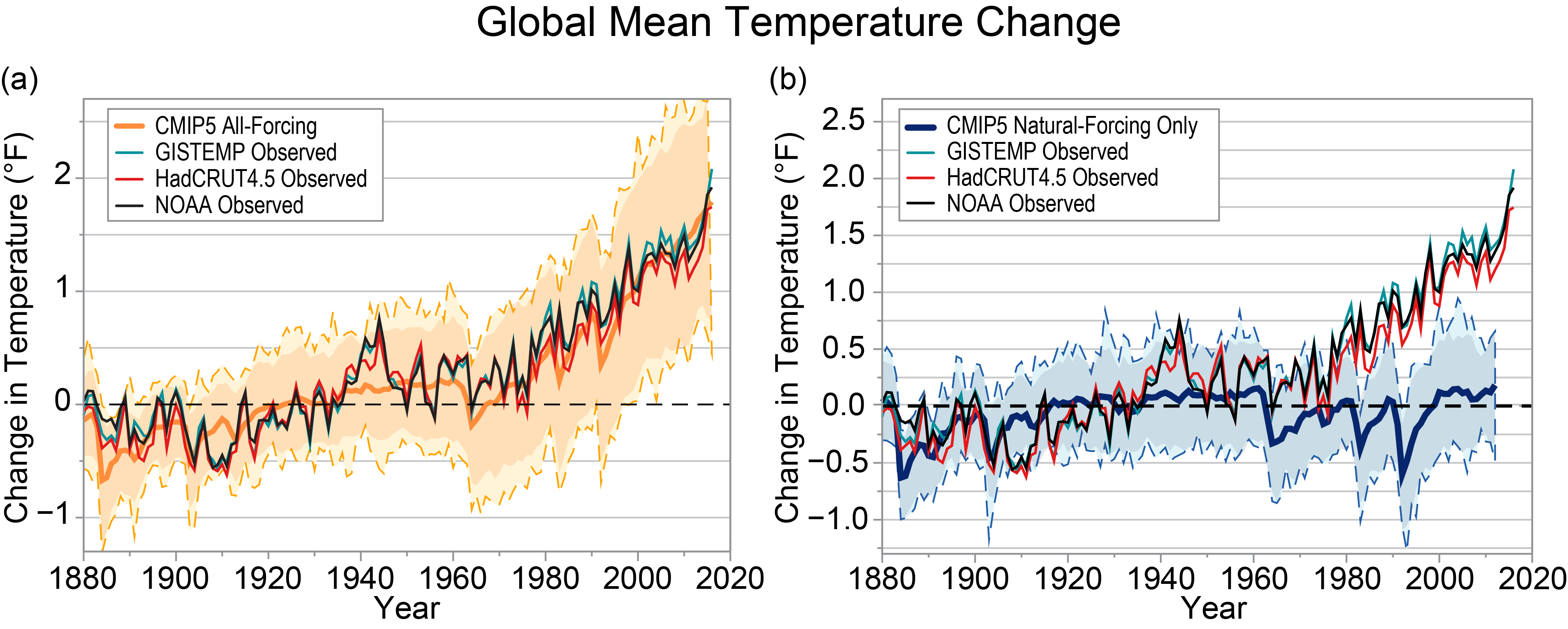
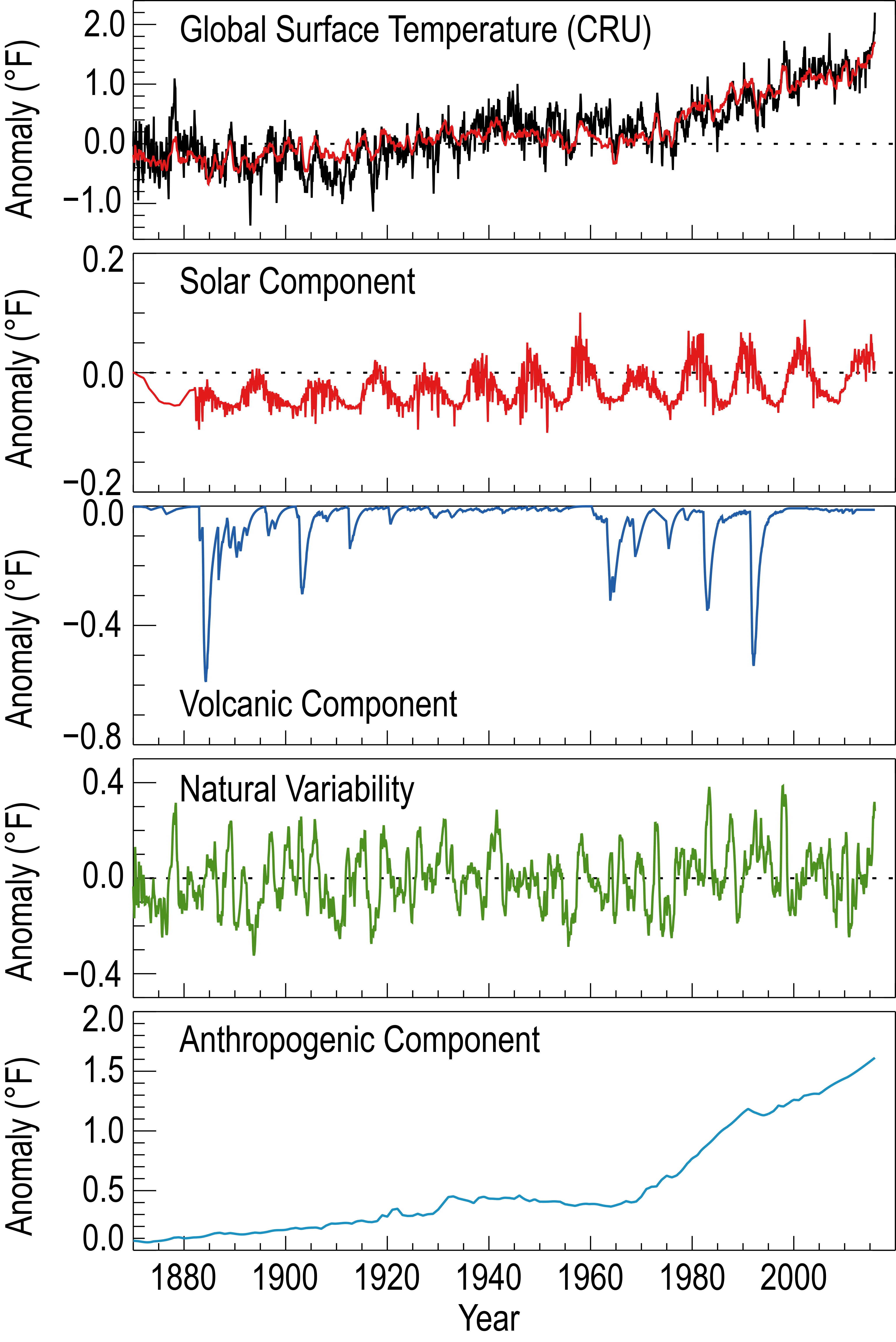
- The figure3_3.png stacked charts are rather nice, except for the matter of different scales, that make the contribution due to (e.g.) solar (barely reaches 0.1{{deg} F. once) and natural variability (never reaches 0.4° F.) seem comparable in size to the 1.5° anthropogenic component. Rhode's "Climate Change Attribution" chart is much better. We should definitely use that one, though perhaps it is not the best for the lead. ♦ J. Johnson (JJ) (talk) 23:28, 8 October 2019 (UTC)
- I've asked Robert A Rohde on his user talk page if he knows of any updated charts. Separately, I will take a stab at merging the "stacked" NCA4 graphs into a common vertical scale (won't be trivial in Photoshop). I strongly favor showing attribution/causality in the lead, because the issue is so critical, as shown by the lead's long-existing text. —RCraig09 (talk) 15:44, 9 October 2019 (UTC)
- I agree that the lead should address both aspects (former issues?) of reality and cause. I am not entirely convinced that addressing both in the same figure is best. My experience (more with managers than scientists, and strongly influenced with the KISS principle) is that each figure should address exactly one point. I think Rhode's graph (updated or not) is excellent, and the span appropriate, for comparing contributions. But showing that the current GW is anomalous really needs a longer time span, which suggests a separate figure. Keep in mind the lead is supposed summarize the article, and that addressing these points does not mean a detailed explication, which should be done in the appropriate section. ♦ J. Johnson (JJ) (talk) 19:46, 9 October 2019 (UTC)
- The point of the composite (two-chart) image is to show current AGW in perspective, which is critical; plus, I've blue/red color-coded the two charts. Question: By "...needs a longer time span" were you implying the 800,000-year chart should be introduced (separately) or merged (into a three-chart image) or otherwise? —RCraig09 (talk) 22:08, 9 October 2019 (UTC)
- No, I think the 2,000 year chart is suitable for that. ♦ J. Johnson (JJ) (talk) 23:50, 9 October 2019 (UTC)

- I've used Photoshop to manually adjust the varied vertical (temperature) scales in the NCA4 Vol.I Ch.3 Fig.3.3 (2017), and manually merged them to form the composite attribution chart I just uploaded and inserted into the article (File:2017 Global warming attribution - based on NCA4 Fig 3.3.png) to replace the outdated (1990s) attribution chart. —RCraig09 (talk) 17:50, 12 October 2019 (UTC)
- Very nice. Even better than Rhode's chart. Let's use it. But one little quibble: the subscripts to the labels are too small. Are they really needed? I reckon most readers will understand that the color of label indicates which line. ♦ J. Johnson (JJ) (talk) 20:25, 13 October 2019 (UTC)
- Merci, danke, bedank, tack, grazie & gracias. The red "solar" trace is hard to distinguish from the other traces in which it is entwined, so I added the "(red)" sub-label for it, and added the other "(color)" sub-labels to be consistent. I purposely made the sub-labels smaller for the reason you mentioned: that most people will deduce the traces are color-coded. —RCraig09 (talk) 20:54, 13 October 2019 (UTC)
- New version with only one tiny label — "(red)" for Solar forcing — has been uploaded to Wikimedia Commons. —RCraig09 (talk) 05:14, 14 October 2019 (UTC)
- Very nice. Even better than Rhode's chart. Let's use it. But one little quibble: the subscripts to the labels are too small. Are they really needed? I reckon most readers will understand that the color of label indicates which line. ♦ J. Johnson (JJ) (talk) 20:25, 13 October 2019 (UTC)
Removal of useful polling information
This information was obviously useful. User:Femkemilene, could you please add it back somewhere in the article, since it demonstrates the variation of concern of different parts of the world? --Comment by Selfie City (talk about my contributions) 11:44, 21 September 2019 (UTC)
- It's already in the article :). There is an entire (bloated) paragraph on different polling questions. See Global warming#Society and culture#Public opinion and disputes. Femke Nijsse (talk) 12:15, 21 September 2019 (UTC)
- OK. Thanks for pointing that out. The problem is that the information is somewhat overlapping between the information to which you link, and this part of the lede's content. Maybe the word "globally" can be removed from the sentence, "Globally, a majority of people consider global warming a serious or very serious issue," as it does not really serve much purpose and, if anything, actually confuses the information explained in the poll? --Comment by Selfie City (talk about my contributions) 12:24, 21 September 2019 (UTC)
- I think it might actually be more confusing if that word is cut out. In every country a majority (of varying size) is concerned. If you leave out the world globally, people will be wondering about who we're talking here. Femke Nijsse (talk) 21:53, 21 September 2019 (UTC)
- I'm about to take a small whack at that bloated paragraph. But the whole section ("Public opinion") is poorly done, and needs a complete re-do. Perhaps a consideration of what it contributes to the article.
- Selfie City: please understand that the lead ("lede") paragraph is supposed to be a succinct summarization, or even a preview, of the article, and merely "useful" is not a sufficient criterion for inclusion. Of course, having said that, yes, we do need to do some serious trimming and summarizing. ♦ J. Johnson (JJ) (talk) 22:31, 21 September 2019 (UTC)
- @J. Johnson: I know what a lede is. However, all of Wikipedia's content should be useful, whether it is a summary or not. Cutting out a word, as I suggested later per above, could be "useful." Also, in reply to User:Femkemilene, the source given for the "globally, a majority..." says that "very conerned" is a minority in the U.S. --Comment by Selfie City (talk about my contributions) 16:18, 22 September 2019 (UTC)
- @Femkemilene: See, if you look at the first graph, none show a majority for the U.S. Consequently, "globally" should be removed. --Comment by Selfie City (talk about my contributions) 16:20, 22 September 2019 (UTC)
- Read the article in a bit more detail, and you'll find the quote "Majorities in all 40 nations polled say it is a serious problem". The graphs only show people that find it a very serious problem. I'm not against removing this sentence altogether from the lede, or trying to find more recent polling (the global strikes & extreme weather and all seem to move concern up quite a lot..). Femke Nijsse (talk) 16:29, 22 September 2019 (UTC)
- Why not just remove the sentence, then? The sentence says, "Globally, a majority of people consider global warming a serious or very serious issue." So we should remove "very serious," or remove it altogether. My point is that it's still not entirely accurate. --Comment by Selfie City (talk about my contributions) 16:34, 22 September 2019 (UTC)
- Read the article in a bit more detail, and you'll find the quote "Majorities in all 40 nations polled say it is a serious problem". The graphs only show people that find it a very serious problem. I'm not against removing this sentence altogether from the lede, or trying to find more recent polling (the global strikes & extreme weather and all seem to move concern up quite a lot..). Femke Nijsse (talk) 16:29, 22 September 2019 (UTC)
- While I disagree that the sentence is inaccurate or ambiguous, I'm not wedded to it at all and have deleted it from the lede. Femke Nijsse (talk) 16:48, 22 September 2019 (UTC)
- Selfie: The issue is whether that detail should be in the lead. And there you seem to have missed the key word: summarization. Merely useful, or informative, or even important (in some sense) does not warrant inclusion in the lead; that is what the rest of the article is for. ♦ J. Johnson (JJ) (talk) 19:00, 22 September 2019 (UTC)
- What's your point? You're trying to launch an argument on some obscurity that doesn't fit into the latest developments of the issue at hand. I'm saying that a sentence should be removed. I think you've lost track of where this discussion is headed. --Comment by Selfie City (talk about my contributions) 19:44, 22 September 2019 (UTC)
- Selfie: The issue is whether that detail should be in the lead. And there you seem to have missed the key word: summarization. Merely useful, or informative, or even important (in some sense) does not warrant inclusion in the lead; that is what the rest of the article is for. ♦ J. Johnson (JJ) (talk) 19:00, 22 September 2019 (UTC)
New ocean report
New report, https://www.ipcc.ch/srocc/home/, seems to provide information about tropical cyclones, the collapse of AMOC, sea ice retreat, sea level rise and more! JJ, would you be willing to add it? (I've already added one short-cite to it, but unfortunately, my back has finished working for now). With this report added and implemented, I am even more ready for review (and or discussion about naming)! Femke Nijsse (talk) 12:01, 25 September 2019 (UTC)
- Sure. I'll work on it tonight. Are you likely to be citing any of the supplementary materials? ♦ J. Johnson (JJ) (talk) 21:35, 25 September 2019 (UTC)
- Probably not. I'll probably only use the SPM and the individual chapters. Femke Nijsse (talk) 07:35, 26 September 2019 (UTC)
- As I mentioned above, there is now a complete set of full citations for the SROCC at WP:IPCC citation/SR. Currently cited as "DRAFT", as they are still subject to copy edit and re-pagination. I'll add citations for the finished report when it is definitely finished and published. ♦ J. Johnson (JJ) (talk) 22:19, 28 September 2019 (UTC)
Semi-protected edit request on 29 September 2019
This edit request to Global warming has been answered. Set the |answered= or |ans= parameter to no to reactivate your request. |
https://www.youtube.com/watch?v=eiPIvH49X-E 71.115.81.94 (talk) 08:55, 29 September 2019 (UTC)
- Try not to be silly William M. Connolley (talk) 09:25, 29 September 2019 (UTC)
Reference errors
- Harv error: link from CITEREFIPCC_AR5_SYR doesn't point to any citation.
- Harv error: link from CITEREFIPPC_SYR_SPM2013 doesn't point to any citation.
- Harv error: link from CITEREFNCADAC2013 doesn't point to any citation.
- Harv error: link from CITEREFUNEP2010 doesn't point to any citation.
- Harv error: link from CITEREFIPPC_SYR_SPM2013 doesn't point to any citation.
- Harv error: link from CITEREFIPCC_AR5_WG22014 doesn't point to any citation.
- Thank you, DrKay. You may have noticed that we are doing a major revision of how citation is done here, and in the interim will probably be making more of a mess. When things get sorted out (in a month?) it would be good to check these again. ♦ J. Johnson (JJ) (talk) 20:33, 7 June 2019 (UTC)
- They're still happening. DrKay (talk) 19:03, 29 September 2019 (UTC)
Re your recent edit summaries here – "User:J. Johnson get it right please
" – and here — "it's not worked, and I can't be bothered to track the error
" — are not particularly helpful, and perhaps you shouldn't be so quick to shoot from the hip. I have bothered to track "the error". When you attempted to correct an actual link error here you "corrected" the wrong end (at the full citation). I reverted that, and then went to correct the problem at the short-cite. At about the same time you went to a different short cite that links to the same full citation, and changed that.
In case you haven't noticed, there is currently a LOT of work being done on this article, so some "dust" is to be expected. If it bothers you so much to "correct the mistakes of its editors
" it would be a good start to make fewer of them yourself. Or at least bother to not proceed blindly. ♦ J. Johnson (JJ) (talk) 20:02, 29 September 2019 (UTC)
- You don't correct incivility by being uncivil yourself. I did very carefully track the error as shown here: https://en.wikipedia.org/w/index.php?title=Global_warming&diff=prev&oldid=918666430. You refer to my edits [1][2][3][4][5] as "wrong". They are not wrong. For example, "Kyoto Protocol 1997" didn't link to the short citations, which were called "UNFCC 1997" [2 c's]. Furthermore, "UNFCC 1997" didn't link to any full citation (because they were neither called "Kyoto Protocol" to match the original harvid nor "UNFCCC" [3 c's] to match the new automatic harvid). The citations were wrong at both ends. My edits corrected them. Your comments are both rude and unjustified. DrKay (talk) 20:40, 29 September 2019 (UTC)
- I agree that this is not something to get agitated or rude about (both of you?). It's only some citation errors that we do fix in due time (usually immediately, sometimes after a week). Is there a particular reason that you want us to fix them faster? Does it show up in some category that should be empty or otherwise interfere with your editing practice? If so, sorry for that. It's a lot of work to convert all of this, and sometimes after having done half an hour of work on some citations, time's up and bed calls (like now). Wikipedia doesn't have a deadline. Femke Nijsse (talk) 20:57, 29 September 2019 (UTC)
- I misunderstood J Johnson's comment from June as an invitation to help check ref errors in a month. I've been checking every month since.
He now tells meI infer from his request for me to "make fewer" edits and "at least bother to not proceed" that I am not to make any further edits. So, I will not. The loss is not mine. DrKay (talk) 21:11, 29 September 2019 (UTC) Amended per WP:REDACT. DrKay (talk) 22:16, 29 September 2019 (UTC)
- I misunderstood J Johnson's comment from June as an invitation to help check ref errors in a month. I've been checking every month since.
- I agree that this is not something to get agitated or rude about (both of you?). It's only some citation errors that we do fix in due time (usually immediately, sometimes after a week). Is there a particular reason that you want us to fix them faster? Does it show up in some category that should be empty or otherwise interfere with your editing practice? If so, sorry for that. It's a lot of work to convert all of this, and sometimes after having done half an hour of work on some citations, time's up and bed calls (like now). Wikipedia doesn't have a deadline. Femke Nijsse (talk) 20:57, 29 September 2019 (UTC)
- No, I did not refer to your edits as "wrong", and most certainly have not told you "
not to make any further edits
". If you are going to complain about incivility I will remind you that misrepresentation of others is considered behavior that is unacceptable. What I said is that you "corrected" the wrong end of a link, and that should not proceed blindly. Nothing uncivil are rude there, or in any of my comments; that all seems to be on your side. ♦ J. Johnson (JJ) (talk) 21:58, 29 September 2019 (UTC)- My comments are no worse than yours. If you've not been uncivil, then neither have I. DrKay (talk) 22:05, 29 September 2019 (UTC)
- No, I did not refer to your edits as "wrong", and most certainly have not told you "
Please do keep in mind that communicating over the internet requires a bit more tact and civility than normal communication, as people can't see you. @DrKay: I think we've found a working routine for fixing the citations here and that it might indeed be a bit difficult for you to help us. I forgot that you offered before (may even have asked the help myself). Thanks for checking in! I think we've got it now, though. Femke Nijsse (talk) 08:30, 30 September 2019 (UTC)
@All,
I wish we'd ban the use of the three letter string "you" and instead require various templates such as
- Template:You-I have advice and would like to be your friend
- Template:You-I would like to know more about your view, please clarify
- Template:You-Caution to prevent future problems please read ''WP:Foo''
- Template:You-Yeah you, you stupid idiot
- Template:You-Fuck off
- etc.
One reason Wikipedia is losing editors I believe is our culture that tolerates WP:Gaming the system by those who keep their toxicity to just below the threshold for admin action. But as a general rule if Template:You-I have advice and would like to be your friend feel the need to use "you", its usually better to do it at user talk. NewsAndEventsGuy (talk) 10:40, 30 September 2019 (UTC)
EPA quote
Fact: Climate change is real and it is happening now. The U.S. Global Change Research Program, the National Academy of Sciences, and the Intergovernmental Panel on Climate Change (IPCC) have each independently concluded that warming of the climate system in recent decades is "unequivocal". This conclusion is not drawn from any one source of data but is based on multiple lines of evidence, including three worldwide temperature datasets showing nearly identical warming trends as well as numerous other independent indicators of global warming (e.g., rising sea levels, shrinking Arctic sea ice).
— U.S. Environmental Protection Agency.
Note #2 ("near the top of the article") quotes the EPA "Myths vs. Facts" statement. This is such a strong, definite statement (see box) that I think it ought be quoted in the text. And perhaps in box as done here. I can see this as an organizing statement which sets the stage for the several figures that follow. Comments? ♦ J. Johnson (JJ) (talk) 23:10, 29 September 2019 (UTC)
- This dates back to the pre-post-facts era, still up on the EPA website but undated. Clearly related to "Denial of Petitions for Reconsideration of the Endangerment and Cause or Contribute Findings for Greenhouse Gases under Section 202(a) of the Clean Air Act / Regulatory Initiatives / Climate Change / U.S. EPA". Environmental Protection Agency. 14 April 2011. Retrieved 16 September 2011. – which has been vanished from the current website, though presumably still on their archive or snapshot. . . . dave souza, talk 11:50, 30 September 2019 (UTC) Context: Climatic Research Unit email controversy#United States Environmental Protection Agency report, the page was at "Myths vs. Facts: Denial of Petitions for Reconsideration of the Endangerment and Cause or Contribute Findings for Greenhouse Gases under Section 202(a) of the Clean Air Act / Regulatory Initiatives / Climate Change / U.S. EPA". Environmental Protection Agency. 14 April 2011. Retrieved 16 September 2011. but that link no longer seems to work – the page is now at this page. . . dave souza, talk 12:13, 30 September 2019 (UTC)
- Huh?
- Not "related", but the very page. There is another source which should document the date.
- So are you okay presenting that quote? Does anyone have an objection? ♦ J. Johnson (JJ) (talk) 21:19, 30 September 2019 (UTC)
- I'd like more time to think whether to add this US source. Femke Nijsse (talk) 21:26, 30 September 2019 (UTC)
- It's good to have an international perspective: Femke notes it is a "US" source and not international... Further, (as I understand it) the EPA is "downstream" from NASA, NOAA, IPCC, etc., which may be bad (less directly authoritative) or good (may project more "reliability" as a "secondary" source). It's a great quote, and my only concern is that there might be a more authoritative source for a similar quote. I like quote boxes, but especially on a contentious subject they should be used in moderation (not a problem here). For what it's worth, the earliest Wayback Machine archive is July 2017. —RCraig09 (talk) 22:22, 30 September 2019 (UTC)
- It is indeed a great quote. I don't believe any source would be more authoritative except the IPCC or GCRP. But the point of the quote is not to simply repeat what other more authoritative sources have said at much greater length (and with all the boring scientific nuances), but to present the key point simply and effectively, and to affirm the authority on which it is based. It is actually a tertiary source (reporting on the secondary review by the IPCC and others of the scientific literature), and yet quite reliable.
- That this is a "US" source should not matter. Our principal authoritative sources for all of this are the IPCC reports, which are thoroughly international. As to a US perspective: that the EPA made such definite pronouncement on the matter reflects the reality that the US is the hatchery of climate denialism. ♦ J. Johnson (JJ) (talk) 00:42, 1 October 2019 (UTC)
- Looking in the archives, this page states the date and context:
On July 29, 2010, EPA denied ten petitions. "The petitions to reconsider EPA's "Endangerment Finding" claimed that climate science can't be trusted, and asserted a conspiracy that calls into question the findings of the [IPCC, NAS, U.S. GCRP]. After months of serious consideration of the petitions and of the state of climate change science, EPA found no evidence to support these claims." The "Myths v Facts" page is linked there, under "Resources".
So, it's a snapshot from 2010, pre AR5 and before the current administration's efforts to hobble the EPA. But very well stated. . . dave souza, talk 05:20, 1 October 2019 (UTC)
- Looking in the archives, this page states the date and context:
- That this is a "US" source should not matter. Our principal authoritative sources for all of this are the IPCC reports, which are thoroughly international. As to a US perspective: that the EPA made such definite pronouncement on the matter reflects the reality that the US is the hatchery of climate denialism. ♦ J. Johnson (JJ) (talk) 00:42, 1 October 2019 (UTC)
- The reason I'm emphasized the US focus what A) it's a bit weird to have three US sources so prominently explicitly mentioned and more importantly B) for countries in which climate denial is not really a thing (all countries except Australia & US?), this is such an open door statement that focus on it is weird I think. Femke Nijsse (talk) 08:10, 1 October 2019 (UTC)
- Because this article seems to be the central location for discussing the issue, I moderately agree it's a good place for the scientific consensus quote box, though it may inspire sniping from drive-by denialist editors. I think the quote box is even more appropriate at Scientific consensus on climate change and Global warming controversy and possibly somewhere in Climate change denial. —RCraig09 (talk) 16:06, 1 October 2019 (UTC)
- Agree, and with Femke – it's not the ultimate worldwide list of authorities; the U.S. Global Change Research Program, the National Academy of Sciences, and the Intergovernmental Panel on Climate Change (IPCC) are cited as [I think] their reports formed the basis for the EPA determination in December 2009 that climate change caused by emissions of greenhouse gases threatens the public's health and the environment, as covered on the main EPA Denial of Petitions page. Eloquent, but a box would take up space better used for an illustration or graph. In my opinion. . . dave souza, talk 20:39, 1 October 2019 (UTC)
- Because this article seems to be the central location for discussing the issue, I moderately agree it's a good place for the scientific consensus quote box, though it may inspire sniping from drive-by denialist editors. I think the quote box is even more appropriate at Scientific consensus on climate change and Global warming controversy and possibly somewhere in Climate change denial. —RCraig09 (talk) 16:06, 1 October 2019 (UTC)
I like Rcraig09's suggestion of using this on other pages. Agree with dave souza that figures are probably a better use of space, and we've got plenty of those already! Femke Nijsse (talk) 07:49, 2 October 2019 (UTC)
- I don't know why "
figures are probably a better use of space
", as the quote gets right down to what (for many people) is the key issue, whereas the figures only show things that indirectly support that key issue, that indirectness giving the deniers scope to quibble and cavail.
- I agree that that quote in a box is also appropriate for those other articles. But none the less so for this article, in affirming that GW is real. The differences are in the precise focus and handling in each article. E.g., at the scientific consensus article the focus is on the basis and extent of the consensus, and "real" is the result. Here it affirms the reality of the topic (without which there would be no basis for an article). We give a light-weight overview of why CC/GW is considered real (so the readers don't have to traipse over to other article), then move on to content about GW (such as its effects).
- I do not understand why it should be "weird" to prominently mention the US EPA. They pronounced this great quote, and for the audience that matters most the EPA is probably the most authoritative source to be had. Nor do I understand what is meant by "
an open door statement
". Perhaps the "weirdness" is because non-anglophone audiences don't understand why denial is an issue? Well, they should. The U.S. contributes nearly one-fifth (~18%) of CO2 emissions, and the denial-induced paralysis in the US affects everybody. Even Adaman Islanders that have never heard of the US.
- So again: why are figures "probably a better use of space"? ♦ J. Johnson (JJ) (talk) 23:34, 2 October 2019 (UTC)
- Rethinking: international perspective is critical for real issues in the real world, but the context we're considering here is the English-language Wikipedia. Accordingly, I favor expressing this (EPA) scientific consensus prominently because of the persistent denialist undercurrent in the U.S. (and, according to Femke, in Australia). The quote box seems appropriate both in the other articles I've suggested above, and also here in this "top level" article. P.S. At this point, it's a good use of space! (The polar bear and helicoptor/wildfire pictures can go!).
- First of all, This quote is about denial Stage 1 (denying warming is happening), which is not a big thing anymore, not even in the US. According to the linked Guardian article
Most climate contrarians have come to accept that the planet has warmed significantly
. - The English Wikipedia is the international wikipedia and a US-focus is explicitly against NPOV policy for topics that are not related specifically to the US (explanatory FAQ: Wikipedia:Neutral_point_of_view/FAQ#Anglo-American_focus). From hesitatingly being against it, I'm now very strongly against it as it not only gives undue weight to the temperature aspect of climate change, but I have to consider it NPOV as well. Femke Nijsse (talk) 08:45, 4 October 2019 (UTC)
- First of all, This quote is about denial Stage 1 (denying warming is happening), which is not a big thing anymore, not even in the US. According to the linked Guardian article
- This is likely to be an interesting discussion.
- Femke: I submit that GW denial is still "a big thing", particularly in the U.S., and consequently for everyone else on this planet, the U.S. being a major impediment to reducing CO2 emissions.
- That this is still a big thing in the States is somewhat obscured since the mainstream media stopped "balancing" the scientific position with denialist views. But polls show that approximately half of the U.S. populace is still in denial. More importantly, a majority of the U.S. Senate opposes any climate change response, and need I mention the current administration's intent to withdraw of the U.S. from the Paris Agreement?
- This on-going denial is manifested even on this page. E.g.: just last night there was this edit (since deleted), stating: "
Global warming isn't real. Although many think it is, it is just a hoax made up by democrats.
" Even if most "climate contrarians have come to accept that the planet has warmed significantly
", what Nuccitelli was referrng to was the pushing of denialism by prominent deniers; I don't see that most believers have accepted the reality of warming.
- This on-going denial is manifested even on this page. E.g.: just last night there was this edit (since deleted), stating: "
- Denialism has been, and remains, a significant, even integral, part of this topic, and therefore ought to be addressed in this article. The EPA statement goes straight to the core issue that GW is real, and the need for doing so is not obviated simply because a majority of our readers (or editors) find it obvious. ♦ J. Johnson (JJ) (talk) 23:33, 4 October 2019 (UTC)

- I appreciate your (Femke's) perceptively distinguishing exactly what people are still denying (the warming itself vs. what is causing it). However, I doubt many non-scientists (WP readers) truly appreciate that distinction, and denier reasoning is still foggy, confused and persistent (example: Trump ridiculing Greta). After compiling the above 3-chart image, I was struck by how the unprecedented nature of recent warming is, by itself, one of the most convincing arguments that humans are causing that warming! The U.S. EPA is merely used as a secondary (tertiary?) source that cites the (international) IPCC, so I don't think it violates NPV (though the sourcing is not ideal). Other WP articles I've mentioned above may be better destinations for the quote box, but the public is less likely to read them and I think it's ~OK here in the absence of a quote or image that is more comprehensive (proves warming PLUS human causation)—if one exists! —RCraig09 (talk) 02:23, 5 October 2019 (UTC)
- I've just discovered the Robert Rohde chart at right, which is used in several WP articles already. It captures causation. Unfortunately, it's outdated. —RCraig09 (talk) 03:44, 5 October 2019 (UTC)
@JJ: I never said climate denial in general isn't still a big thing and my primary goal of editing Wikipedia is making sure that good information about climate is available from a trusted source to fight climate denial. Instead, I said climate denial STAGE 1 is not a big thing anymore. As of May, it was only 5% of the US population that said climate isn't changing at all.[1] Stage 2 (humans cause it) is still a thing, albeit restricted to a few countries around the world, and I would be more willing to accept a quote refuting this. I've tried to strengthen the article in refuting Stage 3 (it's bad) and Stage 4 (there's nothing we can do).
@ RCraig: I like that figure as well! I've been thinking of recreating it, but haven't found the right data to reproduce it. Might look into it again later. In my assertion the quote might be POV, I'm not trying to argue that EPA brings in the POV, but more so that putting emphasis on Stage 1 climate denial brings in POV. As most recent polling shows that this type of denial is not even a thing anymore in the US, I'd say my major objection has shifted from Anglo-American POV to WP:UNDUE weight. Interacting with a lot of climate deniers, I do very much think they know the difference between denying climate change or denying the cause of climate change. This is not as difficult as to require a scientists background. Femke Nijsse (talk) 07:06, 5 October 2019 (UTC)
- FYI: Somewhat-updated similar IPCC figures FAQ Fig. 5.1, page 393 (2013). Sorry, original data not presented. :-\ —RCraig09 (talk) 18:13, 5 October 2019 (UTC)
References
- ^ Harvey, Oliver Milman Fiona (2019-05-08). "US is hotbed of climate change denial, major global survey finds". The Guardian. ISSN 0261-3077. Retrieved 2019-10-05.
- I recall when denial of any warming, or at least not as long-term climate change (which slides into belief of not human-made), was running over 50% in the U.S. I thought the "Stage 1 denial" was still running around 15%-20%, but perhaps the uptick in progress made in the last year or two has been greater than I had reckoned. If the remaining 5% is not significant (though that is questionable, particularly in the Senate) then it might unnecessary, even unrelevant, to refute it. But I don't see that as being a NPOV issue. And the historical fact of denialism is still important for illustrating the flimsy character of stage 1 denial, and for explaining why we have lost a generation in responding. Both of these points are directly applicable to stage 2 denialism, and therefore the quote may still be relevant. Though I allow perhaps not as the lead figure. ♦ J. Johnson (JJ) (talk) 21:53, 5 October 2019 (UTC)
- I do agree that denialism is one of the facets of explaining WHY we've lost this generation is responding. Before we explain WHY we have to maybe state more explicitly THAT we have lost a generation. Currently, the only sentence given context like that is about the Copenhagen Agreement. I'm not entirely sure where and with what kind of sources this information should be added though. Currently, the subsubsection about controversy doesn't have a figure, so there is space there for a quote. I'm still not hugely in favour (because I think we shouldn't focus too much on it), but there it doesn't compete with figures that I find more valuable. Femke Nijsse (talk) 11:24, 6 October 2019 (UTC)
- Yet another section that could be rewritten better, then perhaps a good place for the quote. I could get into some of that, but for now I think the citation work has higher priority. And I may have a suitable edit notice; see above. ♦ J. Johnson (JJ) (talk) 21:11, 6 October 2019 (UTC)
On having more than one item in a note
@MarnetteD: Thank you for tackling that bare url (here). However, we should discuss your premise for removing the second item ("Official list of current members ...") from that note. In your edit summary you stated that "two items in one set of ref tags doesn't really work
". I beg to differ. We do that quite often, and I am not aware of any problem. Perhaps you would explain how you think it doesn't work. I would also note that the link to the list relates to which countries are parties, so it really needs to be where it applies, and not in the External Links section. ♦ J. Johnson (JJ) (talk) 03:38, 1 October 2019 (UTC)
- I knew that I was guessing at how you would want that item handled in this article and I figured the odds would be good that my guess would be wrong. The first problem is that neither reflinks nor refill will fix bare urls if there are two of them in one set of ref tags. Next, my expectation is that readers will have a hard time distinguishing which ref is what if they click on the link. Or to put it another way how will they know to click on one link - read its info - return to the page and click on a second one in the same numbered ref. Your experience with refs is different and I am not saying that there is anything wrong with it I'm just relating my years of experiencing fixing bare urls. You can certainly move it back but my suggestion is to use a second set of ref tags. After I moved it I also had a thought that the one I moved to the ELs might work better as a footnote than as a reference since it goes to a list rather than a specific item but I can certainly understand it you think that suggestion is wacky. One last request if you still need it converted to a citation after you move it please use a {{Bare URLs}} at the top of the article. That inline bare url tag is difficult to find in a brief article and in this one it took me almost two days to track it down in this one :-) My apologies for any problems I caused in this situation and best regards to all who take care of this article. MarnetteD|Talk 04:44, 1 October 2019 (UTC)
- Nothing is perfect on the first try, right?
- Yes, our experiences differ, which is why we are having this discussion, so we can share and thereby profit. E.g., I did not know that 'reflinks' can handle only one bare url in a note, so that is something to consider. Also, why is tracking down a "bare inline" tag difficult? Does it not suffice to just search for "Bare URL"?
- I don't understand what you say that "
readers wll have a hard time distinguishing which ref is what if they click on the link
", nor this bit about "click on a second one
["ref"?]in the same numbered ref.
" Perhaps you would explain that some more. Do note, though, that we do have a bit of a terminology problem here. E.g., where you said that one url "might work better as a footnote than as a reference
", I do not understand how you distinguish "footnote" and "reference". (I have found the latter to be used in eight or ten different ways, so generally avoid using it.)
- I don't understand what you say that "
- I look forward to your comments. ♦ J. Johnson (JJ) (talk) 23:07, 1 October 2019 (UTC)
- Hello again. the inline tag is small and can only be seen in the reference section of the article. In an article with almost three hundred refs like this one it can easily be missed and I had to go through them several times to finally find find it. To see what I mean scroll to ref 231 here. The {{Bare URLs}} sits at the top of the page and also has the benefit of giving easy access to activate refill which the inline one does not. I see that there was some separation of the two items that were in one set of ref tags by having "Official list of current members available at" in black in the ref. If the second item is formatted into a cite that will turn blue and IMO readers will see what looks like one long ref. If you want to move the item back to the body of the article I would suggest formatting it like reference 273 in this article. For the diff between notes and ref sections see the (foot)note section here Claude Debussy#Notes followed by Claude Debussy#References. I notice that this articles ref section headers are different from most that I edit so my suggestion may not be workable. This may still be unclear so whatever you can work out in dealing with this is fine. MarnetteD|Talk 00:52, 2 October 2019 (UTC)
- The distinction between the sections titled "Notes" and "References" at Claude Debussy (and many other articles) is only one of several possibilities, which close examination shows to be ambiguous. In particular, "references" carries a lot of baggage with most editors; I find it better to use other less loaded, more specific terms.
- I don't understand what you mean regarding "ref 231". (Your diff is to a name correction.) The note currently numbered 231 is: "IPCC AR4 WG3 Ch1 2007, Executive summary." Is there a problem with that?
- Regarding the tag: why do you have "
go through them several times
" to find that tag? Why not use the search ("find") function? In your browser window, hit ctrl-f, enter "Bare URL" in the box, and your browser should take you right to the spot. Right? ♦ J. Johnson (JJ) (talk) 22:27, 2 October 2019 (UTC)
- Regarding the tag: why do you have "
- Use the link I left to scroll down to see what ref 231 looked like before I made my edit - the edits since then have changed things. My browser window does not work the way yours does. MarnetteD|Talk 23:13, 2 October 2019 (UTC)
- Okay, so you are referring to the note you edited (currently #229), which I had previously tagged with "Bare URL". Your point is that: the tag is small and hard to see, right? Well, this gets back to what I keep saying: use your browser's search/find function. Does your browser not have such a function? What kind of browser are you using? ♦ J. Johnson (JJ) (talk) 23:51, 2 October 2019 (UTC)
- I'm glad you were able to see how small the tag is. I'm afraid my computer skills are minimal so I look for things in the old fashioned slow way. Thanks for the suggestion though. It might help in future work with bare urls. MarnetteD|Talk 00:35, 3 October 2019 (UTC)
- My point is that "small and hard to see" isn't a problem if you use search. Send me e-mail if you'd like some assistance.
- On the fixing of bare urls: if reflinks or refill work only on a minimal note (i.e., containing only the URL, which to me is a bug) I would offer the following work-around. Do a temporary edit that splits the note (like inserting "</ref><ref>" tags), fix the bare url, then remove the inserted tags. If I find a suitable candidate for trying that I will bring it to your attention. ♦ J. Johnson (JJ) (talk) 20:15, 3 October 2019 (UTC)
<ref>{{cite web|url=https://treaties.un.org/Pages/ViewDetailsIII.aspx?src=IND&mtdsg_no=XXVII-7&chapter=27&Temp=mtdsg3&clang=_en |title=UNTC |publisher=Treaties.un.org |date= |accessdate=2019-10-04}}</ref>
OK here is the item as formatted by reflinks. I will let you make any tweaks and then insert it into the proper place in the article as you see fit. You can try asking the programmers about what you want to change re the two ref fix bots. Unfortunately the talk page for both programs seems to get little to no response so you might try at the WP:VPT. MarnetteD|Talk 01:29, 4 October 2019 (UTC)
Peer review before TFA
JJ: you previously indicated that you wanted to get some more citation work done before we go to peer review. I'd really like to have the peer review done before the article is featured on the main page, which is now scheduled to happen on December 2. If we don't put it up for peer review soon, I'm afraid we won't have time to properly address all reviewers before December. Can I sign it up? Femke Nijsse (talk) 08:16, 7 October 2019 (UTC)
- "scheduled?" What does that mean? NewsAndEventsGuy (talk) 10:35, 7 October 2019 (UTC)
- @NewsAndEventsGuy: sup? Check it ——SerialNumber54129 11:08, 7 October 2019 (UTC)
- Not that much, we can still withdraw or postpone. Wikipedia:Today's_featured_article/requests/pending. It's customary to have a 'hook' on why the article should be refeatured, which is, in this case, the start of the COP25 on December 2. Femke Nijsse (talk) 11:00, 7 October 2019 (UTC)
- Ach so, a procedure I didn't know about. Thanks NewsAndEventsGuy (talk) 11:03, 7 October 2019 (UTC)
- I generally don't like to have quality driven by schedule, and I think we have a LOT of work to do before peer review. But possibly we could get it done "on schedule". I wonder if there might be other good events/dates later in December, but I can see some desirability of hitting Dec. 2. How soon do want to start peer review? Is the whole of November sufficient for peer review? ♦ J. Johnson (JJ) (talk) 21:22, 7 October 2019 (UTC)
- We could push towards the end of the COP (December 14?). That gives us two extra weeks. I think I need more outside input. A lot of things I don't like about the article still, but don't have the inspiration to know how to improve it. Femke Nijsse (talk) 21:30, 7 October 2019 (UTC)
- Which is to say that 2 Dec. is a soft target (not a "dead" line), and we're okay if there's a few days slide. With the likely spike in public attention I'd rather aim for the earlier date. I'm willing to give it a try. What kind of schedule are looking at with peer review? And how does that fit in with FA? (I'm okay with not making FA by then, provided the article is "pretty damn close" to it.) ♦ J. Johnson (JJ) (talk) 22:30, 7 October 2019 (UTC)
- Personally, I favor removing it from the schedule until completion of the rename process, and then, depending on teh outcome, making FA quality edits to reflect the outcome. That's far enough down the road that being on the calendar seems premature to me. But that's just me. NewsAndEventsGuy (talk) 22:55, 7 October 2019 (UTC)
@JJ: I don't quite understand your question: And how does that fit in with FA? Could you clarify? @NEAG: would you favour having the renaming discussion first before peer review? That has some advantages. I'd like to start the renaming procedure here at the earliest when there is consensus that climate change's WP:PRIMARYTOPIC is this article and that it shouldn't refer to climatic changes in general. A possible, but tight, schedule is:
- - launch renaming discussion for climate change on October 13.
- - rename CC to whatever we decide on October 26
- - launch renaming discussion for GW on October 27
- - possibly rename GW on November 10 + insert changes
- - Sign up for peer review November 17
- - Have peer review completed December 17??
- - Postpone TFA till January.
Considering we won't even make it in these conditions, I concur with NEAG that we should abandon our date in the calendar :(. We don't need a hook (why feature on that particular date) per se, but it would be good to have. Femke Nijsse (talk) 11:04, 8 October 2019 (UTC)
.jpg)
- Cripes, this again? It is quite a perennial issue.
- NAEG is quite right that any considerations of name should precede FA consideration. Indeed, as the name sets the scope and focus of an article, setting the name should precede all other work. I had thought the matter was more or less settled to not rename ("move") this article, the last request to do so (June 2018) having been closed as "
No move. It is apparent that there's a lack of consensus for any of the suggested titles
", and the last discussion on this having fizzled out just last July. If this is not settled then we should STOP ALL WORK until we agree, permanently, on which direction we should be pulling. Which will certainly blow any schedule, but I don't see any way around that — unless we make a determination that the name is settled, and there is to be no "re-" about it.
- NAEG is quite right that any considerations of name should precede FA consideration. Indeed, as the name sets the scope and focus of an article, setting the name should precede all other work. I had thought the matter was more or less settled to not rename ("move") this article, the last request to do so (June 2018) having been closed as "
- Femke: you presume too much. Particularly, you presume that there will be a rename, perhaps anticipating a discussion result that is yet to come. I point out that this matter has already been discussed multiple times over the years, and every proposal to rename has failed for lack of consensus. If we have to do this again I think we should go the whole nine-yards and through every argument, even taking it to Arbcomm for a definite stake through the heart of the issue, so we don't have to keep revisiting it. I see two alternatives: either the name is settled, and we move on, or it is not, and we have a full and proper debate to settle it. ♦ J. Johnson (JJ) (talk) 22:30, 8 October 2019 (UTC)
- @JJ. I agree that it's not certain we'll rename. I give it about a 50% chance that it'll work for this page.
- Note, there is zero discussion about changing the scope of this article. It is already been written to cover the scope of the IPCC reports, there is little work in terms of content for this article. Only the first paragraph will need rewriting. Frankly, it doesn't make sense to stop all work if there is a renaming discussion coming up.
- Let me point out that over the last 6 months I've analyzed past discussions, analyzed use of the terms in literature (Google, Google Scholar, UK parliament archives, Google books), read all relevant policy. Plus, the renaming discussion we're preparing is not a shot in the dark like the previous ones that got shut down before they properly started. This should be a discussion to settle it at least for another five years. I don't see Arbcomm getting involved in here as we have clear policies what to do in case of no consensus (no rename, and new discussions allowed).
- Before we can start the discussion here, the 'easy' discussion to rename the climate change article must be held. I've collected ample evidence why its current title doesn't work in User:Femkemilene/sandbox Q1.1. Femke Nijsse (talk) 08:09, 9 October 2019 (UTC)
- Perhaps we should move this discussion into its own thread, especially as I am unclear as to what kind of rename you would do that would entail only a rewrite of the first paragraph. Short of some very cogent argument that settles the matter in very short order, I am doubtful of FA status by December. And I think I shall have to spend more time at Talk:Climate change, which will delay completion of various tasks I have undertaken here. So for your initial question re signing up for peer review: at this point that seems premature. ♦ J. Johnson (JJ) (talk) 20:38, 9 October 2019 (UTC)
Okay, clear. I'll postpone the TFA. There are different options in the air as a potential new name. I would propose climate change (as per UNFCCC definition), which corresponds with this article's scope and the IPCC reports. The article already uses global warming and climate change as near-synonyms. Other people propose things like human-caused climate change or global warming and climate change. I think we should not put the rename under a new threat YET as it is we should have one renaming discussion at the same time and the big fish to fry is the fact that the naming of the climate change article leads to widespread confusion (one example, we've got an estimated 4500 blue links that should come here but instead go to climate change). Femke Nijsse (talk) 20:58, 9 October 2019 (UTC)
Renaming of climate change
There has been a long unease on Wikipedia about the distinction between global warming and climate change. Bold proposals have been put forward, but no consensus was ever obtained for to rename global warming into climate change. I've launched a less bold proposal now: making climate change into a redirect to global warming and renaming that article. With the terminology of current climate change shifting from global warming to climate change, the confusion of our (somewhat arbitrary) distinction between the two terms is becoming larger. Feel free to participate in the discussion at Talk:Climate change#Renaming this article to solve confusion. Femke Nijsse (talk) 20:21, 9 October 2019 (UTC)
- Ah, you have anticipated me. Excellent. I'll start studying this tonight. ♦ J. Johnson (JJ) (talk) 21:01, 9 October 2019 (UTC)
- Discussions of the different options has concluded and a proposal has been put forward to rename to climate change (general concept). The proposal will stay up for at least seven days. Femke Nijsse (talk) 15:09, 18 October 2019 (UTC)
Suggestion for change to second sentence
What would you think about changing "It is a major aspect of current climate change," to "It is the main cause of current climate change,"?
Chidgk1 (talk) 08:09, 11 October 2019 (UTC)
- I'd argue greenhouse gases are the cause of climate change and global warming is either used as a synonym or it is a major aspect of climate change. Femke Nijsse (talk) 08:11, 11 October 2019 (UTC)
- (A) Human activities are the main cause, says IPCC.
- (B) The sentence was created in the latest lead tweak that attempted to mollify complaints about the scope and title of global warming versus current form of climate change. When we solve the real issue this lead will likely be redone, and that's the best way to resolve Chidgk1's comment NewsAndEventsGuy (talk) 10:17, 11 October 2019 (UTC)
- I guess I was subconsciously making an assumption of global warming being defined as the average temperature change at the actual surface of the globe i.e. the land and ocean; whereas climate is a property of the atmosphere. But on further reading I understand the satellite to measure the surface temperature was only put up this century. I had not properly read the definition in the first sentence. So although I understand (correct me if I am wrong) in practice the warming is measured to be the same, I am guessing scientists stick with the definition in the first sentence to have a consistent series with 19th and 20th century land based weather station temperature measurements, which would be air temperature slightly above the surface. So I withdraw my suggestion as it would be inconsistent with the definition in the first sentence.Chidgk1 (talk) 14:28, 11 October 2019 (UTC)
- Satellite? Don't think any satellites were put up to measure surface temperatures, but satellites measurements of microwaves from the troposphere have been used to infer Satellite temperature measurements which are adjusted to relate to surface temperatures in the instrumental temperature record. . . dave souza, talk 19:41, 11 October 2019 (UTC)
- Thinking about this further I think the definition of "global warming" in the first sentence of simple:global warming will be better for non-scientists after I have made a slight tweak over there. Take a look if you have time and especially if you are good at explaining stuff to kids.Chidgk1 (talk) 15:09, 11 October 2019 (UTC)
- I guess I was subconsciously making an assumption of global warming being defined as the average temperature change at the actual surface of the globe i.e. the land and ocean; whereas climate is a property of the atmosphere. But on further reading I understand the satellite to measure the surface temperature was only put up this century. I had not properly read the definition in the first sentence. So although I understand (correct me if I am wrong) in practice the warming is measured to be the same, I am guessing scientists stick with the definition in the first sentence to have a consistent series with 19th and 20th century land based weather station temperature measurements, which would be air temperature slightly above the surface. So I withdraw my suggestion as it would be inconsistent with the definition in the first sentence.Chidgk1 (talk) 14:28, 11 October 2019 (UTC)
Foote note
As discussed at #Peer review? above, I've rewritten the Global warming#History of the science section to show context, and avoid undue weight to false claims that the greenhouse effect was "discovered in 1856 by Eunice Newton Foote". Her research got very little attention until a 2011 paper proposed that other scientists had conspired to hide her research. As more recent sources show, her 1856 experiments used [glass] cylinders filled with different gases heated by sunlight, an apparatus which could not distinguish the infrared greenhouse effect. There's no evidence she was noticed by subsequent researchers, so even debunking the claim gives her attention which has to be balanced by showing at least some of those who are known to have influenced the science. At the same time, because sexism, it's worthy to give her a mention, so I've worked on that basis. Sources still to be added to match the citations, in particular Huddleston, Amara (17 July 2019). "Happy 200th birthday to Eunice Foote, hidden climate science pioneer". NOAA Climate.gov. Retrieved 8 October 2019., Calel, Raphael (19 February 2014). "The Founding Fathers v. The Climate Change Skeptics". The Public Domain Review. Retrieved 16 September 2019. {{cite web}}: Invalid |ref=harv (help) and Fleming, James Rodger (1998). Historical Perspectives on Climate Change. Oxford University Press. ISBN 978-0-19-507870-1. {{cite book}}: Invalid |ref=harv (help) . . . dave souza, talk 11:20, 11 October 2019 (UTC) (note: references now added. . . 19:43, 11 October 2019 (UTC))
- Thank you for taking such a skillful interest in a needed area NewsAndEventsGuy (talk) 12:23, 11 October 2019 (UTC)
- Thanks! Difficult to condense, so hope have struck a reasonable balance. . . dave souza, talk 19:43, 11 October 2019 (UTC)
- Likewise. And I love the header. ♦ J. Johnson (JJ) (talk) 21:26, 11 October 2019 (UTC)
- Thanks. Good flow, perfect sourcing, interesting. BUT.. I feel is highly disproportianate in terms of length. If you compare it to the section on adaptation to climate change, the section on the climate movement, the section on the effect on the biosphere, all section that are at least as important in my opinion, it does not work. To decide what is due weight to a given perspective, I try (which is difficult) to find some 10-page summary of the entire topic by another source. Many of the sources you've added were not general sources, but specialist sources on the history of science. I'm sure general sources don't have Adolphe Brongniart, de Saussure and all those other people. I've been thinking of removing ALL names out of the section, just rough time periods and when the different lines of evidence were first discovered, but maybe that is too drastic. With the expansion of this section, we're over the 'arbitrary' prose size of 50,000 indicating that the article might be on the long size. A long article per se is not a bad thing when discussing climate change, but I think we should be extra sharp on the WP:SUMMARY style when we are above this threshold. My ideal section length would be about 1/6th to 1/3th of the current section. Femke Nijsse (talk) 18:48, 13 October 2019 (UTC)
- Fair enough, tend to agree and hope we can cover the main thread more concisely: Adolphe Brongniart is useful context for Foote, but rather think she can be dealt with in a footnote. For the greenhouse effect, de Saussure provided the (hotbox rather than greenhouse) analogy for Fourier, whose work was central at that phase. Think it's good to note the Greek origins and the 17th century ideas, otherwise readers may think everyone before the 19th century thought climate was fixed as created. Will treat the current version as a resource, which will feed into other articles. . . dave souza, talk 19:45, 13 October 2019 (UTC)
- Sounds good. ♦ J. Johnson (JJ) (talk) 20:01, 13 October 2019 (UTC)
- Fair enough, tend to agree and hope we can cover the main thread more concisely: Adolphe Brongniart is useful context for Foote, but rather think she can be dealt with in a footnote. For the greenhouse effect, de Saussure provided the (hotbox rather than greenhouse) analogy for Fourier, whose work was central at that phase. Think it's good to note the Greek origins and the 17th century ideas, otherwise readers may think everyone before the 19th century thought climate was fixed as created. Will treat the current version as a resource, which will feed into other articles. . . dave souza, talk 19:45, 13 October 2019 (UTC)
- Thanks. Good flow, perfect sourcing, interesting. BUT.. I feel is highly disproportianate in terms of length. If you compare it to the section on adaptation to climate change, the section on the climate movement, the section on the effect on the biosphere, all section that are at least as important in my opinion, it does not work. To decide what is due weight to a given perspective, I try (which is difficult) to find some 10-page summary of the entire topic by another source. Many of the sources you've added were not general sources, but specialist sources on the history of science. I'm sure general sources don't have Adolphe Brongniart, de Saussure and all those other people. I've been thinking of removing ALL names out of the section, just rough time periods and when the different lines of evidence were first discovered, but maybe that is too drastic. With the expansion of this section, we're over the 'arbitrary' prose size of 50,000 indicating that the article might be on the long size. A long article per se is not a bad thing when discussing climate change, but I think we should be extra sharp on the WP:SUMMARY style when we are above this threshold. My ideal section length would be about 1/6th to 1/3th of the current section. Femke Nijsse (talk) 18:48, 13 October 2019 (UTC)
Current citation work (October, 2019)
The citations for SRCCL (Climate Change and Land) are now available at WP:IPCC_citation/SR. As before these are for the "FINAL DRAFT" versions, which are still subject to "trickleback" and copy-editng, and of course the pagination won't be done until all that is finished. The author and editor lists are also yet to be finalized. When all that is finished and published I will update those citations.
I am about tackle implementation of the edit notice. I am also working on getting our missing "In"s in (there's a bit of resistance). ♦ J. Johnson (JJ) (talk) 22:32, 13 October 2019 (UTC)
And there's a new ![]() icon. ♦ J. Johnson (JJ) (talk) 20:48, 14 October 2019 (UTC)
icon. ♦ J. Johnson (JJ) (talk) 20:48, 14 October 2019 (UTC)
- Great, thanks :). Bonus civility is always a way to decrease resistance. Femke Nijsse (talk) 08:06, 16 October 2019 (UTC)
- Glad you like it.
- Another way of reducing resistance is to just boldly do stuff, without asking for input. But do take a look at what I think is the "keeper" text at #Edit notice. ♦ J. Johnson (JJ) (talk) 19:57, 16 October 2019 (UTC)
Several months ago I had hoped to be done with the bulk of the citation work by now. But alas, it's not. (For the benefit of anyone looking back at this: we've all been largely occupied regarding the rename of "Climate change" to Climate change (general concept).) So, the work will continue into November. Eventually it will be substantially done. ♦ J. Johnson (JJ) (talk) 22:05, 31 October 2019 (UTC)
Feasibility of showing temperature rate-of-change: ideas needed!
My goal: To find or create a graph that conveys the present rate of warming (slope of the temperature graph: bottom chart) compared to historical norms or historical extremes (even if not provably "unprecedented").
Background: I used the 800,000-year ice core data (used in the top chart) to study temperature rate-of-change issues. There are >5,800 ice core data points. There are >80 points for the most recent millennium, but only 2, 1 or even 0 data points for some of the oldest millennia. Therefore, to make the chart, I had my spreadsheet average the data points within each millennium to arrive at the 800 points for the top (purple) trace. To estimate millennial-average rate of change, I merely subtracted the (n-1)th value from the nth value; it's like a first derivate/slope.
Findings:
- From bottom chart: the temperature change in the last 50 years is about +0.9°C, which extrapolates to about 18°C per millennium. NOAA says it's 0.17°C/decade --> 17°C/millennium and NASA says 0.15-0.20°C per decade --> 15-20°C/millennium.
- In the ice core data: temperature anomalies relative to most recent millennium's average ranged from -10.58°C to +5.46°C, with millennium-average temperatures rounding the extremes down to -9.8°C to +3.89°C respectively. Therefore, ice age cycles for 800,000 year cover only <17°C between extremes.
- In the ice core data, the temperature difference between some adjacent datapoints extrapolates to -287°C to +260 (12.7°C average absolute value) per millennium!!! As @Femkemilene: described at 07:17, 5 Oct 2019, "uncertainties propagate" from "low resolution" datasets (ones that have substantial gaps).
- The millennium-average rate of change that my spreadsheet calculated, varies from -2.25°C to +3.14°C per millennium (0.54°C/millennium average absolute value).
Conclusion: The current 15-20°C rate per millennium far surpasses the "maximum normal" millennium-average change (≤3.14°C), though it's uncertain if more extreme changes (>3.14°C/millennium) have occurred naturally.
Ideas needed: How can one show the exceptional nature of recent temperature growth? I've seen texts describing the temperature climb, but no really convincing graphics. I've considered simple bar charts showing the above comparisons, but they might approach WP:No original research. Does anyone have comments, critiques, ideas, suggestions, or specific links? —RCraig09 (talk) 20:41, 15 October 2019 (UTC)
- Update: I'm going to experiment with superimposing graphs of global average temperature over various different time frames, onto a common degrees-per-unit-time vertical axis and proportional time axis, so slopes can (hopefully) be compared. —RCraig09 (talk) 23:15, 15 October 2019 (UTC)
- Cool project, but let me reinstate that I'm against including any figures that are not typically found in summary documents about climate change. Femke Nijsse (talk) 08:00, 16 October 2019 (UTC)
- Femke Nijsse, many images here are not taken directly from Global Warming/Climate Change (GW/CC) reliable sources (RS); many are WikiMedia "Own work" (examples: works from Robert Rohde and yourself, or graphs made directly from RS data). Definitely, substantive content should have a basis in GW/CC sources, but is there a Wikipedia policy/guideline that formally states that WP images should also be based on sources' images? —RCraig09 (talk) 22:40, 16 October 2019 (UTC)
- Cool project, but let me reinstate that I'm against including any figures that are not typically found in summary documents about climate change. Femke Nijsse (talk) 08:00, 16 October 2019 (UTC)
- I'm perfectly okay with not taking images directly from sources about climate change RSs. However, I do want the data to be in line with the presentation of the data in RSs. Take as an example the figure about the last 2000 years, or the Hockey stick graph. A variant of this figure is used in many summary documents about climate change. I'm just making a Wikipedia variant of it. If you start computing rate of change of data, you start doing OR in my view. Computing rate of change is difficult if your data is uncertain AND there is autocorrelation in the uncertainty. I'm not aware of any WP guidelines whatsoever specifically about images, so we'll have to rely on WP:OR and WP:COMMONSENSE to decide where the boundary lies. Femke Nijsse (talk) 07:46, 17 October 2019 (UTC)
- I moved the current version of these images down off the top summary level of the article because the top level needs to be understandable at a glance on a smartphone or as a thumbnail on Google and other services. The graphics you are working on (which I think are great) fit perfectly into the section on "Observed temperature changes". That offers an opportunity for more detailed exploration of how current changes vary from the rate of change shown in the geological record.Efbrazil (talk) 17:28, 17 October 2019 (UTC)
- We should distinguish between images generally (including photos), and the somewhat more restricted sense of figures, which includes charts (visual depections of data) and similar kinds of illustrations (such as maps, etc.). I think I have seen some guidance on this somewhere, but it is quite incomplete. A significant problem in using many expert-derived, data-based figures from peer-reviewd materials is that the published version is copyrighted. However, data is not copyrightable, so we are allowed to create similar charts that replicate, and are in accord with, the expert-derived, peer-reviewed original. Beyond that it is quite murky as to what might be OR.
- Femke: are your "summary documents" only the IPCC's explicitly titled "Summary for Policymakers"? Or would you allow a broader scope? Indeed, as the IPCC's oeuvre is entirely secondary (or even tertiary), it is fairly considered a summary of scientific knowledge. While use in a SPM (or similar) suggests high value, I think that should not be a limiting criterion.♦ J. Johnson (JJ) (talk) 20:00, 17 October 2019 (UTC)
- No, every document or website from a highly reliable source will do: the Met Office, NASA, European commission... But not the figure that is on page 1435 of a technical report. We want to communicate what RSs generally communicate to the public and not some obscure angle what we believe is of most scientific interest. Femke Nijsse (talk) 21:51, 17 October 2019 (UTC)
- Thanks for the clarification. Your "technical report" (I presume) refers to the primary literature. And just because something was published doesn't mean the scientific community has accepted it, which is why we are (and should be) somewhat diffident about using such sources. ♦ J. Johnson (JJ) (talk) 23:34, 17 October 2019 (UTC)
- No, every document or website from a highly reliable source will do: the Met Office, NASA, European commission... But not the figure that is on page 1435 of a technical report. We want to communicate what RSs generally communicate to the public and not some obscure angle what we believe is of most scientific interest. Femke Nijsse (talk) 21:51, 17 October 2019 (UTC)
Suggestion: Thanks for all the interest, but to avoid consuming your time, maybe we should wait for me to construct a particular chart—this one will take a couple of days. —RCraig09 (talk) 20:52, 17 October 2019 (UTC)
- I was sort of hoping to prevent you putting effort into this if it doesn't get major support. But it's an interesting exercise and maybe maybe we can use it on a different page. Or maybe you can convince me something like it is being used currently by RS to communicate the science. Femke Nijsse (talk) 21:51, 17 October 2019 (UTC)

Discouraging update (for those interested): As noted above (and consistent with NASA and NOAA), the recent warming rates extrapolate to about 15°C/millennium (recent few decades) or 7°C/millennium (last 140-170 years). However, using the ice-core data sourcing the top chart of File:800,000-, 2,000-, 139-year global average temperature.png, I have since found that, in steep warming segments recovering from the most recent ice age, from ~17,400 to ~14,300 years ago the average rate was 2.4°C/millennium, and for ~12,500 to ~11,700 years ago the average rate was 5.6°C/millennium — not as dramatically different from recent decadal rises, especially considering "recent" rises were over shorter time spans. Plotting the different curves on a common graph is very messy and not very illuminating, so I've given up on that specific project. I have made a nice graph of ice-core-derived temperatures from 20,000 to 10,000 years ago (data points plotted at 20-year intervals; includes the recovery from most recent ice age), which I can upload on the chance it might become useful somewhere, somehow. which I have uploaded (shown at right). If you have thoughts or suggestions, enter them below. Thanks. —RCraig09 (talk) 20:52, 20 October 2019 (UTC) Adding image. —RCraig09 (talk) 06:08, 21 October 2019 (UTC)
- I had hopes for an illustrative rate-of-change graph, but perhaps the data is too messy for that. And while there might be some way of doing that, I would say that you gave it good try, so the odds of that are not great. (Or as I once heard someone tell her kids: no bears under that blanket!) It's not effort lost, as now we know what's not there. Thanks for looking into the possibilities. ♦ J. Johnson (JJ) (talk) 22:02, 22 October 2019 (UTC)
- Thanks, JJ. I want to emphasize that rate-of-change comparisons "can" be made, but the overlapping graphs look like a plate of spaghetti, and, more important, along lines Femke Nijsse has noted, older-era data (example: ice age data points are about 50 years apart) doesn't have the resolution of recent instrumental readings (1 year apart), so it's not possible to confidently compare 1980-2018 A.D. to 11,780-11,818 years ago. In the older-era data, certain adjacent data points imply a >250°C change per millennium (>0.25°C change per year)! —RCraig09 (talk) 22:36, 22 October 2019 (UTC)
Preliminary discussion concerning possible Requested Move of "Global warming"
In parallel with the Move Request from "Climate change" to "Climate change (general concept)" and changing the "CC" article to a redirect to the present article "Global warming" (October 30, 2019 closing diff), various suggestions were made to move the present article, which describes current warming of Earth's climate system.
Both colloquially (popularly) and in Reliable Sources, this subject matter is widely referred to both as GW and as CC, raising the issue as to what this destination article should be titled. I open this section in hopes that, eventually, a formal Move Request proceeds with sound reasoning and with all reasonable viewpoints fairly considered. To start things, I list the following proposals that I have noticed so far. Please add to the list, discuss your reasoned preferences, and make procedural suggestions below, to achieve consensus.
- Global warming (no change)
- Global warming and climate change
- Anthropogenic global warming and climate change
- Human-caused global warming and climate change
- Climate change (global warming)
—RCraig09 (talk) 22:59, 30 October 2019 (UTC)
Subsection: When to proceed
(A) I don't understand the structure above, if you meant to make subsections they aren't subsections and if you meant to just use bold I don't understand the purpose of the bold text. (struck after some reformatting of OP)
(B) Please consider withdrawing for a little bit. In these difficult waters, I think we'll have the best community and strongest consensus if we use the walking path instead of the railroad. A lot of people probably haven't yet realized the change took place, much less had a chance to consider formal undo efforts. NewsAndEventsGuy (talk) 23:20, 30 October 2019 (UTC)
(A) I didn't plan a particular "structure".(B) Some opposed the CC-->CC(GenCon) move out of concern for what would happen to "GW"! These changes—including any (hypothetical) "undo efforts"—are interrelated and should be thoughtfully and comprehensively coordinated. This Preliminary Discussion is the opposite of railroading, and helps concerned editors "realize the change took place". Notably, if we had all "withdrawn a bit" on the necessary issue of how to redirect "CC" after the move, then the CC Move Closer would not have made the CC-->GW redirect and we would not have come this far. —RCraig09 (talk) 00:08, 31 October 2019 (UTC)
- I have some ideas to add to the list. The previous discussion has left me exhausted however and I would like to postpone this discussion at least until we have fixed all the internal links that now incorrectly point here. I think that is a matter of some urgency at least, which might need a small army of volunteers not elsewhere distracted. Would that work for you? Femke Nijsse (talk) 07:49, 31 October 2019 (UTC)
- I don't see harm in opening a discussion on this now. If you're worried about backlash, I think this discussion would be a productive place to direct any backlash, instead of having it go into the already completed move. All the "climate change" links now point here and "climate change" is the modern term for "global warming", so the need for a rename that includes "climate change" in the title is obvious. Efbrazil (talk) 19:04, 31 October 2019 (UTC)
Subsection: How to proceed
- Any comments on how to conduct any prospective Move Request
- I've started this section because several possible article names have already been suggested, and we should at least narrow the choice(s) down before any formal Move Request. —RCraig09 (talk) 18:47, 31 October 2019 (UTC)
Subsection: Concise opinions on specific article names
- Suggested format: ● Your preferred article name: concise reasoning.
- Climate change (global warming): The term global warming was renamed to climate change back in the George W Bush administration, and the change has stuck. It's the IPCC after all, not the IPGWCC or whatever. The parenthesis in the proposed title will make it clear what the scope is and will clearly differentiate the article from Climate change (general concept). The rename from "global warming" to "climate change" was partly made to clarify that "global warming" had more effects than just temperature increase, but the terms are used to refer to the same phenomena and we should not introduce confusion by implying they are different concepts (using "and") when somebody is looking up information on wikipedia. Efbrazil (talk) 19:04, 31 October 2019 (UTC)
- Just getting the facts straight: climate change was already the preferred term before this one adviser to Bush tried to push it. See https://skepticalscience.com/climate-change-global-warming.htm. It was always the most popular term in scientific writing. US English btw lags behind on other variants in uptake CC vs GW (see Google trends). Femke Nijsse (talk) 19:21, 31 October 2019 (UTC)
- Thanks, that's a good source. A key point that the article skips though is that from 1988 NASA testimony about global warming to congress to the defeat of Al Gore in 2000, there was a preference for using the term global warming in US public debate. Even in the 2006 Al Gore film an inconvenient truth, the term "global warming" is used 24 times and "climate change" is not used once. Since that time, there's been a steady trend towards climate change as the term, partly because of its use in the scientific community. The graph in your article captures some of that transition. I think this article has the most depth on the issue that I've seen: https://www.washingtonpost.com/news/capital-weather-gang/wp/2018/01/29/debunking-the-claim-they-changed-global-warming-to-climate-change-because-its-cooling/ Efbrazil (talk) 20:31, 31 October 2019 (UTC)
- @Efbrazil, I disagree with your (apparent) premise that GW and CC are the same concept. Properly defined, they are different. Per the newly-organized second paragraph (this diff), the concepts are are different concepts, even though readers arrive at this article from two directions (readers 'using both "GW" and "CC"). The "and" in "GW and CC" contrasts these two different concepts. —RCraig09 (talk) 03:47, 1 November 2019 (UTC)
- Just getting the facts straight: climate change was already the preferred term before this one adviser to Bush tried to push it. See https://skepticalscience.com/climate-change-global-warming.htm. It was always the most popular term in scientific writing. US English btw lags behind on other variants in uptake CC vs GW (see Google trends). Femke Nijsse (talk) 19:21, 31 October 2019 (UTC)
- Climate change as this is BY FAR the most universally used term, conforms to WP:CONCISE, and is consistent with many, many other WP articles/categories that already have "climate change" (not "global warming") in their titles (such as Climate change denial). The content here can be distinguished with the separate broader topic covered at climate change (general concept) by hatnotes in both articles. UnitedStatesian (talk) 19:41, 31 October 2019 (UTC) I'd be happy with this as well, I just didn't want to overreach. Efbrazil (talk) 19:57, 31 October 2019 (UTC)
- Though you are correct that "CC" is definitely gaining favor (even in popular use), as Femke notes above(19:21, 31 Oct) the U.S. is slow to adopt; more importantly, since "GW" and "CC" are not properly interchangeable,(see my above 03:47 1 Nov post) to eliminate "GW" altogether would obscure this still-important distinction from arriving readers. Maybe when use of "GW" effectively disappears, the article name can change. —RCraig09 (talk) 04:07, 1 November 2019 (UTC)
- Pages in the Wikipedia Top 25 Report
- Wikipedia featured articles
- Featured articles that have appeared on the main page
- Featured articles that have appeared on the main page once
- Old requests for peer review
- Wikipedia In the news articles
- FA-Class Antarctica articles
- High-importance Antarctica articles
- WikiProject Antarctica articles
- FA-Class Arctic articles
- High-importance Arctic articles
- WikiProject Arctic articles
- FA-Class Environment articles
- Top-importance Environment articles
- FA-Class Climate change articles
- Top-importance Climate change articles
- WikiProject Climate change articles
- FA-Class geography articles
- Top-importance geography articles
- WikiProject Geography articles
- FA-Class Weather articles
- Top-importance Weather articles
- Unsorted weather articles
- WikiProject Weather articles
- FA-Class Geology articles
- High-importance Geology articles
- High-importance FA-Class Geology articles
- WikiProject Geology articles
- FA-Class Globalization articles
- High-importance Globalization articles
- FA-Class sanitation articles
- Mid-importance sanitation articles
- WikiProject Sanitation articles
- Wikipedia pages referenced by the press
- Externally peer reviewed articles
- Externally peer reviewed articles by The Denver Post
- Articles copy edited by the Guild of Copy Editors