This is an old revision of this page, as edited by Nezzadar(talk | contribs) at 20:23, 22 November 2009(adding banner about roll call). The present address (URL) is a permanent link to this revision, which may differ significantly from the current revision.
Revision as of 20:23, 22 November 2009 by Nezzadar(talk | contribs)(adding banner about roll call)
This star, with one point broken, symbolizes the featured candidates on Wikipedia.
Featured pictures are images that add significantly to articles, either by illustrating article content particularly well, or being eye-catching to the point where users will want to read its accompanying article. Taking the adage that "a picture is worth a thousand words", the images featured on Wikipedia:Featured pictures should illustrate a Wikipedia article in such a way as to add significantly to that article, according to the featured picture criteria.
Promoting an image
If you believe an image should be featured, create a subpage (use the "For Nominations" field, below) and add the subpage to the current nominations section.
For promotion, if an image is listed here for ten days with five or more reviewers in support and the consensus is in its favor, it can be added to the Wikipedia:Featured pictures list. Consensus is generally regarded to be a two-thirds majority in support, including the nominator and/or creator of the image; however, anonymous votes are generally disregarded, as are opinions of sockpuppets.
All users may comment. However, only those who have been on Wikipedia for 25 days and with at least 100 edits will be included in the numerical count. If necessary, decisions about close candidacies will be made on a case-by-case basis. Nominations started in December are given three extra days, due to the holidays slowing down activity here.
The archive contains all opinions and comments collected for candidate nominations and their nomination results.
If you nominate an image here, please consider also uploading and nominating it at Commons to help ensure that the pictures can be used not just in the English Wikipedia but on all other Wikimedia projects as well.
Delisting an image
A featured picture can be nominated for delisting if you feel it no longer lives up to featured picture standards. You may also request a featured picture be replaced with a superior image. Create a subpage (use the "For Delists" field, below) and add the subpage to the current nominations section.
Please leave a note on the talk page of the original FPC nominator (and creator/uploader, if appropriate) to let them know the delisting is being debated. The user may be able to address the issues and avoid the delisting of the picture.
For delisting, if an image is listed here for ten days with five or more reviewers supporting a delist or replace, and the consensus is in its favor, it will be delisted from Wikipedia:Featured pictures. Consensus is generally regarded to be a two-thirds majority in support, including the nominator. Note that anonymous votes are generally disregarded, as are opinions of sockpuppets.
However, images are sometimes delisted despite having fewer than five in support of their removal, and there is currently no consensus on how best to handle delist closures, except that:If the image to be delisted is not used in any articles by the time of closure, it must be delisted. If it is added to articles during the nomination, at least one week's stability is required for the nomination to be closed as "Kept". The nomination may be suspended if a week hasn't yet passed to give the rescue a chance.
Outside of the nominator, all voters are expected to have been on Wikipedia for 25 days and to have made a minimum of 100 edits. If necessary, decisions about close candidacies will be made on a case-by-case basis. As with regular nominations, delist nominations are given three extra days to run if started in December.
Note that delisting an image does not mean deleting it. Delisting from Featured pictures in no way affects the image's status in its article(s).
Evaluate the merit of a nomination against the featured picture criteria. Most users reference terms from this page when evaluating nominations.
Step 2: Create a subpage
For Nominations
To create a subpage of Wikipedia:Featured picture candidates for your nomination, add a title for the image you want to nominate in the field below (e.g., Wikipedia:Featured picture candidates/Labrador Retriever) and click the "Create new nomination" button.
For Delists (or Delist & Replace)
To create a subpage for your delist, add a title for the image you want to delist/replace in the field below and click the "Create new delist nomination" button.
Write Support, if you approve of the picture. A reason is optional.
Write Oppose, followed by your reasoning, if you disapprove of the picture. All objections should be accompanied by a specific rationale that, if addressed, would make you support the image. If your concern is one that can only be addressed by the creator, and if they haven't nominated or commented on the image, and if they are a Wikipedian, you should notify them directly.
You can weak support or weak oppose instead, so that your opinion will be weighed as half of a "full" opinion.
To change your opinion, strike it out (with <s>...</s>) rather than removing it.
If you think a nominated image obviously fails the featured picture criteria, write Speedy close followed by your reasons. Nominations may be closed early if this is the case.
Recommendations added early in the process may be disregarded if they do not address concerns and/or improvements that arise later in the debate. Reviewers are advised to monitor the progress of a nomination and update their votes accordingly.
Prior to giving an opinion, the image should be assessed on its quality as displayed at full size (high-resolution) in an image editing program. Please note that the images are only displayed at thumbnail size on this page. The thumbnail links to the image description page which, in turn, links to the high-resolution version.
How to comment for Delist Images
Write Keep, followed by your reasons for keeping the picture.
Write Delist, followed by your reasons for delisting the picture.
Write Delist and Replace if you believe the image should be replaced by a better picture.
You can weak keep, weak delist or weak delist and replace instead, so that your opinion will be weighed as half of a "full" opinion.
To change your opinion, strike it out (with <s>...</s>) rather than removing it.
You may find the glossary useful when you encounter acronyms or jargon in other voters' comments. You can also link to it by using {{FPCgloss}}.
Editing candidates
If you feel you could improve a candidate by image editing, please feel free to do so, but do not overwrite or remove the original. Instead, upload your edit with a different file name (e.g., add "edit" to the file name), and display it below the original nomination. Edits should be appropriately captioned in sequential order (e.g., Edit 1, Edit 2, etc), and describe the modifications that have been applied.
Is my monitor adjusted correctly?
In a discussion about the brightness of an image, it is necessary to know if the computer display is properly adjusted. Displays differ greatly in their ability to show shadow detail. There are four dark grey circles in the adjacent image. If you can discern three (or even four) of the circles, your monitor can display shadow detail correctly. If you see fewer than three circles, you may need to adjust the monitor and/or computer display settings. Some displays cannot be adjusted for ideal shadow detail. Please take this into account when voting.
Displays also differ greatly in their ability to show highlight detail. There are light grey circles in the adjacent image. If you can discern three (or even four) of the circles, your monitor can display highlight detail correctly. If you see fewer than three circles, you may need to adjust the monitor and/or computer display settings (probably reduce the contrast setting). Some displays cannot be adjusted for ideal highlight detail. Please take this into account when voting.
On a gamma-adjusted display, the four circles in the color image blend into the background when seen from a few feet (roughly 75–150 cm) away. If they do not, you could adjust the gamma setting (found in the computer's settings, not on the display), until they do. This may be very difficult to attain, and a slight error is not detrimental. Uncorrected PC displays usually show the circles darker than the background. Note that the image must be viewed in original size (263 × 68 pixels) - if enlarged or reduced, results are not accurate.
Note that on most consumer LCD displays (laptop or flat screen), viewing angle strongly affects these images. Correct adjustment on one part of the screen might be incorrect on another part for a stationary head position. Click on the images for more technical information. If possible, calibration with a hardware monitor calibrator is recommended.
If you are viewing this notice, please sign in at the roll call in the talk page, under the header "Roll Call" and the subheader that corresponds to your opinion on the project. As part of an ongoing effort to make the FP/VP/PPR process better, the roll call was created to determine the usage of each the three projects. Your participation is important and we want to know about it.
Roll call spans November 22 to November 29, 2009. Contact Nezzadar for details.
Original - World War I poster in Yiddish. Translated caption: "Food will win the war - You came here seeking freedom, now you must help to preserve it - Wheat is needed for the allies - waste nothing". Color lithograph, 1917.
Reason
Well designed historic poster communicates a part of Jewish history in the United States with visual symbolism that needs no translation. The text (translated in caption) urges a Yiddish speaking audience to conserve food during wartime shortages. Restored version of File:Yiddish WWI poster.jpg.
Support as nominator --Durova369 07:23, 22 November 2009 (UTC)[reply]
Support I'm not crazy about the crispness of image when in full view size, but the problem is clearly in the artistic technique, not the image itself. Also, perhaps due to the text being grey, it seems like the contrast is a bit low in the bottom. Overall though, a faithful representation of the image, so I approve. Nezzadar[SPEAK] 19:02, 22 November 2009 (UTC)[reply]
Comment: I love the image, but there's one thing bothering me- was this widely distributed? As in, is this a government commissioned poster, or is it just something that went up in someone's village hall? J Milburn (talk) 22:05, 22 November 2009 (UTC)[reply]
Not sure. Probably wasn't posted on the wall of city hall in Peoria. Still, relevant to the history of the Yiddish language and the target audience. Durova369 22:32, 23 November 2009 (UTC)[reply]
Support, excellent. There is more on the image's background here; it was published by the United States Food Administration. --JN466 02:50, 23 November 2009 (UTC)[reply]
Support Excellent image. Criterion 3 is especially strong for me here: I'm instantly compelled to read more about this subject. Meets all the criteria. JujutacularT · C 20:04, 23 November 2009 (UTC)[reply]
Support - Very interesting, good image. — OliORPyfan! 20:23, 23 November 2009 (UTC).[reply]
Support - per nom and Jujutacular. Elekhh (talk) 20:48, 23 November 2009 (UTC)[reply]
Support Very interesting, and good EV. Sophus Bie(talk) 11:40, 28 November 2009 (UTC)[reply]
Support Good to see LOC including a translation. upstateNYer 01:35, 29 November 2009 (UTC)[reply]
Support High quality and historic. I do, however, think the description on the photo page should mention that this was posted in the U.S..—DMCer™ 03:42, 29 November 2009 (UTC)[reply]
This tank was one of the first to be used ever in combat, during the Battle of the Somme. What makes this picture special is the fact that its design is quite unique, the picture quality is very high for a photograph from 1916, and the subject is enhanced by several British Army soldiers.
Comment 700 × 524 pixels, file size: 216 KB. Is a larger version available? Durova369 07:27, 22 November 2009 (UTC)[reply]
Yes, I did create a larger one, albeit the rules do allow exceptions for historical photographs. The derivative I created is at the Commons here, so that is not a problem.
It is one of the first to be used in combat because of the period (September, 1916), and it is unlike others because of the large amount of other features in the photo, as I mentioned. Monsieurdlmon talk 13:52, 22 November 2009 (UTC)[reply]
Oppose. Upsampling is not a good way to attempt to meet featured picture criteria, and the restoration was uploaded over the original filename. Certainly encyclopedic, but not feature-worthy. As a side note, fellow FPC regulars please review the WWI FP gallery, especially the oldest promotions near the top of the page. Our project's refusal to delist that material may have contributed to the misunderstandings in this discussion. Durova369 18:23, 22 November 2009 (UTC)[reply]
I have met the criteria, as it is a historical photograph where no example of a larger resolution is available, so that most certainly is not a reason to oppose. However, not feature-worthy is an opinion to oppose that I can accept as legitimate even though IMO I think it is feature worthy. Monsieurdlmon talk 18:33, 22 November 2009 (UTC)[reply]
I just posted to your talk page on this photo... thanks for the note! Monsieurdlmon talk 18:41, 22 November 2009 (UTC)[reply]
Oppose As the image Cheshire Regiment trench Somme 1916.jpg illustrates, there are WWI photos of high quality and sufficient size for FP status. This is not one of them... Nezzadar[SPEAK] 19:19, 22 November 2009 (UTC)[reply]
Oppose; nothing special here. It's small, and I'm not seeing any reason to ignore our usual guidelines. J Milburn (talk) 22:10, 22 November 2009 (UTC)[reply]
Once again, it does not go against the 'usual guidelines, and I quote: "Exceptions to this rule may be made for historical or otherwise unique images. If it is considered impossible to find a technically superior image of a given subject, lower quality may sometimes be allowed" and "Exceptions to this rule may be made for historical or otherwise unique images, if no higher resolution could be acquired." If you will judge this photograph based upon standards of color images taken with modern land cameras, digital cameras, what have you, then by this standard you are rejecting outstanding historical photographs, and that to me is a shame. Call it not as interesting, call it not your cup of tea, but please do not tell me that it doesn't meet the basic guidelines for consideration. Monsieurdlmon talk 00:36, 23 November 2009 (UTC)[reply]
Oppose There is a wealth of other tank images on most of the pages where this image appears. While it is certainly more dramatic than most, I don't see a compelling reason to ignore the size requirments as we do with other images. Cowtowner (talk) 23:04, 22 November 2009 (UTC)[reply]
Original - One Laptop per Child, mission and core principles
Reason
Describes quickly OLPCs mission, encyclopedic. Information about OLPC (to avoid misunderstandings when assessing this candidate): The One Laptop Per Child Association, Inc. (OLPC) is a U.S. non-profit organization set up to oversee the creation of an affordable educational device for use in the developing world. Its mission is "To create educational opportunities for the world's poorest children by providing each child with a rugged, low-cost, low-power, connected laptop with content and software designed for collaborative, joyful, self-empowered learning."
Support as nominator --Kozuch (talk) 17:33, 21 November 2009 (UTC)[reply]
Comment:. Well, this video is an advertisement. Of course we do have some historical ad and propaganda images featured but... --KFP (talk | contribs) 18:13, 21 November 2009 (UTC)[reply]
Well, I would not call it advertisement. The organization is a non-profit. We do have a featured OLPC XO-1 image already, so I dont think this should be a problem, right? A problem could be people not knowing OLPC and thinking it is a bad advert, but this really is not true. I added some info about OLPC at the top.--Kozuch (talk) 19:45, 21 November 2009 (UTC)[reply]
I think that is a different issue entirely. That's an image of a product; it's not trying to sell you on an idea like this is. That is also a FP on Commons. Cowtowner (talk) 18:48, 21 November 2009 (UTC)[reply]
Well the video is not trying to sell us anything, it is just informing purely about OLPCs mission. It is not intended to be watched by the kids who should receive these laptops. It think it is just highly informative really.--Kozuch (talk) 19:47, 21 November 2009 (UTC)[reply]
I can't see how this isn't selling an idea; it uses the first person plural, talks about how the kids are "our mission, not our market", very much an NPOV issue. I oppose over this issue. Cowtowner (talk) 04:50, 22 November 2009 (UTC)[reply]
Oppose This sort of video really doesn't offer anything over written article text and a few images. Noodle snacks (talk) 22:40, 21 November 2009 (UTC)[reply]
Oppose Low quality for starters. Also too much like a commercial (was that it's original intent?) Nezzadar[SPEAK] 01:21, 22 November 2009 (UTC)[reply]
Oppose - No encyclopedic value and not of a particularly high-quality. –Juliancolton | Talk 17:42, 22 November 2009 (UTC)[reply]
Not promoted File:OLPC Mission Video.ogv --Caspian blue 03:16, 29 November 2009 (UTC)[reply]
Original - Destruction of Godesburg fortress during the Cologne War 1583; the walls were breached by mines, and most of the defenders were put to death.Edit 2 - upsampled to 2048 2400, noise-reduced and deskewed.Edit 3 - original resolution (1200), noise-reduced and deskewed.
Reason
This historically significant engraving depicts the Siege of Godesberg 1583, the first major siege of the Cologne War. It is beautifully rendered, showing the Tercios, Fussvolk (foot folk, or infantry), and cavalry units. It is the primary (box) picture of the Featured Article Cologne War.
Support either Edit or original (prefer Edit 2) It's a very nicely executed image which superbly illustrates an important and dramatic event of the Cologne War. --JN466 21:54, 20 November 2009 (UTC)[reply]
Nearly full support Mark in lower RH corner should be explained or perhaps cloned out; use of shearing tool could make the image more rectangular, but sharpness might suffer. Papa Lima Whiskey (talk) 20:37, 29 November 2009 (UTC)[reply]
I believe that is the accession mark from the museum. I'm not positive, but it would be characteristic of such pieces, thus part of the picture's provenance. Auntieruth55 (talk) 23:51, 29 November 2009 (UTC)[reply]
Weak oppose original, Oppose upsampled edits. On the fence about this for a long time. But really, our standards should be consistent. I'd get annihilated if I nommed something at this quality. Durova371 22:44, 1 December 2009 (UTC)[reply]
I realize it is not of the quality of current digital photography. It is, however, a very good engraving of an important siege in the "Sewer War" (Cologne War. That said, and knowing we won't get a different digital copy, can something be done with the one we have to improve it? It could be downloaded again from here. Auntieruth55 (talk) 01:09, 2 December 2009 (UTC)[reply]
I've been thinking about what you wrote, Durova. You might disapprove of the quality of this image by 21st century digital standards. This picture was drawn in 1585 or so, and is outstanding in its quality and detail. Imagine the technical work that went into this project. This was not accomplished with computers and lasers, but with every line, and every curve done by hand. Kupferstich was an incredibly difficult process, both in terms of its artistic process, its science, and its mechanics. Mechanical print was barely a century old. I'm disturbed at your statement, you'd be annihilated if you nommed anything of this quality. This piece of work is a miracle. Auntieruth55 (talk) 02:32, 2 December 2009 (UTC)[reply]
I feel pretty certain Durova was referring to the quality of the scan rather than the quality of the original artwork. I had misgivings about that as well. The resolution is not the highest, only barely above 1k. If you zoom in, the lines are not as sharp as one might wish. Balanced against that is, as you say, the exceptional quality of the orginal artwork, and its superb educational value in illustrating articles mentioning the event. If anything can be done in Photoshop to sharpen the image, Durova is probably the best-qualified person to do so, but it may just be impossible, and we may have to judge the image as it is, weighing educational value against scan quality. --JN466 11:22, 2 December 2009 (UTC)[reply]
that makes sense. I certainly have not seen better scans of 16th century engravings. Perhaps one of the folks who has better picture-skills can improve this one in some way. Auntieruth55 (talk) 16:49, 2 December 2009 (UTC)[reply]
I've had a go in Photoshop; see Edit 1 (upsampled to 2048, and noise-reduced). Is this a step in the right direction? --JN466 19:46, 2 December 2009 (UTC)[reply]
Edit 2 is de-skewed as well. --JN466 01:07, 3 December 2009 (UTC)[reply]
Compare to Wikipedia:Featured picture candidates/London, 1616 and Wikipedia:Featured picture candidates/Delaware Bay 1639. Both originals date from the seventeenth century and were well over 10MB; legibility issues in certain areas prevented one from getting promoted and in the other instance an editor made his support contingent upon translation of archaic Dutch. I'm not sure it's right to uphold such standards for early modern graphic art, but since those standards are being applied it's rather hard to support an image that is not legible, not translated, and an order of magnitude smaller in filesize. And I categorically oppose upsampling. Durova371 17:05, 5 December 2009 (UTC)[reply]
The German and the French are both translated. The translations are on the commons page. Shall I copy them on to here (see below)? I have no idea what upsampling is. Auntieruth55 (talk) 21:05, 5 December 2009 (UTC)[reply]
Inscriptions / Inscripties:
GODESBERG
7.
Vor Godesberg, eim festen Schloß // Thet Hertzog Ernst gar manchen schos // Als sichs damit nit schricken ließ, // Mit sprengen ers angreiffen hieß, // Auch steigen vil vom fußvolck sein // Durch ein heimlich gemach hinein, // Als er nun sturmet drinn und drauß // Erobert er diß feste Hauß.
Godesbergh enuiron vne lieu de la ville de Bonn, vng chasteau fort, apres // que ceulx de la part de Truchseß, estoient dedens, se auoient braueme’t // deffenduz, a este des gens du nouueau Archeuecque, rompu en pieches par // moien de miner et force pouldres. Le 17. de Decembre L’an 1583.
English Translation of German inscription
At the fortified castle of Godesberg // Duke Ernst fired many shots // When that did not frighten it // He had it attacked with explosives // In addition, many of his infantry // Entered through a secret chamber // So when he stormed it from inside and out // He conquered this fortified house.
English Translation of French inscription
Godesberg, about a league from the city of Bonn, a fortified castle, after // those inside who were on the side of Truchseß had bravely // defended themselves, was broken to pieces by people of the new archbishop, // by means of tunnelling and gunpowder. The 17th of December in the year 1583.
Okay, returning to weak oppose for the non-upsampled version. Durova371 17:38, 6 December 2009 (UTC)[reply]
great. Is that the edit #2? Before the upsampling? Is there any way we can increase the size, and not upsample? Auntieruth55 (talk) 18:06, 6 December 2009 (UTC)[reply]
I've relabelled the edits for ease of reference. If there is interest, I can do another edit based on the original to deskew it, i.e. make the vertical edges straighter, as they are in Edit 2, without upsampling.
Personally, I find the upsampled and noise-reduced edit 2 more pleasing to view; somehow the depicted scene feels more alive that way. But I accept it is not everybody's cup of tea. I am new to FPC and not familiar with established conventions here, so please bear with me.
Upsampling is the same as increasing the size. When you tell Photoshop to double the image width and height, it divides each of the original pixels into four pixels, and tries to do so as cleverly as it can. --JN466 18:18, 6 December 2009 (UTC)[reply]
I've added Edit 3. This retains the original resolution (no upsampling), but deskews the picture and reduces noise. (I've removed Edit 1 from consideration). Is this better for you, Durova? --JN466 22:56, 6 December 2009 (UTC)[reply]
Enthusiastic Support As I said in WP:PPR, if Juju didn't nominate this, I would. Wonderful document. Nezzadar[SPEAK] 17:19, 12 November 2009 (UTC)[reply]
Comment: Can the slight tilt (the right side is lower than the left by a shade) be fixed? SpencerT♦Nominate! 22:58, 12 November 2009 (UTC)[reply]
It's actually going to need some slight distortion. If you look closely: the equator is perfectly level, the top line slopes down, and the bottom line slopes up (going from left to right). I'll see what I can do, thanks for bringing it to my attention. JujutacularT · C 04:09, 13 November 2009 (UTC)[reply]
Actually it isn't done. Perhaps the equator is straight, but the image needs perspective correction. Did you save a version prior to working on the histogram? If so, and if it doesn't step on your toes, I'd like to lend a hand. There are substantial brightness differences across different regions of this image and the librarian's notes haven't been removed. Other assorted issues (large low level smuddges etc.) could be addressed. Highly encyclopedic, would like to collaborate and make this restoration all it could be. Best regards, Durova364 22:30, 13 November 2009 (UTC)[reply]
Unfortunately no, I didn't save a version prior to working on the histogram... If you want, I could go back to the original and redo most of my restoration work without messing with the histogram or perspective, then send it over? I'd be glad to let you help. JujutacularT · C 03:15, 14 November 2009 (UTC)[reply]
Support per nom. Excellent EV for both cited articles. Spikebrennan (talk) 22:19, 17 November 2009 (UTC)[reply]
Oppose I expect more image quality of a featured map. GerardM (talk) 13:07, 19 November 2009 (UTC)[reply]
It's important to keep in mind that based on the articles in which this image is cited as appearing, this image is _not_ being offered for the encyclopedic value of the depiction of information in the image as a map; but rather for Timeline of meteorology (where it illustrates a moment in the history of the science of meteorology), and Alexander von Humboldt (the map cites Humboldt as the source of its data, which helps illustrate how the scientific community held Humboldt's research in high regard). Spikebrennan (talk) 15:01, 19 November 2009 (UTC)[reply]
Support edit. Could we possibly re-run this nomination since the new edit has just been completed today? Durova366 23:06, 20 November 2009 (UTC)[reply]
I think a rerun is in order. I'm moving this back to the top of the nominations, with the edit now complete. SpencerT♦Nominate! 23:10, 20 November 2009 (UTC)[reply]
Support All the previous issues I found are rectified. Good quality and enc. SpencerT♦Nominate! 23:13, 20 November 2009 (UTC)[reply]
Support Happy to support the restored version :) GerardM (talk) 19:56, 21 November 2009 (UTC)[reply]
Comment Umm, the southern tip of Frorida never has, nor ever will be, 74 degrees. What is the illustrator thinking, or am I missing something? Nezzadar[SPEAK] 19:23, 22 November 2009 (UTC)[reply]
Are you talking about latitude lines? The numbers along the side of the map show the southern tip of Florida to be at approximately 25° north of the equator. The '77' that is near Florida I believe refers to the average temperature in Fahrenheit of the region. Take a look at the right side of the map above 'Explanations' - it says: "New Holland, Latitude 25° South, Longitude 134° East of London, Temperature 67°". JujutacularT · C 19:43, 22 November 2009 (UTC)[reply]
Support Edit, excellent job of addressing the concerns raised. Cowtowner (talk) 22:04, 22 November 2009 (UTC)[reply]
Support Edit, great job on the restoration. Kaldari (talk) 00:52, 23 November 2009 (UTC)[reply]
Promoted File:Woodbridge isothermal chart3.jpg --Papa Lima Whiskey (talk) 10:51, 28 November 2009 (UTC)[reply]
Support. There is a dust spot to the left of the front-left leg. Also, the background seems very patchy, but otherwise a pretty damn good capture there. Ðiliff«»(Talk) 11:31, 19 November 2009 (UTC)[reply]
Support After seeing the image in your gallery, I was going to nominate it here but you beat me to it :). Best mosquito picture I have seen. 2x? --Muhammad(talk) 11:39, 19 November 2009 (UTC)[reply]
Your camera date is messed up --Muhammad(talk) 11:40, 19 November 2009 (UTC)[reply]
Yes, probably, The usb port is broken. The onboard flash is broken, I wonder what will go next. Roughly 2x yes. Noodle snacks (talk) 22:25, 19 November 2009 (UTC)[reply]
Support. Noodle snacks, thank you. — Ben pcc (talk) —Preceding undated comment added 19:23, 19 November 2009 (UTC).[reply]
Neutral. Is sharp and has a nice colour composition, but I would preffer a female human arm as the base, for various reasons, but mostly because I find the hair somewhat distracting. I also think is more characteristic for mozzies to bite where is less hair. Elekhh (talk) 22:58, 19 November 2009 (UTC)[reply]
There is one advantage - a sense of scale. I usually get bitten on my legs, so I wouldn't call it characteristic to bite where there is less hair. Noodle snacks (talk) 00:16, 20 November 2009 (UTC)[reply]
The texture of the skin also provides scale, as long we know is human, not dinosaur. Following the issue I just raised on the talk page, I wouldn't hesitate to support it as Valued picture. Elekhh (talk) 00:26, 20 November 2009 (UTC)[reply]
Voting oppose and then soliciting that same image for VP is considered bad form. It doesn't bother me greatly, but I know that some people really dislike it and see it as harmful to the FPC process. There are plenty of closed nominations, and tens of thousands of images that don't make it here (which was the rationale for VP after all) Mostlyharmless (talk) 04:47, 20 November 2009 (UTC)[reply]
I wasn't voting oppose as you can see above. Elekhh (talk) 04:58, 20 November 2009 (UTC)[reply]
The last time I checked, females have hair on their arms, too. I'm afraid I don't understand how a female arm could be relevant in the slightest? Maedin\talk 06:51, 20 November 2009 (UTC)[reply]
Aaah..., but females don't let 'em grow ;-) --Muhammad(talk) 09:11, 20 November 2009 (UTC)[reply]
LOL.. But unless this is a regional cultural ritual that I was not aware of, I don't think that females usually shave their arms. ;-) Ðiliff«»(Talk) 10:22, 20 November 2009 (UTC)[reply]
Support crop. In face of such overwhelming enthusiasm, I can't stay neutral. Elekhh (talk) 02:00, 21 November 2009 (UTC)[reply]
Support. I salute your bravery! :p --SilversmithHewwo 07:20, 20 November 2009 (UTC)[reply]
Original - South Cape Bay, Southwest National Park, TasmaniaEdit - Warmer and brighter.Edit 2 - Mostly just brighter.
Reason
I think it stitched pretty well given the surf. This is taken from pretty much the bottom of Tasmania. It was quite windy. The rock in the distance is called lion rock. I annotated it at commons, but the feature hasn't been turned on at enwiki yet. The beach is part of the last (or first) day of the South Coast track.
Comment At this colour temperature and exposure, I feel like I can't see a barking thing. (I know, I know... the white foam... but still.) Any remedy? Papa Lima Whiskey (talk) 13:25, 19 November 2009 (UTC)[reply]
Perhaps, do you want it warmer and brighter? Noodle snacks (talk) 22:34, 19 November 2009 (UTC)[reply]
Thanks. It turns out the colder colors do work better. Added an edit. Did you take a separate shot of the trees in the background? Papa Lima Whiskey (talk) 01:08, 21 November 2009 (UTC)[reply]
Oppose: To me there is a sizeable area of rather ordinary rocky ground in the foreground that spoils the photograph by obscuring the bay, which I presume is the main object of the photograph. However, I feel it was wise to stand some distance from the edge of the cliff top when taking the photograph. Snowman (talk) 14:53, 19 November 2009 (UTC)[reply]
I figured there is an advantage to having it there - the geology. That is, as soon as I figure out the rock type. I don't usually mind standing close to the edges of cliffs, but this rock was quite like shale and there were warning signs about edges collapsing. Noodle snacks (talk) 22:34, 19 November 2009 (UTC)[reply]
Support. I don't mind that the picture shows the rocks and cliffs that surround the bay. Mostlyharmless (talk) 01:00, 20 November 2009 (UTC)[reply]
Support The quality and the composition are there for me. While I wonder if it would have been possible to take the image from the beach itself, this image adequately displays the landscape. Cowtowner (talk) 23:07, 22 November 2009 (UTC)[reply]
Support: any of the current three options, with a preference for Edit 2. Maedin\talk 07:46, 23 November 2009 (UTC)[reply]
Comment. I am wondering what sort of leaves it has. I think it could be cropped slightly from the left and right to reduce featureless areas. Snowman (talk) 15:12, 19 November 2009 (UTC)[reply]
I guess that the lack of leaves will make it more difficult to corroborate identification. Snowman (talk) 22:16, 20 November 2009 (UTC)[reply]
It wouldn't make a difference within Cymbidium. It might be helpful outside cymbidium, but I don't think it is a genus that you'd try and identify via the leaves instead of the flower. Noodle snacks (talk) 23:29, 20 November 2009 (UTC)[reply]
Comment: There are two images of this flower in the Cymbidium article. Once as Cymbidium Clarisse Austin 'Best Pink cultivar' and once as Cymbidium Clarisse Best Pink. Neither of these is a binomial species name and no species on the article's list includes the word clarisse or austin. I suppose this is some kind of hybrid? What is its correct designation? 75.41.110.200 (talk) 18:08, 19 November 2009 (UTC)[reply]
I can only go by what was written on the label. Noodle snacks (talk) 22:39, 19 November 2009 (UTC)[reply]
I don't think I'd be willing to support unless this issue is resolved. J Milburn (talk) 16:12, 20 November 2009 (UTC)[reply]
Oppose. Until name is resolved. Kaldari (talk) 00:57, 23 November 2009 (UTC)[reply]
No consensus. It looks to me like it will be easiest to renominate when the taxonomy has been confirmed. However, at your option (you didn't say when you would be back), I'm willing to suspend it instead. Papa Lima Whiskey (talk) 14:17, 26 November 2009 (UTC)[reply]
Original - Macleay's Swallowtail (Graphium macleayanus), Franklin - Gordon Wild Rivers National Park, Tasmania, AustraliaCrop
Reason
It took a lot of effort to get this shot (hours driving and hours to get the shot), so I hope it passes. I believe it meets the criteria. I'd say its the best looking butterfly found here.
Comment: Is the amorphous zone that takes up much of the left of the picture needed? Would it be better cropped to a square? Snowman (talk) 15:06, 19 November 2009 (UTC)[reply]
Cropped. It is worth noting that the crop is still 2mpix or so. Noodle snacks (talk) 00:18, 20 November 2009 (UTC)[reply]
I think I would have cropped it to an exact square. Snowman (talk) 01:47, 20 November 2009 (UTC)[reply]
Oppose Very eye-catching at thumbnail but shallow DOF. --Muhammad(talk) 15:44, 19 November 2009 (UTC)[reply]
As they hang around the tree tops, then drop down for a quick bite to eat and disappear again it was difficult enough to get them in focus. There was simply not enough time to fiddle around with focus stacking and the like. Noodle snacks (talk) 00:21, 20 November 2009 (UTC)[reply]
Weak Support. It has very high EV as it provides a lot of detail and presents all parts of the Swallowtail. Is true that the subject only occupies 20% of the image, however the background is not distracting but focused on the subject, and thus the composition is very good. White (flash?) flowers are slightly distracting. Technical quality meets FP criteria. Would be worth trying the crop though. Elekhh (talk) 19:22, 19 November 2009 (UTC)[reply]
Oppose crop. I don't think trading space for composition does it any favors. Papa Lima Whiskey (talk) 00:46, 21 November 2009 (UTC)[reply]
Support original, weak oppose crop: High EV, nicely captured. The composition of the original is superior to the crop. Maedin\talk 08:10, 23 November 2009 (UTC)[reply]
Support either. Looks good to me. The pseudo-requirement that insects be completely in the focus plane has left us with very limited possibilities for butterfly photography. I think DOF is over-emphasized in this area and we should be willing to exercise more creativity in our insect photography. This photograph is a good example of that, IMO. Kaldari (talk) 17:38, 25 November 2009 (UTC)[reply]
Support either, preference to original. EV, composition, quality. DOF doesn't bother me. Mostlyharmless (talk) 23:27, 27 November 2009 (UTC)[reply]
Promoted File:Graphium macleayanus.jpg --Caspian blue 18:26, 28 November 2009 (UTC)[reply]
The image is a great look at one of the most famed Australian animals that has been made famous by the Warner Brother's character, Taz. This image has sharp detail with great focus on the subject. Meets the minimal size requirement and has a free license.
Oppose, it is a good image... but I find the background somewhat distracting, the angle of the animal is not ideal, and I think the depth of field could be a little better on the shot. It's a great image though I just don't see any feature that pushes it to FP. grenグレン 03:13, 18 November 2009 (UTC)[reply]
Oppose per Gren. This shot is very repeatable at many wildlife parks here. In the wild you only ever really see them at night, commonly on the road eating something. Noodle snacks (talk) 10:01, 18 November 2009 (UTC)[reply]
Oppose: It would be better if the caption and image description include where the photograph was taken. Without location details I think that people will wonder if it is a zoo animal or if it is a wild animal, and I think that a featured image should not have this sort of a doubt. I think the caption should be rewritten. Snowman (talk) 11:23, 18 November 2009 (UTC)[reply]
Oppose: I agree that this one just isn't quite there. J Milburn (talk) 20:55, 18 November 2009 (UTC)[reply]
Another nice high-res shot from the photo submissions queue, provided by the subject. High quality, plenty of character (remember that this is someone who is famous for appearing on a kids' show), has all author and copyright info and is a good size.
Oppose. EV = Quality of image x Rarity of image x Notability of subject. 10 x 10 x 0 = 0. Kaldari (talk) 18:34, 17 November 2009 (UTC)[reply]
I disagree with your equation. The final term has to be a 0 or 1. Since there is an article devoted to the subject of hte image, that term has to be 1. Now, were that article to be deleted as non-notable... 75.41.110.200 (talk) 18:40, 17 November 2009 (UTC)[reply]
Completely flawed. Would you be opposing photographs of rare plants and animals because less has been written about them than other plants and animals? If the subject is notable enough to be covered on Wikipedia, they are notable enough to have a featured picture. We frequently get complaints about the fact that FAs are on minor topics, and people are always told that articles are chosen on their merits, not on the merits of their subject- the belief that FAs and other featured content should be based on the subject rather than the content shows a complete misunderstanding of how Wikipedia works. J Milburn (talk) 18:55, 17 November 2009 (UTC)[reply]
Further, in response to 75.41..., this article won't be deleted- a quick Google News search shows there is coverage out there, and major roles on all those films is worth something too, according to our guidelines. J Milburn (talk) 19:01, 17 November 2009 (UTC)[reply]
I think that was his point, that barring deletion (which won't happen), the subject is notable. Staxringoldtalkcontribs 02:23, 18 November 2009 (UTC)[reply]
I read it as suggesting that deletion was a viable option, but yes, I think we're agreed on the basic point here. J Milburn (talk) 12:33, 18 November 2009 (UTC)[reply]
Support, per nom. WP:FPC works on the assumption that if something is notable enough to have an article, it is notable enough to be illustrated. Mostlyharmless (talk) 22:09, 17 November 2009 (UTC)[reply]
Support per nom. Not crazy about the white background, but this may be customary for this kind of publicity shot. The subject has an article so notability is not an issue. Spikebrennan (talk) 22:14, 17 November 2009 (UTC)[reply]
It isn't. White background on a human is a rare technique for reasons demonstrated below. It messes with visual color and light perception too much. Nezzadar[SPEAK] 01:24, 22 November 2009 (UTC)[reply]
Comment: I would be happier about this being a FA, if there were more inline references in the article to establish the notability beyond doubt. At the present time all of the "Personal life" section should be deleted promptly, because there is no obvious verification. Snowman (talk) 11:32, 18 November 2009 (UTC)[reply]
The article's not perfect, but I don't have time to work on it right now- I'll see what I can do about it if there are concerns. J Milburn (talk) 12:32, 18 November 2009 (UTC)[reply]
Oppose I don't like, among other things, the harsh lighting on the left side, the white background, and the blurriness of that thing on her headband. Nezzadar[SPEAK] 15:24, 18 November 2009 (UTC)[reply]
Oppose I can get behind otherpersonalityphotos but this one isn't in the same league. There's nothing compelling here, lighting is amateurish and the pose is wooden, there's no expression in the eyes and technically it looks like a hobbyist studio shot (f14?) with the concomitant nowhere-focussing and lame hand-on-hip stance. No matter how many boxes it ticks, it simply doesn't represent outstanding content. mikaultalk 20:37, 18 November 2009 (UTC)[reply]
Support per the nominators rationale. This looks like a quality "character" image to me. Cowtowner (talk) 02:17, 19 November 2009 (UTC)[reply]
Oppose There is no real value to this picture. Don't get me wrong, it's a great shot of a TV personality. But I feel She is not a notable one.Tim1337 (talk) 07:46, 19 November 2009 (UTC)[reply]
While we have an article, she is to be considered notable enough. We're judging the picture, not the person. J Milburn (talk) 12:32, 19 November 2009 (UTC)[reply]
Support - per others --Childzy ¤ Talk 16:11, 19 November 2009 (UTC)[reply]
Oppose This is a boring, posed publicity shot and the white background and what seems to be bright light on her right elbow mean its not of a good technical standard. Nick-D (talk) 09:55, 20 November 2009 (UTC)[reply]
Oppose Too twee and too ... pink, given that there is no background colour. It just isn't an outstanding image of her. --JN466 22:16, 20 November 2009 (UTC)[reply]
Original - Mayer and Bettle explain what Creative Commons is and how it works. A short promotional animation created for Creative Commons Australia and the Queensland University of Technology
Video = Motion pictures --H92110 (talk) 18:56, 15 November 2009 (UTC)[reply]
Ok, didn't know it was possible. — raeky(talk | edits) 18:58, 15 November 2009 (UTC)[reply]
Oppose. It's very cute, and well done. But I'm not sure about the encyclopedic value: content should illustrate articles and concepts in a way that allows the viewer to get the idea quickly. In this case, it takes a long time (about 1:20) before CC is discussed, and the manic diva isn't to everyone's taste and thus might drive people away - if this wasn't a FP nomination I doubt I would have put up with her for more than about 30 seconds. Mostlyharmless (talk) 00:25, 16 November 2009 (UTC)[reply]
Oppose Voices are irritating. Takes too long to get the point across and doesn't do so as concisely as text does imo. Noodle snacks (talk) 03:27, 16 November 2009 (UTC)[reply]
Oppose Mostlyharmless said it best. Nezzadar[SPEAK] 15:16, 16 November 2009 (UTC)[reply]
Nominations in this category are older than seven days and are soon to be closed. Votes will still be accepted until closing of the nomination. Please close nominations from the bottom up.
Original - A female Alpine Ibex, in Slovenia. A vulnerable species, which tends to be found on steep, rough terrain at elevations of 2,000–4,600 m (6,500–15,000 feet).
Reason
Encyclopedic value, composition, natural habitat, good technicals.
Support as nominator --Elekhh (talk) 08:22, 15 November 2009 (UTC)[reply]
Weak oppose. I would expect FP-level photo to be more like this - a more aesthetic angle and a bit more detail. For the record though, I had the same trouble capturing sheep, as they tended to keep turning their bodies away from me as an instinctual safety mechanism, so I understand this this wild animal would be difficult to photograph. Ðiliff«»(Talk) 11:09, 15 November 2009 (UTC)[reply]
Oppose I do share Diliff's concerns about it, specificly for me it's missing it's legs in the high grass. Also this is a very young specimen I would prefer a FP showing the majesty of a alpha male like this for example. There is a very stark difference in it's horns from the young and aged adult. — raeky(talk | edits) 18:32, 15 November 2009 (UTC)[reply]
Correction, it's a female specimen. My opinion still stands that I think an adult male would make a better FP, and with the cut-off legs I don't think I can support it. — raeky(talk | edits) 19:22, 15 November 2009 (UTC)[reply]
I don't see a reason why an article couldn't have both a female and a male FP. More importantly, and I know this could become a broader debate, for me a photo of a wild animal in its natural ecosystem tends to have higher EV than one in the zoo, even if at the cost of some details of its fur or bottom part of its feet. Guess is just my way of seeing the world. Elekhh (talk) 20:15, 15 November 2009 (UTC)[reply]
theres no reason why you couldn't take a picture of it in the natural world that did include it's legs not hidden in high grass. — raeky(talk | edits) 20:28, 15 November 2009 (UTC)[reply]
I wouldn't hold that against it, personally. Shots with this sort of context are worth many times the value of zoo shots and IMO a good deal of leeway should be allowed for obstructions like grass, branches, etc. It's a great shame that this one has been butchered (digitally, I mean..) with aggressive sharpening and "unclean" conversion to jpeg, as it used up all its brownie points mitigating that. mikaultalk 20:49, 18 November 2009 (UTC)[reply]
So, per the earlier comment by Papa Lima Whiskey, basically? ;) Papa Lima Whiskey (talk) 20:30, 20 November 2009 (UTC)[reply]
Support. I think it's a beautiful image that captures the animal very well. And it's great to see one that isn't in a zoo. --SilversmithHewwo 23:26, 15 November 2009 (UTC)[reply]
Support, per Silversmith. High EV in illustrating an animal in its natural habitat. Mostlyharmless (talk) 00:33, 16 November 2009 (UTC)[reply]
Support The background gives a good idea of the environment, and the grass doesn't subtract in my view. Noodle snacks (talk) 03:30, 16 November 2009 (UTC)[reply]
Weak support as Noodle snacks, the background is good. The missing foot/hoof is a bother. --H92110 (talk) 11:23, 16 November 2009 (UTC)[reply]
Oppose Hidden lower legs, chromatic aberration, and artefacts from use of a bad resizing algorithm, or possibly sharpening (onboard?). Papa Lima Whiskey (talk) 13:36, 18 November 2009 (UTC)[reply]
Oppose Legs do not bother me nearly as much as posture, which I find to be a poor choice. Also, is the eye really that color or is this some sort of redeye? Nezzadar[SPEAK] 19:34, 19 November 2009 (UTC)[reply]
I agree that you wouldn't choose that posture for a Homo Sapiens, for the Ibex however it well reaveals its whole body including tail. Elekhh (talk) 19:45, 19 November 2009 (UTC)[reply]
The angle is as such as that it throws off the proportions of the body. I dislike that for side view shots. Nezzadar[SPEAK] 22:10, 19 November 2009 (UTC)[reply]
Weak oppose. The missing foot; otherwise good. --JN466 22:21, 20 November 2009 (UTC)[reply]
Comment. This is a grazing animal. Its natural behaviour is standing in grass and eating it. This is not a studio shot. In the past it has been practice to accept that animals in the wild often have small parts of their bodies obscured by their natural environments, and for grazing animals to have received no objections based on grass around their hooves. Mostlyharmless (talk) 23:07, 20 November 2009 (UTC)[reply]
You might want to take a look at for comparison. It avoids most of the flaws of the nominated image. Papa Lima Whiskey (talk) 00:20, 21 November 2009 (UTC)[reply]
I do hear what you're saying. Such an image is possible. We could hold out and oppose this on the assumption that one day we will have it. The composition of that image isn't great, and the direct sunlight on rock and shadow makes for a mix of harsh over and under-exposure. The overexposed rock is in turn distracting from the subject of the image. That's a lot to sacrifice just for some hooves, which in this case aren't all that visible anyway. —Preceding unsigned comment added by Mostlyharmless (talk • contribs) 01:29, 21 November 2009
It's not the grass; it is that the hindfeet would be out of shot even if the animal were standing on rock. It's a (minor) compositional issue rather than the animal being obscured. --JN466 01:35, 21 November 2009 (UTC)[reply]
That's pretty much irrelevant, isn't it? Had the feet been visible, the composition would have been adjusted, but, as they are not visible there's no real reason to complain in my opinion. Cowtowner (talk) 01:40, 21 November 2009 (UTC)[reply]
You don't get a useful sense from the picture of how long the animal's hindlegs are. This would be different if you could see the part of the meadow its hindlegs were standing on. --JN466 17:10, 21 November 2009 (UTC)[reply]
Support Given that this is how the animal would most often be seen, I see no reason to oppose it for the reasons given above. They are products of the environment, in a way we should be thankful that they remain undisturbed. Cowtowner (talk) 01:39, 21 November 2009 (UTC)[reply]
Oppose: Composition and artefacts. Maedin\talk 17:16, 21 November 2009 (UTC)[reply]
ALT - The commander of the Apollo 17 mission, Eugene Cernan (note: the original has been deleted on the commons)
Reason
A breathtaking picture. I know that the size is under 1000px, and there are some oddities, but details such as the reflection in Eugene's (the subject's) visor, and the stark color of the American flag make this picture truly wonderful.
Support as nominator --Ontello (talk) 23:44, 14 November 2009 (UTC)[reply]
Support per nom. Durova366 00:04, 15 November 2009 (UTC)[reply]
Prefer alt. Durova366 16:40, 15 November 2009 (UTC)[reply]
Support. You would have thought they could get a higher quality shot in their studio, but this will do. J Milburn (talk) 00:48, 15 November 2009 (UTC)[reply]
Comment I'm not entirely convinced that this is the best quality we can find for this image. It's wonderful for all the reasons that the nominator put forth, but we have other feature pictures from the moon (say Apollo 11, which also includes other images of high resolution not yet nominated or featured) that are of a much high technical quality. Cowtowner (talk) 01:39, 15 November 2009 (UTC)[reply]
Was not logged in, sorry. Did I mentioned I love the composition?
I tend to agree with you on that point - the cameras they took on the later Apollo missions were of a high quality and have produced for us some wonderful featured material, all of which has been of a higher resolution. Mostlyharmless (talk) 10:48, 15 November 2009 (UTC)[reply]
Oppose Read WP:HOAX! Just kidding. I support the nom per nom. Nezzadar[SPEAK] 08:14, 15 November 2009 (UTC)[reply]
Comment Tracked down a higher resolution version of the image (ALT1), but the colors are slightly different and I prefer the original colors. Maybe this could be fixed? JujutacularT · C 08:48, 15 November 2009 (UTC)[reply]
Support alt. Higher resolution, colour doesn't bother me - I assume that it is true to the original (if it is not, then I'll reconsider). Mostlyharmless (talk) 10:50, 15 November 2009 (UTC)[reply]
Support Alt Only. The resolution and colors are much better in the alt, IMO. Kaldari (talk) 16:24, 15 November 2009 (UTC)[reply]
Support Alt That's more like it! Cowtowner (talk) 18:25, 15 November 2009 (UTC)[reply]
Support Alt Good job sourcing that! I was going to go look for it today myself since I _know_ larger than 950x950 image has to exist. — raeky(talk | edits) 18:38, 15 November 2009 (UTC)[reply]
Support Alt Well alright then! One cool thing to note: In the alt, Earth is visible in the reflection of the helmet (which for whatever reason was removed in the low res version that was uploaded). 71.113.239.202 (talk) 18:46, 15 November 2009 (UTC)[reply]
Probably the little dot just disappeared at the lower resolution. — raeky(talk | edits)
Support Alt Very nice image. It's a bit grainy at full, but it's a very good image otherwise. I really like how well the suit got captured, and how you can see the Earth and the photographer. Takeiuchi (talk) 18:47, 16 November 2009 (UTC)[reply]
Support alt High quality, good resolution and enc. SpencerT♦Nominate! 20:06, 16 November 2009 (UTC)[reply]
Support Alt. Great image, very good compositition. Might be considered for includion in Exploration of the Moon as well. Elekhh (talk) 17:31, 17 November 2009 (UTC)[reply]
Support Alt without reservation for the historical moment of the historical event.--Caspian blue 15:41, 18 November 2009 (UTC)[reply]
NOTE Removing ALT, a bot has replaced all instances of the first version and an admin deleted it as a duplicate. — raeky(talk | edits) 19:00, 18 November 2009 (UTC)[reply]
Is the alt not gonna be back to the page? Most of people have support for the image....--Caspian blue 10:21, 19 November 2009 (UTC)[reply]
The original has been completely replaced by the alt, as it was apparently an exact replica, so there is no need for keeping the alt on here as it would just be exactly the same image as the first. I disagree however that it should have been replaced, the (original) original had slightly different colours which IMHO made for a better shot. Ontello (talk) 10:46, 19 November 2009 (UTC)[reply]
To avoid confusion: the original file was deleted on the commons - so I renamed the caption "ALT" instead of original. JujutacularT · C 19:14, 19 November 2009 (UTC)[reply]
Support Not bad for a studio shot either... Gazhiley (talk) 08:46, 19 November 2009 (UTC)[reply]
Original - Machu Picchu at sunsetAlt 1 Neutral look
Reason
Of high technical standard, high resolution (near 100 mpx) and represents well Machu Picchu. If you have problems viewing at full resolution, downsampled versions are available here
Support as nominator --S23678 (talk) 07:20, 14 November 2009 (UTC)[reply]
Comment Wow, this is a impressively large version of Machu Picchu. I'm not sure the colors are right, might need better white balancing (Although I assume it was taken during the golden hour.) So long as there is no major stitching errors, which would require some time to examine, very big image, I'm definitely leaning towards support here. ;-)
Support edit 1 After going over it in Photoshop I can't see anything that would qualify as a stitching error, so it has my support. — raeky(talk | edits) 07:48, 14 November 2009 (UTC)[reply]
I also think it's probably a bit too warm - even the shadows look warm, which wouldn't normally be the case). Clearly it was taken near sunset, but IMO it looks a bit more balanced with a WB correction - just doing an auto colour correction in Photoshop looks more balanced to me. Still, the photographer is experienced, so I guess I will just take their word for it. Ðiliff«»(Talk) 15:16, 14 November 2009 (UTC)[reply]
I've uploaded a new version, were the levels were set to offer a more neutral look. Less pleasing to the eye, but closer to reality. --S23678 (talk) 16:04, 14 November 2009 (UTC)[reply]
Thanks, I'm glad you agree that it is more realistic in Alt 1. I would even argue that it is also more pleasing to the eye as I found the first one a little 'washed out' in terms of colour. Ðiliff«»(Talk) 19:44, 14 November 2009 (UTC)[reply]
Changing my support for Edit 1. — raeky(talk | edits) 21:50, 14 November 2009 (UTC)[reply]
Support magnificent picture.--Caspian blue 08:15, 14 November 2009 (UTC)[reply]
Support - Edit 1 only. - ☩Damërung☩. -- 18:09, 14 November 2009 (UTC)[reply]
Support Edit 1 only. Ðiliff«»(Talk) 19:44, 14 November 2009 (UTC)[reply]
Support Edit 1, per above. Cowtowner (talk) 01:42, 15 November 2009 (UTC)[reply]
Support Edit 1, Oppose Original Blurry, but absurdly large to the point that it can be downsampled and look good as a full standard size poster (approx 4000 x 3000 px). Nezzadar[SPEAK] 07:02, 15 November 2009 (UTC)[reply]
Support Edit 1, per above. Elekhh (talk) 13:21, 15 November 2009 (UTC)[reply]
Support Edit 1. I've replaced the original in the article with the edit. Mostlyharmless (talk) 04:22, 16 November 2009 (UTC)[reply]
Comment. An interesting comparison with the last Maccu Picchu nom, put up by Janke back in April 2006, which failed due to lack of consensus on a version to promote. This a considerably superior image to that one, in my opinion, in both quality and EV. Mostlyharmless (talk) 04:29, 16 November 2009 (UTC)[reply]
Agree. this is a poster quality image that I would expect to see in a magazine or something, the resolution is great, you can zoom in and see all the people walking around in sufficient detail. — raeky(talk | edits) 16:10, 17 November 2009 (UTC)[reply]
Support alt 1. It looks sharper and lightens up the atmosphere.Tim1337 (talk) 07:45, 19 November 2009 (UTC)[reply]
Support alt 1. Also think it should be downsampled a bit. —Krm500(Communicate!) 23:04, 19 November 2009 (UTC)[reply]
Support. Rather amazing. --JN466 23:23, 20 November 2009 (UTC)[reply]
Original - Gibraltar Airport, as seen from the Rock of Gibraltar. The image pictures a Monarch Airlines aircraft at various stages of its take off into the Bay of Gibraltar. The airport terminal is in the centre of the image.
Reason
great image, already featured on commons for its technical quality but I think it also has a significant EV
Support as nominator --Avala (talk) 22:19, 11 November 2009 (UTC)[reply]
Support Not much to say except that I love this. Out of curiosity I wish there was some info in the image page on how it was made. — Ben pcc (talk) 22:33, 11 November 2009 (UTC)[reply]
Comment. Needs an image caption. It's an FPC requirement, but there are practical reasons for having it. Parts of the image should be described, especially the movement of the plane. Mostlyharmless (talk) 23:37, 11 November 2009 (UTC)[reply]
It says "Composite Image: Monarch Jet taking of from Gibraltar Airport (GIB/LXGB)". Caption is supposed to be a summary and this is the one. I can't think of much else to write, like "The plane is moving on the runaway towards the other end where it takes off" which doesn't sound like a necessary explanation.--Avala (talk) 23:40, 11 November 2009 (UTC)[reply]
Caption as it stands now (see time stamp on my post) says the airplane is taking off into the Bay, which I hope isn't true, but over the Bay??? Auntieruth55 (talk) 01:33, 25 November 2009 (UTC)[reply]
Support Fantastic picture, great composition. I agree with Ben about getting more info about how it was created. --SquidSK(1MC•log) 15:06, 12 November 2009 (UTC)[reply]
Oppose The quality isn't very good (Lack of sharpness/blurry and artifacts present). The same goes for the composition (lack of horizon and perspective distortion). --Massimo Catarinella (talk) 15:30, 12 November 2009 (UTC)[reply]
Image actually has a very high resolution, yes there is atmospheric haze, sea fog that is, but that has got nothing to do with image quality, rather geographic conditions. This is a very wide panorama, taken under extraordinary circumstances catching the plane that is about to take off in several positions and that is what makes it special, not macro detail that would add nothing to the image. The same goes for horizon, it's not the subject of this photo, if it was there I would suggest a crop.--Avala (talk) 21:55, 12 November 2009 (UTC)[reply]
The perspective distortion makes it less of an encyclopedic image. And I disagree on the fog. Even if there is some that doesn't explain the lack in quality totally. --Massimo Catarinella (talk) 22:13, 12 November 2009 (UTC)[reply]
Support Excellent image, is that the same plane on the runway or different ones? Staxringoldtalkcontribs 16:13, 12 November 2009 (UTC)[reply]
It is the same plane.--Avala (talk) 21:55, 12 November 2009 (UTC)[reply]
Oppose Oh how I want to support this, but Massimo is correct in the lack of sharpness. Nezzadar[SPEAK] 17:23, 12 November 2009 (UTC)[reply]
Support Given the high resolution, I see no legitimacy for the sharpness complaint. Papa Lima Whiskey (talk) 20:44, 12 November 2009 (UTC)[reply]
Compare the quality with the current FP's of a similar resolution and you'll find out it is clearly lacking. This is FPC, it should be the best of the best. --Massimo Catarinella (talk) 22:13, 12 November 2009 (UTC)[reply]
"Compare with" is not the criterion. WP:WIAFP is very specific on what resolution is required. Papa Lima Whiskey (talk) 01:43, 13 November 2009 (UTC)[reply]
Support Beautiful interesting picture IJA (talk) 11:25, 13 November 2009 (UTC)[reply]
Comment. I'd suggest referencing Winston Churchill Avenue in the caption. (The runway stretches across the entire isthmus that separates Gibraltar proper from Spain; consequently, road access to Gibraltar proper is by means of Winston Churchill Avenue (which is shown in the photo), which intersects the runway and has to be closed whenever a plane is taking off or landing. Spikebrennan (talk) 16:47, 13 November 2009 (UTC)[reply]
Oppose. I find the perspective disorientating. I think this is partly due to some of the verticals on buildings not being vertical by about 20 to 30 degrees, the horizon not being level, and the photograph being too long. It goes right off the screen. I think it might be better if there was more height. Snowman (talk) 18:50, 13 November 2009 (UTC)[reply]
The image is not too long, it is a panorama. As for the extra height, like I already said it is not part of the subject.--Avala (talk) 19:53, 13 November 2009 (UTC)[reply]
Have you done any manipulations to the image? Snowman (talk) 20:06, 13 November 2009 (UTC)[reply]
Support. Very interesting with WOW factor and good detail. --SilversmithHewwo 00:49, 14 November 2009 (UTC)[reply]
Support Very much WOW. — raeky(talk | edits) 01:16, 14 November 2009 (UTC)[reply]
Oppose The multi-location aircraft is a rather obvious artifact of combining pictures, and I find it distracting. And at a glance it makes it look like the airport schedule the flights much too tightly. Narayanese (talk) 13:17, 14 November 2009 (UTC)[reply]
Showing the airplane in several stages of take off is not an "artifact of combining pictures" but the whole point of this panorama. And no, it doesn't look like 5 planes are taking off at the same time as that is impossible.--Avala (talk) 20:23, 14 November 2009 (UTC)[reply]
This concern could be completely eliminated with just a better caption on the image that explains it shows the plane in multiple stages of it's takeoff. — raeky(talk | edits) 20:42, 14 November 2009 (UTC)[reply]
Ok, the caption is now updated.--Avala (talk) 22:39, 14 November 2009 (UTC)[reply]
Support Though a projection along the run way and not the horizon is unorthodox and mildly disorienting, I like it. Cowtowner (talk) 02:00, 15 November 2009 (UTC)[reply]
Oppose per Massimo's initial comment -- mcshadyplTC 06:35, 15 November 2009 (UTC)[reply]
Support - Outstanding, strange, and wonderful. Madman (talk) 03:58, 16 November 2009 (UTC)[reply]
Support - Wow.. my heart almost skipped a beat from viewing this picture... this'd be a superb A+ featured picture! NoFlyingCars (talk) 21:23, 16 November 2009 (UTC)[reply]
Weak support I like it, but the cut off legs is a detriment (see my past baseball FPCs, even a slightly trimmed toe drew some ire). Staxringoldtalkcontribs 09:43, 11 November 2009 (UTC)[reply]
I knew that this would most likely be brought up, which I find quite funny since no other portrait except for depictions of athletes are often required to be full body shots here at FPC (not even the picture of a model with cut off legs got any comments about it). Personally I believe that this is the best composition. When I go to an article about an athlete on Wikipedia I want to see an image of the person so I can identify him. Now what type of image best identifies and athlete? Compare this and this image of Wayne Gretzky; Quite identical images, similar stance only the angle and colour of the jersey is different. One image is up close and detailed, the other is a full body shot—Which one identifies the person best? What value does the cut off parts from the close up image give to the full body shot image that makes up for the lack of detail? —Krm500(Communicate!) 15:11, 11 November 2009 (UTC)[reply]
I completely agree, just saying. Although there is at least some EV (particularly for baseball pitchers, for example) in their legs as a part of their action. I assume skating is reasonably uniform, though. Staxringoldtalkcontribs 21:18, 11 November 2009 (UTC)[reply]
Composition for a specific individual can depend on what a person is known for. An actor for example will be famous basically for their face, and thus a portrait will be generally preferable, with their body usually less important (some notable exceptions could be made). An athlete is typically known for their activities and their body, while their facial details are generally less important (except perhaps for some really famous examples, who could be deserving of both portrait and action images). The other possible issue of course is that these shots cutting off just part of the legs are sort of in between - they're neither full body, nor portrait. --jjron (talk) 14:28, 12 November 2009 (UTC)[reply]
Weak Oppose The image is framed poorly. For one, there is no space between the helmet and the top of the shot, same with the hockey stick and the left border. Combine this with the legs missing, and it tips me in the oppose direction. Nezzadar[SPEAK] 17:27, 12 November 2009 (UTC)[reply]
I prefer the tight crop so that the image is clear when viewed at thumbnail size in articles and infobox. But if you like I could redo the the crop with a little more space around. —Krm500(Communicate!) 04:54, 14 November 2009 (UTC)[reply]
Support. High quality, encyclopedic, and attractive. The cut-off feet are only a minor detriment to this image. Mostlyharmless (talk) 22:44, 12 November 2009 (UTC)[reply]
Oppose. It is good and it does look like it is taken during a real game, but I think is should include the feet on the ice. Snowman (talk) 14:16, 14 November 2009 (UTC)[reply]
Oppose. As per Snowman, plus composition: red shirt on red background. Elekhh (talk) 23:45, 19 November 2009 (UTC)[reply]
Support I don't find the missing leg to be an issue as this is an image of only 1 athlete, not hockey players as a whole. While his legs are certainly part of him, I don't see that we are losing anything of great value here. Cowtowner (talk) 18:51, 21 November 2009 (UTC)[reply]
Support even if he does have a really dumb look on his face. upstateNYer 04:44, 22 November 2009 (UTC)[reply]
Promoted File:Fredrik Pettersson.jpg --ZooFari 03:00, 23 November 2009 (UTC)[reply]
Original - A photograph of the sea after sunset with an exposure time of 15 seconds. The swell from the waves appears as fog. The white balance has been adjusted towards the warm side for creative effect.
Reason
Typical style for seascape photography. Clearly illustrative in appropriate photography articles. Doesn't appear at Clifton Beach, Tasmania for obvious reasons.
This is my wallpaper now. Out of curiosity, what are those obvious reasons why is not in the beach's article? franklin.vp 13:09, 9 November 2009 (UTC)[reply]
Probably cos where's da beach ? --jjron (talk) 13:37, 9 November 2009 (UTC)[reply]
Support, per nominator. Encyclopedic value in both the articles it illustrates. Mostlyharmless (talk) 22:58, 9 November 2009 (UTC)[reply]
Support. The captions in the respective articles make a good case for ev, imo. Good quality, too. SpencerT♦Nominate! 23:21, 9 November 2009 (UTC)[reply]
Support In the context of creative photography, it has EV, in the context of an illustration of the location, it does not (due to the very creative long exposure). — raeky(talk | edits) 07:03, 10 November 2009 (UTC)[reply]
Support Raeky said it best. Nezzadar[SPEAK] 15:06, 10 November 2009 (UTC)[reply]
Support. A solid and eye-catching example of a photographic technique. J Milburn (talk) 17:46, 10 November 2009 (UTC)[reply]
Support per nom. Durova362 17:59, 10 November 2009 (UTC)[reply]
Support Very well done and very nice. Cat-five - talk 06:07, 11 November 2009 (UTC)[reply]
Support - This makes a great wallpaper. ZooFari 00:58, 12 November 2009 (UTC)[reply]
Oppose So this picture has EV only as a technical shot. I argued before that theses are "easily" reproducibles ("easily" meaning "a good photographer could use the technique for another shot anytime"...Obviously a random guy like me wouldn't be able to do one of theses shots). Therefore I think they shouldn't be promoted if they have no EV elsewhere. However, I admit there was no clear decision about it (as a matter of fact there wasn't much of a discussion) so I would understand if someone argued that my vote is invalid... Ksempac (talk) 09:25, 12 November 2009 (UTC)[reply]
This photograph has great EV in the photography field hence the three photography-related articles. It could be better by adding the image to the most relevant article, but that article is too short and the image is demonstrating photography techniques and not the subject itself. ZooFari 22:54, 12 November 2009 (UTC)[reply]
Someone other than myself did actually place it in Clifton Beach, Tasmania, but the white balance and "fog" are exactly what prevent it from having a place there in my view (so I removed it). Noodle snacks (talk) 00:15, 13 November 2009 (UTC)[reply]
Support--Mbz1 (talk) 15:24, 12 November 2009 (UTC)[reply]
Comment. I think a lot of detail has been lost by the smudged effect on the waves due to the time lapse, which is probably the point of the photograph. I doubt if it is usable to illustrate an article except one on photography effects. There are categories for featured images on birds, animals, landscapes and so on. What category will this one go in? I might support it as an example of a photography effect, because it would be puzzling if shown in a landscape or beach category. Snowman (talk) 13:28, 14 November 2009 (UTC)[reply]
See the articles it is in. I completely agree that it isn't usable for illustrating Clifton beach and so on. Noodle snacks (talk) 23:03, 14 November 2009 (UTC)[reply]
I am sure the following will seem overwhelming to most (myself included), so allow me to put this rationale first. The following 20, yes 20 images are all illustrations of various ways we depict our Earth as a whole. They both individually and collectively illustrate these projections often as the only image in their article. Their presence (I address them as a collective for the sake of my sanity) allows for the understanding of concepts which would otherwise only be represented mathematically. Truly, a picture is worth a thousand words in their case. In each image latitude and longitudinal lines are provided (no matter the distortion) to provide a sense of scale. As a set they are useful in side to side comparison where distictions in the projections would be otherwise difficult to describe. Their technical qualities are superb in my opinion--universally high resolution, consitent colouring and sharpness at least comparable to other FPs.
This list is by no means final, I am sure the panorama makers out there know of more projections. I am also open to the removal of some of these images, they are admittedly similar in some cases, though we have precedents for promoting similar images (bugs, anyone?) and I consider their EV to be distinct from each other.
On a logistical note, they are organized alphabetically.
Most of these images (particularly the less common projections) appear only in their namesake articles. Others, like Mollweide appear in further articles where they have generally good EV.
Support as nominator --Cowtowner (talk) 04:54, 6 November 2009 (UTC)[reply]
Comment I think that consolidating the most notable or recognizable ones into a single image would be a major improvement. You should definitely consider merging these images rather than leaving individually as such. -- mcshadyplTC 06:38, 6 November 2009 (UTC)[reply]
Strong Oppose Too many images, so very little EV, especially as a set. Nezzadar[SPEAK] 07:39, 6 November 2009 (UTC)[reply]
Allow me to clarify. You cannot ask to have us consider each image in a set individually for EV. I won't do it, especially since you did not link to any pages where these images appear, or any articles where the set appears. I don't see much EV in this in general. Some of these fail at WOW for being plain, some are so ill used as to be unneeded. Overall, this is a bad nomination. Nezzadar[SPEAK] 07:41, 6 November 2009 (UTC)[reply]
WOW is not a criteria. There is commons:Commons:FPC if you are more interested in that. Educational value is the goal. Please keep this in mind when reviewing images. Noodle snacks (talk) 09:14, 6 November 2009 (UTC)[reply]
WOW is too a criteria, all be it an informal one. It is taken from the FP description where it states FPs should be "eye catching". Look at the Gates portrait comments. Nezzadar[SPEAK] 21:54, 6 November 2009 (UTC)[reply]
WOW is most definitely not a formal criterion, but the following is "A featured picture is not always required to be aesthetically pleasing; it might be shocking, impressive, or just highly informative." As for your opposition it appears to be born out of sloth and a lack of willingness to evaluate them individually; this is not, in my opinion, a valid reason to oppose (or to support). Also, there is no article where all of these images appear together (I explained this in the nomination), this should, however, be forthcoming. Just for you, the images are now linked to their articles. Cowtowner (talk) 23:56, 6 November 2009 (UTC)[reply]
Since you are new here let me explain something to you. If there is anyone that hangs around FPC that you don't want to insult, it would be me. I am notorious for responding poorly to such things. I would, if I were you, choose your words carefully. I reserve the right to judge a submission as a whole instead of individual items. In doing that, your submission fails. No apologies, not even further explanations, it fails. And congratulations, you pissed me off. Have a nice day. Nezzadar[SPEAK] 00:18, 7 November 2009 (UTC)[reply]
Nezzadar, in the interest of fact, Cowtowner has been here (FPC) roughly three times as long as you have. To all, please remain WP:CIVIL. Noodle snacks (talk) 00:33, 7 November 2009 (UTC)[reply]
Thanks Noodle, I'm resigning myself from this aspect of the discussion; if someone wishes to continue it, take it up on my talk page please. I hope I haven't appeared out of line; I still stand by my reasoning. Cowtowner (talk) 00:45, 7 November 2009 (UTC)[reply]
I was refering to the comment "your opposition it appears born out of sloth and a lack of willingness to evaluate them individually" and warning cow that I take attacks seriously and will not hesitate to respond in kind. I made no mention of time. I will disengage here for the benefit of FPC, although I believe that this is nothing more than nomination spam. Nezzadar[SPEAK] 06:10, 7 November 2009 (UTC)[reply]
Comment - This collection of images is really begging for a List of Map Projections (or something similar) article. If the list had specific properties and grouped the images into broad types it would be quite a valuable article in my view. I'd argue that if this was promoted as a set that it should be shaved down to a small number of key examples for different projection types. I don't think they should be merged into one image personally. There is a pretty easy DYK for anyone interested in producing such a list in my opinion. Noodle snacks (talk) 09:14, 6 November 2009 (UTC)[reply]
I was thinking the same thing, when I have time (tomorrow, maybe) I intend to attempt to create an article as such. Cowtowner (talk) 23:44, 6 November 2009 (UTC)[reply]
Oppose Too many images. Maybe one good Earth map would be nice, but here's a bunch of half decent images. Plus, the white lines are highly distracting to me. In addition, not all the images are equal. What I mean, is that some of them have white backgrounds, others have black backgrounds. Some of the images are pixelated when viewed at full resolution (Craig Retroazimuthal for example). Takeiuchi (talk) 18:51, 6 November 2009 (UTC)[reply]
That was bias and irrelevant MH. Unless you think this is a sockpuppet, there is no place for that...
Let me get this straight. I need to have a multitude of edits and additions to say if a picture is nice or not? Not going for it. My oppose vote still stands. Takeiuchi (talk) 19:44, 10 November 2009 (UTC)[reply]
It is standard practice to note when a new user appears and tends to focus their attention here quickly. Any 'vote' will still stand and be taken on its merits unless there's an indication of impropriety. No personal offence is intended. --jjron (talk) 13:58, 12 November 2009 (UTC)[reply]
I agree that MH's comment should be disregarded for the vote count. Now, if Wikipedia have the mechanisms sockpuppetry should be investigated in this case. Takeiuchi likes video games. franklin.vp 23:11, 9 November 2009 (UTC)[reply]
It's only really sockpuppetry if they were using both of their accounts for the same purposes, e.g. multiple voting on FP noms. If you want the user investigated, you'll have to give evidence pointing to a particular puppetmaster, which it doesn't seem you have. In any case, this shouldn't be discussed on an open nom, and I suggest hiding MH's comment and the replies (including this one). Papa Lima Whiskey (talk) 00:53, 10 November 2009 (UTC)[reply]
I have not edited my user page all that much, since I haven't had the time. I am not a sock puppet, and I hardly know anyone on here, other than that harmless thinks my photo critique is rather poor. I do like Video Games, but I am also taking a photography class, and doing rather well in it. Takeiuchi (talk) 19:44, 10 November 2009 (UTC)[reply]
I think you may have misinterpreted their purpose. The fact that there are so many is in part tied to the monumental nature of their task and perhaps the impossibility of it; their quantity is also a dubious reason for opposition in my opinion. Using "one good Earth map" would be firstly unencylcopedic in their articles and is in opposition of the aforementioned reason for their quantity. As for them being "half decent" they each sport quality resolution and excellent sharpness, but feel free to elaborate on this point. Cowtowner (talk) 23:44, 6 November 2009 (UTC)[reply]
I also think you are misunderstanding something. I don't think they are terrible pictures at all. But Wikipedia lists Featured Pictures as; "The best pictures Wikipedia can offer." These pictures are good, but not the best. We can't use all of them, and we can't just use a handful of them, because yes, that would be "unencyclopedic". As such, I still oppose it. Takeiuchi (talk) 00:29, 7 November 2009 (UTC
Could you explain to me your rationale for not being able to use them all? Thanks, Cowtowner (talk) 00:31, 7 November 2009 (UTC)[reply]
OH!!! This is spectacular! I definitely SUPPORT (and all of them). I also agree there should be an article about the projections in general. I don't know about possible technicalities of Wikipedia but, if possible, they should be featured individually. I guess that was the intention of the nominator. It is easy to evaluate each of them, in terms of quality of the images because if one of them is sharp and have enough detail and color quality the others will have since they are computed (produced) out of the same set of images. The set it self is quite a collection. The big number is just showing the impossibility of making a plane of the earth and the attempts of many many men. Put there bright minds as Euler and Gauss. With this collection a man of the 15th century would probably become instantly rich. To produce and devise some of these took centuries. The thing is that some are good because they are angle preserving, some are area preserving, some are none of these. This is a monument to several hundreds of years of human history. The man trying to understand the shape of the earth. The attempts to create the perfect projection is linked to the creation of modern geometry, to the discovery of America, to Politics, even to Einstein's relativity. Some of them look like a bad picture of the earth but in fact it is just an illusion an illusion created by us being used to see only few of these in our school Atlases but the truth is that all at bad pictures of the earth and all are useful or were in a way or another. Franklin.vp 23:20, 6 November 2009 (UTC)[reply]
Strong Support. Very high encyclopedic value, for the articles they are placed in. Attractive and accurate. Mostlyharmless (talk) 01:27, 7 November 2009 (UTC)[reply]
Comment. I consider the opposes of Nezzadar and Takeuichi to be outside the Featured Picture Criteria. Mostlyharmless (talk) 01:27, 7 November 2009 (UTC)[reply]
Okay, however recent opinion is that FP has lost it's wow and is in danger of losing it's purpose as a consequence of that. See the comments at the Gates photo nom. Nezzadar[SPEAK] 06:11, 7 November 2009 (UTC)[reply]
Support per nom. All encyclopedic cartographic projections, and excellent as a set to show the distortions each generate upon a flat plane. Durova357 04:21, 7 November 2009 (UTC)[reply]
Comment While the potential EV is unquestionable, the images do not currently contribute as well to the article. Perhaps nomination should be suspended till the article or list that NS refers to is created. --Muhammad(talk) 15:01, 7 November 2009 (UTC)[reply]
To which article are you referring to? In their own articles, I believe the contribute nicely. As I mentioned before, I will try to make the aforementioned list; this will be a new experience for me so it may take some time though. Cowtowner (talk) 18:50, 7 November 2009 (UTC)[reply]
Comment These images are tagged as "Own work" for the upload, but the nomination claims NASA as the creator, whats wrong with that picture? — raeky(talk | edits) 17:20, 7 November 2009 (UTC)[reply]
This was my error, I misread the upload, the source images were from NASA; a wiki user did make these, however. I've corrected the nomination, good catch. Cowtowner (talk) 18:50, 7 November 2009 (UTC)[reply]
Article created the framework for a list article has been created at List of map projections. This increases the overall EV and addresses many of the requests made above. Currently, the article only includes the images proposed here, but should eventually be expanded (either by myself or others). Cowtowner (talk) 20:05, 7 November 2009 (UTC)[reply]
Note: this should not be taken to mean that the images have no or little encyclopedic value in the articles they are already in - their EV in illustrating these concepts is high. Mostlyharmless (talk) 22:37, 7 November 2009 (UTC)[reply]
I completely agree, the purpose of me making this article is merely for the sake of having one where all of the set can be seen together, Cowtowner (talk) 23:22, 7 November 2009 (UTC)[reply]
Neutral Changing to neutral because of the list. I still think this should be a featured set, but we don't have those now, and we can always double back and change it later. The list needs some fine tuning, but I like it a lot. Nezzadar[SPEAK] 00:33, 8 November 2009 (UTC)[reply]
P.S. 1) Should we make the backgrounds to the projections transparent instead of black. 2) Moved some comments so everything was above the line for voting. Please be careful people. Nezzadar[SPEAK] 00:36, 8 November 2009 (UTC)[reply]
Comment I've expanded on the list. We have an example in this set for each category, with the exception of gnomic and perhaps equidistant (can't find an example). Can we add two more images to ensure completeness? Can probably afford to drop a few in the cylindrical and azimuthal categories (4 images each). Noodle snacks (talk) 01:24, 8 November 2009 (UTC)[reply]
Support Want to see Gnomonic and Equidistant examples in there though. Noodle snacks (talk) 01:27, 8 November 2009 (UTC)[reply]
Thanks for the work on the article Noodle. I, too, would like to see a Gnomic example. We have a potential one here but I don't think it compares with the others. Regarding equidistant projections, we have a few examples listed here, of which 4 are nominated here. Personally, I would prefer that all the nominated images of azimuthal and cylindrical categories remained; especially in the azimuthal ones they are distinct and offer EV to their respective articles pretty much equally. Cowtowner (talk) 02:10, 8 November 2009 (UTC)[reply]
As a follow up, some potential additions I stumbled across are the two-point equidistant and the Aitoff projection. The former would address your concern with equidistant projections, the later is of equal quality as the other images. Cowtowner (talk) 02:13, 8 November 2009 (UTC)[reply]
Suggest either and/or for equidistant are added. I haven't seen User:Mdf around for some time, so I don't know if he'd be able to create a consistent Gnomonic image or not. Noodle snacks (talk) 02:44, 8 November 2009 (UTC)[reply]
Added both, now the gallery looks bad though, a necessary evil I'm afraid. Cowtowner (talk) 03:11, 8 November 2009 (UTC)[reply]
Oppose. I find them boring and I don't like the white spotty lines. I appreciate it's necessary to show the lines of long. and lat. but they stand out too much (when viewed at full size) and the images are very dark.--SilversmithHewwo 23:28, 8 November 2009 (UTC)[reply]
As discussed boring is not an official criterion, in fact it is noted that the images may not always be interesting. As for dark, see this, this and this. This colouration is more or less standard for this type of image. Also, the EV is greatly enhanced by longitude and latitude lines. Cowtowner (talk) 00:24, 9 November 2009 (UTC)[reply]
You managed to show me 3 images I also wouldn't have supported if I'd been around at the time of their noms. Yes, there is official criteria, but individuals also have individual criteria, otherwise we'd all just agree on the ones that tick the official boxes.--SilversmithHewwo 12:35, 9 November 2009 (UTC)[reply]
That's generally the point of having the official boxes - so we can tick them off and avoid ticking users off instead. We may apply our interpretations to those boxes, but ultimately our opinions are just that: interpretation. I still think the precedent stands. Cowtowner (talk) 01:34, 10 November 2009 (UTC)[reply]
Comment You missed a few Cowtower. Was that on purpose? Nezzadar[SPEAK] 05:11, 9 November 2009 (UTC)[reply]
No, it wasn't. There were quite a few but it's understandable that some got overlooked. I've added the Cassini one to the nomination, thanks. Have you found any others? Also, would you consider changing your vote to support? Cowtowner (talk) 05:24, 9 November 2009 (UTC)[reply]
another version of the Van der grinten projection
Cassini projection
Gall-Peters projection
Sorry about that. Forgot to hit save page. Yes, found others. Nezzadar[SPEAK] 06:51, 9 November 2009 (UTC)[reply]
Conditional Support of all but one with the condition that these are promoted as a set, not as 21 individual independant nominations. I oppose the Two Point Equidistant projection of Asia, as it has significantly less EV (it is tailored to look good for the region of asia and bears no resemblance to the projection if it were done of the Earth as a whole.) Also, I pity the promoter here, this is going to be a bit of work. Meanwhile I am working on that list. Go for FL baby, ooh! Nezzadar[SPEAK] 07:07, 9 November 2009 (UTC)[reply]
Thanks for finding those other images, but they're currently orphans. If you'd like to add them to their articles I'd probably add them to the set (except for the Van de Grinten, I think we have one already). With the two-point one, part of the idea is that it does not cover the whole world. It is more akin to what you would see from a very high altitude looking down. Cowtowner (talk) 14:45, 9 November 2009 (UTC)[reply]
Following from the discussion between Cowtowner and Nezzadar, I suggest suspending this nomination until the whole set has found its place in article space, should be easy enough to achieve. Papa Lima Whiskey (talk) 21:55, 9 November 2009 (UTC)[reply]
I've added the Gall-Peters projection to its article and added it to the nomination, I also checked on the Cassini projection and it is included as well. The second van der Grinten projection is more or less superfluous as I can't find the appropriate article for it (other than the one we already have an illustration for). I'd say the suspension is more or less unnecessary at this point (I have done a comprehensive search of commons, wikipedia and mdf's page and come up with no more, so I doubt that any others will surface). Cowtowner (talk) 01:16, 10 November 2009 (UTC)[reply]
Comment. Can someone please clarify. 1. How did we determine Mdf to be the creator rather than NASA? (An uploader is not a creator). 2. If these were created by a user then that would seem to qualify as Original Research, especially as there is no suitable referencing, and thus preclude these images. --jjron (talk) 14:14, 12 November 2009 (UTC)[reply]
Closers: Please do not close this until Jjron's concern is addressed This is serious, and Kudos for finding this. Nezzadar[SPEAK] 17:29, 12 November 2009 (UTC)[reply]
Comment More details on image creation would be desirable (particularly, naming the program used). Cries of "foul, OR" are not yet warranted imo. Criterion 8. Papa Lima Whiskey (talk) 21:17, 12 November 2009 (UTC)[reply]
If mdf did create them: All of the projections have mathematical definitions (see Aitoff projection for an example). Let us assume that MDF started from a NASA map with some 2d projection. First, you'd convert the pixels of that projection back to spherical coordinates (you can do this from the formulas). Then you'd go from spherical to your new projection using the mathematical definition. If mdf was able to get the data already in a spherical format then you can remove a step. I guess we need to decide if the article references are sufficient. We could send mdf a message but he is only active periodically. Noodle snacks (talk) 10:14, 13 November 2009 (UTC)[reply]
Comment It was determined that mdf created these based on the license which was a self release. What Noodle proposes as a method for creating these appears most plausible to me and in my opinion would not be original research. I've gone back and reviewed the sources of the 24 articles and they appear to be solid. For some of the stubs Flattening The Earth - 2000 Years of Map Projections is the only source, but it appears to be a fine reference. The rest of the articles (constituting the majority) have multiple reliable sources (e.g. universities, books etc.). Cowtowner (talk) 23:13, 13 November 2009 (UTC)[reply]
Agree with Noodle Snacks: straightforward mathematical transformations from known formulas does not constitute original research. There might be a question regarding referencing of the formulas, but the transformations themselves would be verifiable and involve no original thought. Suggest suspending the nomination pending sources. Durova364 03:30, 14 November 2009 (UTC)[reply]
This seems premature, current it is +5 Support, -2 Oppose. In most other noms that would be a pass, this should be suspended instead of closed pending the result of the formula references. Cowtowner (talk) 03:31, 23 November 2009 (UTC)[reply]
Numericly, this is valid. Also, this got a lot more time then most noms because the closers took a few days off. Honestly, the problem was that no one actually voted on individual images either. With a new threashold of five votes, this wasn't even really close. Be happy that this spawned a good list article. Work on that, you might just get it up to FL status. Nezzadar[SPEAK] 18:42, 24 November 2009 (UTC)[reply]
What do you mean? The votes were for the images as a set. This set has a consensus for promotion. Mostlyharmless (talk) 02:48, 26 November 2009 (UTC)[reply]
It looks to me like we already have a consensus to promote all but the Two-Point Equidistant Projection of Asia. However, if we could just address Silversmith's concern about the overly prominent white dotted lat/long delineators (should be possible as a batch process?), we could indeed promote the whole set. Papa Lima Whiskey (talk) 13:51, 26 November 2009 (UTC)[reply]
Older nominations requiring additional input from users
These nominations have been moved here because consensus is impossible to determine without additional input from those who participated in the discussion. Usually this is because there was more than one edit of the image available, and no clear preference for one of them was determined. If you voted on these images previously, please update your vote to specify which edit(s) you are supporting.
Place the following text at the bottom of the WP:FPC/subpage:
{{FPCresult|Not promoted| }} --~~~~
Do NOT put any other information inside the FPCresult template. It should be copied and pasted exactly.
If the nominator is new to FPC, consider placing {{subst:NotpromotedFPC|Image name}} on their talk page. To avoid overuse, do not use the template when in doubt.
When promoted, perform the following:
Place the following text at the bottom of the WP:FPC/subpage:
{{FPCresult|Promoted|File:FILENAME.JPG}} --~~~~
Replace FILENAME.JPG with the name of the file that was promoted. It should show up as:
Promoted File:FILENAME.JPG
Do NOT put any other information inside the FPCresult template. It should be copied and pasted exactly.
The caption for a Wikipedian created image should read "Description at Article, by Creator". For a non-Wikipedian, it should be similar, but if the creator does not have an article, use an external link if appropriate. For images with substantial editing by one or more Wikipedians, but created by someone else, use "Description at Article, by Creator (edited by Editor)" (all editors involved should be clear from the nomination). Additionally, the description is optional - if it's essentially the same as the article title, then just use "Article, by Creator". Numerous examples can be found on the various Featured Pictures subpages.
Add the image to the appropriate section of Wikipedia:Featured pictures - newest on left and remove the oldest from the right so that there are always three in each section.
Add the Featured Picture tag and star to the image page using {{Featured picture|page_name}} (replace page_name with the nomination page name, i.e., the page_name from Wikipedia:Featured_picture_candidates/page_name). To add this template you most likely will have to click the "create" button on the upper right if the "edit" button is not present, generally if the image originates from Commons.
If an edited or alternative version of the originally nominated image is promoted, make sure that all articles contain the Featured Picture version, as opposed to the original.
Notify the nominator or co-nominators by placing {{subst:PromotedFPC|File:file_name.xxx}} on each nominator's talk page. For example: {{subst:PromotedFPC|File:Blue morpho butterfly.jpg}}.
If the image was created by a Wikipedian, place {{subst:UploadedFP|File:file_name.xxx}} on the creator's talk page. For example: {{subst:UploadedFP|File:Blue morpho butterfly.jpg}}.
Then perform the following, regardless of the outcome:
Move the nomination entry to the top of the "Recently closed nominations" section. It will remain there for three days after closing so others can review the nomination. This is done by simply moving the line {{Wikipedia:Featured picture candidates/Page name}} to the top of the section.
Add the nomination entry to the bottom of the June archive. This is done by simply adding the line {{Wikipedia:Featured picture candidates/Page name}} from this page to the bottom of the archive.
Here you can nominate featured pictures you feel no longer live up to featured picture standards. You may also request a featured picture be replaced with a superior image. Please leave a note on the talk page of the original FPC nominator (and creator/uploader, if appropriate) to let them know the delisting is being debated. The user may be able to address the issues and avoid the delisting of the picture.
For delisting, if an image is listed here for fourteen days with five or more reviewers supporting a delist or replace, and the consensus is in its favor, it will be delisted from Wikipedia:Featured pictures. Consensus is generally regarded to be a two-third majority in support, including the nominator. However, images are sometimes delisted despite having fewer than five in support of their removal, and there is currently no consensus on how best to handle delist closures. Note that anonymous votes are generally disregarded, as are opinions of sockpuppets. If necessary, decisions about close candidacies will be made on a case-by-case basis.
Note that delisting an image does not equal deleting it. Delisting from Featured pictures in no way affects the image's status in its article/s.
Use the tool below to nominate for delisting.
Please use Keep, Delist, or Delist and Replace to summarise your opinion.
A before and after areal view of Passchendaele, a location of a WWI battle.
Reason
Durova mentioned that there were some WWI images that weren't up to snuff, so I looked, and found this. It really isn't feature worthy. High EV yes, but tiny, even by WWI standards, with quality issues. Especially if you consider that this is actually two images, this really should be delisted.
Previous nomination/s
If someone can find the original FPC nomination, please put it here.
Keep, I appreciate the sentiment here, I really do, but in my opinion, this should remain featured. It demonstrates an event that is entirely unreplaceable. Passchendaele as seen in the above picture is never going to be recreated, and the destruction in the below picture should hopefully never be reproduced. Aerial photography in 1917 was hugely limited, we didn't have NASA snapping wonderful photos yet I can forgive the quality on this front. I would hope a better scan could be found, but this is unlikely. Cowtowner (talk) 20:34, 22 November 2009 (UTC)[reply]
Aerial photography was more than half a century old by 1917. Examples from the 1860s are far better than this. See Mostlyharmless's comments below. Durova369 16:33, 26 November 2009 (UTC)[reply]
Keep I echo the opinions of Cowtoner, essentially. However, I would be very open to someone visiting the imperial war museum and rescanning, however unlikely. SpencerT♦Nominate! 23:17, 23 November 2009 (UTC)[reply]
Strong delist Encyclopdedic, but soft focus and very far below specs even if it were a single image rather than a composite. Also mismatched orientation, which would further detract from the dimension and filesize specs if corrected. We simply don't have a feature-worthy image of this subject. And the only reason this was ever promoted was because it was promoted when the FP program was very new (and availability/filesize was very different from current standards). Severely lacking in every criterion except EV. Durova369 03:38, 25 November 2009 (UTC)[reply]
Retaining strong delist as expressed above: which would further detract from the dimension and filesize specs if corrected. Starting a talk page thread about this. Durova369 18:54, 25 November 2009 (UTC)[reply]
Strong delist. My reasons have not changed: "There is no doubt that the events of Passchendaele were extremely important, and it would be wonderful to have a FP of the subject. This is a moving image, IMHO. However, the encyclopedic value of illustrating the destruction in this image is not particularly outstanding (it would be in the absence of other works), and the quality and size are well below what we accept, even taking into consideration the time and circumstances." Some things are important and interesting, but do not represent a high standard of visual illustration of that topic, even when the constraints on the producion of that image considered. They cannot be featured pictures. This is very clearly one of them. Mostlyharmless (talk) 02:45, 26 November 2009 (UTC)[reply]
Strong keep. I think it's a great image that has a lot of impact. If a better version comes along then we can replace it. --SilversmithHewwo 07:45, 26 November 2009 (UTC)[reply]
Comment. This image is composed of two images that are approximately 250 by 335 pixels across. This is farfarfar below the standards of the field of aerial photography at the time. Compare with this image, taken in 1904. Aerial photography was 60 years old at in 1918. It was relatively well developed. What we have here is an ultra-low resolution web-copy of an actual photograph that is much much larger. It was simply an image found in 2004 when nobody had any idea about what a Featured Picture was. Voters now have no excuse for such ignorance. Mostlyharmless (talk) 11:10, 26 November 2009 (UTC)[reply]
And when a better scan becomes available we can do a replace. --SilversmithHewwo 21:39, 26 November 2009 (UTC)[reply]
Am doing an in-depth survey regarding the matter. Basically Silversmith's answer reflects a profound misunderstanding, and if that argument carries the day it may seriously hamper our site's growth and improvement in terms of access to premium quality digitized historic media and volunteers to restore it. Yes, that's a bold assertion. It comes from hard work and experience: two years ago when I began contributing to FPC this site had six featured pictures of World War I. I have contributed fourteen more about this war. In fact, the only FP promoted on this subject within the last two years that didn't have my name on the nomination was done by an editor I trained: I gave him the project and assisted him with parts of it. Without this work our FP coverage of this war would have stagnated at 2004 quality levels. The persistence of 2004 level material at the very top of the WWI gallery constitutes a significant barrier to progress, partly because Wikimedians have to be proactive and ask for access. The failing WWI tank candidacy is symptomatic of our failure to maintain minimum quality control: technical specs of incoming material from new sources that are only a little better than the worst of our showcase, and good faith labor gets wasted on attempts to restore third-rate source files. Durova369 07:32, 27 November 2009 (UTC)[reply]
Well, maybe instead of just having a "delist" section to FPC, we should have a "needs better scan" section as well, because essentially you're saying that by just keeping these low-res images no-one is motivated to find better versions. As we can see from the Bison skull delist nomination, suddenly there is talk of obtaining a better version. My concern, which is why I said what I did about keeping this image, is that if it is delisted then we might just forget all about it. As long as it is there and in our faces as a low-res FP, perhaps someone is more likely to try getting a better version. If we had a page devoted to such images, people might suddenly decide their mission on here is to clear that page. And then we'd also have a talk page devoted to discussing attempts and giving suggestions etc. --SilversmithHewwo 07:07, 28 November 2009 (UTC)[reply]
Silversmith, I think you have missed the entire point of Featured Pictures. It is not for "good enough" work. "Until we get something good to replace it" is an argument that would sink like a lead balloon with a nomination. It is to showcase the best. What we have done in the past is to very consistently delist images like this one. If someone does get a featurable quality version, they can renominate the image. Unfortunately, that seems to have changed recently. Mostlyharmless (talk) 08:38, 28 November 2009 (UTC)[reply]
I have voted to delist a few pictures recently, so I'm not just someone who wants to keep everything no matter what. I've also opposed recent nominations that I didn't think were great though others argued they had high historical value etc. I'm voting to keep this image because I like it just as it is. Yes, it would be better if we could obtain a better version, but I like this image more than a lot of current FP's that have exceptional quality which are as dull as dishwater. --SilversmithHewwo 02:33, 29 November 2009 (UTC)[reply]
Keep. In my opinion, the EV for this image is so tremendous that it outweighs the size issue. For such a valuable image, I'm just content that the resolution is enough that it is possible make out what is depicted. As I said in the previous delist nomination, the actual image can be purchased for only ₤4.95. They offer an A5 300dpi JPEG via email. Surely that would meet the standard, no? NauticaShades 11:26, 27 November 2009 (UTC)[reply]
Comment. So this is the only image ever recorded of damage in World War One? Because you are saying that this image has extreme encyclopedic value (and so are the rest of the keep voters on this page). I don't believe you for one second that there are not other images that convey the destruction very well, and have infinitely higher quality. Mostlyharmless (talk) 11:38, 27 November 2009 (UTC)[reply]
Like for example, most of the images in Second Battle of Passchendaele some of which could be featurable after restoration (I'm not suggesting Durova do it, she has more than enough on her plate). There is no comparison. They're all reasonable scans of original prints or from the National Archives of Canada. See Durova's comment above about the impact on Wikipedia of this and the other awful image that is likely to be kept for yet another reason why this should be delisted. I really want Wikipedia to have a Featured Picture of this battle (other than this, which should also be delisted, but won't be). What was then .16% of my country's male population were killed and .54% were casualties in a single day of fighting at the First Battle of Passchendaele. It has enormous significance to me. But Wikipedia deserves the best possible image as featured picture - and we can do that, if and only if there is a consensus to have high standards here. Mostlyharmless (talk) 11:58, 27 November 2009 (UTC)[reply]
As I said in the previous delist nomination, the actual image can be purchased for only ₤4.95. They offer an A5 300dpi JPEG via email. That is a very good suggestion if one wants to adopt a model where volunteers pay out of pocket for source material in an inappropriate format. In a year and a half nobody has made use of that opportunity, including its proposer. I have been striving to establish a baseline of 10MB in TIFF format for featured picture restorations. That baseline is making progress with museum negotiations only because the negotiators are showing them my personal galleries rather than the site's official featured picture galleries. This dilemma is very beneficial for me as an individual and I am likely to get another museum show in a European capital soon, but it isn't very good for Wikipedia. Other Wikipedians who edit historic media aren't getting as much attention as they deserve and a window of opportunity for meaningful development in this area may close. There are two schools of thought among volunteers who solicit institutional donations of historic media: quantity and quality. The Bundesarchiv donation of 100,000 medium images included no high resolution material, and WMF Deutschland is not prioritizing requests for better files. A vocal faction within the Israeli WMF volunteer comnmunity is ideologically opposed to the hosting of high resolution images and actively works to discourage its acquisition. Most of the en:wiki FPC reviewers are out of touch with these factors and deaf to attempts at communication, and as a result I may accept opportunities that lead in other directions. Durova369 18:29, 27 November 2009 (UTC)[reply]
Original - Little WattlebirdReplacement - Little Wattlebird
Reason
It was borderline when it passed and the replacement is better in several respects in my opinion (lighting, cut off bits, detail). I'm doing it this way because three featured pictures in an article is probably a bit much and continual improvement is in the wiki spirit imo.
Delist and replace Much better composition. How comes it's not noisy at ISO-1600? --Muhammad(talk) 02:17, 11 November 2009 (UTC)[reply]
450D is quite a lot better in that particular respect it turns out. Noodle snacks (talk) 02:54, 11 November 2009 (UTC)[reply]
D & R if it were a new nom I'd definitely have issues with the new version but it is much better than the current FP in terms of clearness and not having the distracting background. Cat-five - talk 06:10, 11 November 2009 (UTC)[reply]
D & R background is less distracting. — raeky(talk | edits) 08:23, 12 November 2009 (UTC)[reply]
D & R per above. Elekhh (talk) 12:12, 12 November 2009 (UTC)[reply]
Has no description, so I have no idea what the projection of this map is, though I believe it is a azimuthal equidistant projection (similar to the UN emblem). That said, this projection creates a misleading size comparison as anything in the northern hemisphere is much smaller, relatively speaking, to its southern counterparts. Also, the image is not used in any articles except Common heritage of mankind, in which its use is dubious anyway. And on a side note, this really should be an SVG (if it can find an article).
"Please leave a note on the talk pages of the original creator/uploader and/or FPC nominator to let them know the delisting is being debated." Thanks. Makeemlighter (talk) 03:49, 6 November 2009 (UTC)[reply]
Fixed; thanks for the reminder. upstateNYer 22:02, 6 November 2009 (UTC)[reply]
Comment Aside from the technicalities being debated, I think that this image has huge EV. I love how it focus strictly on the bodies of water--an inverse of what your focus would be on a typical world map. Even in spite of the size, I would advise to keep this as long as the projection can be determined. -- mcshadyplTC 06:48, 6 November 2009 (UTC)[reply]
Delist. Yes, the subject is an interesting one, and I could certainly see there being an oceanic map FP. However, this file is not the one. The labelling is poor, the scale is off and it really should be an SVG. J Milburn (talk) 11:46, 6 November 2009 (UTC)[reply]
Comment Agreed, an ideal candidate for SVG conversion. Nezzadar[SPEAK] 22:02, 6 November 2009 (UTC)[reply]
abstain, author It makes me sad to know this is being delisted as I think althought being simple is a very different view of the world's oceans that we normally don't see around. This is a view of the world in an azimuthal equidistant projection whose center is the antipode of urumqi, which itsef is the point of earth furthest form any ocean. The purpose is to show the map of the worls oceans as one, ignoring most landmasses. Of course it distorts asia, but it's proposital since it's the biggest landmass. Maybe wikipedia standards have risen well above this simple map, and then I welcome it as a good thing. I also uploaded a SVG version (it wasn't accepted back then) --Alexandre Van de Sande (talk) 23:37, 8 November 2009 (UTC)[reply]
I planned to do a map of the worlds currents based on that map, but never did it. I Hope someone picks it up.--Alexandre Van de Sande (talk) 23:37, 8 November 2009 (UTC)[reply]
Comment Personally, I quite like the idea. I would like to see that the SVG version put up here replaced the current animation at the open of the Ocean page. Cowtowner (talk) 04:05, 9 November 2009 (UTC)[reply]
Request Suspension of Delist I think that if we could pad the edges of the SVG with some empty space and make this more square, it would be a prime candidate for a transfer of FP status from one version to another. The suspension would give time for a fix of the SVG. Then we could get into the details of transfering FP status, since the SVG clearly works, and this is a high EV image. Nezzadar[SPEAK] 04:45, 9 November 2009 (UTC)[reply]
You're welcome to vote delist and replace if you'd like (might want to send this over to User:ZooFari, who is the SVG expert around here - also, you don't really need to suspend, delists go on for as long as they need to in practice), but I still don't think this is the best projection to use because it scales bodies of water in the south up and scales bodies of water in the north down so the area they take up in the diagram aren't actually comparable. upstateNYer 04:56, 9 November 2009 (UTC)[reply]
I seriously doubt any perfect projection is possible. I'm just glad the illustrator didn't use the Boone projection. Nezzadar[SPEAK] 14:52, 9 November 2009 (UTC)[reply]
Given the current nom, I don't think there is any denying that there is no perfect projection. I think the best representation for this kind of image may be the Peirce quincuncial projection for its conformity. Cowtowner (talk) 01:24, 10 November 2009 (UTC)[reply]
Yea, I'm not saying there is a perfect projection, only that this is far from the optimal one to compare area. upstateNYer 01:26, 10 November 2009 (UTC)[reply]
Delist. Projection isn't the only issue; the inclusion and exclusion of landmasses on this map seems to me to be kind of weird and arbitrary. Where's New Zealand, for example? Spikebrennan (talk) 21:14, 23 November 2009 (UTC)[reply]
New zealand is where it should be, by the side of australia. Its a small patch of white, but its there --Alexandre Van de Sande (talk) 22:00, 23 November 2009 (UTC)[reply]
New Zealand, Indonesia, and Scandinavia are all horribly mangled. The last is arguably a function of the projection, but there isn't an excuse for the first two. Mostlyharmless (talk) 11:25, 28 November 2009 (UTC)[reply]
Map of the world according to the Han DynastyReplacement: bigger and with brighter colors
Reason
For one, doesn't meet size requirements. Additionally, quality is not up to par: text isn't smooth (look like they were copy+pasted from a photocopy or something, if that were possible), text is really small, and in my opinion, the colors are not good for a map (way to dark; hard to read the text in many areas).
Delist and do not replace — upstateNYer 01:57, 6 November 2009 (UTC)[reply]
"Please leave a note on the talk pages of the original creator/uploader and/or FPC nominator to let them know the delisting is being debated." Thanks. Makeemlighter (talk) 03:49, 6 November 2009 (UTC)[reply]
Done. Thanks for the reminder. :) upstateNYer 22:14, 6 November 2009 (UTC)[reply]
Move for Speedy Delist Historical inaccuracy, I have three textbooks in front of me and all of them concur that the Han Dynasty does not stretch that far west. There might be some claims to that area, but it impossible to hold, and the Han avoided it. Also, image poorly done. Nezzadar[SPEAK] 03:51, 6 November 2009 (UTC)[reply]
Comment, if inaccurate the most important place to go to is the articles. No need to speedy from FP but getting proper information into articles is more important. If this is representing territorial claim that's but instead should be noted. For many older civilizations there is an unclear line between ambition and actuality. grenグレン 05:16, 6 November 2009 (UTC)[reply]
Tentative keep / delist I probably won't be on again before this is over but if it is accurate then I definitely think it is worthy to be an FP since it seems to be well done and of high quality, if it is inaccurate then it definitely shouldn't be used since EV is definitely the most important factor on uploads outside of commons. Cat-five - talk 06:14, 11 November 2009 (UTC)[reply]
Update It seems that the maps cannot agree on the true westward limits of the dynasty, textbooks, being more conservative, show it being slightly less than this, while the internet maps show more. This is because it is debatable as to how big of an impact the Great Wall had. By the way, where is the Great Wall in this image?—Preceding unsigned comment added by Nezzadar (talk • contribs) 18:53, 12 November 2009
Keep pending further arguments and evidence. This is a difficult delist nomination to consider, because several issues are mixed up with one another. The graphics are of a design that could just as well have been intended for printing or possibly a TV program, somewhere between National Geographic and Discovery Channel. Basing a historical schematic on a physical map is certainly impressive, while arguments about the best EV I'm sure will go both ways. The copies we received of this and its sister images (File:Qin empire 210 BCE.pngFile:Ming foreign relations 1580.jpg or see User:Yeu Ninje/Maps; one further map by the same author is found here [1]) are of a resolution that is insufficient for FP, but it seems highly likely to me that larger versions exist. On the other hand, I couldn't find any evidence in Yeu's communications of why he might have withheld the larger versions. It is possible that Yue is actually closer to the subject matter than some of the textbooks that have been cited above - he seems to have dealt with these matters at a university; however, his main focus is on History of banking in China, an article he started and is the main contributor to. Now, you know and I know that we can make these images any colour we want, which is much easier than delisting and renominating, so I would much prefer that if it were to remain the main complaint. Nobody has mentioned so far the fact that the image is densely referenced, something that is very rare even in FPs. It cites four books as its sources. If someone wants to bring forward more authoritative sources, you'll probably have to thrash it out among Chinese history experts. I doubt the usual FPC suspects have the expertise to settle this content debate. Papa Lima Whiskey (talk) 00:48, 25 November 2009 (UTC)[reply]
Delist. Small, the colours aren't great, and having the licensing in the image is just awful (as much as I dislike people ignoring licensing requirements). There is simply no way this would pass a nomination tomorrow. If it is kept it is just another example of a double standard being applied. Mostlyharmless (talk) 11:37, 28 November 2009 (UTC)[reply]
I don't think "would pass nomination tomorrow" has been the criterion we've generally used. I think the consensus criterion is more along the lines of "seriously fallen behind". As for the colors, those are easy to fix (like I said above). Nobody has actually said what colors would be required, so the legitimacy of those comments has to be called into question. Meanwhile, Wikipedia:WikiProject Maps/Conventions is not even an official WP guideline. Instead, it's mostly an entirely unreferenced essay written by Yug[2], and some of the edit summaries added by others who went about copyediting his writings do not inspire confidence (e.g. "cleaning. i dont even know what that last sentence is supposed to mean"). On top of that, this map type isn't even listed there, so whether any of the remarks apply to it is seriously questionable - you'd have to pretend it's actually trying to be a map of one of those other types. If the original essay is OR, I don't know what that latter leap would be... Papa Lima Whiskey (talk) 12:03, 28 November 2009 (UTC)[reply]
Replace and delist or keep. Oppose delisting without replacement. Papa Lima Whiskey (talk) 18:17, 28 November 2009 (UTC)[reply]
Delist - poor colors, tiny text, not the best map Wikipedia has to offer. Renata (talk) 21:35, 7 December 2009 (UTC)[reply]
Delist, per Nezzadar, and the nomination statement. If the map is factually inaccurate, its encyclopedic value is severely lessened. –blurpeace(talk) 22:49, 9 December 2009 (UTC)[reply]
No evidence has been presented to establish that the secondary literature presented by Nezzadar trumps the primary literature used by the creator of the image. Nezzadar hasn't even named his "textbooks", whereas the creator has:
Tan Qixiang (ed.), Zhongguo lishi ditu (中国历史地图集; 1982)
Conditional Support based on the success of lack thereof of the current nomination. As stated there, the cameras NASA had at the time are likely not equal to the ones they have now. Also, they don't go smashing up jumbo jets on a regular basis, so the difficulty of reproduction compensates, in my view, for these technical short comings.
Edit history indicates above unsigned statement made by Cowtowner.
Umm, is that conditional keep or conditional delist? Nezzadar[SPEAK] 05:43, 5 November 2009 (UTC)[reply]
I intended that to be a conditional support of the delist. However it's now a delist. Cowtowner (talk) 02:06, 15 November 2009 (UTC)[reply]
Keep-not so bad as the nominator says.--Avala (talk) 11:10, 4 November 2009 (UTC)[reply]
Delist; Crop is very unfortunate. Uncropped image or less cropped image is much better as it reveals the context (i.e. demonstartion rather than real accident) AltElekhh (talk) 12:42, 4 November 2009 (UTC)[reply]
"Please leave a note on the talk pages of the original creator/uploader and/or FPC nominator to let them know the delisting is being debated." Makeemlighter (talk) 03:49, 6 November 2009 (UTC)[reply]
Comment The crop is definitely unfortunate, I would be in favor of delisting the crop if the uncropped was promoted. This is a controlled crash test done in 1984, so I don't buy the "nasa has better cameras" crap, for the cost of one of these jets and to setup a test like this this would of been the best high-speed camera setup around in 1984. Probably best not to be injecting your POV that you think nasa had better cameras at this time but decided not to waste them on a mega-exensive test like this, because that is all it is, your opinion, not backed up by any facts. — raeky(talk | edits) 08:01, 10 November 2009 (UTC)[reply]
Delist Since we've prompted another version of this, this crop can be delisted. — raeky(talk | edits) 01:20, 14 November 2009 (UTC)[reply]
Question Can someone explain how a blocked IP address voted here? Nezzadar[SPEAK] 19:30, 19 November 2009 (UTC)[reply]
Please log in to vote. --jjron (talk) 12:50, 10 December 2009 (UTC)[reply]
Delist. Redundant image now that array is featured. This makes five delist votes, so can we move this one along now... --jjron (talk) 15:12, 12 December 2009 (UTC)[reply]
Delist per jjron. Time3000 (talk) 12:20, 15 December 2009 (UTC)[reply]
massive digital editing, to the point where it is obviously an unrealistic representation of the tree. Author explains process at the image's file page. Also, technically illegal promotion becuase while there was support consensus, it was promoted by the image creator. Finally, questionable EV on the articles where it is placed.
Just on the "technically illegal promotion" aspect, the generally accepted notion that creator/nominator/voter shouldn't close (note that it's not actually a rule as such even now) didn't really exist back then and has only gradually evolved since as a potential COI, and nonetheless this was a non-controversial promotion. Other points are valid. --jjron (talk) 03:46, 3 November 2009 (UTC)[reply]
keep I am against delisting in the first place .,, it is like rerwriting history. GerardM (talk) 11:48, 3 November 2009 (UTC)[reply]
Then you should abstain, as your voting skews the process. I don't think "I don't like the process" holds up that well anyways. Nezzadar[SPEAK] 20:20, 3 November 2009 (UTC)[reply]
Delist. Clearly doesn't meet FPC - particularly point 9 digital manipulation. Note: FPC was merely an incipient draft at the time of the 2005 FP promotion. Elekhh (talk) 22:27, 3 November 2009 (UTC)[reply]
"Please leave a note on the talk pages of the original creator/uploader and/or FPC nominator to let them know the delisting is being debated." Thanks. Makeemlighter (talk) 03:50, 6 November 2009 (UTC)[reply]
Delist This looks like an example of HDR just going wrong.-- mcshadyplTC 06:50, 6 November 2009 (UTC)[reply]
Strong Delist we have a HUGE amount of Sakura images at Commons, 334 in that catagory at this time, there is plenty that would better illustrate Sakura than this stylized image. This has no EV for Sakura and it's not a remarkable or anyway great digital manipulation to give it EV for creative photography or digital editing. — raeky(talk | edits) 07:53, 10 November 2009 (UTC)[reply]
Delist. Clearly too manipulated. Gerard, the list of featured pictures is not static. You could just as easily argue that we should not feature any new pictures because doing so 're-writes history' too. Ðiliff«»(Talk) 14:20, 24 November 2009 (UTC)[reply]
576 × 461 pixels, file size: 175 KB. Encyclopedic, but not even close to minimum on the technical side. A 2005 nomination that may have been the site's best back then, but just isn't up to par anymore.
Delist Fails current criteria, by a long shot. Nezzadar[SPEAK] 07:15, 1 November 2009 (UTC)[reply]
Delist I remember this being used recently as an example of where historical value trumps dimensions. That's a bad lesson to be teaching people, interesting image but way below standards. Staxringoldtalkcontribs 15:35, 1 November 2009 (UTC)[reply]
(Weak) Keep I tend to agree with the arguments put forth in the previous delist attempt--historical value trumps the size in this case. The information is conveyed acceptably. Cowtowner 05:34, 2 November 2009 (UTC)
The previous delist attempt was two and a half years ago. It's been a very long time since editors have promoted a nomination with technical shortcomings as severe as this (been a regular since late 2007 and can't recall it once). No one is suggesting deleting the image from the project, but if this were a new FPC nomination it would probably be speedily closed. This simply isn't Wikipedia's best content. Not by a longshot. Durova352 15:08, 2 November 2009 (UTC)[reply]
I completely and utterly agree with this sentiment. This is just too awful to be a FP, despite its EV. Mostlyharmless (talk) 22:48, 12 November 2009 (UTC)[reply]
Keep, if someone ever finds an image to better represent such an important period in the history of the American bison, or human factors causing endangered species then I will vote to replace this image with that. As of now this is what we have and historical value does trump dimensions. If it didn't then we would have no old photos because their dimensions are usually resultant from scan quality and not the original image. This image is incredibly striking and is one of the few images of this size that deserve to be featured. An image like this is better quality but just doesn't have the same effect of scale. grenグレン 15:37, 2 November 2009 (UTC)[reply]
To a degree you are correct, but I thought it was a pile or rocks before reading the caption, it's that bad. Nezzadar[SPEAK] 23:56, 2 November 2009 (UTC)[reply]
While I can appreciate the sentiment, the caption is there for that reason; the same could likely be said about a number of other FPs. I've also changed my earlier vote to a weak support. Cowtowner (talk) 04:48, 3 November 2009 (UTC)[reply]
Delist It's not the size, it's the detail. I certainly can't tell that those are bison skulls. We can make exceptions for historic images, but this is too far below the standards for an exception. Makeemlighter (talk) 05:29, 3 November 2009 (UTC)[reply]
keep I am against delisting in the first place .,, it is like rerwriting history. GerardM (talk) 11:49, 3 November 2009 (UTC)[reply]
Then you should abstain, as your voting skews the process. I don't think "I don't like the process" holds up that well anyways. Nezzadar[SPEAK] 20:22, 3 November 2009 (UTC)[reply]
Delist. I really don't see why everyone is so mad about this picture. J Milburn (talk) 12:31, 3 November 2009 (UTC)[reply]
Delist The poor quality image is unrecognizable without the caption. Featured pictures means worthy pictures themselves, not have to resort to the one line of "caption", but the picture is far away from that standard. --21:37, 3 November 2009 (UTC)
Edit history says this ^ ^ ^ was Caspian blue voting.
Delist for poor image quality. However I would consider it for a Valued Picture nomination. Is there a straightforeward process of transfer from WP:FP to WP:VPICS? Elekhh (talk) 22:19, 3 November 2009 (UTC)[reply]
Keep - you can't retake this and there were no "megapixels" in 1870s for anyone to complain about them.--Avala (talk) 11:11, 4 November 2009 (UTC)[reply]
Weak keep The wow factor has me, but not fully. upstateNYer 03:22, 5 November 2009 (UTC)[reply]
Keep per Gren. A rare monument to such an abject human folly, it blows me away every time I see it. Would a bigger version have any more impact? No. Unique, striking, poignant, encyclopedic and irreplaceable. Keep. mikaultalk 21:34, 5 November 2009 (UTC)[reply]
I think is reasonable to assume that a better version would have more impact. One has to admit that at 250px as it appears in the articles is not recognisable that those are skulls. And even a zoom to max size is very unclear. Certainly is a great image, but its visual quality is very low. Elekhh (talk) 22:15, 5 November 2009 (UTC)[reply]
"Please leave a note on the talk pages of the original creator/uploader and/or FPC nominator to let them know the delisting is being debated." Thanks. Makeemlighter (talk) 03:50, 6 November 2009 (UTC)[reply]
The original uploader has not edited since 2005.[3] The original nominator has made fewer than 100 edits in 2009, most of which were in January.[4] Will notify the latter. Durova357 03:58, 6 November 2009 (UTC)[reply]
Thank you. It's more procedural than anything. With a close nom like this, I prefer to see everything go by the book. Makeemlighter (talk) 05:12, 6 November 2009 (UTC)[reply]
You're absolutely right. Should've thought of that myself. Thanks for the catch. :) Durova357 18:04, 6 November 2009 (UTC)[reply]
Keep per Mikaul, et al. If there's a comparable higher quality version I would be happy to support a replace, but until then this looks irreplaceable, and huge EV. There seems little reason to shuffle this sort of stuff out of FP, when things with a fraction of the EV are still going in just because they're big. --jjron (talk) 12:08, 7 November 2009 (UTC)[reply]
Delist. I am going to make the assumption that this photograph is essentially irreplaceable for what it represents - photography in the field was still rare in the 1860s and 1870s, and in frontier country even more so. There are not likely to be very many any photographs that illustrate large piles of dead buffalo in this way, at least not that have survived and are accessible publicly. I also assert that this has very high EV in the sections of the articles it illustrates - it shows the deliberate extermination of a species in a very clear and visible way. It also is a powerful image that has an effect on many viewers. Despite this, it should be delisted. Some things that are amazing just simply can't be featured pictures, and this is one of them. It is a particularly bad photograph in almost every respect except for its notable subject, even for a photo taken in the early 1870s - it is not due to technical limitations of photography at the time that this is bad. Mostlyharmless (talk) 00:53, 8 November 2009 (UTC)[reply]
Weak Keep On one hand this is an immensely irreplaceable image and overwhelming EV, on the other it's a horrible resolution. Presumably the original for this scan still exists, if only it could be tracked down and digitized by today's standards. I'm still in favor of keeping these historic images around, do we even remotely have anything better to illustrate the bison slaughter during this time? — raeky(talk | edits) 07:49, 10 November 2009 (UTC)[reply]
Strong Keep Screw the idiotic size guidelines, if a picture has high EV and is irreplaceable which this is then there is no good reason to delist it and those who want to delist this should really go through the archives and see the spirit of the older days of FPC and if they can't then in my opinion they should stop coming to this page. Cat-five - talk 05:56, 11 November 2009 (UTC)[reply]
That's blatant OR to connect the two images. Nezzadar[SPEAK] 15:26, 13 November 2009 (UTC)[reply]
What do you mean? It's not my opinion that the artwork I linked to was inspired by the bison skull photo, it says so under the picture. To quote: "This piece is inspired by the famous photograph from the 1870's of the great American bison slaughter." Anyway, I would have voted keep having never see the artwork. --SilversmithHewwo 00:53, 14 November 2009 (UTC)[reply]
Comment The outcome of this discussion will have consequences for future featured pictures. Do those in support think that we should abolish all size and quality requirements for FPC, for images we don't think we can find another example of? Mostlyharmless (talk) 01:22, 14 November 2009 (UTC)[reply]
Isn't that how it already is? — raeky(talk | edits) 01:24, 14 November 2009 (UTC)[reply]
Only for images that are already featured. Durova364 01:46, 14 November 2009 (UTC)[reply]
We have some reasonably bad quality images File:Buffalo soldiers1.jpg, File:Conf dead chancellorsville edit1.jpg, File:GoldenSpikev3.jpg, File:View from the Window at Le Gras, Joseph Nicéphore Niépce.jpg The first I would nominate for delisting, the second has been nominated and encountered the same arguments as are presented here (despite the fact that it is an poor piece of Civil War era photography, the third is of questionable FP status and should be delisted, and the last we give up quality requirements because its value is in representing what a first photograph is, not in its pictorial representation of the buildings. This image File:Cicatrices de flagellation sur un esclave.jpg is perhaps the closest to the one in question here - low image quality, but essentially irreplaceable and of high value for a number of reasons. I might be a hypocrite, but I think that one should be kept, and Buffalo Pile delisted.
And just this week I nominated File:Pale Blue Dot.png, which is of low quality, but is both at the limit of technology available (no better image will be able to be produced of the Earth as seen from outside the Solar System for at least two decades) and represents its subject in an important way because of its low quality, not in spite of it. Low quality does nothing to improve our understanding of dead buffalo. I would also gladly support this if a suitably licensed version became available, because it represents the best available for the time. (I might just email them and ask them to license it under GFDL or CC). Mostlyharmless (talk) 02:20, 14 November 2009 (UTC)[reply]
Also I would like to thank Durova. Looking through our historic images it becomes obvious just how many have been restored and nominated by her, and how she has improved Wikipedia and established what should be a historic featured picture. Mostlyharmless (talk) 02:23, 14 November 2009 (UTC)[reply]
That's great that libraries are digitizing their old works, but some things just either are not digitized yet, may never be, or lost, or not publicly available anymore. There has to be exceptions for historically unique and irreplaceable images that just ooze EV to be nominated. The example recently is pictures of the Kaaba, and for that matter any good image inside a Islamic mosque. Due to their religion banning cameras/photos anything of good quality would be near impossible for some of these holy sites. Why should they be excluded from FP status? — raeky(talk | edits) 02:49, 14 November 2009 (UTC)[reply]
Many thanks to Mostlyharmless for the kind words. Since doing the buffalo soldiers restoration my skills have improved a bit and it might be possible to get a better edit out of that material, if it were up for delisting (have a very full plate with new work so haven't tried). Raeky, one of the main reasons I try to delist images such as this one is because we've got free culture volunteers talking to the great libraries. This is one of the images that stands in the way of our credibility as a project. It's cheaper and easier for institutions to rush off a mediocre job like this than to emulate the really high quality work the Library of Congress is doing. Access to historic media isn't a passive matter; increasingly we have to talk to institutions and do outreach and persuade them to digitize at a high standard. Do you want this image to convey "good enough"? Because we have to either direct away from the galleries where this sort of image appears, or else run the risk that this is as high as they aim. Durova364 04:02, 14 November 2009 (UTC)[reply]
You do have a point, but I doubt this one image will convince a library to JUST provide just small resolution images. I'd really like to replace this image with ANYTHING better that portrays the slaughter of the bison like this. I'm _sure_ the LOC has an image somewhere, probably not digitized yet. But anything that can show the tens of thousands of bison that was killed during this time would replace this. Sadly I think this is all we got that conveys the numbers. Thats why I don't fully support delisting it. — raeky(talk | edits) 04:58, 14 November 2009 (UTC)[reply]
There may not be anything, ever. This may be all we ever get. For many things there is precious little that can be found to illustrate them, and many articles will never get illustrations. Others will have very poor quality illustrations, because no high quality illustration was ever made. That is the way things are, unfortunately, but simply being the only illustration of something is not a free pass, otherwise we would have thousands of poor quality "featured pictures" representing "Wikipedia's best work" It has been my understanding (and I have assumed of others), that lower quality can be accepted where there are very strong reasons for it, and that lower image quality can be accepted for particularly historic images (although here we can expect that drawing, painting and other forms of illustration are given precedence as the high quality standards of their time), but that image quality is always taken into consideration. In the case of this delist, it seems to have been ignored entirely, and that arguments for keeping consist of asking users to ignore it. In practice it is expected of newly nominated historic images, but there is an inconsistency with older images such as this and the delist mentioned above, something I would suggest can be explained as loss aversion. Mostlyharmless (talk) 06:17, 14 November 2009 (UTC)[reply]
Where does it say that new images of lower quality can't be nominated if there is nothing better to be found. Both rule #1 and #2 have those exceptions. So where do you get that only "already featured" part? — raeky(talk | edits) 02:46, 14 November 2009 (UTC)[reply]
Comment Is this only me thinking that how come several editors who are not WP:FPC regulars found the delist request and visit the page to support to keep the image?--Caspian blue 06:28, 14 November 2009 (UTC)[reply]
Cowtowner, Grenavitar, GerardM, Avala, UpstateNYer, Mikaul, jjron, Muhammed, Raeky, Silversmith have all voted on this page to keep. I respect the right of every one of those participants to do so, and consider their opinions on this image sincere (even if I hope to change their minds). I don't think that is a fair statement - they all participate regularly at various times and should not have their participation questioned. Mostlyharmless (talk) 06:38, 14 November 2009 (UTC)[reply]
Well, I know that most of them you're referring to are regulars, but I did talk about non-regulars. I said it because I felt odd for people who just came to oppose the delisting. Your comment is rather harsh.--Caspian blue 06:46, 14 November 2009 (UTC)[reply]
I knew I should have checked - I missed Cat Five. Cat Five has just the same right to an opinion as any other. I thought your vague assertion of bad-faith voting (I'm not sure how else you'd like us to read your comment) was quite uncalled for. Mostlyharmless (talk) 06:54, 14 November 2009 (UTC)[reply]
I did not name names unlike you just to disagree with me. Moreover, don't you think that your comment is "bad-faithing" on my question? --Caspian blue 07:14, 14 November 2009 (UTC)[reply]
I'm sure there's quite a few lurkers that don't have occasion to voice an opinion on nominations or delists, except when they feel strongly about something. If your suggesting someone is trolling to get votes here maliciously, I highly doubt that. As for this image, I'm only weekly supporting keep, but I'd be more inclined to delist this and have it voted as a VP. The quality is awful no doubt. But this particular subject enlists deep feelings in me, such a massive amount of these animals was killed in a very short period of time. This image speaks volumes to the damage man can do to an ecosystem or organism. I just wish we had a better version of it. — raeky(talk | edits) 07:20, 14 November 2009 (UTC)[reply]
Hmm..I did not insinuate that somebody is trolling here, so no thanks for the hyperbole and accusation. I just find the image very lower in quality than other images that meet the FP criteria. That can give false impressions that any historical image can be FP regardless of the quality and size. However, I see now that why people want to keep the image, "ecosystem" although I'm not persuaded by the rationales because the white objects are not recognizable without the caption.--Caspian blue 07:27, 14 November 2009 (UTC)[reply]
Even if the picture was clear as day you would still need a caption to know what the skulls were since the average person can't easily distinguish one animal skull from another. Also, it is amazing to discover what looks like a pile of rocks is actually skulls IMO. --SilversmithHewwo 23:08, 14 November 2009 (UTC)[reply]
Delist per Durova. Yes, the picture is valuable, but the quality of _this particular reproduction_ is bad. The remedy is to find a better-quality copy of the photo and do a competent scan of it. Spikebrennan (talk) 22:27, 17 November 2009 (UTC)[reply]
And if that can't be done? — raeky(talk | edits) 01:24, 18 November 2009 (UTC)[reply]
Then we accept that we have no featured picture for that subject. It's what we normally do. Mostlyharmless (talk) 02:00, 18 November 2009 (UTC)[reply]
Here is the actual image, they will scan it for you for a fee... if someone wants to pay them to get a high res version of this picture. lol. — raeky(talk | edits) 05:54, 18 November 2009 (UTC)[reply]
That's interesting, I live nearby that museum (relatively). I doubt I could negotiate a free scan though =(. Cowtowner (talk) 05:44, 19 November 2009 (UTC)[reply]
I have written the library that has the original print and requested a better version. They replied that the request is being forwarded to another person's attention and should receive a decision next week. Durova369 20:39, 27 November 2009 (UTC)[reply]
That would be amazing if we could get a higher quality version of this photograph. — raeky(talk | edits) 09:33, 28 November 2009 (UTC)[reply]
It could equally be terrible - if we simply get a larger copy of what is still a poor quality image from the time, and everyone simply votes "keep cause it's larger". I hope that doesn't happen. Mostlyharmless (talk) 09:43, 28 November 2009 (UTC)[reply]
Suspended pending results of Durova's request to library. --jjron (talk) 12:47, 10 December 2009 (UTC)[reply]
Received a reply a few days ago. They seemed willing to donate a higher resolution image. Replied promptly, but no followup yet. Delays might be due to the holidays (not sure). Durova383 05:58, 18 December 2009 (UTC)[reply]
If consensus is to REPLACE (and at least one of the images is used in articles), perform the following:
Place the following text at the bottom of the WP:FPC/delist/subpage:
{{FPCresult|Replaced|}} with File:NEW_IMAGE_FILENAME.JPG --~~~~
Do NOT put any other information inside the FPCresult template. It should be copied and pasted exactly.
Replace NEW_IMAGE_FILENAME.JPG with the name of the replacement file.
Replace the {{Featured picture}} tag from the delisted image with {{FormerFeaturedPicture|delist/''Image name''}}.
Update the replacement picture's tag, adding the tag {{Featured picture|delist/image_name}} (replace image_name with the nomination page name, i.e., the image_name from Wikipedia:Featured_picture_candidates/delist/image_name). Remove any no longer applicable tags from the original, replacement and from any other alternatives. If the alternatives were on Commons and no longer have any tags, be sure to tag the description page with {{missing image}}.
Replace the delisted Featured Picture in all articles with the new replacement Featured Picture version. Do NOT replace the original in non-article space, such as Talk Pages, FPC nominations, archives, etc.
Ensure that the replacement image is included on the appropriate sub-page of Wikipedia:Featured pictures and the appropriate section of Wikipedia:Featured pictures thumbs. Do this by replacing the original image with the new replacement image; do not add the replacement as a new Featured Picture.
Then perform the following, regardless of the outcome:
Move the nomination entry to the top of the "Recently closed nominations" section. It will remain there for three days after closing so others can review the nomination. This is done by simply moving the line {{Wikipedia:Featured picture candidates/delist/Image name}} to the top of the section.
Add the nomination entry to the bottom of the archived delist nominations. This is done by simply adding the line {{Wikipedia:Featured picture candidates/delist/Image name}} to the bottom of the appropriate section of the archive.
Nominations in this category have already been closed and are here for the purposes of closure review by FPC contributors. Please do not add any further comments or votes regarding the original nomination. Nominations will stay here for three days following closure and subsequently be removed.
Support as nominator --Ikiwaner (talk) 13:00, 14 November 2009 (UTC)[reply]
Oppose. It does not show much of the fields. It shows the back of a lorry. It shows about 100 to 200 yards of the road on the brow of a hill. Snowman (talk) 14:25, 14 November 2009 (UTC)[reply]
Oppose It is a nice looking picture, but I don't think it has sufficient EV. Noodle snacks (talk) 22:48, 14 November 2009 (UTC)[reply]
Oppose per low EV concerns. And that would be a truck. Cowtowner (talk) 01:40, 15 November 2009 (UTC)[reply]
In bad British accent:Ay, mate. Wikipedia doesn't mandate American English. If he wants to call it a lorry, he can. Nezzadar[SPEAK] 08:12, 15 November 2009 (UTC)[reply]
It was a joke buddy. =) Cowtowner (talk) 19:54, 15 November 2009 (UTC)[reply]
Oppose Per Snowmanradio and Noodle snacks. Nezzadar[SPEAK] 08:12, 15 November 2009 (UTC)[reply]
Comment: In all seriousness, how would a road be better illustrated? J Milburn (talk) 11:35, 15 November 2009 (UTC)[reply]
The actual features of the surface of the road and the line markings on the road are very visible, but this discussion is entitled "Wheat fields and truck in Eastern Washington". Snowman (talk) 12:54, 15 November 2009 (UTC)[reply]
It doesn't matter what the title is. The image appears in U.S. Route 2 in Washington and if you agree that it has EV, then that is it. --H92110 (talk) 15:30, 15 November 2009 (UTC)[reply]
It may be difficult to illustrate a road, I would perfer an elevated image showing a longer stretch of the road or maybe an area that's particularly notable along it's route. It's also possible there may not be any good way to make a FP quality illustrative picture of a road. Just because you can't think of a better way doesn't mean there isn't a better way or location. This image has no "wow factor" for me, and therefore I Oppose it. — raeky(talk | edits) 18:41, 15 November 2009 (UTC)[reply]
While the title doesn't matter, the way it illustrates the road and where it appears in the article do. The area of road shown is very limited, and it appears in the references section of the article. Cowtowner (talk) 19:54, 15 November 2009 (UTC)[reply]
I don't think it illustrates the road particularly well as the photo could have been taken anywhere. Need either identifiable landmarks or a shot from higher up. Noodle snacks (talk) 00:26, 16 November 2009 (UTC)[reply]
Support. EV is particularly high in illustrating Route 2. I've moved it up in that article from the references section. It also illustrates the geography articles by showing the relatively dry wheatfields of that part of the country, and the importance of road-transport and the large high quality roads that span Washington. Its use in the transport article is well placed. As far as quality goes, it's a great image. Mostlyharmless (talk) 00:31, 16 November 2009 (UTC)[reply]
Oppose The EV towards Transportation in the US, or the geographic area are quite low, IMO. And as for the route... I dunno. Seems a bit flimsy to me. Staxringoldtalkcontribs 01:42, 17 November 2009 (UTC)[reply]
Oppose. Nice image, low EV though. Ðiliff«»(Talk) 14:22, 18 November 2009 (UTC)[reply]
Regretful oppose per low EV for the cited articles. Could have better EV for a "tandem trailer" article, but oddly enough, such an article does not exist. Spikebrennan (talk) 15:08, 19 November 2009 (UTC)[reply]
Not promoted --ZooFari 19:28, 22 November 2009 (UTC)[reply]
Original - A Muslim raises his hands to say the takbir to mark the beginning of his prayers. Muslims usually wear white clothes and a cap whilst praying.
Reason
The recent supplicating pilgrim nomination prompted me to nominate this image. Image is of good quality and EV of an unrepresented subject. Lighting is also good.
Comments First off, I really dislike the white on white, but there is nothing we can do about that, as places of worship usually don't paint their walls vibrant colors. What worries me is that there is no personality rights tag on the image, there is something purple on the hands, and the lower half of his body is cut out. Is he standing, kneeling, what? I want to hear your resonses before I vote. Nezzadar[SPEAK] 18:58, 12 November 2009 (UTC)[reply]
The lighting control is such that a smooth gray background is achieved so IMO not much of a problem. You're quite right about the dull colours in places of worship though so not much that can be done there. Personality tag can be added by anybody, I will do it now. FWIW, I have the model permission as this was originally taken for a commercial purpose. --Muhammad(talk) 19:48, 12 November 2009 (UTC)[reply]
Also, a lot of links on the picute page, including your name, are broken. Nezzadar[SPEAK] 19:00, 12 November 2009 (UTC)[reply]
Broken links are a fault with wikis servers probably. --Muhammad(talk) 19:48, 12 November 2009 (UTC)[reply]
Oppose addressed Papa Lima Whiskey (talk) 22:46, 16 November 2009 (UTC) Not sure what the mechanism on WP is for model release, but this needs one, and I see no evidence of it in the image description. Oppose until one can be shown or filed through whatever appropriate channels may exist. Papa Lima Whiskey (talk) 19:58, 12 November 2009 (UTC)[reply]
Model releases are generally not required for use on Commons or Wikimedia. The relevant page though is: commons:Commons:Photographs_of_identifiable_people. I added the personality rights template the second I saw the picture before even reading Nezzadar's comments, and he is right that it needed it. — raeky(talk | edits) 20:20, 12 November 2009 (UTC)[reply]
Oppose. I would like to at least have a full body, and preferably more than one person in an environment that isn't just a blank wall. This picture gives too little information. --SilversmithHewwo 06:39, 13 November 2009 (UTC)[reply]
See below why a full body shot would not be appropriate --Muhammad(talk) 10:46, 13 November 2009 (UTC)[reply]
I would like to see an image like this: as opposed to this: which is what this image is. It's bland and unemotional and has no wow factor.--SilversmithHewwo 23:59, 15 November 2009 (UTC)[reply]
No offense but this shows a picture of a person peacefully praying. Sure I could add a bit of wow by strapping a few grenades around him but it wouldn't be very encyclopedic :) You are comparing two different types of images. --Muhammad(talk) 00:34, 16 November 2009 (UTC)[reply]
Comment So is the takbīr just the bit said in this pose or the entire prayer? Noodle snacks (talk) 09:55, 13 November 2009 (UTC)[reply]
The prayer is made up of numerous takbirs at different positions, some while sitting some while standing etc. Between these takbirs there are verses of quran and other acts. --Muhammad(talk) 10:43, 13 November 2009 (UTC)[reply]
How difficult would it be to come up with something like [5] then? I think the enc could be improved doing so. Noodle snacks (talk) 08:16, 14 November 2009 (UTC)[reply]
I was thinking of doing something like that but a problem arises. Unfortunately, different sects have some differences in the other positions hence the image would not be accurate. Also lighting control would be much more difficult for someone who is working without the luxury of a studio. --Muhammad(talk) 10:37, 14 November 2009 (UTC)[reply]
Weak support, I do like this image and I agree that having a full body shot isn't important since it can be done kneeling or standing. I think it is important to represent this and this is a pretty decent way but I'm not sure it makes clear the steps in the process... but I doubt any image can do that. grenグレン 17:03, 13 November 2009 (UTC)[reply]
Question Is there a name for the _gesture_ as distinct from the takbir (which I understand is the utterance of the phrase, rather than the gesture or posture assumed by the person doing the praying). Spikebrennan (talk) 19:15, 13 November 2009 (UTC)[reply]
There is reciting the takbir and performing it. This shows one performance --Muhammad(talk) 00:22, 14 November 2009 (UTC)[reply]
Oppose per above -- mcshadyplTC 06:33, 15 November 2009 (UTC)[reply]
Which above would that now be? --Muhammad(talk) 08:41, 15 November 2009 (UTC)[reply]
Support. A good image with high encyclopedic value. Mostlyharmless (talk) 06:39, 15 November 2009 (UTC)[reply]
Support As it doesn't matter if subject is kneeling or standing. Noodle snacks (talk) 00:05, 16 November 2009 (UTC)[reply]
Support This offers a nice demonstration; excellent EV for me. Cowtowner (talk) 03:37, 16 November 2009 (UTC)[reply]
Oppose per Silversmith, and also because the face is so dark compared to the rest of the photo -- and the face is the most interesting part. Madman (talk) 03:56, 16 November 2009 (UTC)[reply]
Conditional Support Wonderful contribution but I would like to see the model permission before supporting. I know it is not a requirement but if a guy is going to have his face on the main page, I want to know it is fine with him --H92110 (talk) 11:22, 16 November 2009 (UTC)[reply]
Model ReleaseHere it is. Sorry for taking time but busy IRL, exams going on. --Muhammad(talk) 14:23, 16 November 2009 (UTC)[reply]
Support per nom (now that the model release is here). Spikebrennan (talk) 15:17, 16 November 2009 (UTC)[reply]
Original - The animation shows the progression of how the majority of continental North American land was partitioned after European colonization
Reason
This image, one of several, which are also good, seems to meet all of the criteria: The creator has released it to the public, high res., the subject is very clear, obviously adds value to articles about North America and is definitely one of the best works on Wikipedia IMO because it's such a detailed animation of more than 250 years of North American history, and the page itself is loaded with historical information. I didn't create this image and don't know if Esemono will be willing or able to tweak its graphics, so as far as my part in nominating this it's 'take it or leave it'. WARNING: It has a very BIG filesize, so be careful when viewing it.
Support as nominator --I′d※<3※Ɵɲɛ (talk) 06:48, 10 November 2009 (UTC)[reply]
OpposeNeutral Gif animations are great for small stuff or if you live in 1995, but in the modern world of the internet, something like this as a static liner gif does not work, It takes way to long to progress, huge file. This is something that should be a Flash file, and this is why Wikipedia needs to allow flash for illustrations like this. — raeky(talk | edits) 06:59, 10 November 2009 (UTC)[reply]
The file is only 500KB. The lapse between stages allows you to look at the detail (there are many in some). About flash, if Wikipedia does not use it (even if it should) how can we use it as an evaluation criteria? What is the policy of FPC about this? Is there any? franklin.vp 11:20, 10 November 2009 (UTC)[reply]
Don't ask me where, but there are ongoing discussions on that issue. Wiki support for flash seems to be weak because it isn't an open standard. Imo it is a defacto standard like GIF though and consequently should be supported. Noodle snacks (talk) 12:33, 10 November 2009 (UTC)[reply]
Well GIF isn't a free file format either, and for the most part so isn't JPEG. But the bigger issue is there isn't any free programs that I know of that creates flash files? If there is then there wouldn't be any reason to not allow flash. As far as browser support, pretty sure the vast overwhelming majority of browsers now support flash. — raeky(talk | edits) 16:17, 10 November 2009 (UTC)[reply]
In the modern world of of fast internet, huge files should not be a problem :-) --Muhammad(talk) 16:48, 10 November 2009 (UTC)[reply]
To some extent yes, but just such a large animated gif being scaled actually lagged my computer when it first displayed, that combined with the server doesn't create a thumbnail, so anyone who is not on a broadband connection, which is still a pretty significant % of the US population, 500k image is _huge_ for these people. Specifically when this exact same thing could be done as a flash file, giving you control to pause,rewind,speed up,slow down, and be 1:10th or 1:20th the size. I'm sure wikipedia is the only mega-visited website still in existence that uses animated gif's. — raeky(talk | edits) 17:05, 10 November 2009 (UTC)[reply]
changing to Neutral now that it's speeded up, and it may become support if Durova's concerns can be addressed, my Oppose wasn't on file format but on speed mostly (and some on the actual file-size, because animated gif's are not thumbnailed and display full size in the article.) The file format argument was just to illustrate how we still use such an antiquated file format. It is clearly holding much EV if it's properly sourced. — raeky(talk | edits) 18:02, 10 November 2009 (UTC)[reply]
Comment The arrows at the bottom are two big as to be distracting, heck entire bottom bar is poorly done, also too slow. Waiting on vote until format issue is resolved, but as it stands, would be an oppose. Nezzadar[SPEAK] 15:04, 10 November 2009 (UTC)[reply]
OpposeSupportI have no problem with the gif format but this is way to slow.Staxringoldtalkcontribs 16:30, 10 November 2009 (UTC)[reply]
Changed to support now that the speed is more reasonable. Staxringoldtalkcontribs 20:11, 10 November 2009 (UTC)[reply]
Conditional support This detailed and meticulously annotated animation is hugely informative, and exactly the sort of subject we ought to be featuring if we can. It's more than a little bit WP:BITEy to focus solely on the file format and neglect to review the content itself. Would love to give this strong support except for one missing criterion: the animation is currently sourced to Wikipedia articles. Please provide reliable sources (either online or book sources) for the information. If that takes a little while we could suspend the nomination during research. Durova362 17:31, 10 November 2009 (UTC)[reply]
Reliable sources (either online or book sources) have been provided for each slide of the animation on the Animation article page at, Territorial evolution of North America -- Esemono (talk) 15:25, 14 November 2009 (UTC)[reply]
Faster Faster! Now it is faster. Each frame lasts 1 sec. franklin.vp 17:38, 10 November 2009 (UTC)[reply]
Thank you! Thanks for making it faster. I definitely understand Raeky and Staxringold's issues with it, it would be much better if it was flash and could move at different speeds and you could go back to different frames (I definitely am for adding flash as a Wiki filetype), however I didn't see anything in the criteria about images being too big/slow or what have you. --I′d※<3※Ɵɲɛ (talk) 18:35, 10 November 2009 (UTC)[reply]
My interpretation is that if it moves at a pace nonconstructive to viewing, it detracts from Encyclopedic Value (EV). Nezzadar[SPEAK] 20:24, 10 November 2009 (UTC)[reply]
Comment. It has a particularly misleading title. It does not show non-Native control over North America, but non-Native territorial claims. The distinction is very important, as many of the early claims were not turned into de-facto control until the late 19th Century - as Native Americans were exercising sovereignty over their lands. Few would dispute this point. If an appropriate title and image label can be found, I'll support. Non-Native American Nations Territorial Claims over N America 1750-2008? Mostlyharmless (talk) 23:46, 10 November 2009 (UTC)[reply]
Thought: Well, if it would be ok we could simply move the image to a differently titled URL. --I′d※<3※Ɵɲɛ (talk) 04:32, 11 November 2009 (UTC)[reply]
Non-Native American Nations Control over N America 1750-2008 is a terrible title. Since when are Russia, UK, France and Spain "American Nations". It is obvious that they are "Non-Native" since they are not on "N America". 75.41.110.200 (talk) 06:05, 11 November 2009 (UTC)[reply]
Conditional Support having not read the above discussion much. I do agree with Durova though; I will accept Wikipedia as a source - for the US and Canada - if the current FPs are cited. That means someone needs to compare, because there can be no anomalies. Great file though; extremely informative. upstateNYer 23:51, 10 November 2009 (UTC)[reply]
Canada animation
US by state animation
Southwestern US and Mexico animation
Confederate States animation
Comment: Can the bottom two arrows be changed to a bar (preferably) or a single arrow? The two arrows look awful, to be frank. SpencerT♦Nominate! 23:59, 10 November 2009 (UTC)[reply]
The arrows seem to be a pretty big issue for some people. I personally don't mind them, they kind of match other colors so I don't really care about them, but... --I′d※<3※Ɵɲɛ (talk) 04:23, 11 November 2009 (UTC)[reply]
Oppose For several reasons:
The legend is extremely difficult to read.
The timescale bar at the bottom is unnecessary and redundant. It takes up valuable space and detracts and distracts from the animation.
There is no way to pause the animation and so any sort of information (as opposed to broad brushstrokes) is lost as we quickly move to the next slide.
Interesting in a catch-my-eye sort of way, but not a Featured Picture. MapMaster (talk) 02:46, 11 November 2009 (UTC)[reply]
I disagree. What's wrong with the legend? It simply shows the "official" governing nation that the land was governed under and a scale of 258 years. "Extreme" is a very strong word. Also, I'm not just talking about image, the page the image is on has so much information on it; The criteria just said the image should have a nice caption, that page almost is a whole encyclopedic page, seems pretty feature-worthy to me. --I′d※<3※Ɵɲɛ (talk) 04:32, 11 November 2009 (UTC)[reply]
I agree with what's said above that the arrows should become a bar and the legend should be enlarged. As for pausing, it's a gif, they don't pause. Nor do the other four FPs we have, which are shown above. upstateNYer 03:43, 11 November 2009 (UTC)[reply]
Two islands (St. Pierre and Miquelon) appear in only one frame of the animation (in the 1700s) despite the fact that they remain French possessions today. Also the legend doesn't mention that lighter shades indicate territories while darker shades indicate states/provinces. 75.41.110.200 (talk) 03:48, 11 November 2009 (UTC)[reply]
Support very well done and high quality and very encyclopedic. Cat-five - talk 06:05, 11 November 2009 (UTC)[reply]
Oppose Per concerns raised by 75.41.110.200, UpstateNYer, and others. Main concern is the poor legend/no indication of what the cross-shaded regions indicate. Nezzadar[SPEAK] 06:47, 11 November 2009 (UTC)[reply]
Creator comment - as the creator of this image I believe I can answer some of the issues involving this image.
Why isn't this a Flash file - Contrary to popular belief I didn't snub technology and create a dated .gif file. Nothing pains me more than watching this gif and not being able to pause the image, or rewind, or find out more information on a particular border change, and I made it! I would love to do this as a flash file but wikipedia doesn't support flash, them da breaks.
Arrows at the bottom - The godfather of animated gifs on wikipedia, Mr "Let's Animage" Golbez sets the standards on Animated gifs and the protocol, he created, is to have a time line bar on the bottom of the image. He uses the bar but when the image is thumbnailed like the ones in the Gallery you can't see the bar. That is why I increased the size of the, "slider".
Ooh, a title. :) Personally I did that because it's clean, and I don't care how thumbnails look for these large animated gifs; no matter what you do, they'll be inferior to a full view. --Golbez (talk) 11:21, 16 November 2009 (UTC)[reply]
Reliable sources - I based the image on User:Golbez's Animated images of Canada, Mexico and America. His animations are sourced on reliable sources and the articles based on those images have since become featured articles:
Reliable sources (either online or book sources) have been provided for each slide of the animation on the Animation article page at, Territorial evolution of North America -- Esemono (talk) 15:25, 14 November 2009 (UTC)[reply]
I'll have to take a look at your new sources; I know for a fact at least two of the articles you linked of mine are out of date/downright incorrect, and the third is heading that way. :P --Golbez (talk) 11:21, 16 November 2009 (UTC)[reply]
Title - The title is clumsy I agree but best I could think of. Russia, UK, France and Spain were are Non-native powers that at one time controlled part of North America.
Legend - I contemplated just erasing a Nation from the legend when it ceased to exist in North America but then I thought that a list of all former nations would be useful information. So to distinguish former nations from current nations I used a grey font. To keep the image as uncluttered as possible I didn't add what the grey meant as I thought it would be common sense. But you know what they say about assuming...
St. Pierre and Miquelon - Are so small that to scale they wouldn't appear on the map. That is why they only appear in one image. — Preceding unsigned comment added by Esemono (talk • contribs)
The title is okay. How about Territorial evolution of North America 1750-2008. It's impossible to put all information into the image title, that's what caption is for, of course. Mostlyharmless (talk) 03:04, 12 November 2009 (UTC)[reply]
I agree that this is a problem - these independent nations are not recognised on this map, it erases them. Mostlyharmless (talk) 01:18, 14 November 2009 (UTC)[reply]
Oppose - Where's the rest of North America? Kaldari (talk) 05:02, 12 November 2009 (UTC)[reply]
What part is missing?! — raeky(talk | edits) 08:06, 12 November 2009 (UTC)[reply]
Presumable the part between Mexico and Colombia. 75.41.110.200 (talk) 02:59, 13 November 2009 (UTC)[reply]
If only part of North America is shown in both of these animations, why is one titled "North America" and the other isn't? Neither of them show North America. Kaldari (talk) 16:20, 15 November 2009 (UTC)[reply]
Because central America isn't part of North America? -- Esemono (talk) 04:07, 16 November 2009 (UTC)[reply]
See the link to North America above. Which continent do you think Central America is on? 75.41.110.200 (talk) 05:38, 16 November 2009 (UTC)[reply]
You mean the part where it says, "The term North America may mean different things to different people in the world according to the context" When I did the animation I was thinking of terms of North America as the North America article says North America may be used to refer to the United States and Canada together often including Mexico (as in the North American Free Trade Agreement). -- Esemono (talk) 07:09, 16 November 2009 (UTC)[reply]
Support per nom, and accord with Durova. Spikebrennan (talk) 16:50, 13 November 2009 (UTC)[reply]
Oppose, on the grounds that it does not recognise indigenous nations who made claims to territory and were de-facto independent from the colonial powers. Including them would be a lot of work (and mean research); something I cannot demand of any user and would not try to, but their omission is too problematic. Mostlyharmless (talk) 01:18, 14 November 2009 (UTC)[reply]
There is nothing wrong with creating a map of say Cantons of Switzerland without naming every surrounding nation. Just like there is nothing wrong with creating a map that charts non-indigenous nations in North America. What is a problem is if you name said map nations of North America instead of non-native nations of North America. -- Esemono (talk) 07:02, 14 November 2009 (UTC)[reply]
I wonder if the same issue would be raised over a map for native populations that did not include colonial powers. In my opinion this image fulfills its purpose. Having an image addressing MH's concerns would be of great value but as I understand it because there were not formal "borders" between first nations, likely of dubious veracity. Support per above. Cowtowner (talk) 02:04, 15 November 2009 (UTC)[reply]
The map currently implies that control over North America was maintained by the nations illustrated, in the way that is illustrated. This is completely incorrect. If it were changed to make explicitly clear that it was a map of territorial claims by European nations and their successor states, and made clear that it only examines their claims to territory and is only useful for this purpose but does not show their control or any countervailing control or claims by indigenous nations, it would be correct. Otherwise, it would have to be edited to show other claims and control. Mostlyharmless (talk) 04:50, 15 November 2009 (UTC)[reply]
The file name is now Non-Native American Nations Control over N America 1750-2008 as in only European nations and their successor states. The file name as it is presently makes it pretty clear that indigenous nations aren't included. -- Esemono (talk) 07:32, 15 November 2009 (UTC)[reply]
And the file name is wrong. Non-Native American Nations Control over N America was not established in the way the map shows. Various powers claimed from sea to shining sea well before they took the land off the indigenous inhabitants. Mostlyharmless (talk) 08:47, 15 November 2009 (UTC)[reply]
OK. Hm. As the one who made the territorial evolution maps that part of this is based on, some comments...
I'm not sure we need to know the names and colors of former countries. They can be removed from the list.
I'm personally not sure that we need to delineate internal borders. That adds a lot of complexity that doesn't add to the focus of the picture, which is the national evolution of North America. If people want to see how the states of the US, or provinces of Canada, etc. evolved, they can go to those specific articles/GIFs. It seems cluttery to include them here. That said, it's kind of neat.
Which brings me to a further point: It's a nice tool for illustrating how the borders - all of them - moved across the continent, but I'm not sure it's entirely useful as a learning tool.
Needs dates. All that is given is years; are the changes in a year being combined?
St. Pierre and Miquelon changed hands several times between 1713 and 1814.
"United Kingdom" and "Great Britain" seem to be used interchangeably; in particular, the term "United Kingdom" is being used from the first map, where it didn't become that until 1801. Also, in one frame somewhere around the 1840s, the United Kingdom tag jumps a half inch right.
You seem to be marking things as *part* of France, the UK, etc., when they were colonies/possessions. I'm not sure Russian America was ever considered *part* of Russia, or St. Pierre and Miquelon considered part of the UK. Personally, I would have labelled each colony independently.
When I envisioned doing these kind of things (and started some prototypes), it would include neighboring continents, but greyed out so they weren't involved, but that would allow for expansion of things like the Fed. Rep. of Central America.
I strongly suggest this go to peer review, because while FLC is happy to deal with my nitpicking, that kind of stuff doesn't belong in an FPC; I would love to help get this better, but that has to be done in a PR environment.
Based on the above, and at minimum the factual issues concerting St. Pierre and Miquelon, I must vote oppose at this time, but look forward to helping improve it. --Golbez (talk) 00:23, 17 November 2009 (UTC)[reply]
Comment I agree more fixes are needed, in addition to the points made by Golbez I don't think the Spanish claims on the early frames are right - the straight line northern border of Mexico didn't exist until 1819, Spain claimed the whole coast, and there probably should be some internal boundaries in there if you're going to show internal boundaries. Regarding the title issue I think you could just change "control" to "claim" and you'd be fine. I'd be willing to help nitpick on this one further as it's a really cool map and I'd like to see it polished. Kmusser (talk) 15:26, 18 November 2009 (UTC)[reply]
Not promoted --ZooFari 02:55, 22 November 2009 (UTC)[reply]
Support Edit 1 --Kaldari (talk) 23:38, 11 November 2009 (UTC)[reply]
Oppose - Beautiful, but unfortunately the lighting is harsh and the surroundings aren't ideal. ZooFari 00:54, 12 November 2009 (UTC)[reply]
Support. This is currently up for FP on Commons. As I nominated it there, I guess I should support it here. --SilversmithHewwo 07:26, 12 November 2009 (UTC)[reply]
Weak oppose For a single plane image, I would expect the DOF to be greater. No way f/4 can be used for macro without stacking.--Muhammad(talk) 17:31, 12 November 2009 (UTC)[reply]
Support edit 1 Sharpness concern is overruled by 10MP resolution. Papa Lima Whiskey (talk) 21:00, 12 November 2009 (UTC)[reply]
I don't agree. Providing more pixels does not mean the image can be sub-par. I downsampled the image and still half of the body is OOF --Muhammad(talk) 21:09, 12 November 2009 (UTC)[reply]
I downsampled to minimum eligible size, and everything is wonderfully crisp. I rather suspect though, that both of us are conducting original research, and therefore both comments have to be disregarded... Papa Lima Whiskey (talk) 21:21, 12 November 2009 (UTC)[reply]
Weak support edit 1. Don't love the harsh lighting, but it's generally a nice shot. J Milburn (talk) 16:11, 13 November 2009 (UTC)[reply]
I also cropped edit 1 so that the moth is centered in the frame. Kaldari (talk) 21:01, 13 November 2009 (UTC)[reply]
Support edit1 Good sharp and proper wb --H92110 (talk) 07:46, 14 November 2009 (UTC)[reply]
Oppose original. Edit 1 is better, but I find lighting and background still disturbing. I would support Edit 1 as Valued picture. Elekhh (talk) 20:36, 14 November 2009 (UTC)[reply]
Support edit 1. Brand[t] 16:17, 16 November 2009 (UTC)[reply]
Gave it time, but in the end, didn't have enough support.
IMO, Edit1 is a clear promote. --Muhammad(talk) 11:59, 22 November 2009 (UTC)[reply]
Agree, Edit 1 should definitely be promoted. upstateNYer 17:37, 22 November 2009 (UTC)[reply]
I agree as well, 7 supports for edit 1, an oppose, a weak oppose and VP advertisment. Cowtowner (talk) 22:02, 22 November 2009 (UTC)[reply]
I only count 6 supports, not 7. Also, one of the opposes was only for the original and an implied neutral for the edit 1 version, so while my count seems to be different, it still looks like a promote to me. Ðiliff«»(Talk) 10:27, 23 November 2009 (UTC)[reply]
Well now, umm "oops" there. Miscounted Edit 1 as 5.5 - 1, or 4.5, which does not meet the threshold. On reexamination, it seems that there were 6.5 - 1, or 5.5, which does meet the threshold. Someone can promote this. Nezzadar[SPEAK] 16:23, 23 November 2009 (UTC)[reply]
Promoted File:Brahmaea wallichii insulata (Brahmeid Moth) wb edit.jpg --Papa Lima Whiskey (talk) 18:24, 23 November 2009 (UTC)[reply]
Early color photograph from 1940 of a dugout home inhabited by a New Mexico homesteader. Restored version of File:Dugout home.jpg. A compressed courtesy copy available upon request.
Support I love the colors in older photos like this. That blue just looks bluer (and not in an electric blue sort of way). Staxringoldtalkcontribs 05:04, 14 November 2009 (UTC)[reply]
Support It has the wow missing here + the good value --H92110 (talk) 07:20, 14 November 2009 (UTC)[reply]
Comment I know this is a 1940 color picture, but the level and color do not look right. Could you give alternatives? Caspian blue 08:12, 14 November 2009 (UTC)[reply]
There actually wasn't any repositioning of the end points on the histogram: just a very mild tweak of the midrange in curves. Did a 2% radial gradient brightness mask to reduce the vignetting and brought down the yellow slightly in dark and midtones to take the green cast out of the sky. Compare balance to the unrestored version. If you'd like a separate go at the final edits would be glad to send you the interim restoration, but am unable to upload that version because it exceeds the 100MB upload limit as a TIFF file. Durova366 23:58, 14 November 2009 (UTC)[reply]
You're welcome to tweak it too. And if you want I'll send the interim restoration. Couldn't upload because it's over 100MB. Durova366 02:35, 17 November 2009 (UTC)[reply]
Hi, thank you for the detailed explanation. What if you just test the histogram with the picture in a much smaller size like 1200x800 pixels? Or just adjusting the sky color a bit? --Caspian blue 01:42, 17 November 2009 (UTC)[reply]
Support nice to see such old old colour pictures... GerardM (talk) 11:55, 14 November 2009 (UTC)[reply]
Support Definitely screams EV and draws the viewer in to want to know more about this. — raeky(talk | edits) 09:22, 19 November 2009 (UTC)[reply]
Promoted File:Dugout home2.jpg --ZooFari 06:30, 21 November 2009 (UTC)[reply]
The heliograph was a wireless communication method with significant military applications from ancient times until the late twentieth century. Photograph depicts a Turkish WWI military heliograph crew during World War I. Restored version of File:Turkish heliograph at Huj.jpg.
Weak support The picture has good educational value but it is not very attractive. --H92110 (talk) 07:18, 14 November 2009 (UTC)[reply]
What do you mean by "not very attractive"? I find this image very interesting not just for the main subject, but also the soldiers' poses and military clothing, and facial expression, composition etc. However, you would have different views though.--Caspian blue 08:39, 14 November 2009 (UTC)[reply]
Monochrome pictures are not veru attractive to my eyes. Thank you for respecting my views :-) --H92110 (talk) 11:25, 16 November 2009 (UTC)[reply]
Support Good EV, can see what the roll of each person is. Noodle snacks (talk) 22:50, 14 November 2009 (UTC)[reply]
Comment There seems to be no 100% black in the image, can it be redone to up the contrast? Nezzadar[SPEAK] 07:15, 15 November 2009 (UTC)[reply]
Double checked the histogram; there's data at the dark end, although the histogram doesn't pick up very much until about 6. Durova366 07:45, 15 November 2009 (UTC)[reply]
Support per nom. Elekhh (talk) 13:23, 15 November 2009 (UTC)[reply]
Support as nominator --Snowman (talk) 12:23, 13 November 2009 (UTC)[reply]
Support I saw this in PPR, liked it. A bit worried about it only being in one article though. Nezzadar[SPEAK] 15:55, 13 November 2009 (UTC)[reply]
It contributes to one article strongly. Multi-article use is not a requirement. --H92110 (talk) 07:27, 14 November 2009 (UTC)[reply]
Yes, but if it ever were to be replaced, it would become an orphan. Nezzadar[SPEAK] 06:58, 15 November 2009 (UTC)[reply]
Support, lovely shot. I can't see how it being in only one article is a problem- it illustrates that article damn well. J Milburn (talk) 16:05, 13 November 2009 (UTC)[reply]
Support per J Milburn. Durova364 22:53, 13 November 2009 (UTC)[reply]
Support. Nothing distracting, good quality and colours. --SilversmithHewwo 00:54, 14 November 2009 (UTC)[reply]
Support - great shot, meets the criteria - Peripitus(Talk) 03:39, 14 November 2009 (UTC)[reply]
I know nominations like this are controversial, so I will say little and leave it to the community to decide. A high resolution, high quality image received through the image submission system of a notable figure in the U.S. military. It was sent to us by the Public Affairs office at United States Special Operations Command, which I am assuming means that the subject requested the office do something about the fact his article was illustrated with a low resolution shot.
Department of Defense for United States Special Operations Command Public Affairs
Support as nominator --J Milburn (talk) 16:45, 13 November 2009 (UTC)[reply]
Oppose: probably an orchestrated photograph. Snowman (talk) 17:40, 13 November 2009 (UTC)[reply]
Well, yeah. What's so bad about that? J Milburn (talk) 18:33, 13 November 2009 (UTC)[reply]
Was it photographed for an occasion? Snowman (talk) 19:02, 13 November 2009 (UTC)[reply]
As far as I know, no- it was photographed to illustrate his official biography. What's your point? It seems to illustrate him and his character very well. J Milburn (talk) 01:07, 14 November 2009 (UTC)[reply]
Support it is great when we get pictures in this way.. featuring is also signalling our pleasure with such contributions GerardM (talk) 21:33, 13 November 2009 (UTC)[reply]
With respect, that's a poor reason to support an FP candidacy. Featuring is awarded entirely on merit, not gratitude. mikaultalk 21:17, 18 November 2009 (UTC)[reply]
Weak Oppose per the (good and persuasive) reasons given at the Gates nomination. Though technically good, it tells us very little about his character beyond that he has blue eyes, is a four-star general and wears military fatigues. Cowtowner (talk) 23:00, 13 November 2009 (UTC)[reply]
This tells us an awful lot. He's opted for his uniform over a suit (and a very soldiery uniform at that- he doesn't even look like an officer to me- note the caption here) and has clearly opted for a photograph without makeup. He's chosen not to smile, and has chosen to have his hair somewhat scruffy and unmodified. I think it's quite clear the kind of man Olsen is. J Milburn (talk) 01:05, 14 November 2009 (UTC)[reply]
All of that is possibly true, but wholly speculative. The same arguments were raised about the Gates nom (small not, no makeup, tight lipped) but they apparently did not stand. I am voting primarily on precedence here. Cowtowner (talk) 02:30, 14 November 2009 (UTC)[reply]
Of course it's wholly speculative. What do you actually want? One of the reasons I struggle with the opposition to this sort of photograph is that it's not clear what you're looking for- what do you want as an alternative? J Milburn (talk) 00:51, 15 November 2009 (UTC)[reply]
I suppose the most commonly cited example was the Obama featured picture versus the Obama official image . The featured one offers much greater insight to the character than the posed one. The same argument could be made here. Personally, I am torn. In many ways I agree with the point you are making, but I'm not convinced that is in line with with FP criteria. Cowtowner (talk) 01:56, 15 November 2009 (UTC)[reply]
What does the candid shot show that is not also "wholly speculative"? There seems to be no relevant differences between the two shots... J Milburn (talk) 21:44, 16 November 2009 (UTC)[reply]
Candid shots, by their unposted nature, express the nature of a person more clearly. I don't think there is any mistaking Obama's intensity in the candid shot; this doesn't show through in the other image. Cowtowner (talk) 23:56, 16 November 2009 (UTC)[reply]
So we have some wholly speculative intensity... Any guesses we make about the nature of a person from their portrait are going to be wholly speculative. I'm still really not seeing it. J Milburn (talk) 00:35, 17 November 2009 (UTC)[reply]
I don't think there is anything speculative about the intensity seen in Obama here; we are humans, we instinctively recognize emotion and expression. Cowtowner (talk) 02:53, 19 November 2009 (UTC)[reply]
How do you work that out? The emotion in one portrait isn't speculative because we can instinctively recognise emotion, but the emotion in another is speculative? What you're saying is somewhat inconsistent... J Milburn (talk) 12:29, 19 November 2009 (UTC)[reply]
Support - High quality of a soldier (yes I know his rank) looking properly soldierly. The gates photo is, I think, different in that it's just a bloke in a suit.....could be an insurance salesman. I can't see how we could get a more appropriate photo of him. - Peripitus(Talk) 03:37, 14 November 2009 (UTC)[reply]
Oppose per Mikaul's comments the the Gate nomination. Thank you for linking it Silversmith --H92110 (talk) 07:17, 14 November 2009 (UTC)[reply]
Support I wish we had more portraits of this quality. The quality is much better than the image of Gates. --Ikiwaner (talk) 13:06, 14 November 2009 (UTC)[reply]
Weak Oppose Gates aside, I really dislike the lighting, which is harsh. Nezzadar[SPEAK] 07:13, 15 November 2009 (UTC)\[reply]
Support. This is a high quality portrait. Mostlyharmless (talk) 02:34, 16 November 2009 (UTC)[reply]
Support. Satisfies all FP criteria, and highly encyclopedic. Spikebrennan (talk) 15:21, 16 November 2009 (UTC)[reply]
Strong Oppose: I don't think portraits should be considered as a FP. Furthermore, the expression on his face shows a lot of stress and tension, even though he's squeezing a smile in it - it's not a refreshing quality picture. Though, the article is pretty good. NoFlyingCars (talk) 21:38, 16 November 2009 (UTC)[reply]
Why on Earth should portraits not be FPs? We have an awful lot of portraits as FPs... J Milburn (talk) 21:40, 16 November 2009 (UTC)[reply]
Support - technically, it's a fine portrait, and I think we should recognize that it was submitted via the image submission system; hopefully we can encourage more such quality submissions in future. --Ser Amantio di NicolaoChe dicono a Signa?Lo dicono a Signa. 15:09, 17 November 2009 (UTC)[reply]
Oppose I see the Gates nom has already been cited a couple of times. As I said at the Draper nom above, it can tick all the criterion boxes and still fall well short of representing outstanding content. I don't understand what this portrait offers us that the Gates one didn't, to make it seem to be a worthy candidate. I'm sorry, but neither of them are any more compelling or interesting than a passport photo. mikaultalk 21:04, 18 November 2009 (UTC)[reply]
Oppose: Nothing special here. I don't see any engagement in the portrait nor much notability in the subject. Maedin\talk 23:17, 18 November 2009 (UTC)[reply]
Respectfully, I don't think that disputing the notability of the subject is a legitimate objection, when Wikipedia has an article about the subject. Spikebrennan (talk) 15:10, 19 November 2009 (UTC)[reply]
I'm sorry, my wording was at fault. Instead of notability, I was referring to EV, I suppose. My intended meaning was that this stiff and formal portrait doesn't tell me much about the subject, and is not engaging enough for FP (in my opinion, of course, I don't expect agreement from all). I see this as a technically proficient photograph with little else on offer. Apologies for not being clear, it was past my bed time! :-) Maedin\talk 15:27, 19 November 2009 (UTC)[reply]
Not promoted --ZooFari 06:26, 21 November 2009 (UTC)[reply]
This is a graphic, shocking, unique and impressive image that is the best and only example of Predation by a Python in Wikipedia. See the deer's hoof for scale. It has good technical standard and resolution with no manipulation (990 × 695 pixels, file size: 907 KB, MIME type: image/jpeg), accurate and succinct caption and a Creative Commons Attribution 2.0 license. It adds value and understanding to each article it illustrates.
Oppose Per what Noodle snacks said of the image at WP:PPR, copied and pasted below; Nezzadar[SPEAK] 00:09, 12 November 2009 (UTC)[reply]
I don't think it'd pass on the basis of borderline resolution and image quality. Also there is a lot of stuff in the way and we can't see most of the python or the deer. Noodle snacks (talk) 08:30, 7 November 2009 (UTC)
Oppose Per Nezzadar's copy-pasta of myself. Noodle snacks (talk) 01:20, 12 November 2009 (UTC)[reply]
Twenty awesome points for Noodle snacks for gratuitous use of pasta... Nezzadar[SPEAK] 17:21, 12 November 2009 (UTC)[reply]
Oppose. Not for the 10 pixels missed by NYer, but for the obstruction of the subject(s) by the branches. However I understand the photographer did not dare to get closer, or take the obstructions away! I think it would have a good chance to meet WP:VPICS. Elekhh (talk) 20:45, 14 November 2009 (UTC)[reply]
Oppose You have to spend too much time looking at the image to actually figure out what is going on. It is indeed shocking. But, it's confusing, and I do not feel it adds value to the article. NoFlyingCars (talk) 21:41, 16 November 2009 (UTC)[reply]
Oppose Does not meet size requirements and doesn't show the subject well --ZeWrestlerTalk 01:17, 18 November 2009 (UTC)[reply]
Not promoted --ZooFari 06:22, 21 November 2009 (UTC)[reply]
Support Very nice. Unless some expert claims there is some mistake with it I do support. franklin.vp 19:28, 7 November 2009 (UTC)[reply]
Comment- I'm confused. Why are the two labeled grapes different and why are some of the text red? The labels "Inner" and "Outer" are ambiguous (inner what?). And the background grape is transparent... ZooFari 22:13, 7 November 2009 (UTC)[reply]
I think the red labels are categories and the black labels that follow are items in that category. For example: There is the category Flesh and then, signaled in the diagram, septal flesh, inner flesh and outer flesh. Also the two grapes are pictured differently because they are showing the structural elements and the other the chemical contents appearing in different zones. franklin.vp 22:36, 7 November 2009 (UTC)[reply]
maybe some indentation of the black labels will help with the red-black labels issue. franklin.vp 22:38, 7 November 2009 (UTC)[reply]
@ZooFari: Franklin.vp is correct about the labeling. As for the transparent grape, can you fix it? If so it would help. You can also make the labeling clearer if you wish, although I thought it was fine. Nezzadar[SPEAK] 00:21, 8 November 2009 (UTC)[reply]
Comment forgot to say that the transparent grape is no longer transparent. I tried moving the labels but, I didn't like the results. I preffer the way it is than what I did. franklin.vp 19:59, 8 November 2009 (UTC)[reply]
Support. I like the colours, the composition, the information seems quite clear, it's not cluttered or disorganised and it's a SVG. --SilversmithHewwo 22:53, 8 November 2009 (UTC)[reply]
Support. I presume on the basis of its stability in the articles that it is accurate, and thus that it illustrates the subject well. (If I get time I'll ask a winemaker I know who knows a lot about grape biology to review it for accuracy). Clear and useful. Mostlyharmless (talk) 23:06, 9 November 2009 (UTC)[reply]
Comment: Can the space on the left be expanded several pixels so "locule" isn't so close to the edge? On all the other borders, there is more space. SpencerT♦Nominate! 23:27, 9 November 2009 (UTC)[reply]
I moved your comment; presumably it's directed at me. It's good now. SpencerT♦Nominate! 00:01, 11 November 2009 (UTC)[reply]
Support Seems well sourced enough. Noodle snacks (talk) 12:30, 10 November 2009 (UTC)[reply]
Conditional oppose. Sourcing concerns. It's a bit worrisome when the first source link goes to Blogspot. Use only reliable sources, please. Durova362 18:02, 10 November 2009 (UTC)[reply]
Hey Durova, I think that was a source because it had an image of an actual cut open grape in it. All of the actual nameing data seems to be in later sources (#3 particularly). I think that seeing an actual grape is a prerequisite to drawing one. Nezzadar[SPEAK] 18:34, 10 November 2009 (UTC)[reply]
Surely Blogspot is not the only available source for an image of a sliced grape? Durova362 18:45, 10 November 2009 (UTC)[reply]
Surely the other six sources are more than enough to demonstrate that the information is legitimate. Besides, I=if Blogspot is unreliable, what does that say about your blog there? Nezzadar[SPEAK] 20:19, 10 November 2009 (UTC)[reply]
I would never use Durova's blog as a cited source, not even for an article on image restoration! If it's good enough to use, it should be published. There are rare exceptions, of course. Mostlyharmless (talk) 00:06, 11 November 2009 (UTC)[reply]
I am saying that if I need an image of a cut open grape, I would use the clearest one I could find, regardless of where it is, it's a g-d damned picture of a grape! I don't see the problem, considering that the other sources are good. Nezzadar[SPEAK] 19:11, 12 November 2009 (UTC)[reply]
Support - Great illustration. We need more featured diagrams. Kaldari (talk) 17:44, 16 November 2009 (UTC)[reply]
Hard to find a more encyclopedic image of Islam than this. This may not be the highest resolution image, but it's strongly encyclopedic, evidenced by it's use in 10 articles. I feel it's a great composition and artistically nice. Shame it isn't higher resolution, but baring that shortfall I think it deserves another shot at a FP status here. (Note this was nominated before in 2006and in 2007)not for vote in 2007
Support as nominator --— raeky(talk | edits) 00:16, 8 November 2009 (UTC)[reply]
Oppose Per the many good reasons given in 2006. Blurry, person blocks the shot, etc. Nezzadar[SPEAK] 00:43, 8 November 2009 (UTC)[reply]
Mostly Support I'm pretty sure the person is supposed to be the subject of the image, you know, religious reverence etc. --I′d※<3※Ɵɲɛ (talk) 07:10, 10 November 2009 (UTC)[reply]
Oppose per Nezz. Definitely a subject that could feature some excellent pics, but this is blurry in several areas. Staxringoldtalkcontribs 02:23, 8 November 2009 (UTC)[reply]
Regretful oppose IMO this picture of mine does a better job. --Muhammad(talk) 08:27, 8 November 2009 (UTC)[reply]
I think either of them would be fine if the quality were better. Are you allowed to take a DSLR in with you, or is that considered disrespectful? Ðiliff«»(Talk) 13:48, 8 November 2009 (UTC)[reply]
I'm guessing you can't, the best images I've seen from inside are from tiny point-and-shoot, the MAJORITY is cell phone cameras. I'm going to bet you can't take a SLR camera in. If thats the case that would explain why ALL these images suffer in quality. The linked image is good for illustrating the Kaaba, but the proposed image illustrates far more of the Islamic faith and prayer and thats why it's used on 10 pages. If you was allowed to take SLR's in then I would image there would be PLENTY of great images of this. This is of course one of the most visited places on earth. Because the overwhelming vast majority of images of this are from tiny easly consealable cameras and cell phones I'm betting no large SLR's allowed, see below. — raeky(talk | edits) 14:16, 8 November 2009 (UTC)[reply]
This image says it was taken with a D70, so maybe SLR's are allowed in, but I'm not sure where in the temple that was taken, clearly a high vantage point and theres some high rise hotels around the temple, so a good zoom lens could make that image from one of the hotels probably. An image like This would be great, it illustrates the circum-ambulation quite well with the timelapse, but this is clearly taken from one of the high-rise hotels. Every image I see from inside the temple is cell phones or tiny point and shoot cameras... According to a comment here, "btw....nt a single camera is allowed in ...the mecca premisis" and here it says not even the king has "permission to carry a camera inside the kaaba", and "As we all know, Cameras are not allowed in most holy places". Then this image is clearly within the temple complex with a SLR, but the top comment is asking "How did you get access to this place that is usually a no-no even for Ahl al-Kitab?", so I don't know. — raeky(talk | edits) 14:33, 8 November 2009 (UTC)[reply]
Cameras are strictly prohibited inside the mosque (not temple Raeky :)). According to their understanding of Islam, taking pictures is not allowed according to sharia. If you are caught, the security confiscates your camera and in some cases breaks it right before you (at least it was so a few yrs ago). When I was there, the security used to check our possessions before we entered so sneaking in a compact was difficult, let alone an SLR. And one may risk a cheap compact but imagine if an SLR is confiscated. --Muhammad(talk) 15:51, 8 November 2009 (UTC)[reply]
Sorry on the Mosque and Temple thing. ;-) Thats my understanding from reading various comments and such about it. So that explains why almost every image of the Kaaba is on cell phones or cheap POS cameras. So we should really be ignoring the technical issues of a bad camera here, if this is about the best we can expect quality wise. — raeky(talk | edits) 00:18, 9 November 2009 (UTC)[reply]
Support Encyclopedic and nice work. FP at Turkish Wikipedia. --.dsm. 17:11, 8 November 2009 (UTC)[reply]
Oppose. I don't like the composition, and the colours are bland. --SilversmithHewwo 22:46, 8 November 2009 (UTC)[reply]
Colors are going to be an issue of the poor quality of camera due to rules of the mosque. Composition wise this image isn't meant to illustrate the Kaaba. — raeky(talk | edits) 00:24, 9 November 2009 (UTC)[reply]
No, colors are going to be an issue because of the dress code. There won't be any photos that are not white on white. As for composition, this image is the worst of those shown so far. Half of the image isn't even mosque, it's Mecca skyline, and it's more white on white, Half of the gathering area is cut out and there is a man (with no indications as to who the man is, blocking off a significat portion of the shot. I ask, what is the shot's focus? For all I know, it could be the man, as that is the only thing that looks remotely in focus or of contrast in the shot. Nezzadar[SPEAK] 00:47, 9 November 2009 (UTC)[reply]
The title is "Supplicating Pilgrim at Masjid Al Haram", one of the I'm sure someone who is Islamic could explain it better but going to this particular place is one of the things that all able bodied Islams are required to do if they can afford it, the man in the foreground is doing what people do when they go there, pray. And your faulting the image's colors based on the dress these pilgrims wear at the mosque, not colorful enough for you? — raeky(talk | edits) 00:54, 9 November 2009 (UTC)[reply]
I would raise the same objection if the people were all wearing hot pink, the buildings in the foreground were hot pink, and the skyscrapers in the background were hot pink. It's not a matter of colorfulness, but that the large number of white objects, combined with the poor clarity, make this image one giant white blob at anything less than fullscreen view. Nezzadar[SPEAK] 04:27, 9 November 2009 (UTC)[reply]
Reaffirm Oppose after Request to Reconsider by Raeky I am well aware of the issues, but that is the Mosque's fault, and with all due respect to the faith, if they ban cameras, they aren't going to get good photos, its their own fault. The photo has a host of problems, the blurriness being the least of them, and as I said, all of them are listed in the failed 2006 nomination. My vote stands. Nezzadar[SPEAK] 00:26, 9 November 2009 (UTC)[reply]
Wow, I don't know how to respond to that, it's not the mosque but the faith that dictates the no cameras. So your saying "sorry Islam, you don't deserve featured status of some of the most visited holy relics in the world because your faith isn't in congruent with western values on cameras?" — raeky(talk | edits)
Well when you word it that way, sure, I guess that is what I said. So much for AGF. I am saying that just because something has religious importance, that does not allow it to circumvent the same criteria that other things have to go through. I don't care what it is or how many people like it, this isn't an Islam thing, it's a human thing. Feel free to believe what you want, but that doesn't make things special. This is a terrible picture and as such, I oppose it. For the record, I have updated my talk page to address FPC concerns. It now says that I no longer entertain direct requests for vote changes, only requests to reveiw alternate images. I made my decision, and I will change it when I feel the need to. Nezzadar[SPEAK] 04:24, 9 November 2009 (UTC)[reply]
You're becoming more and more stubborn, it seems... That is not the sort of attitude that is particularly welcome here. We should all be capable of changing out mind when a legitimate and persuasive argument is presented. That's the purpose of discussion. Ðiliff«»(Talk) 08:15, 9 November 2009 (UTC)[reply]
My banner specifically says that I do reconsider my opinions, but I do it myself. I was rather annoyed to get a message that essentially said reconsider this because I told you to. Normally I get along fine with Raeky, but everything he said was already presented at the page, and I can read, so I felt a bit insulted. Nezzadar[SPEAK] 15:03, 9 November 2009 (UTC)[reply]
But my problem with that is that you are so damn easy to offend. As for all of your 'rules' on you talk page, I find them a little ridiculous. Just because you state them on your talk page, it doesn't mean people should be obliged to follow them to the letter. They make it pretty difficult to engage with you and to be honest, they also make it a little unpleasant. I don't see why the world should change in order to interact with you in the matter that you demand and apparently enforce. Instead, perhaps you could just be a little more flexible and easy-going? Anyway, I apologise for bringing this up in a nomination instead of your talk page, but your own rules would have it promptly removed as an apparent insult intended to goad you... ;-) Ðiliff«»(Talk) 16:00, 9 November 2009 (UTC)[reply]
[undent] How dare you use evidence and my own words against me, that insults me... LOL... right. I'll go over the list soon, it does need redoing. Nezzadar[SPEAK] 16:53, 9 November 2009 (UTC)[reply]
Fixed it. Thanks for showing me how harsh I was being. Nezzadar[SPEAK] 17:10, 9 November 2009 (UTC)[reply]
Oppose. It looks nice as a thumbnail, but at even preview resolution it's overblown all over the place, unfortunately. The composition is okay, although I'm not sure if the focus is of the man in supplication, the Masjid al-Haram, or the Kaaba; it captures both moderately well, but not exceptionally so - there are better pictures for illustrating these at all those articles. Mostlyharmless (talk) 01:48, 9 November 2009 (UTC)[reply]
Oppose, needs to be higher quality. This can be retaken any hajj. We need a good hajj picture but this one isn't it. grenグレン 22:26, 9 November 2009 (UTC)[reply]
That we have been waiting for for a a couple of years now. Isnt the purpose of FPC to honour the best that wikipedia has? Sure if a better version comes by, we can always delist the old one. --Muhammad(talk) 02:10, 10 November 2009 (UTC)[reply]
Yes, this may be our best picture that combines all these elements, but is it "Wikipedia's best work"? That contention is obviously disputed. Mostlyharmless (talk) 02:14, 10 November 2009 (UTC)[reply]
This is very possibly the best work for this particular subject we have, the camera limitations of these mosques will greatly limit the mega sharp high pixel DSLR quality images we've come to expect from modern photography. The FP rules make allowances for this, when there simply isn't better out there. Sure someone could get special permission maybe to shoot the Kaaba or the mosque from this angle or whatever, but until that day comes that we can get better, we have to accept there will be quality issues of this particular subject. Objecting on quality grounds in this case I think is a bit against the spirit of this project since quality is going to be an issue here based on already explained reasons. There are other pictures we have that better illustrate say the Kaaba, or any one element in that photograph, but they can't be used in as many different topics as this one. I think that this image has been placed over the years in 10 solid articles by many different editors and has never been replaced with anything better is evidence that it has solid EV for the subject and that we probably won't get anything better anytime soon. — raeky(talk | edits) 06:47, 10 November 2009 (UTC)[reply]
Insha'allah we get one, until then I'm opposing. Mostlyharmless (talk) 07:15, 10 November 2009 (UTC)[reply]
I never guessed anyone would dredge that up :D I understand your point, and it might take some waiting but I do think we need a better quality photo but we really are lucky that we have that. grenグレン 03:23, 11 November 2009 (UTC)[reply]
Note Please review the difference between a Featured Picture and a Commons Valued Picture. WP:FPs are the best there is on Wikipedia, regardless of subject. WC:VPs are the best image within the scope of a field. This might be the best shot of Masjid Al Haram, in which case it deserves VP status, however if it is not the best picture overall, it is not a WP:FP. Nezzadar[SPEAK] 15:20, 10 November 2009 (UTC)[reply]
Rule 1 & 2 are excusable due to limitations of cameras in mosques. It meets #3 under "It illustrates the subject in a compelling way, making the viewer want to know more.", it meets 4, 5, 6, 7, & 8. I'm not sure what rules your looking at but this image falls clearly within the guidelines of the FP criteria. #3 is the only one your arguing against I think, and if you don't feel this image is compelling causing a viewer to stop and read the article if they see that image, then thats your opinion, mine is it does. — raeky(talk | edits) 16:13, 10 November 2009 (UTC)[reply]
Rude and abusive comments removed by Mostlyharmless (talk) 00:56, 11 November 2009 (UTC)[reply]
Rest of the conversation expunged for same reason by Nezzadar[SPEAK] 01:04, 11 November 2009 (UTC)[reply]
Many historic images with far worse quality than this have and are being featured. Sometimes exception can be made with quality. --Muhammad(talk) 00:31, 11 November 2009 (UTC)[reply]
Not promoted --ZooFari 22:41, 19 November 2009 (UTC)[reply]
Despite the number of Aussies that seem to contribute images and the popularity of Australian rules football, there is a shortage of good images of this sport on Wikipedia, with many articles lacking images completely. I went and took a batch of photos just before the 2009 AFL Grand Final to try to help address this, and this is probably the best overall. Nearly all our sports based FPs currently seem to be of USA athletes and/or sports. Would help address this, technicals are in line with other sports images, good capture (e.g., facial expression, body positioning, composition), good action, etc.
Support as nominator --jjron (talk) 13:30, 9 November 2009 (UTC)[reply]
Comment There is a considerable amount of blur on the player such that not much is sharp. Not decided which way to vote yet as the EV is good. --Muhammad(talk) 15:03, 9 November 2009 (UTC)[reply]
Weak support original He looks funny in the edit. --Muhammad(talk) 18:57, 10 November 2009 (UTC)[reply]
Question why his palms look red?--Mbz1 (talk) 15:42, 9 November 2009 (UTC)[reply]
Probably the red dye from the leather ball. Ðiliff«»(Talk) 18:33, 9 November 2009 (UTC)[reply]
As mentioned this is a training session. They had been doing quite a bit of ball handling work, which if you're familiar with these ball sports, especially in cooler weather, will cause your hands to go red. --jjron (talk) 12:42, 11 November 2009 (UTC)[reply]
Oppose. Firstly, it has great composition and very high EV in Robert Eddy, and high EV in Mark. Thanks for making the effort to go and get this photo and the others you took. I really don't think this has it, unfortunately. None of the image is sharp, fooballers are moving obviously, but they're not going that fast when they take a mark like this. The overblown arm and bits of grass are a pain, not a killer if the image was sharp, but they compound things. I had a look on Commons and this does appear to be the best AFL picture we have. I disagree that it's up with the rest of the sports FPs - File:U20-WorldCup2007-Okotie-Onka edit2.jpg would be more along the lines of what I expect as a sports FP. And lastly, I couldn't support a St Kilda FP... Carna Pies! Mostlyharmless (talk) 20:16, 9 November 2009 (UTC)[reply]
That's a bit biased. I go for the Tiges, but I figured what's the odds of them ever making a GF anytime soon. ;-) --jjron (talk) 12:48, 11 November 2009 (UTC)[reply]
Weak support Decent enough shot that shows up nothing but the lack of professional privilege... a 2.8 lens would look cracking wide-open, where this looks a little soft and lacking definition, while the shooting angle not being pitch-side means you get a load of boring grass as a background instead of crowds and stands. Shame to mark a wikipedian shot down for that but that's life, I guess. Weakness of my support reflects only that of my convictions. mikaultalk 22:19, 9 November 2009 (UTC)[reply]
This was taken at a practice session. A Grand Final shot would be wonderful. Mostlyharmless (talk) 22:54, 9 November 2009 (UTC)[reply]
Get me on-field access at the Grannie and I'll happily comply :-). Re Mick, I was vaguely considering if I could get something decent here I might contact some clubs and see if I could get some better access to illustrate their Wiki articles (this would have been taken from an embankment 30 - 50m away), but them's the breaks. --jjron (talk) 13:23, 11 November 2009 (UTC)[reply]
Weak support Has appropriate EV. Technicals are a bit weak though, and the light is coming from the wrong direction in my view. Noodle snacks (talk) 12:31, 10 November 2009 (UTC)[reply]
Yeah, would have preferred to be on the other side, but there were 10,000 people at this session and the gate was unfortunately on my preferred side of the ground for lighting, so couldn't get decent positioning over there as of course that filled first and quickly 1, 2, 3 because of all the other people that didn't want to walk. --jjron (talk) 13:23, 11 November 2009 (UTC)[reply]
Support either Excellent capture and composition. It's a continual surprise how frequently good sports photography gets underrated at this process because of confusion over the desirability of motion blur. For still photography, good use of motion blur is an advantage because it conveys a sense of movement. If anything, the sports images put up for consideration at this process usually have too little of it. Added an alternate edit with shadow/highlight adjustment to show more detail in the shadowed areas. Durova362 17:56, 10 November 2009 (UTC)[reply]
Weak oppose - I'm not convinced with the RGB artifacts, blown highlights, and CA-looking edges (especially around right hand and left arm, which is difficult to distinguish from one another due to the over exposure). There's something about the grass that bothers me as well (maybe excessive cloning?). Durova's edit doesn't look well-contrasted. But on the good side, it has great EV hence the weak vote. ZooFari 03:37, 11 November 2009 (UTC)[reply]
Oppose — Regretfully. Would love to see more sports FP's but I just don't think this makes the cut. Composition for example, sport images taken from spectators area (which I believe this one is) are never optimal IMO. Exposure is not good, you got motion blur and over exposure. This image would be some much better with correct exposure, 1/500 could easily have been 1/1600 or faster to freeze the frame correctly. —Krm500(Communicate!) 05:25, 11 November 2009 (UTC)[reply]
Oppose I really think that this is a poor shot. This is not because of the technical qualities, which are fine, but because this is not representitive of rugby. I want to see the whole lateral, not just one person with a ball floating in front of them. Nezzadar[SPEAK] 17:45, 12 November 2009 (UTC)[reply]
You're probably thinking of another code. It's a pretty representative shot of Robert Eddy though, and a pretty good illustration of this kind of mark. Mostlyharmless (talk) 00:39, 13 November 2009 (UTC)[reply]
This is Australian Football, which is quite different to rugby. Noodle snacks (talk) 09:59, 13 November 2009 (UTC)[reply]
A few more votes please. These are getting more and more insightful. --jjron (talk) 12:23, 13 November 2009 (UTC)[reply]
Support per Noodle Snacks. The lighting is not optimal, but EV is high. (I don't know anything about Australian Football, but this shot helps illustrate several features of the game such as the size and shape of the ball, and the manner in which a player catches it.) Spikebrennan (talk) 16:53, 13 November 2009 (UTC)[reply]
Weak support nice image, but reminds of a shot published in a fashion magazine.--Caspian blue 09:15, 14 November 2009 (UTC)[reply]
Oppose; At the moment of the photograph he appears to have an awkward stance or gait. Hands are a bit fuzzy. Would the sports manoeuvre be better illustrated by a video clip? Snowman (talk) 13:40, 14 November 2009 (UTC)[reply]
It may look awkward (indeed, much of the game looks awkward to the uninitiated), but this is a fairly typical move in Australian Football. Mostlyharmless (talk) 22:27, 14 November 2009 (UTC)[reply]
Yes, I know I voted, however I struck out my vote due to it having a false premise. There is not COI, and the closers are all away this week. Someone needs to close the backlog.
Original - Old Beach and the Meehan Range, including Mt Direction and Gunner's Qouin
Reason
Sent a similar panorama through some time ago. It had some concerns. They have been addressed in this version. It is also big. Field of view is ~170 degrees.
Support, because just about everything seems to be in good detail. --I′d※<3※Ɵɲɛ (talk) 17:29, 10 November 2009 (UTC)[reply]
Comment I am a bit worried that due to it's length the height defaults to 49px in the articles. Is there a crop you could provide for details in those articles? (not for voting of course). As for my support, I need to think about how the size effects my views of EV on the pages first. Nezzadar[SPEAK] 20:22, 10 November 2009 (UTC)[reply]
I could use the {{wide image}} template. Chief complaint was stuff missing on the left last time though. Noodle snacks (talk) 23:03, 10 November 2009 (UTC)[reply]
Hold the Phones! Last time? Shouldn't you link to previous failed submissions of the image? I would like to see them. Won't vote until this is clarified. Nezzadar[SPEAK] 06:42, 11 November 2009 (UTC)[reply]
Comment Massive color difference between the two moths. Which is correct? Nezzadar[SPEAK] 15:40, 10 November 2009 (UTC)[reply]
Both - turns out a lot of hair was missing from the older one. Noodle snacks (talk) 23:07, 10 November 2009 (UTC)[reply]
Keep the old picture shows a bit of the inside of the moth.. the colour is different because of the angle of the light.. I hate the delist process.. it is a travesty. GerardM (talk) 16:31, 10 November 2009 (UTC)[reply]
What is it a travesty of? Surely improvements are a good thing? Also, it is a butterfly, and not quite as far as colour. Noodle snacks (talk) 23:07, 10 November 2009 (UTC)[reply]
Oppose Replacement. In several aspects not better: flowers more distracting, closed eye, flat (less feet and antennae visible). Elekhh (talk) 20:47, 10 November 2009 (UTC); eye details. Elekhh (talk) 01:28, 11 November 2009 (UTC)[reply]
Um, I don't think butterflies are physically capable of closing their eyes... Noodle snacks (talk) 23:07, 10 November 2009 (UTC)[reply]
Keep for now I like the lighting and composition of the current FP. --Muhammad(talk) 02:18, 11 November 2009 (UTC)[reply]
Oppose replacing' The lighting on the proposed replacement makes the colors look blown out and the flower is distracting, the original seems to be the better shot. Cat-five - talk 06:12, 11 November 2009 (UTC)[reply]
The lighter colour of the alt is because the hairs aren't missing. Noodle snacks (talk) 07:10, 11 November 2009 (UTC)[reply]
Delist, replace: I prefer the composition of the alternative, and specimen seems much healthier. As well as the damaged wing, the original little fellow is missing quite a lot of hair. Maedin\talk 09:22, 19 November 2009 (UTC)[reply]
Rather cut and dry, this one is. Still, I yet again would like to mention that the regular closers seem to have simultaneously disappeared.
Original - The Great Seal of the United States, reverse side
Reason
The freemasons contacted me about this one... just kidding. High EV as it is an important symbol for the United States. High quality SVG file. Commons Picture of the Day for November 8th, 2009.
They are licenses. PD is public domain and all US government works are released pd. --Muhammad(talk) 15:38, 8 November 2009 (UTC)[reply]
Yes, it should be PD-USGov. Unfortunately I can't edit it because it's protected. Once it's open again, someone should go in and fix that. upstateNYer 17:27, 8 November 2009 (UTC)[reply]
Comment For reference, and perhaps its own nomination the obverse of the Great Seal. Cowtowner (talk) 16:12, 8 November 2009 (UTC)[reply]
The obverse side of the great seal
The reverse has, what I see as, a subtle detail that can be improved. In the page About the Great Seal, they mention the rule of tincture and how the colors of the shield in the obverse were chosen to agree with it. In the obverse and most of the reverse you find the elements of the design distinguished by their contours. This is not the case of the pyramid and the eye... Oh, now I was trying to edit this, but It seems to be that much of the image is an ordinary image embedded in the SVG. This is very different in the obverse in which there are more than 1000 objects in the image. People with experience in vector graphics would be needed to check if this is true and if it is a problem at all. franklin.vp 22:15, 8 November 2009 (UTC)[reply]
Question: Are the mountains in the background and the plants in front of the pyramid really part of the official description of the seal, or are these fanciful additions? Also, I thought that we had a general disinclination to promote flags, emblems and heraldry. Spikebrennan (talk) 15:28, 9 November 2009 (UTC)[reply]
According to this[6] the great seal design is more like a description than an image. In the reference there is no mention of the mountains but in most pictures there is. (A Pyramid unfinished. In the Zenith an Eye in a triangle surrounded with a glory proper. Over the Eye these words "Annuit Coeptis". On the base of the pyramid the numerical letters MDCCLXXVI & underneath the following motto. "novus ordo seclorum") I tried to do the editing I required to fix the problem mentioned in my previous comment but couldn't manage to make contour lines for the pyramid to pass in front of the grey mountains in the left. I don't have (enough) experience with SVG. franklin.vp 15:41, 9 November 2009 (UTC)[reply]
Oppose Pretty sure this is not EXACT artwork of the official seals, therefore it's not EV but quite far from EV. These are the offical seals of a government, and must be exact, close won't cut it here in my book. — raeky(talk | edits) 07:05, 10 November 2009 (UTC)[reply]
In what way it is not exact? It satisfies the official heraldic description and the extra features are present in all the modern depictions. This is a document of the government. franklin.vp 11:54, 10 November 2009 (UTC)[reply]
Theres a pretty significant differences between File:USSeal.png that file and the SVG nominted here. Sure it may meet the critera of the text description of it, but it's not something I'd consider official. — raeky(talk | edits) 16:23, 10 November 2009 (UTC)[reply]
Well, it is not the obverse the one that is being nominated. In any case, I am also inclined for an oppose but definitely not for not being official. With all due respect, remember that it is not what you consider official but what we find in references as official. The page of the government (above) probably is the place to check that. franklin.vp 16:28, 10 November 2009 (UTC)[reply]
We seem to have lost all our closers, so I am shutting this one down. If anyone thinks this is controversial, I suppose I could withdraw it, but I don't see that as being necessary.
Original - European Goldfinch (Carduelis carduelis), Male, Breeding conditionAlt
Reason
I'd like the branch to be a bit thinner, but all important plumage is present. Meets quality standards. Don't seem to be any high quality images of the species about.
Support. Looks nearly perfect. If this is promoted, I think it should replace the bizarre cut-out images current used in the European Goldfinch infobox. Kaldari (talk) 16:52, 11 November 2009 (UTC)[reply]
Weak Oppose. Aesthetically, I'm not a fan of photos of birds looking at or nearly at the camera and the beak shape/size is hard to see clearly. Also, it looks like there is some motion blur on the head (diagonal - top-left <-> bottom right) but I'm not sure if my mind is playing tricks on me as the shutter speed of 1/800th probably should have been enough (unless it was a pretty fast head movement). Ðiliff«»(Talk) 21:01, 11 November 2009 (UTC)[reply]
There is an alt, though I prefer the green background personally. Noodle snacks (talk) 22:16, 11 November 2009 (UTC)[reply]
Weak Support Original. As per Kaldari, nearly perfect, only the strong midday shadow somewhat disturbing. Original better for composition, pose revealing wing colours, background, and more horizontal view angle rather than from below. Elekhh (talk) 12:01, 12 November 2009 (UTC)[reply]
Weak support either. Original has slight motion blur noticeable at full res and alt is missing the wing colours --Muhammad(talk) 11:21, 14 November 2009 (UTC)[reply]
A tiny bit of yellow is visible on the alt (though agreed not much) Noodle snacks (talk) 12:26, 14 November 2009 (UTC)[reply]
Oppose both. The broad branch is too prominent and is obscuring too much of the bird. It is a good picture showing some the details of the front of the bird (behind the branch), but I would also like to see a bit more of the plumage on its side or back. I think it needs explaining why the backgrounds are completely different on the two pictures shown. Are the backgrounds processed? Snowman (talk) 13:59, 14 November 2009 (UTC)[reply]
I moved quite a bit between the first shot and later, when the second was taken. One is a mulberry tree, the other is the sky. Noodle snacks (talk) 22:53, 14 November 2009 (UTC)[reply]
Support: original or alt, with preference for original. Maedin\talk 09:06, 19 November 2009 (UTC)[reply]
No consensus, due to two opposes and recent change in numerical policy.
This section is for Featured Picture (or delisting) candidacies whose closure is postponed for additional editing, rendering, or copyright clarification.
This novel purportedly tells the autobiographical life history of the titular Tristram Shandy. Unfortunately, he's prone to diversions, and isn't born until half-way through the book or so.
Let me put up the images here.
Plate I: The Effects of Trim's Eloquence
Plate II: Obadiah leading in Dr. Slop
Plate III: The Jack-boots transformed into Mortars
Plate IV: The long-nosed Stranger of Strasburg
Plate V: My Uncle Toby on his Hobby-horse
Plate VI: Trim's relation of Tristram's misfortune
Plate VII: The Quarrel of Slop and Susannah
Plate VIII: The Smoking Batteries (Already an FP, listed for completeness)
The set shows some interesting aspects of George Cruikshank's art. A lot of these happen in the same room, and Cruikshank does a rather good job of giving a coherent sense of place. For instance, compare plates II, III and VI.
All you really need to know about this book is that it's something like a 1950's sitcom, only set in the 18th century. Something like I Love Lucy if there was more men in the cast, fewer women, and no censorship.
I'll just cover a few of the plates: Plate I introduces the servant Trim, whose eloquence is such as to awe all listeners. Plate III is one of the sitcom-like situations: Trim has used a pair of old boots to hold plaster while he was doing some repairs. But they turn out to have been old heirlooms. You've got some splainin' to do, Trim! Plate IV is about Walter (Tristram's father)'s favourite book, a bizarre little book about how important noses are. As I recall (I don't have the book to hand), everyone is so interested in the funny nose of the stranger that they follow him out of the city, and while they do, the Germans slip in and take it over. Plate V is about Uncle Toby, an old soldier, now crippled, falling into discussion of the military with Trim, and his enthusiasm for the military takes hold, and pulls Trim in so much that they begin acting things out with props at hand. In Plate VII, Dr. Slop is trying to make medicine for baby Tristram, gets in a quarrel with the maid Susannah, and they end up having a medicine fight. Poor baby Tristram! Plate VIII is about cannons powered by hookahs, we discussed this last FP.
What more to say? I think that, for what they are, they're pretty good. Let me know if you spot any problems. I had honestly thought I had already nominated these, but am on the laptop just now, so it's a little impractical to get a full check in.
Comment: There seem to be tone discrepencies- this is most obvious in IV, which seems much yellower/browner than the others. If presented as a set, consistency would be good. J Milburn (talk) 11:58, 13 October 2009 (UTC)[reply]
That's true of them in the original book, though. Shoemaker's HolidayOver 213 FCs served 18:02, 13 October 2009 (UTC)[reply]
I doubt that was true originally, and is the point of restoration not to make things look as they did originally? J Milburn (talk) 22:35, 13 October 2009 (UTC)[reply]
That depends on the aesthetic you're going for. Shoemaker's HolidayOver 213 FCs served 02:08, 14 October 2009 (UTC)[reply]
Why were these restored then? J Milburn (talk) 22:56, 14 October 2009 (UTC)[reply]
Comment These are great, but there's no way we should promote them as a set without properly grouping them. You need to select a key image for the FP category page, PoD, etc and place the thumbnails of all member image on the description pages of each member so people can browse them as a set without navigating the labyrinthian FP archives. Oppose until that's done. --mikaultalk 21:53, 14 October 2009 (UTC)[reply]
Sorry, should have added that this opposition is further to a discussion raised on the talk page. --mikaultalk 22:31, 14 October 2009 (UTC)[reply]
Have you actually looked at the pages for these images? That's been done for months. Shoemaker's HolidayOver 213 FCs served 02:35, 15 October 2009 (UTC)[reply]
Of course not, why on earth would I say that if I had :-? I'm not clear as to which the "key" image is and I'm keen to support, but I'd like to see the issues J Milburn raised addressed first. I guess the existing FP will be the main image, right?mikaultalk 06:20, 15 October 2009 (UTC)[reply]
Support. High Encyclopedic value in both the articles they are used in, attractive and clear. Mostlyharmless (talk) 21:51, 15 October 2009 (UTC)[reply]
Weak support. Supporting per ev and artwork, weakly per tonal differences. Would change to full support with better tonal consistency. Durova327 06:02, 18 October 2009 (UTC)[reply]
Request suspension for revision. The suggested edits are not at all trivial, unless you want images on a plain white background. For realistic paper tone, where the paper tone differs wildly in the original, this is a ridiculous amount of work. Shoemaker's HolidayOver 213 FCs served 07:11, 18 October 2009 (UTC)[reply]
Suspended per request of Shoemaker's Holiday.Makeemlighter (talk) 01:23, 19 October 2009 (UTC)[reply]
User has not been on line since November 2nd. Perhaps the recent conflict with a certain other serial FP contributor has chased him away? Nezzadar[SPEAK] 15:39, 19 November 2009 (UTC)[reply]


.jpg)
_Edit2.jpg)
_Edit_3.jpg)


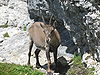 for comparison. It avoids most of the flaws of the nominated image. Papa Lima Whiskey (talk) 00:20, 21 November 2009 (UTC)


 ? --jjron (talk) 13:37, 9 November 2009 (UTC)


 as opposed to this:
  which is what this image is. It's bland and unemotional and has no wow factor.--Silversmith Hewwo 23:59, 15 November 2009 (UTC)

 Canada animation
 US by state animation
 Southwestern US and Mexico animation
 Confederate States animation


.jpg)
_wb_edit.jpg)


.svg)
.svg)


 Plate I: The Effects of Trim's Eloquence
 Plate II: Obadiah leading in Dr. Slop
 Plate III: The Jack-boots transformed into Mortars
 Plate IV: The long-nosed Stranger of Strasburg
 Plate V: My Uncle Toby on his Hobby-horse
 Plate VI: Trim's relation of Tristram's misfortune
 Plate VII: The Quarrel of Slop and Susannah
 Plate VIII: The Smoking Batteries (Already an FP, listed for completeness)


.jpg)
![[5]](http://www.moneduloides.com/images/salat2.jpg)