
Google logo
Google has had many logos since its renaming from BackRub. The first logo was created by Sergey Brin using GIMP. The logo underwent a major revision on September 1, 2015. The previous Google logo was designed by Ruth Kedar, and is a wordmark based on the Catull typeface, an old style serif typeface designed by Gustav Jaeger for the Berthold Type Foundry in 1982.[1] The company also includes various modifications or humorous features, such as cartoon modifications of their logo for use on holidays, birthdays of famous people, and major events, such as the Olympics.[2] These special logos, some designed by Dennis Hwang, have become known as Google Doodles.
Google subsidiary YouTube has also featured some custom logos to highlight special events occurring on the site.[citation needed]
History
In 1998, Sergey Brin created a computerized version of the Google letters using the free graphics program GIMP. The typeface was changed and an exclamation mark was added, mimicking the Yahoo! logo.[3] "There were a lot of different color iterations", says Ruth Kedar, the graphic designer who developed the now-famous logo. "We ended up with the primary colors, but instead of having the pattern go in order, we put a secondary color on the L, which brought back the idea that Google doesn't follow the rules."[4]
In 2010, the Google logo received its first major overhaul since May 31, 1999. The new logo was first previewed on November 8, 2009,[5] and was officially launched on May 6, 2010.[6] It utilises an identical typeface to the previous logo, but the "o" is distinctly more orange-colored in place of the previously more yellowish "o", as well as a much more subtle shadow rendered in a different shading style. On September 19, 2013, Google introduced a new "flat" (two-dimensional) logo with a slightly altered color palette.[7][8] On May 24, 2014 the Google logo was updated, the second 'g' has moved right one pixel and the 'l' has moved down and right one pixel.[9][10] The old 2010 Google logo is still used on some pages, such as the Google Doodles page.[11]
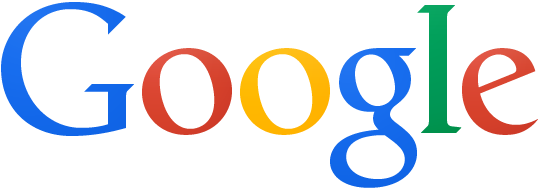
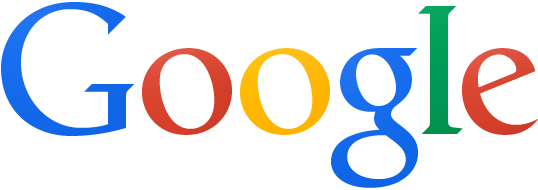
On September 1, 2015 Google introduced a "new logo and identity family" designed to work across multiple devices.[12]
-
 Original Google logo in Baskerville Bold, used from September to October 1998. This is the only Google logo with a major difference in color combination.
 -
 The Google! logo used from October 1998 to May 1999, differs from the previous one with an exclamation mark added to the end of the logo and a change in terms of color. This color combination is still used today, although with different hues.
 -
 The Google logo used from May 31, 1999 to May 5, 2010. This logo lasted for 10 years and 11 months. This is still used on the Picasa software, the Internet Explorer Gallery and some portals which are the only things to contain this logo.
 -
 The Google logo used from May 6, 2010 to September 18, 2013. The major difference in comparison with the previous logo was the reduced distance of the projected shadow behind the word "Google". Also note the minor color change of the second "o" from yellow to orange.
 -
 The Google logo used from September 19, 2013 to September 1, 2015. The major difference in comparison with the previous logo was the flattening of shadows on the lettering in line with the current layout.

Google Doodles
The first Google Doodle was in honor of the Burning Man Festival of 1998. [13][14] The doodle was designed by Larry Page and Sergey Brin to notify users of their absence in case the servers crashed. Subsequent Google Doodles were designed by an outside contractor, until Larry and Sergey asked then-intern Dennis Hwang to design a logo for Bastille Day in 2000. Hwang has been designing the Google Doodles ever since.[15][16]
Colorless logo
From time to time, Google shows a special colorless logo[17] on a local homepage in recognition of a major tragedy, often for several days. The design was apparently first used on the Google Poland homepage following the air disaster that killed, among others, Polish President Lech Kaczyński in April 2010. A few days later, the logo was used in China and Hong Kong to pay respects to the victims of the Qinghai earthquake.[18]
On September 8, 2010, the doodle once again changed to a greyed-out Google logo that lit up with the standard Google colors as the first 6 letters of a search query were entered. It goes by the name of the Keystroke Logo.[19]
Favicon

Google's favicon from May 31, 1999 to May 29, 2008, was a blue, uppercase "G" on white background. It was accompanied by a border with a red, blue and a green side. On May 30, 2008, a new favicon was launched. It showed the lowercase "g" from Google's 1999 logo, colored in white and originally was intended to be a part of a larger set of icons developed for better scalability on mobile devices.[20] A new favicon was launched on January 9, 2009. It included background areas colored in red, green, blue and yellow.[21][22] It was based on a design by André Resende, a computer science undergraduate student at the University of Campinas in Brazil. He submitted it for a contest launched by Google in June 2008 to receive favicon submissions. The official Google blog stated: "His placement of a white 'g' on a color-blocked background was highly recognizable and attractive, while seeming to capture the essence of Google".[21] This is still being used on some portals. On February 1, 2012, a new favicon was being previewed. The lowercase "g" still retained its position but was shifted slightly up.[23] The favicon used from August 13, 2012, until September 1, 2015, shows the small letter "g", but has a simple, light blue background color. It resembles the 2008 favicon. The current favicon, used from September 1, 2015, shows a capital letter "G", in the tailor made font called Product Sans, colored red, yellow, green, and blue in segments, on a circular white background.
References
- ^ "Information about the typeface Catull BQS". Identifont. Retrieved August 14, 2009.
- ^ "Stress Cultlogos". Google. Retrieved August 14, 2009.
- ^ Mark Malseed (November 2005). The Google Story. New York: Bantam Dell. p. 43. ISBN 978-0-553-80457-7.
- ^ Zjawinski, Sonia. "How Google Got Its Colorful Logo." Wired (Online magazine). February 12, 2008. Retrieved on January 5, 2010.
- ^ "Google Search's New Interface Being Tested Now". Retrieved May 6, 2010.
- ^ "The Google design, turned up a notch". Google. May 6, 2010. Retrieved June 3, 2010.
- ^ Eddie Kessler: Updating the Google bar: many products, multiple devices – Inside Search. Google Inc. 2013-09-19. Retrieved 2013-09-19.
- ^ Chris Welch: Google reveals new logo and redesigned navigation bar. The Verge. 2013-09-19. Retrieved 2013-09.13
- ^ "Before". Google.com. Retrieved May 25, 2014.
- ^ "After". Google.com. Retrieved May 25, 2014.
- ^ "Doodles". Google.com. Retrieved April 23, 2014.
- ^ "Google's look, evolved". Retrieved September 1, 2015.
- ^ "Doodle 4 Google". Google.com. Retrieved April 23, 2014.
- ^ "Burning Man Festival". Google.com. August 30, 1998. Retrieved April 23, 2014.
- ^ Hwang, Dennis. "Oodles of Doodles." Google (corporate blog). June 8, 2004. Retrieved on July 19, 2006.
- ^ CNN. July 19, 2006. Retrieved on July 19, 2006.
- ^ "'White Logo'". Retrieved August 30, 2010.
- ^ Google Shows Colorless Logo To Chinese Users Over Qinghai Earthquake, Search Engine Land, April 20, 2010.
- ^ "Google". Google. Retrieved April 23, 2014.
- ^ Mayer, Marissa (June 6, 2008). "Official Google Blog: "One Fish, Two Fish, Red Fish, Blue Fish". Googleblog.blogspot.com. Retrieved August 30, 2010.
- ^ a b Mayer, Marissa. "Official Google Blog: Google's new favicon". Googleblog.blogspot.com. Retrieved August 30, 2010.
- ^ "New Google Favicon". Googlesystem.blogspot.com. January 9, 2009. Retrieved August 30, 2010.
- ^ "Google To Release New All Blue Favorite Icon". Seroundtable.com. April 18, 2014. Retrieved April 23, 2014.
External links
- Official Google logos
- New Google's logo unveiled on September 1, 2015
- Google's Favicons until August 2012
- Small blue "g" favicon is updated.